TBD
A DC-based architecture studio working to create social and environmental equality through thoughtful design.
A DC-based architecture studio working to create social and environmental equality through thoughtful design.
In early 2021, we worked with a close friend of the studio Omar Hakeem on his newly minted architecture studio; To Be Done. Believing that there is always more work to be done, TBD sets out to create social and environmental equality through thoughtful design.
TBD harnesses the inherent goodness in people and the power of design to create sustainable solutions to solve the endemic problems that our world faces. They seek a relevant practice, one which is accessible to all rather than the few “we believe in the right of future generations to a vibrant, livable, and resilient built environment.” They achieve this quest through a unique model that combines architecture, research, and craft.
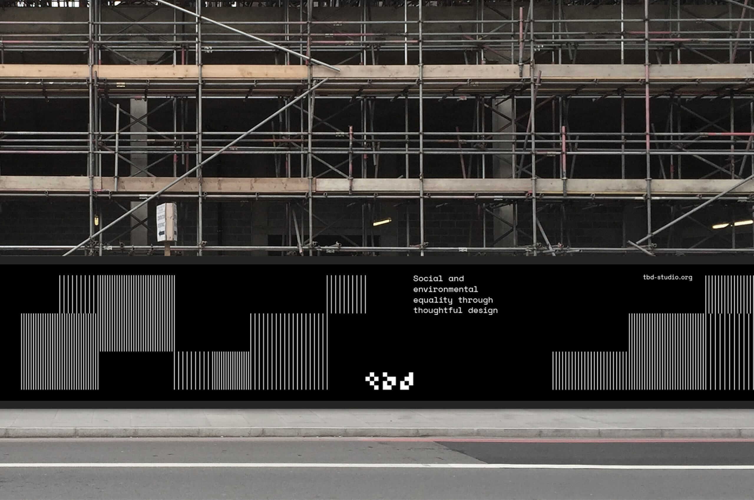
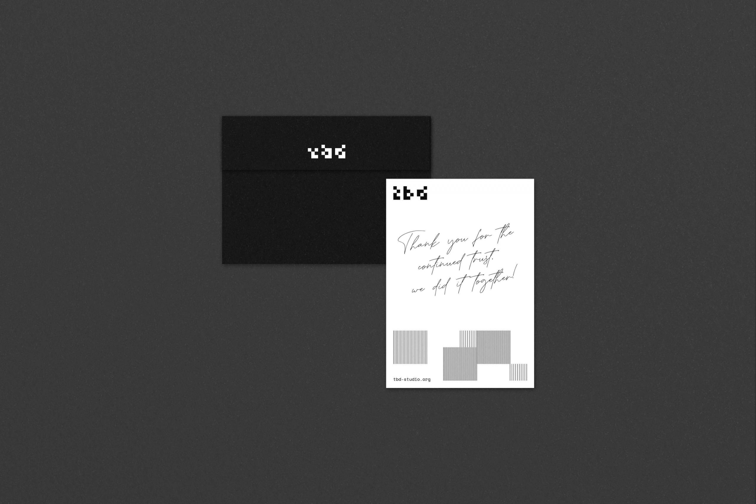
We worked with TBD to create an engaging identity that would support their mission for years to come.
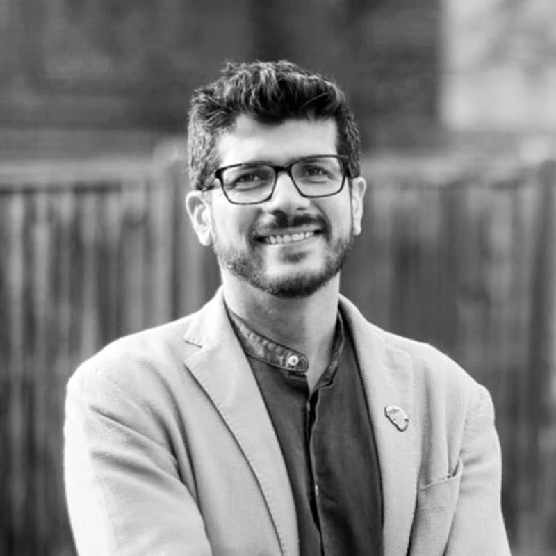
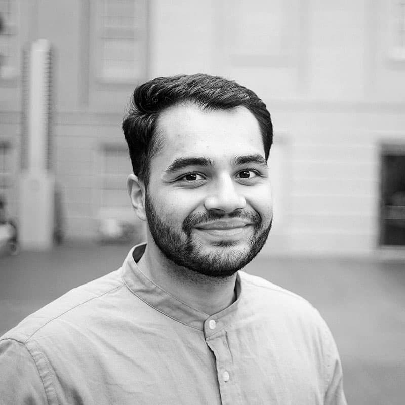
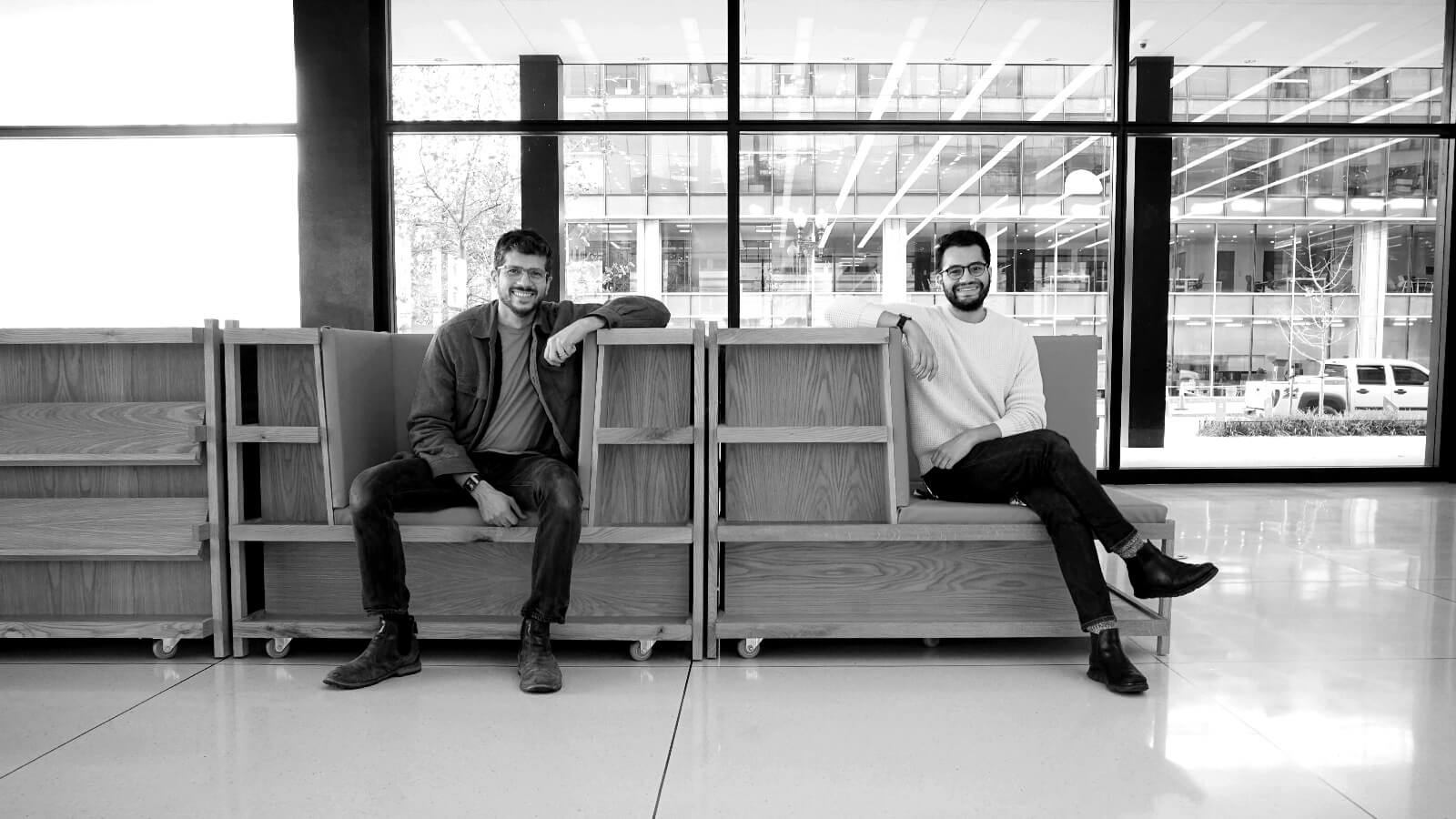
Founder Omar Hakeem and designer Zain Islam-Hashmi focus on geographical, socio-cultural frontiers and work to address the economic, environmental, and health issues that plague these communities.
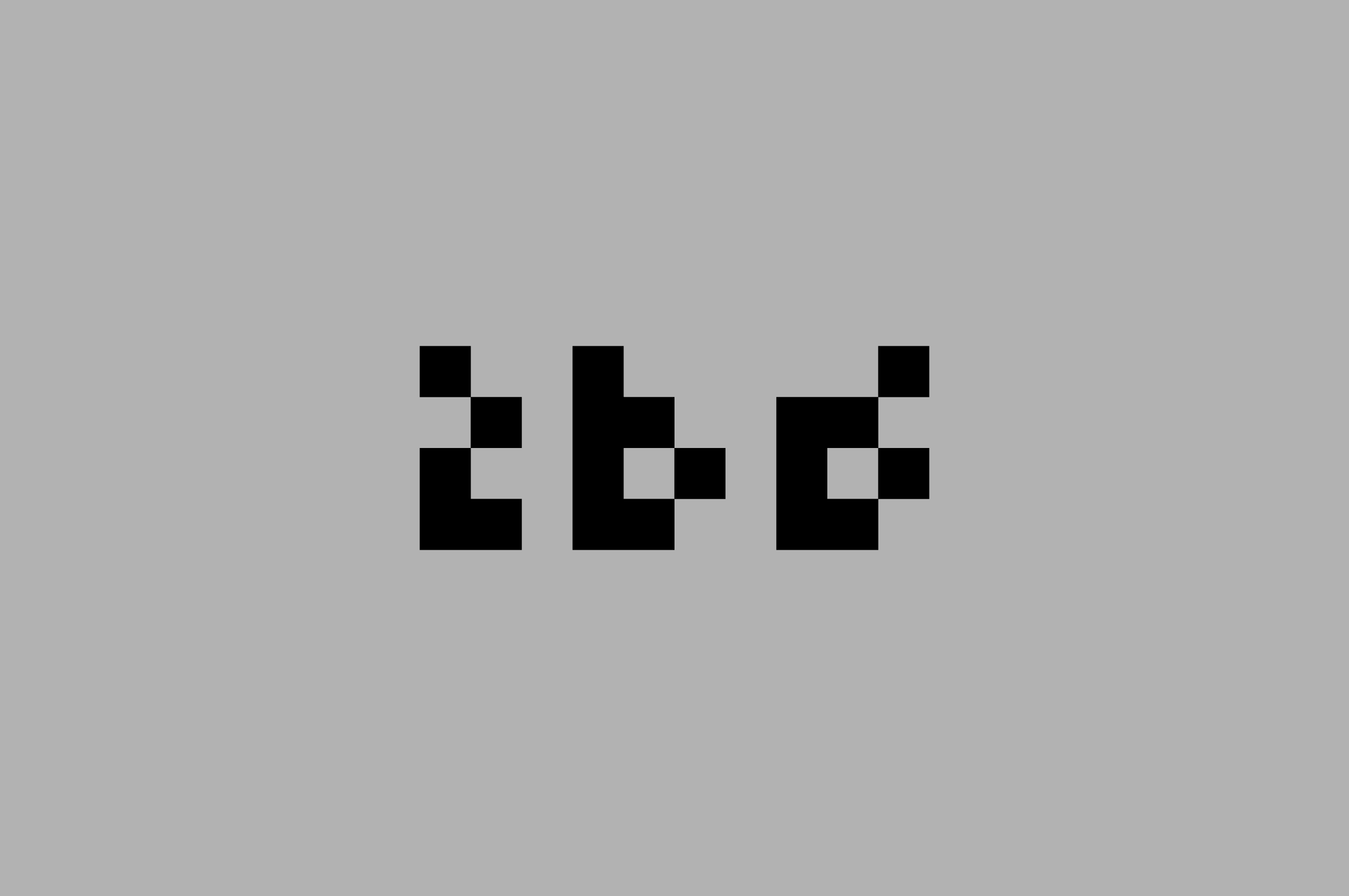
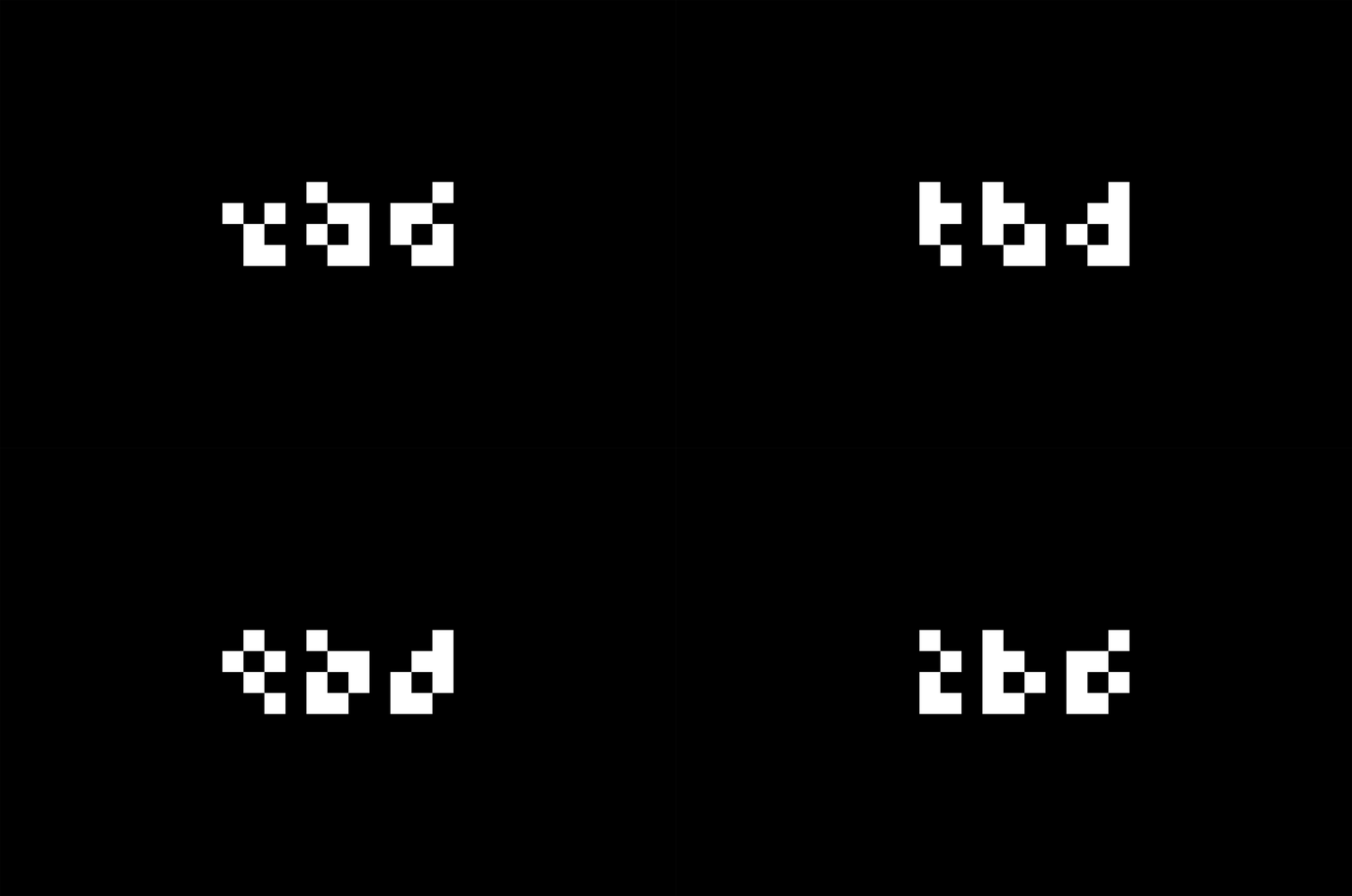
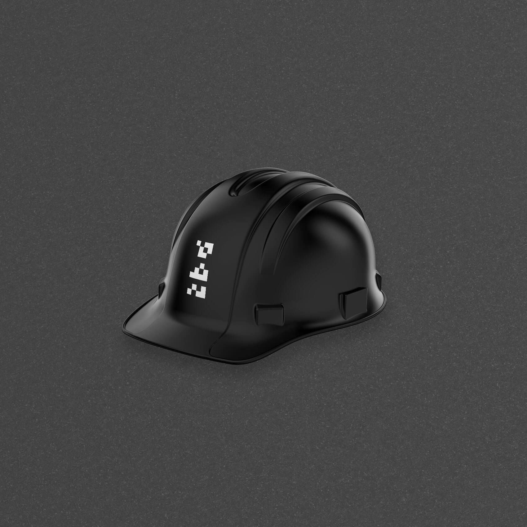
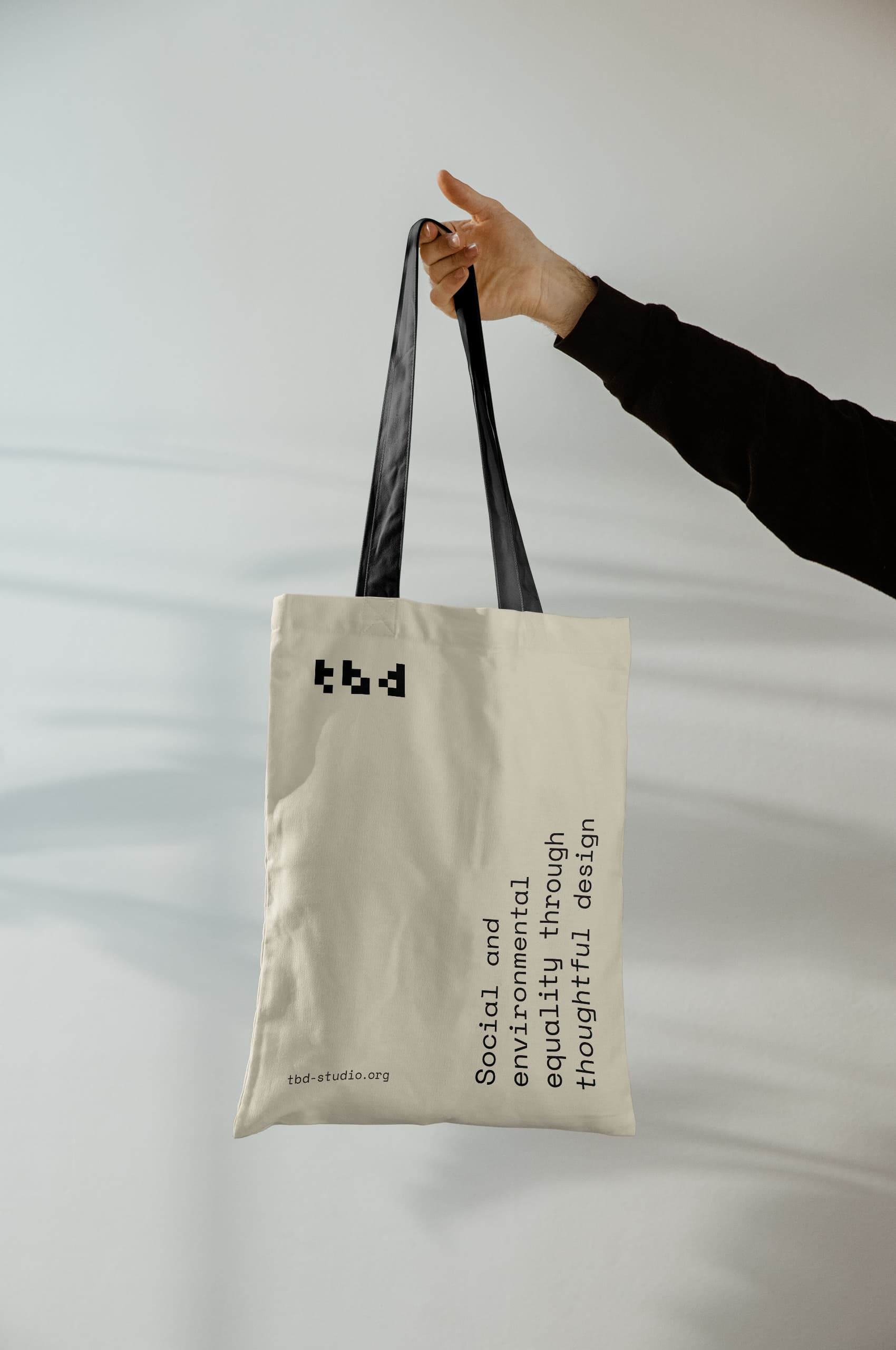
With the flexible focus of the studio, a single static mark would not suit TBD. To work in line with the mission and ethos of the studio, we created a flexible, interchangeable set of wordmarks to emphasize this mission further.
Each variation of the mark is built on the same architectural grid with different pieces removed—while preserving the overall legibility and effectiveness. This visual device echoes the core beliefs that there is always more work to be done and adaptation to solve problems.
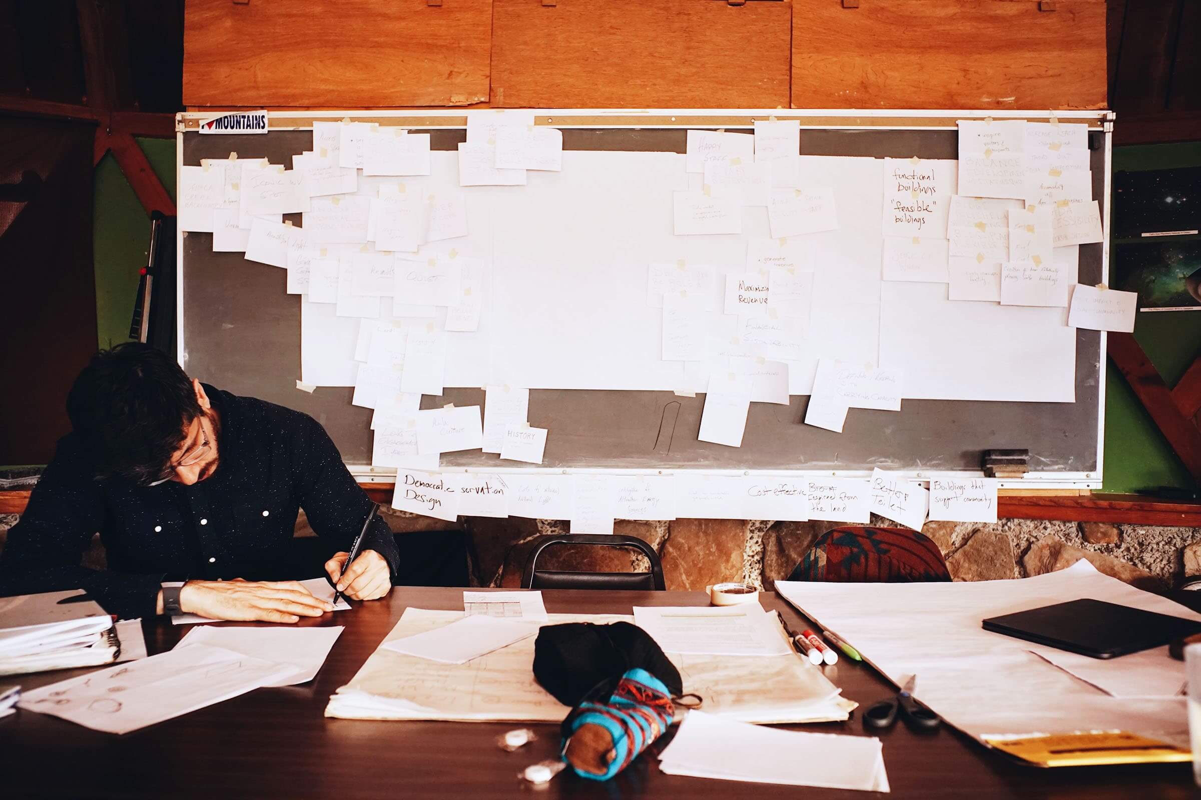
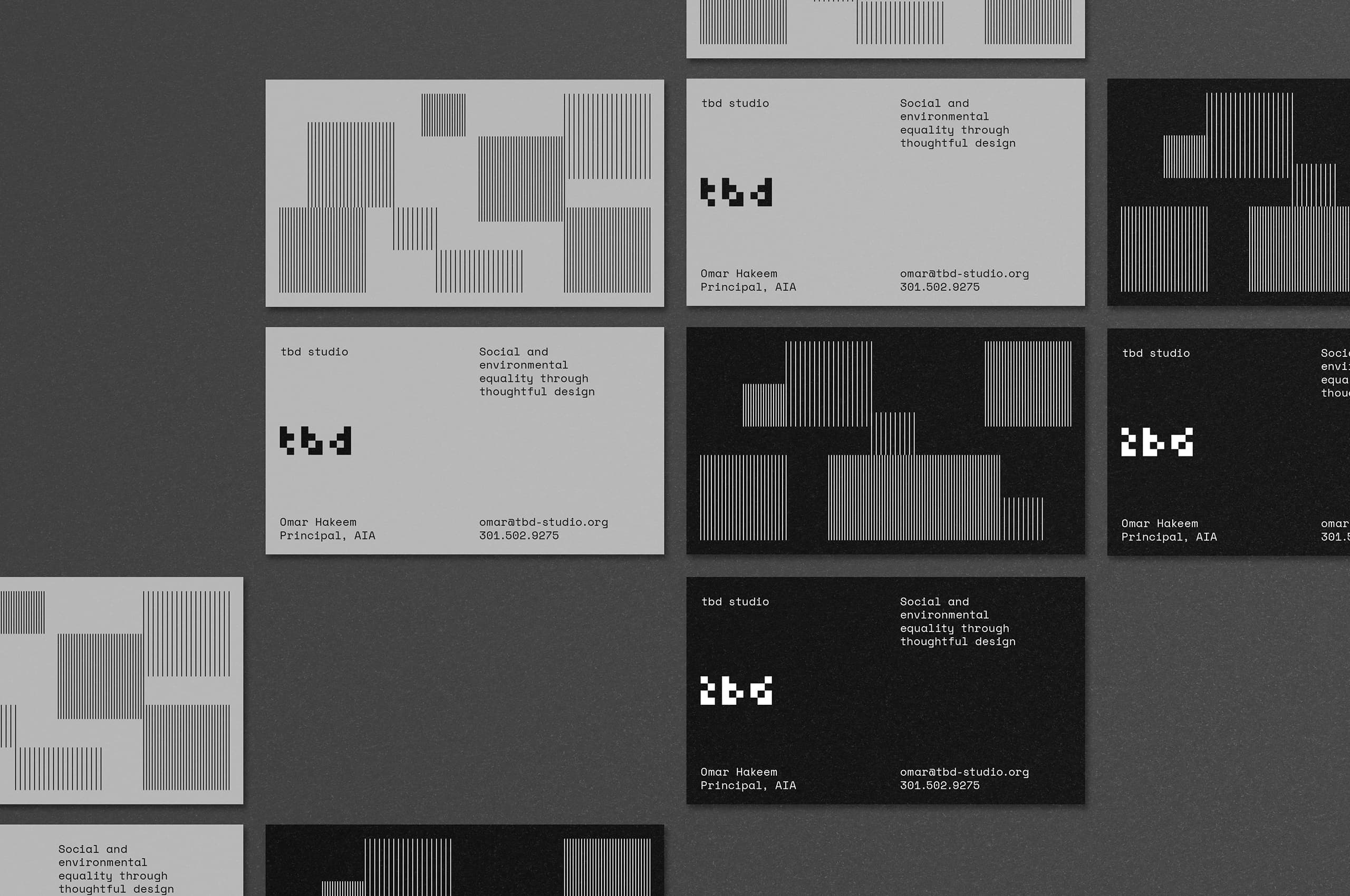
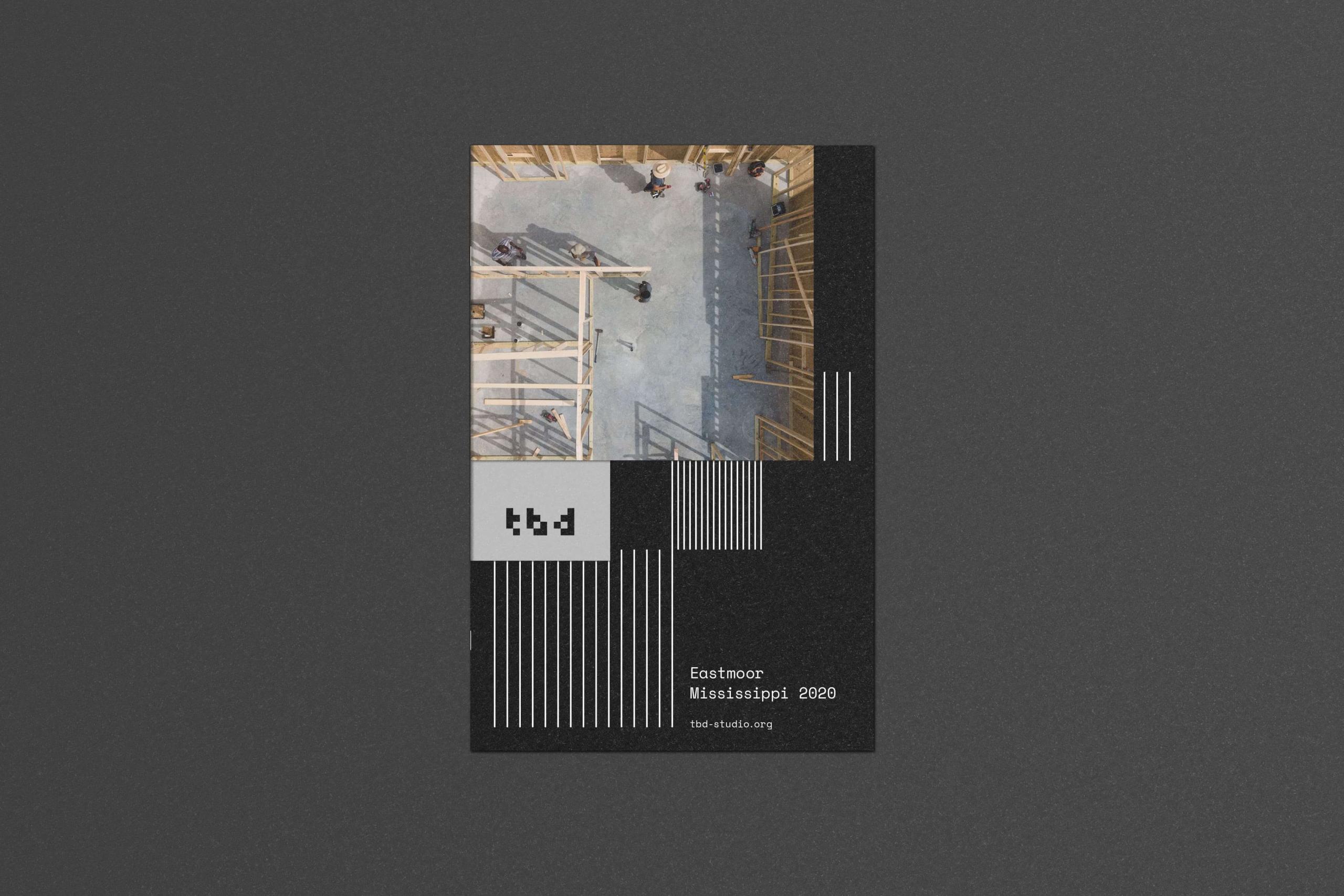
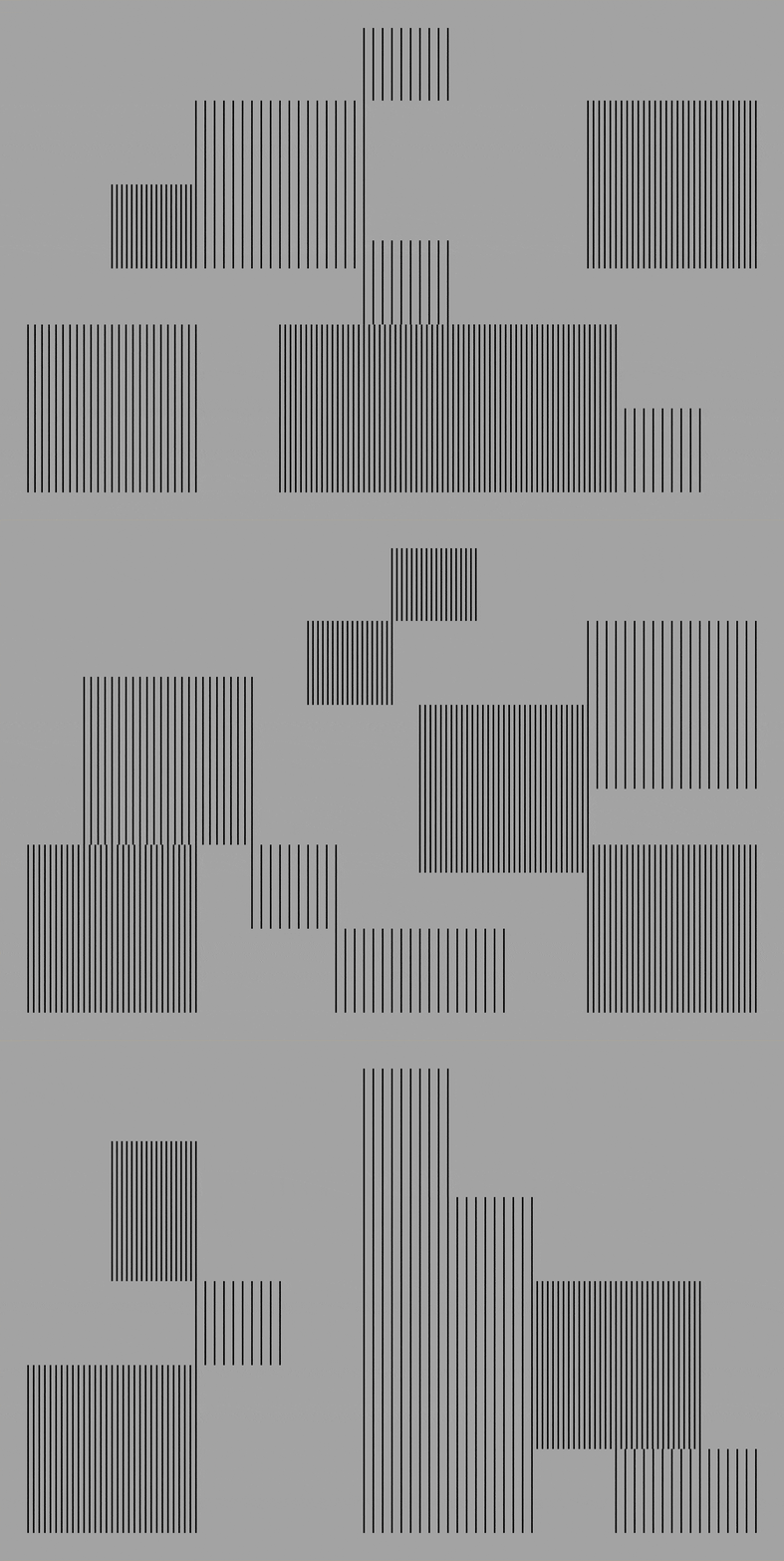
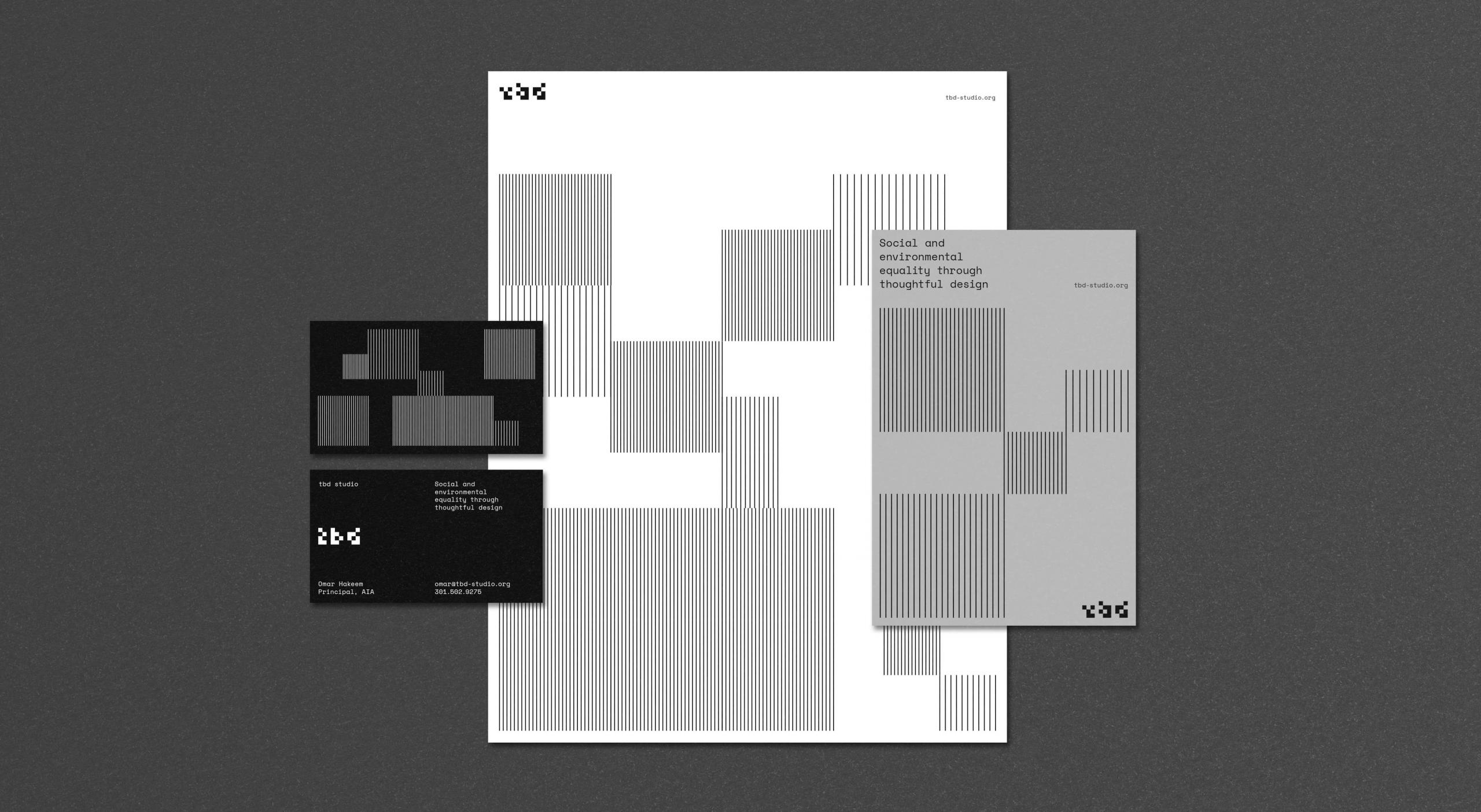
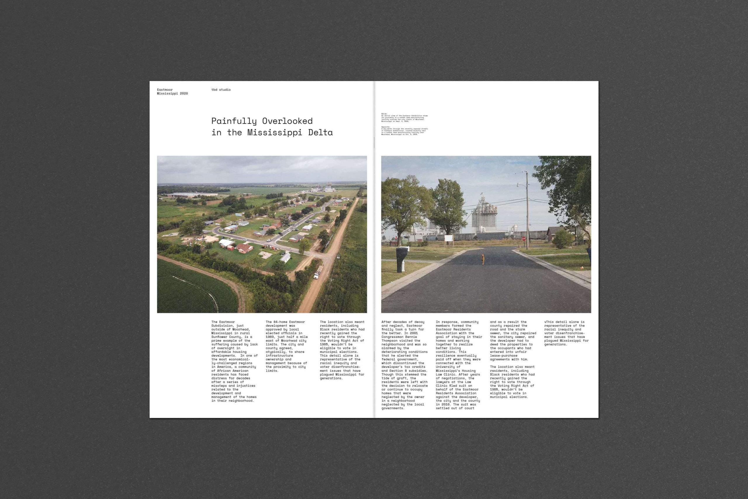
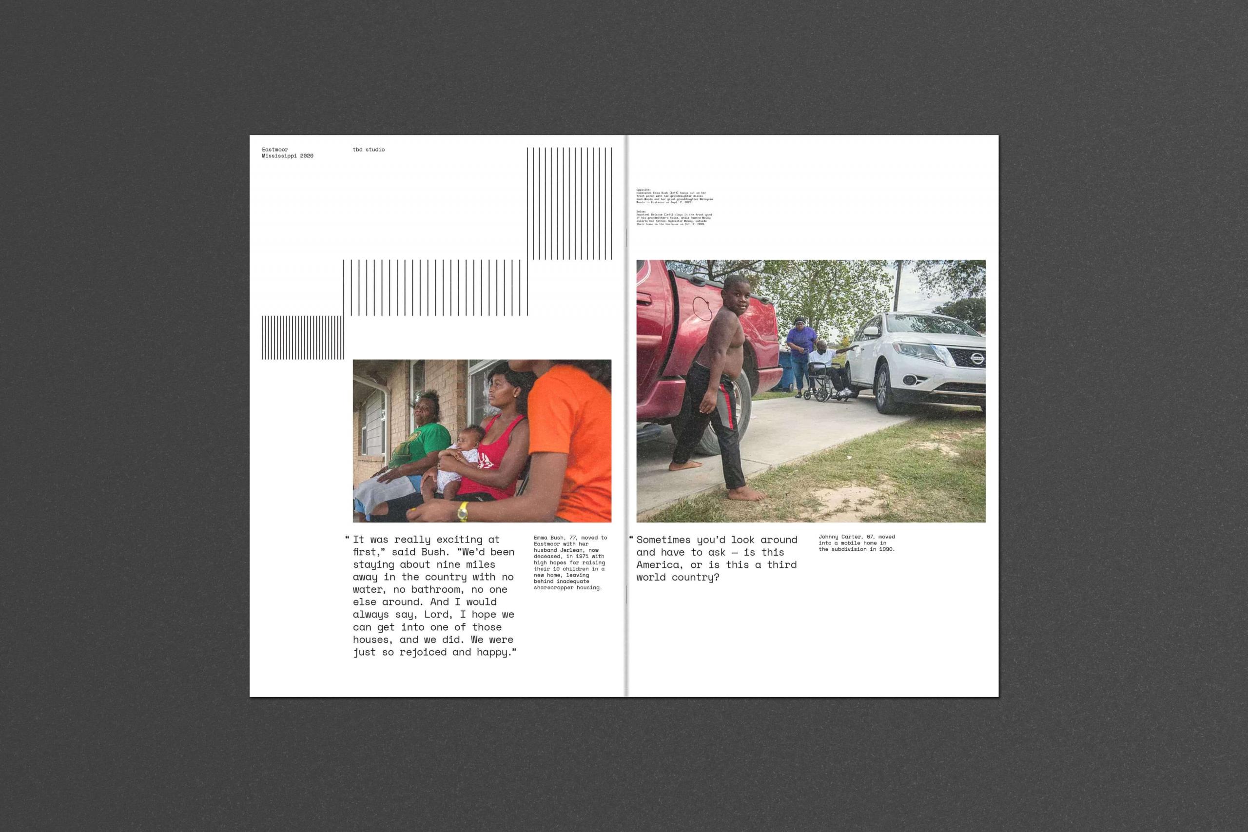
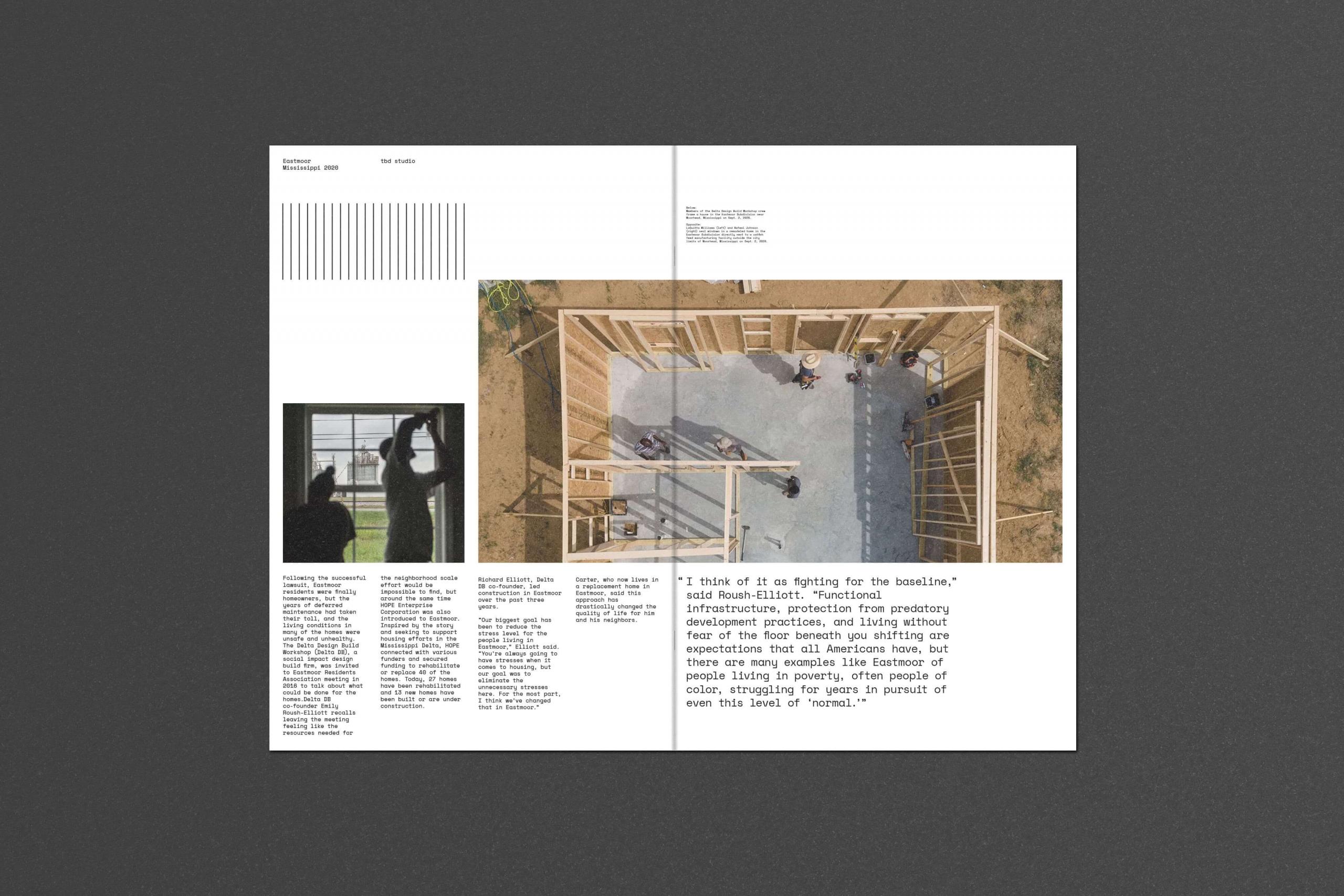
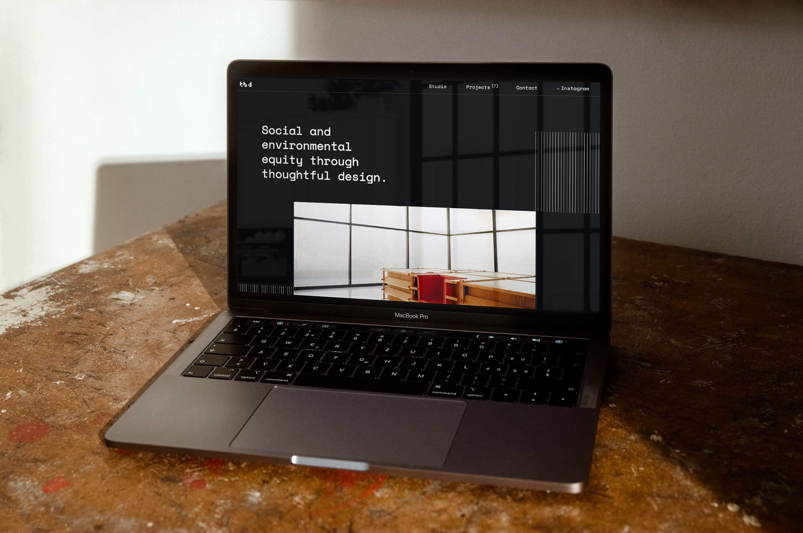
Inspired by plans, drawings, and construction, we developed a flexible pattern system throughout the printed collateral and website. This system allows for endless possibilities, efficiently filling any space. Thus, further strengthening the narrative of the studio.
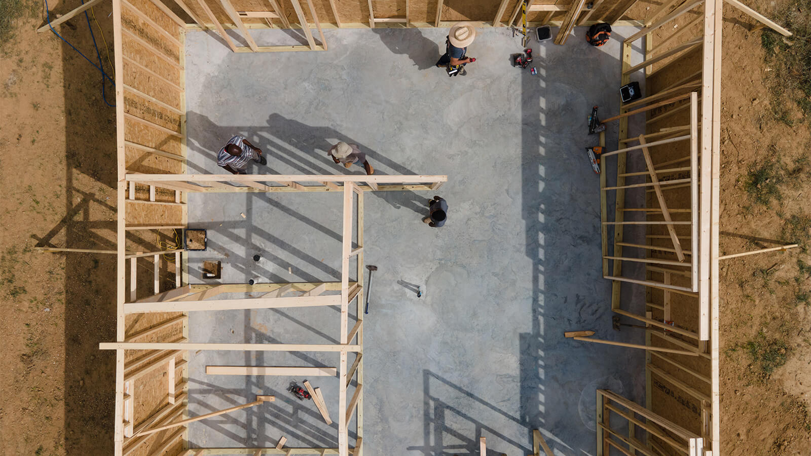
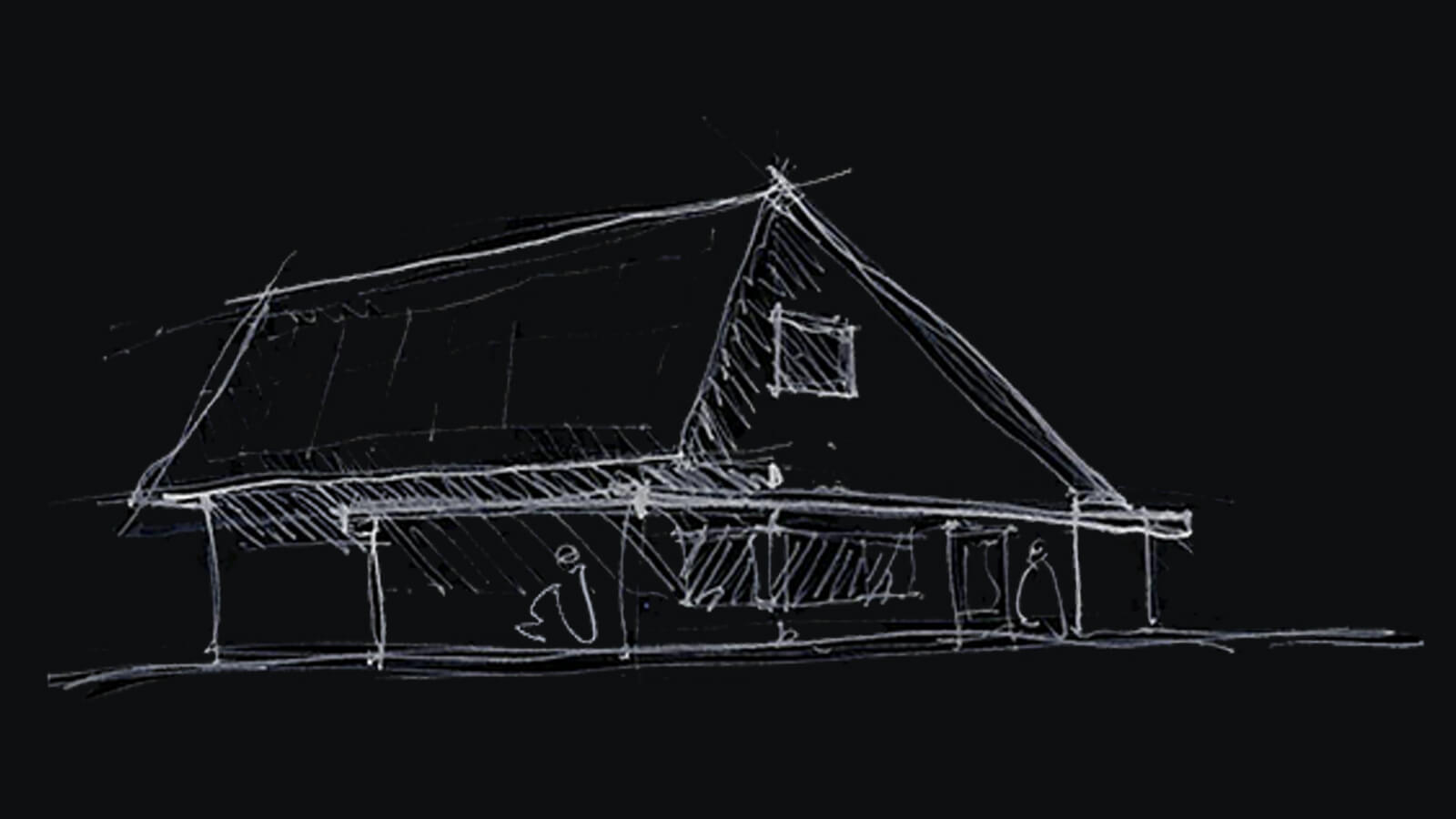
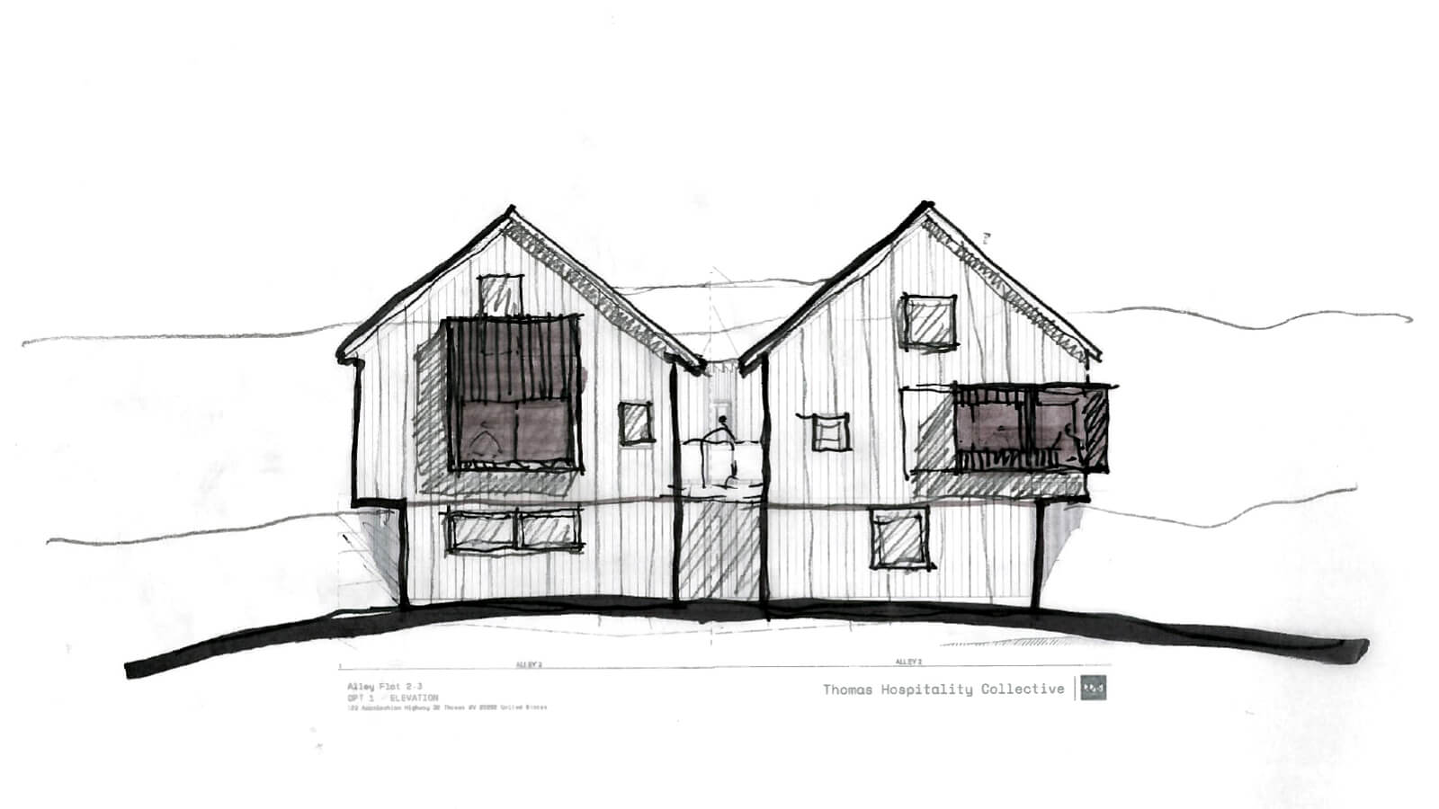
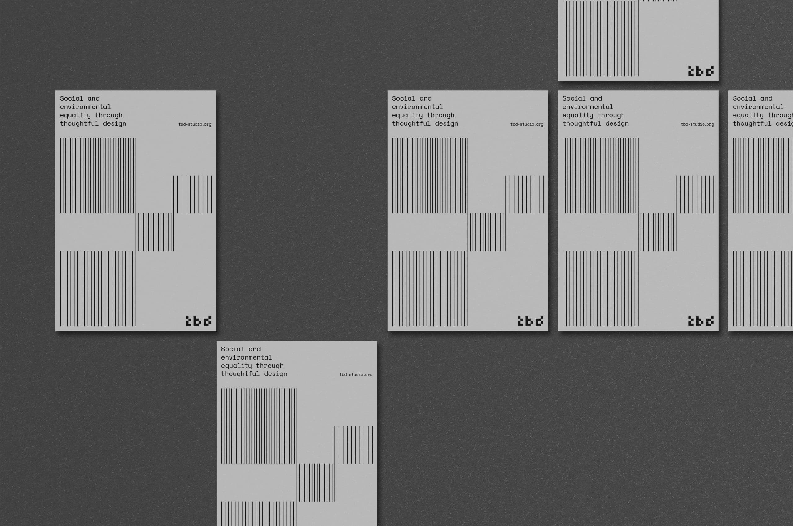

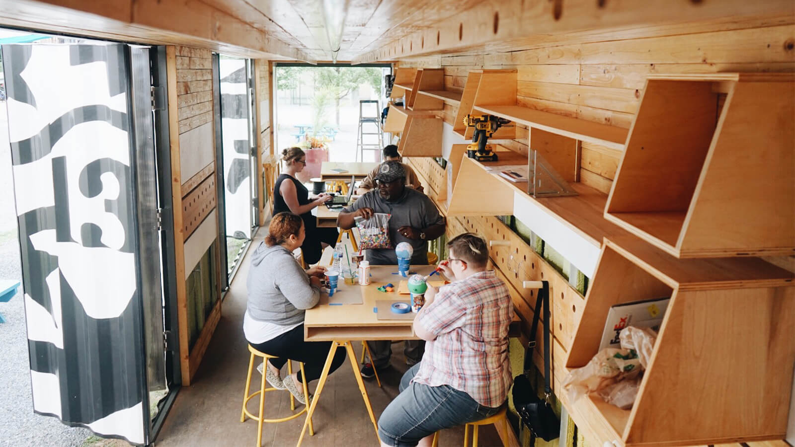
With a strong focus on how their work can positively impact the communities they serve, TBD creates work that engages the community in the outcome and the process itself—creating a meaningful result that these people can have pride and ownership over.
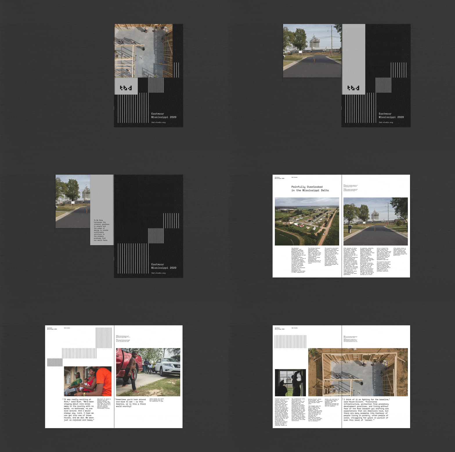
With such an energetic pattern and wordmark system, we wanted to create a simplified color system for the buildout of the brand. It was essential to let the brand support the work itself and not stand in the way— mirroring TBDs ethos.
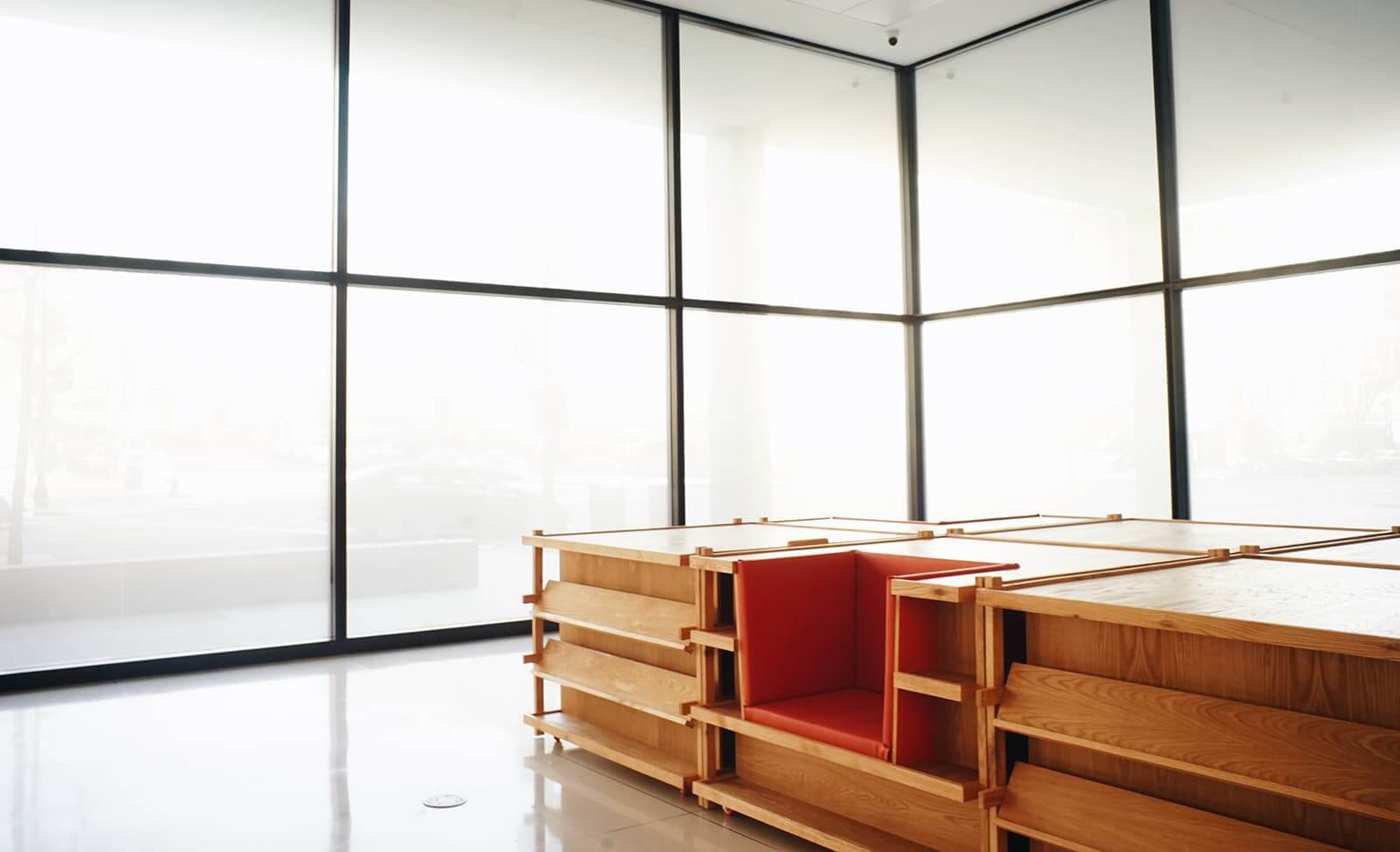
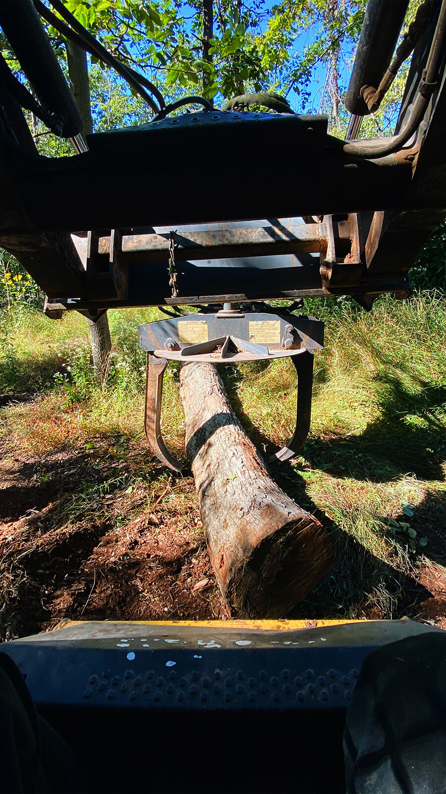
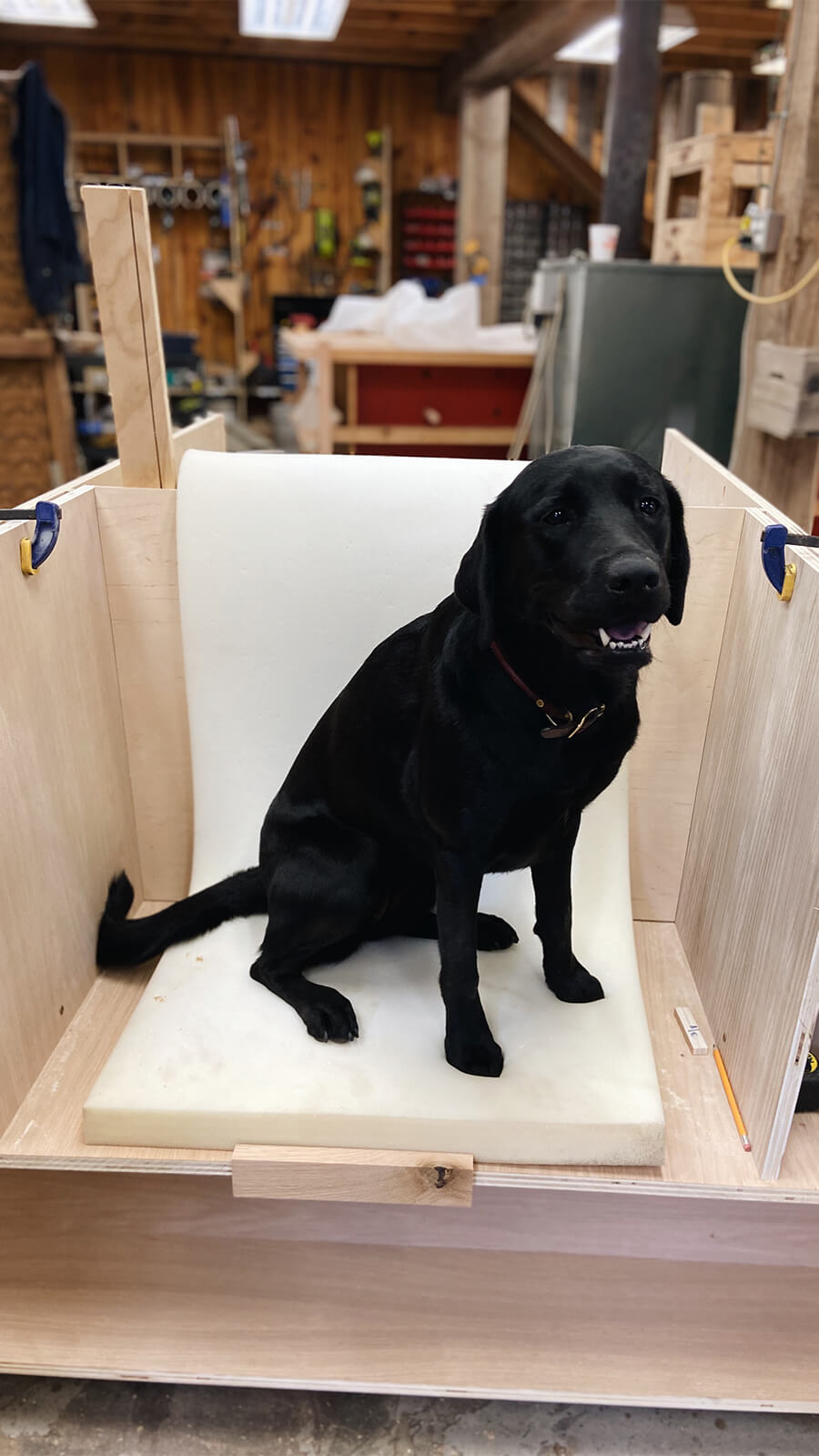
TBD believes that sometimes the best way to impact people’s lives positively is to bring about physical change. Sourcing, shaping, and joining materials keeps them connected to their work as architects and designers and ensures that their partners can realize their visions.
See more work from TBD → here.
