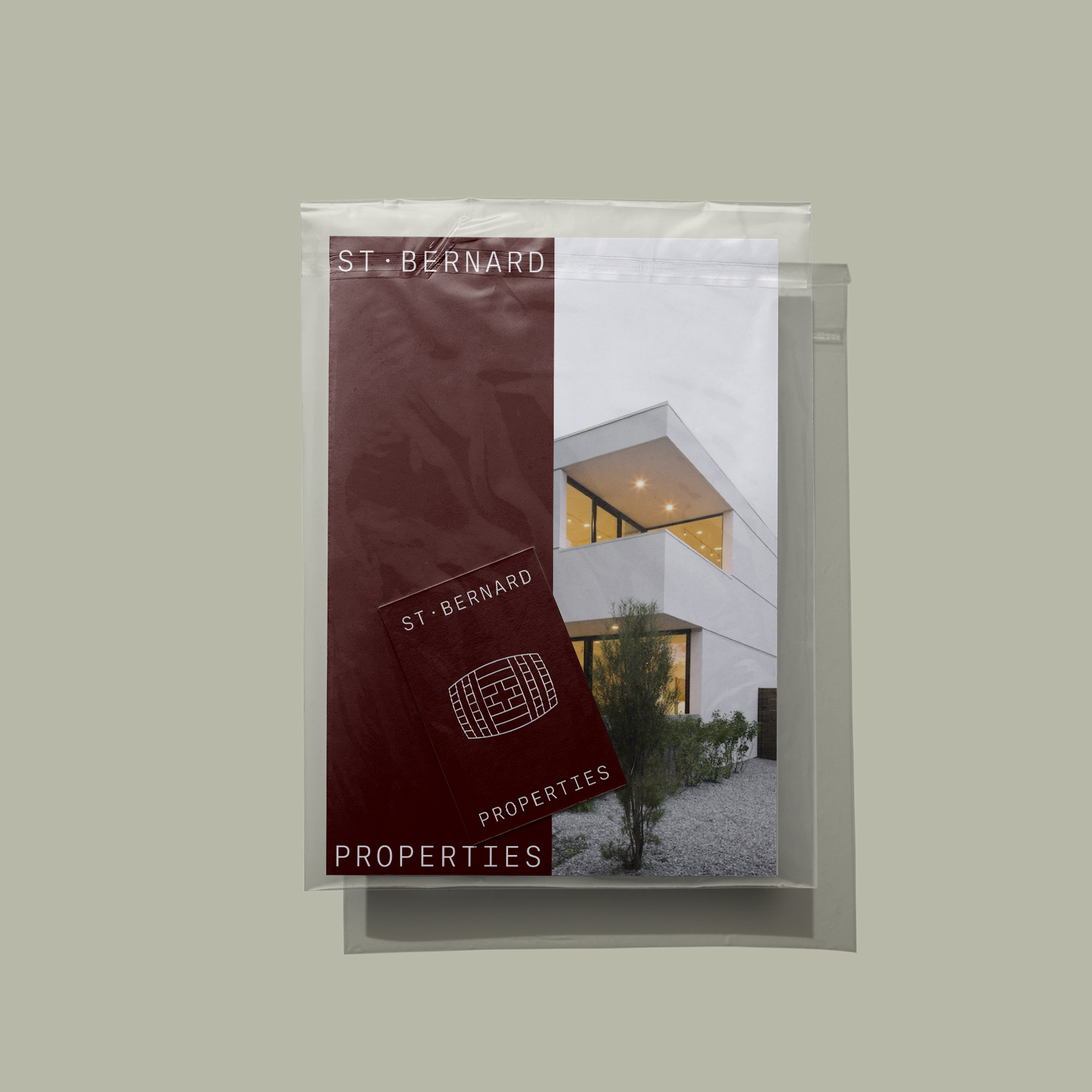
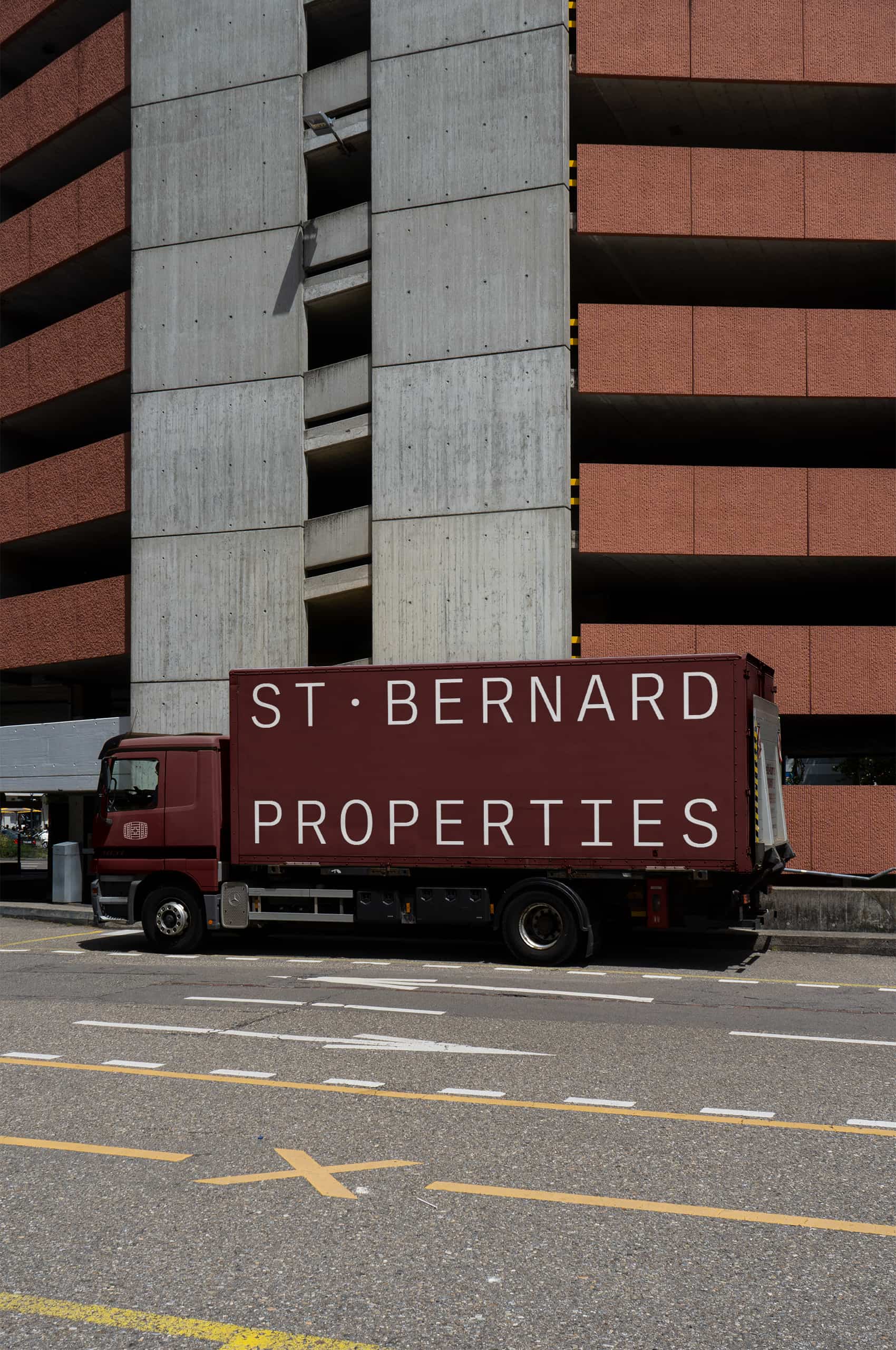
St. Bernard Properties
Bringing new life to Denver, one building at a time.
Bringing new life to Denver, one building at a time.
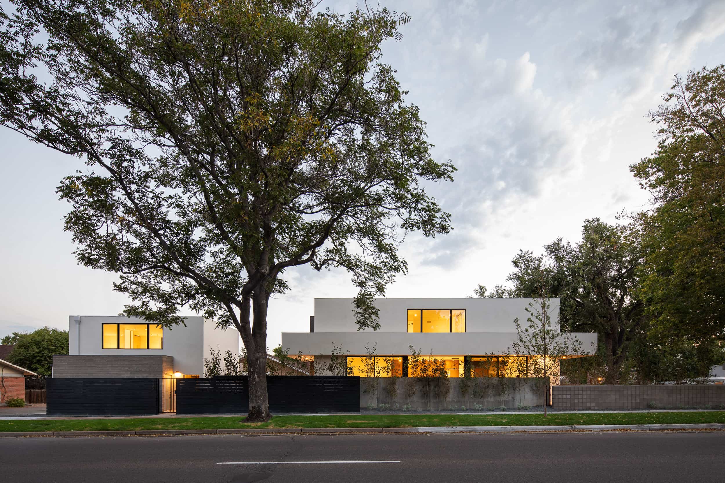
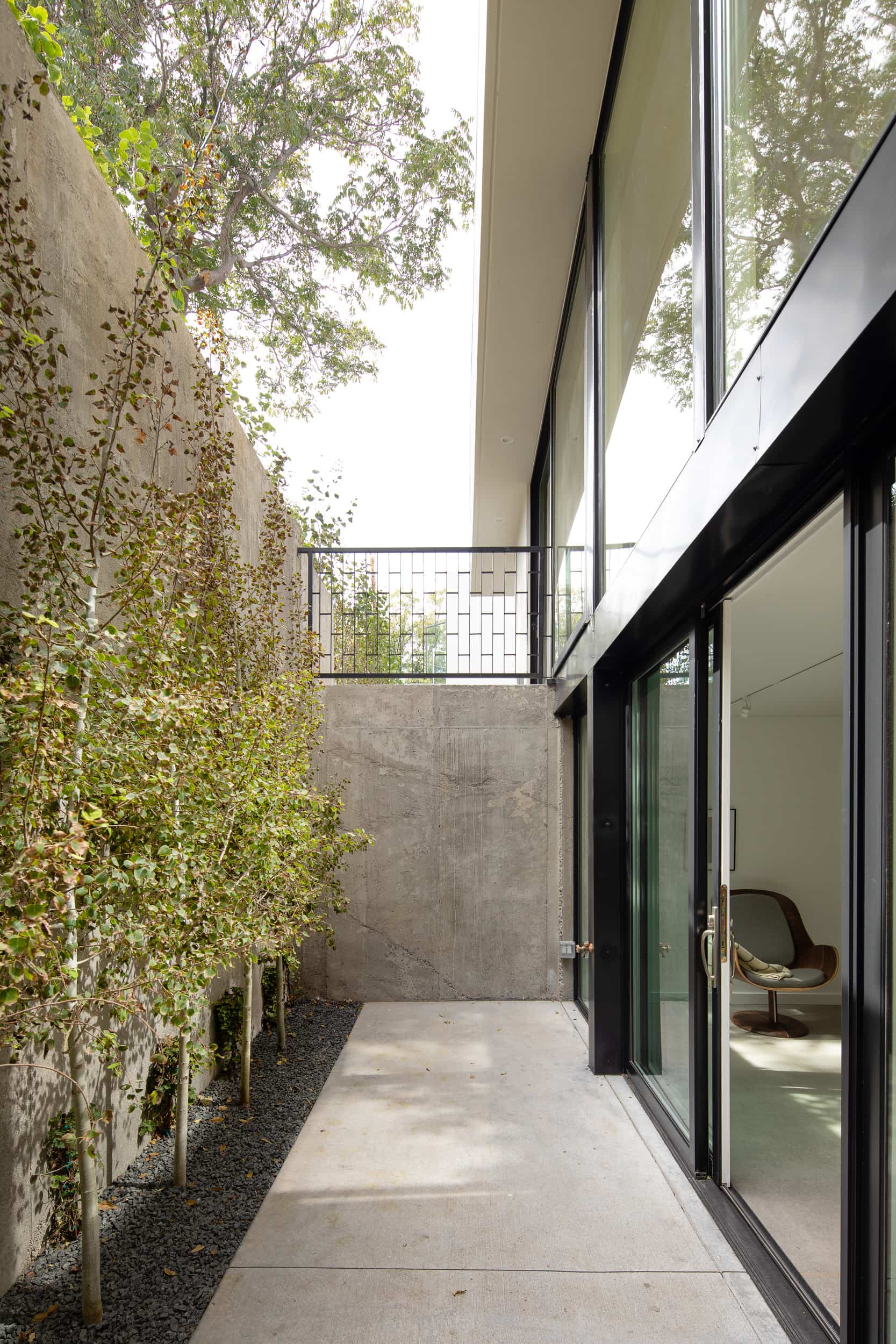
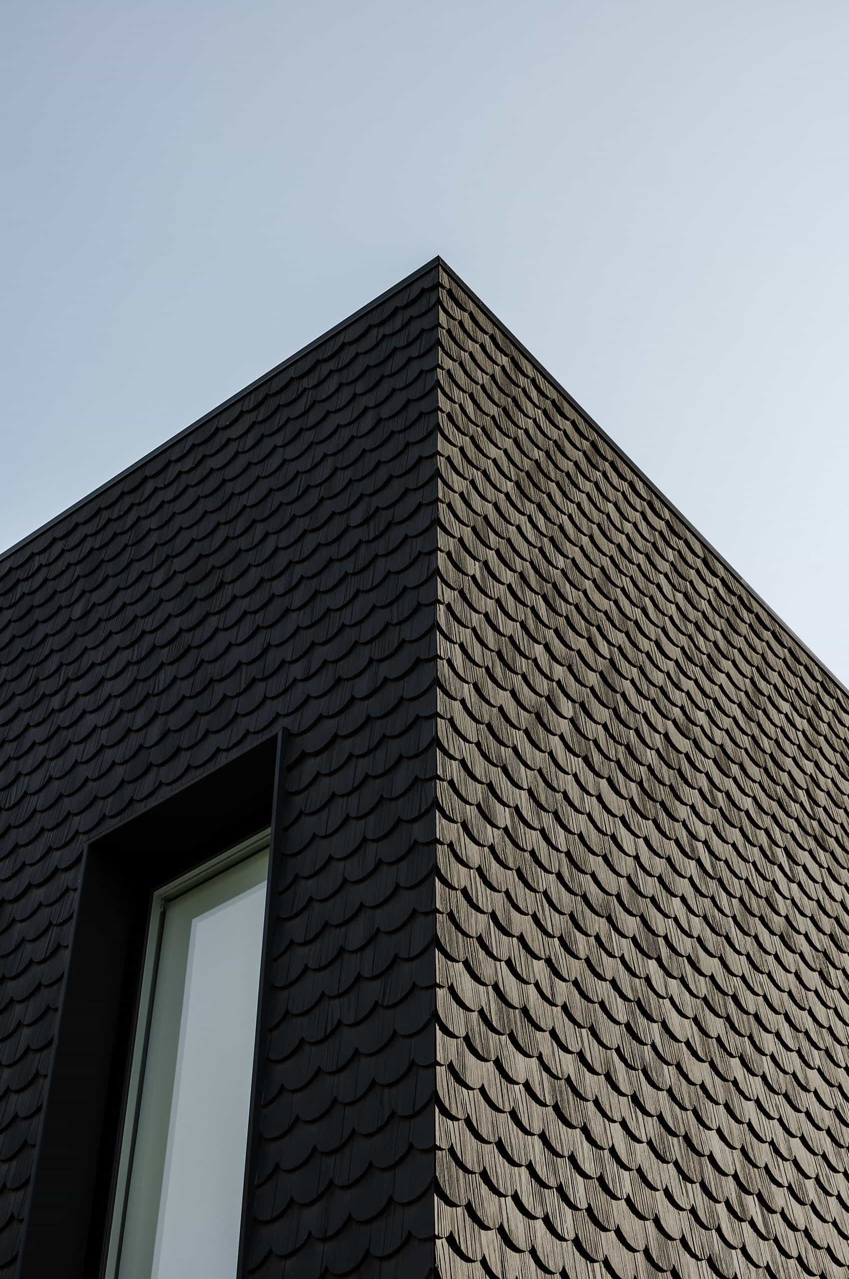
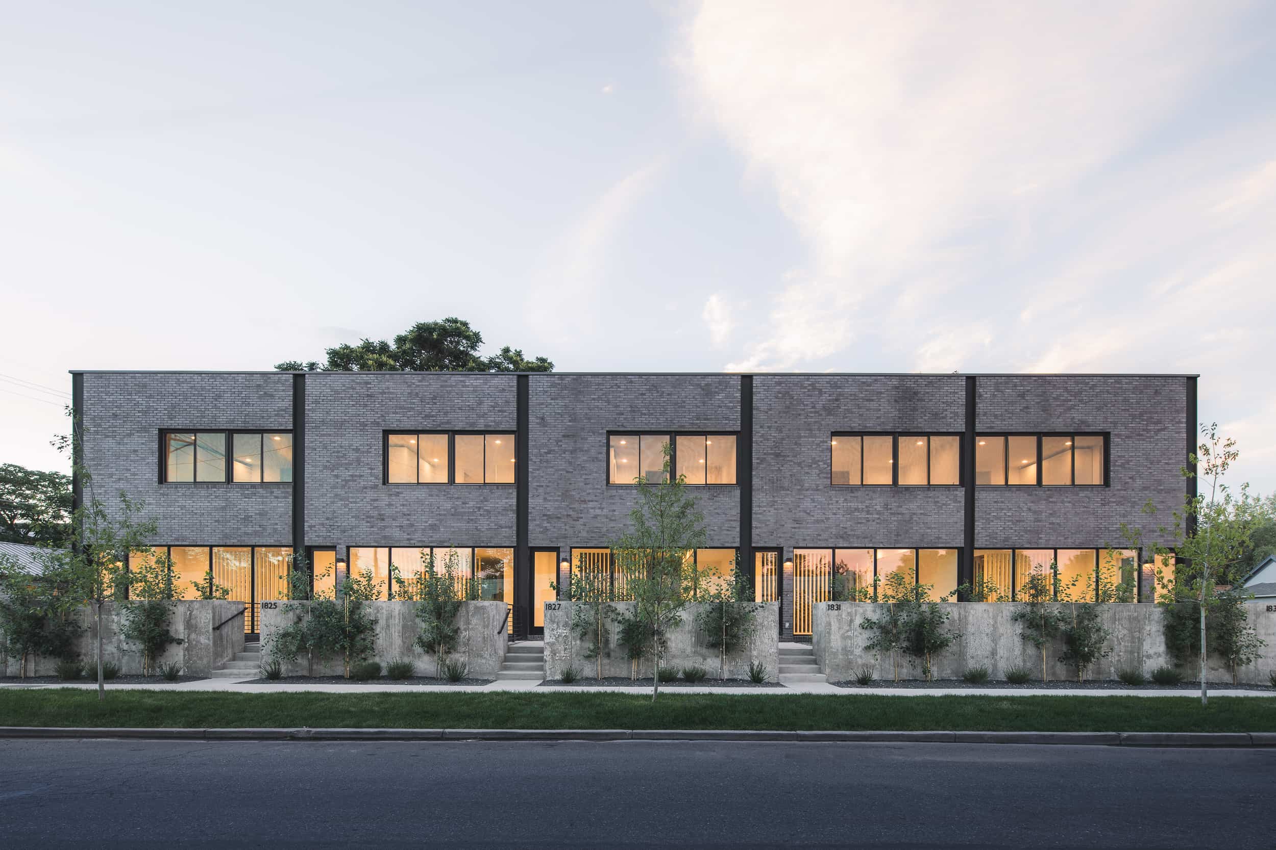
Through rehabilitating historic buildings and developing new builds, Saint Bernard is helping revitalize neighborhoods with both commercial and residential properties.
They work in the development of new single-family residences, residential remodels, new mixed-use buildings, and commercial building rehabilitation/reuse. Their philosophy is to pursue high-quality development, renovation, and compelling design so the properties will be relevant to the neighborhood for years to come.
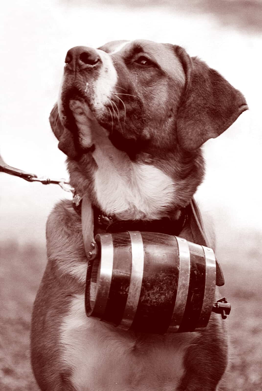
The name harkens to the legendary dogs that carried whiskey barrels around their necks to assist stranded travelers. Saint Bernard came to Mast to help create an identity that embodied the life-giving spirit and lore of the dog while creating a modern look and feel.
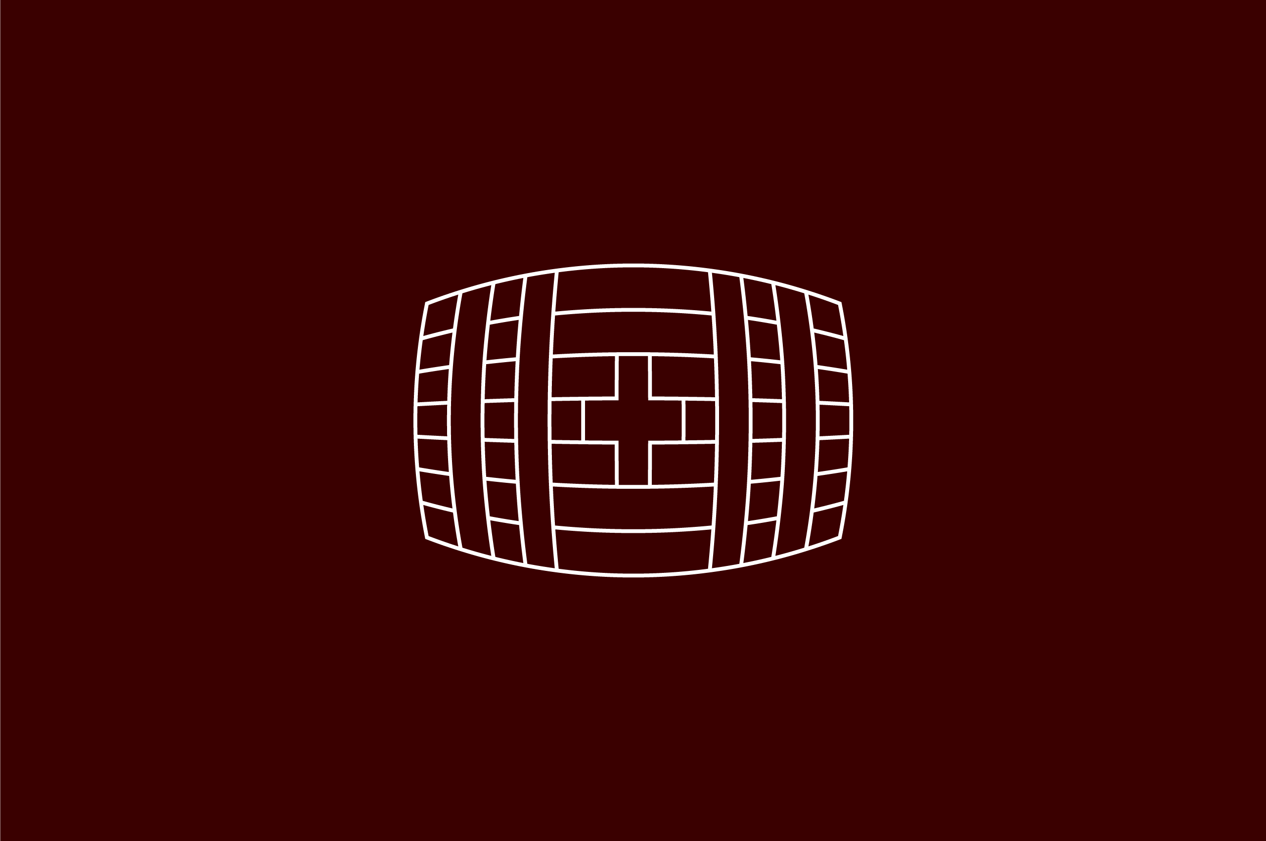
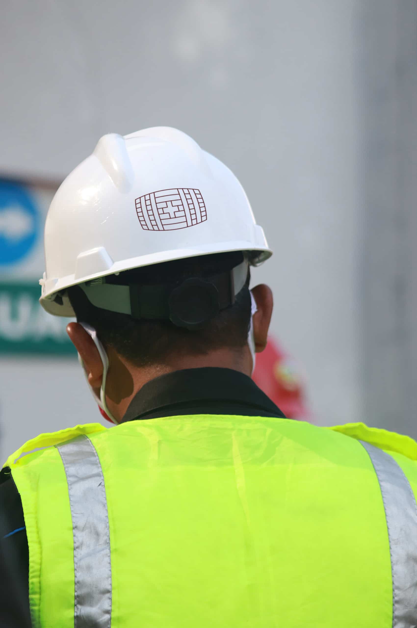
While the first thought was to create a mascot, it would only connect to the name. Instead, we resonated more with the mythical barrels they carried and their rehabilitating power. For this reason, we chose to develop a sophisticated and strong symbol to reinforce their essential work around the neighborhoods of Denver.
Collaborators:
Website: Kinetic Studio
When starting the company, Nathan Beal set out to preserve and breathe new life into town areas that needed revitalization. What better symbol for this revitalization than the St.Bernard—the shaggy alpine dog charging down the mountain with a cask of whiskey to to aid stranded travelers. They chose this as a name as well as a challenge to help bring new life to Denver. Their home.
Photo By Dr. Gustav Nünnicke


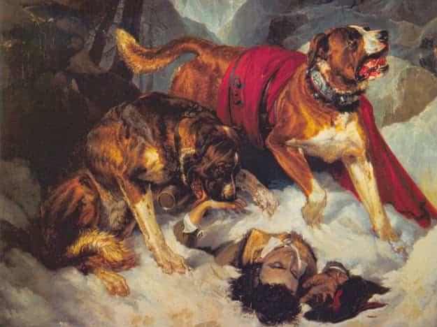
Often shrouded in red and seen with the quintessential jug, similar to this painting by Edwin Landseer, the St. Bernard is an iconic figure representing much-needed support and revitalization. Inspired by these two elements, we created a brand with a modern interpretation of the jug and an elegant red to bring strong visuals to a strong story behind the creation and mission of the company itself.
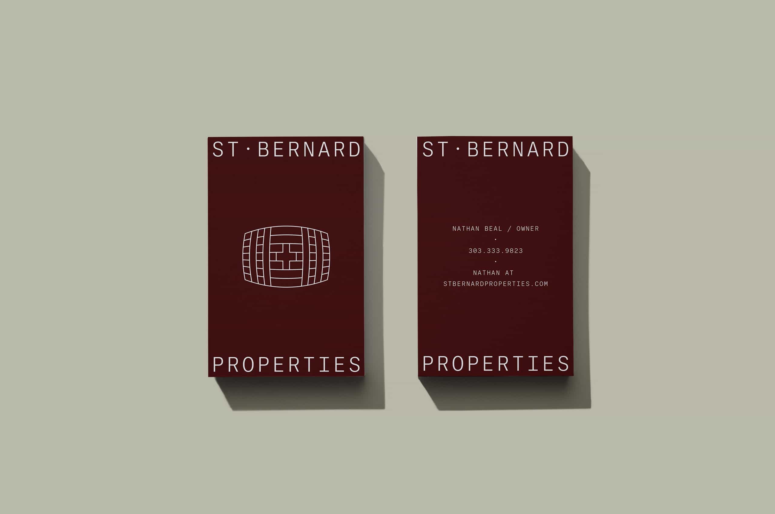
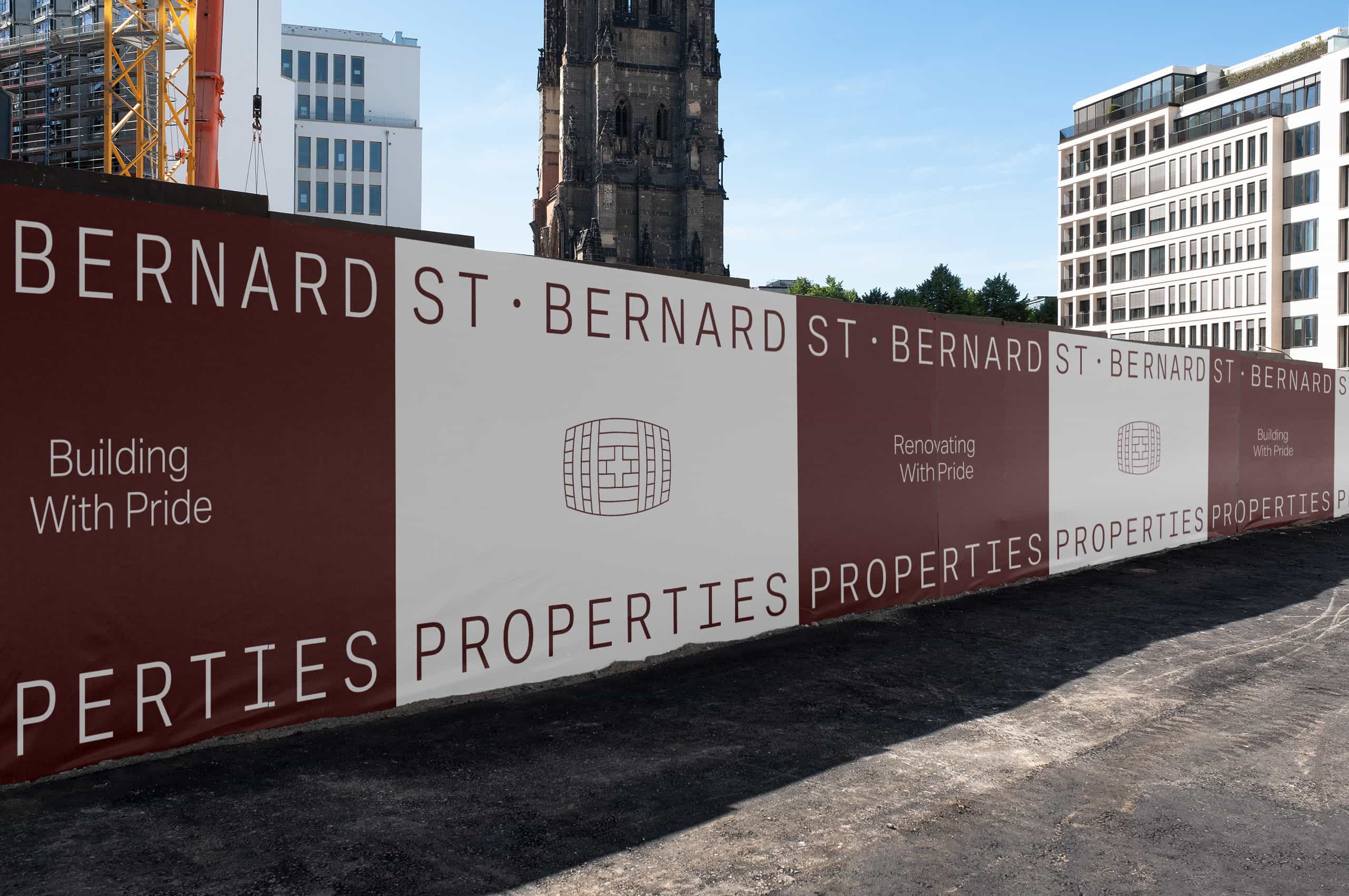
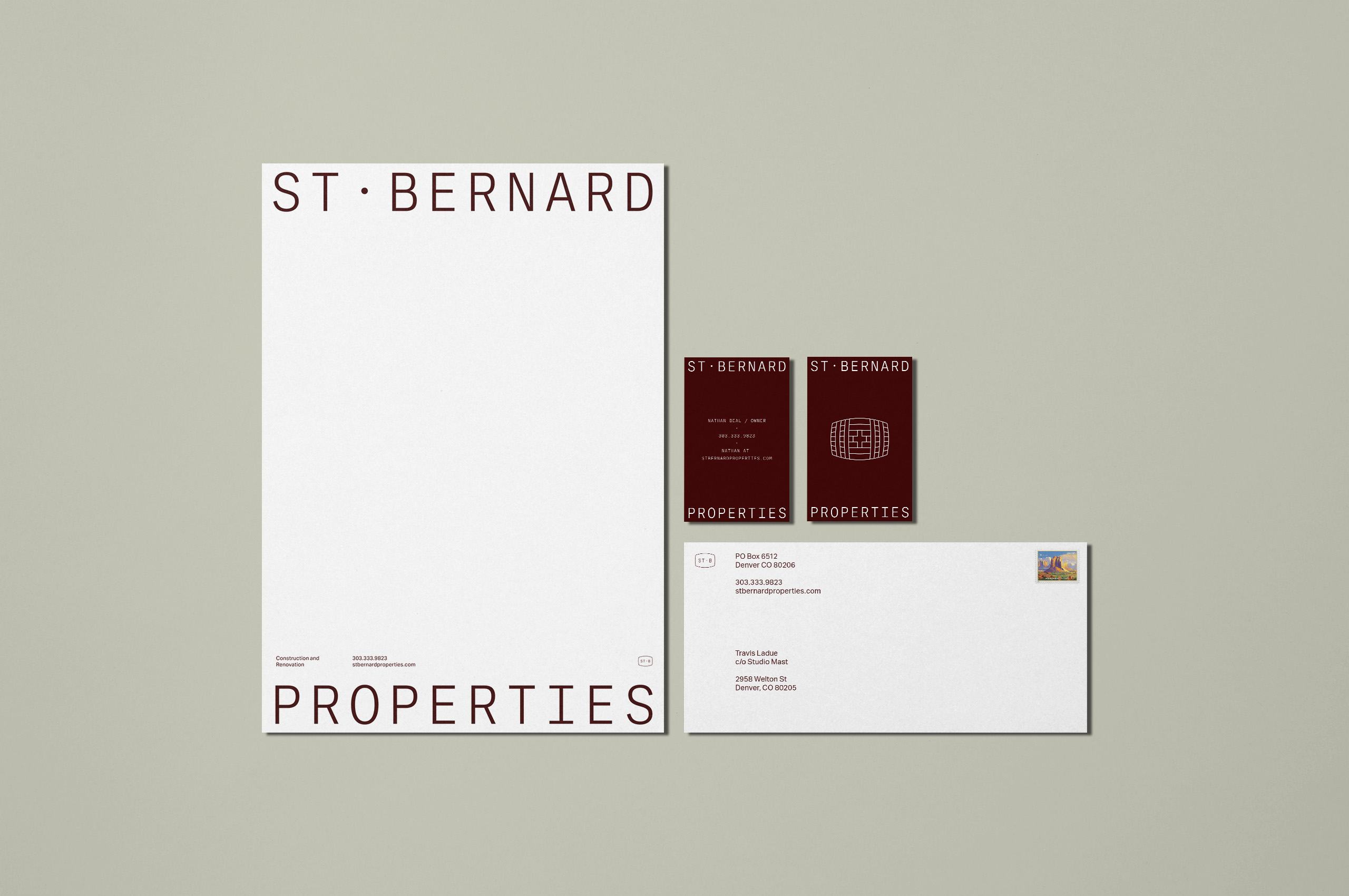
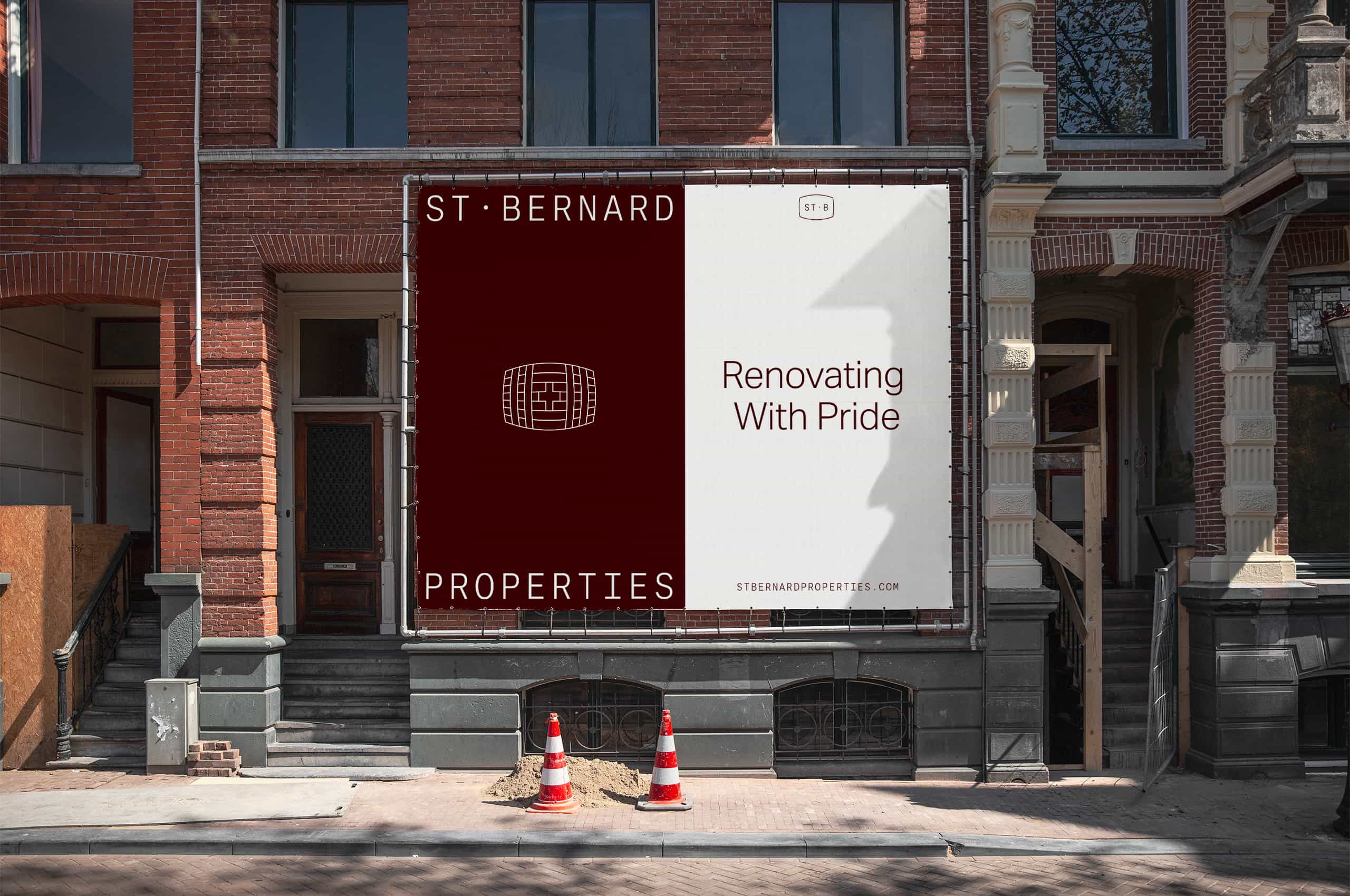
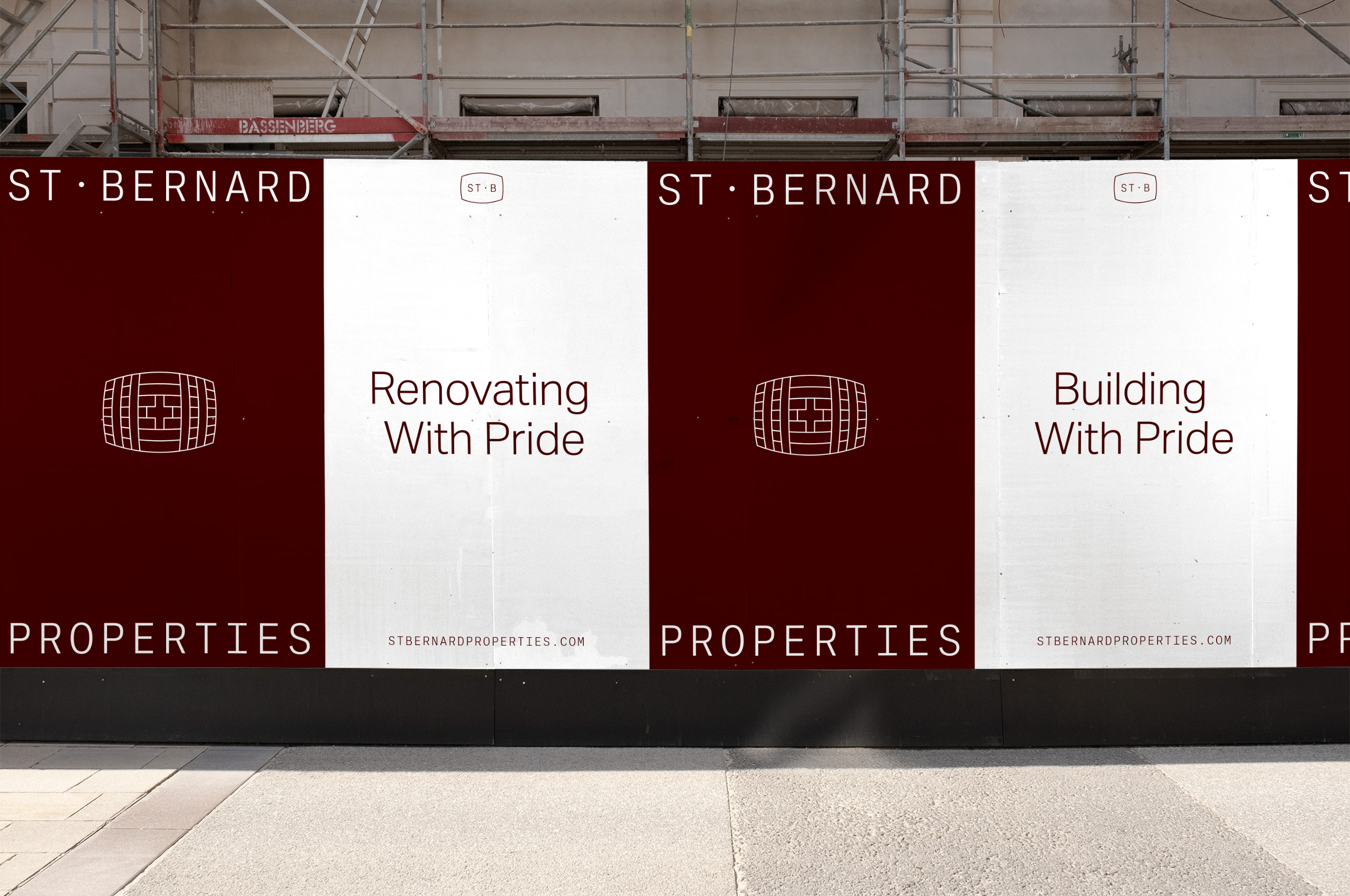
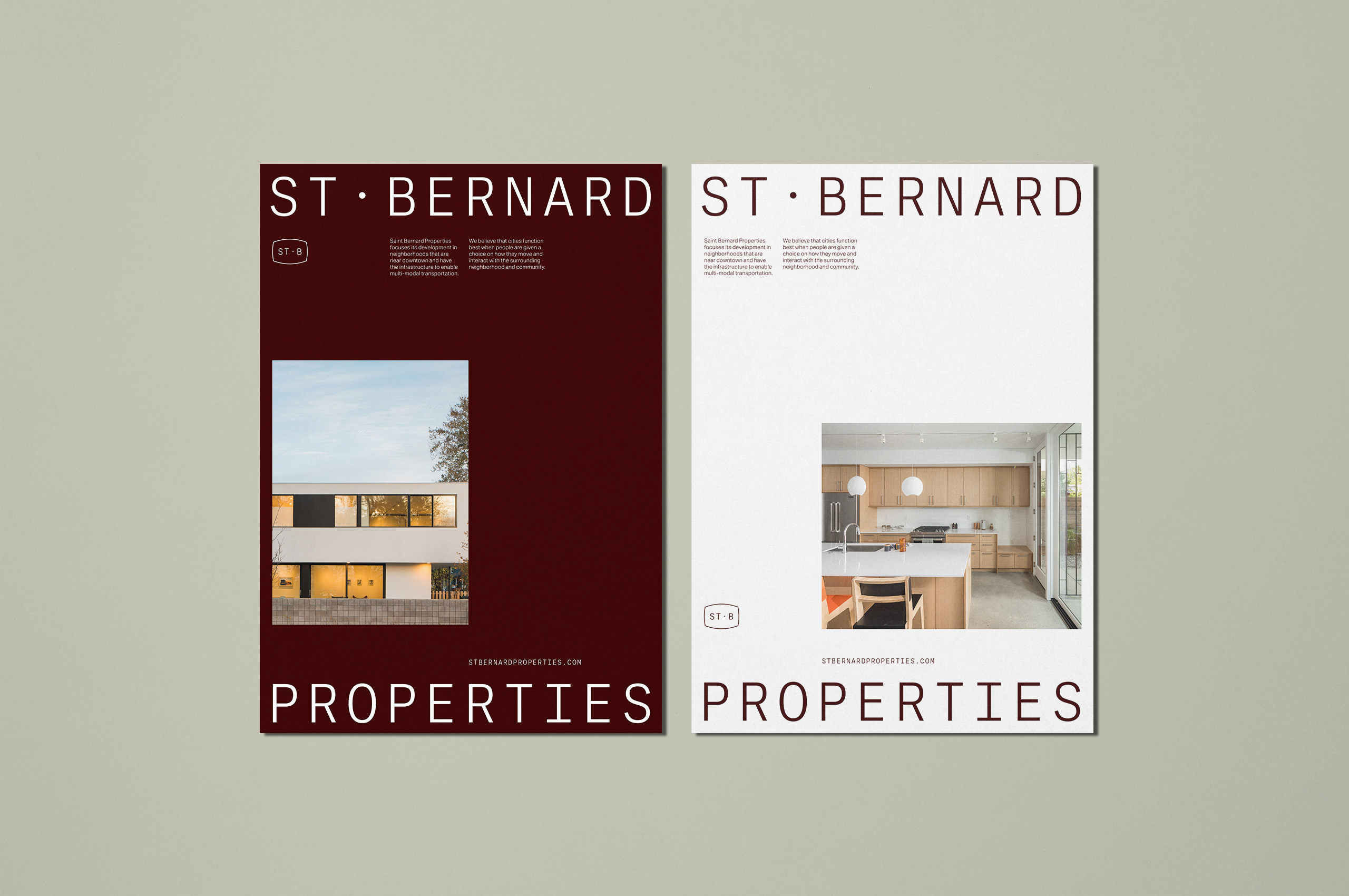
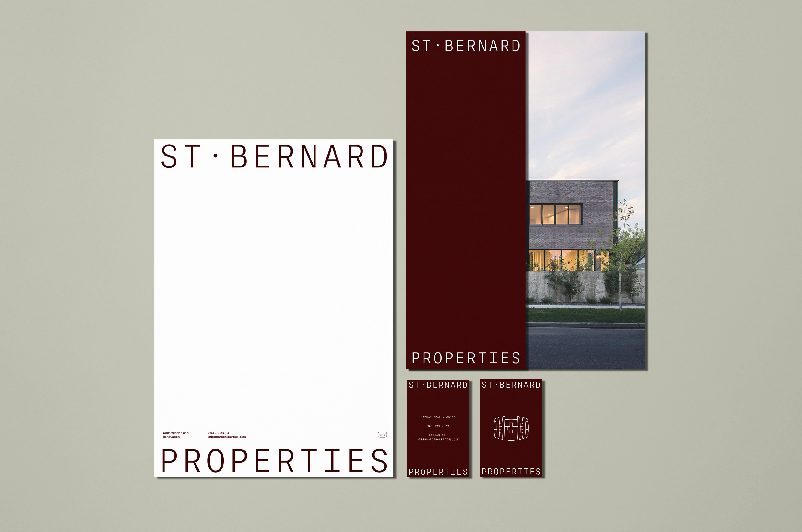
The unique and recognizable shape of the barrel plays into the core symbol while providing a bounding shape to the short-hand mark, thus, creating a connection through the entire suite of marks.
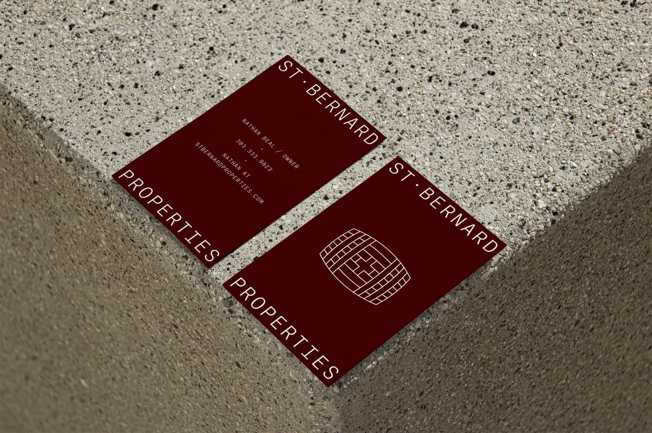
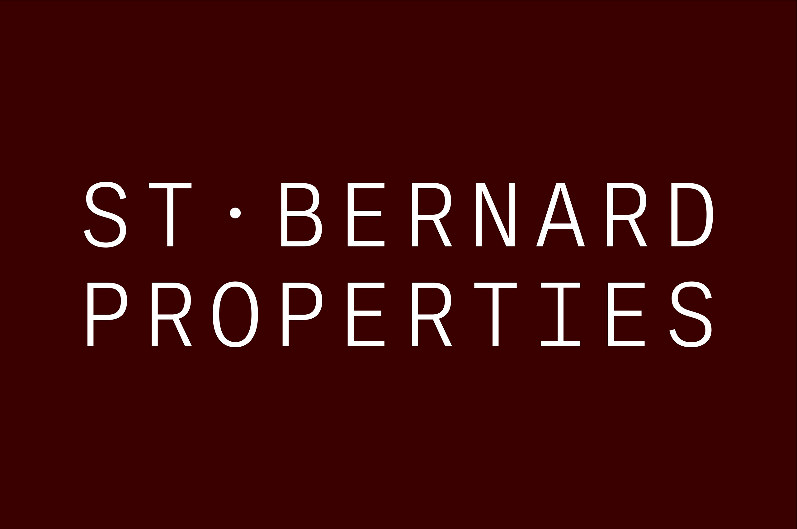
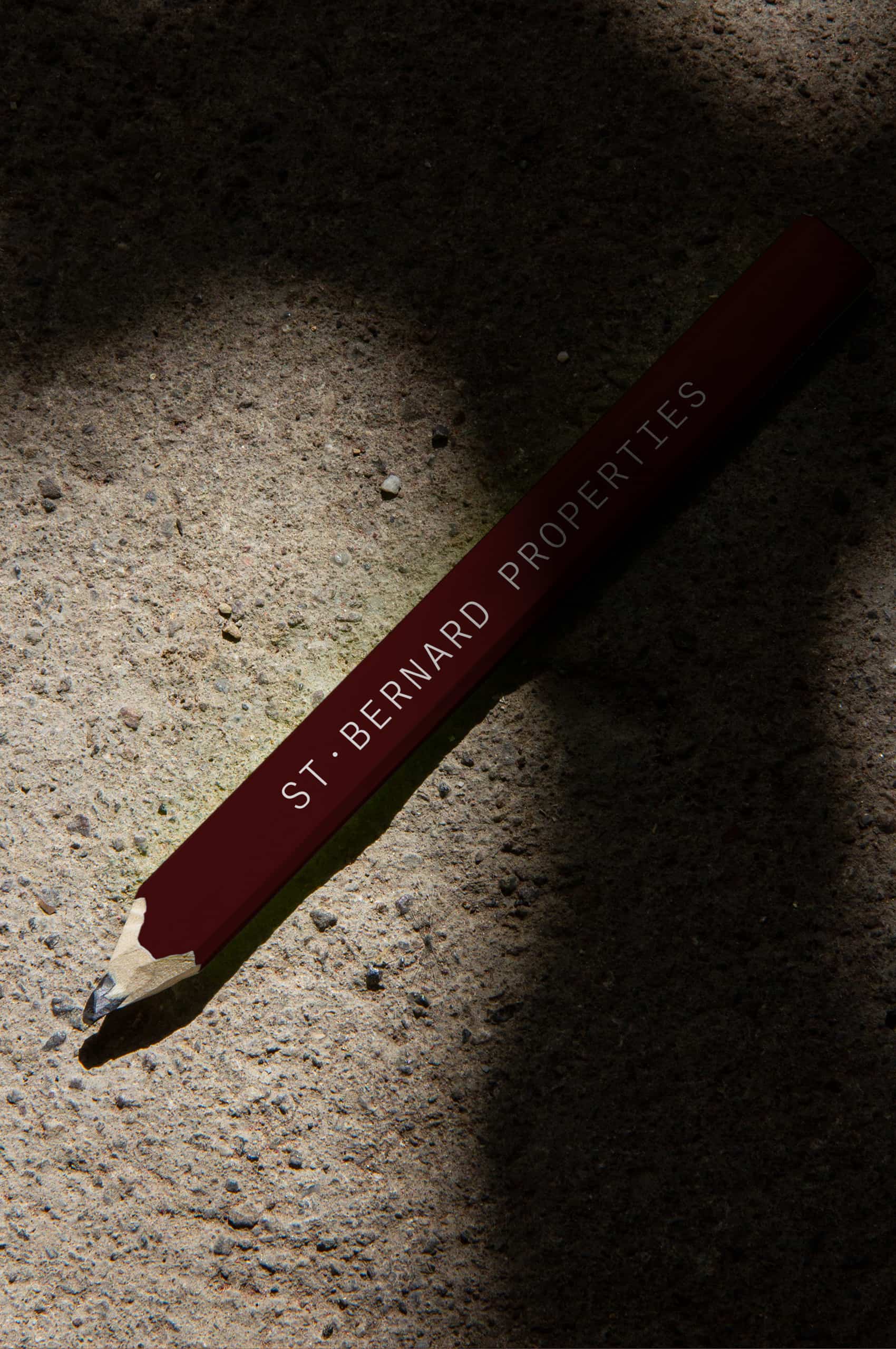
We selected the mono-spaced type due to the equal number of letterforms when stacked—allowing for a strong, sturdy, and robust wordmark that is as well crafted as their properties. In addition, the wordmark can divide, allowing the symbol to occupy space in the middle or stack on its own.
The wordmark also divides within the printed and digital buildout of the brand. Serving as a frame for the content to live within, whether text, symbol, or imagery.
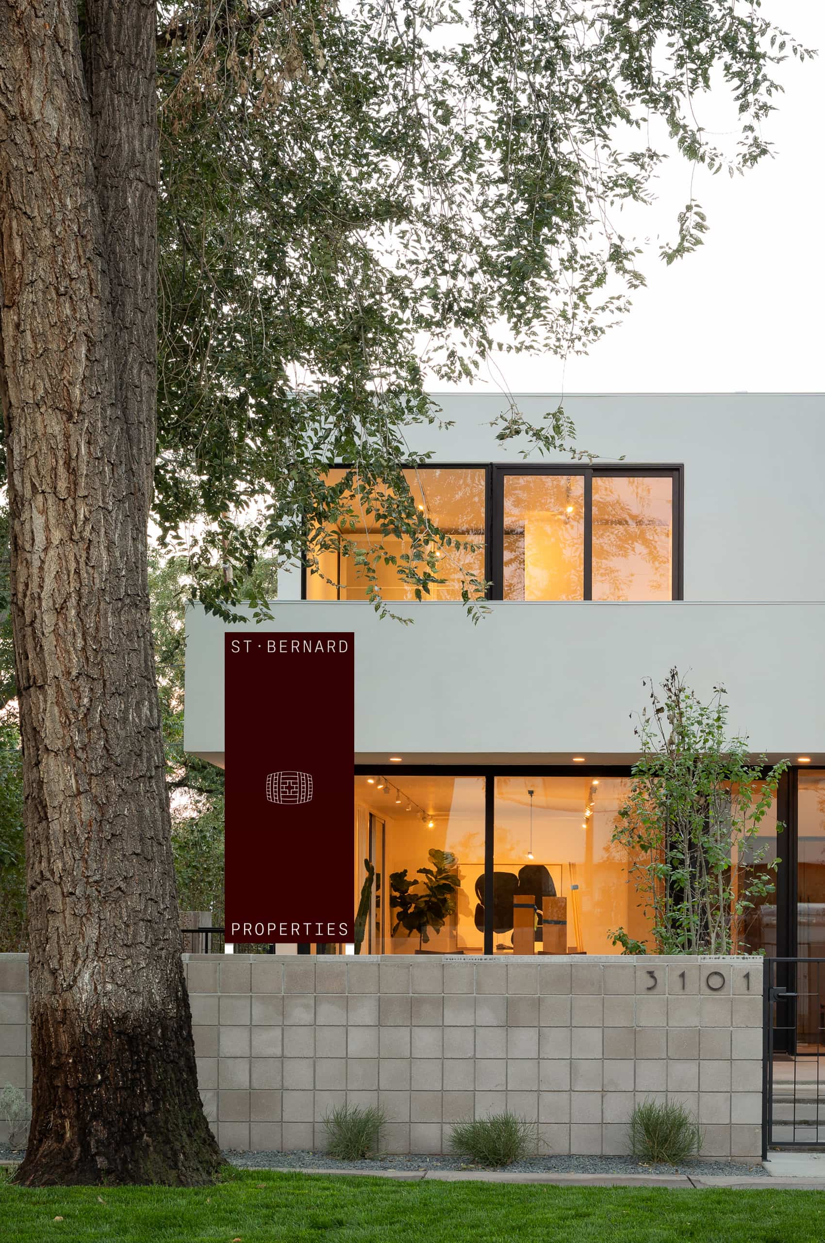
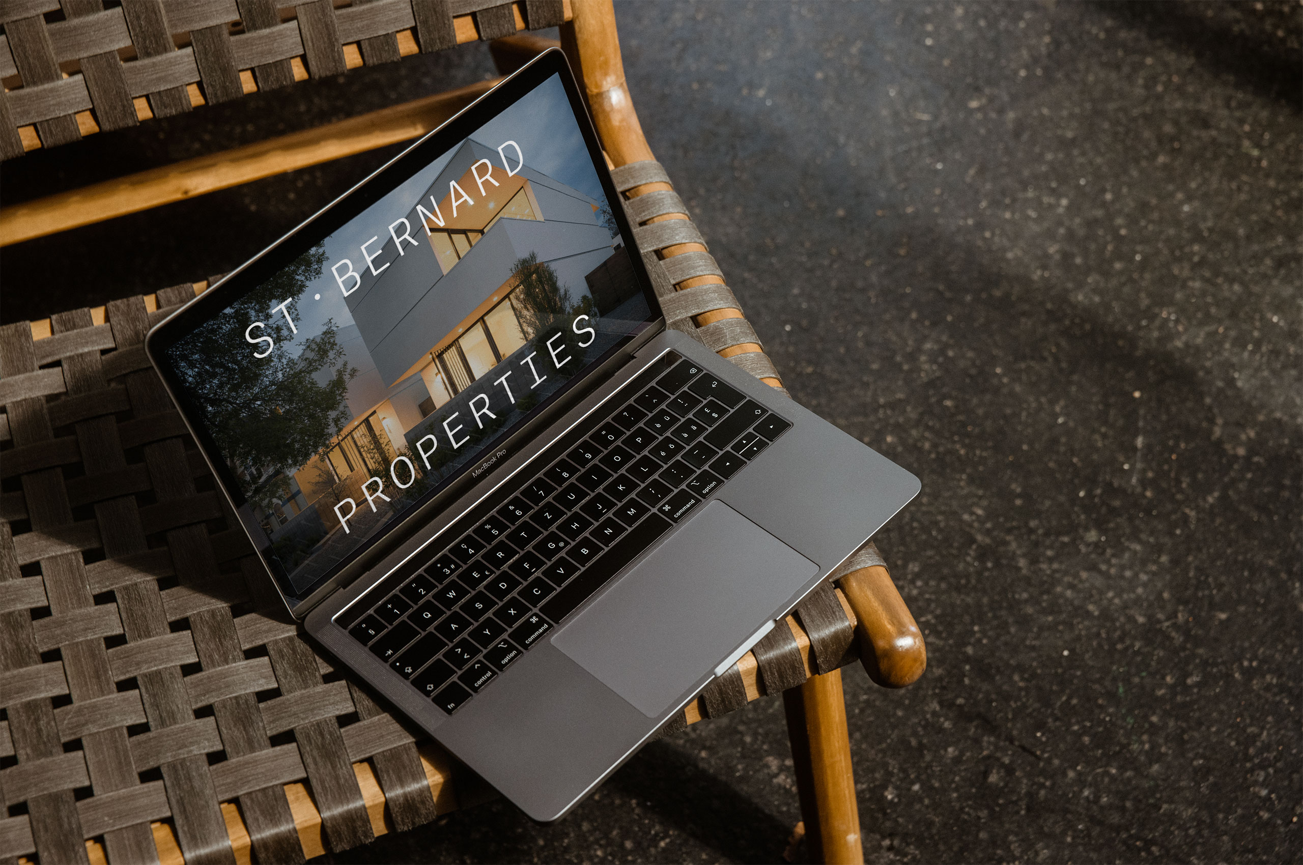
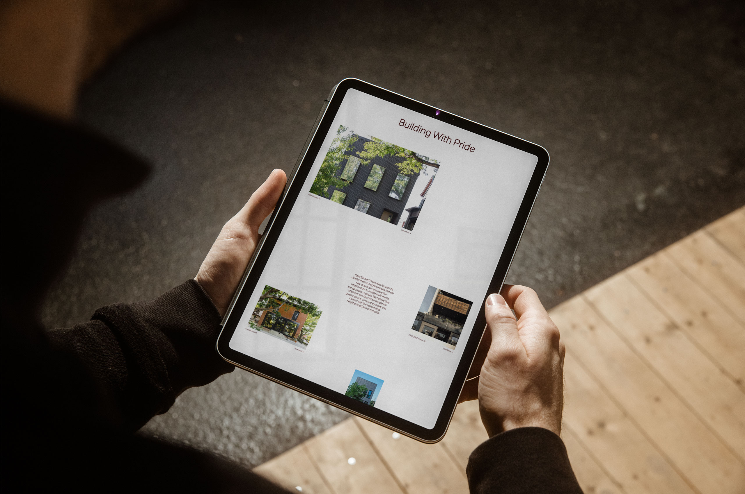
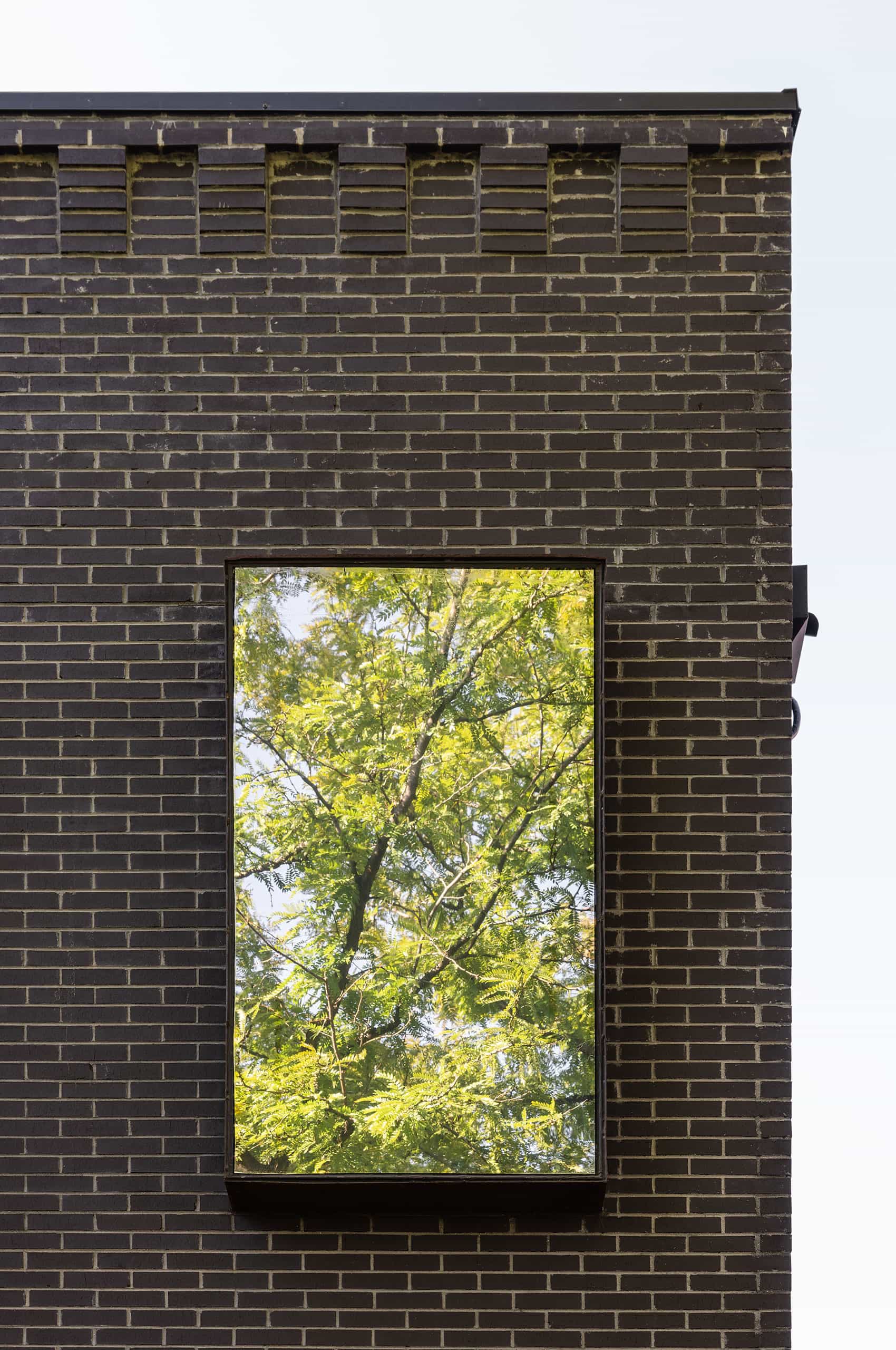
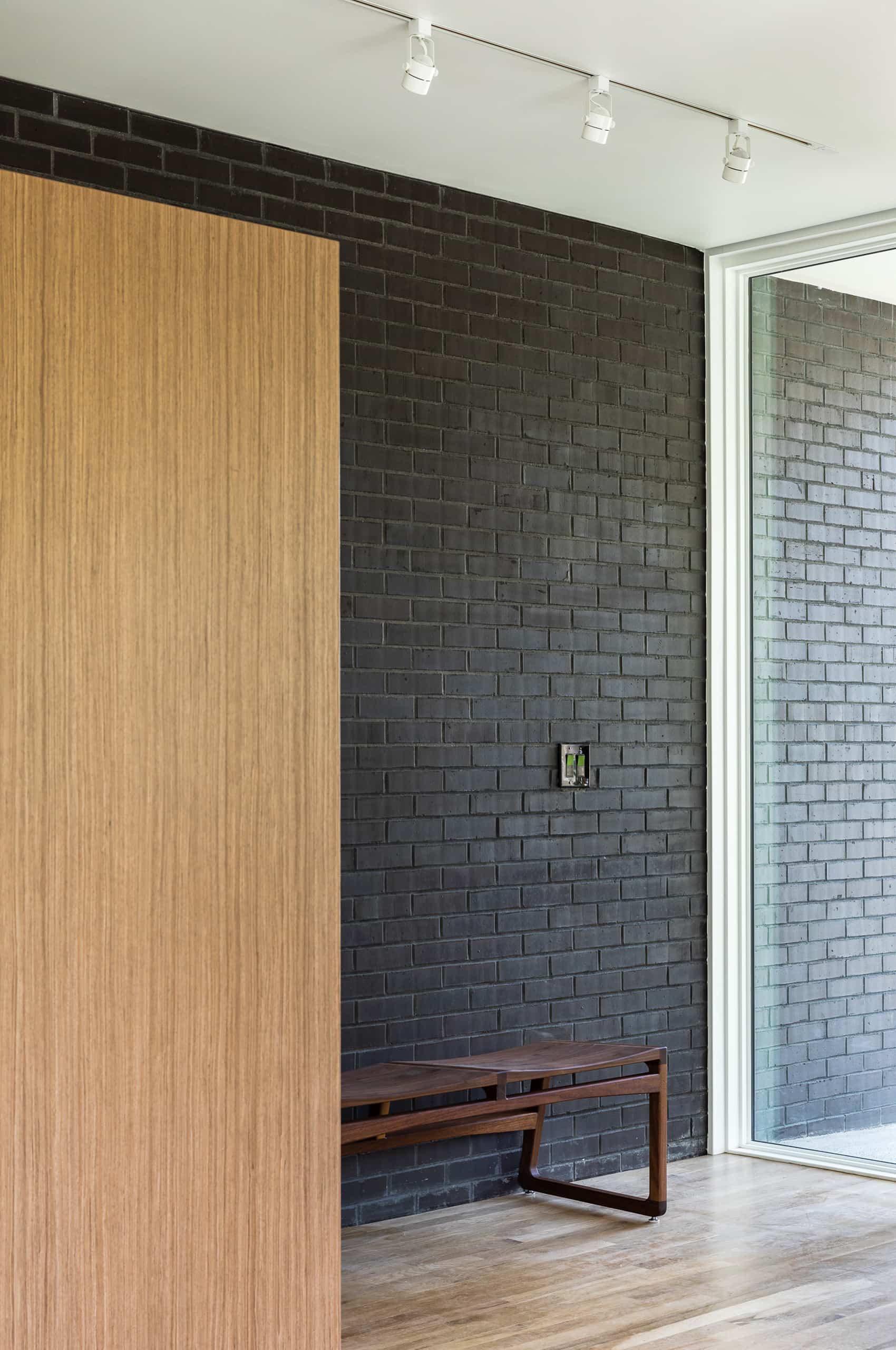
When it came to the website, we wanted to develop a showcase of the properties that did not treat each property as an image on a wall of tiles but as individuals—allowing the website to be a proper gallery, giving each project space and prominence.