Infer
A new London-based technology startup helping to give analysts superpowers to better understand their data.
A new London-based technology startup helping to give analysts superpowers to better understand their data.

After long careers in analytics, Erik Mathiesen-Dreyfus and Ryan Garland set out to start Infer to solve issues they repeatedly encountered in their work.
They often saw the lack, or misuse, of machine learning or “data-driven” outputs when making critical decisions. So instead, they focused on correctly utilizing the data at hand. They set out to improve the way data is used and analyzed internally within businesses to enable better, faster, repeatable, and more reliable decision-making.
“This is a challenge that we are intimately familiar with and have encountered many times during our careers in data science and analytics – both from the leadership side, seeing bad decisions being made, as well as from the practitioner’s side, seeing bad analysis being done. Preventing this from continuing to happen was our motivation for starting Infer.”
They noticed a sizable lack of easy-to-use and accessible tools that allow anyone with a modest understanding of data analysis and machine learning to perform advanced analysis.
“Our ambition isn’t to build a full end-to-end platform to achieve this, but instead to build a layer – sitting between the data layer(eg your database) and the data consumer layer. The inference Layer.”
Ahead of their public launch, Erik and Ryan approached Mast to help shape the company’s identity. One geared towards the individual analysts and empowering them through the unique model.
Collaborators:
Website: Howells Studio
Copywriting: Kate Smith

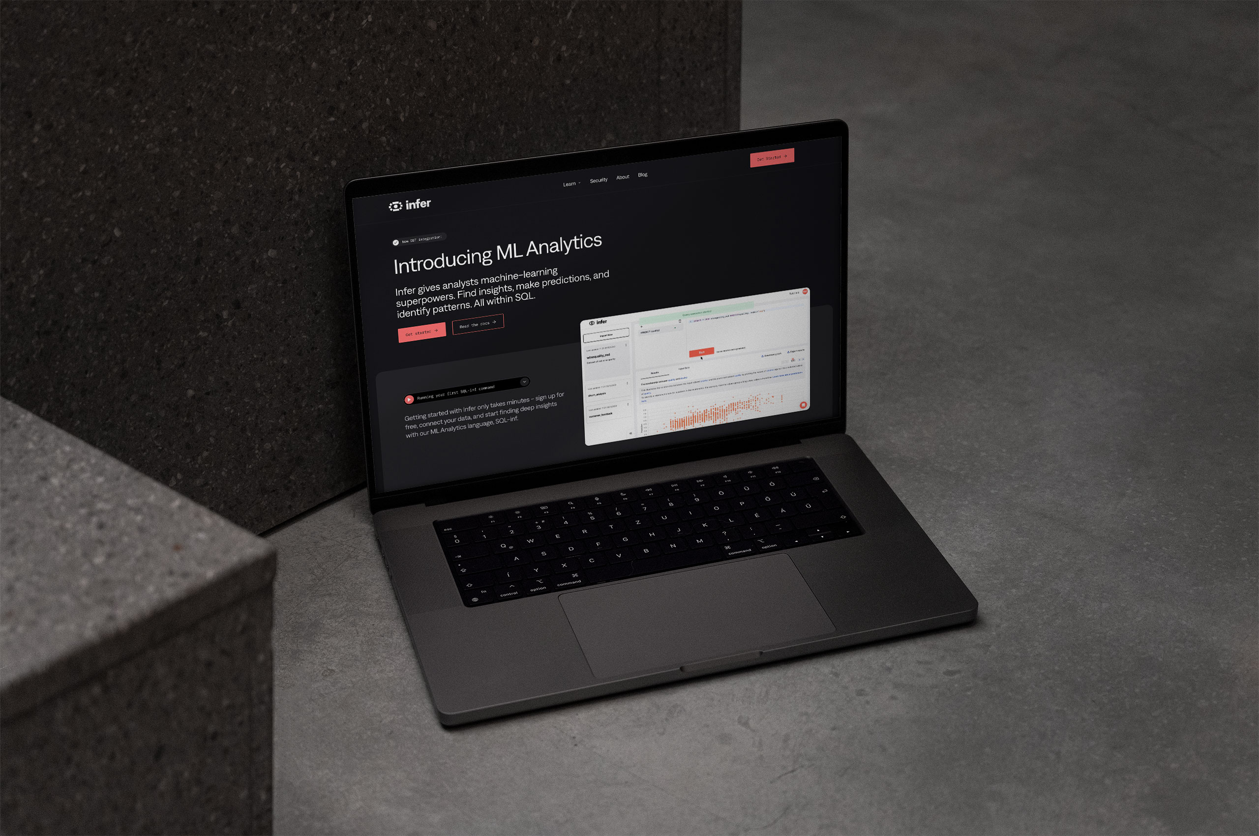
We partnered with Howells Studio to bring the Infer site to life. As the home of their documentation and the digital face of the identity, the website needed to provide the users with deep insight into the product while also providing the ability to understand the company and brand.
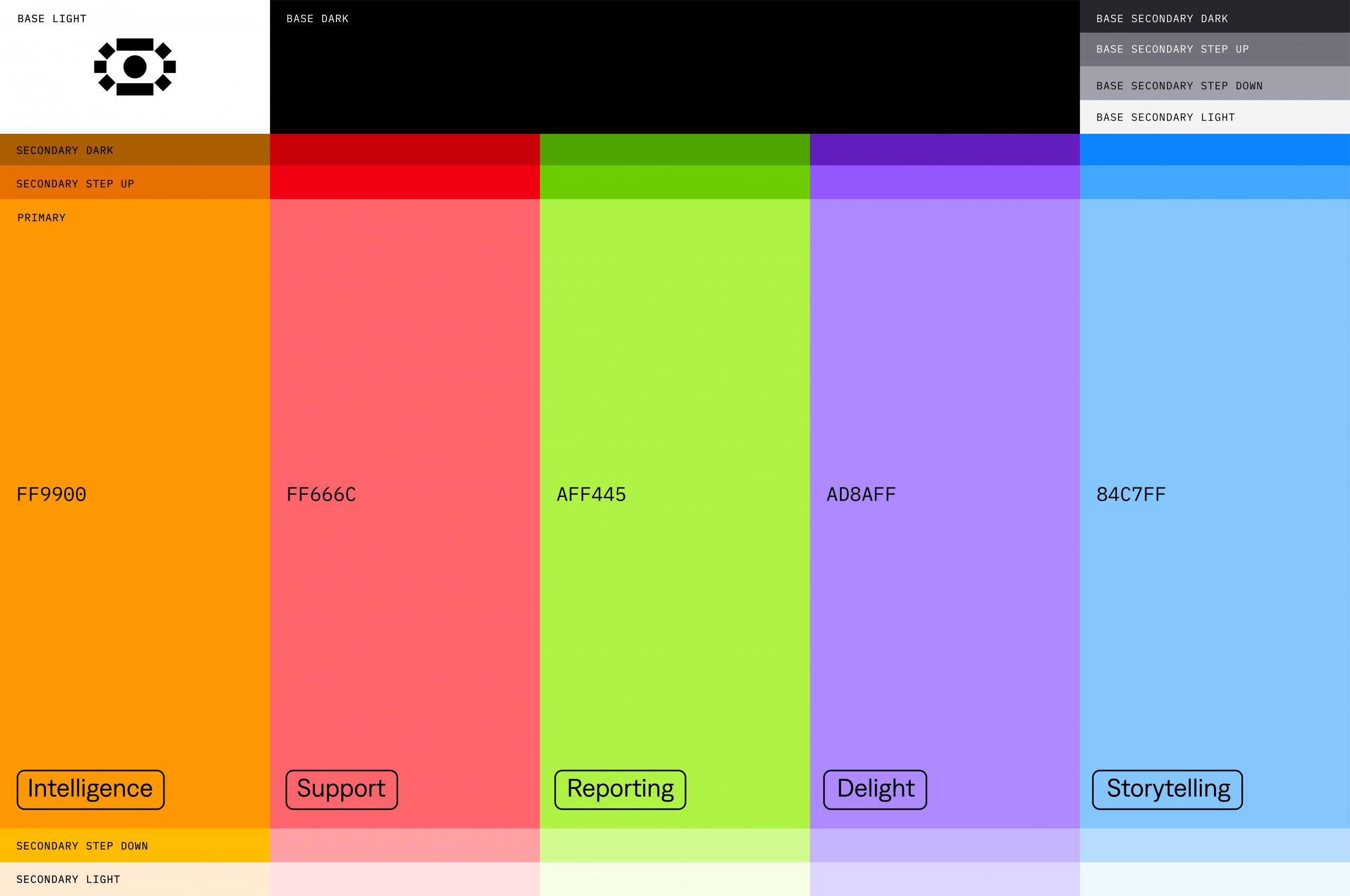
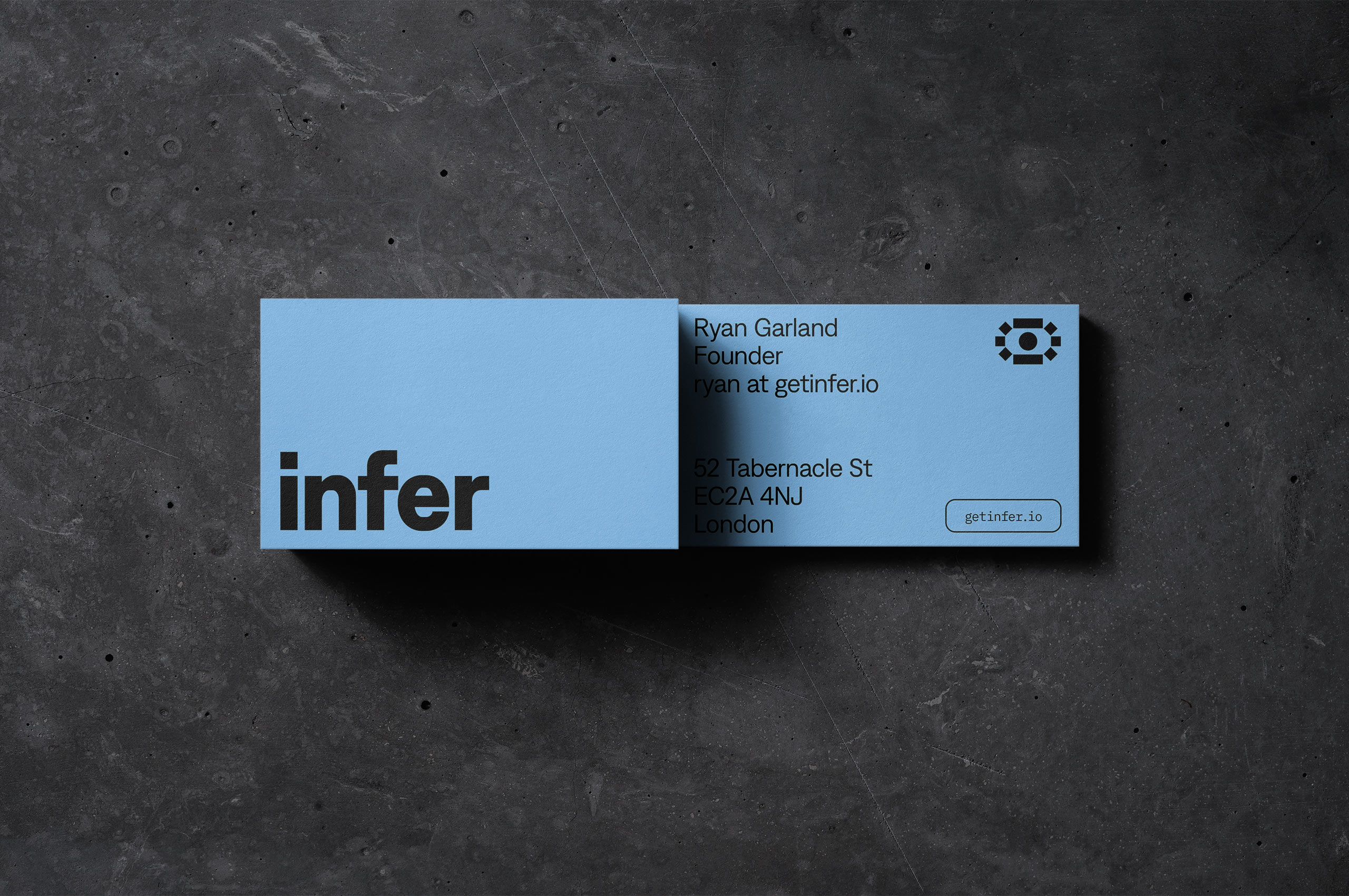
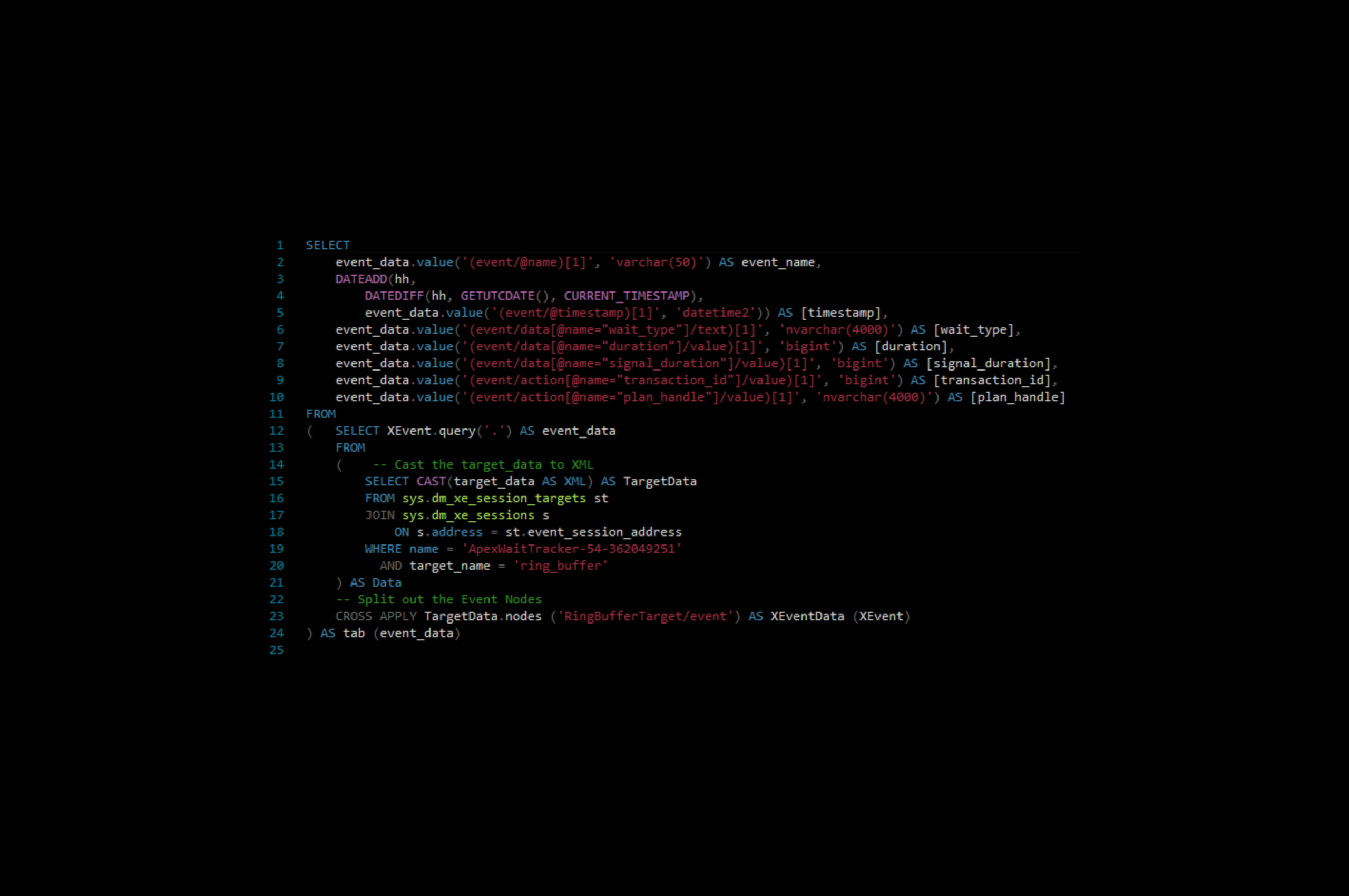
When developing the color palette for the Infer brand, we kept coming back to the notion that the identity was always for the individual analyst first and foremost. So we selected a color palette that paid homage to their familiar SQL language.
This decision created what we lovingly refer to as an “ah-ha” moment within the identity. Something that likely only analysts will recognize and appreciate. Developing a deeper emotional connection to the overall brand.
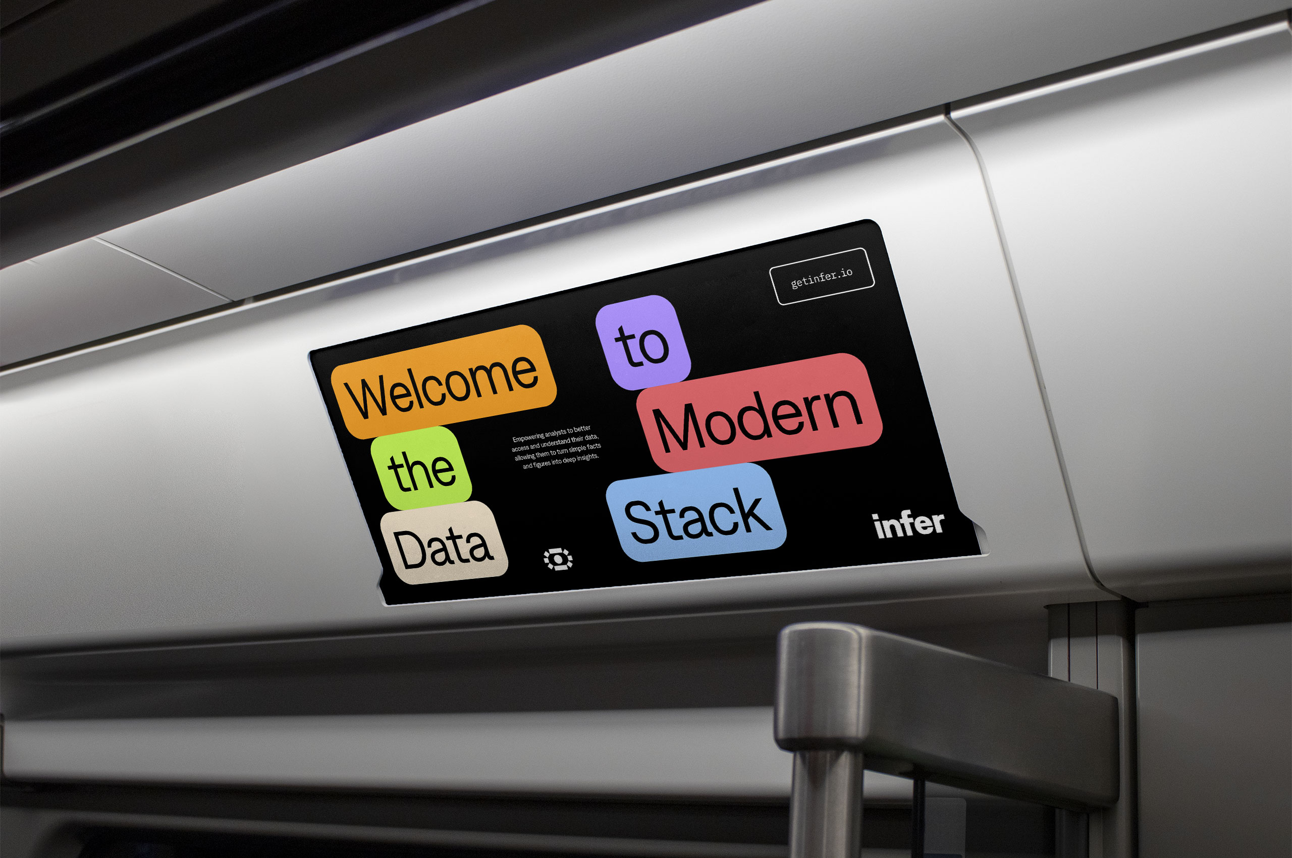
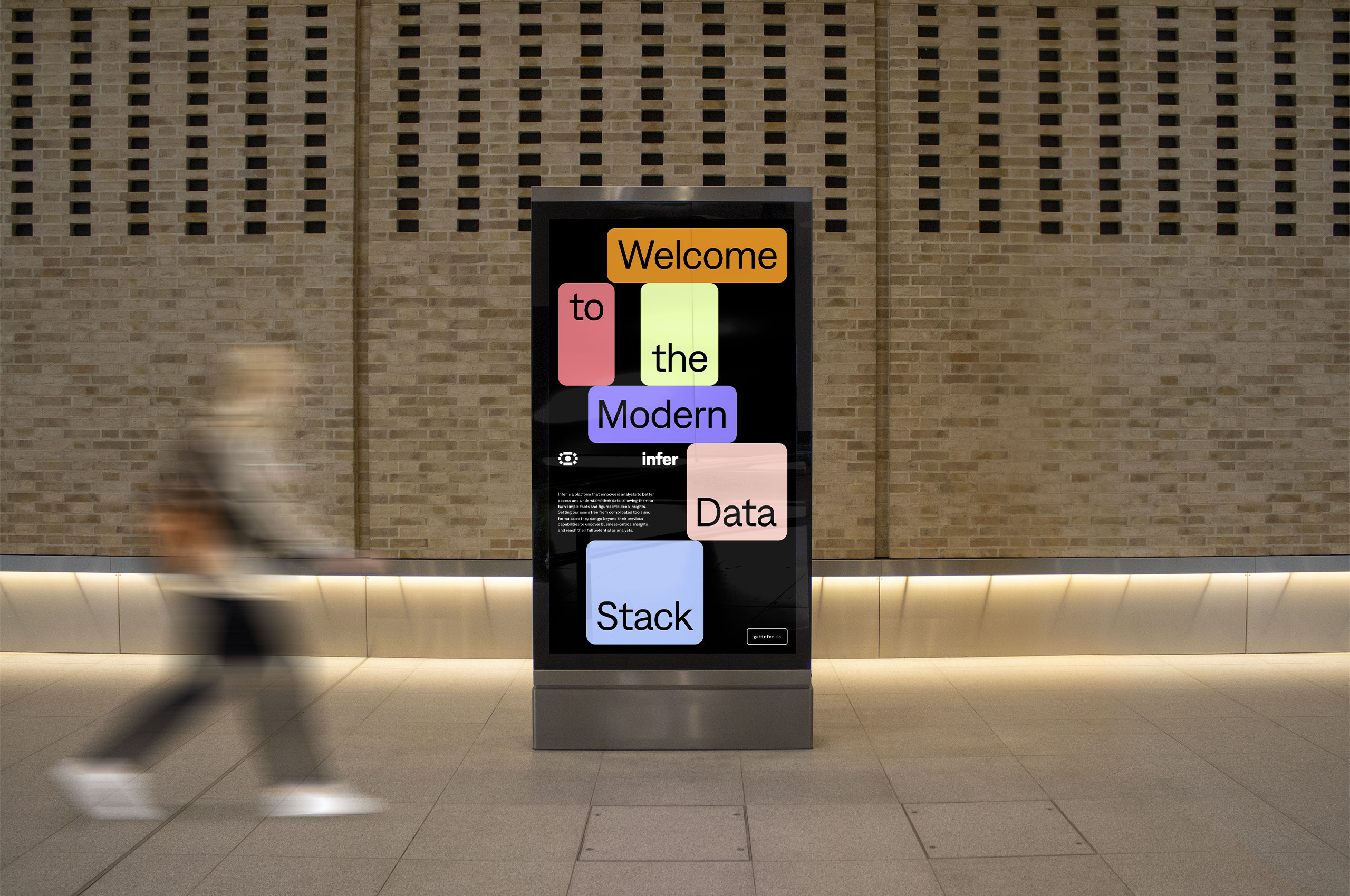
Much like the color palette, we focused on creating a system for the brand that would appeal to the analyst while providing a visually exciting outward presence. We developed a system based on tags, often found within the SQL language—we utilized these stylized tag blocks to offer context, highlight information, and create an exciting, modular look for the brand.
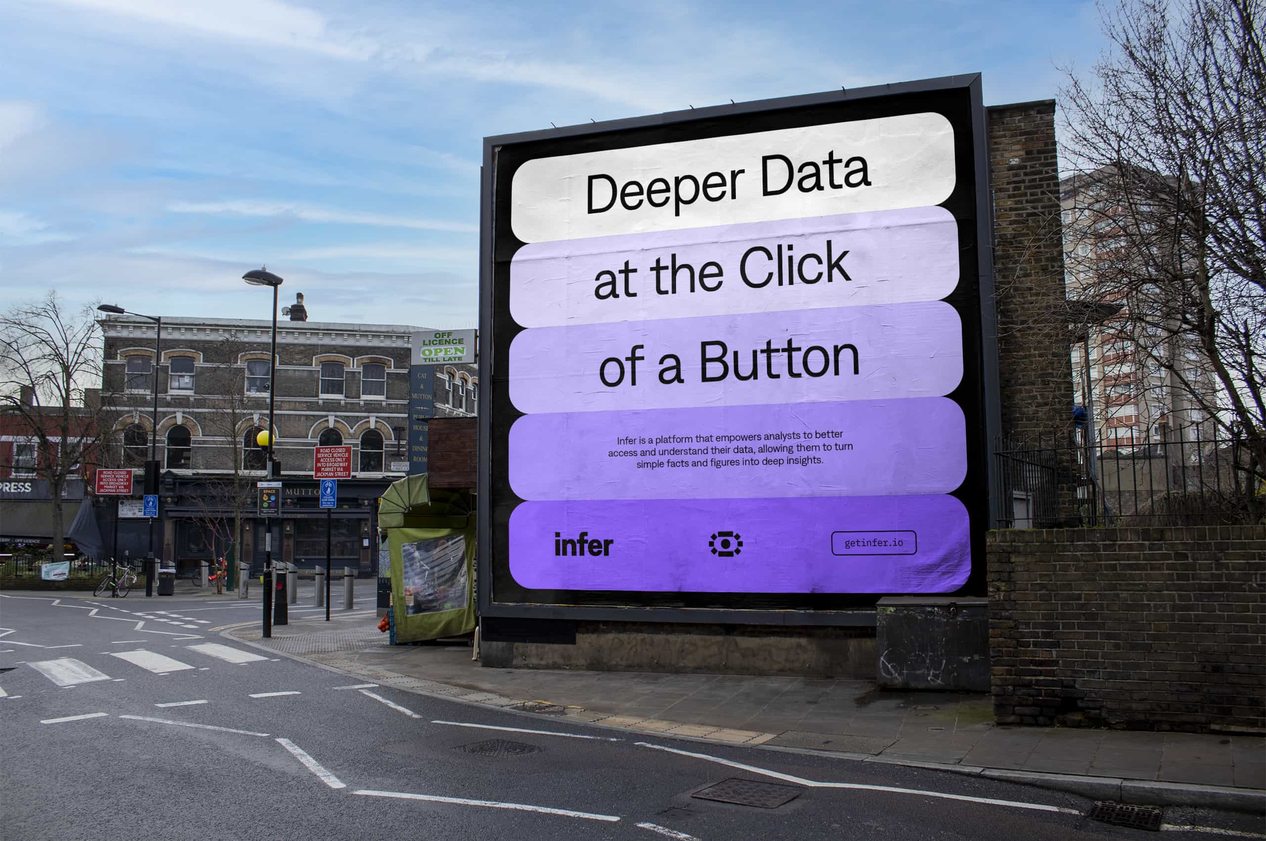
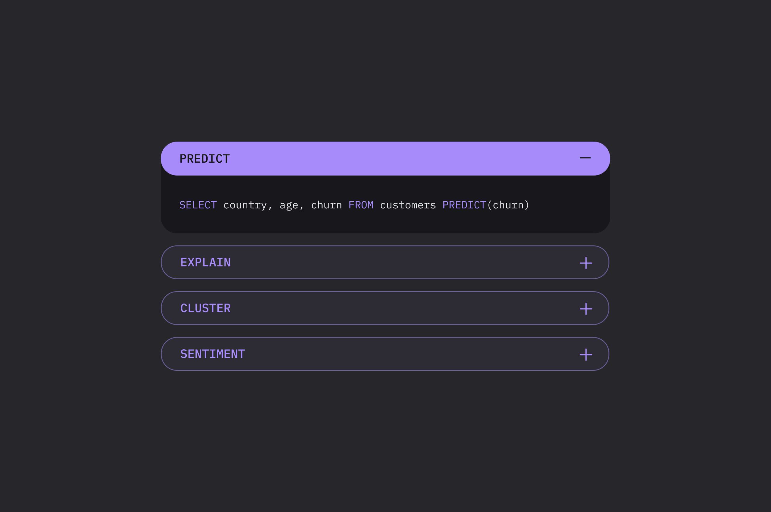
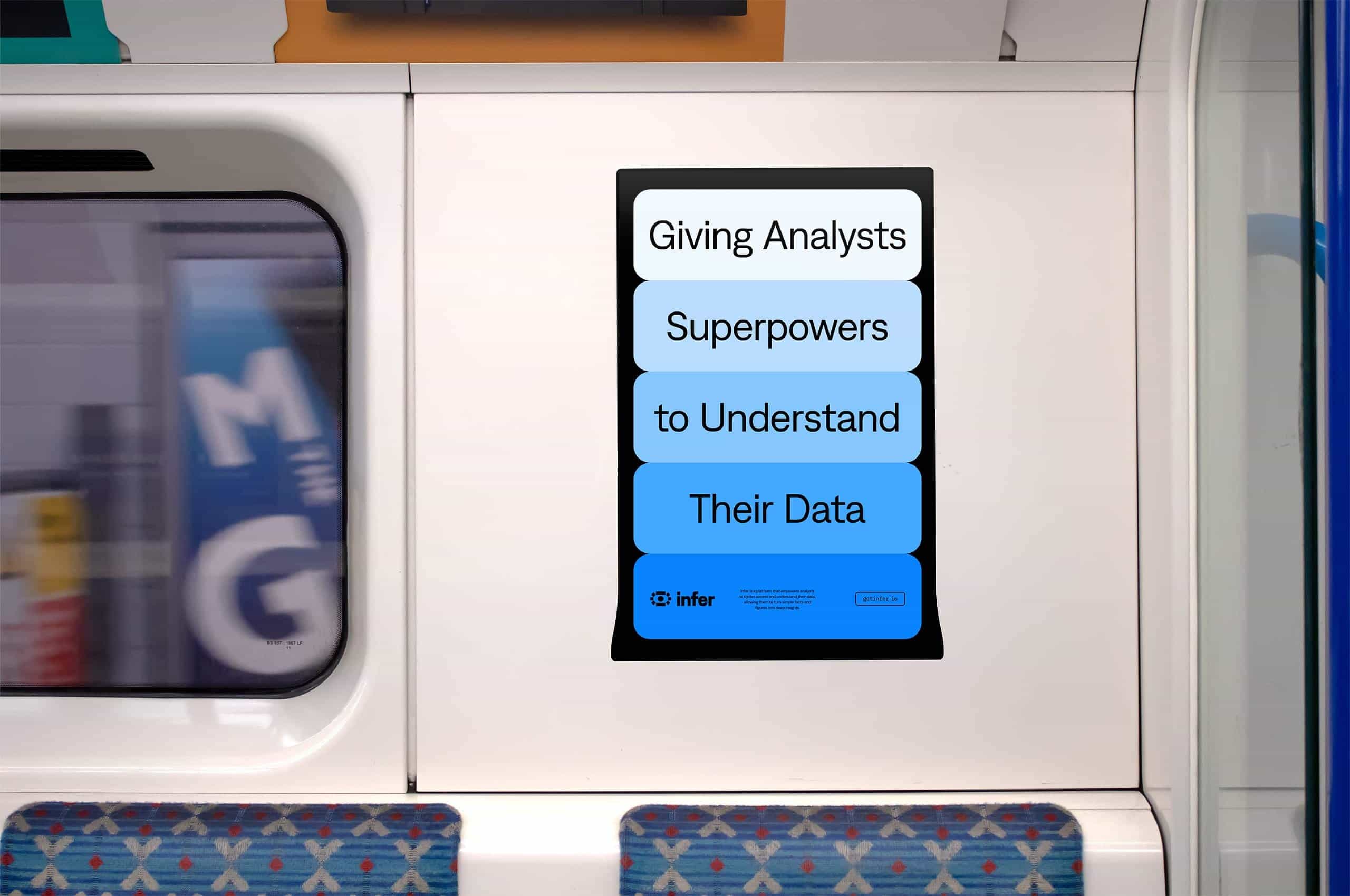
Depending on the final use case, we can utilize these tag blocks in a stacked formation to help better emphasize a more extended thought. When paired with the gradiated individual palette, it creates a glow that attracts viewers. These stacks have a sub-conscious connection to the data stack that Infer is revitalizing.

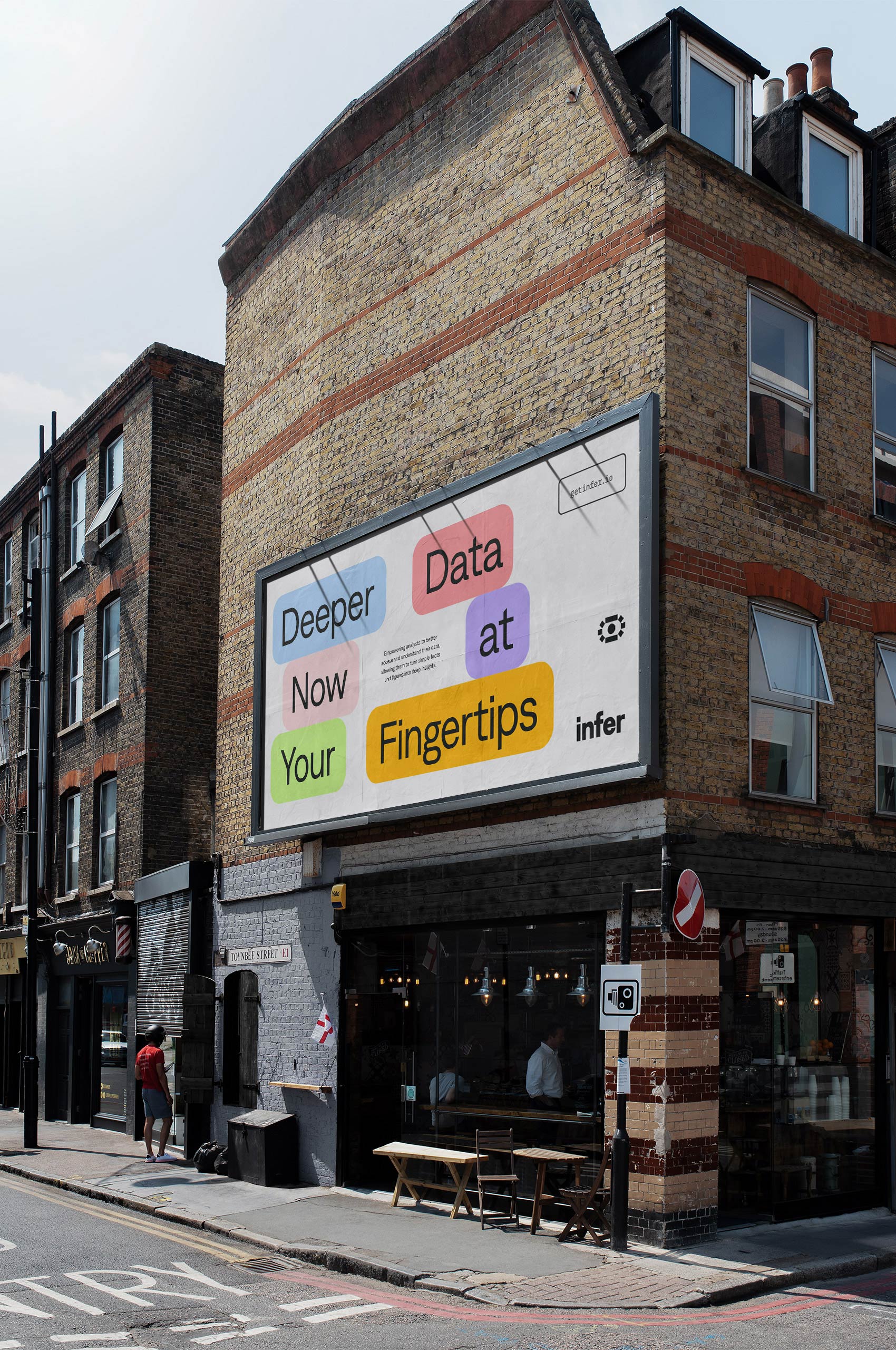
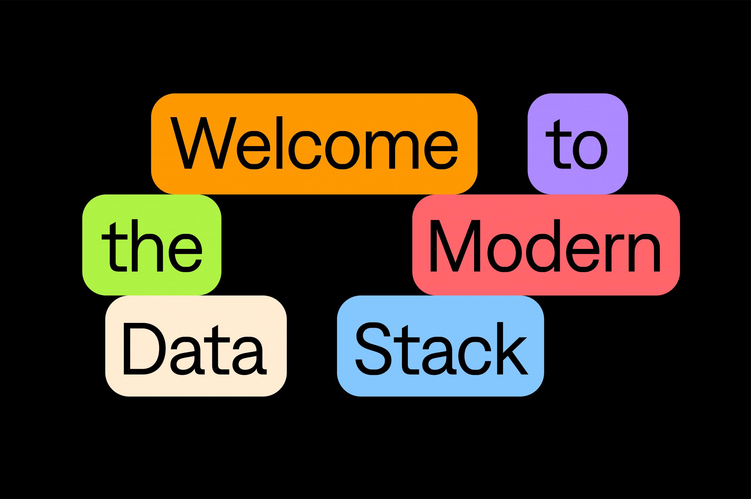
When working with shorter, more concise thoughts, we can utilize the tag blocks in a different formation. While still built to create the connection to the data stack, these are more flexible. Providing an exciting and engaging expression of the brand while still connecting to the product itself and its overall UI.

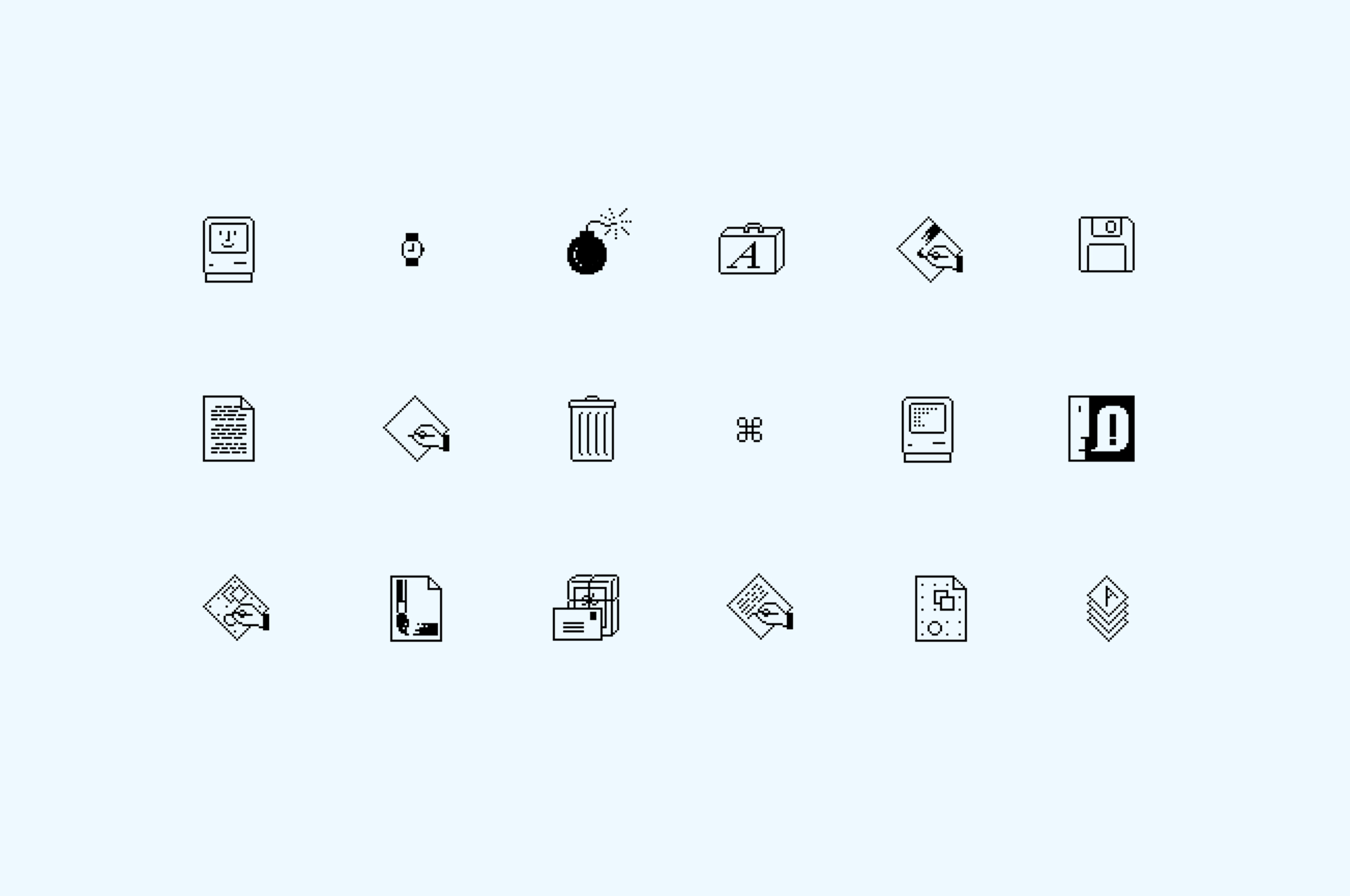
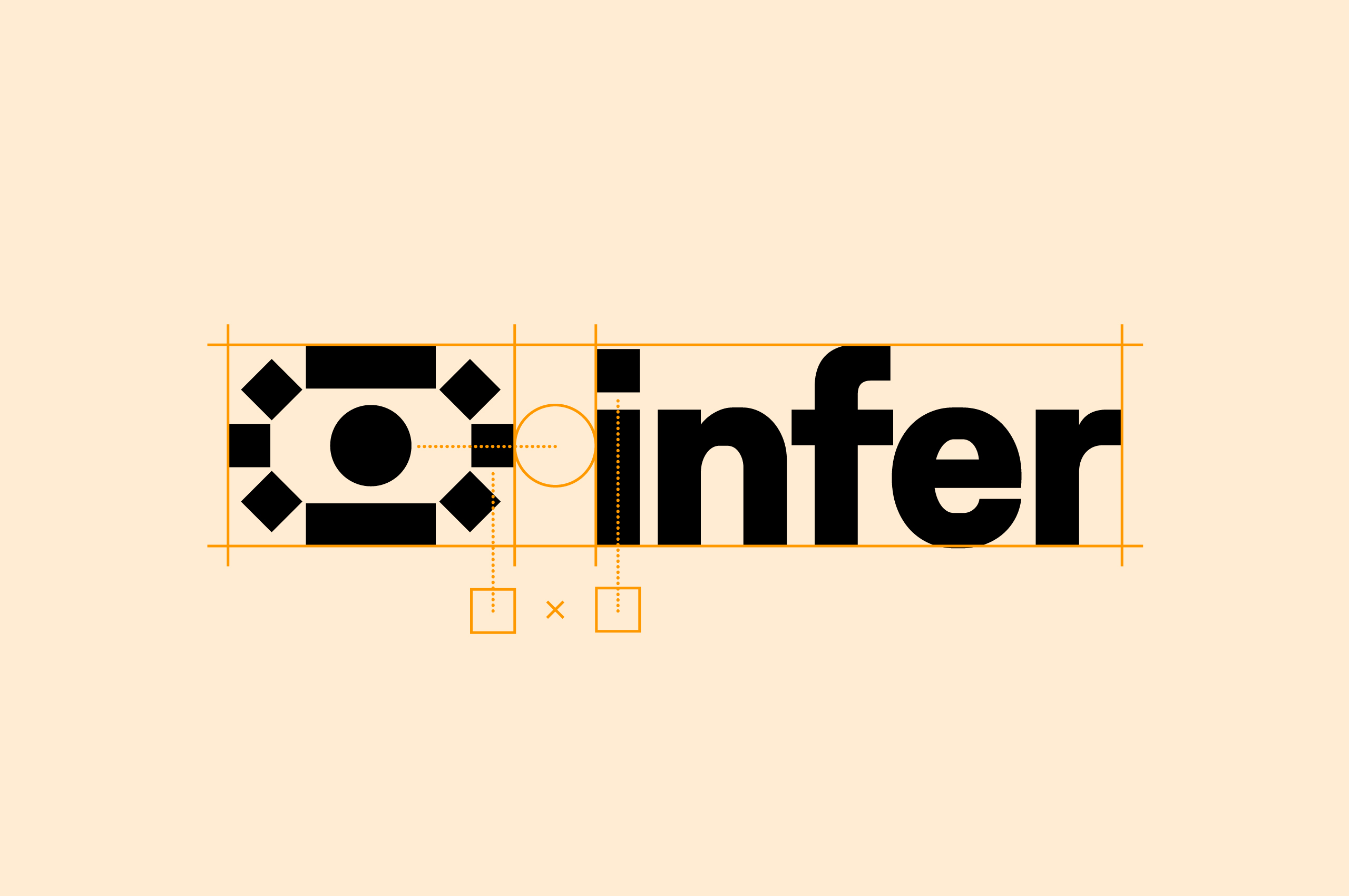
Motivated by the founder’s mission to upend analytics and create something entirely new. We looked back to revolutionary moments in computing history. We were inspired by the original Macintosh Icons designed by Susan Kare seen here. These icons opened the door to the graphic interface and revolutionized personal computing forever.
These simple yet impactful icons inspired the simplified shapes and visuals for the Infer symbol. Resulting in a strong symbol that is impactful at any scale.
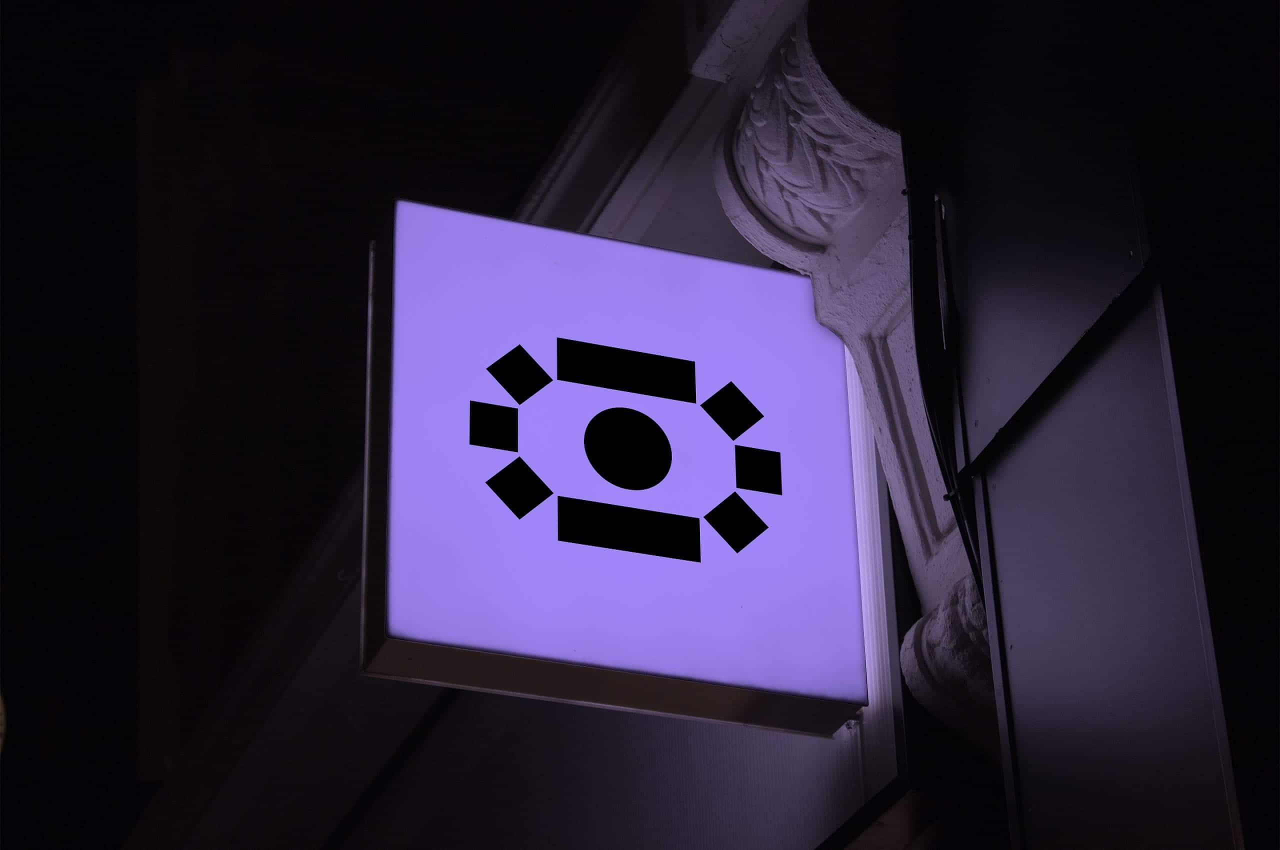
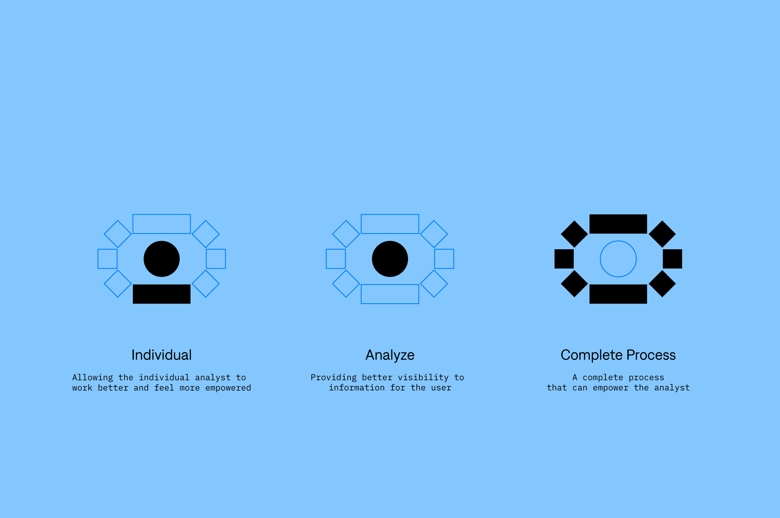
The symbol provides multiple meanings to the viewer in a relatively simplified form. First, there is the individual at the heart of the mission of Infer. Secondly, you can see the eye, harkening to the better visibility of information provided to the analyst. Lastly, you can see the complete process—the data surrounding the analyst, empowering them and making them feel like they have superpowers.
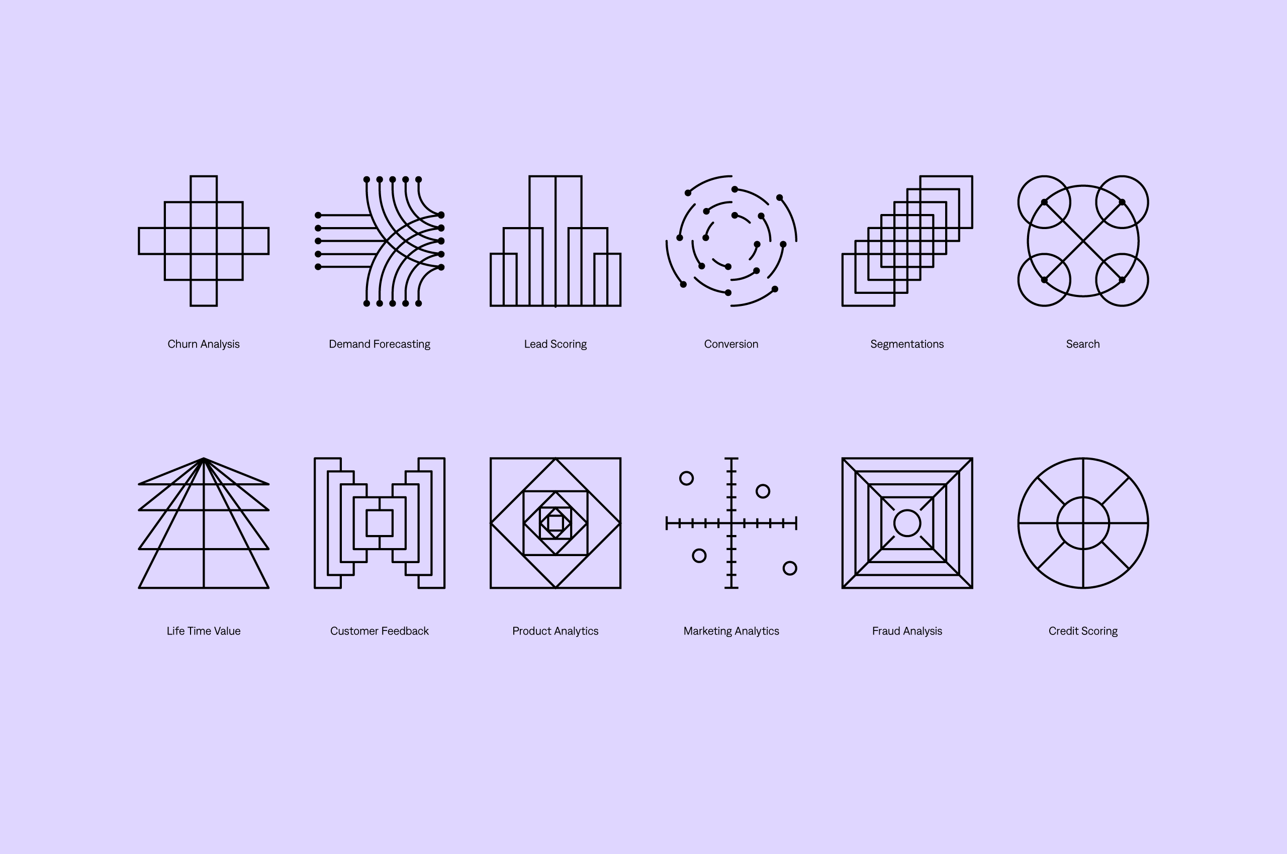

To help better tell the story of Infer and convey complex topics, we created a series of icons and illustrations to expand the Infer identity.
While based on a grid similar to the original Mac icons and Infer’s symbol, we stayed away from squares to create these. We turned to a linework construction to ensure that they didn’t feel “8-bit” or overly retro.
As a result, these icons and illustrations allow the brand to be expressed in a modern way—helping to tell the Infer story through representational and abstract forms.
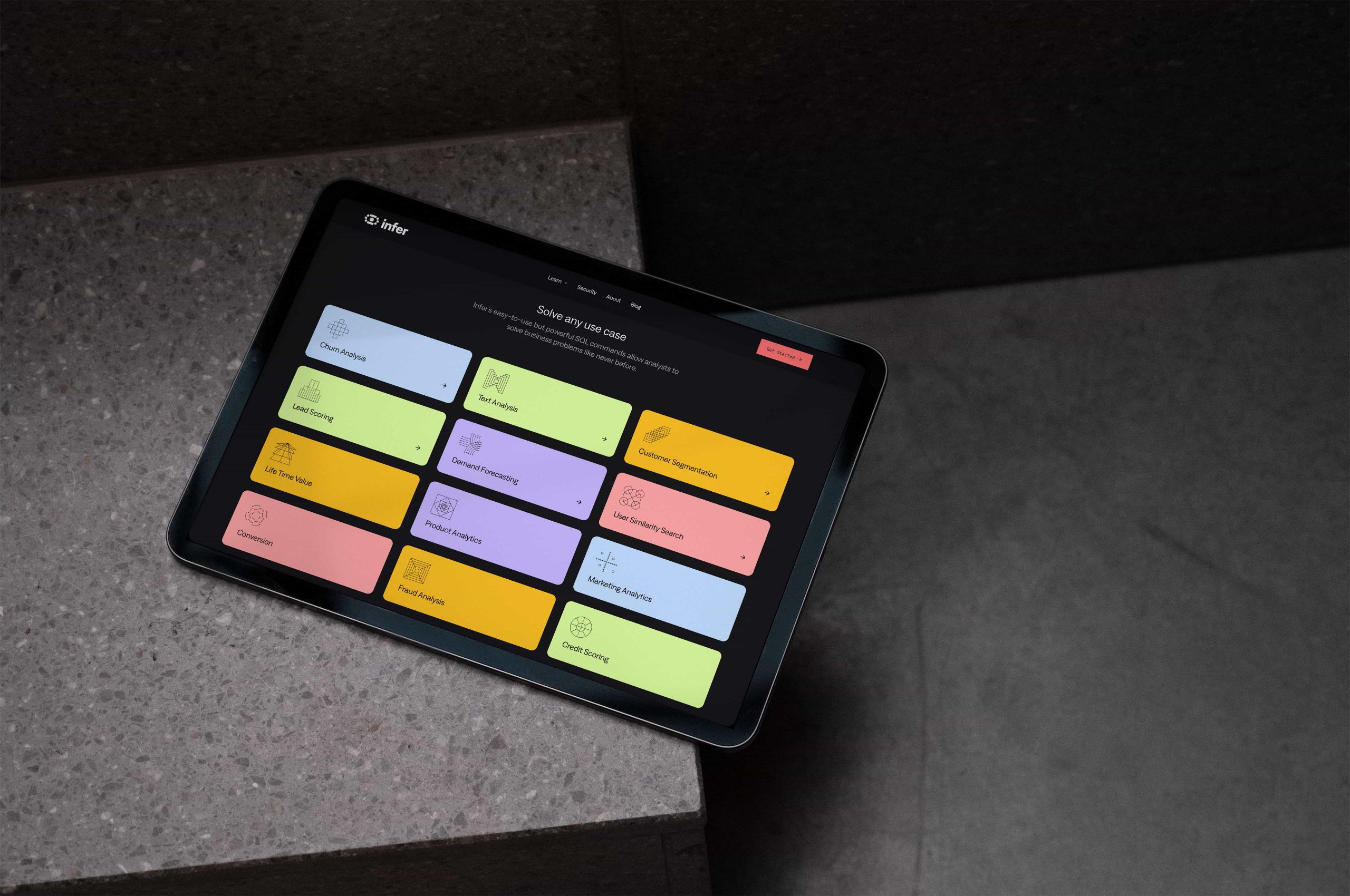
When used on the website, we can combine the icons with the tag blocks to create consistency across the buildout of the brand.
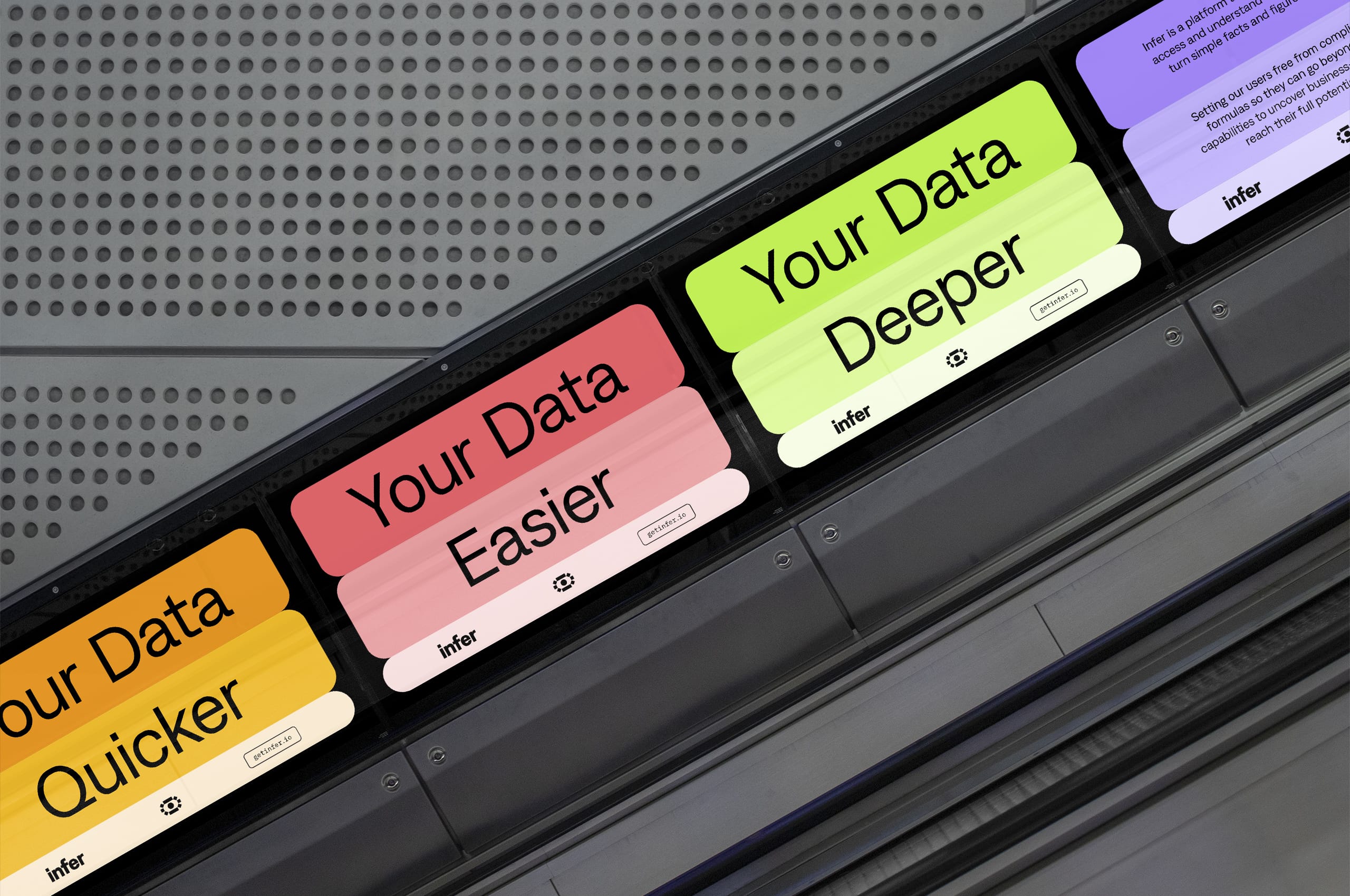
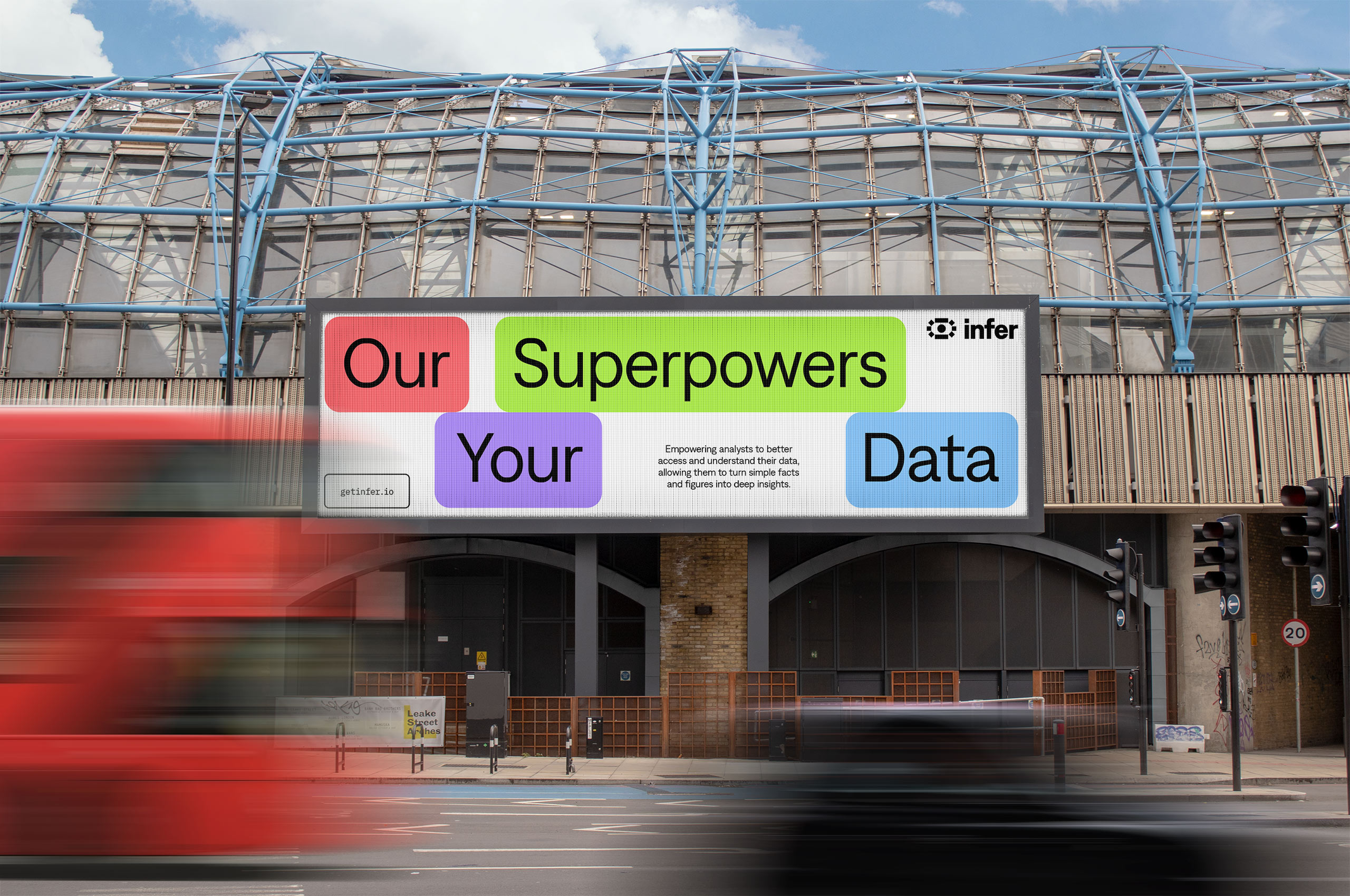
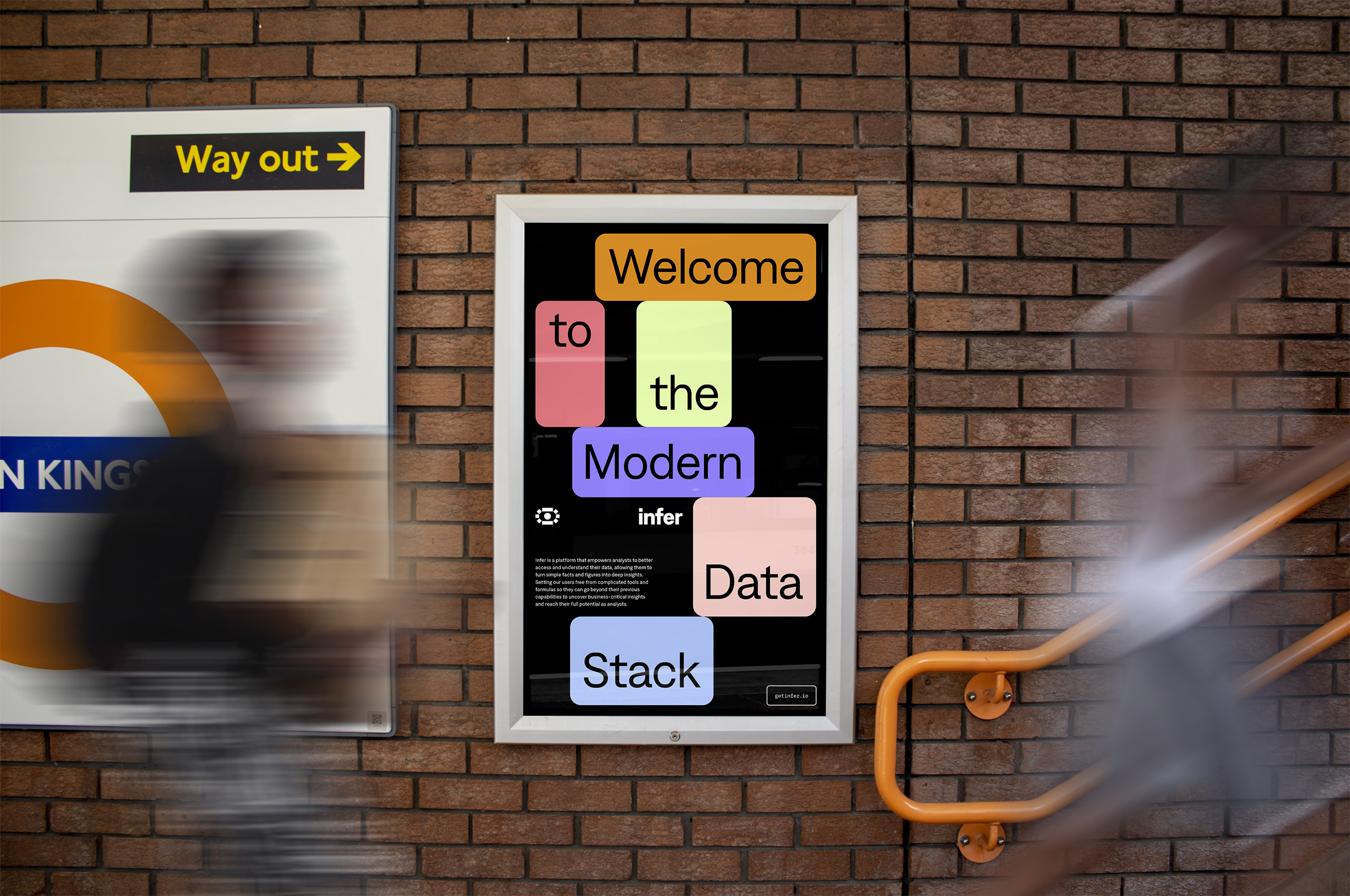
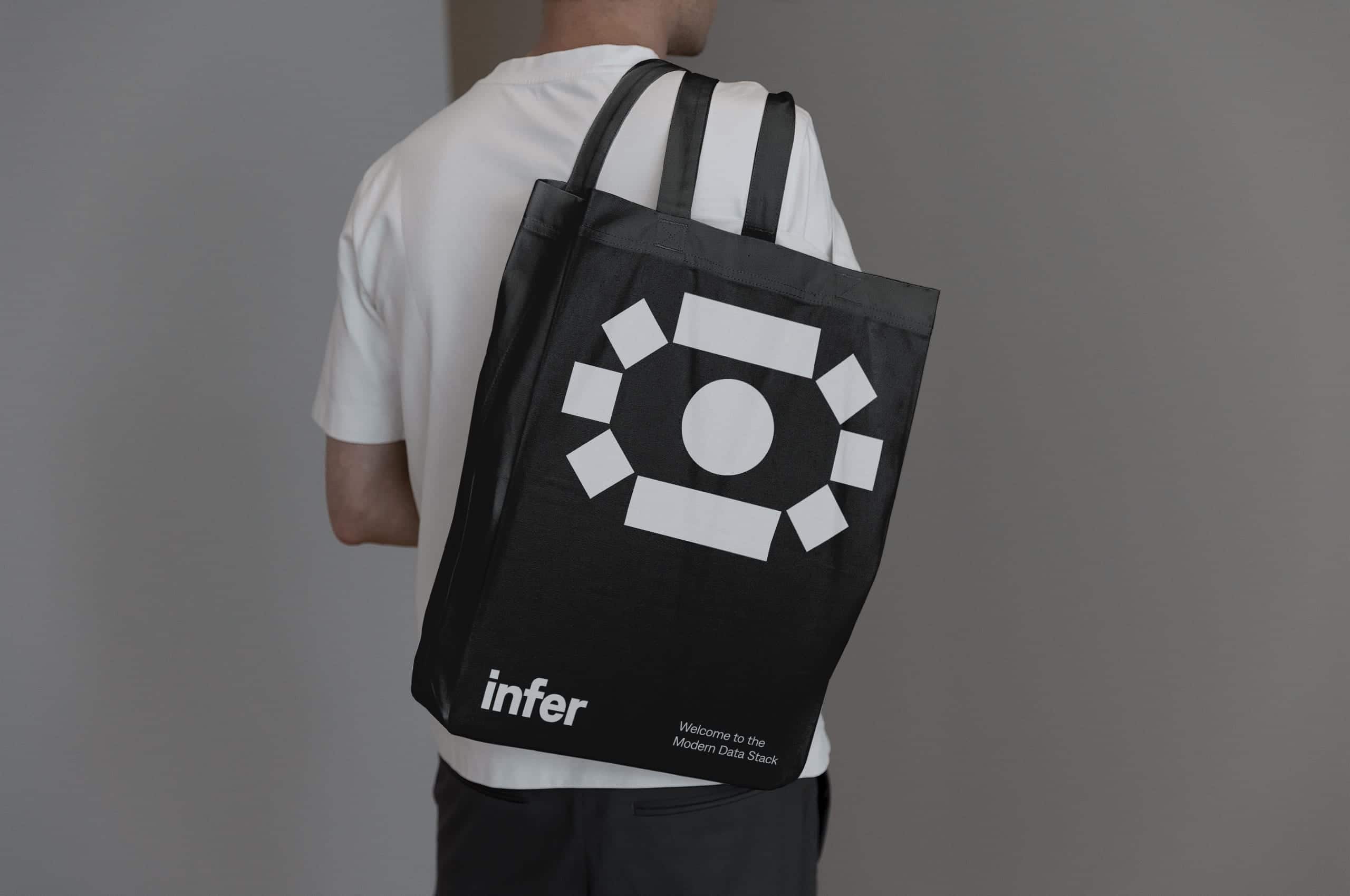
The out-of-home instances of the Infer identity were developed to stop people in their tracks and make them think. They create visual puzzles with the tag blocks, resulting in a stronger connection to the brand itself.