Standard Wax
A candle company that brings art into everyday, long after the candles have burned down.
A candle company that brings art into everyday, long after the candles have burned down.

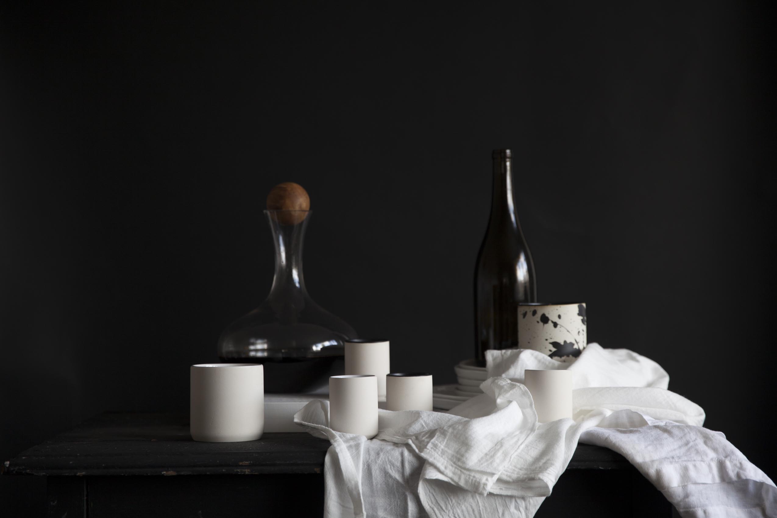
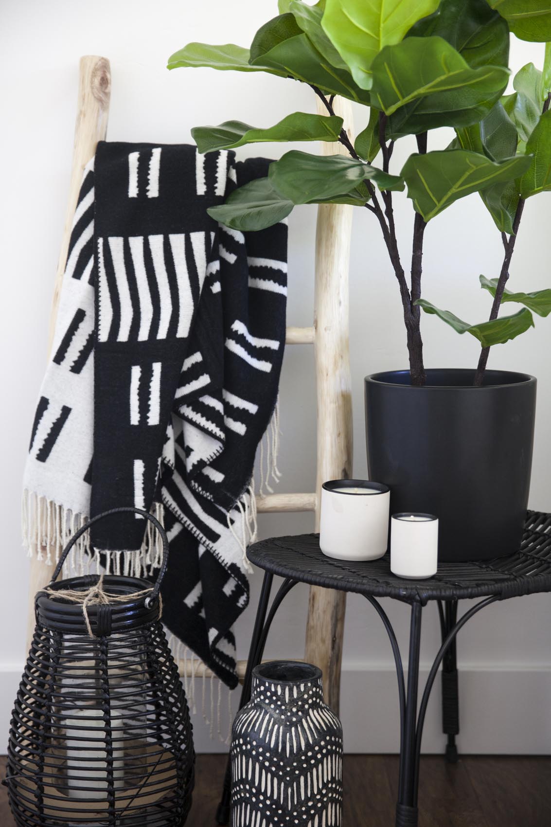
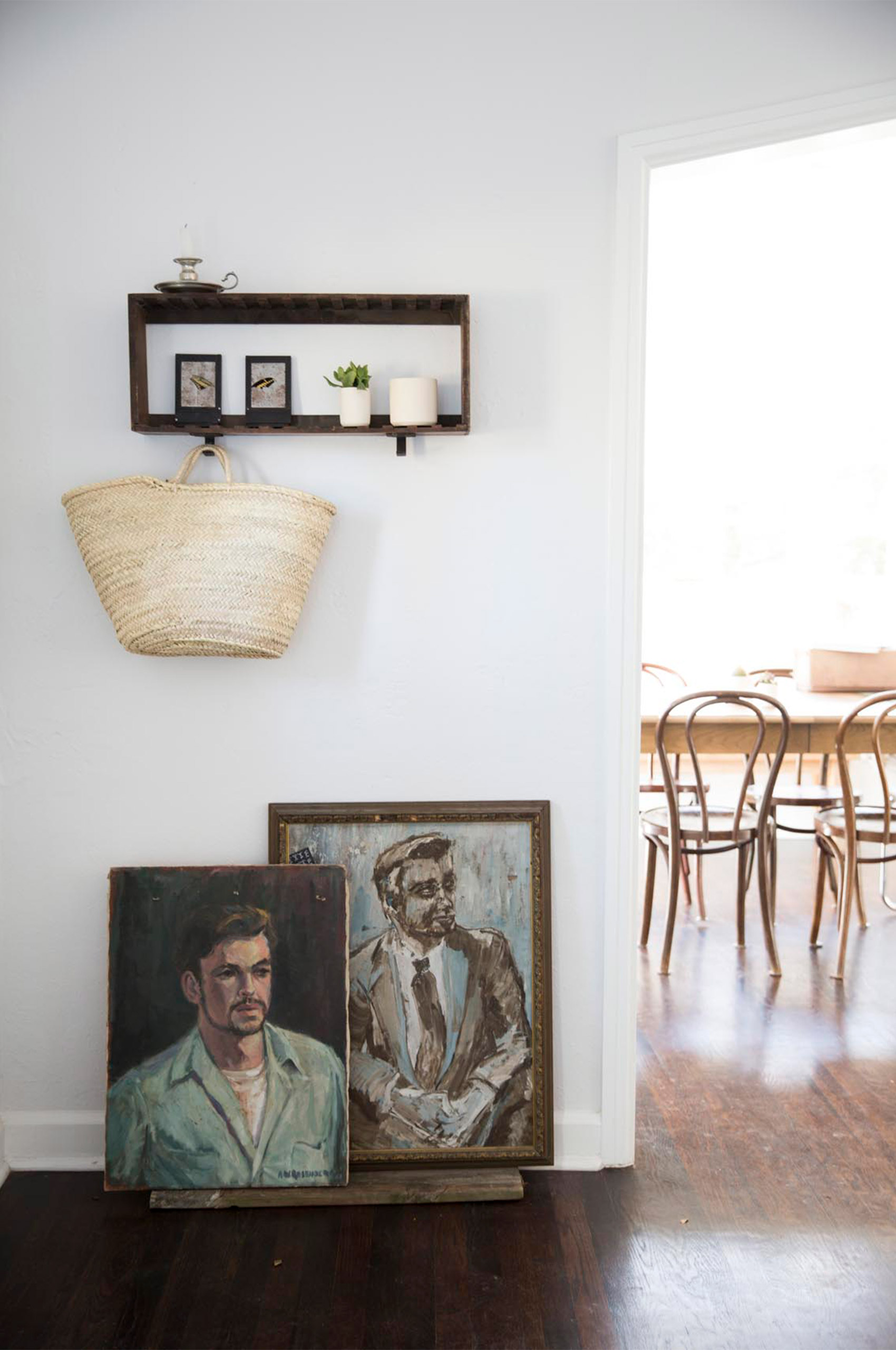
When Samantha Thompson started Standard Wax, it didn’t start as a vision of a candle company; it started as a way to create beautiful ceramic vessels that happen to house candles. This vision is the driving force behind Standard Wax, even today.
They are concerned with creating artfully crafted vessels that bring beauty into the lives of their users, long after the candles have been burned down.
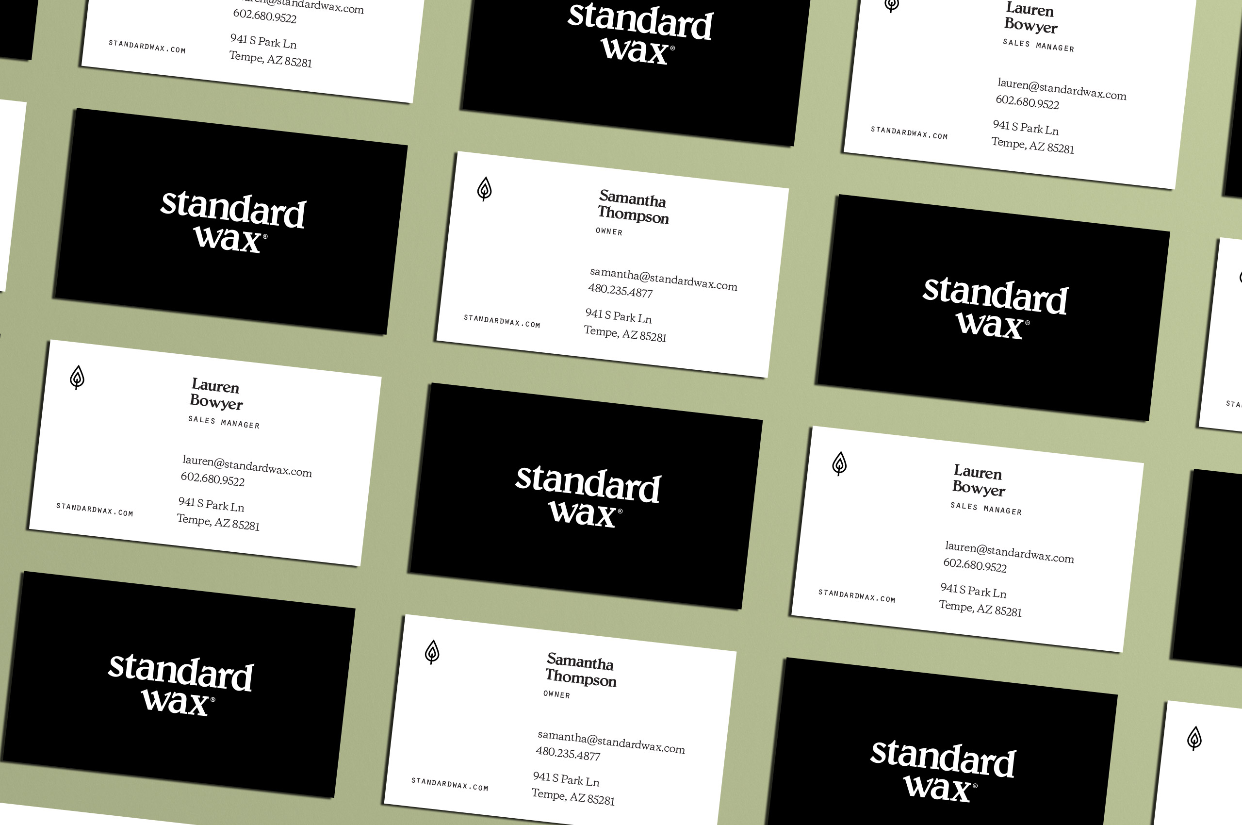
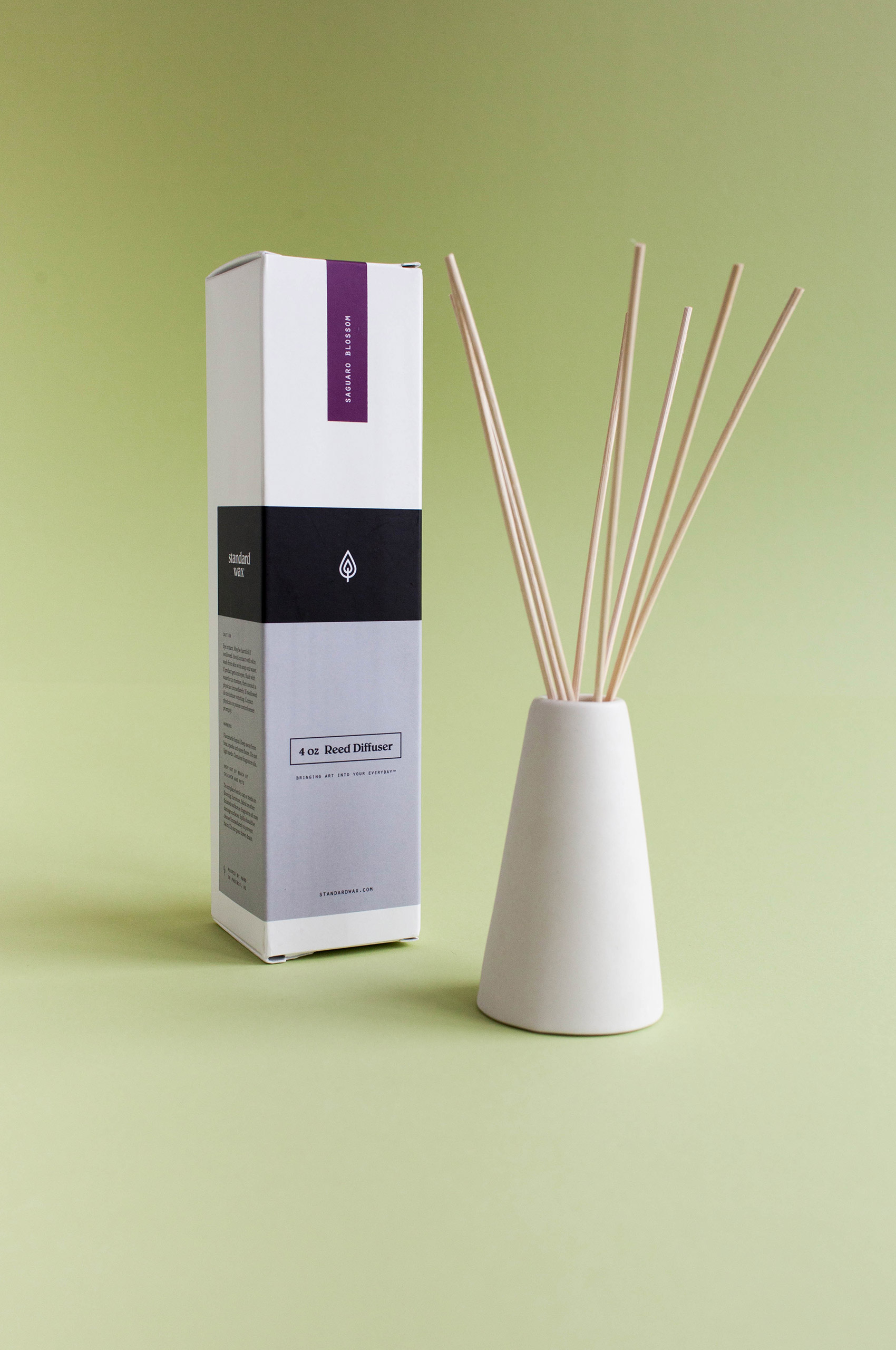
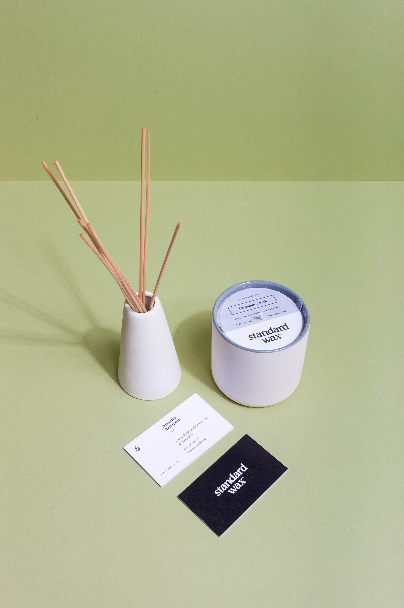
We worked with them to develop a new brand that didn’t stand in the way of these beautiful objects, yet inform and delight the users.


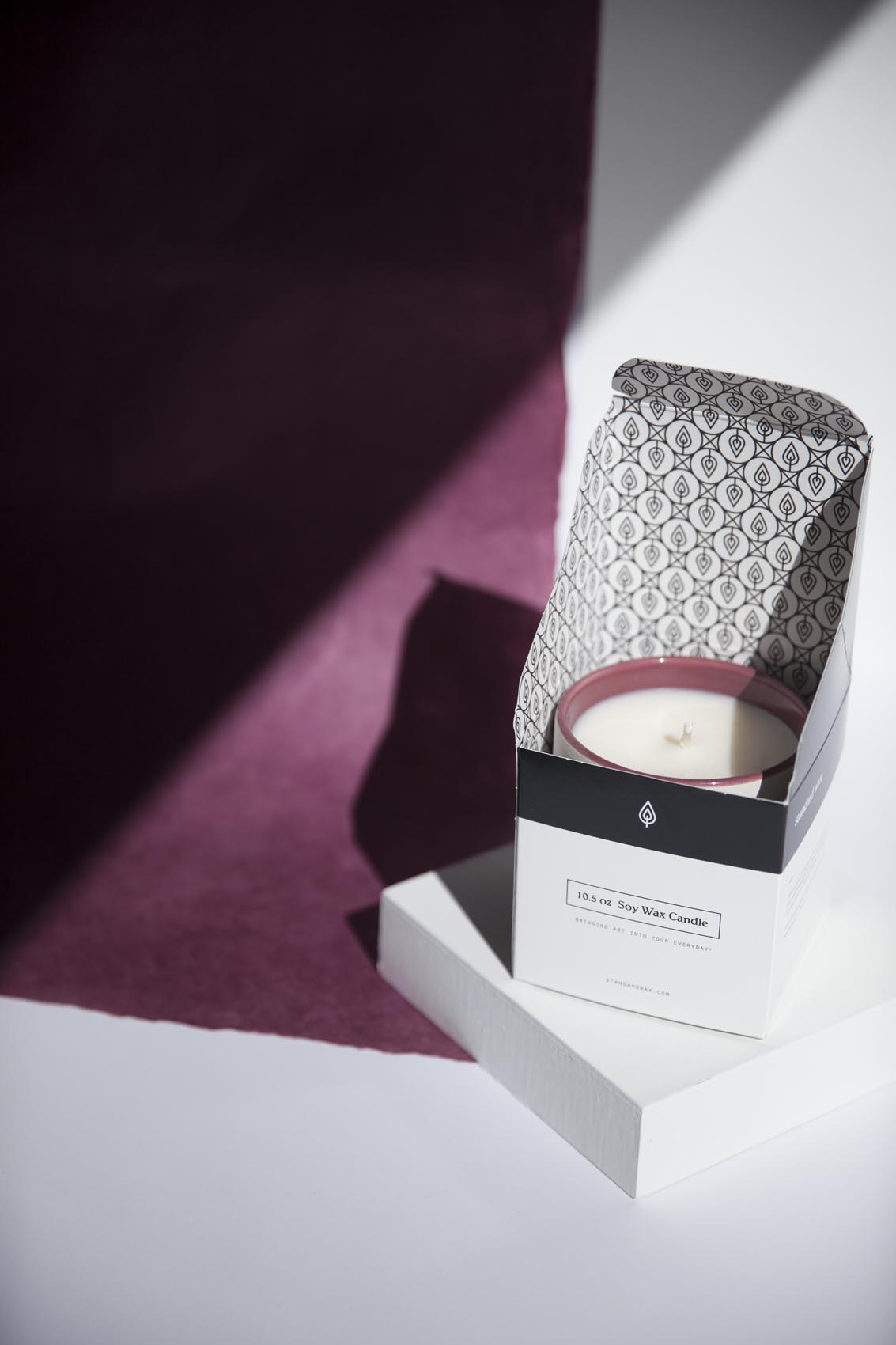
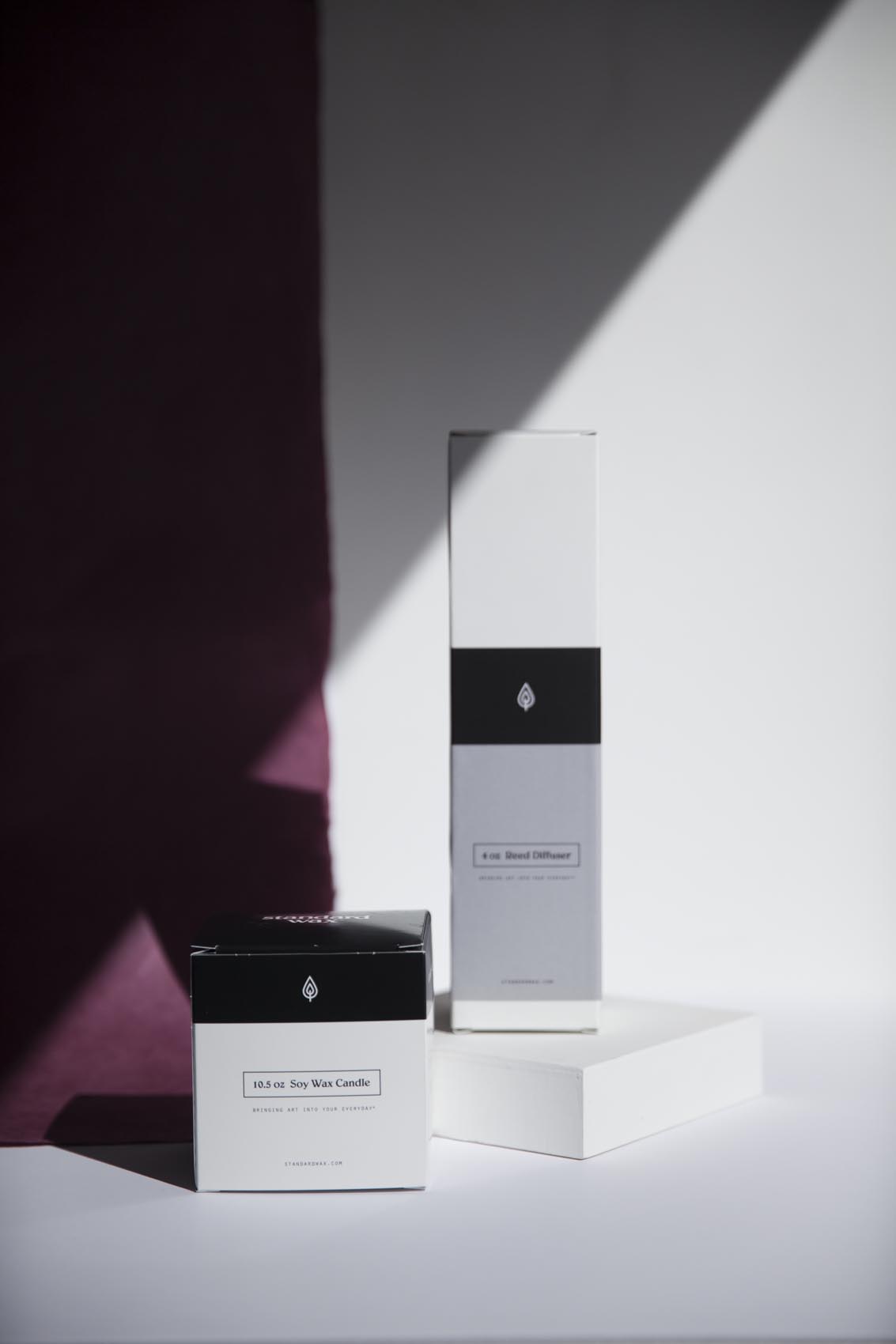
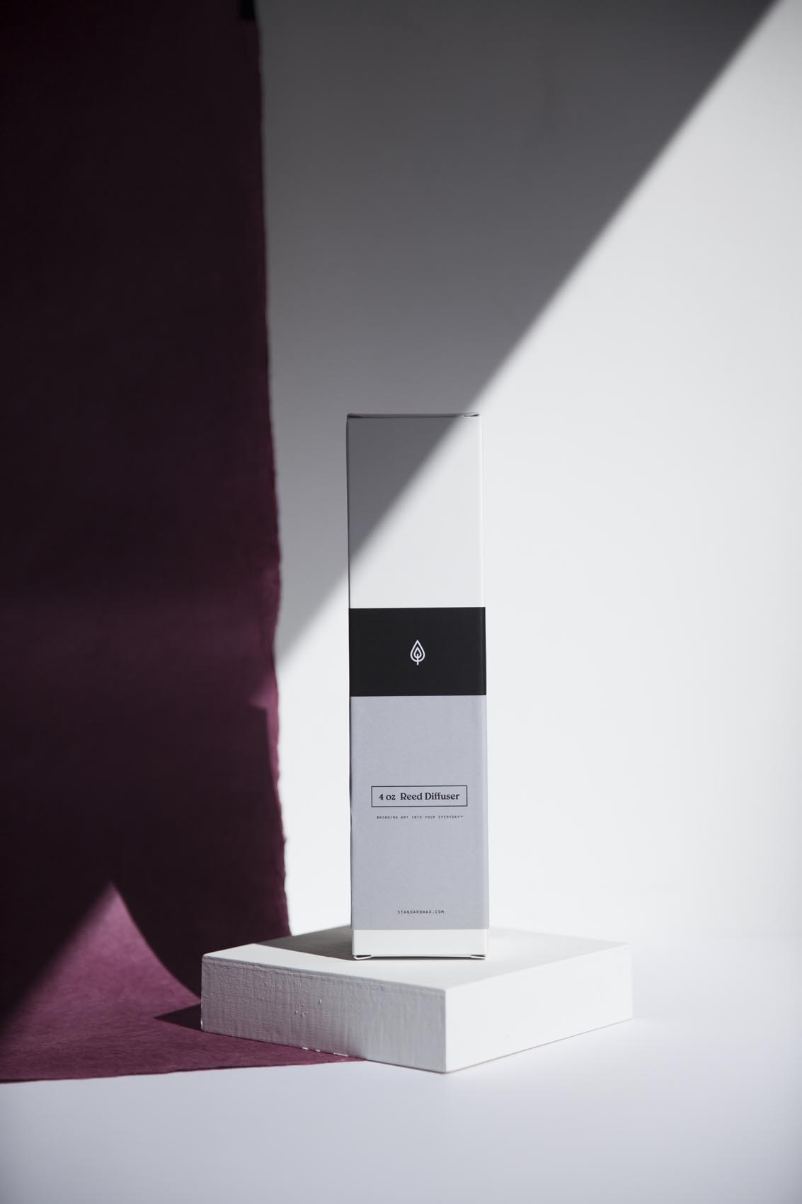

When developing the new symbol for Standard Wax, it was important for them to have an icon that could describe what they did, without screaming it.
Their previous symbol was a simplified SW monogram, leaving little room for imagination.
We worked collaboratively with Samantha to develop the flame – a symbol that would quickly inform and always reference the beginnings of the company, even as they branch out into other product lines.

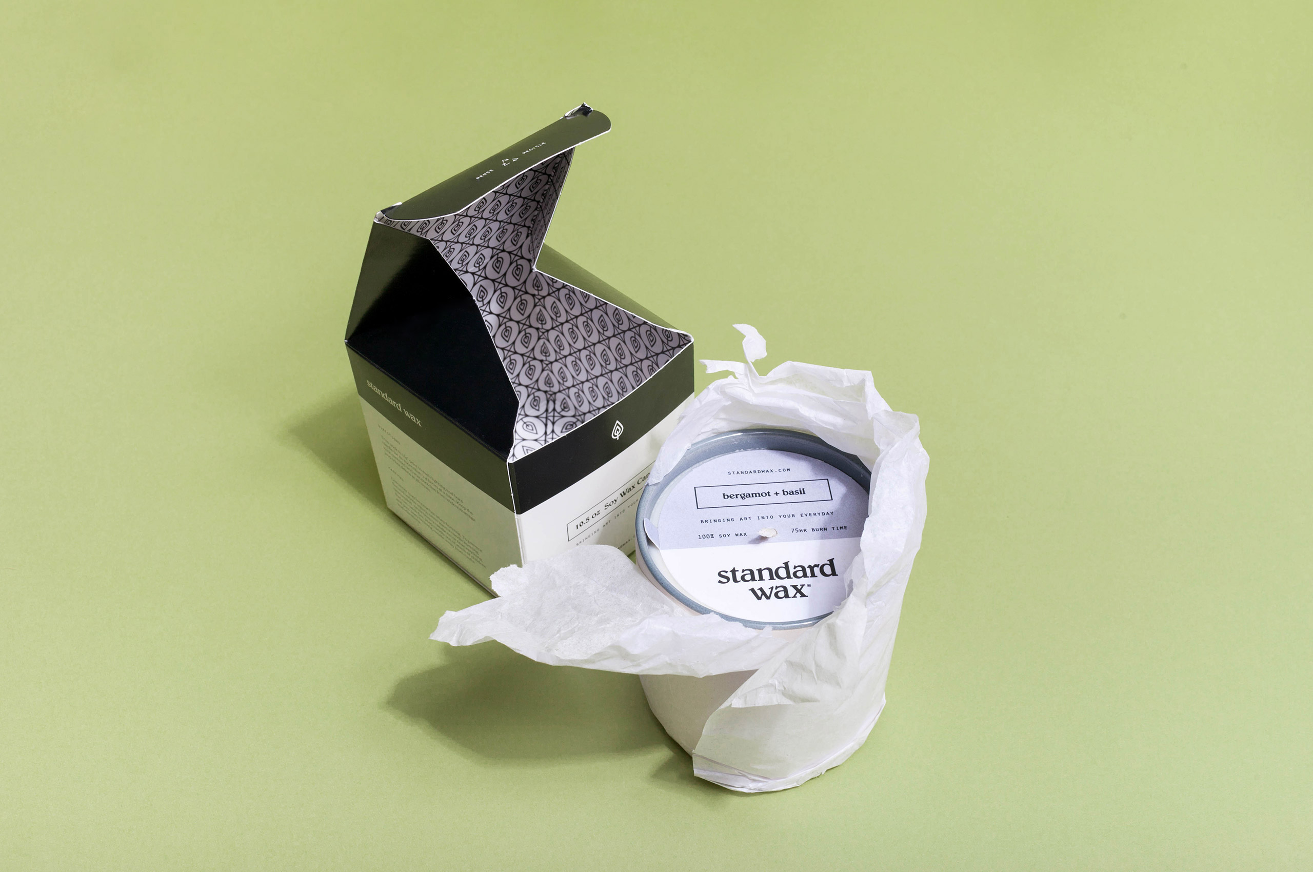
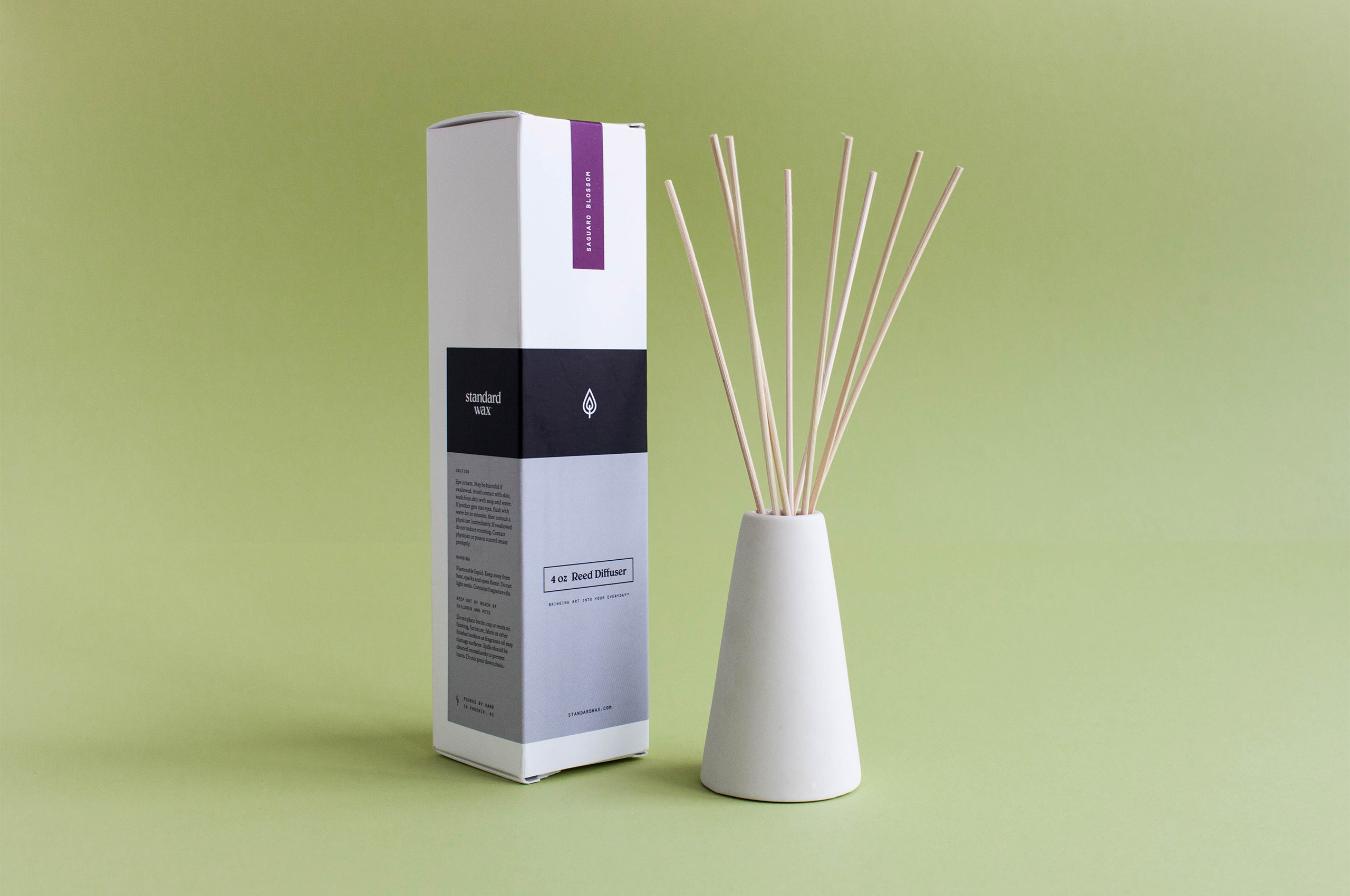
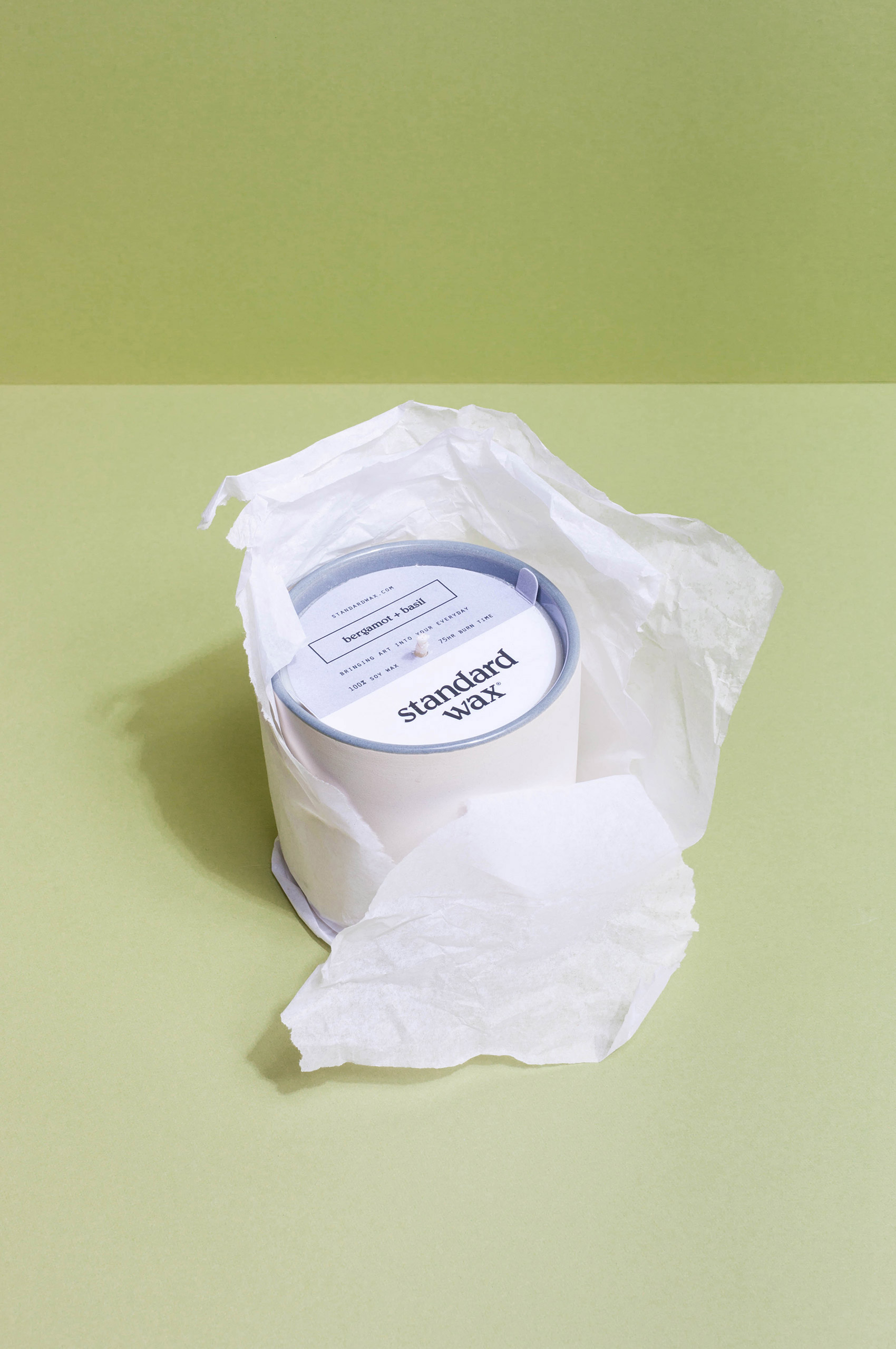
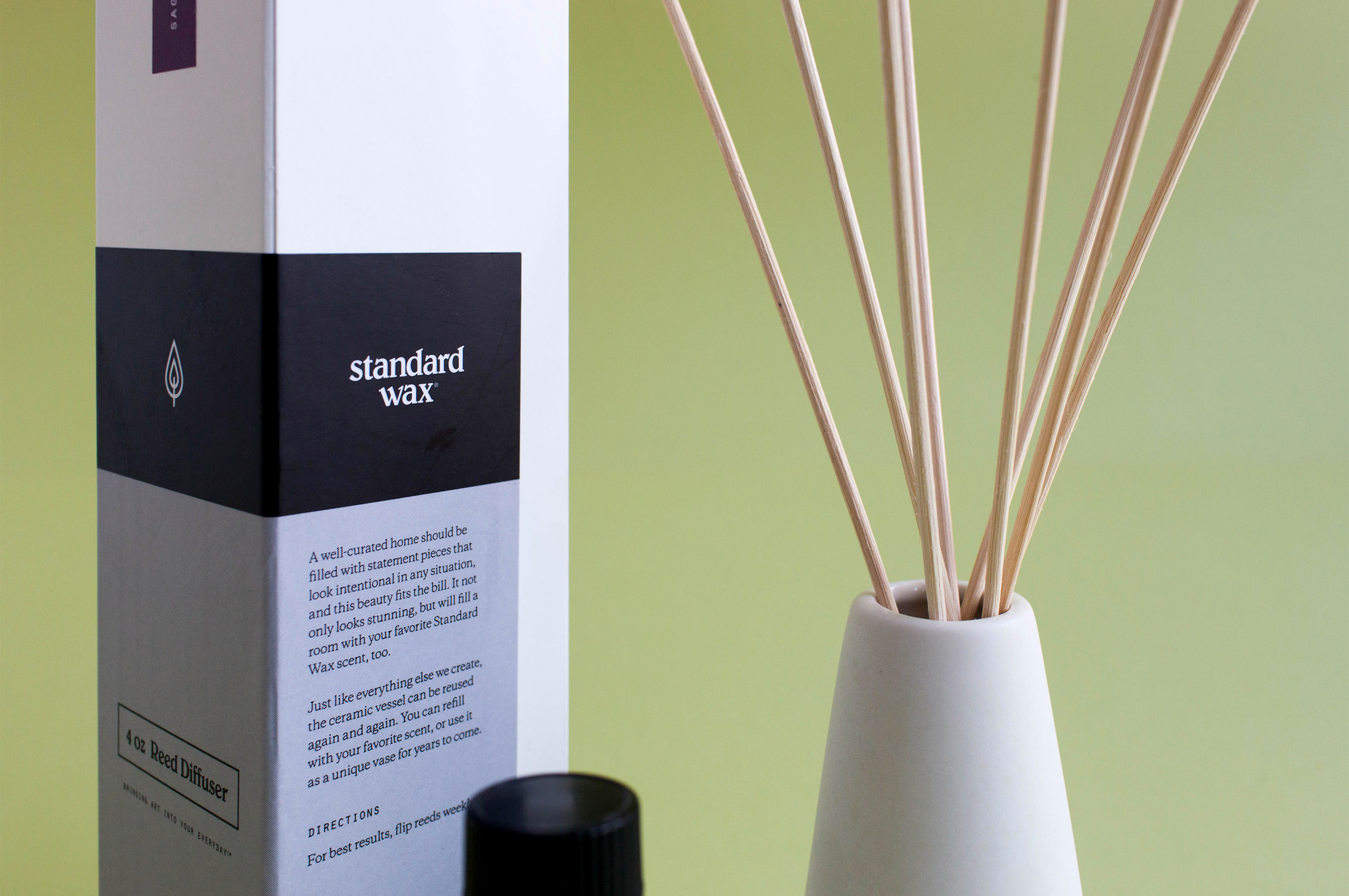

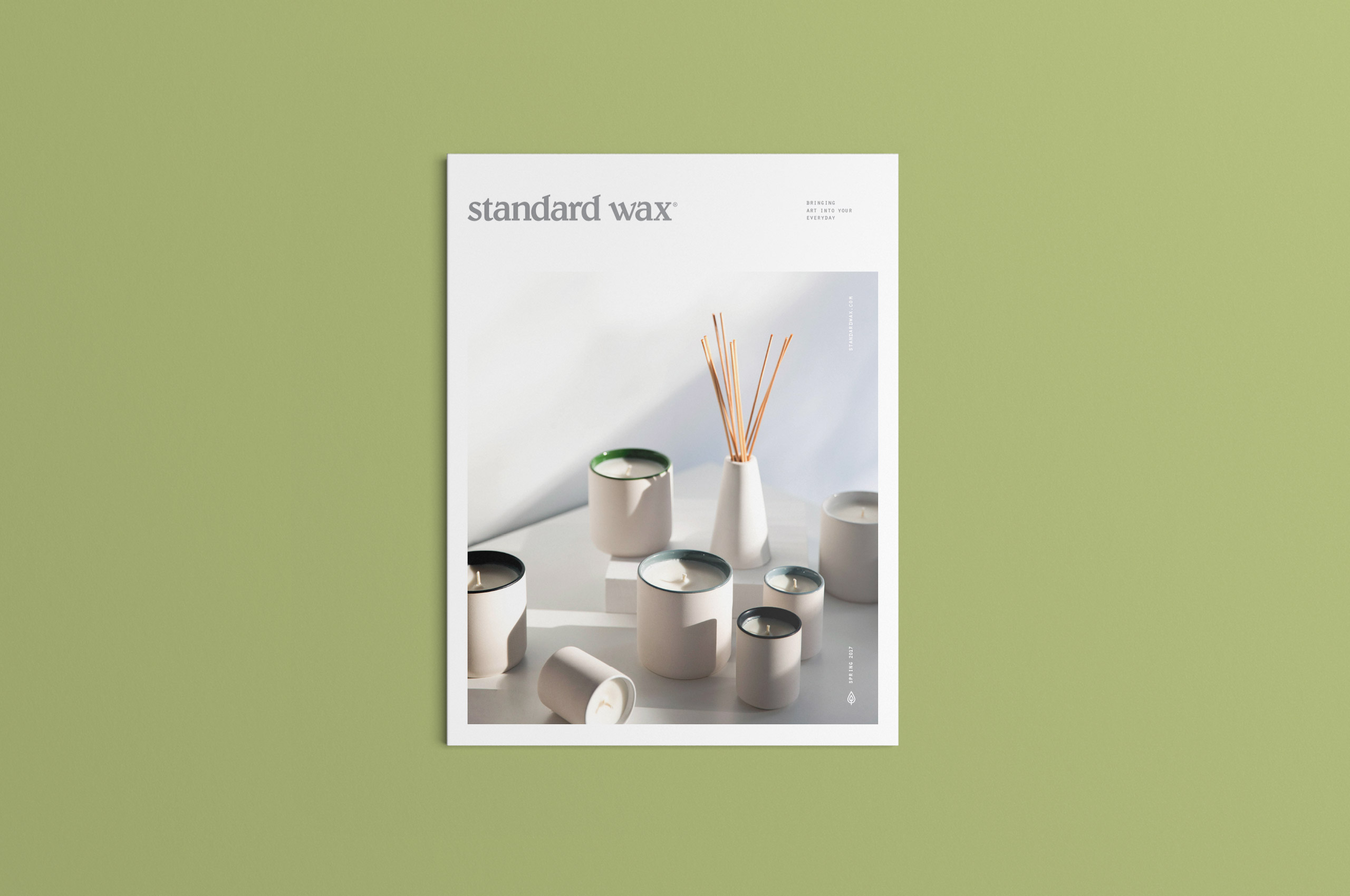
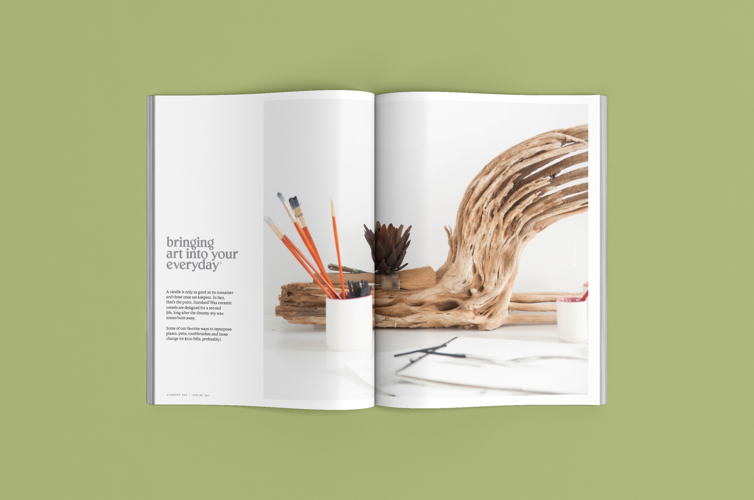
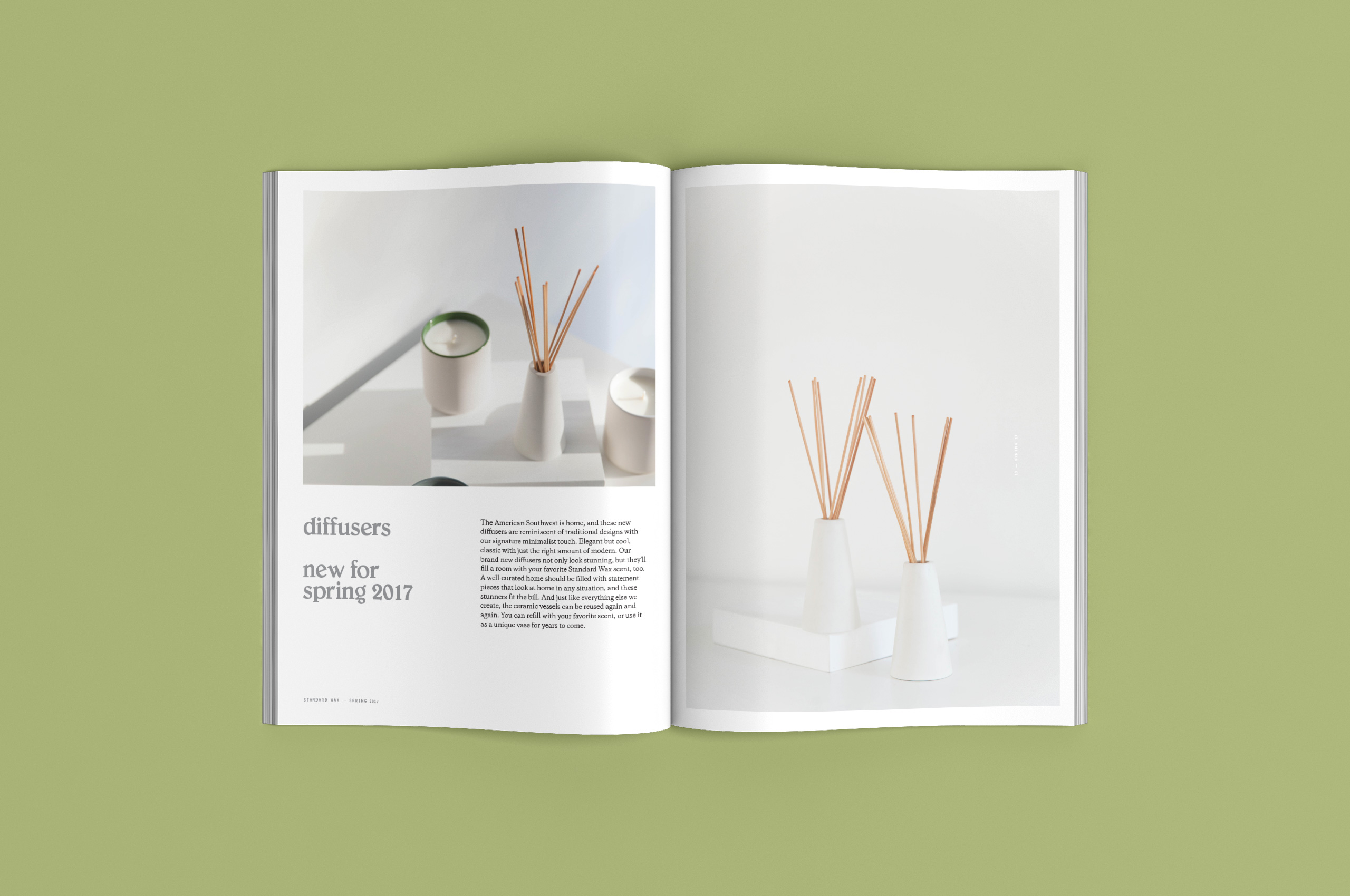


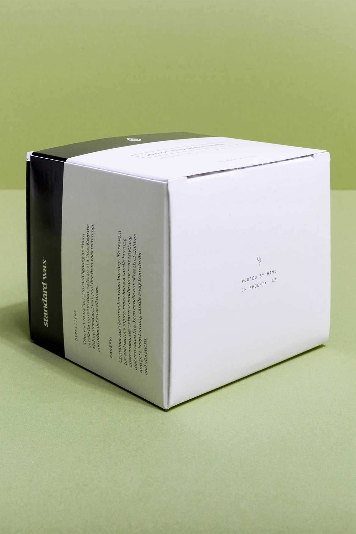
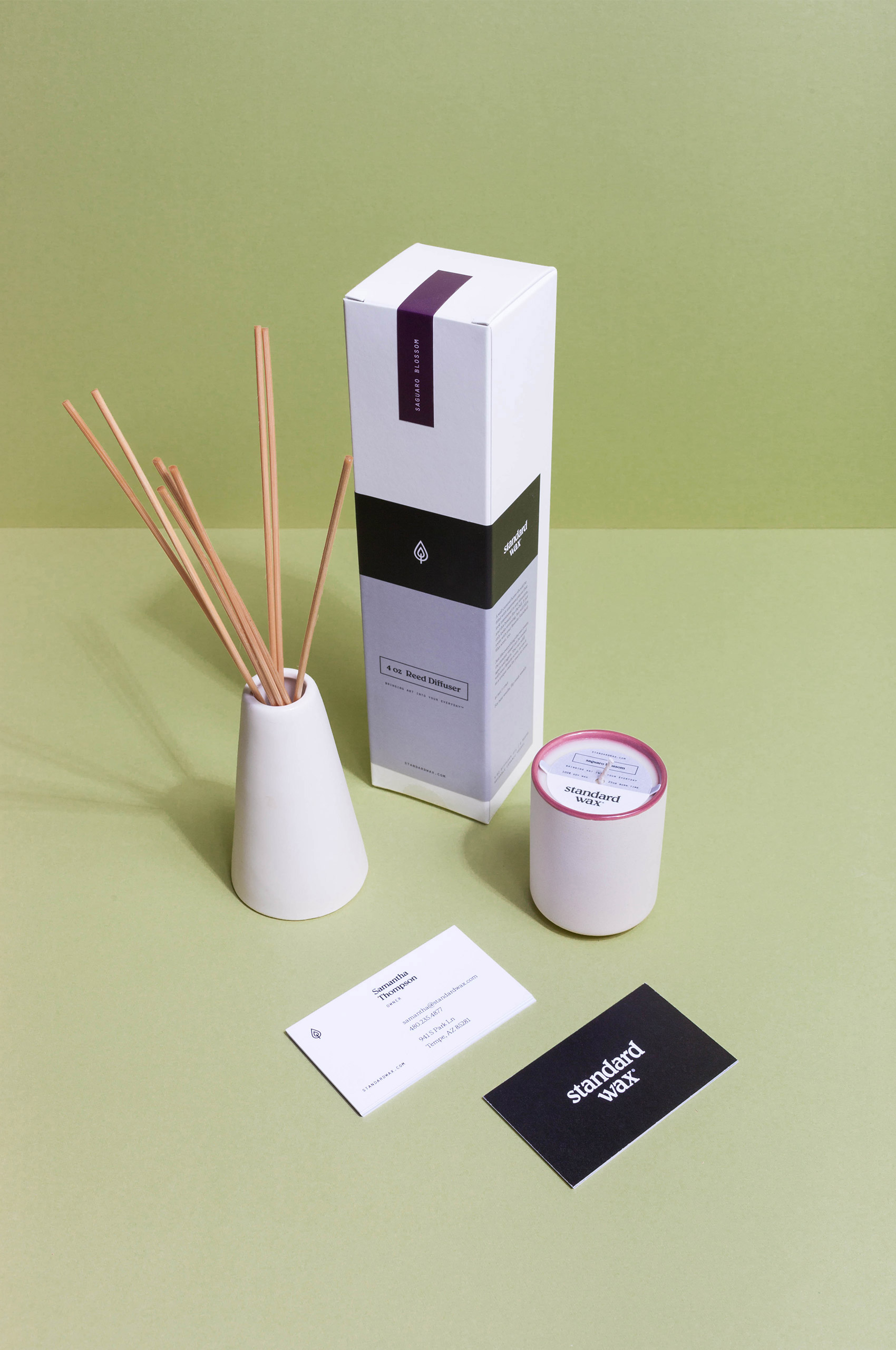
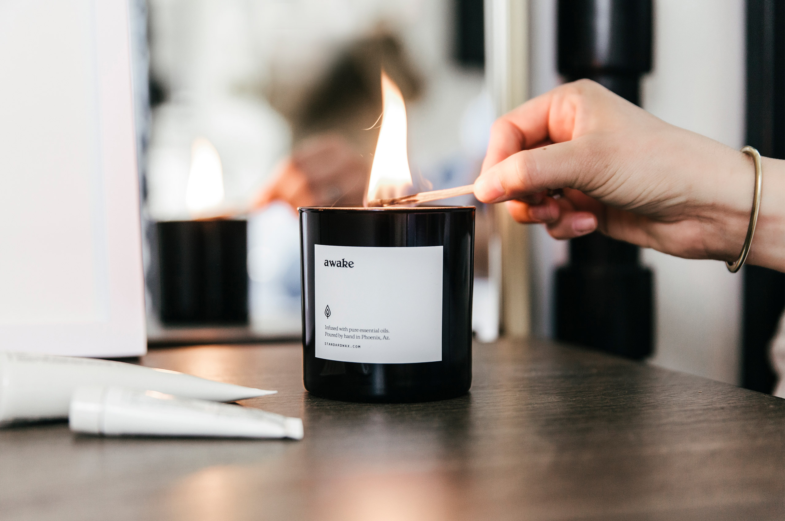
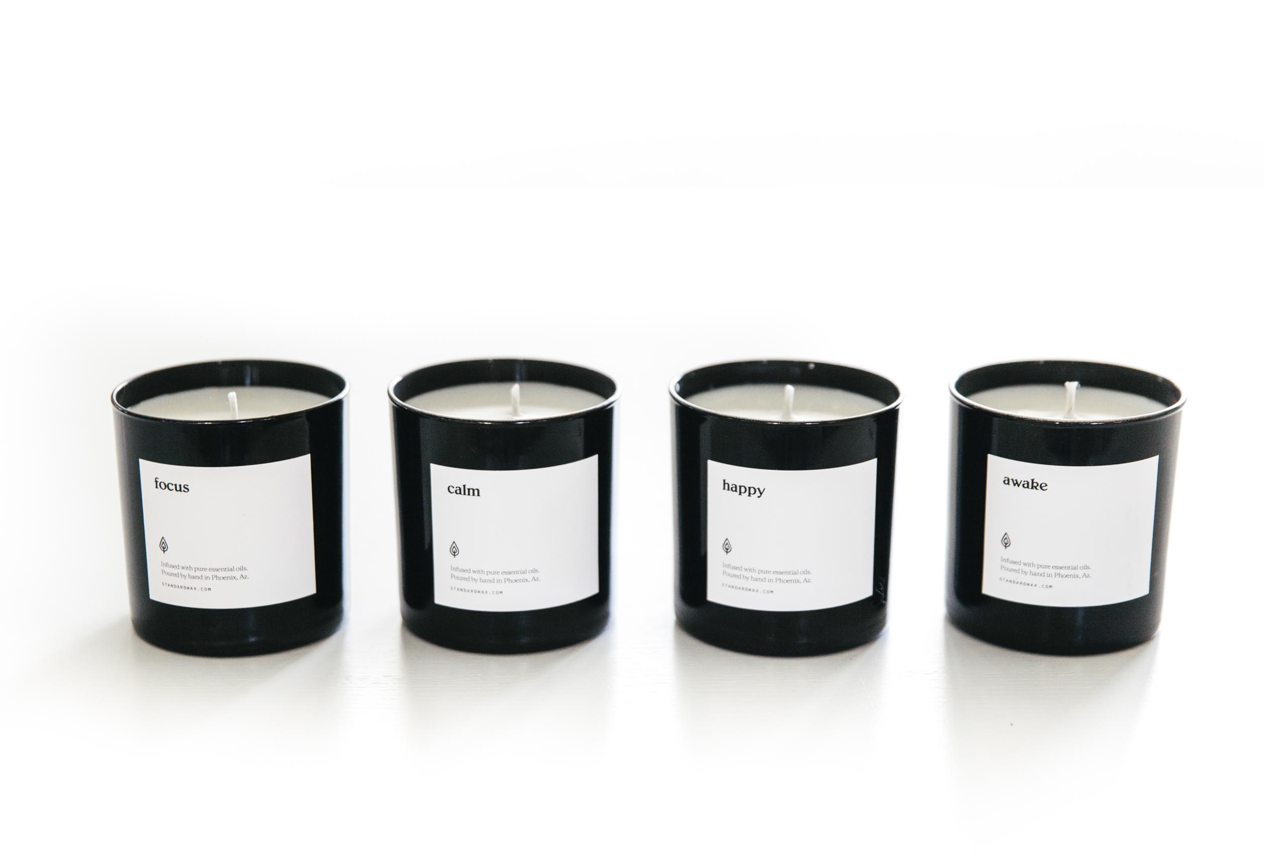
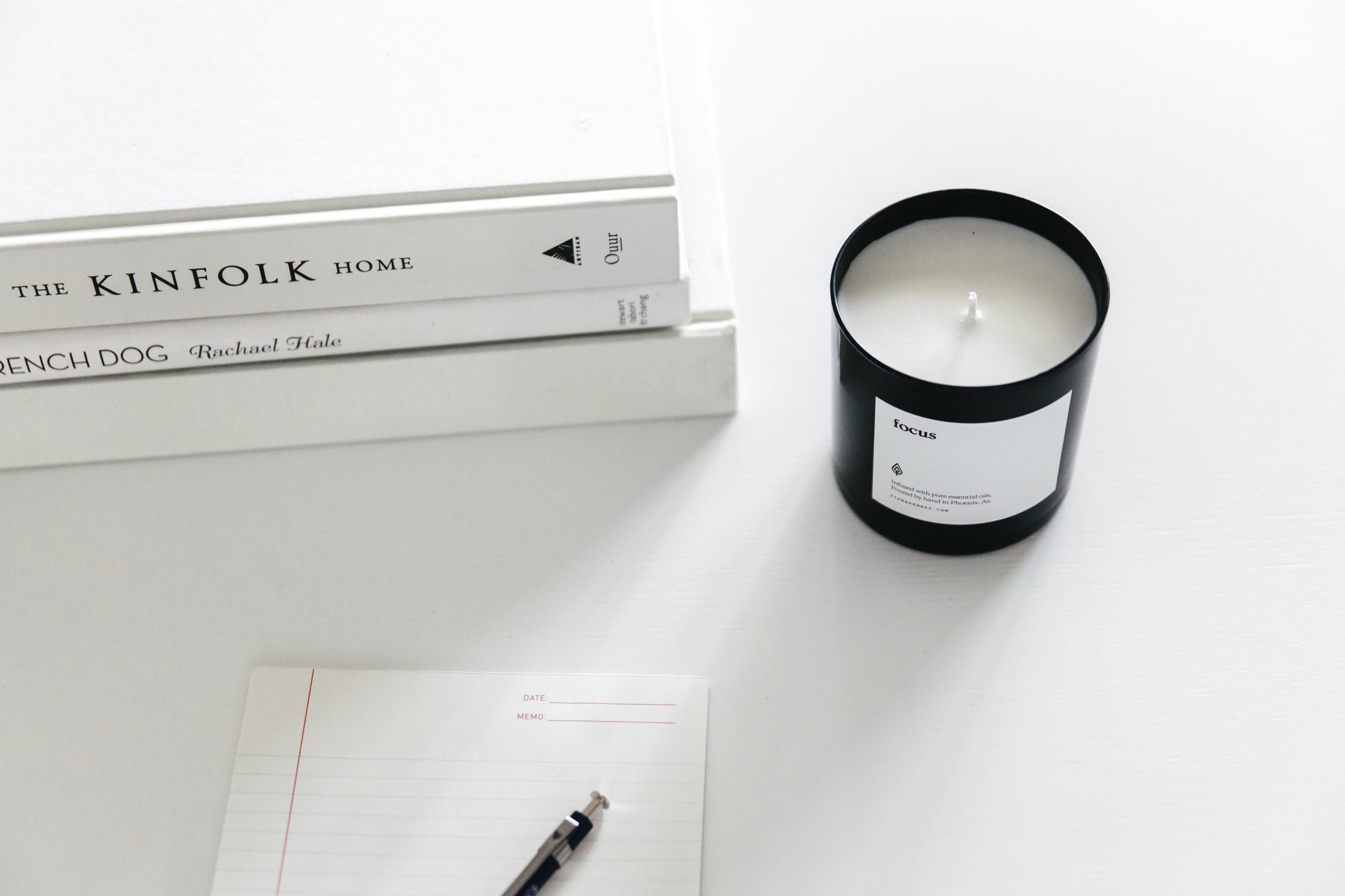
The visual system was simplified to a monochromatic palette, putting the focus on the shapes and colors of the vessels and allowing for fast scent and brand recognition. Giving each scent its own unique label color, matching the interiors of the candles.
We translated this language across all packaging, dust covers, and labels.
