One : One
One : One is a co-working office space that allows creatives, start-ups, and entrepreneurs to inspire each other and treat every day like it’s the first day of any project.
One : One is a co-working office space that allows creatives, start-ups, and entrepreneurs to inspire each other and treat every day like it’s the first day of any project.
One : One is a co-working space in El Paso, Texas. Bringing together entrepreneurs, creatives, start-ups, established businesses into an inspirational environment that pushes them to do more. To take risks, to be bold, to treat every day like it’s your first on any project. No matter the day in the year, treat every day like it’s the first. Treating each project with the same motivation, dedication and drive as the first project.
We worked with them to create a strong brand that would set the foundation for members to start the first day fresh. Allowing them to take each new day and make it their own. It was important to create a brand that would support their goals, not stand in the way. For that reason, we created a brand that was only black and white. Allowing the members to provide the vibrancy and life into the space.
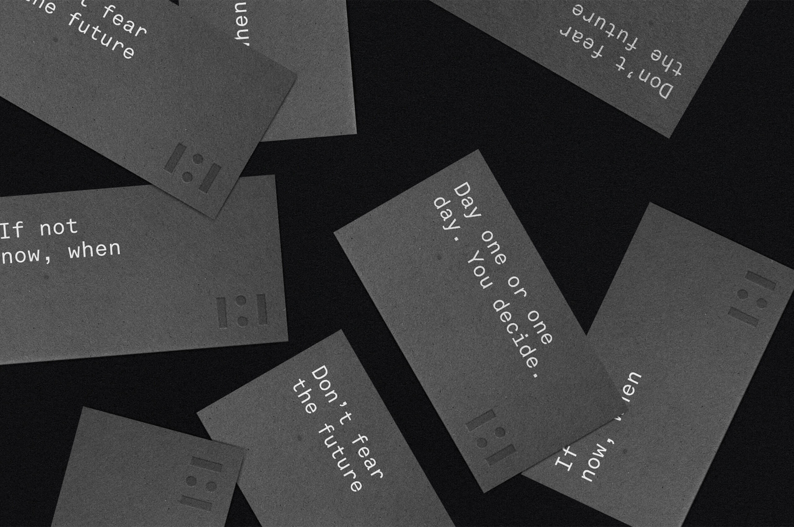
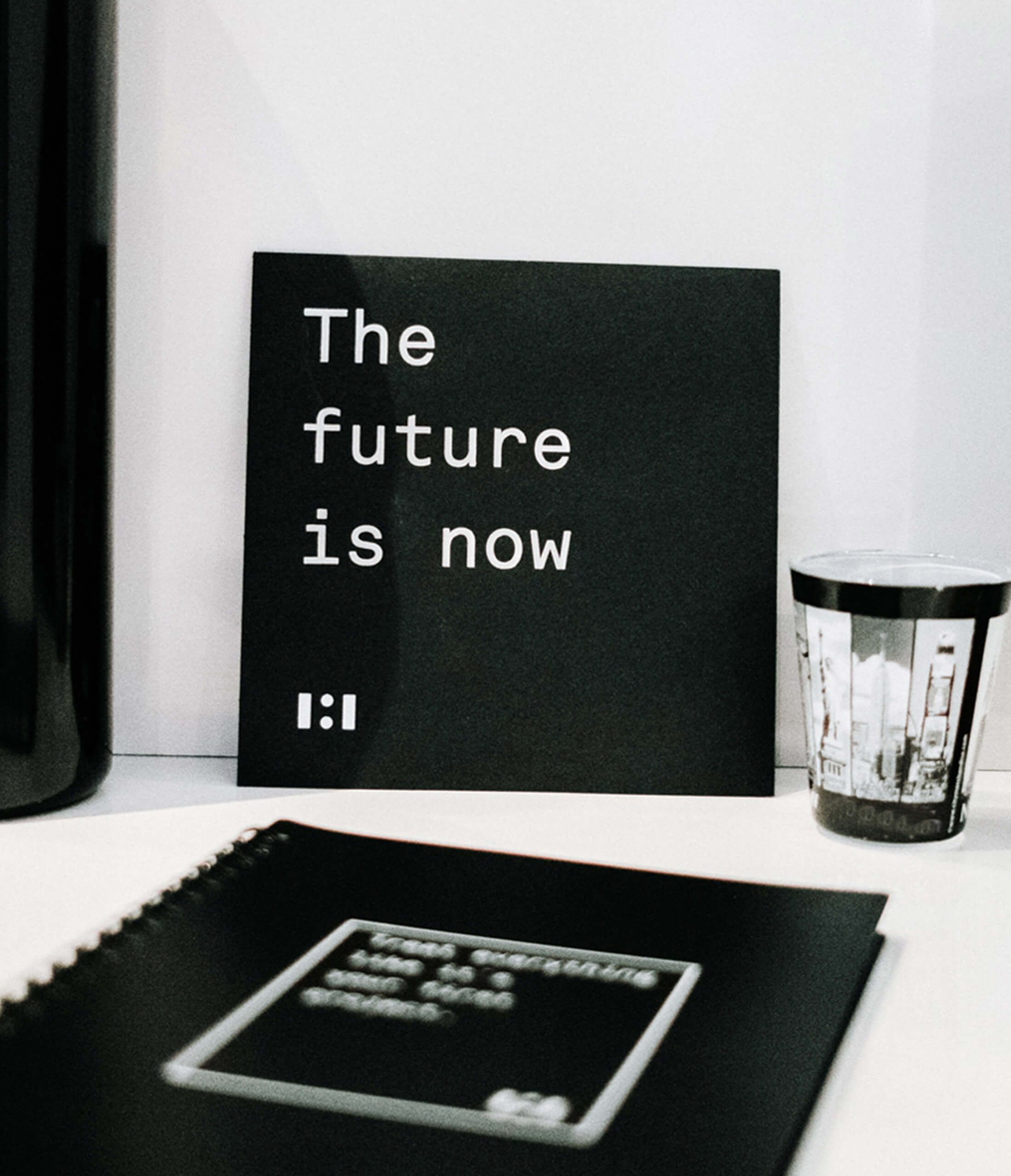
We crafted a strong, stark brand with bold messaging to capture One : One’s big ambitions and to set the tone for boundless creativity throughout the interior decor. The clean, simple lines and straightforward tones conveyed that more than just a place to work, One : One offers an ambiance and attitude for success. Project contracted by Aidan James.

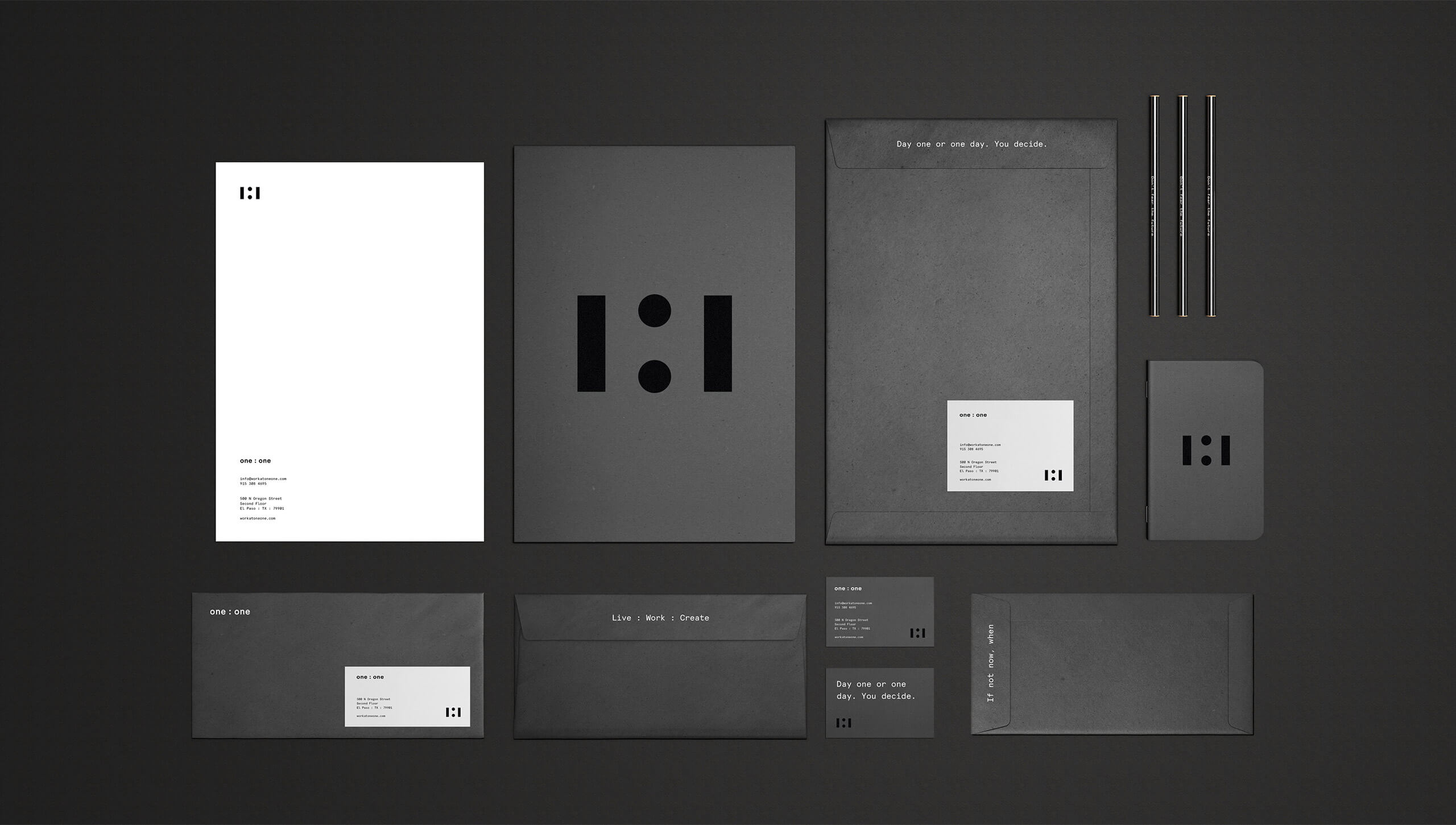

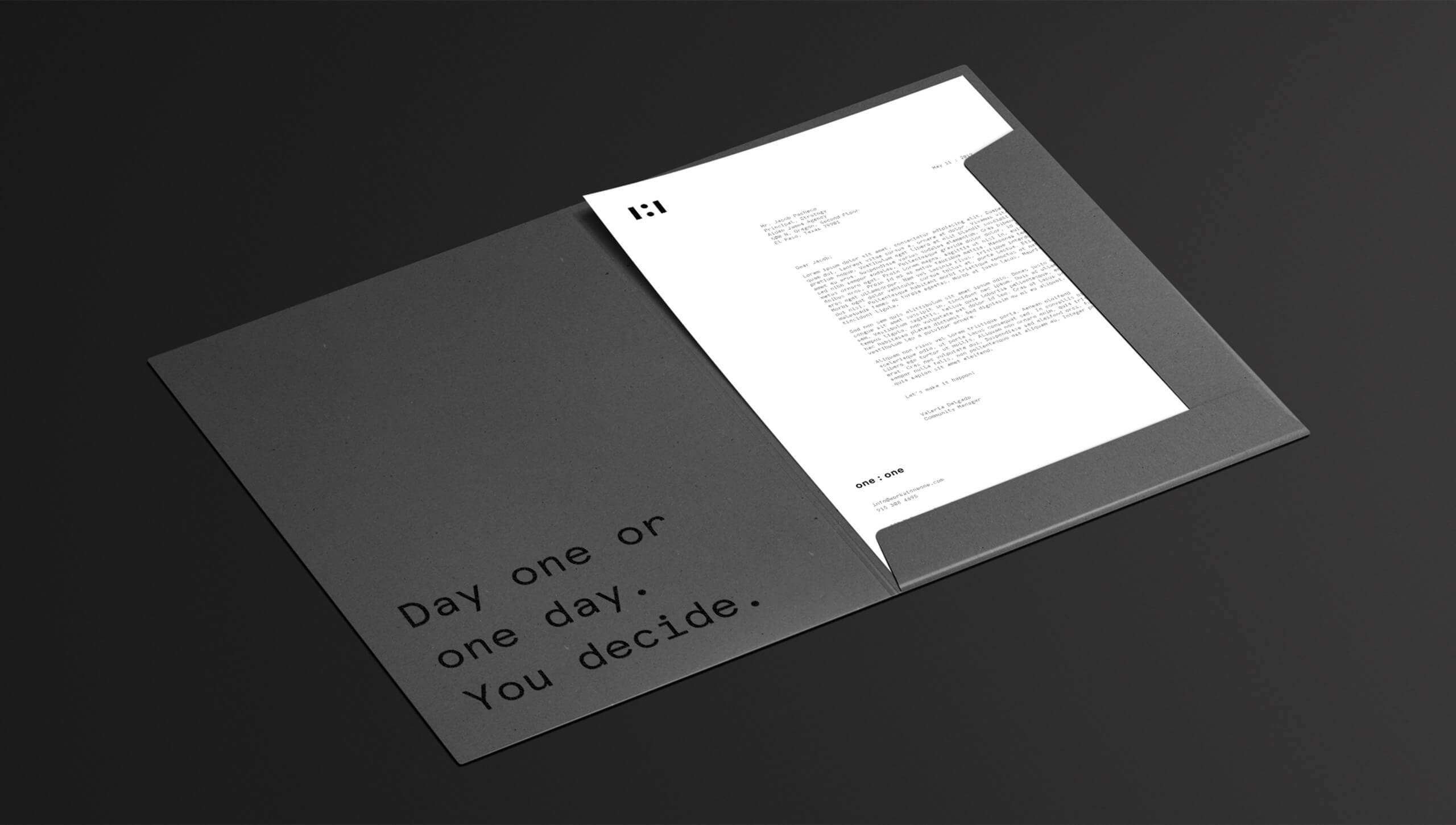
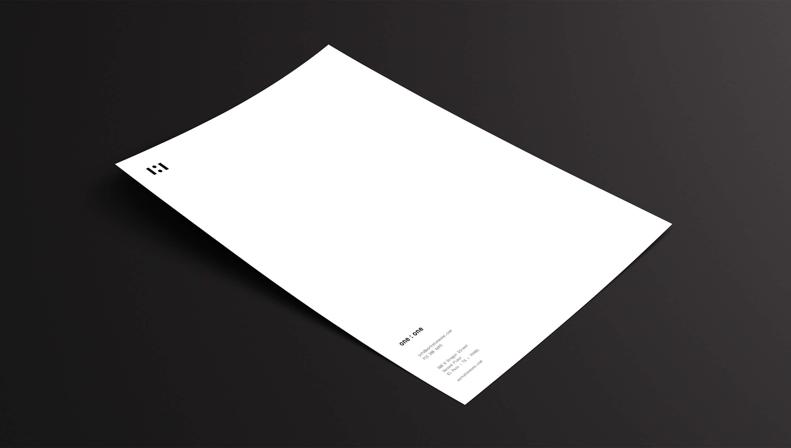
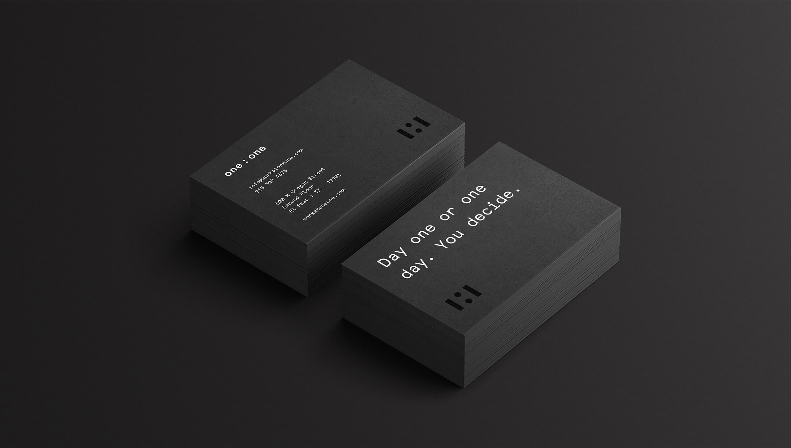
Carrying over the thinking of the palette to the physical collateral resulted in the creation of all black cards, folders, and postcards. Coupled with bold action-oriented messaging throughout. Ensuring that while still bold and engaging, it did not stand in the way of the member’s brand, or personality. Creating a strong foundation, and inspiring their new endeavor.

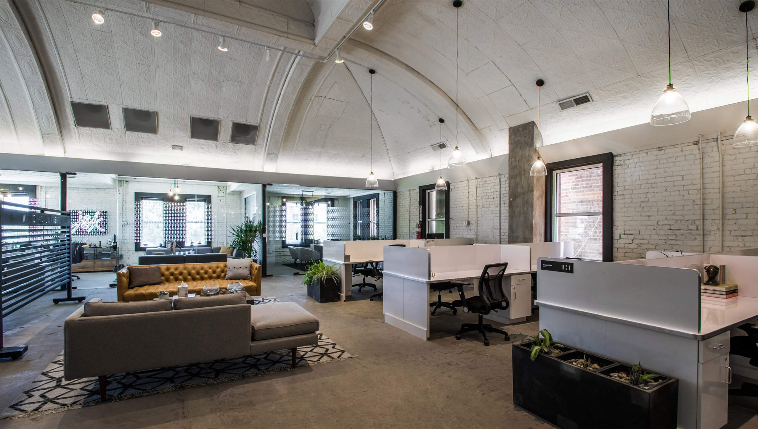
When translating the brand into the physical space, we were able to leverage the unique mirrored nature of the symbol to create a repeating pattern. Throughout the space, this pattern is used to frost windows in meeting rooms. Paired with the buildout of the space in black and white, the brand informs all elements of the space, without becoming overbearing.


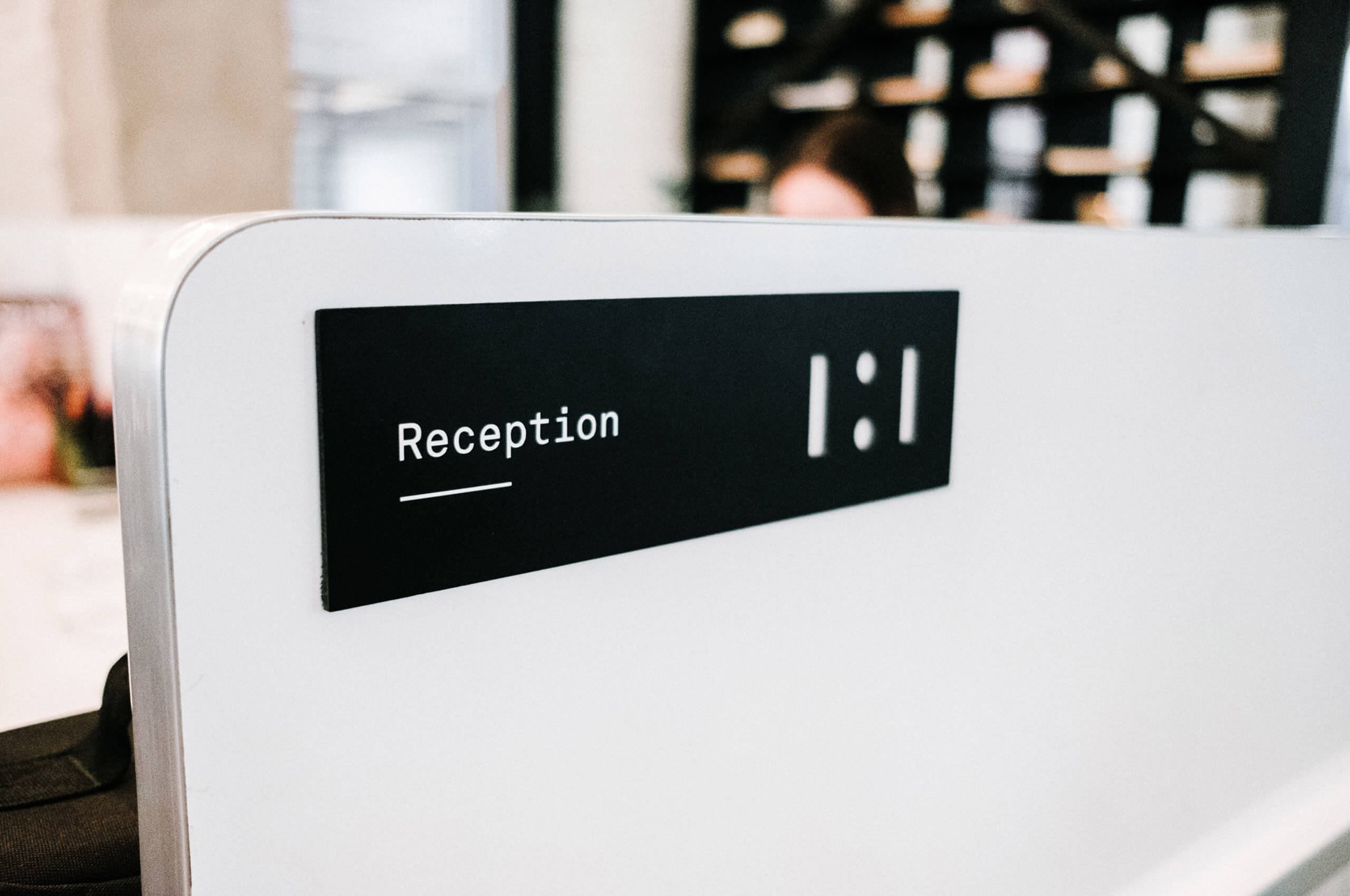
Influenced by the numerals in the name, the symbol is a simplified interpretation of the name itself, One : One. Instead of an exact numeric representation, we chose to create a highly simplified symbol. Drawing inspiration from the floorplans of the space, to create a unique, ownable symbol.


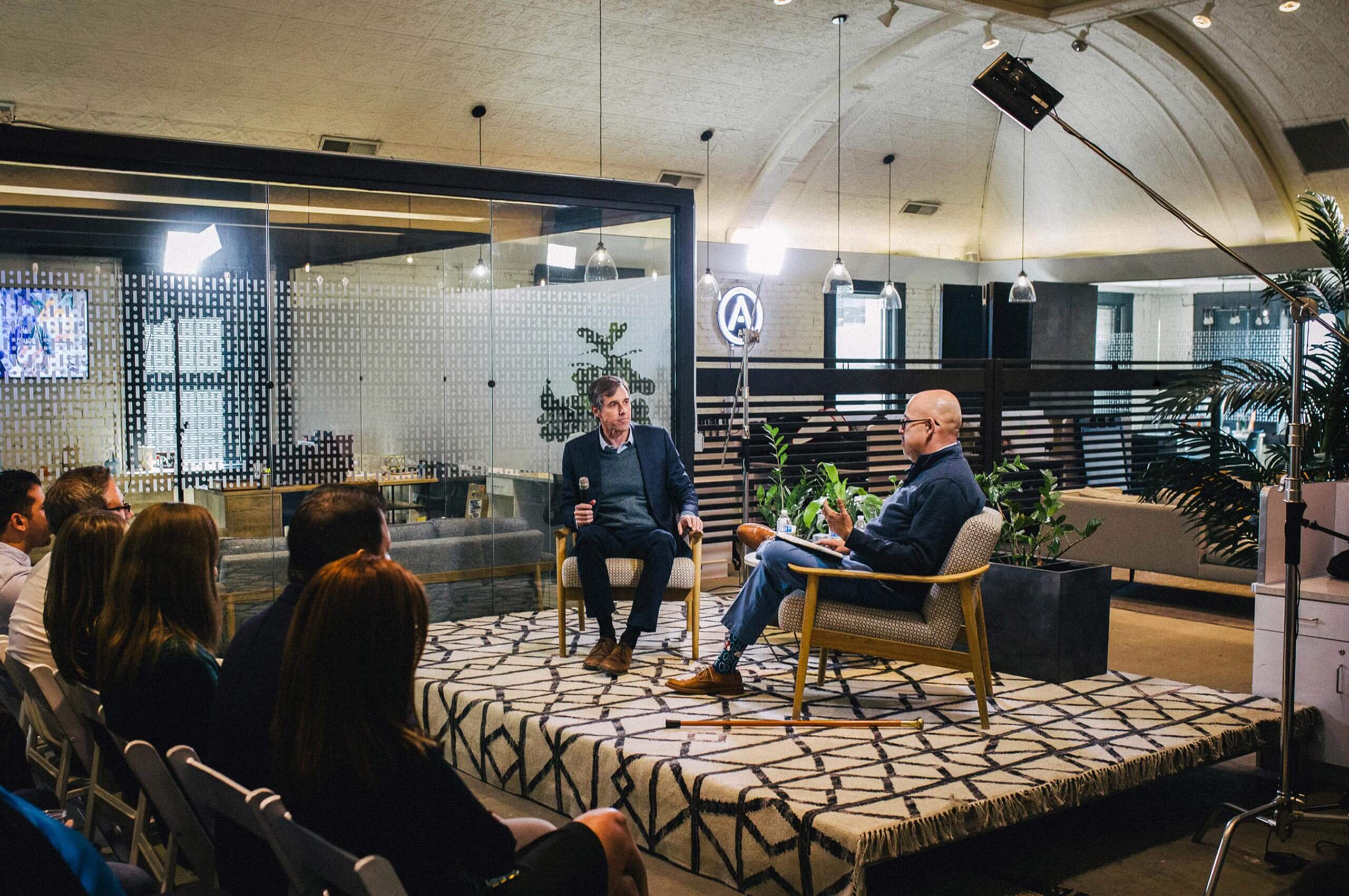
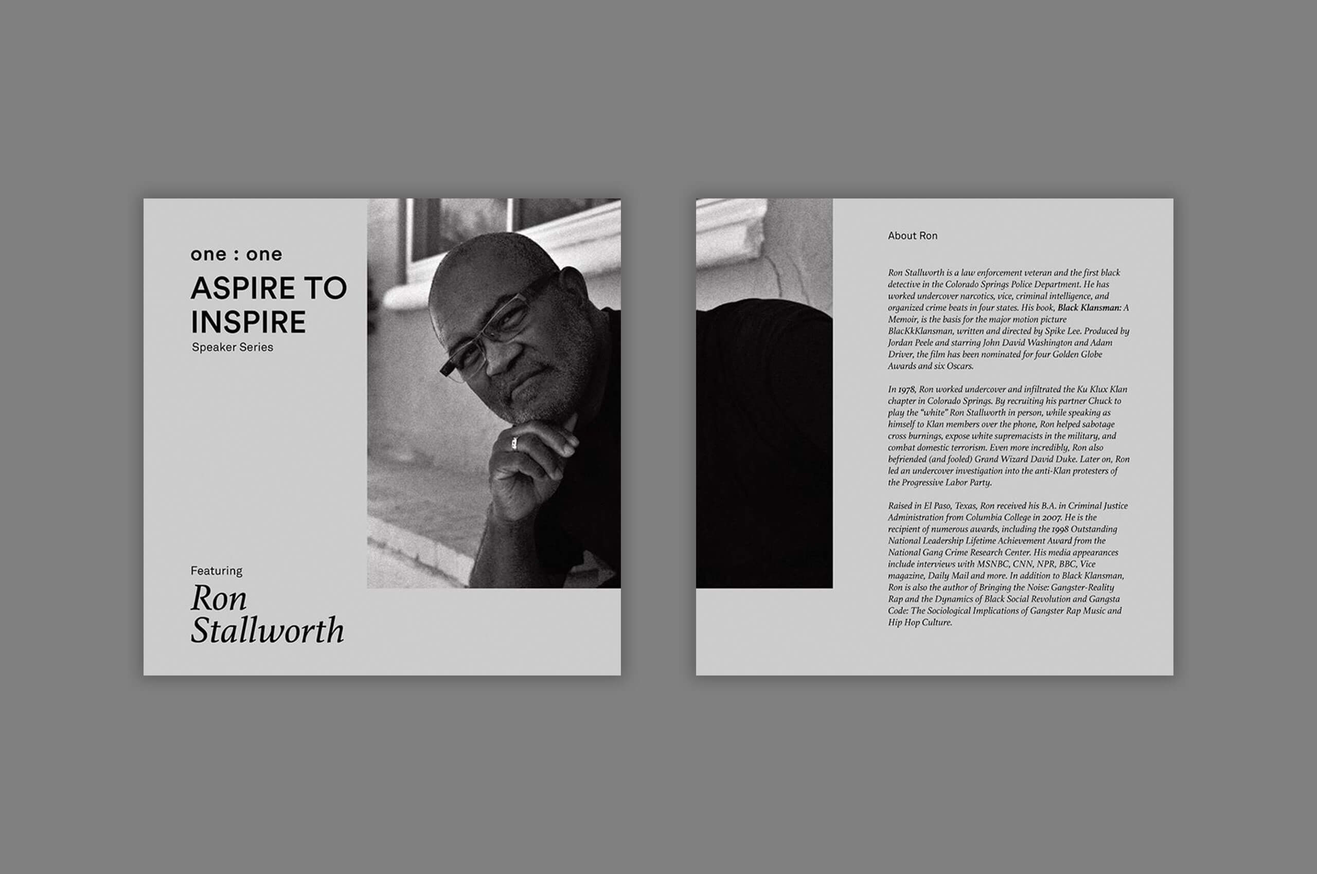
To differentiate itself from other local co-working spaces, One : One has created its own unique culture. Bringing together inspired and ambitious minds to come into contact through discourse, initiatives, seminars, workshops, and events for true collective growth.
When bringing the brand into the digital realm, color is leveraged to create intrigue and excitement in the feed around special events and talks. Creating something that would stand out against the normal palette.
Faithfully executed by the internal team, leveraging the brand.