Innovation Endeavors
Ten years after building the original identity, it was time to let the brand catch up to the firm Innovation Endeavors has become.
Ten years after building the original identity, it was time to let the brand catch up to the firm Innovation Endeavors has become.
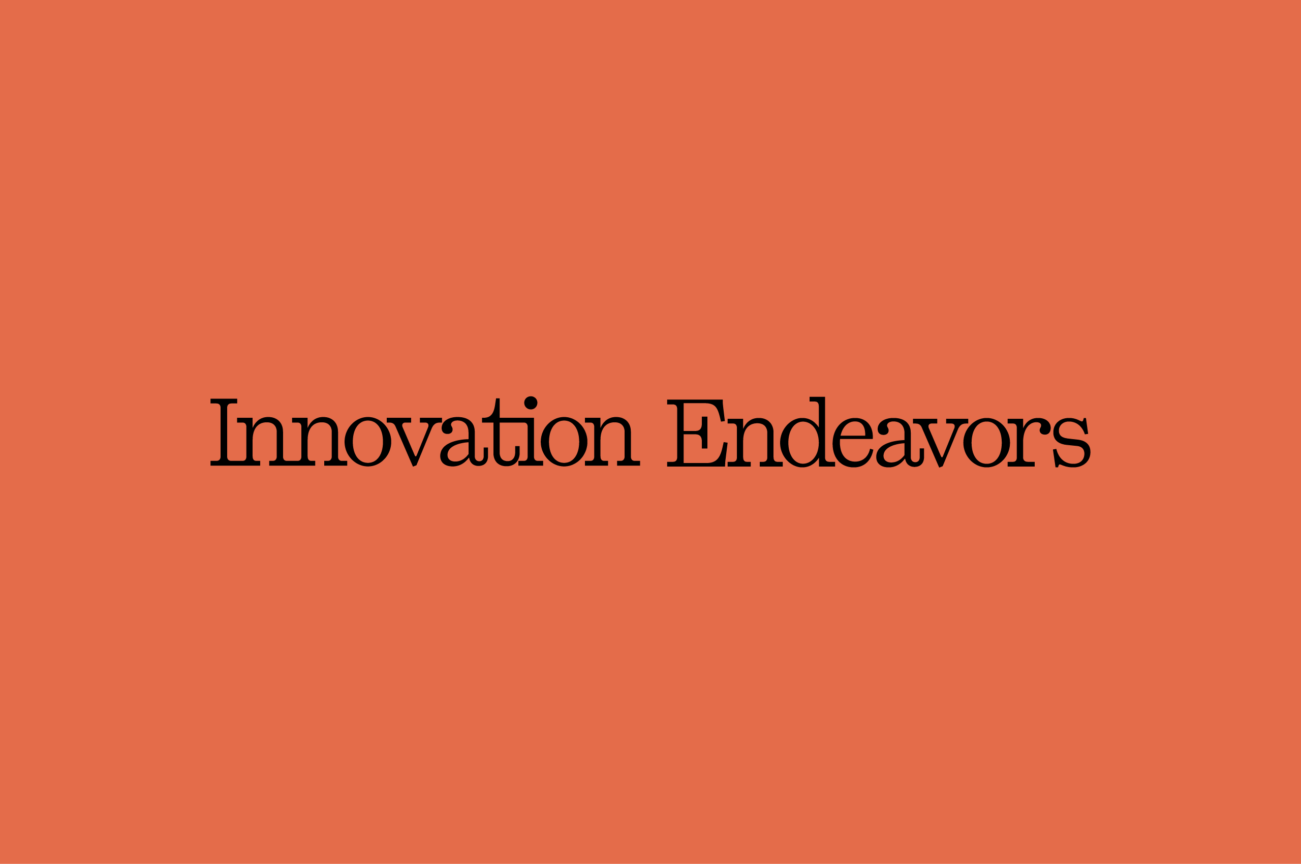
Ten years after creating the original identity, we returned to Innovation Endeavors with fresh eyes and a clear mandate: build a brand that matches the firm they’ve become and the work they’re doing to shape what comes next.
When we first worked with Innovation Endeavors, the firm was still defining itself. The identity we built served that moment well, giving them a foundation to grow into. A decade later, they’ve done exactly that. The portfolio has deepened, the perspective has sharpened, and the firm has earned a reputation that the original brand no longer fully expresses.
This wasn’t a rebuild from scratch. It was a refinement, deliberate and precise, rooted in what already worked. We updated the visual language to carry more weight, brought greater clarity to how the brand shows up across contexts, and created a system flexible enough to grow with them through the next decade.

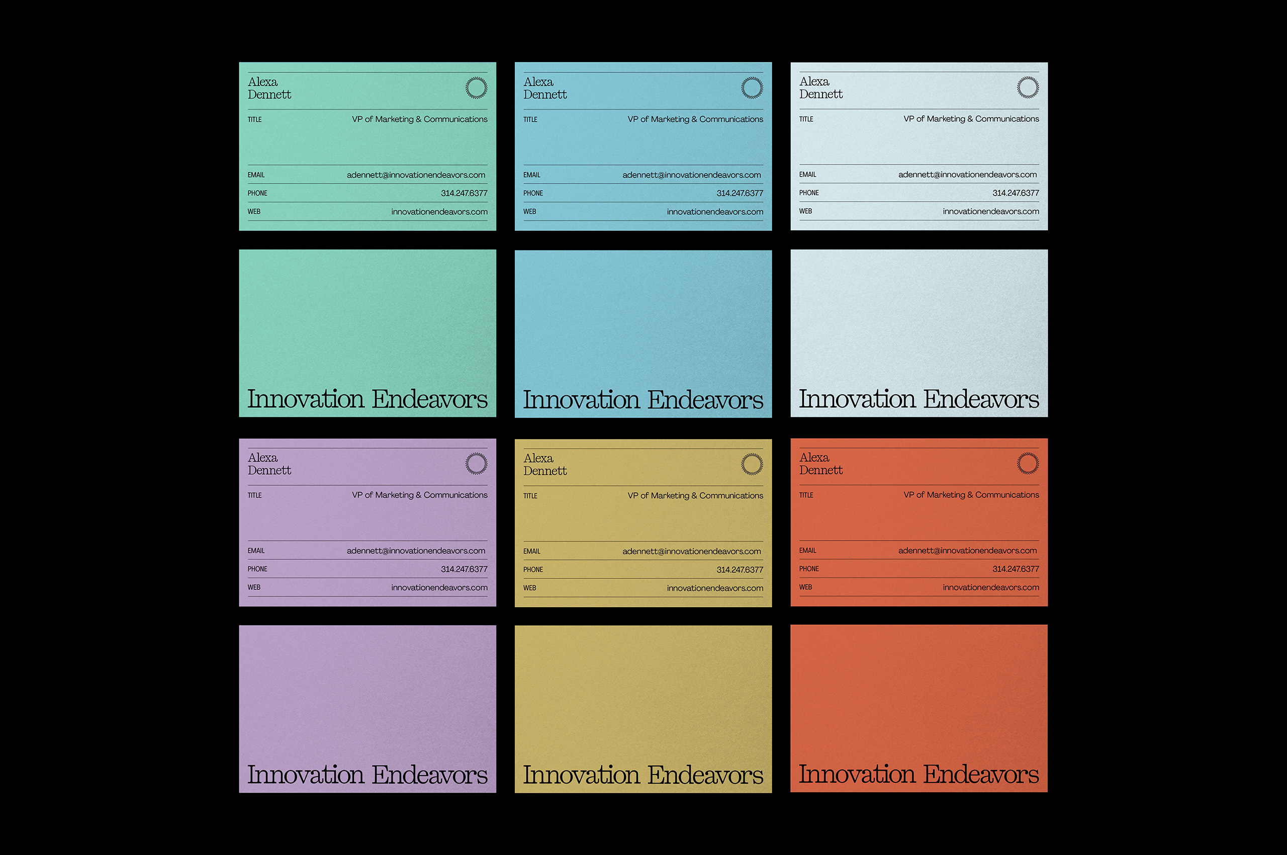
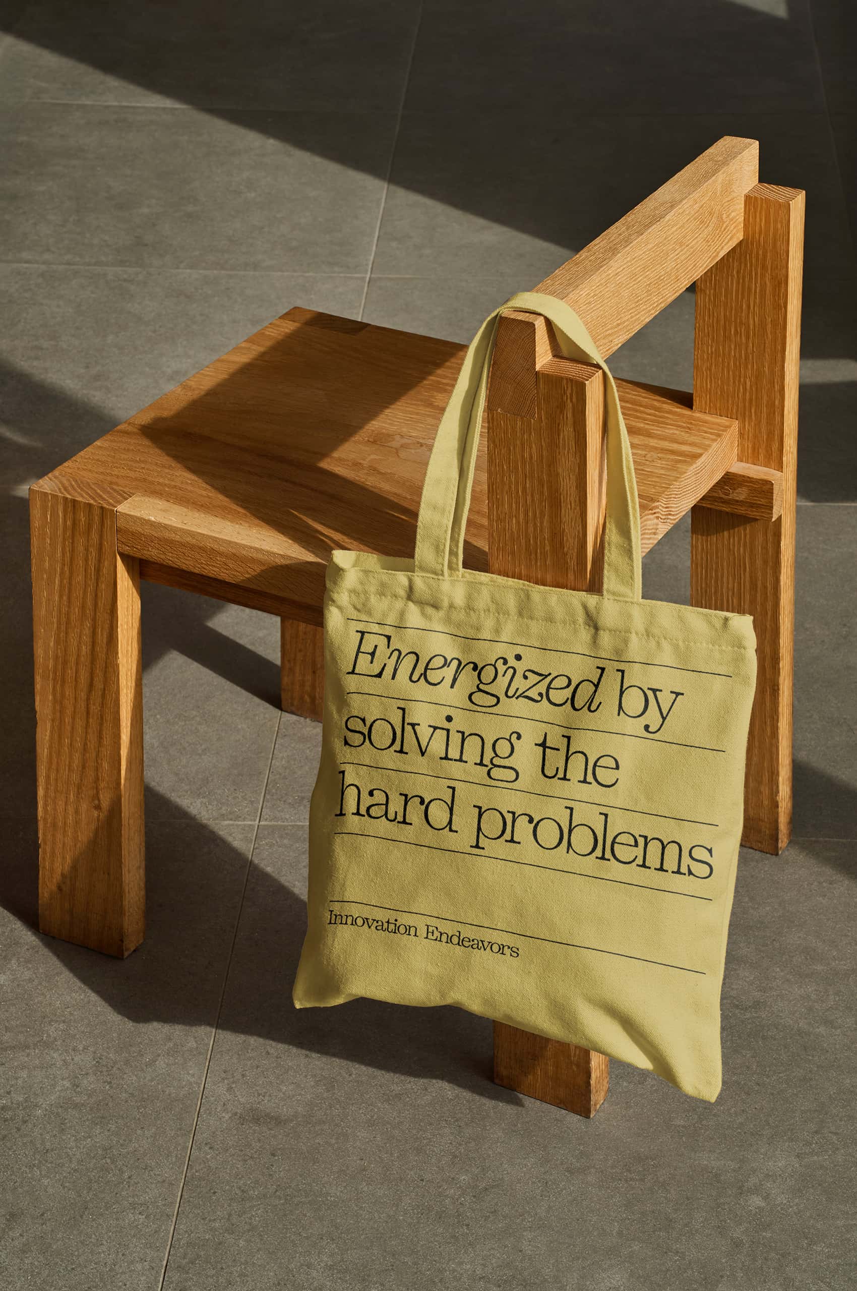
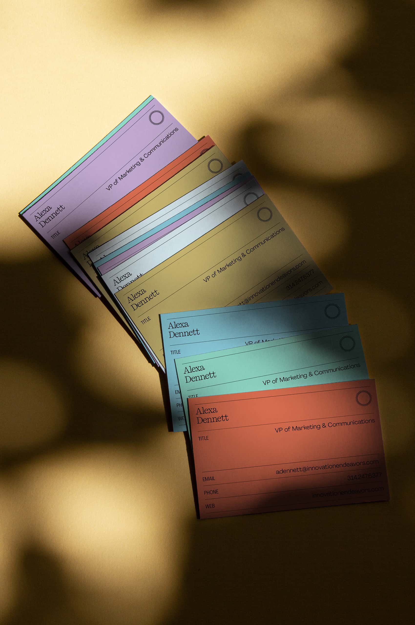
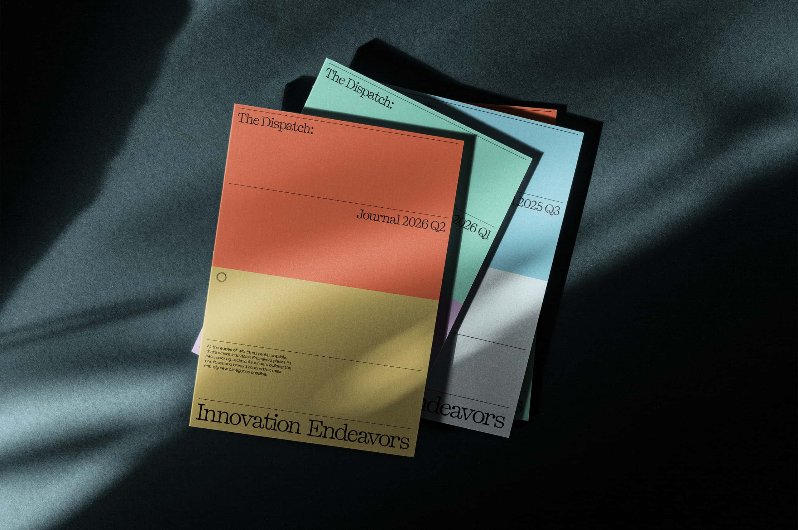
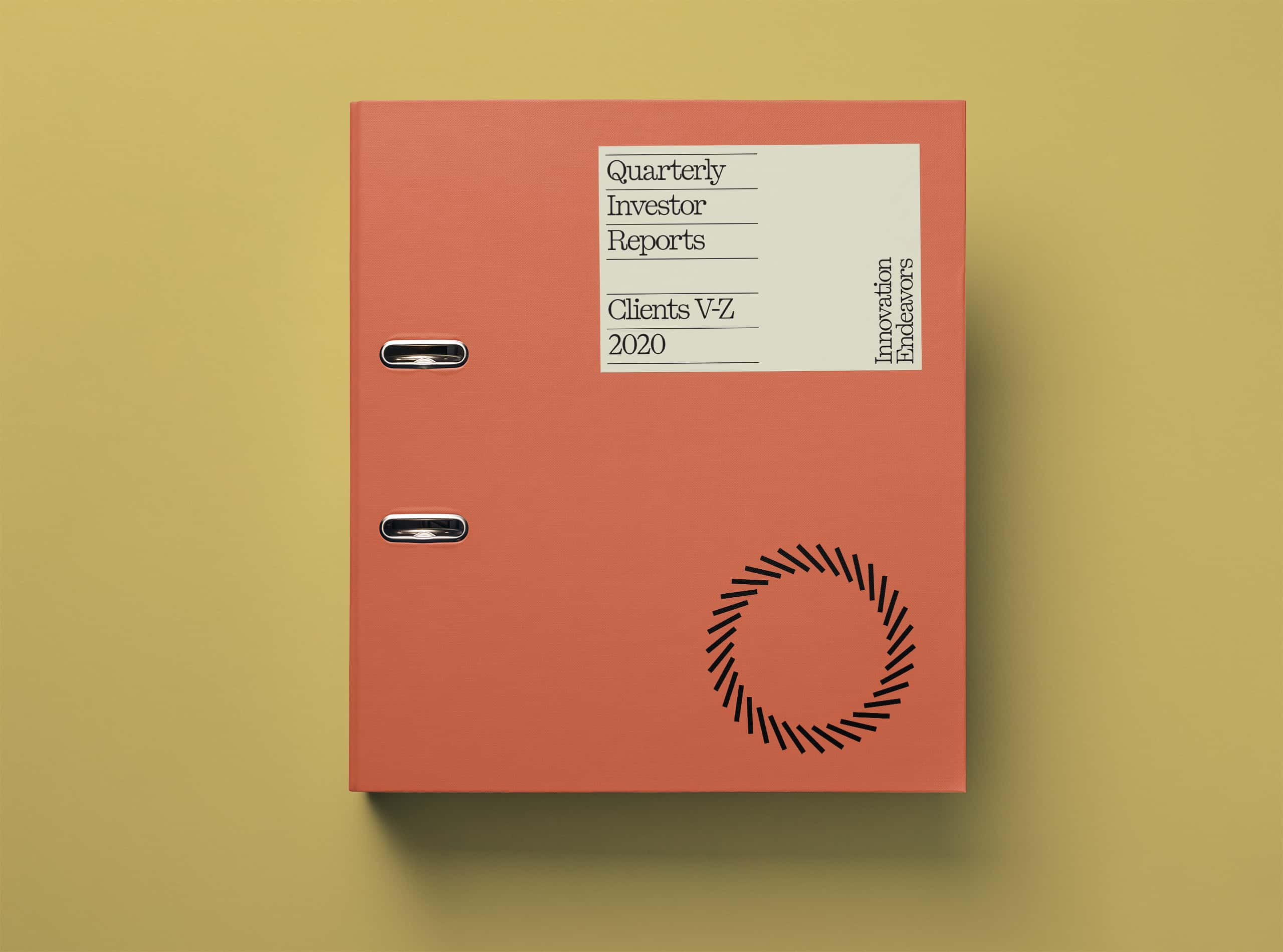
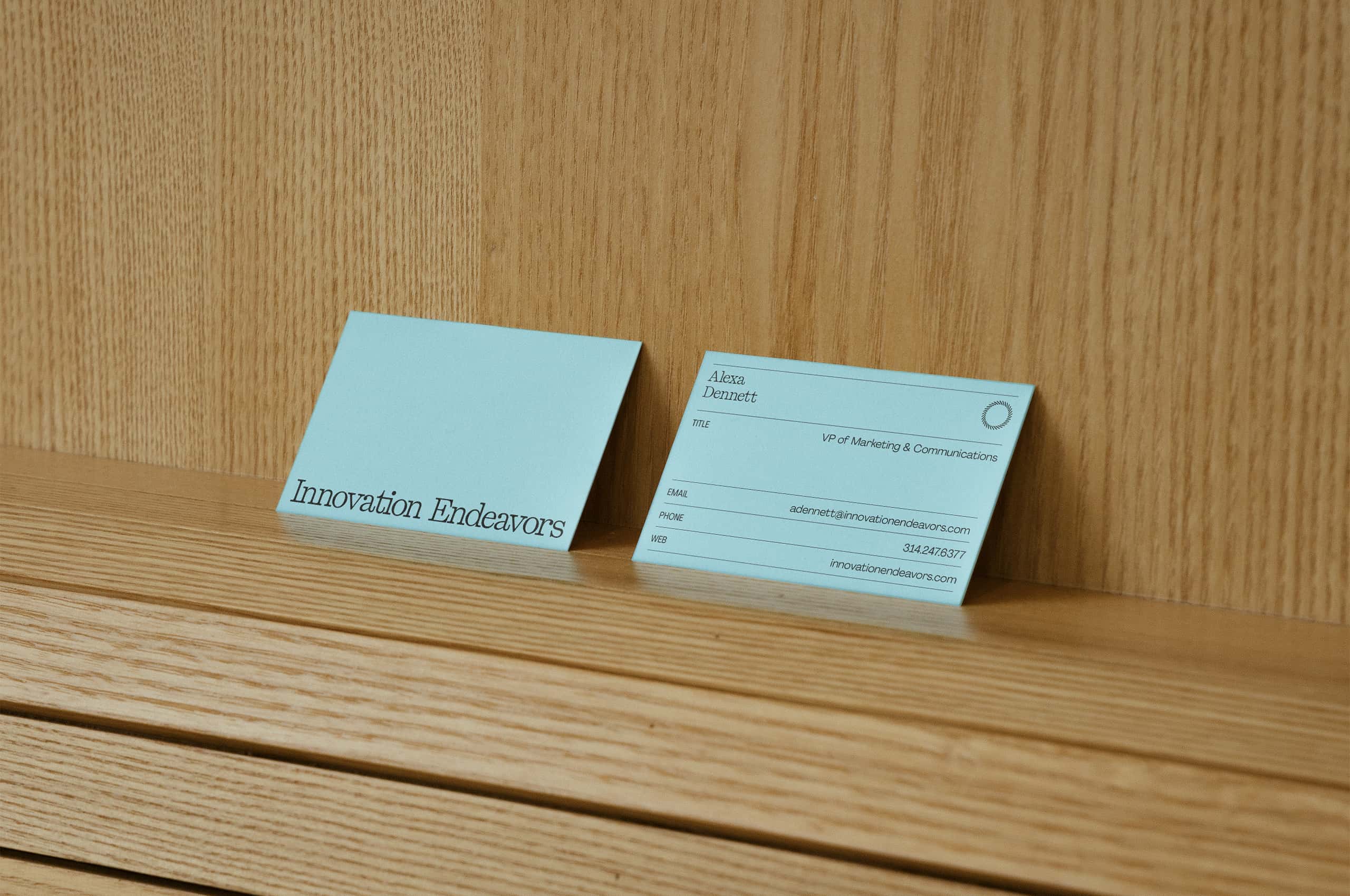

An evolution, not a rebuild. The original identity did its job well, but the fund has matured and its portfolio has grown more ambitious. The updated system trades early-stage energy for something more composed. Elegant, quieter, and built for where Innovation Endeavors is going next.
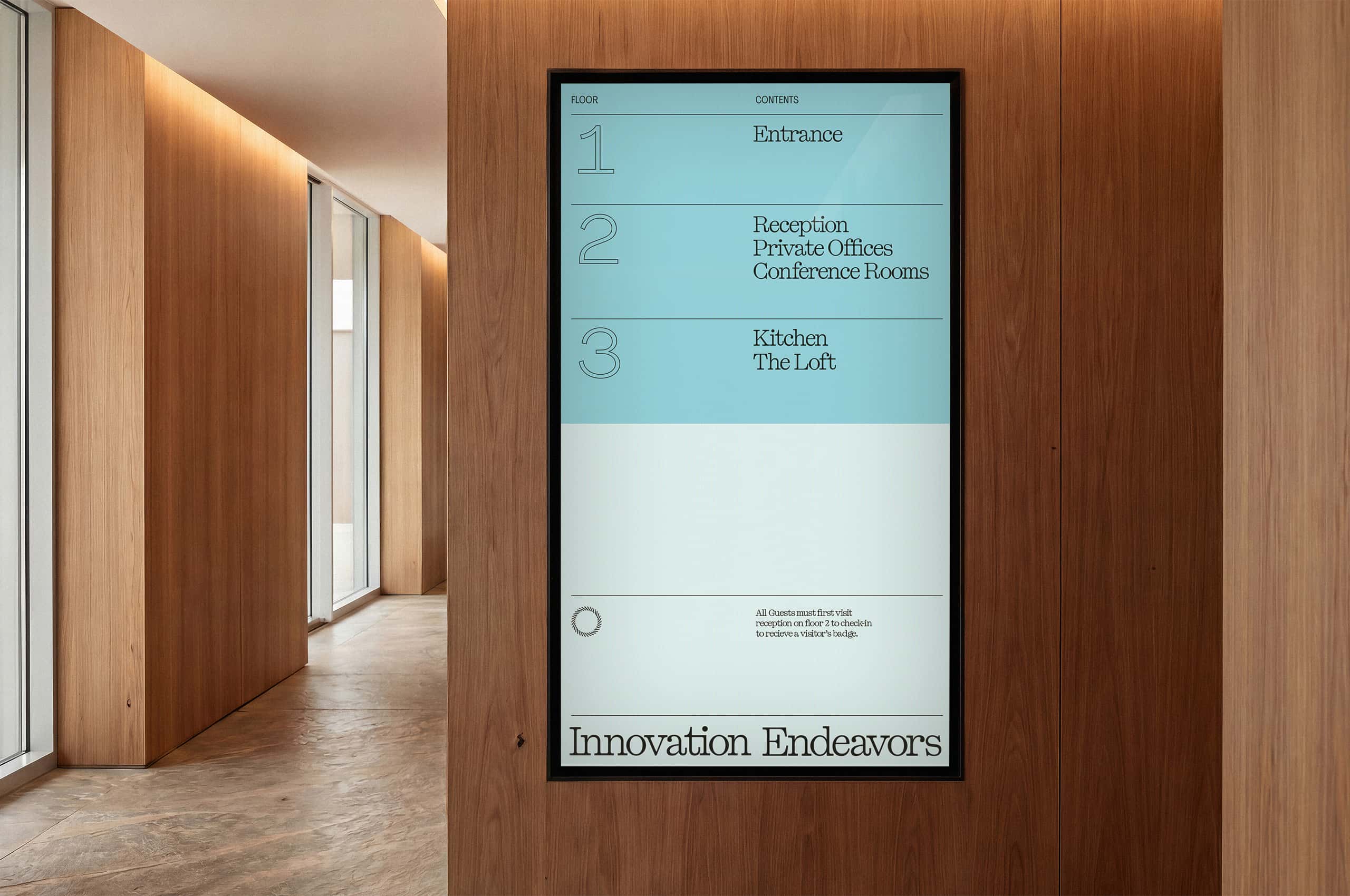
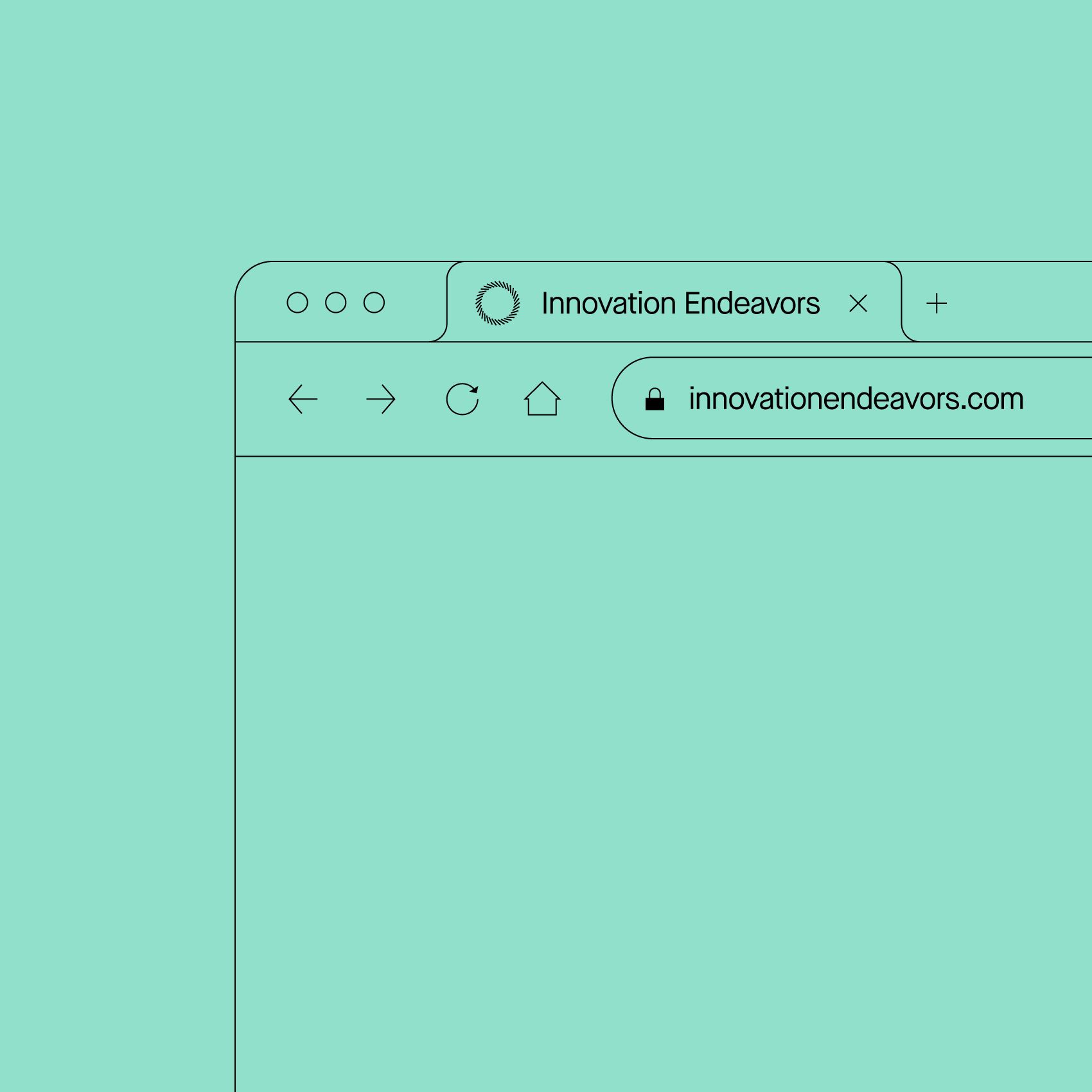

The symbol stayed. Nearly a decade of equity lives inside it, and it still holds up. Rather than reinvent, we preserved it as the anchor of the system and rebuilt everything around it. Recognition is hard-won, and this mark has earned it.
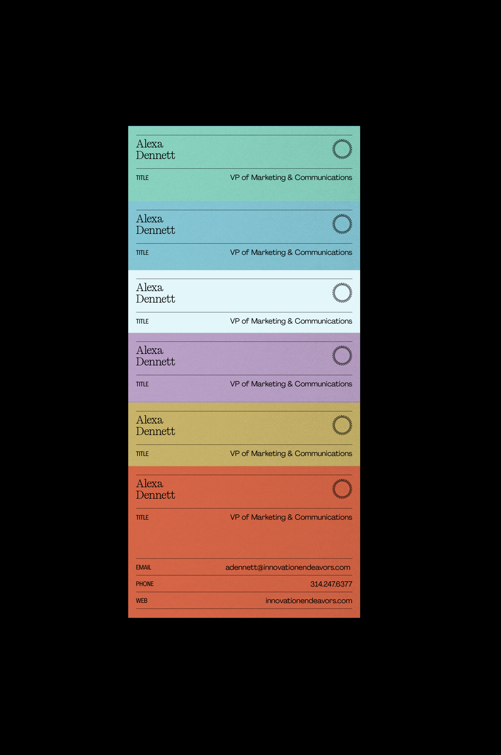
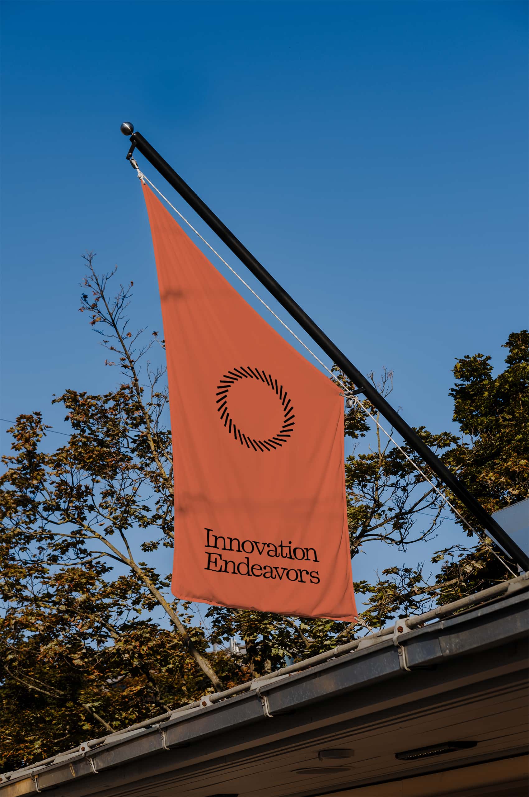

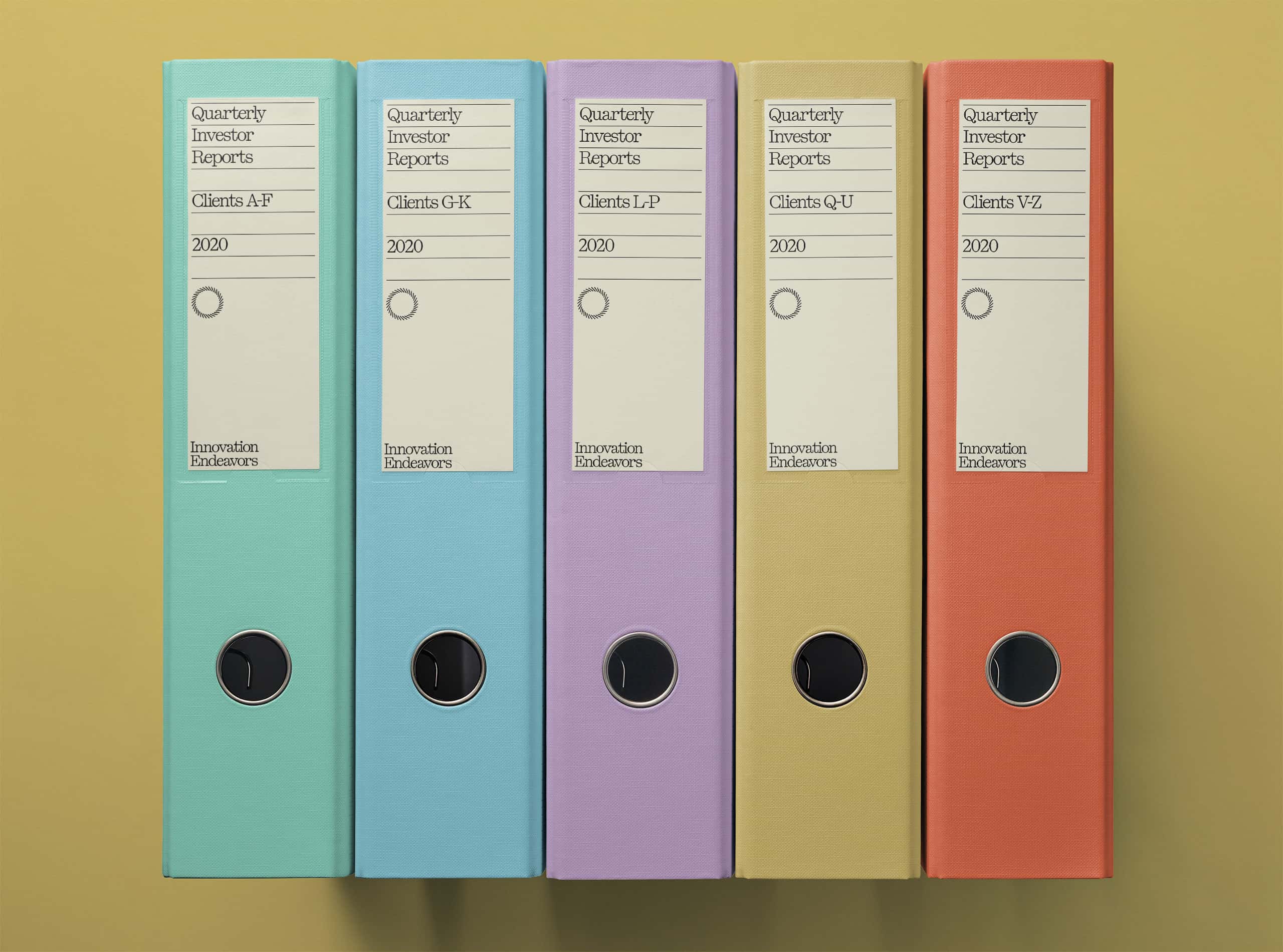
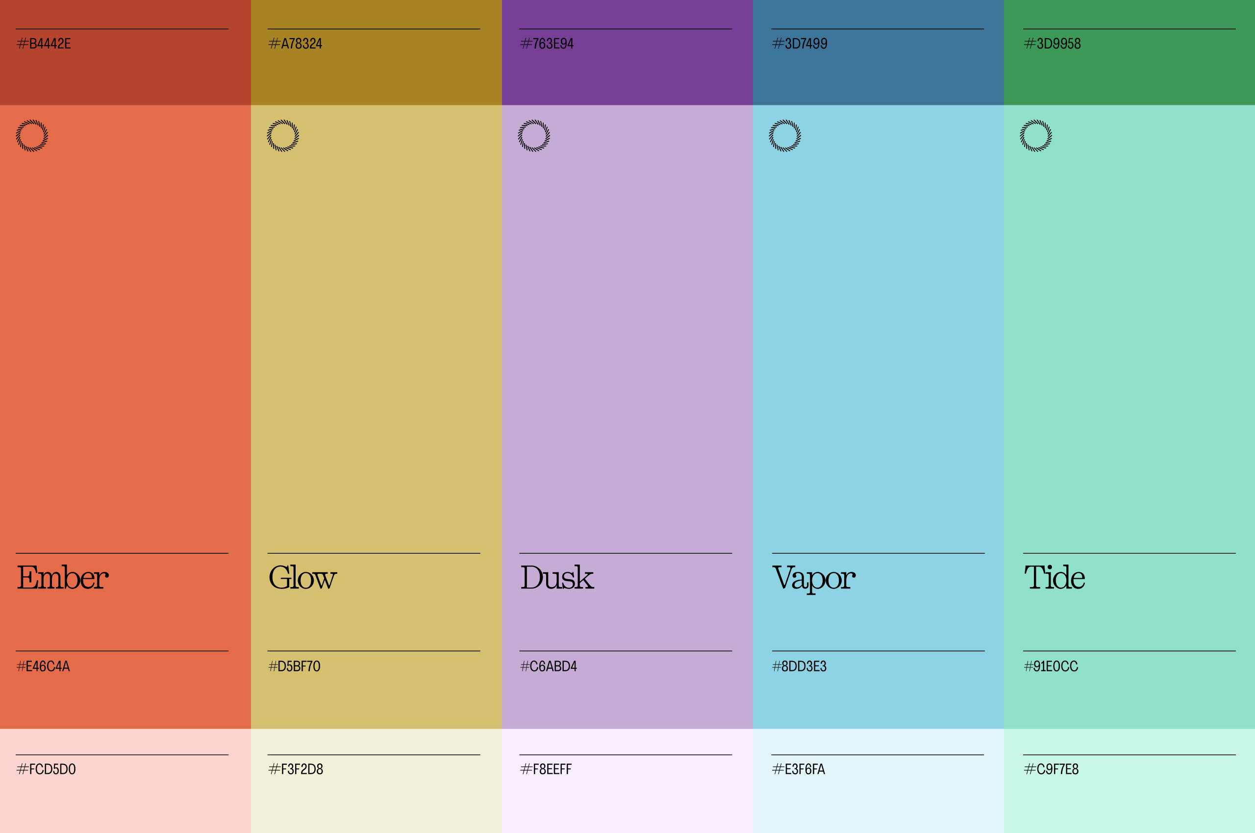
The original blue and green stayed at the core. We pulled the saturation back and expanded the range around them, trading bright and technical for refined and mood-driven. The result reads as considered rather than corporate, with enough range to move between quiet and confident.
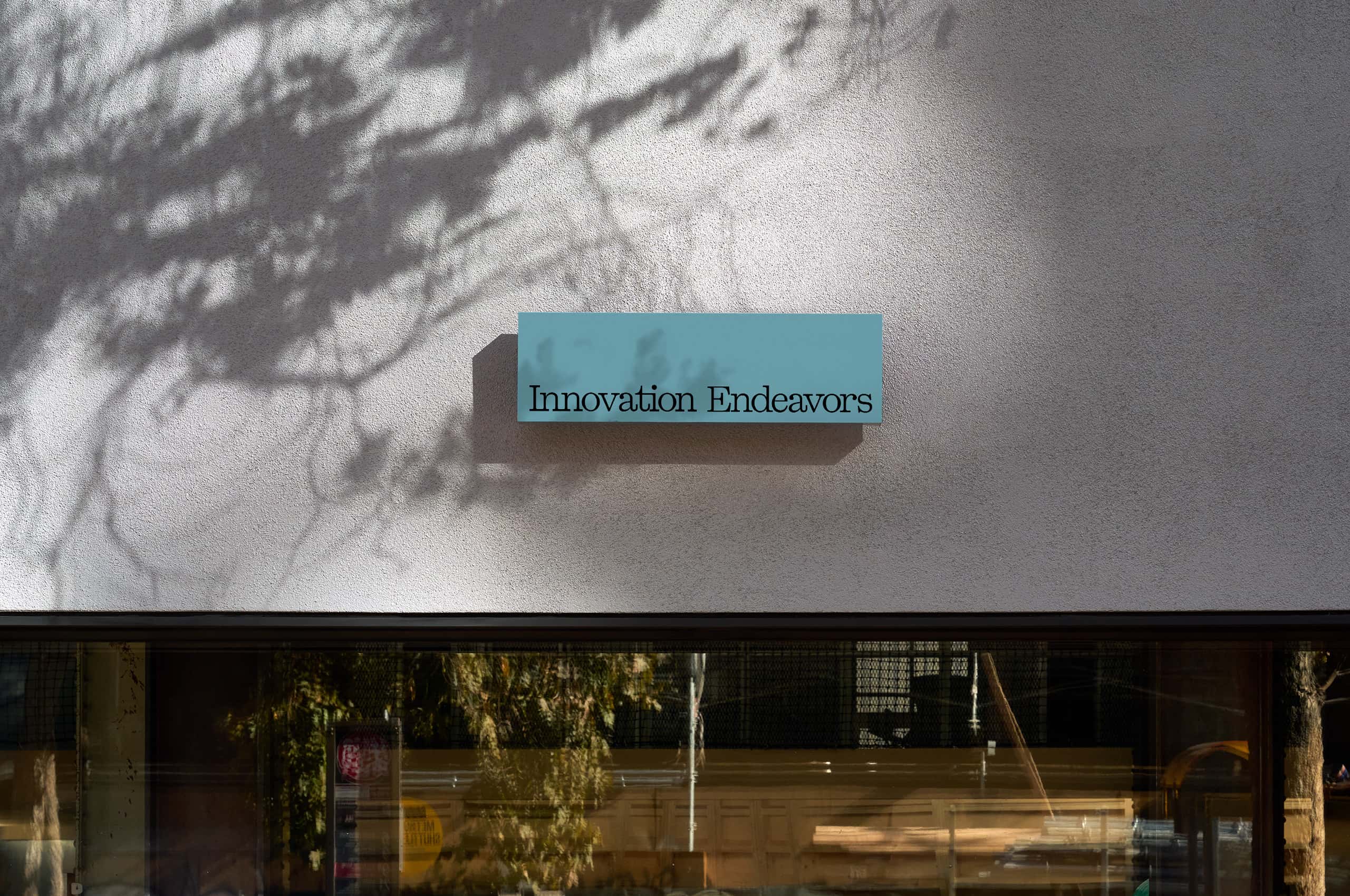

The previous wordmark leaned technical. This one leans elegant. Cleaner letterforms, better proportions, and a rhythm that sits closer to an old imprint than an engineering firm. It reads like the fund thinks: precise, but never cold.
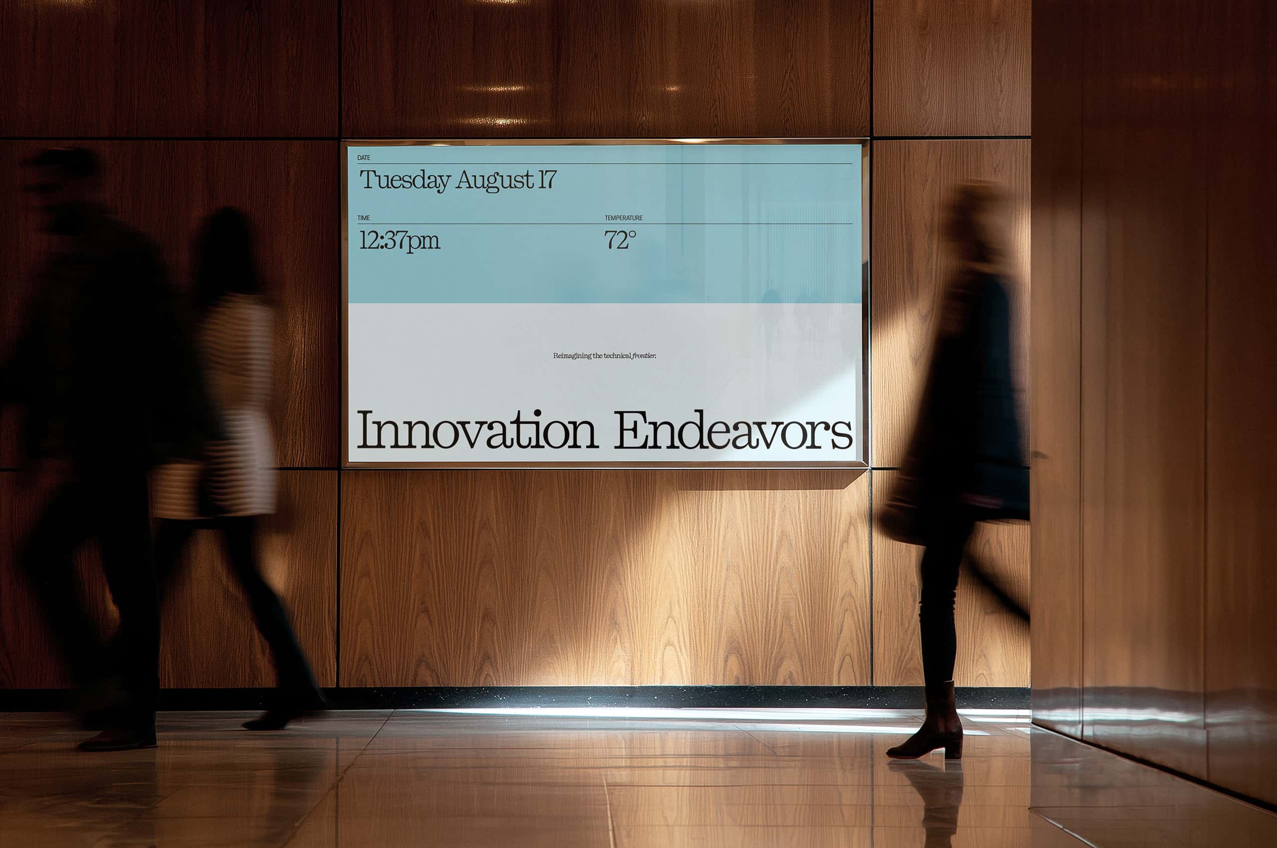

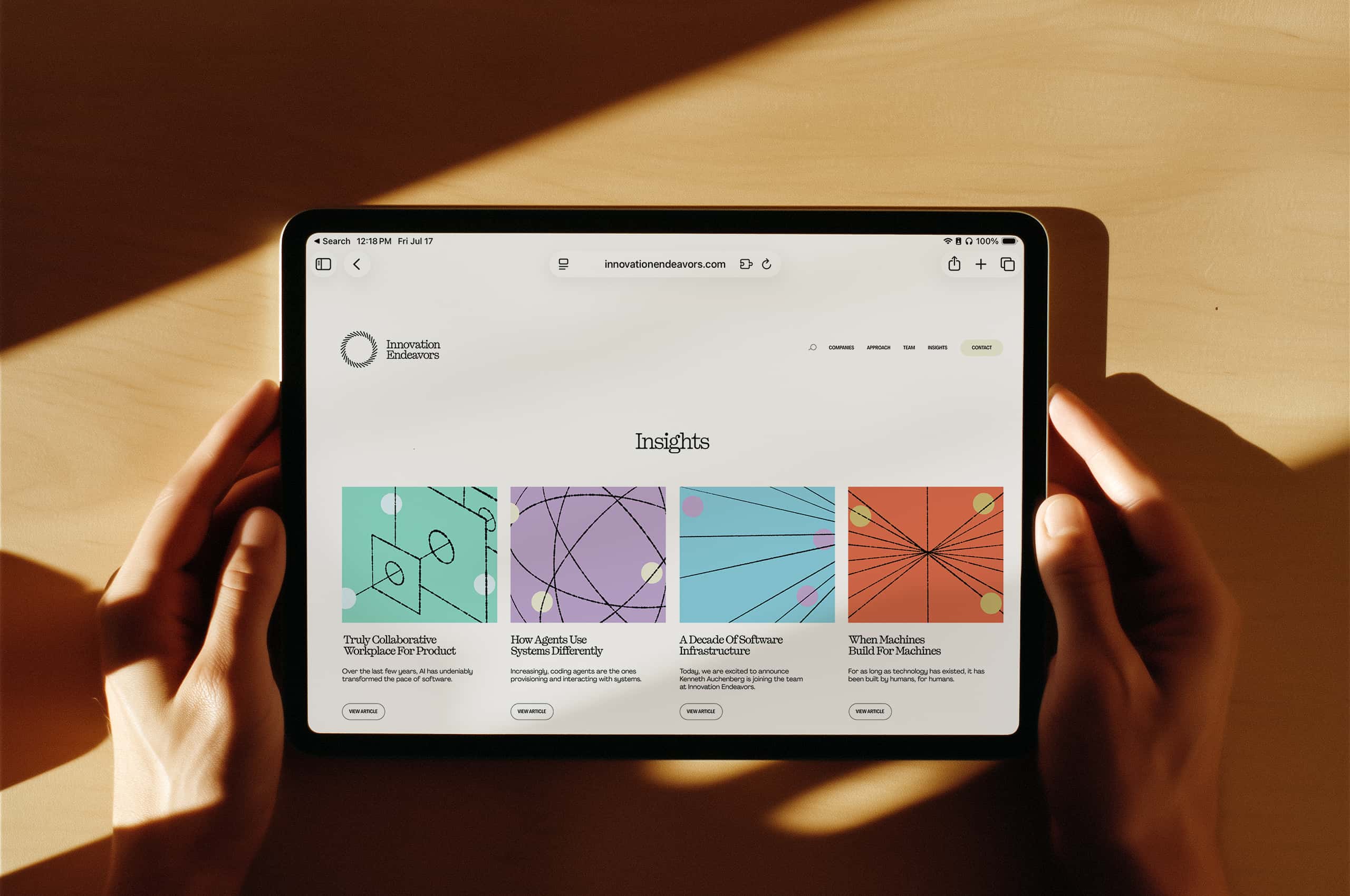
The site had to hold two things at once: the seriousness of an established fund, and the ingenuity of the companies it backs. We built a sleek, quiet framework and let illustration carry the character. The result feels like a firm you’d trust with a company, and one you’d want in the room while building it.

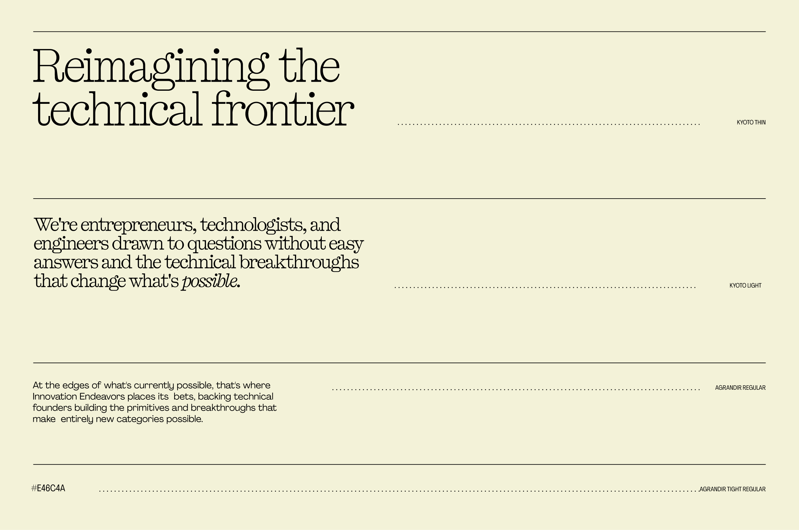

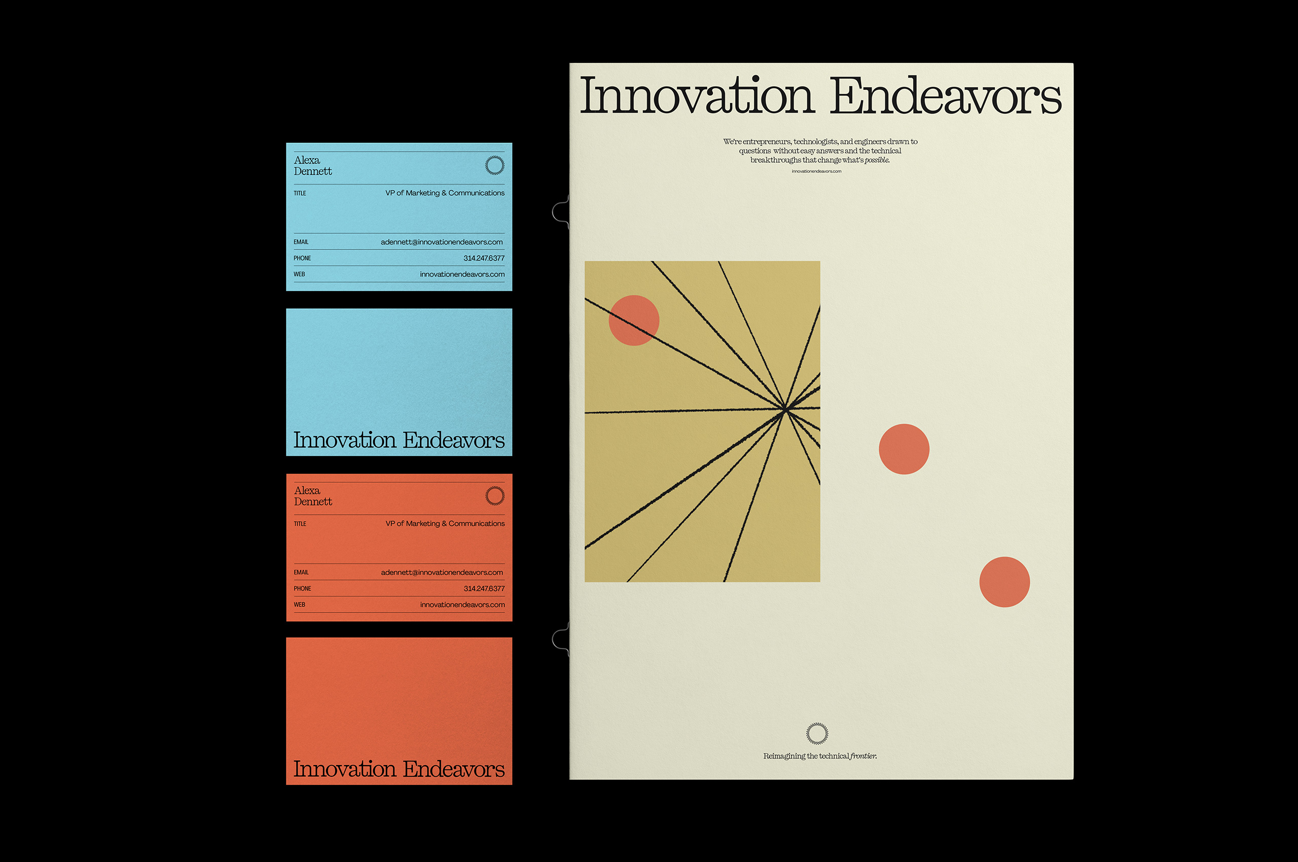
We created a ruled-line system to give the typography a place to live. Inside it, Kyoto does the heavy lifting. It anchors each composition with editorial weight, while the lines hold everything in place beneath it. The pairing gives the brand a rhythm closer to a masthead than a slide.
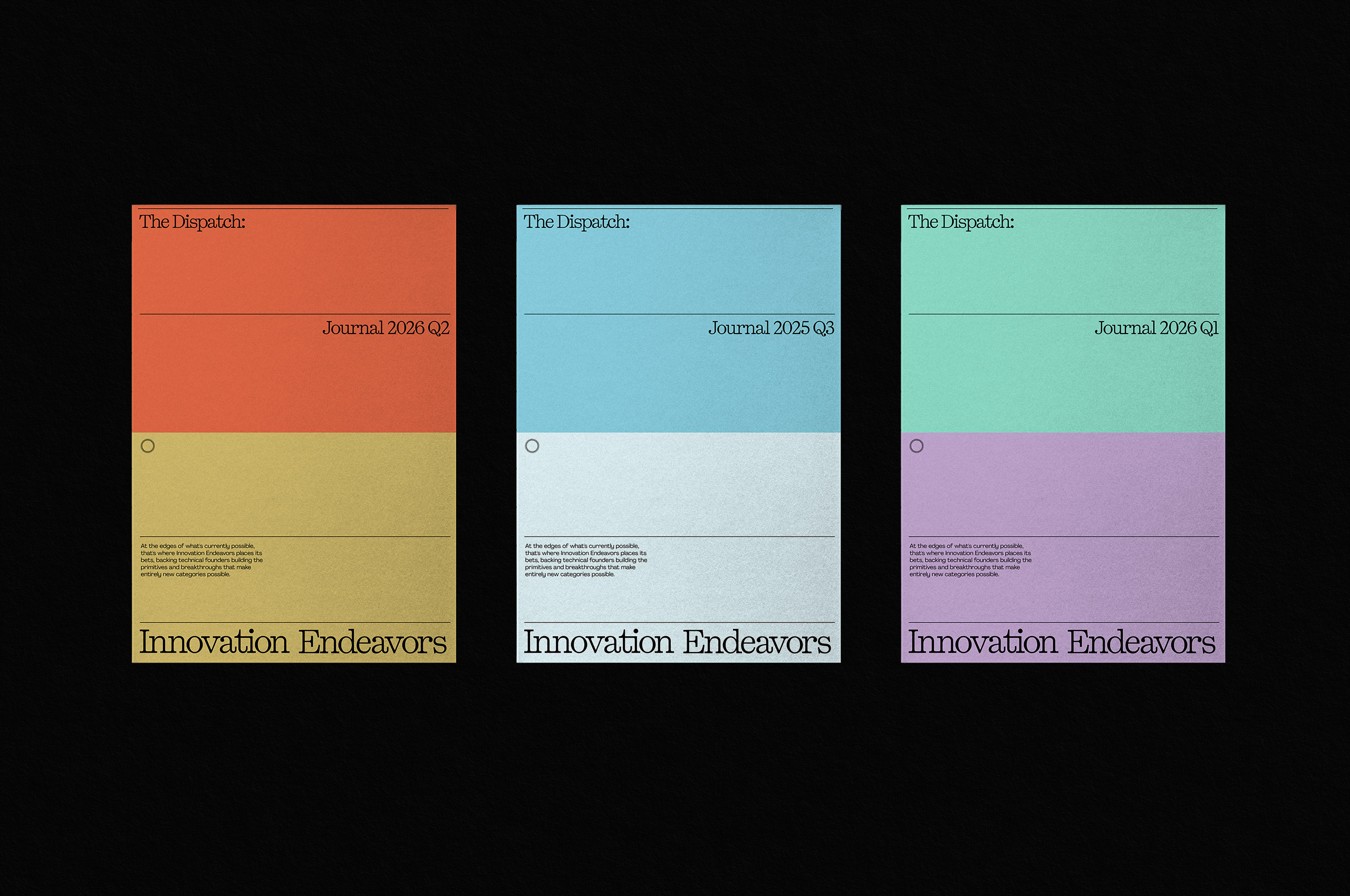
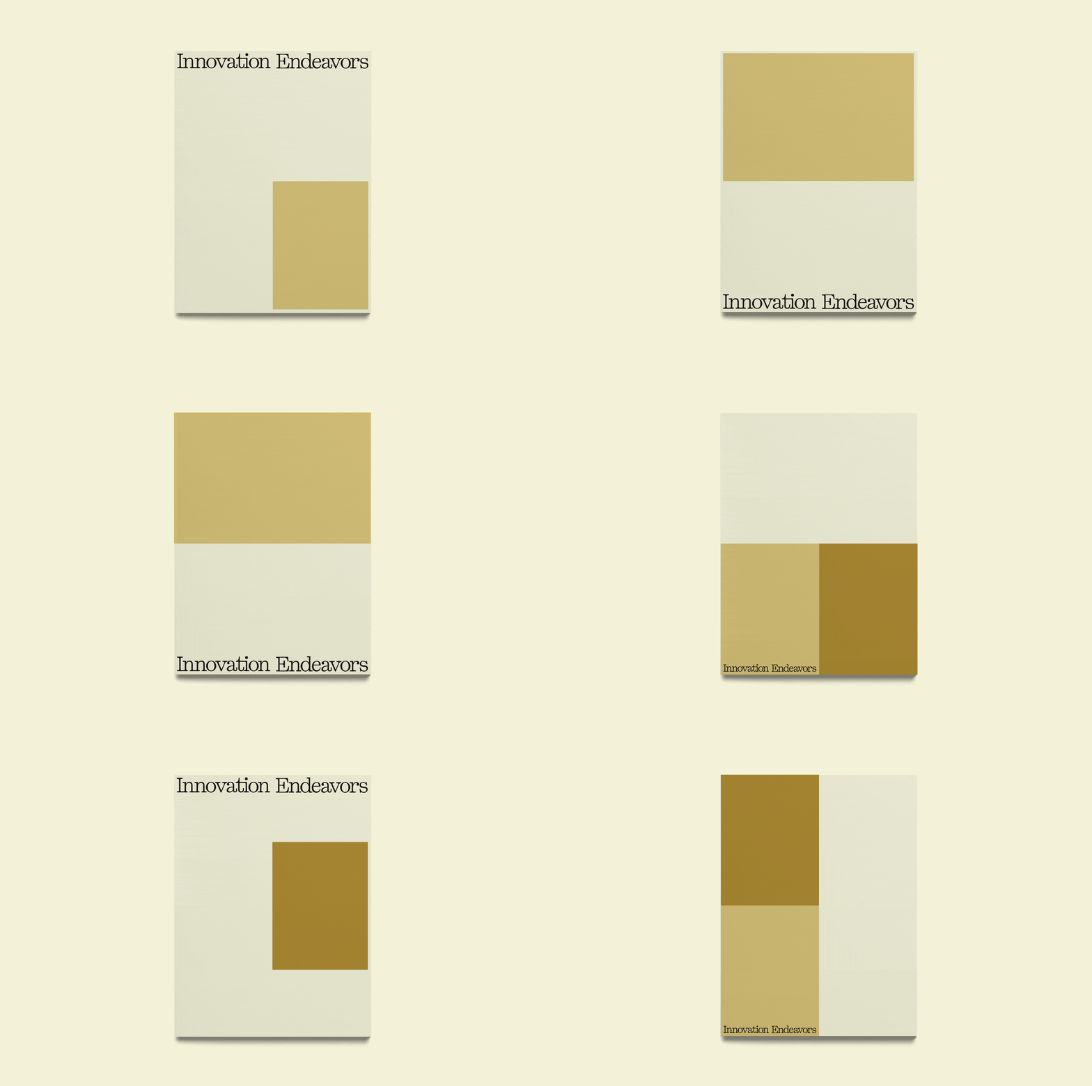
A four-part grid built for impact. It gives the brand a structural language that can hold anything from a single quote to a full portfolio spread, and gives designers a clear way to build hierarchy without losing composure. Simple bones, strong presence.
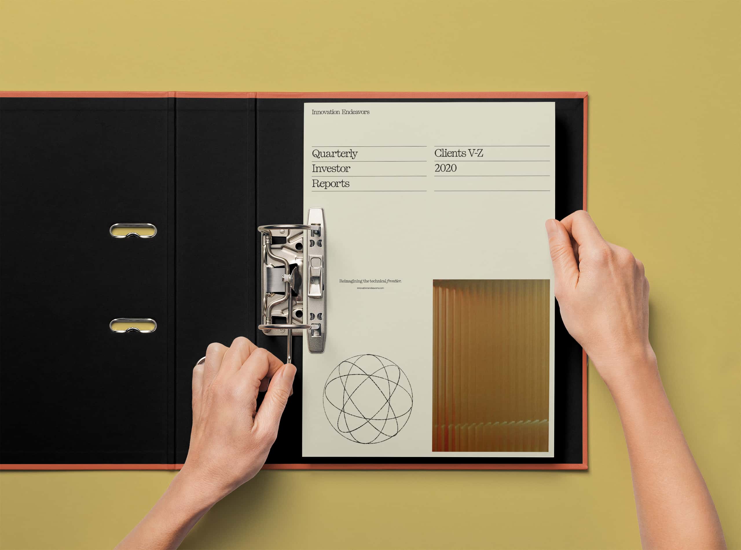


Illustration is where the brand gets to feel. Hand-drawn linework, loose but intentional, carrying the curiosity and optimism of the founders Innovation Endeavors backs. It softens the system and gives the fund a voice that reads warm without losing weight.

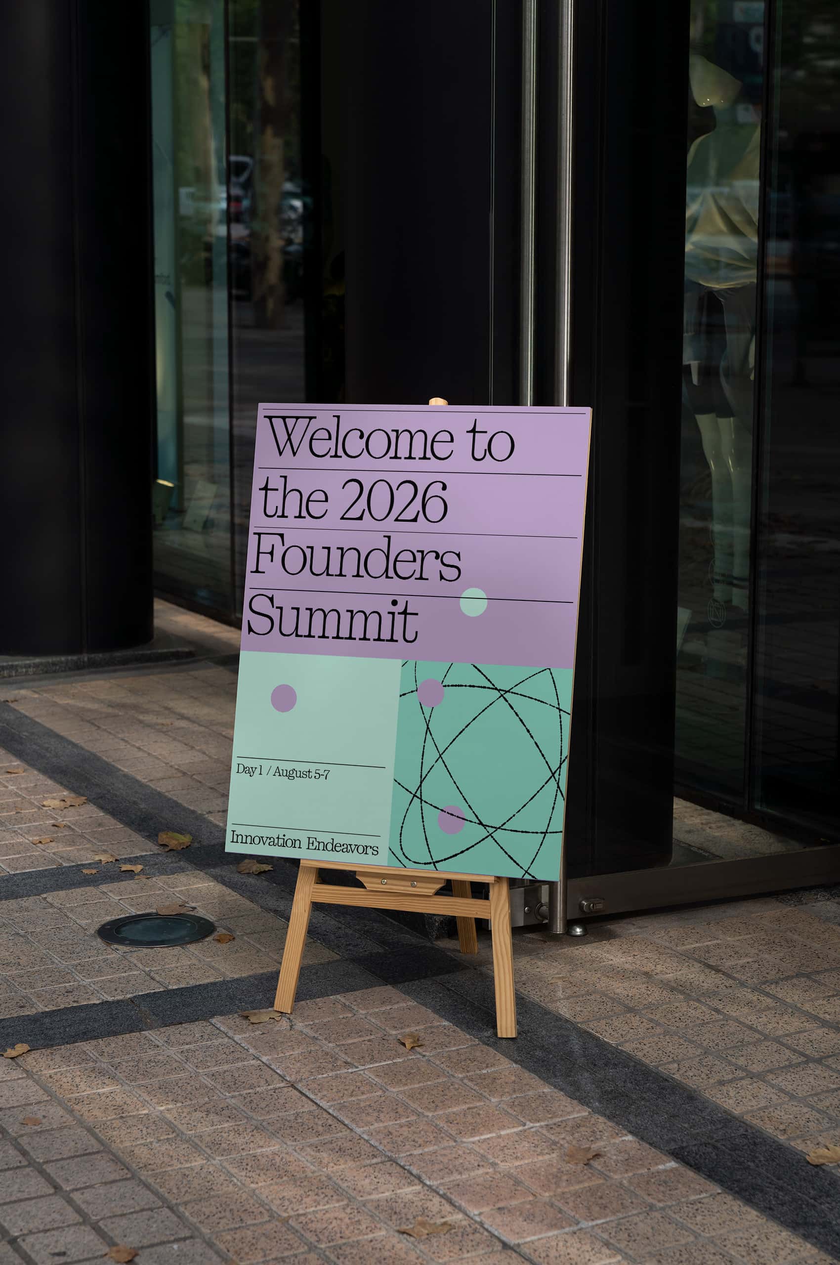
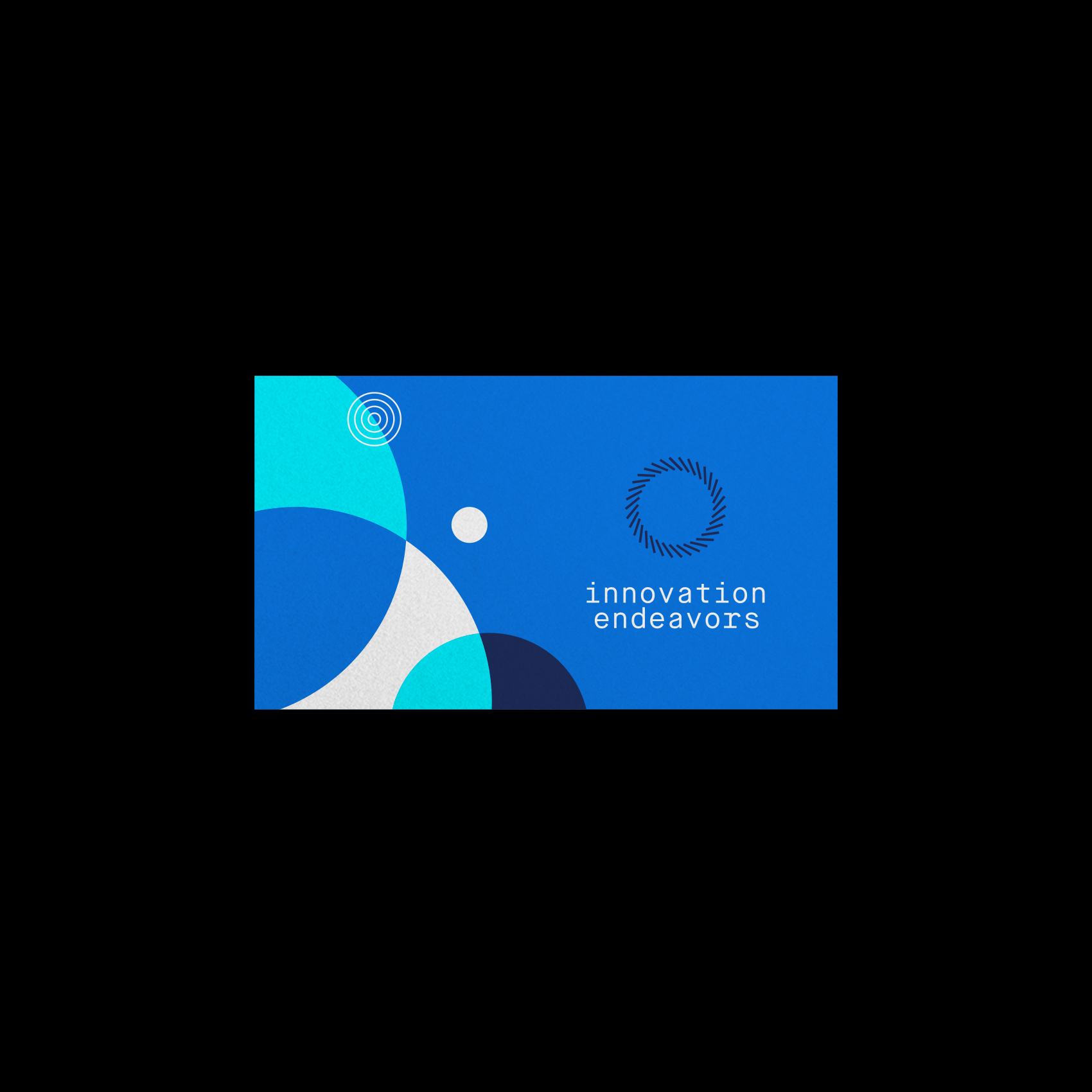
The old illustration system was built around circles, moons, and orbits. The new one keeps the circle and lets the rest go. It reappears throughout the linework as a fixed point, a quiet anchor threading one era of the brand into the next.