COHO
Coho is a global climate adviser dedicated to helping its clients navigate unique complexities and take ambitious steps on their climate journey.
Coho is a global climate adviser dedicated to helping its clients navigate unique complexities and take ambitious steps on their climate journey.
Coho is a global climate adviser committed to developing meaningful and enduring partnerships with their clients—delivering near and long-term end-to-end support to ensure their success. Working with clients such as universities to municipalities, Coho is adept at change management—first understanding the nuanced challenges individual organizations face, then modifying solutions to ensure executable, successful outcomes. They are dedicated to helping their clients navigate the unique complexities of renewable energy to help them take ambitious steps forward along their climate journey.
After 40+ years in the industry operating under the name Customer First Renewables, they decided it was high time to make a change. This change began with a new name; while their name served them in the past, it became more burdensome to carry into the modern landscape. Mast was brought on by strategists Brigette Connell and Ned Connolly to help translate their strategy and name into a cohesive brand. We worked closely with the Coho team as well as Connell and Connolly to create a brand that aligns with their bold goal of “doing everything in their power to embolden organizations to rapidly reduce climate impact.”
Collaborators:
Strategy: Brigitte Connell & Ned Connolly
Naming: Ned Connolly

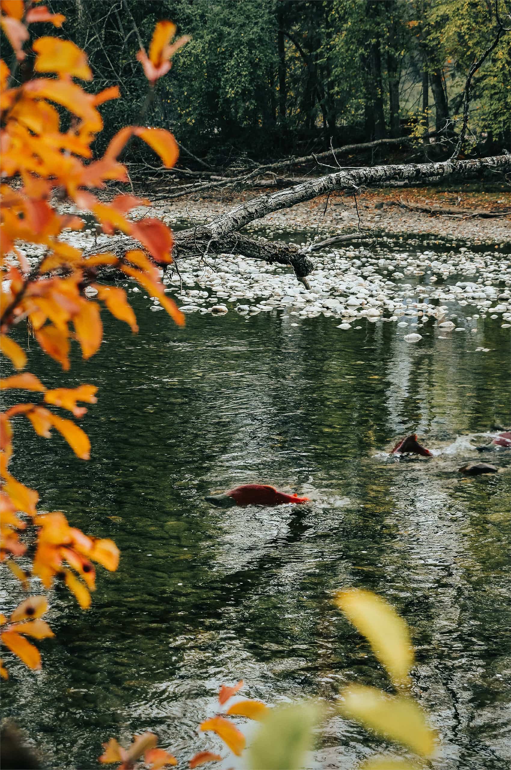
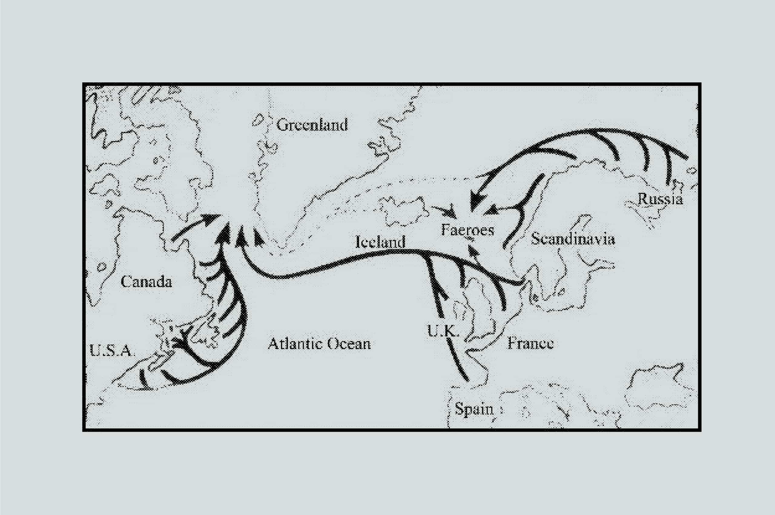
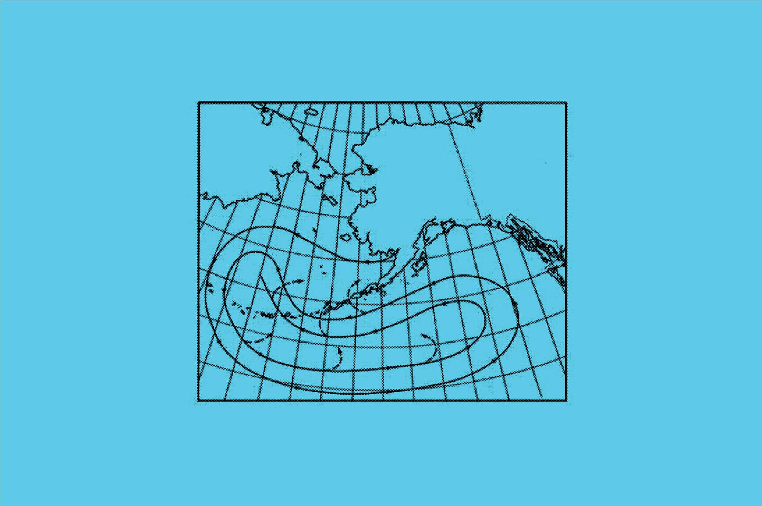
The Coho salmon is a story of Transformation, Determination, and Preservation. They cover an immense range—running along both sides of the North Pacific Ocean, from Japan and eastern Russia to mainland Alaska and northern California. But what makes them most impressive is their awe-inspiring ability to transform themselves, in both color and physical attributes, to make the transition from saltwater to freshwater successfully. All while going against all forces—swimming upriver, against the current—to lay its eggs and ensure its species lives on for future generations.
The name captures the ability to Transform—both in terms of how the company helps clients transform their businesses and their climate impact on the world, as well as the company’s ability to adapt to the ever-changing dynamics of any given client relationship or undertaking. But more importantly, the name is representative of the company and its people’s unrelenting Determination… to go against “the current” of the modern industrial era… to never give up in its efforts to help organizations reverse course and rapidly reduce their climate impact. The Transformation, the Determination… it’s all for the Preservation of our earth and humankind’s existence on it.

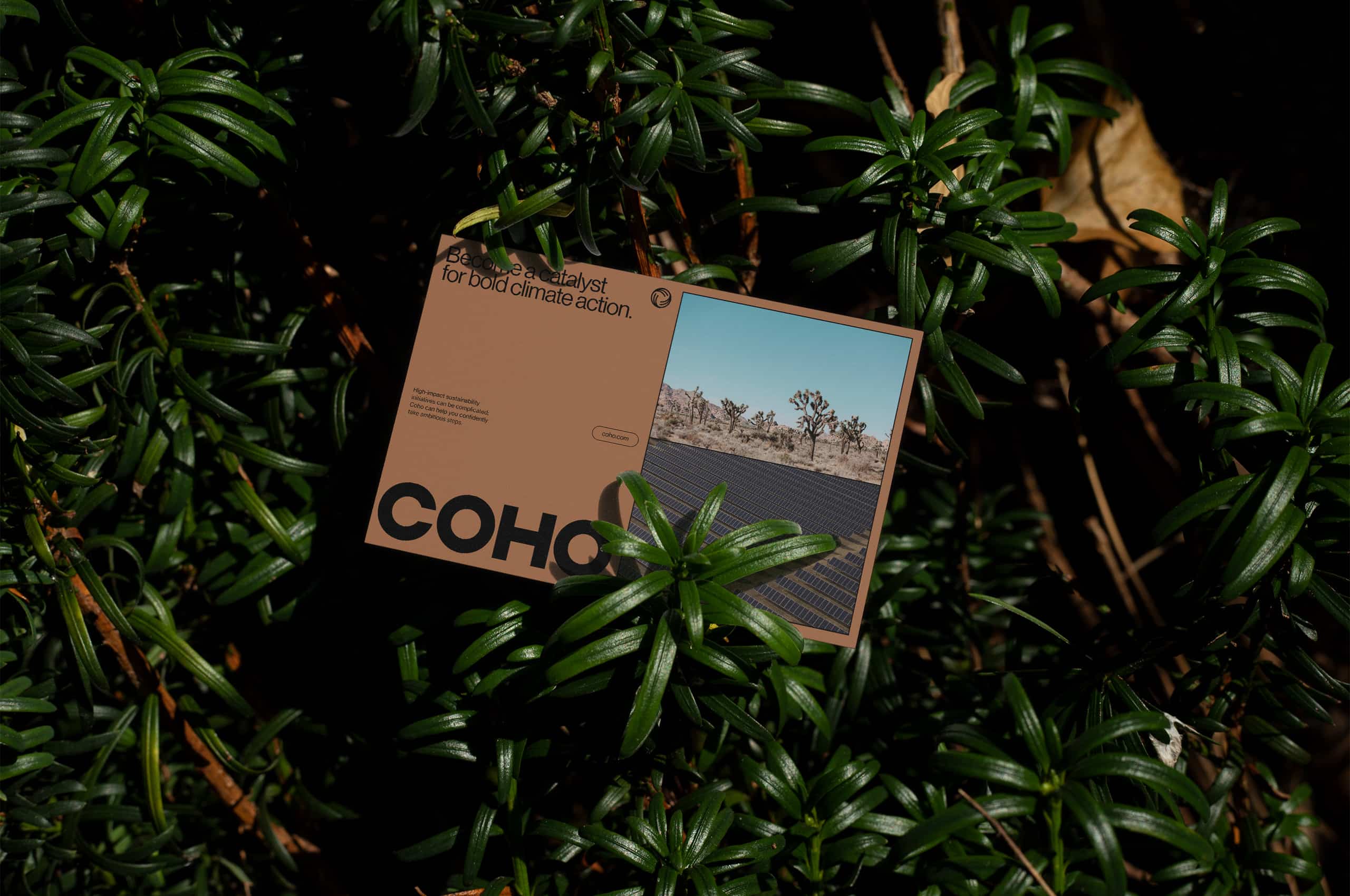
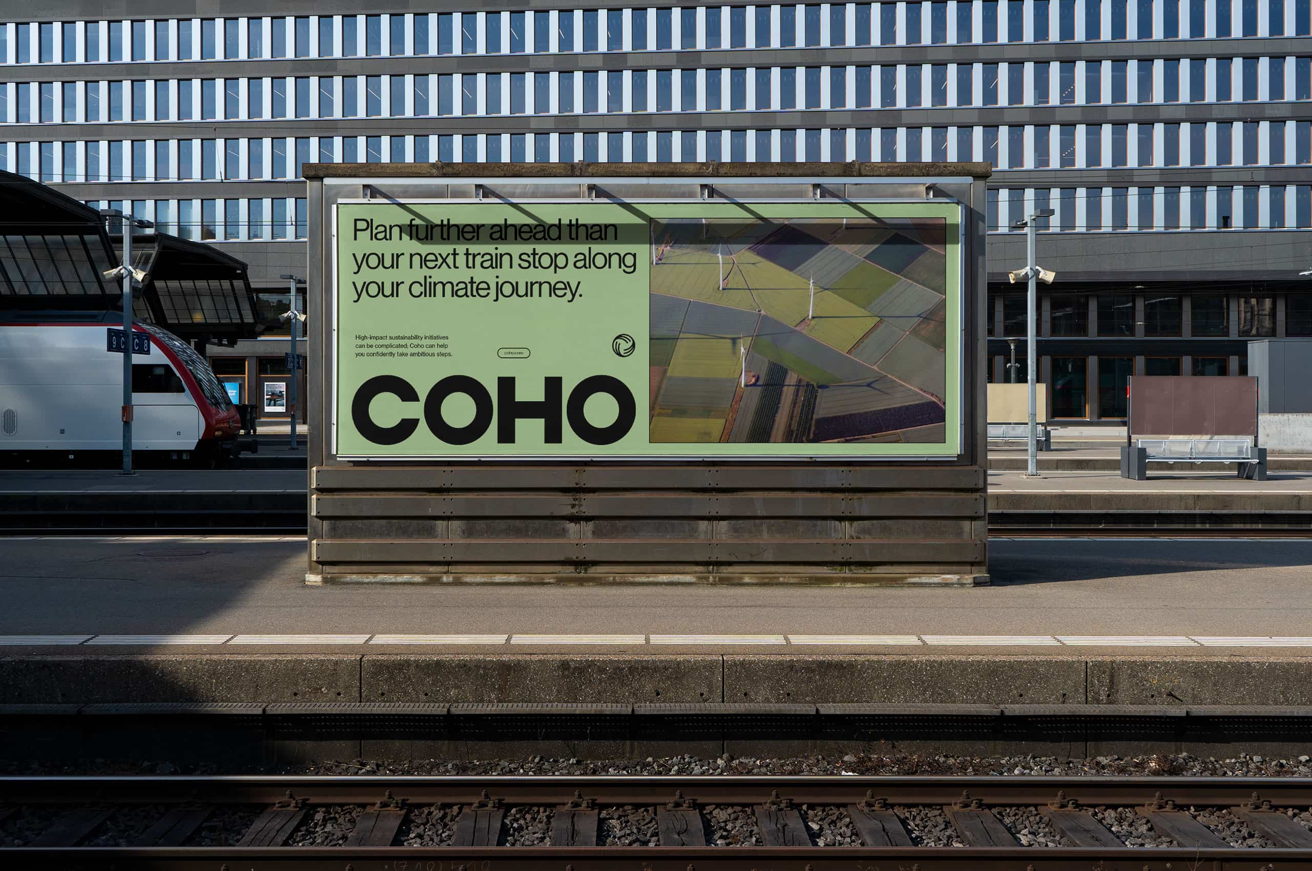
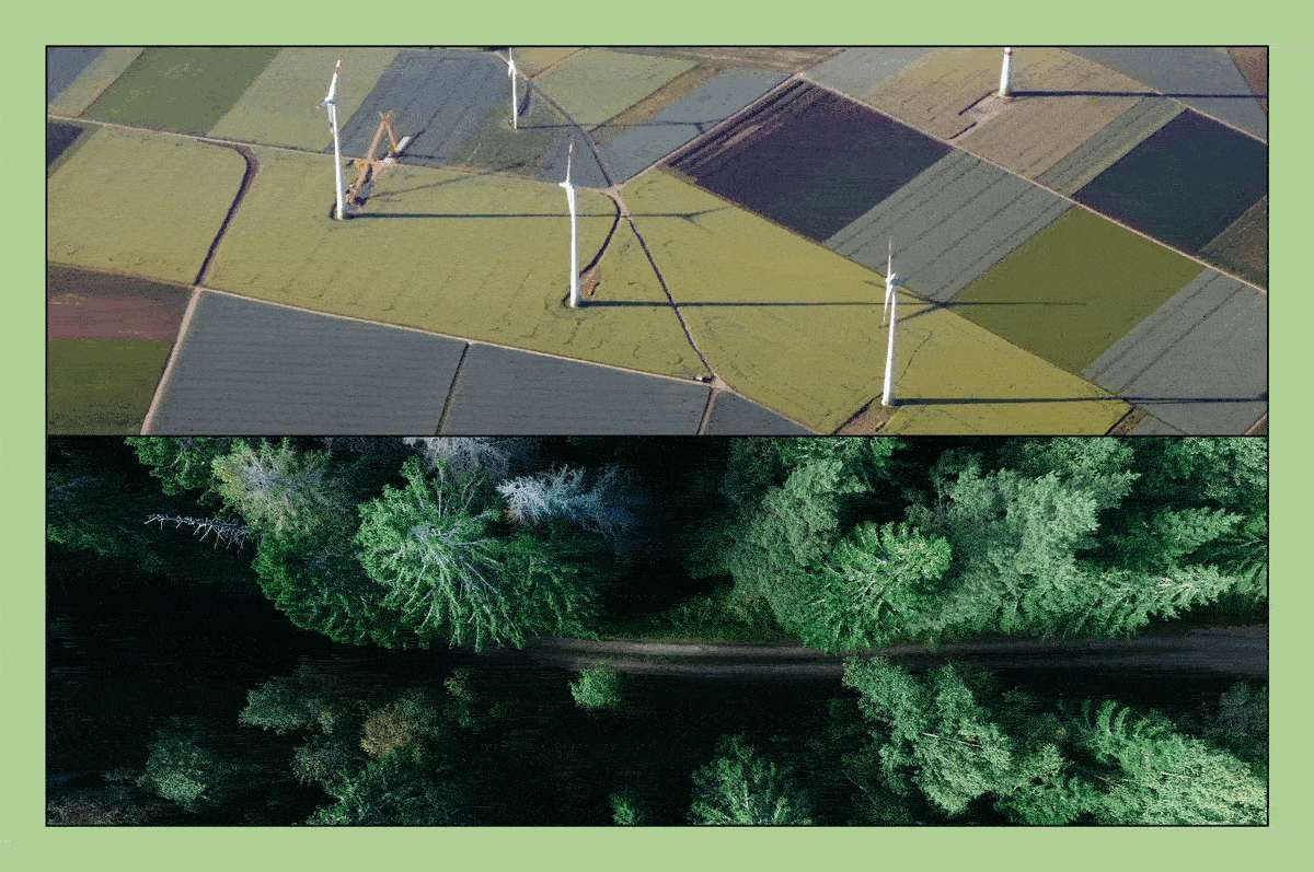
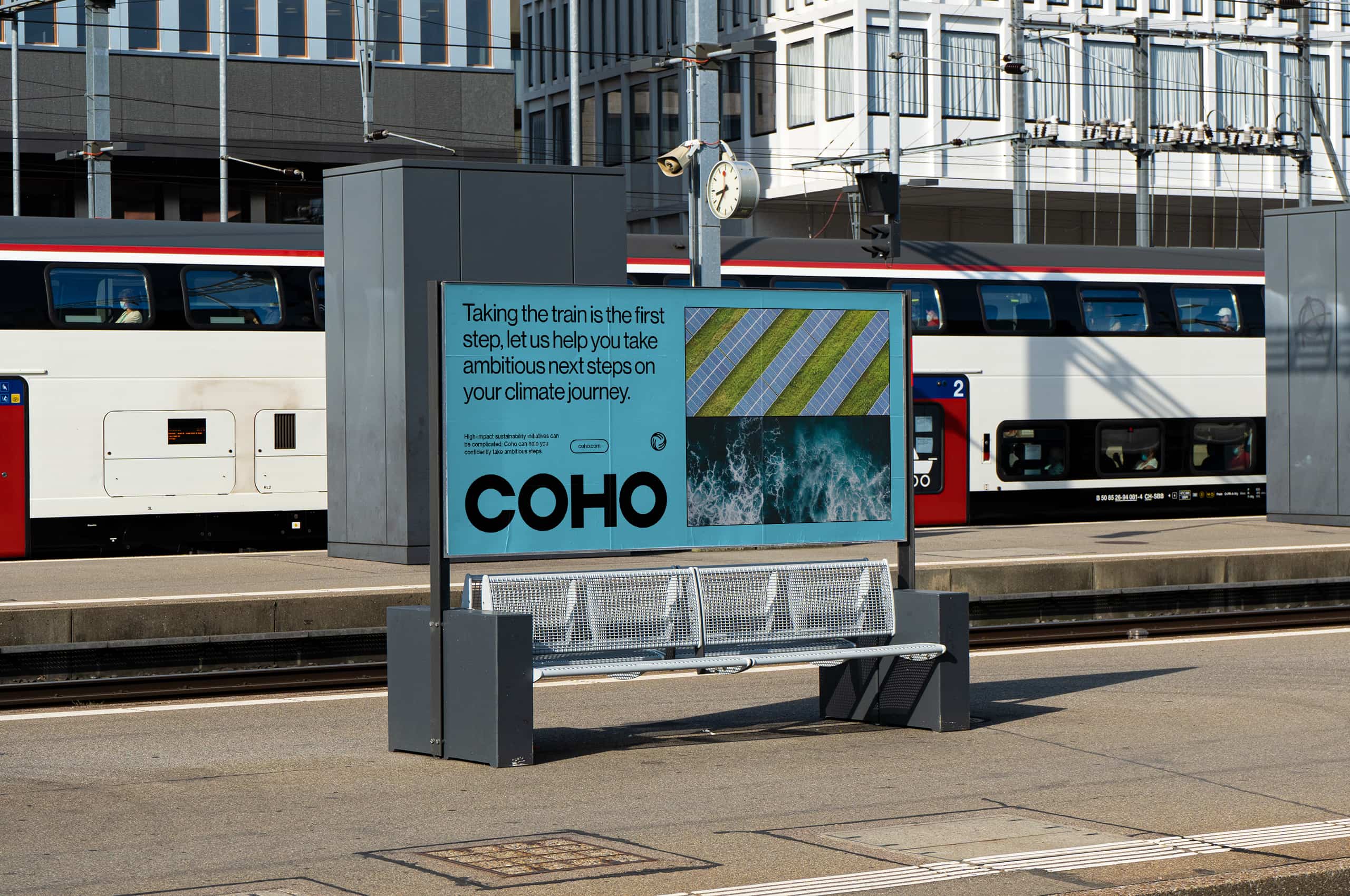
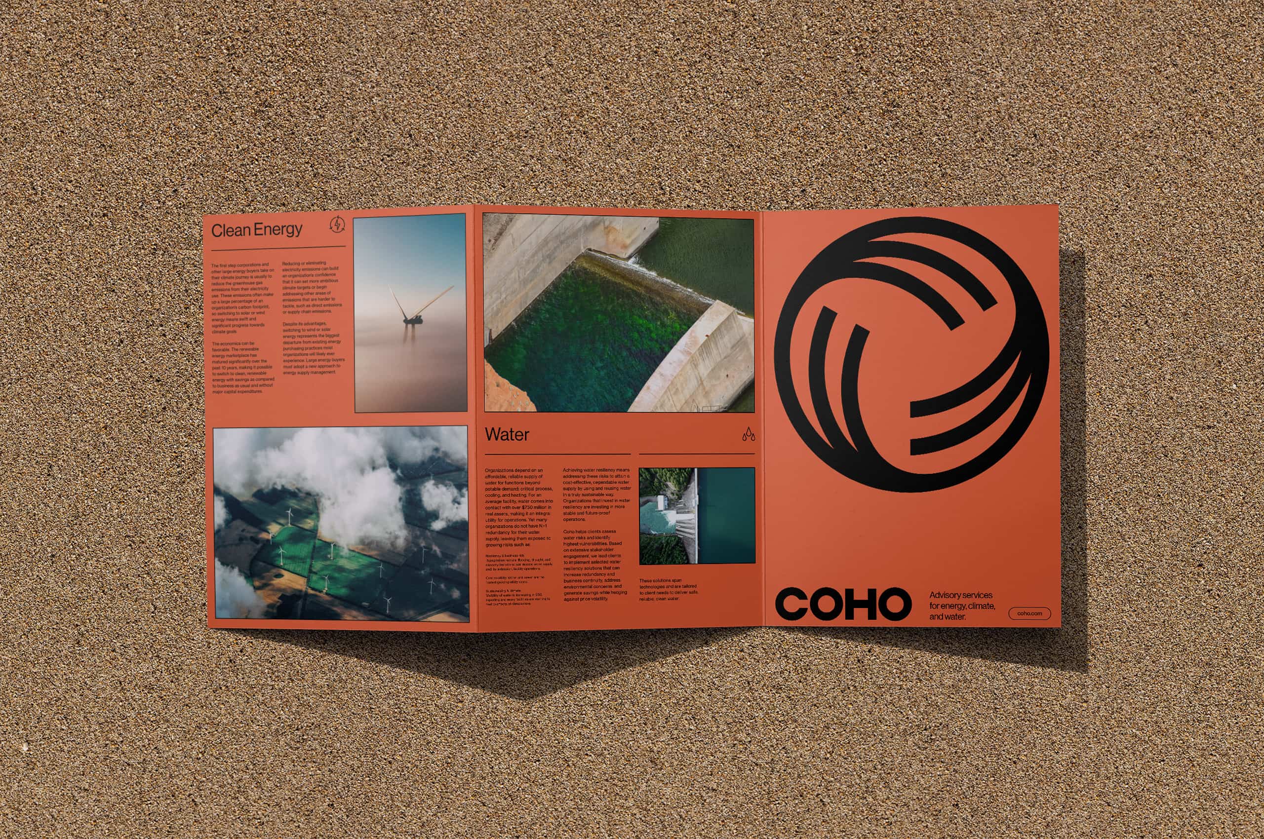
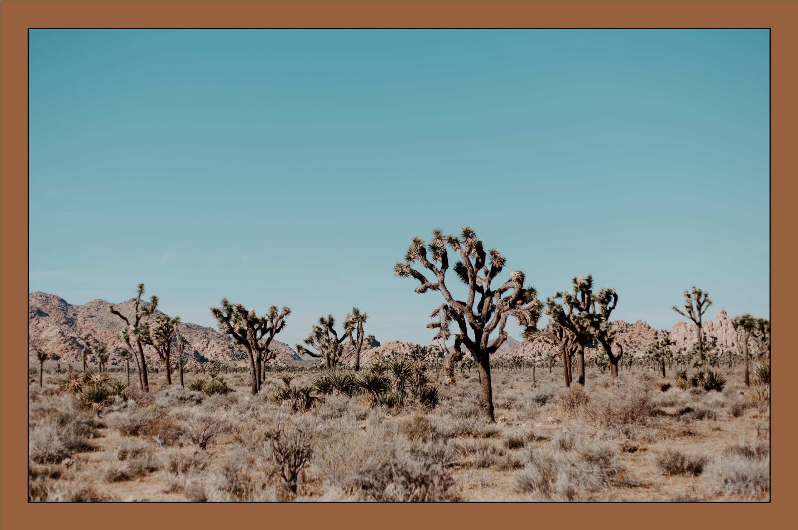
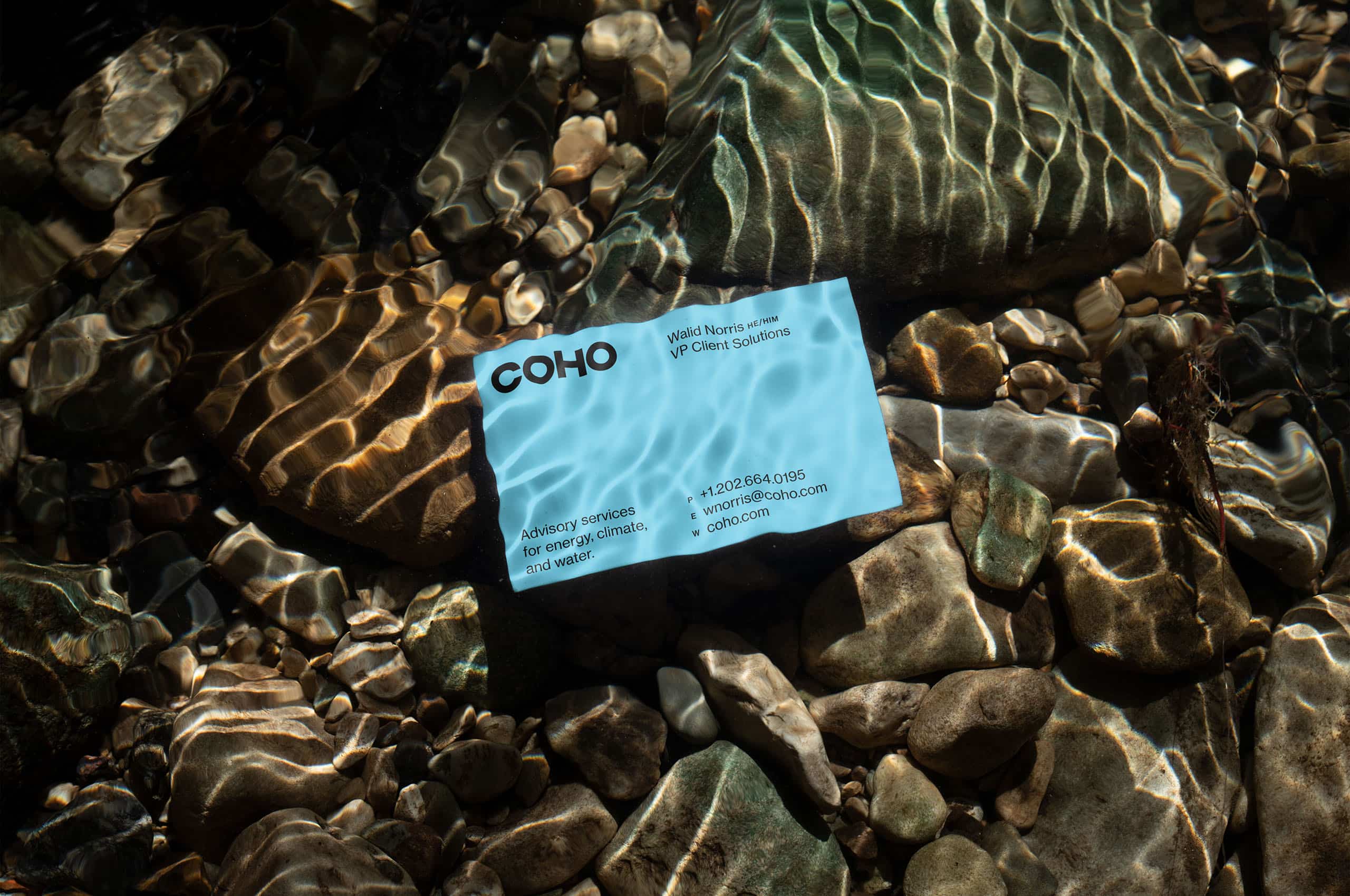
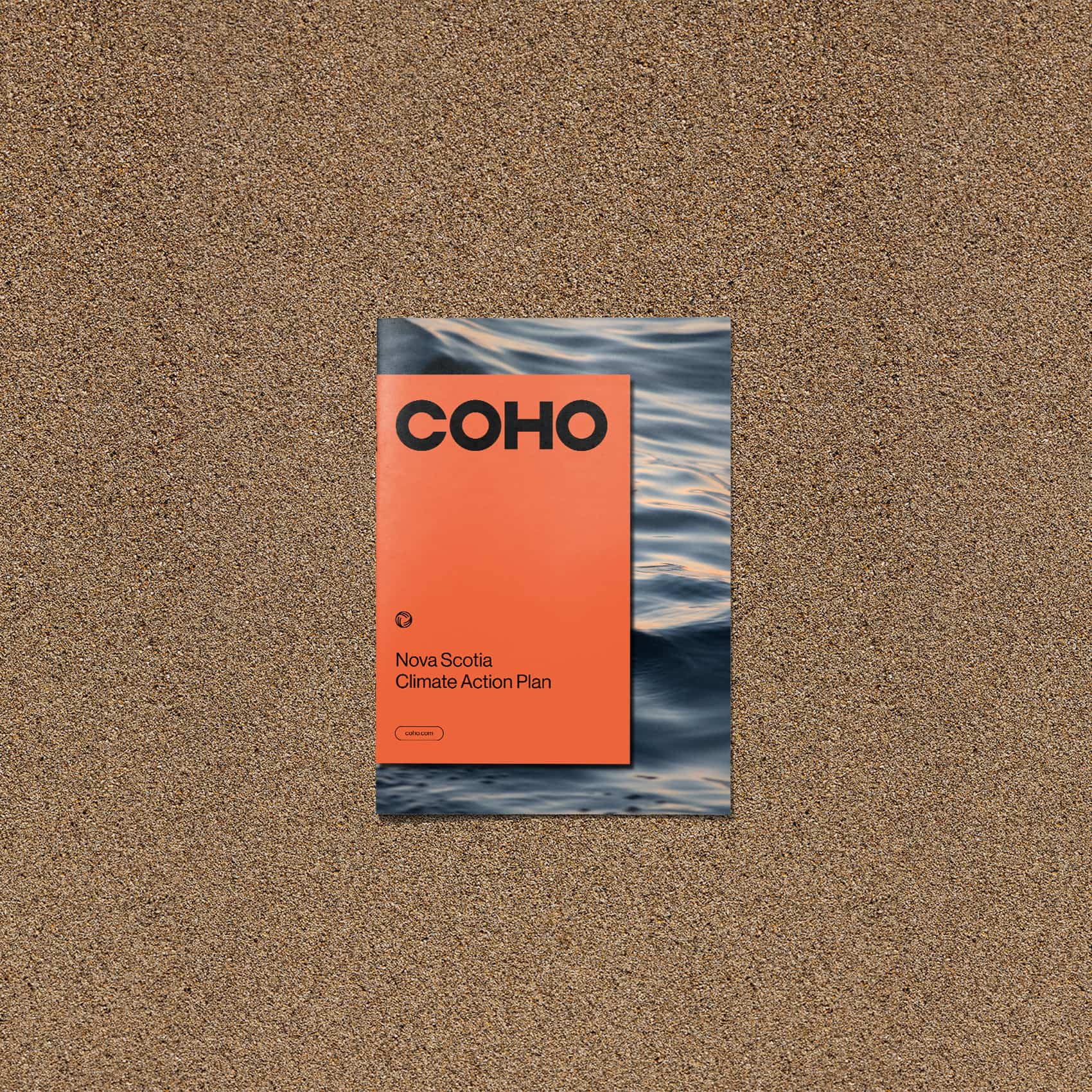
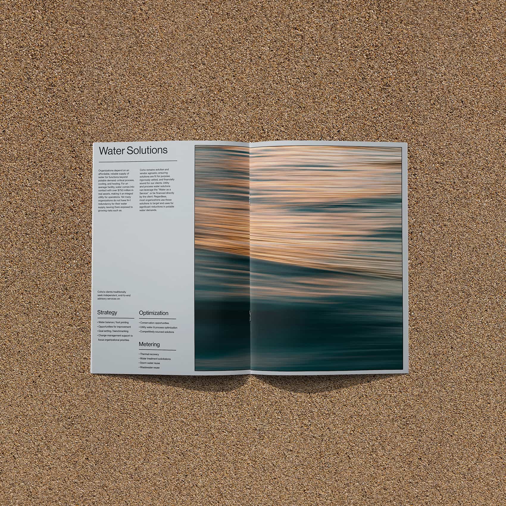
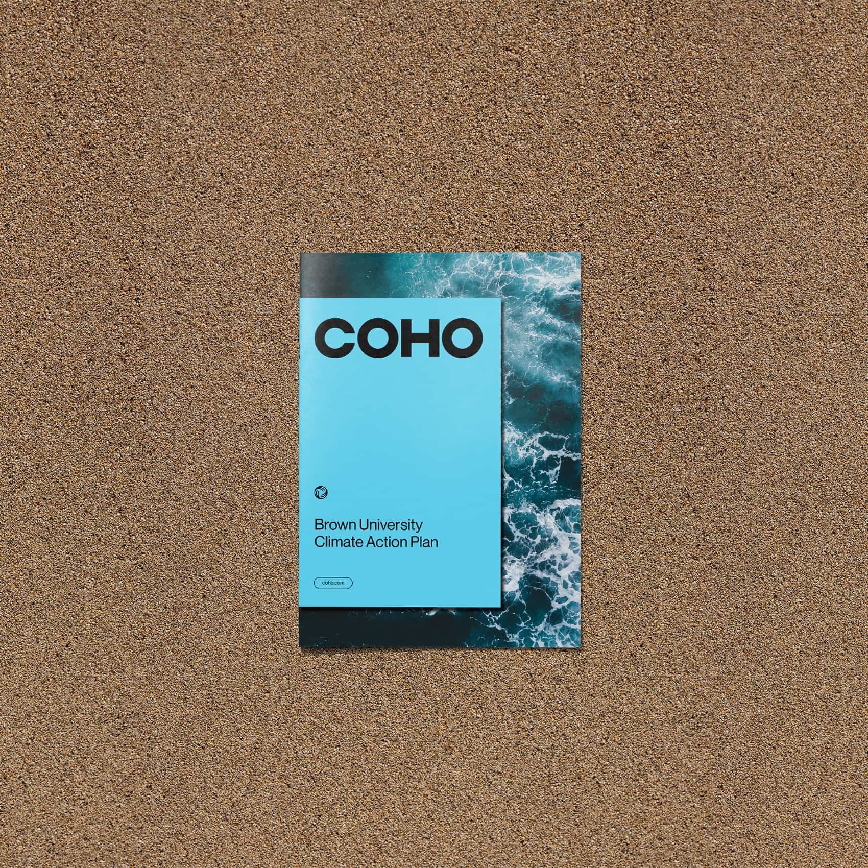
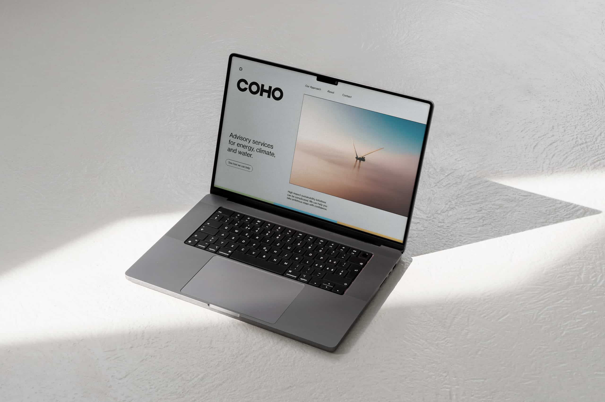
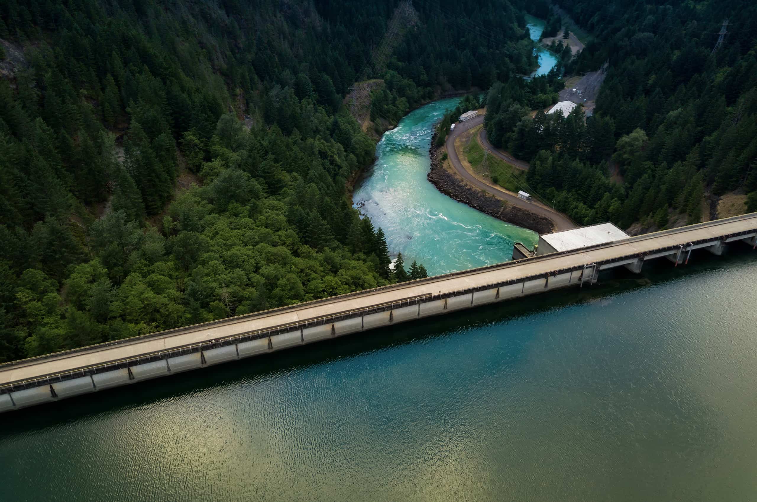
To showcase the effect of the work Coho does with its clients, we’ve created a flexible window system for photography usage. We can use a single or dual image to showcase the work and the impact.
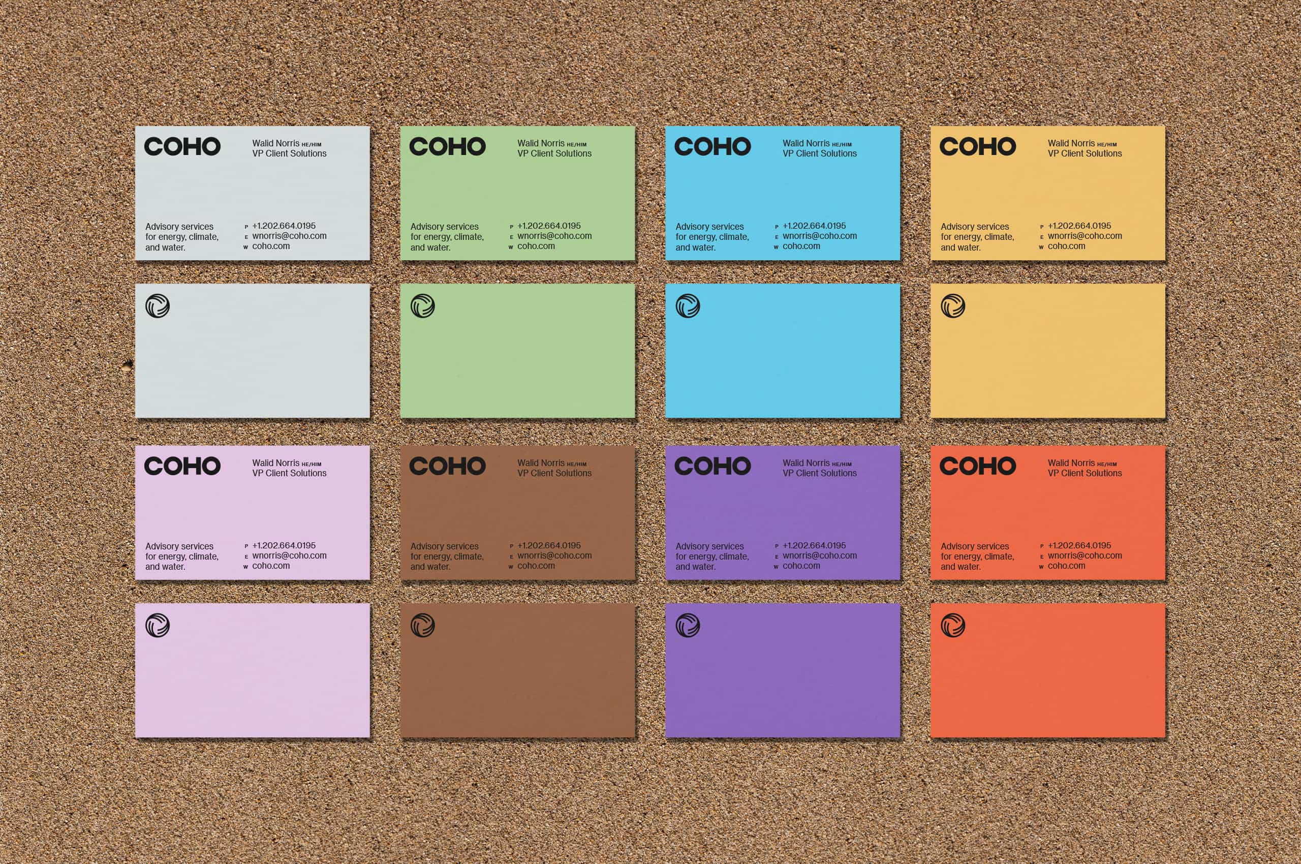
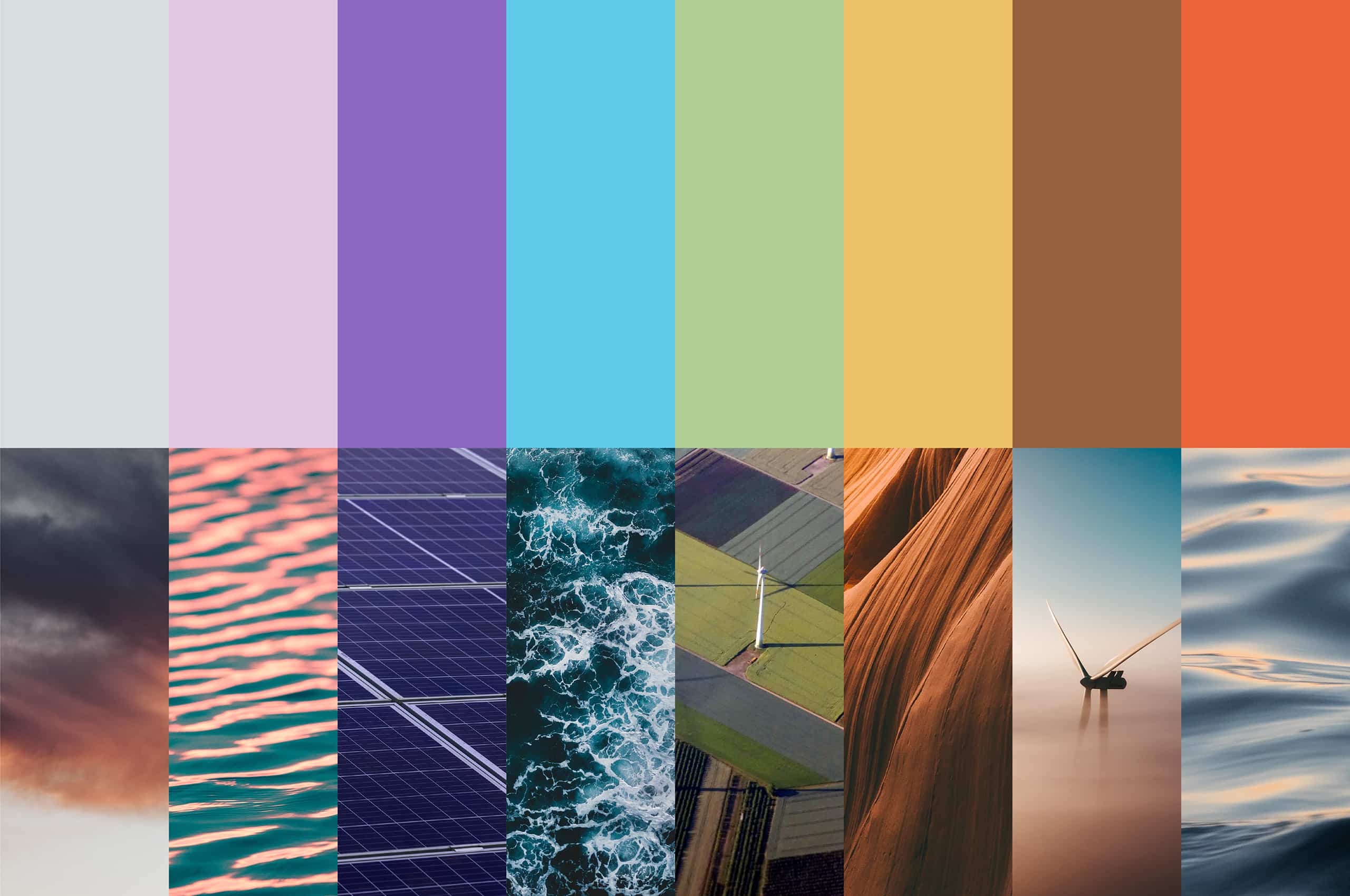
Coho maintains Black and White as a focal point with expressive and expansive use of color based on the natural world to create a robust open-ended color system to create market differentiation. The palette is meant to be energetic and emotive to help inspire and ignite passion behind climate action while allowing the black and white of the brand to strike a serious and mature tone.
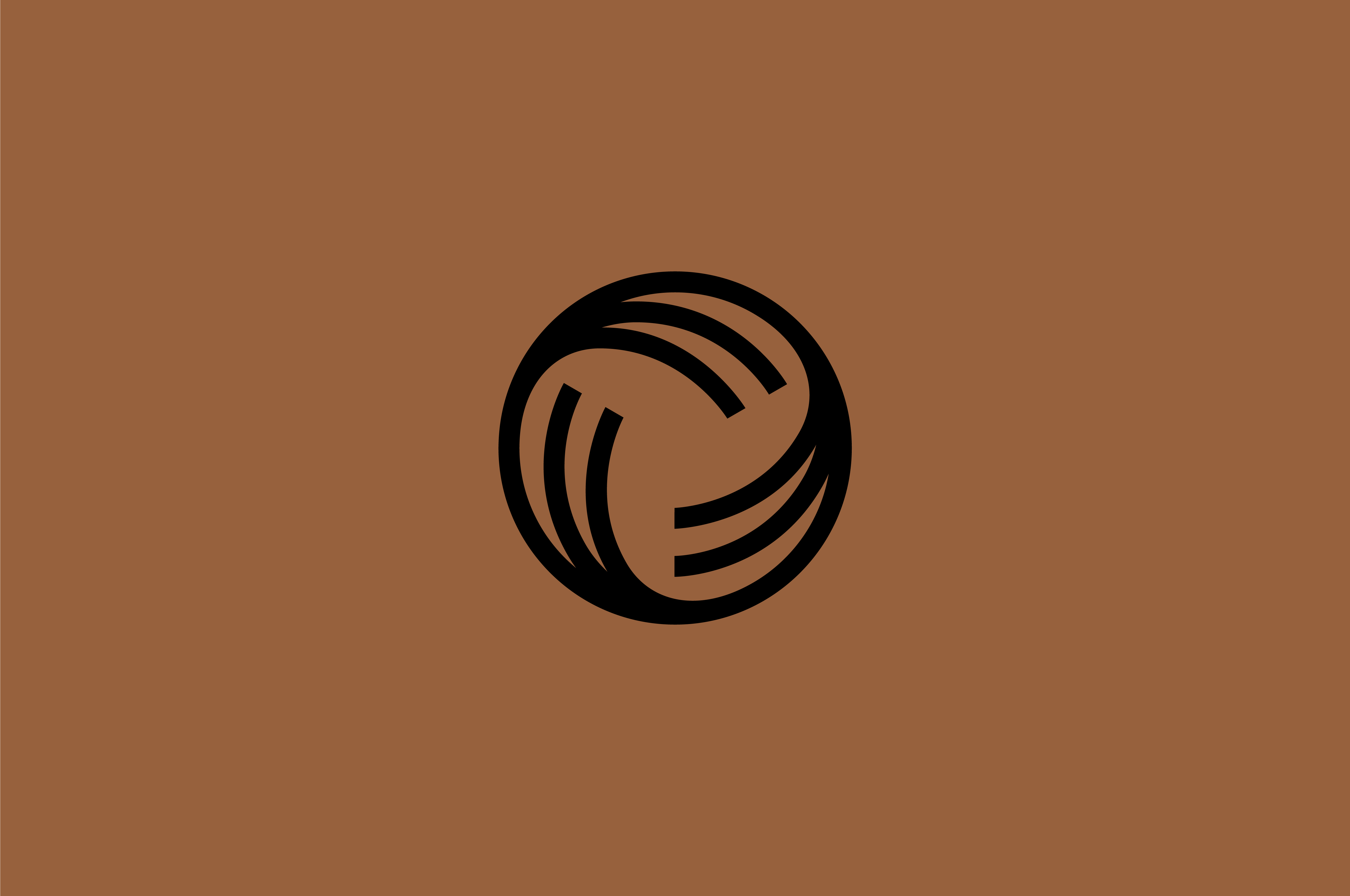
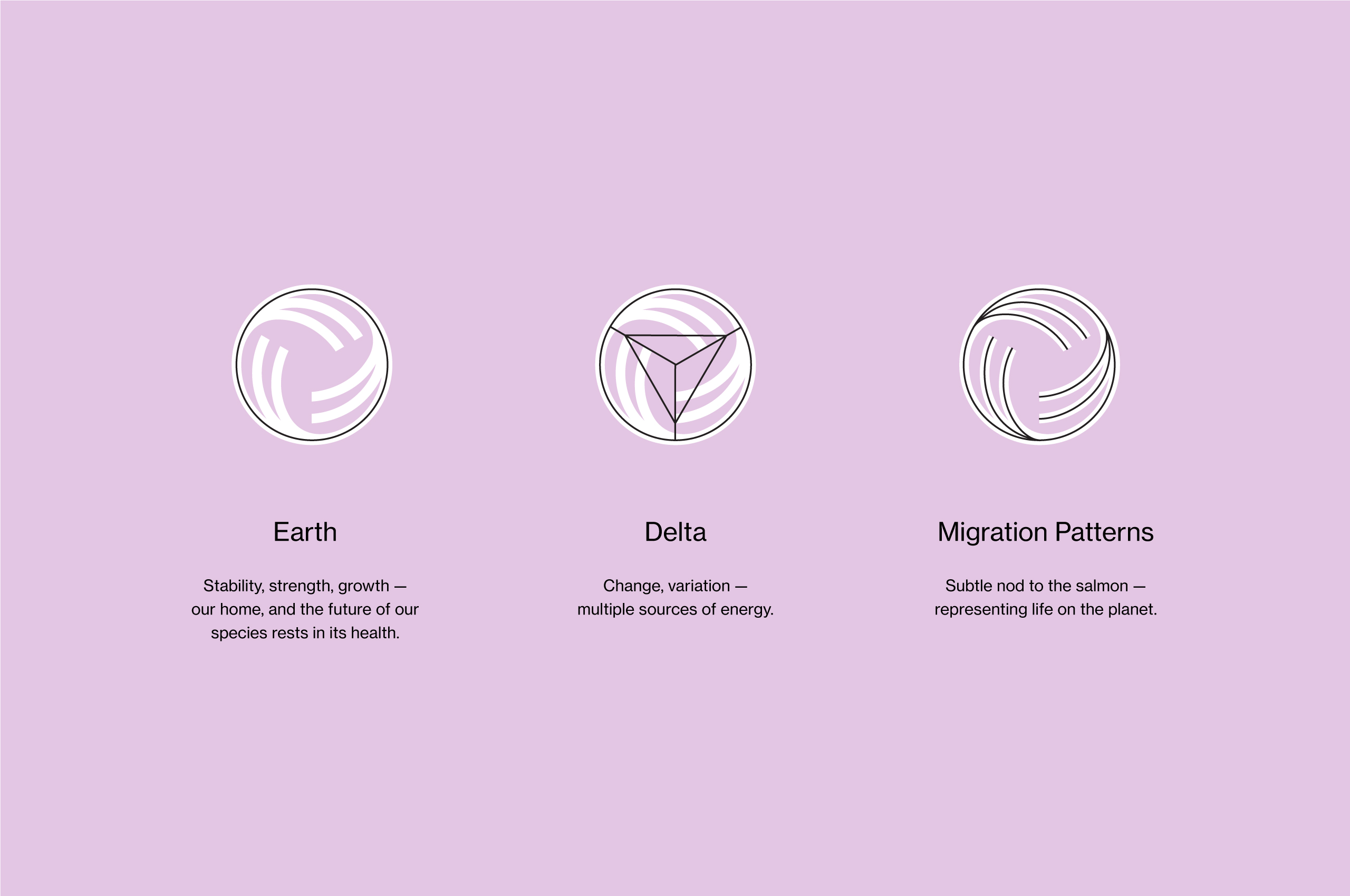
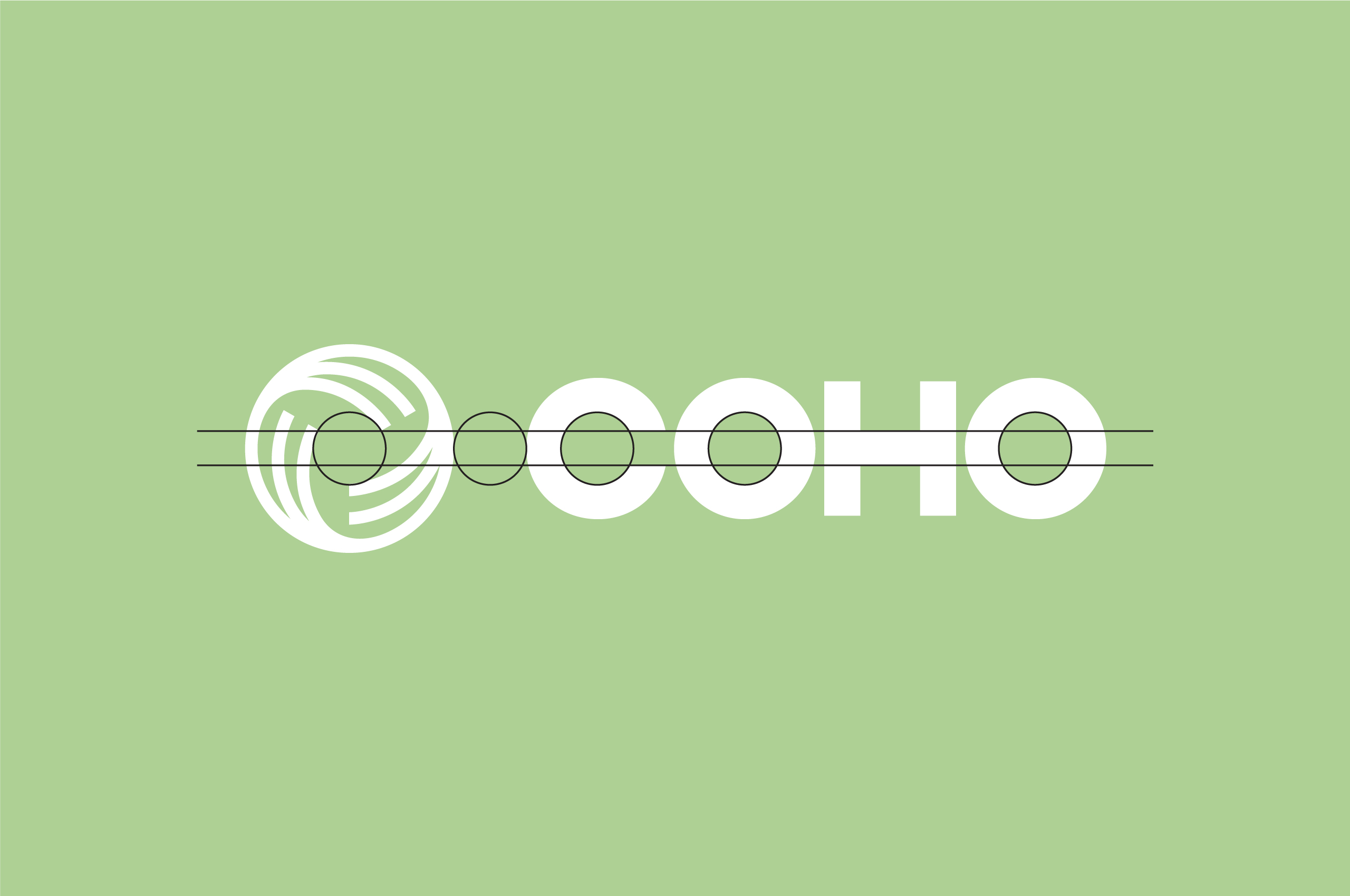
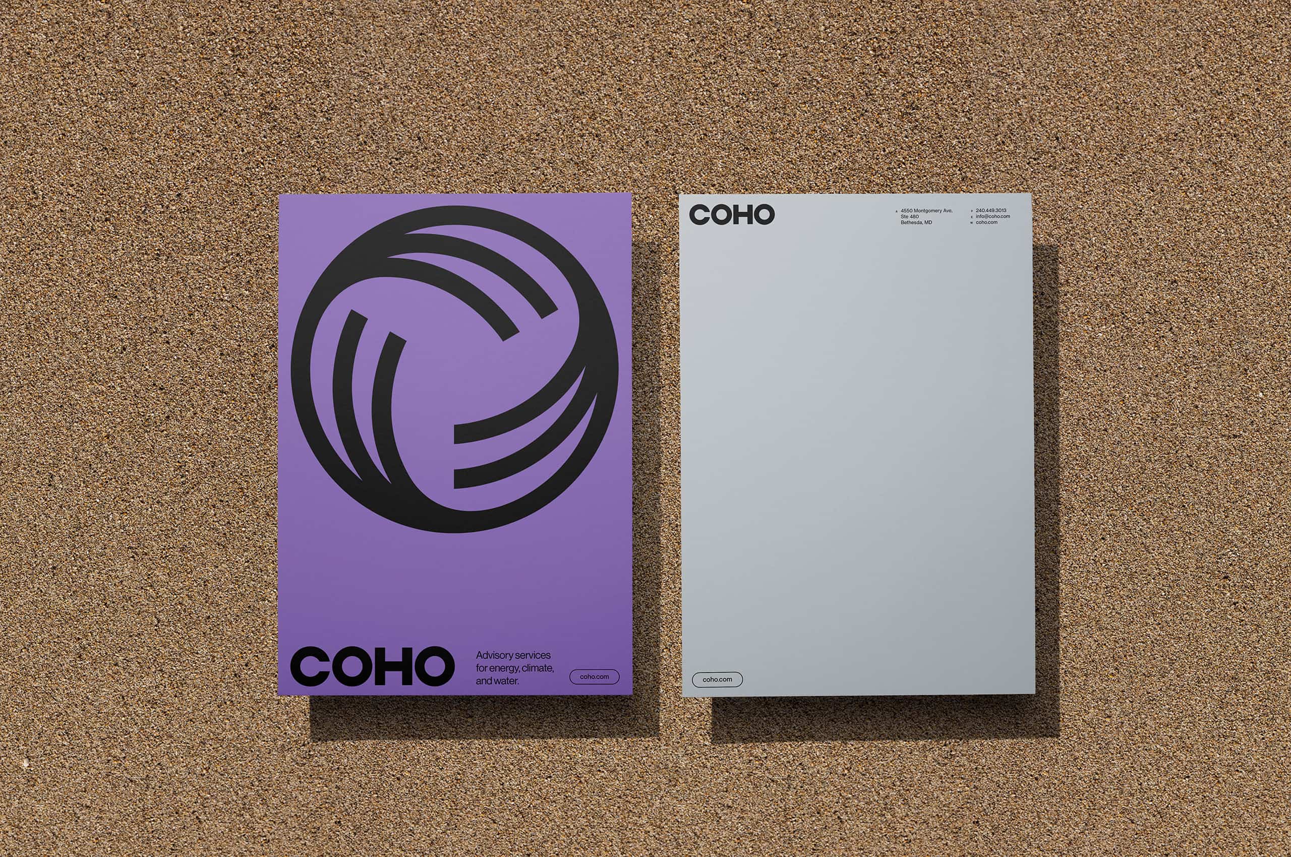
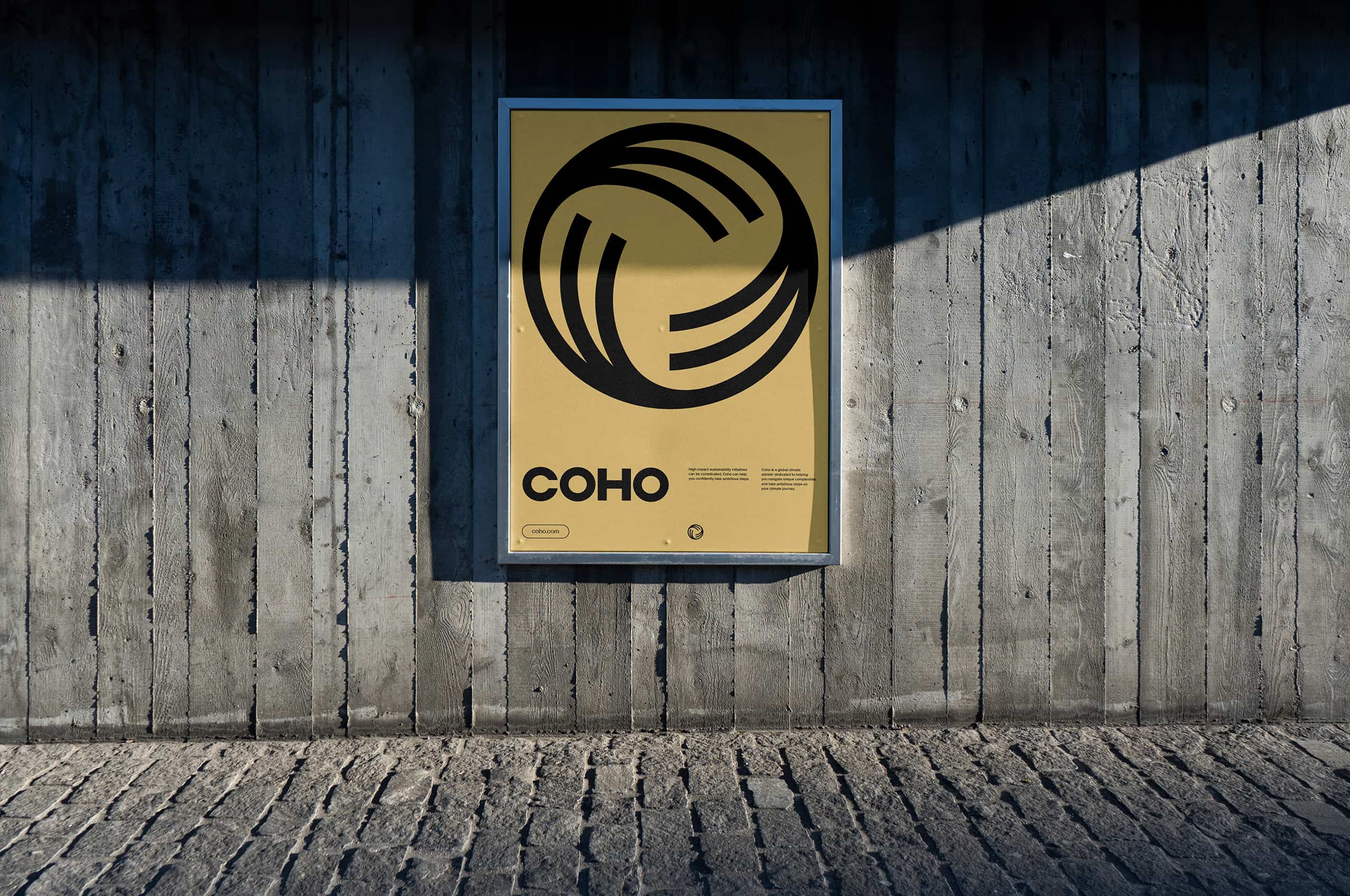
When developing the symbol for Coho, we wanted to tell their unique story in a modern, straightforward way. The story of the symbol exists in three parts; earth, delta, and migration. The globe represents our home, and the future of our species rests in its health. The delta represents change and the multiple sources of energy available to clients. Finally, the movement comes from the salmon’s migratory patterns, depicting the life and movement on earth.

Inspired by the subtle key-line frames around the diagrams, we utilized a thin black line around the images to create this window.
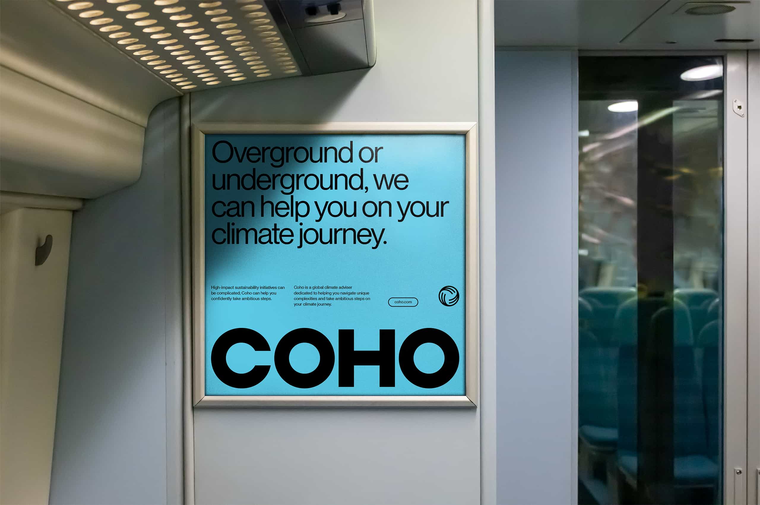
The mature and trustworthy tonality of the brand can either be paired with stronger or lighter copywriting for out-of-home applications to grab the attention of the onlookers. Depending on the usage, the Thus, creating a stronger, more emotive connection to the brand.

Coho is genuinely a global climate adviser. With deep market insight, dedicated to helping their clients navigate unique complexities and take ambitious steps on their climate journey. Working to provide bespoke solutions for their clients is a diverse, seasoned team of industry experts with deep capabilities in analytical problem solving, subject-matter prowess, and comprehension of the ever-evolving local and broad-market landscapes.
Based on the circular nature of the symbol, we create a completely custom wordmark that carries over the curves and creates a direct connection to the symbol itself. Creating a wordmark that is strong, trustworthy, and conveys the strong and mature tonality of the work they do.
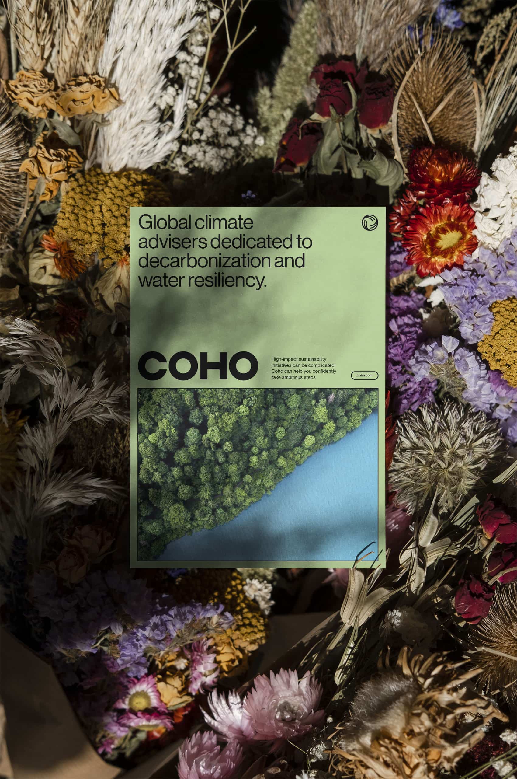
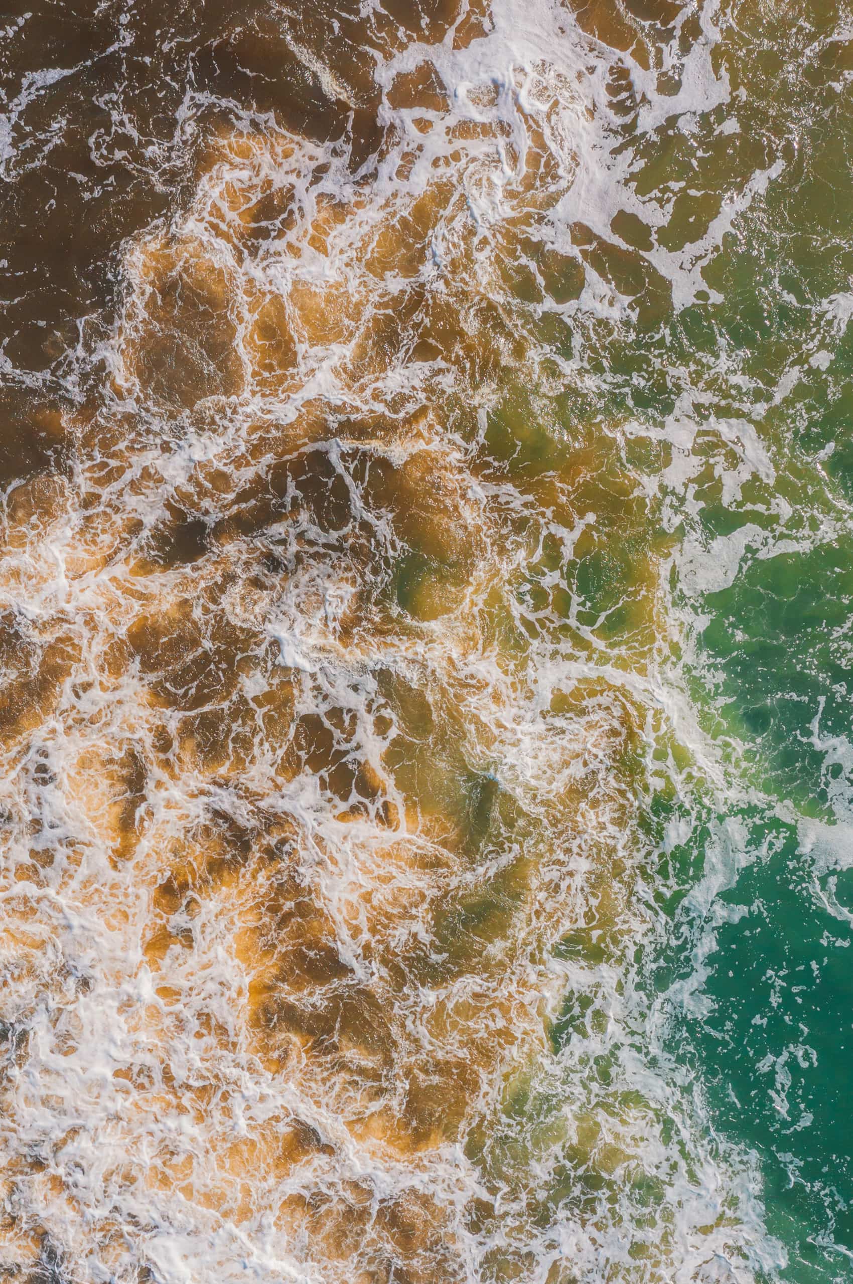
By intermixing photos of the world’s natural beauty with the images of sustainable power, we can create a strong emotional tie to the brand for viewers. These photos can be utilized across all mediums and applications to create a window into the world Coho is working so hard to protect.

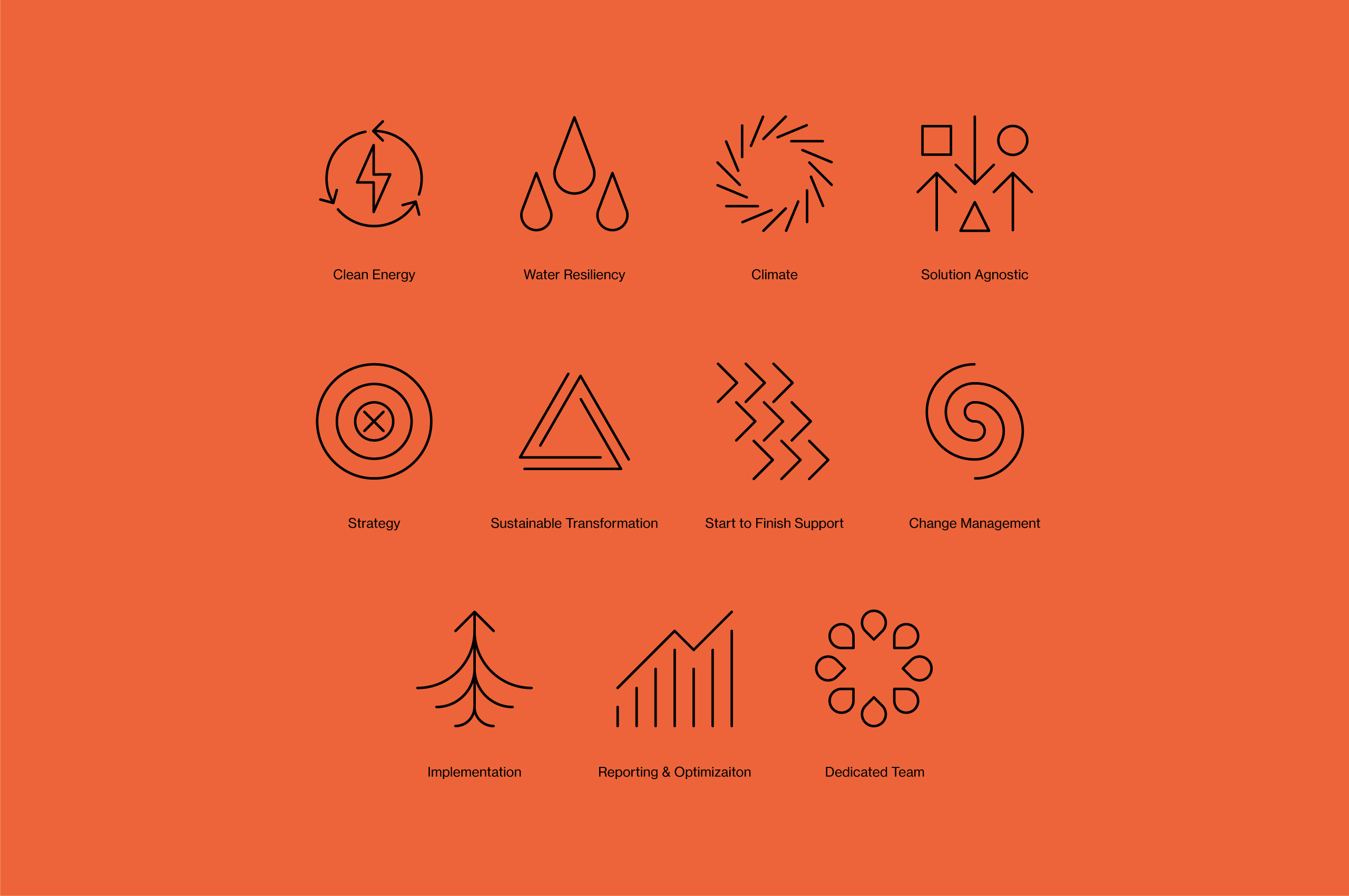
To help tell the story and build out the visual language of the Coho brand, we developed a unique set of illustrations to live online and in printed collateral.
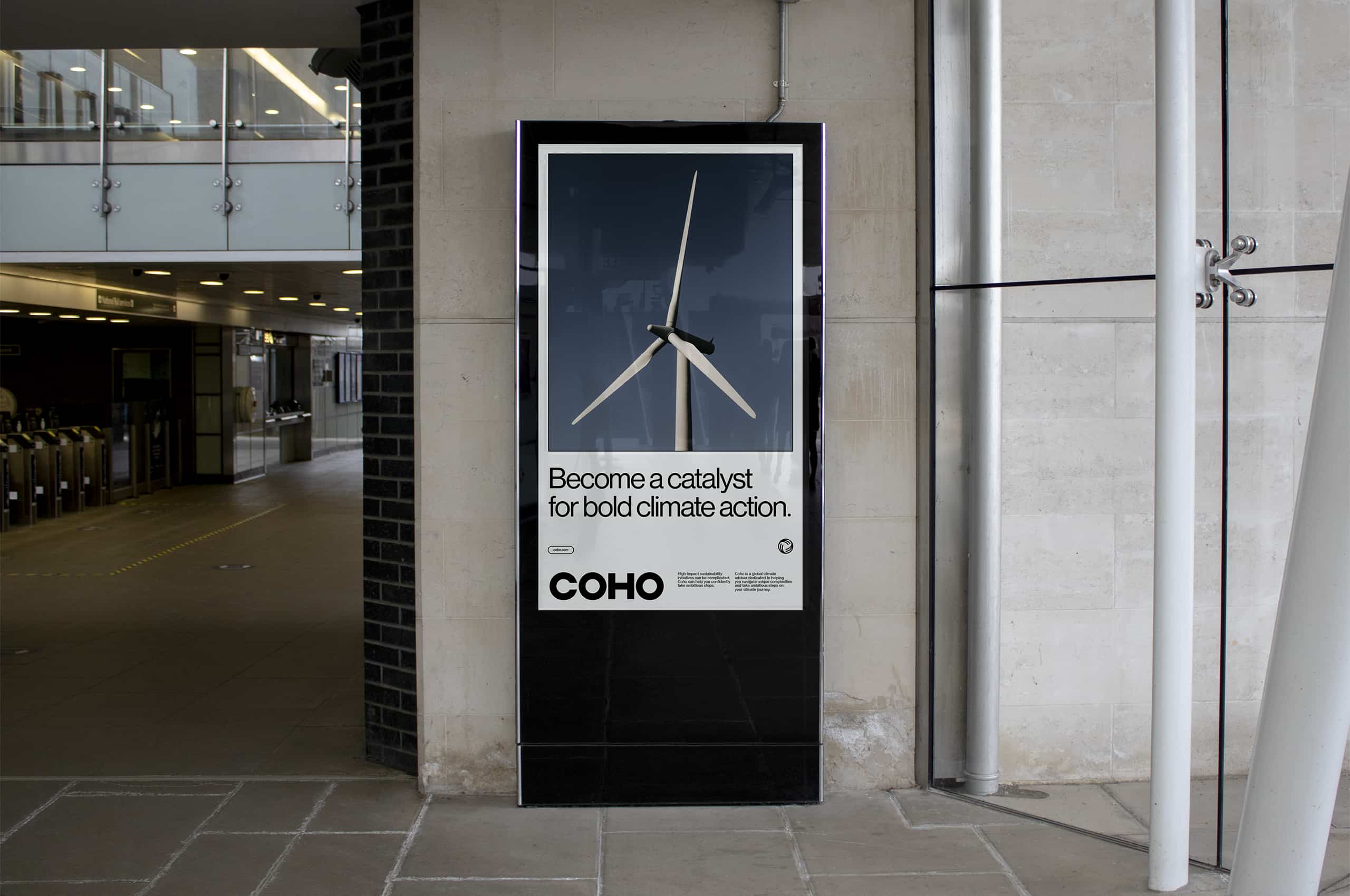
In the out-of-home buildout, we deploy robust gridwork, type, and these natural ‘windows’ to build a strong and mature presence paired with more direct, place-based copywriting to capture passersby.