Carter+Co
A San Diego-based commercial real estate firm committed to their client's best interests.
A San Diego-based commercial real estate firm committed to their client's best interests.
Carter+Co is a San Diego-based commercial real estate firm exclusively representing tenants — never landlords. With a level of transparency, advocacy, and professionalism that is unparalleled, they help their clients find the perfect real estate fit every time.
To solve the lack of transparency he witnessed in the commercial real estate industry, Travis Carter founded Carter+Co to tackle this problem head-on. With his decades of experience in the industry, he knew the process could be better for clients, brokers, and employees. As a result, they help entrepreneurs and CEOs navigate the commercial real estate process with ease and confidence.
Carter approached Mast ahead of stepping out on his own to help bring an identity to life for his new venture. We worked with him to develop a brand as visually transparent as his real estate process.
Collaborators: Hunter Thompson

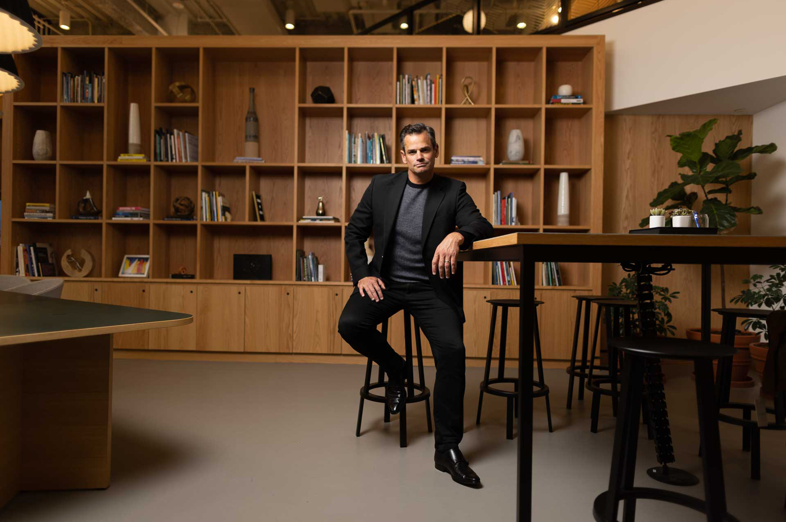
After decades in the Commercial Real Estate industry in San Diego, Travis Carter decided to take a stand and fight for the best interests of tenants, never landlords. He brings this fresh perspective and his buoyant, warm personality to the table, ensuring his clients find the best fit every time and delivering commercial real estate with a heart.
Delivering advice with a transparent and direct manner, with his signature personality. The brand is a perfect extension of Carter.
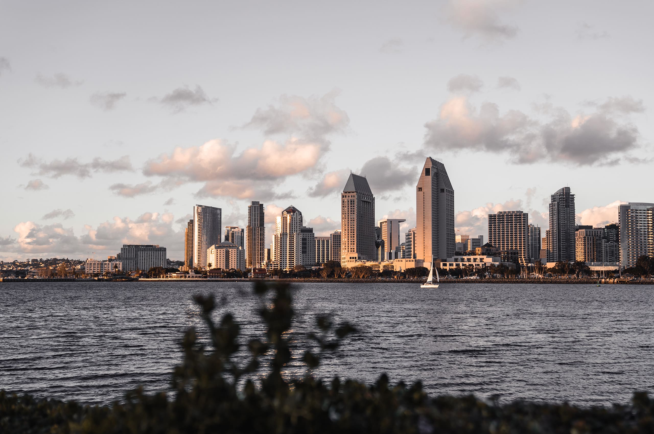
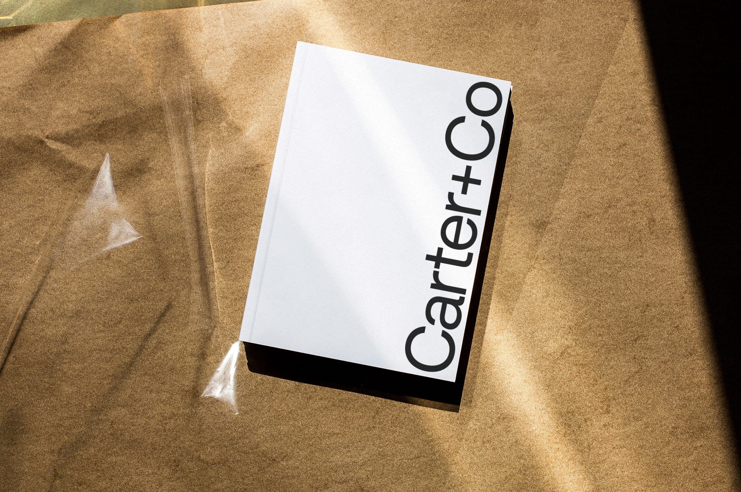

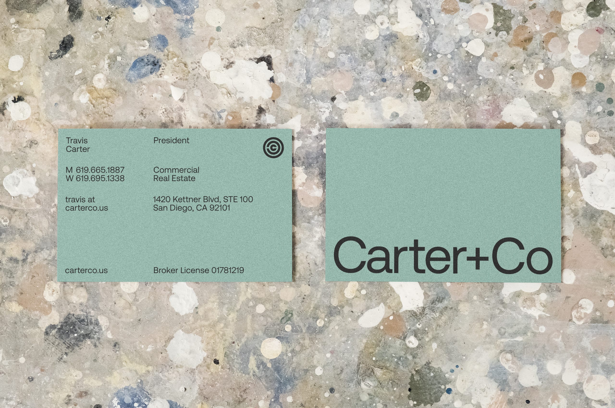
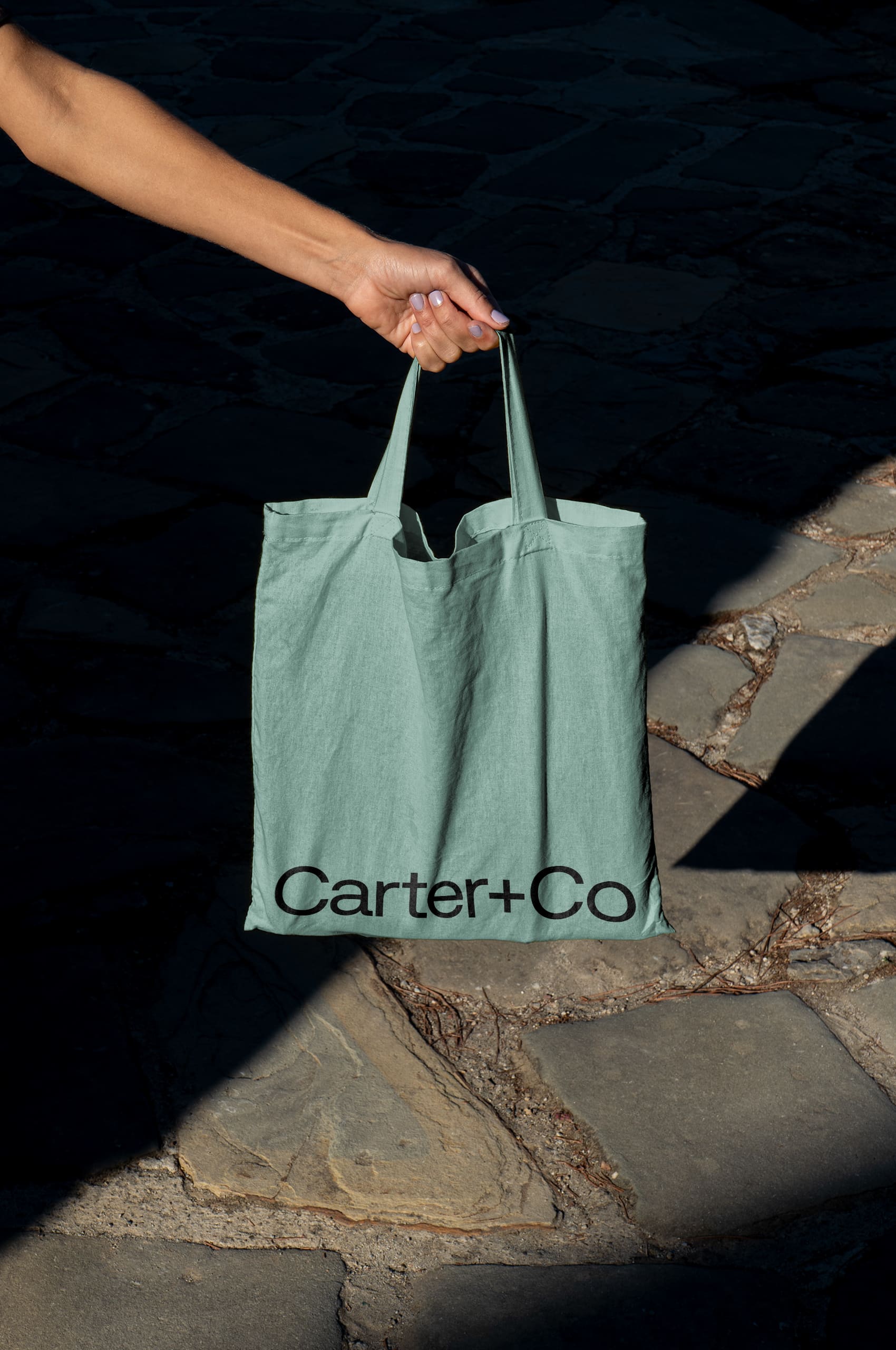
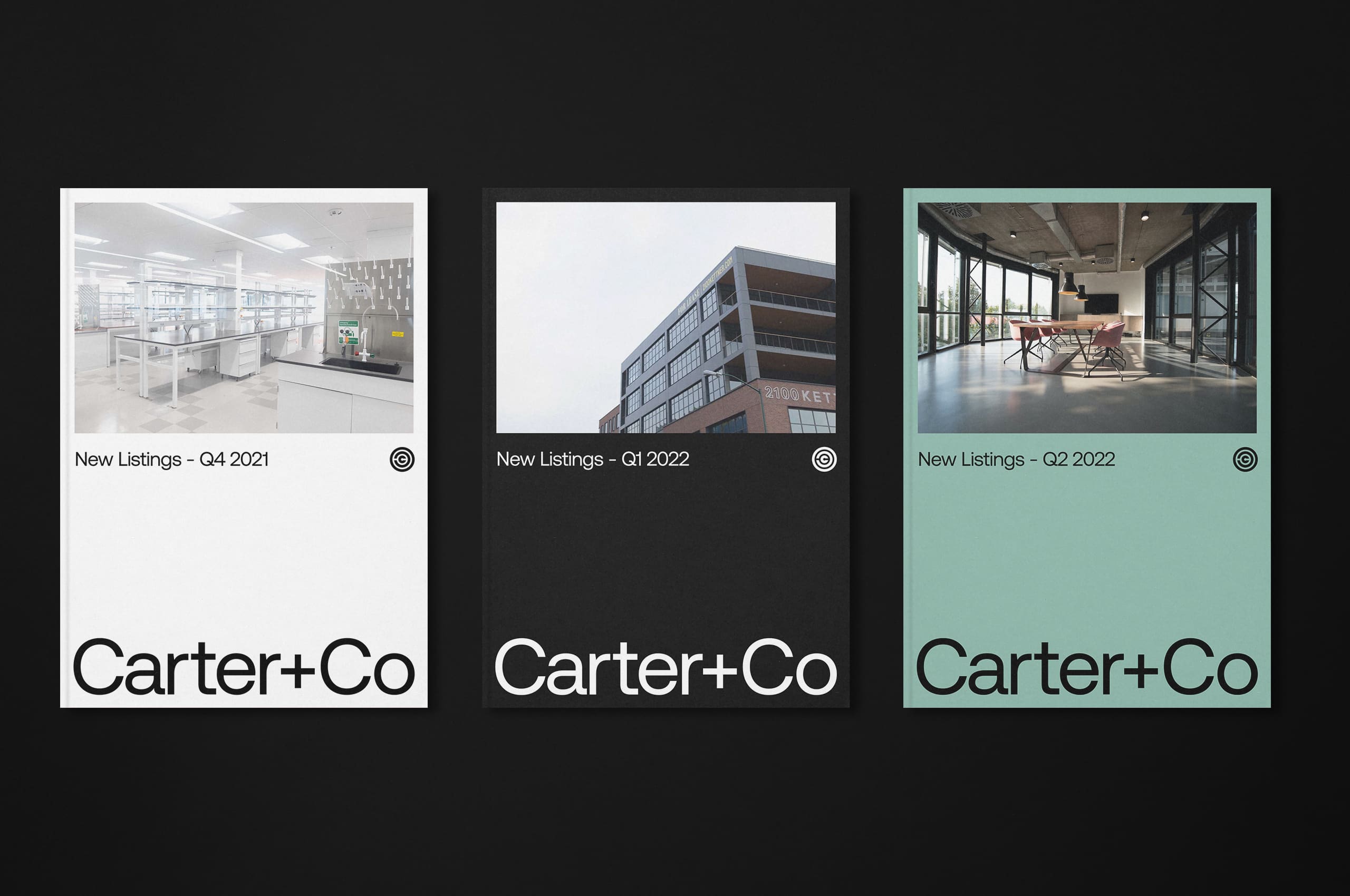
An avid surfer, Carter wanted to find a way to infuse some of this character into the brand. So we selected a seafoam to bring personality into the buildout of the brand. By pairing this seafoam with stark monochromatic counterparts, the brand’s palette is personable while still serious.
The seafoam perfectly ties into the mission of transparency for the company, symbolizing the clarity of the water.
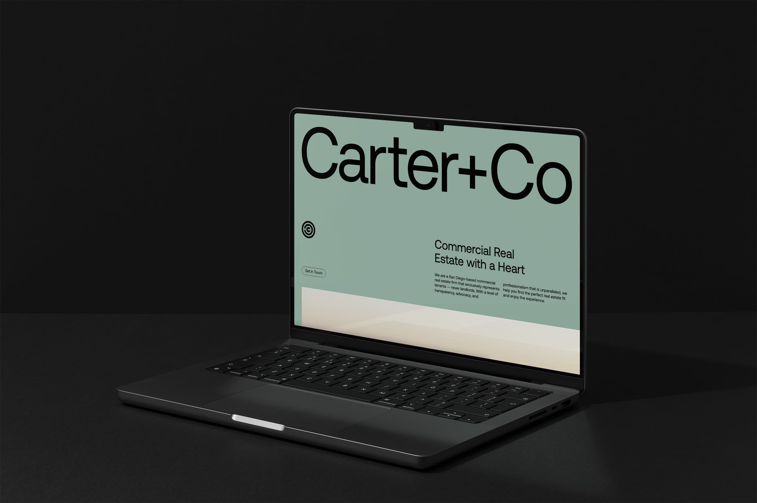
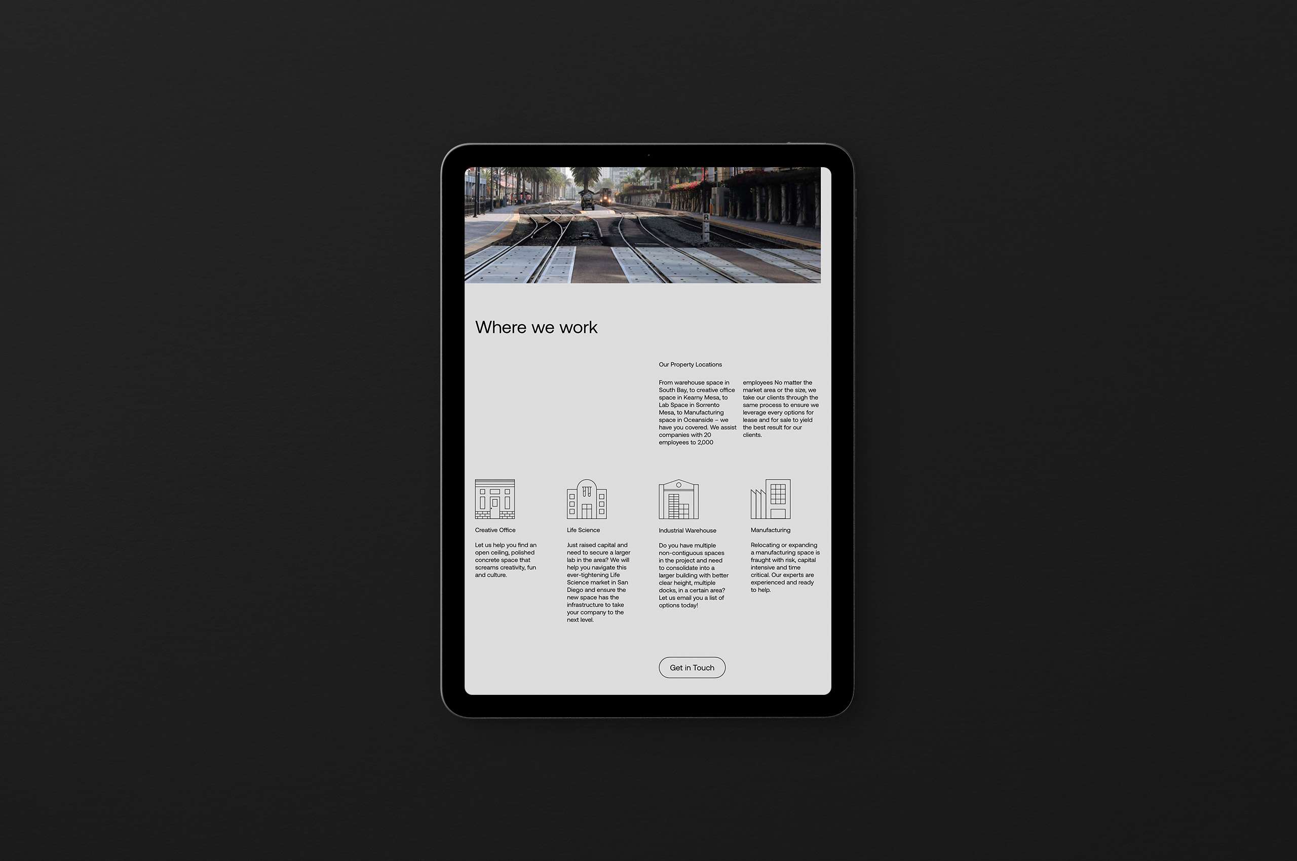
We worked with Travis to develop a digital home for the brand that was as transparent and direct as his process.
View more the website we created for Carter+Co → here
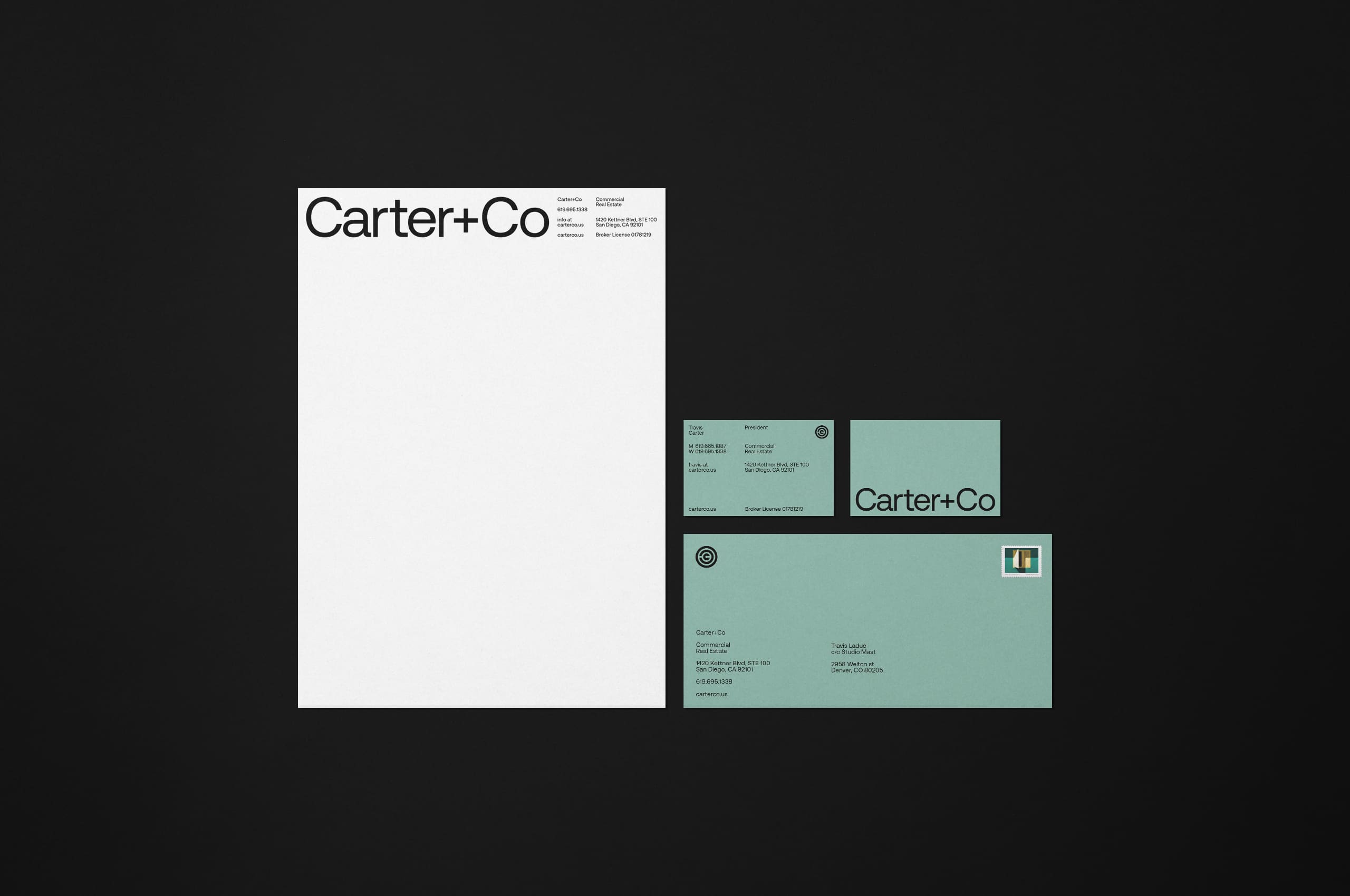
It was paramount to Carter to develop a modern monogram for the brand. The result is a unique set of nested characters representing the complete process and Carter’s connection with their clients.

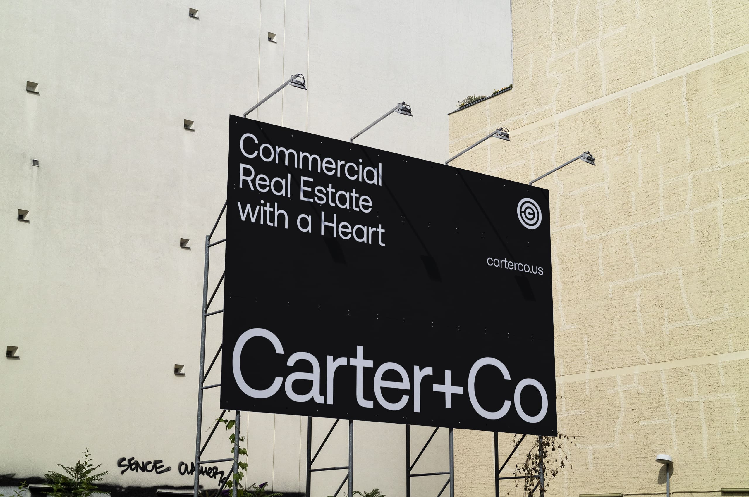
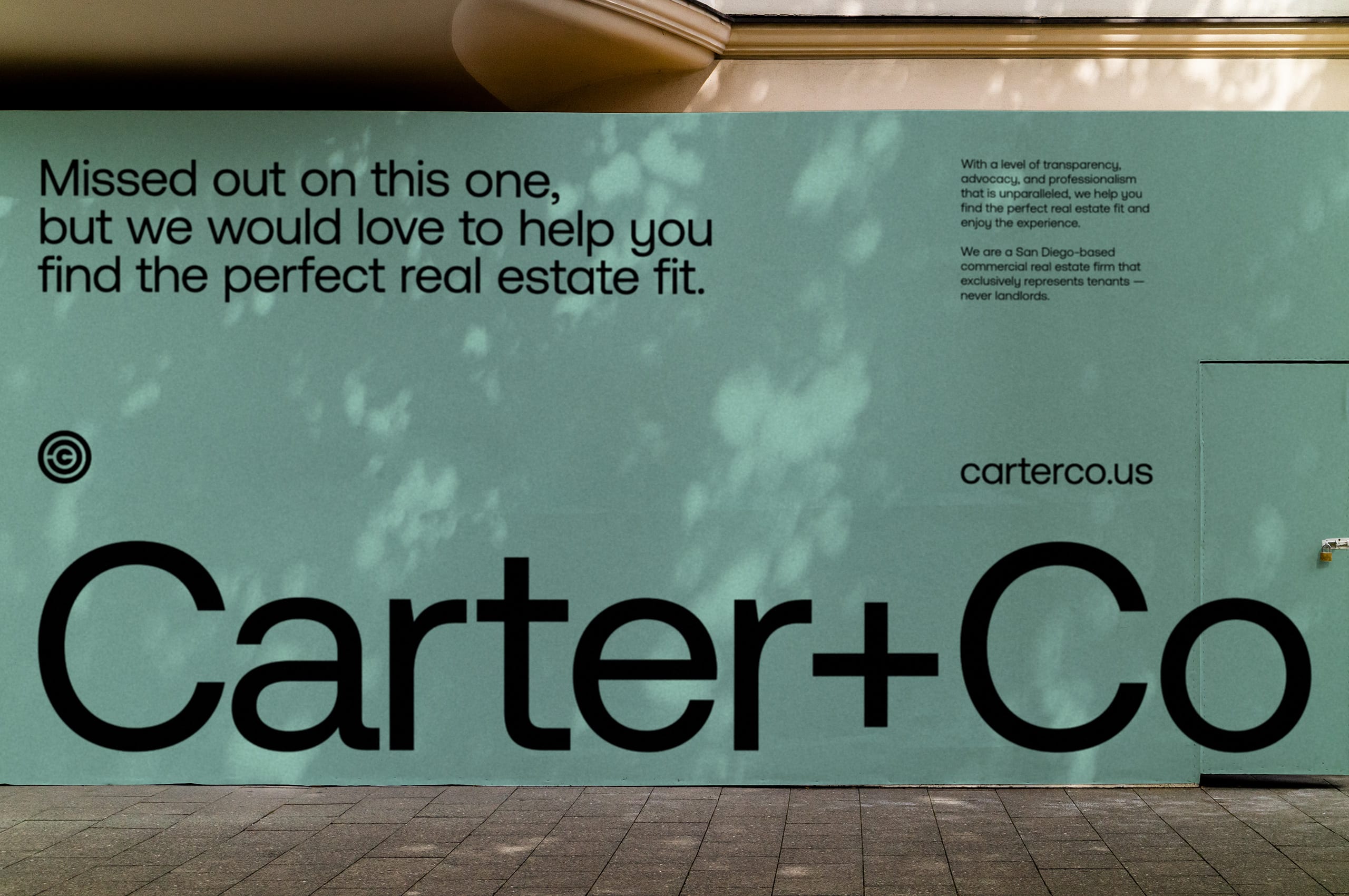
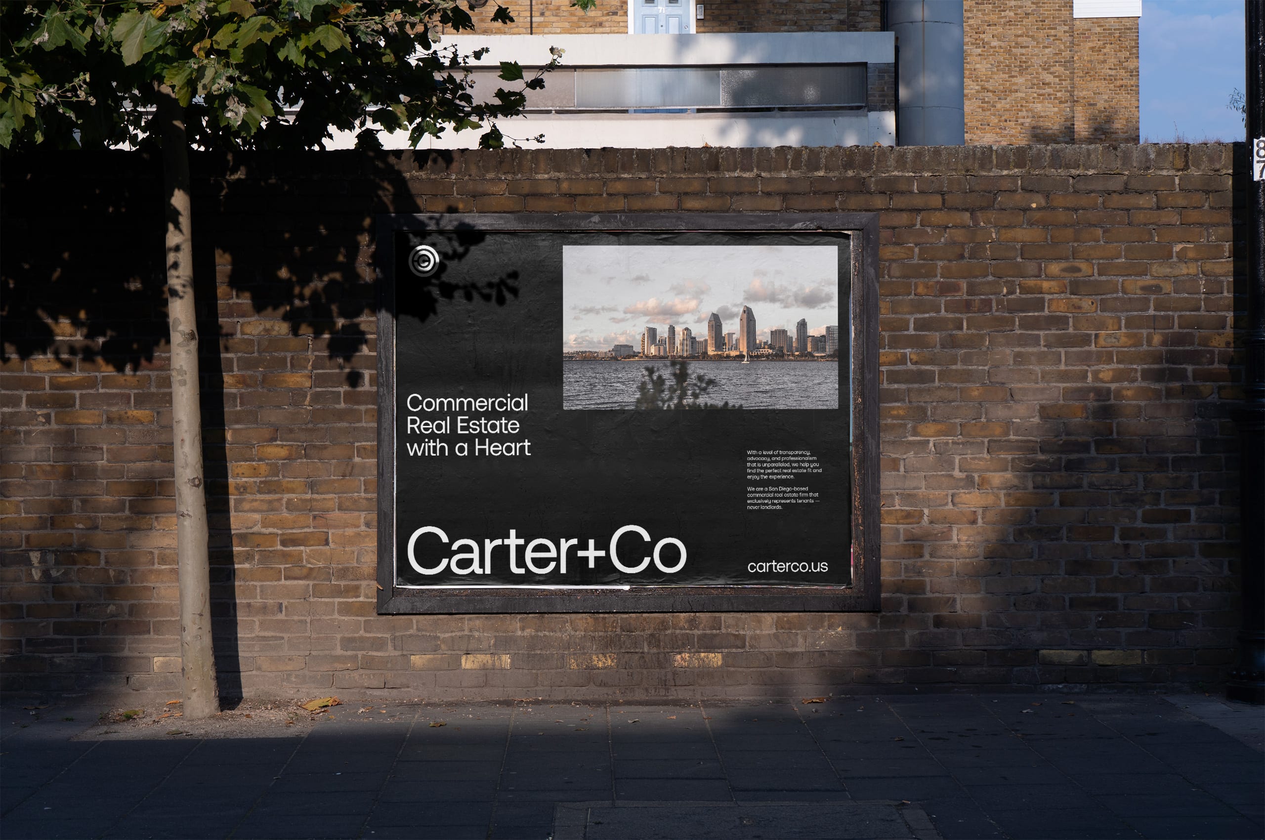
Wildpostings and billboards are utilized to create intrigue in all instances, from smaller posters to construction barricades on new properties. In addition, these out-of-home brand touchpoints allow for quippy copywriting to catch the attention of passers-by.
If you only think of something “with heart” being pink or red and covered in cartoon hearts, you only consider one meaning. In contrast, heartfelt advice is often delivered with sincerity and transparency. For this reason, we created the system for Carter to allow the user to question their preconceived notions of the meaning and create a deeper connection to the brand.
