El Paso Opera
The El Paso Opera is actively defying the status quo to redefine the meaning of Opera.
The El Paso Opera is actively defying the status quo to redefine the meaning of Opera.
Upon the first mention of Opera, thoughts of box seats, expensive clothes, and grand productions often come to mind. An artform that is often thought of as something quite exclusive and expensive.
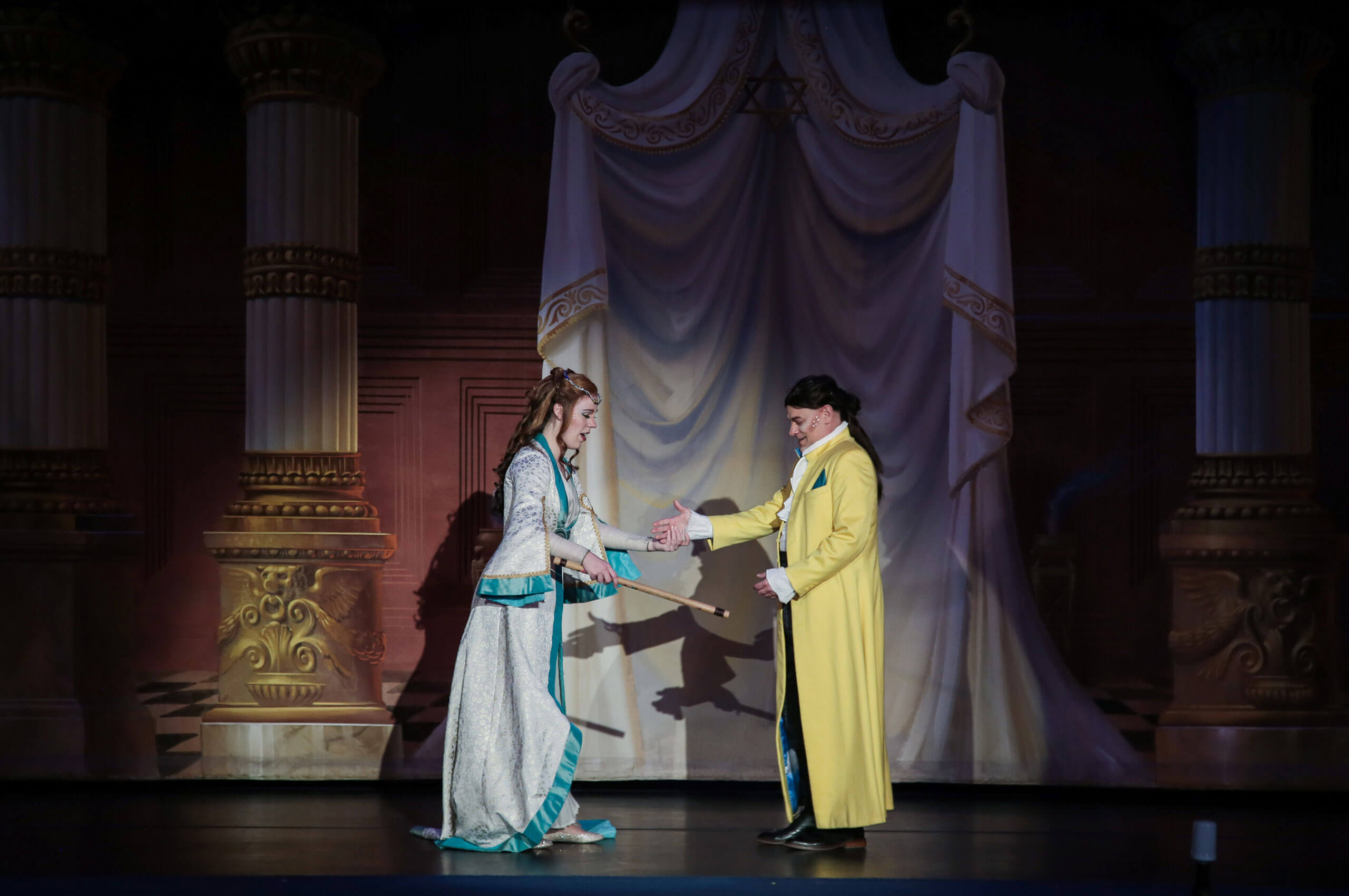
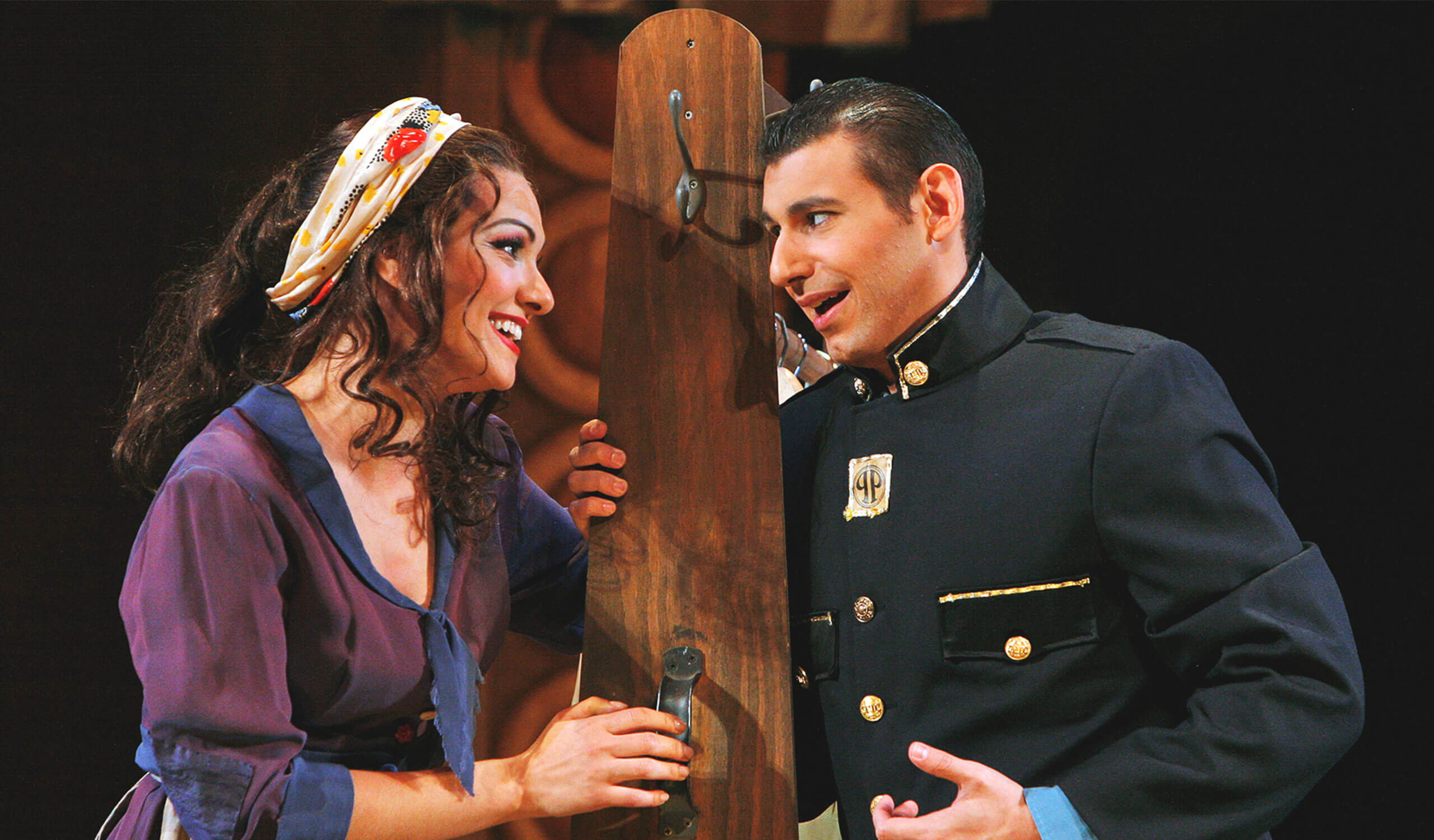
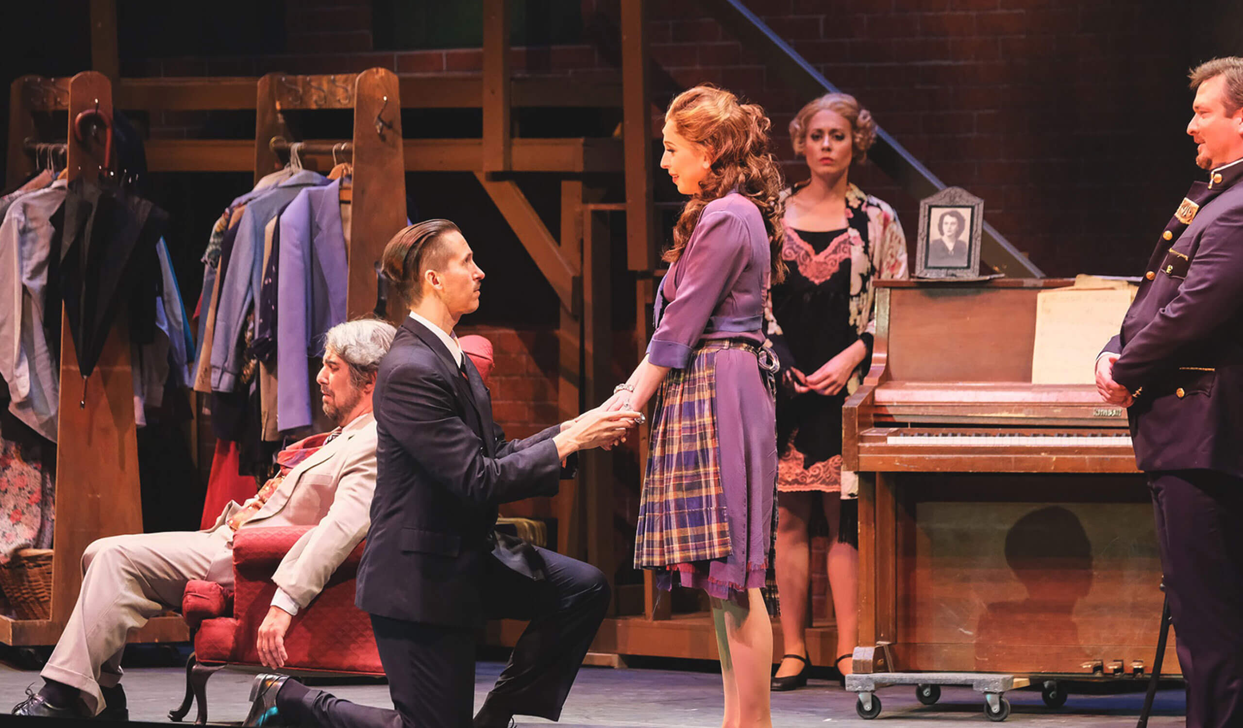
The El Paso Opera had enough of this preconceived notion of what Opera should or should not be. They created new Operas, such as the first Mariachi Opera, as well as reinterpreting the old favorites. Taking advantage of their climate, they moved the locations of the shows around town. Often finding themselves in an open-air theater. Allowing Opera to be exciting and more approachable to a wider group of people, bringing this artform into their lives.
This new outlook had to be paired with a new identity. Their previous identity fell in line with this idea of exclusivity, and that needed to change in order to fulfill this mission. Ahead of their 25th anniversary, they decided that this milestone was a perfect time to update the identity. We worked with them to create a fresh new identity that was approachable, understandable, and unique to El Paso and the El Paso Opera.
A big thanks to our former intern Dana Kingery for all the help on this project. Project contracted by Aidan James.
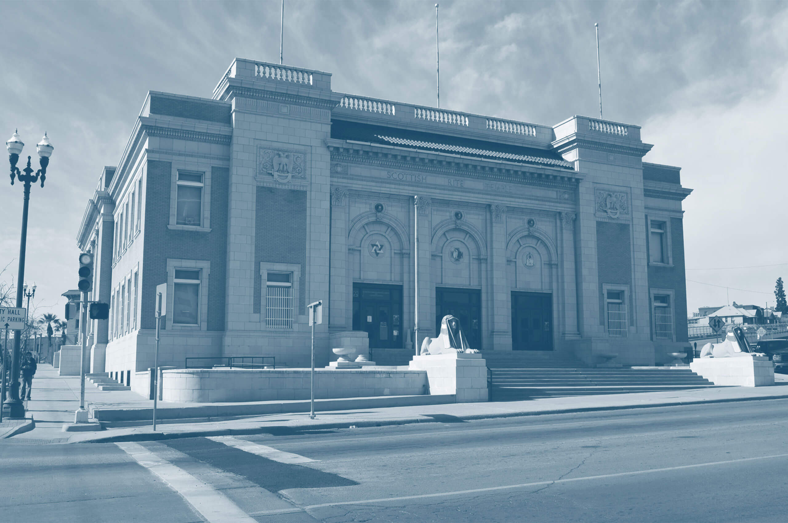
The landscape and architecture of El Paso was the inspiration for the pattern system. Creating a mix of hard lines and organic forms to create a cohesive pattern that felt as exciting and diverse as the city and its people.
This pattern can flex, change, and scale with each new application. Allowing it to easily be applied to physical collateral and digital collateral alike.
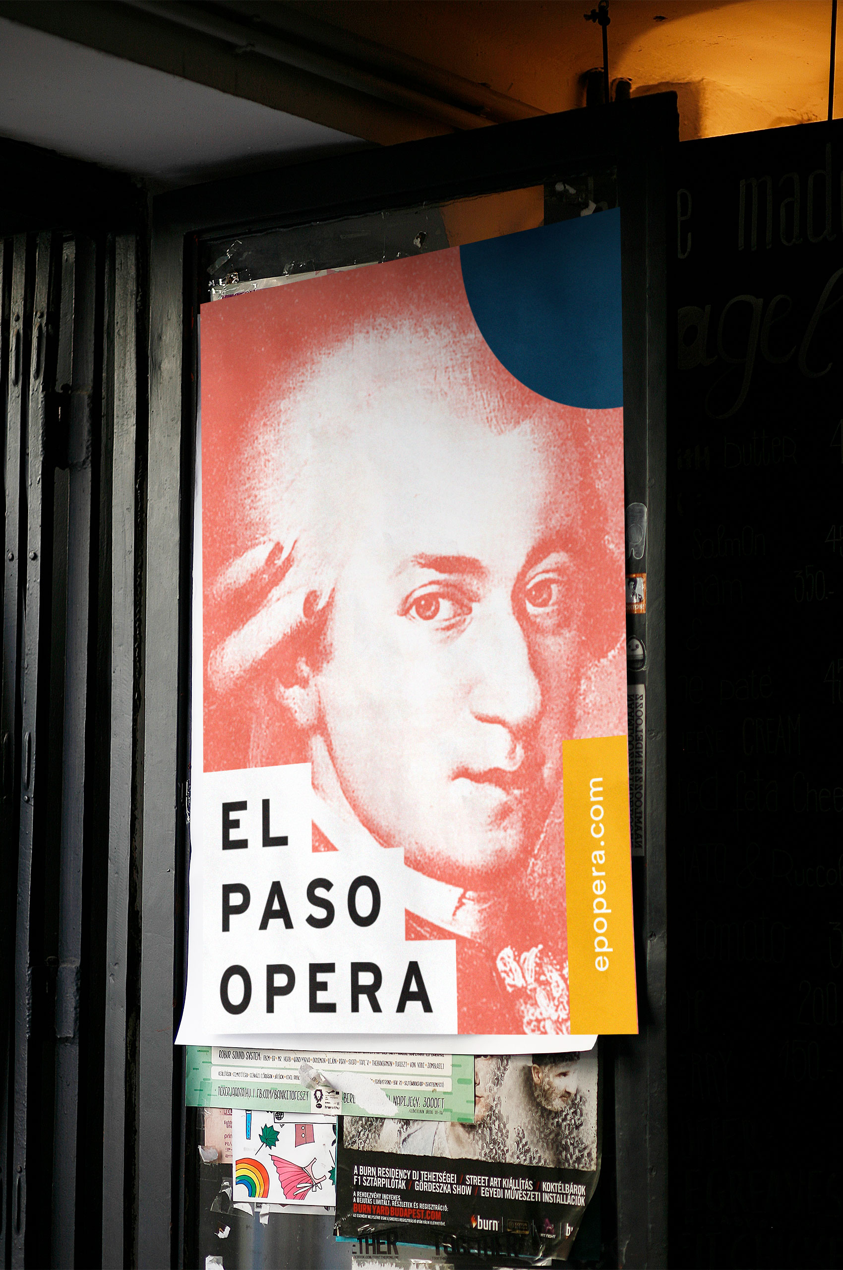
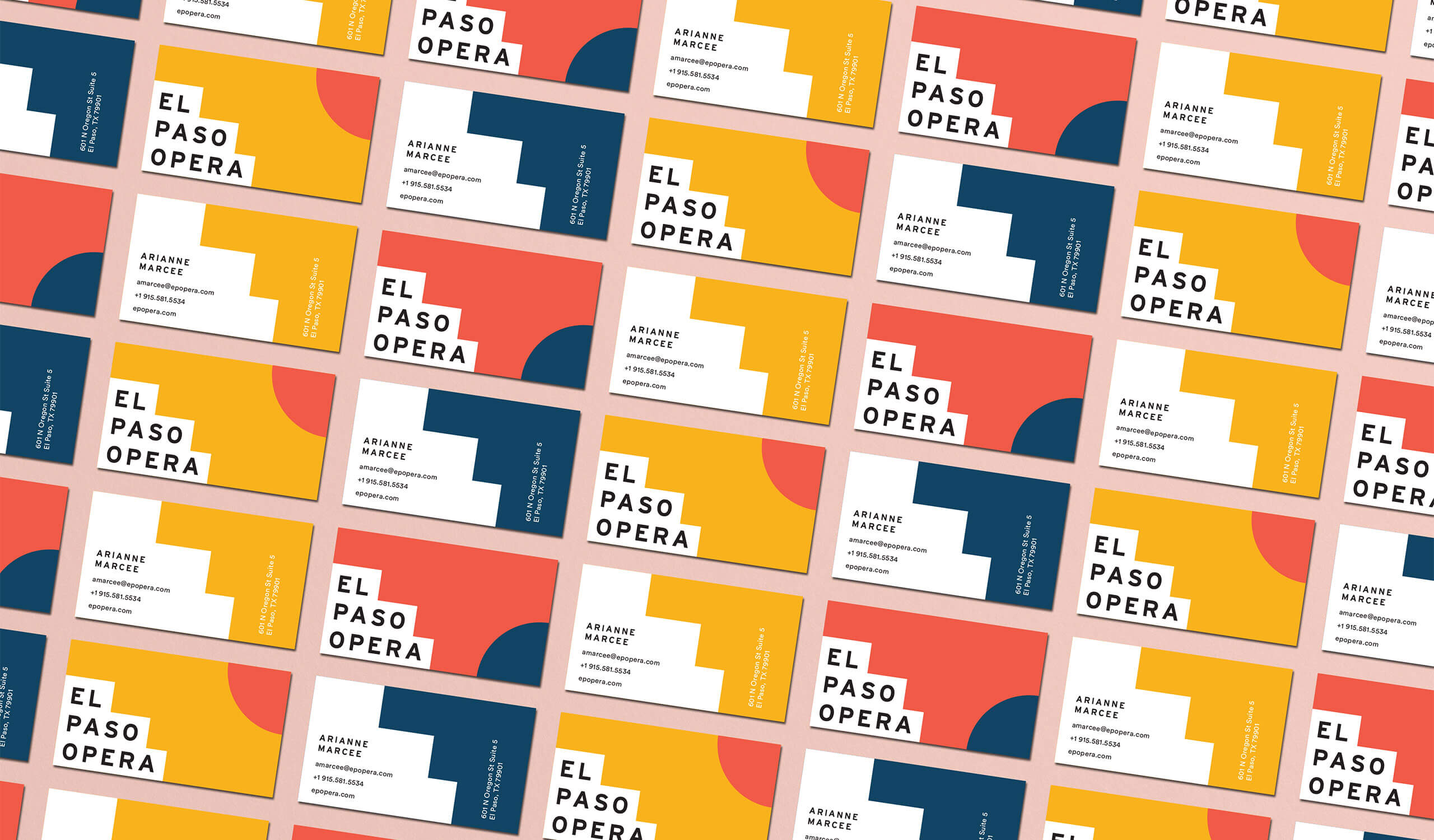
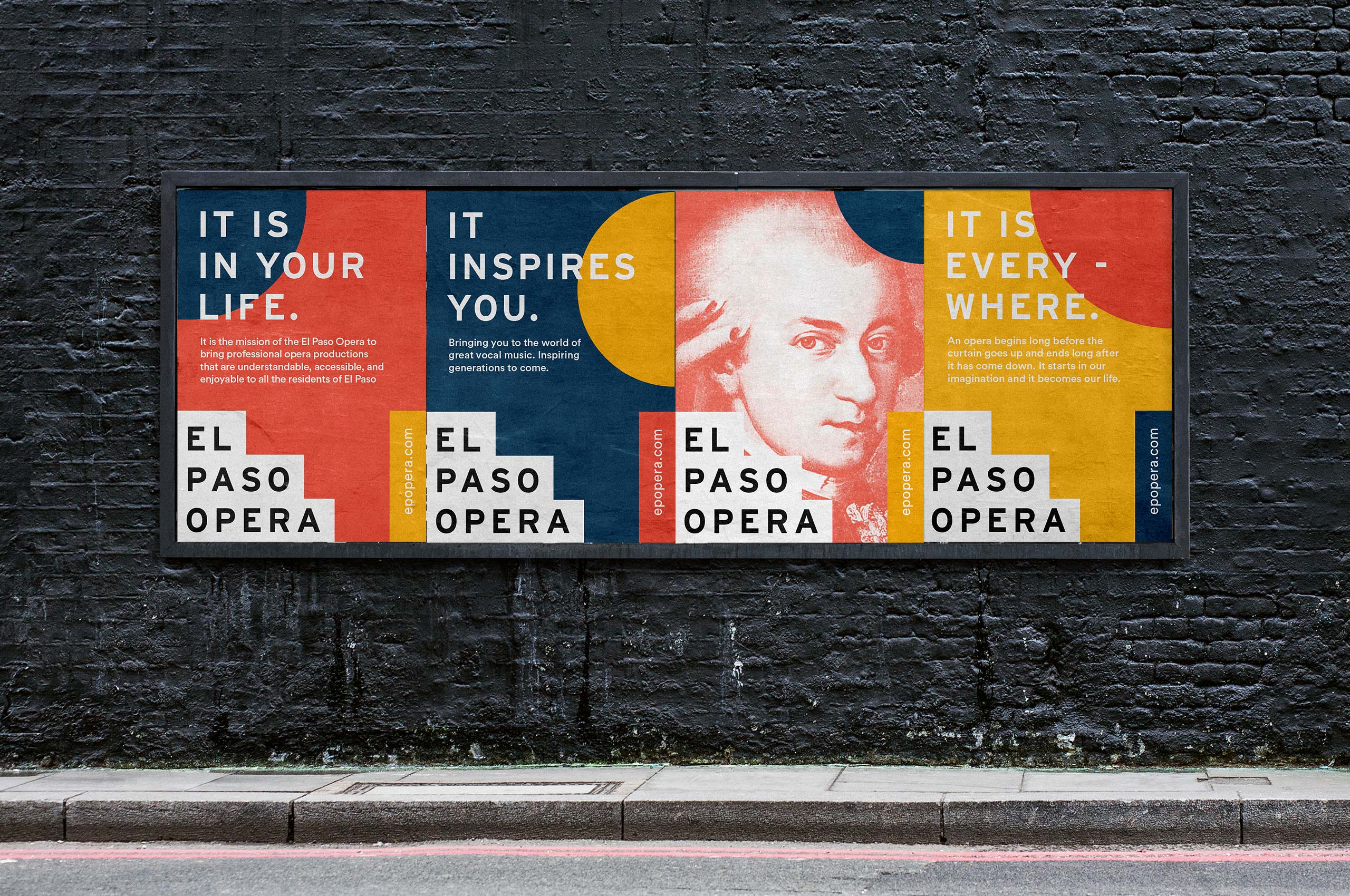
We used the landscape and bright colors of the city as the inspiration for the identity. Allowing the city to breathe life into the Opera. We combined patterning, modern type, and the palette of the area. Bringing together playfulness, seriousness, and the vibrancy of the area to create an identity that would be engaging to all.
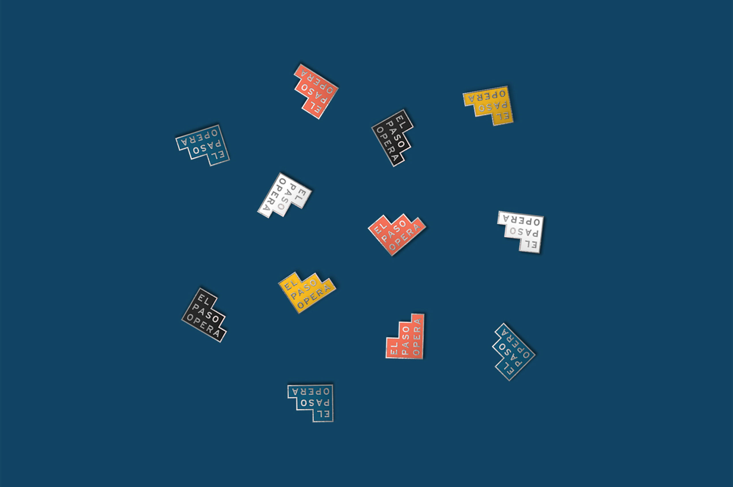
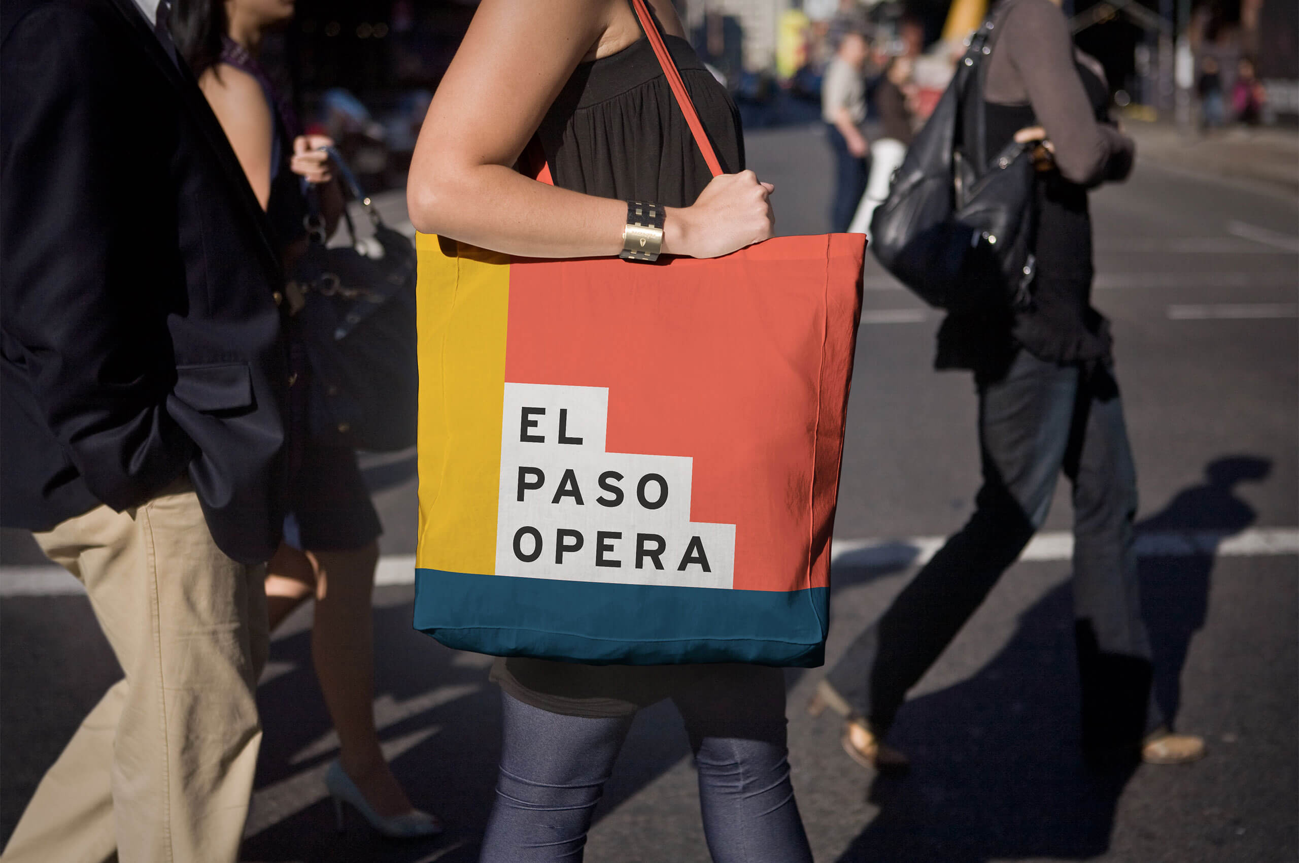
El Paso Opera wanted to allow patrons to show their support and promote the Opera around town. Creating a set of bright, eye-catching pins was a fun and easy way for opera advocates to feel connected while contributing.
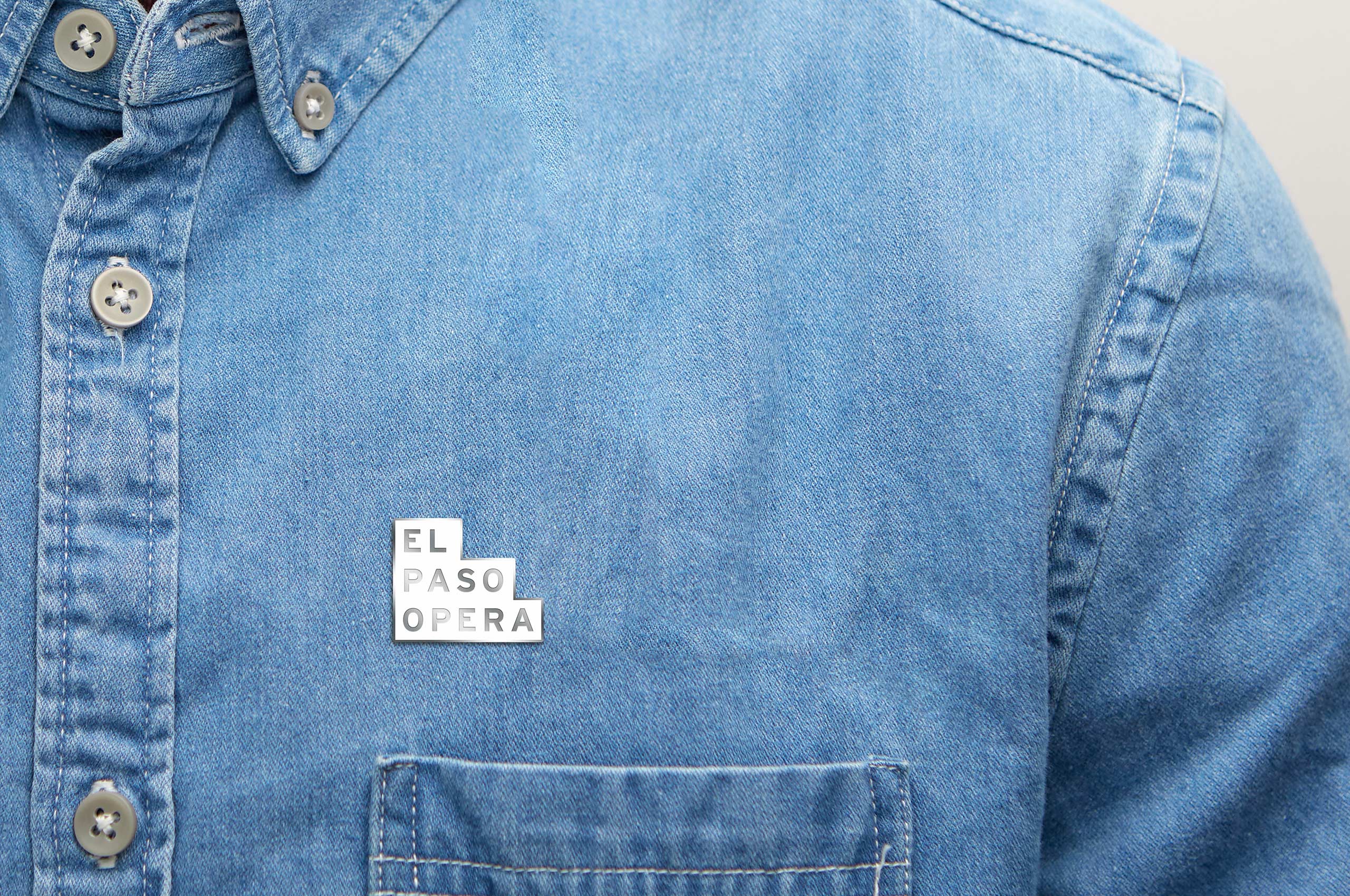

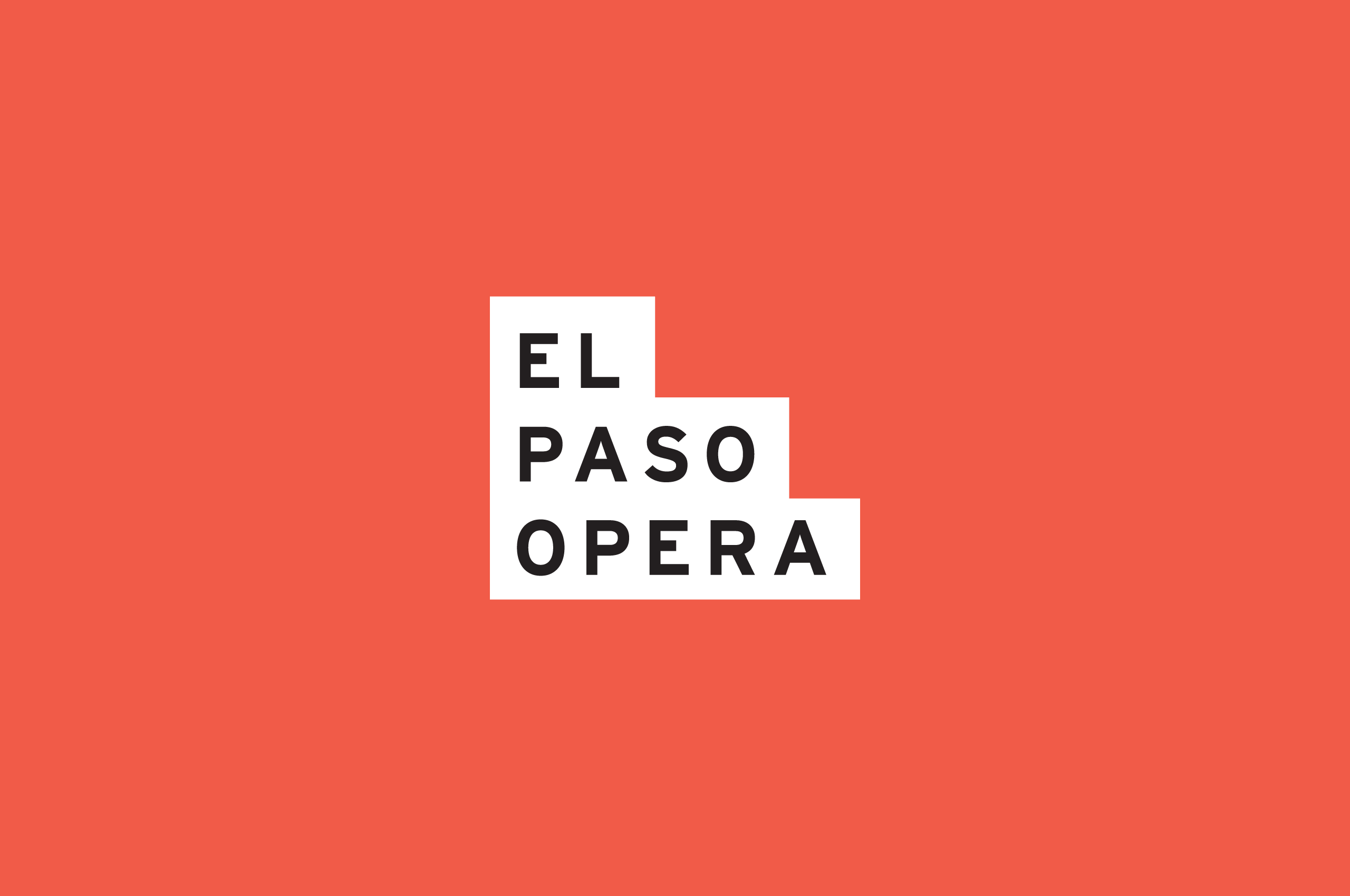
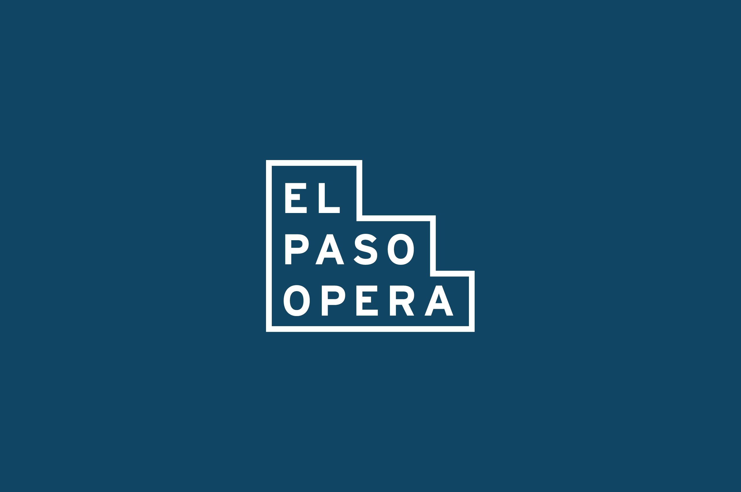
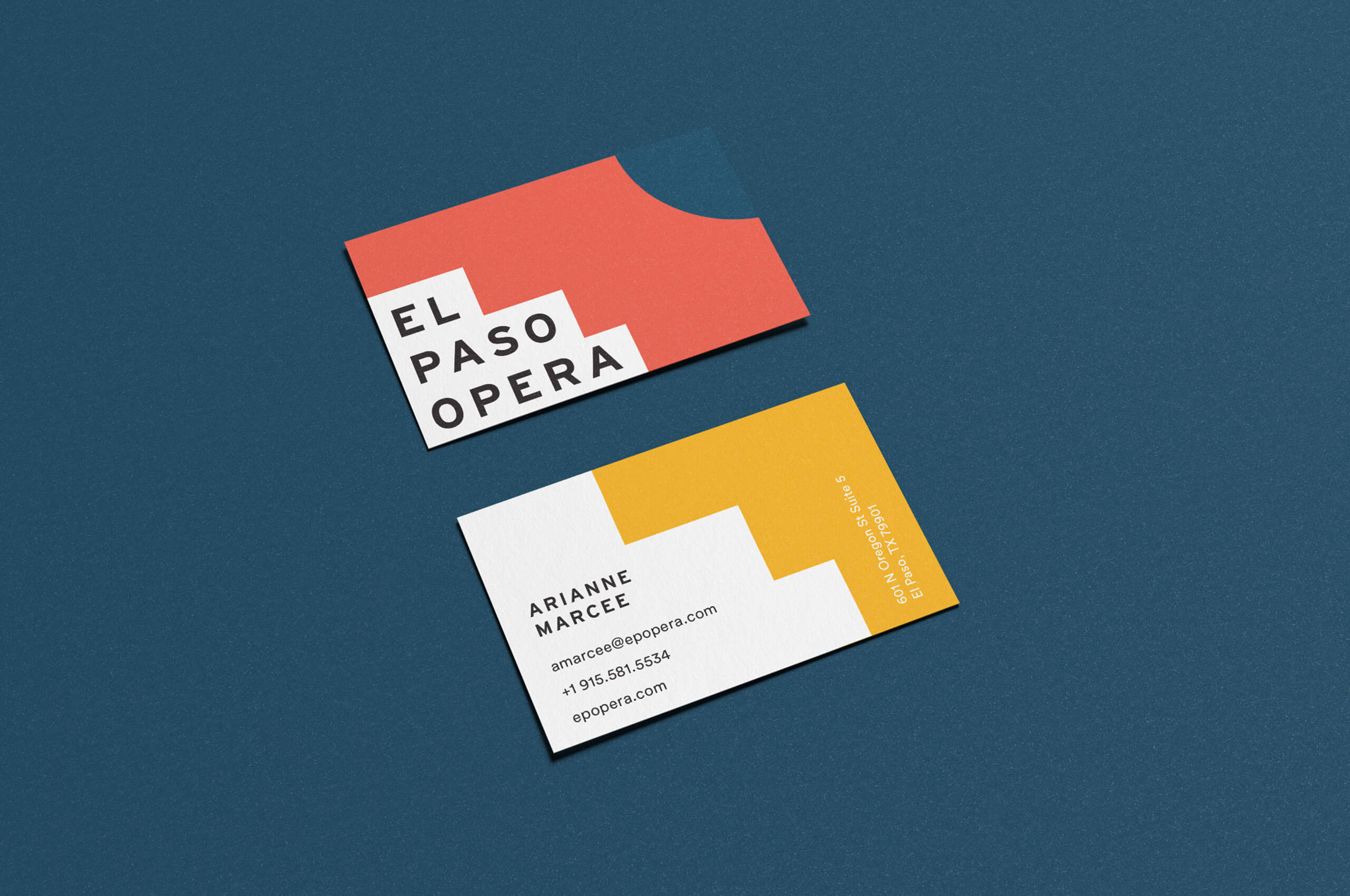
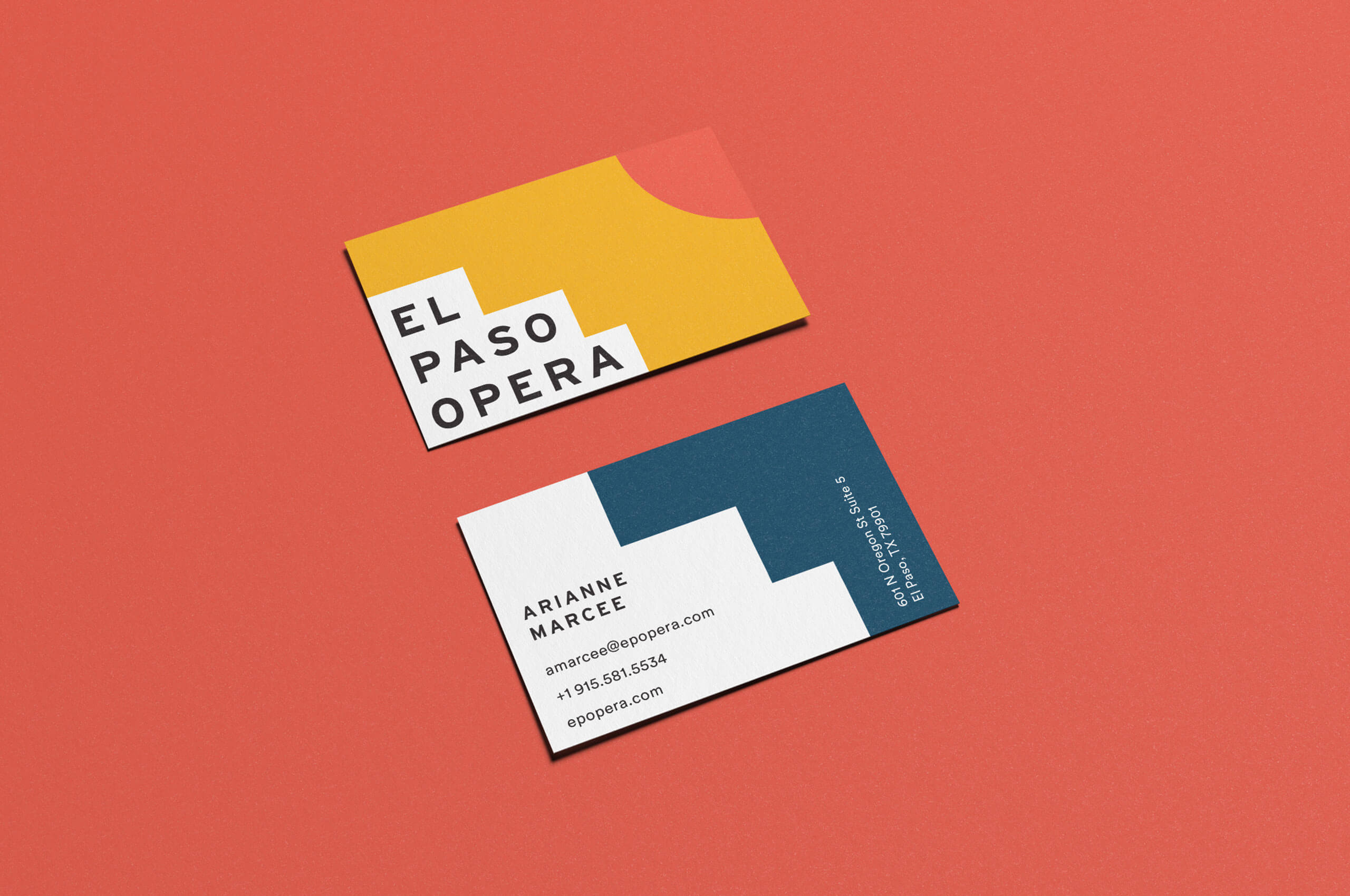
Much like the palette and pattern, the symbol finds its inspiration in the surrounding region. However, it also finds inspiration in the construction of the theater. The “steps” allude to the interaction between the crowd and the stage. Allowing the people of El Paso to take one step closer to the show. This duality can be seen in the construction of the mark itself, combining a traditional symbol with a wordmark to create a strong shape that will quickly be legible and recognizable.
We created two different versions of the mark—solid and outlined—ensuring that no matter how the mark was used, it would be easily recognizable. We chose to build the “steps” to extend up and over the type. Creating optical alignment rather than traditional spacing, producing a more grand scale within the mark; resembling the mountains that surround the city and removing tension.
A look at the previous identity, alongside the update.

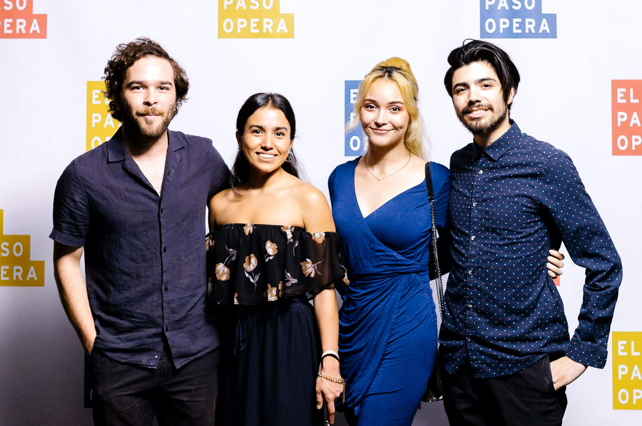
Guests at the launch party for the new brand, ahead of their new season and 25th anniversary.

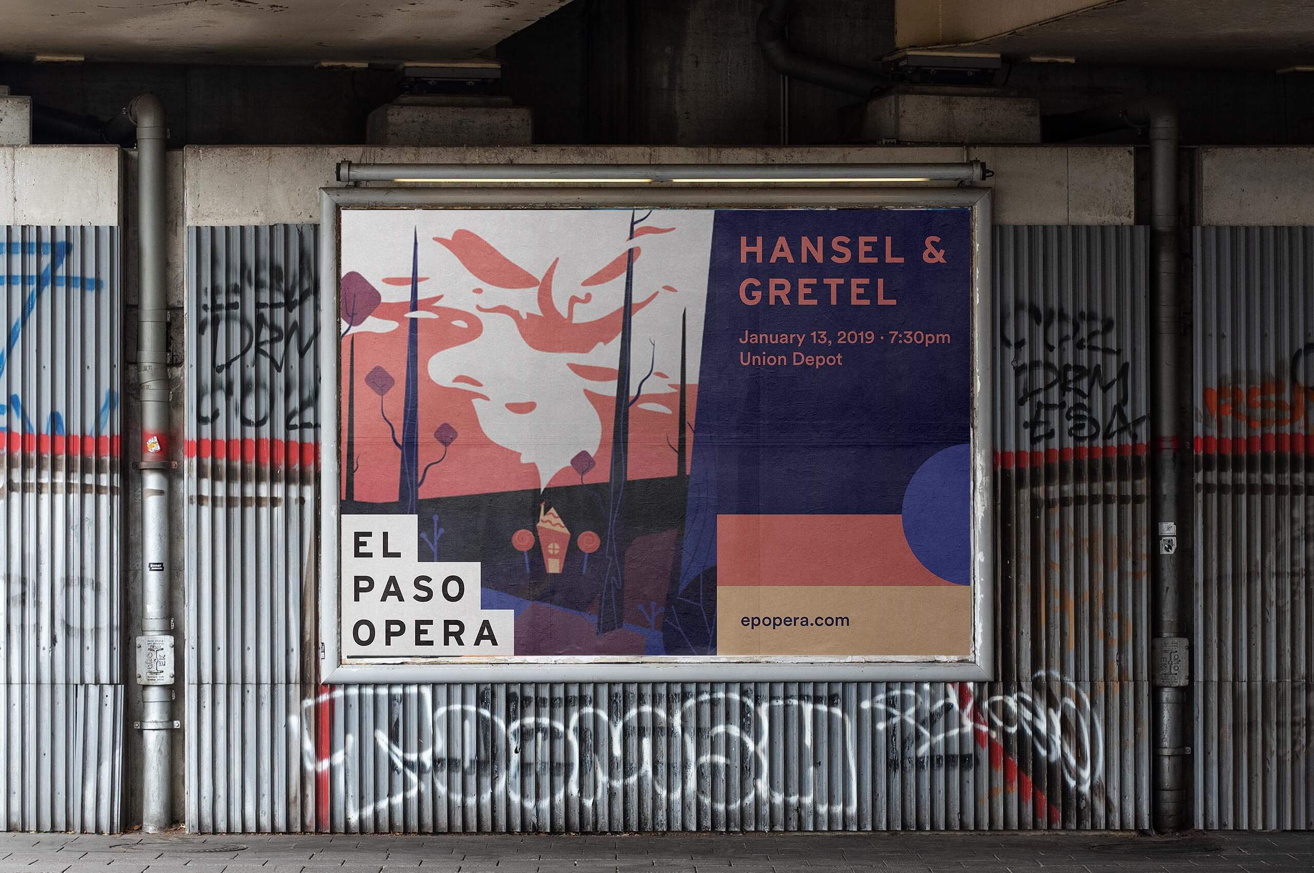
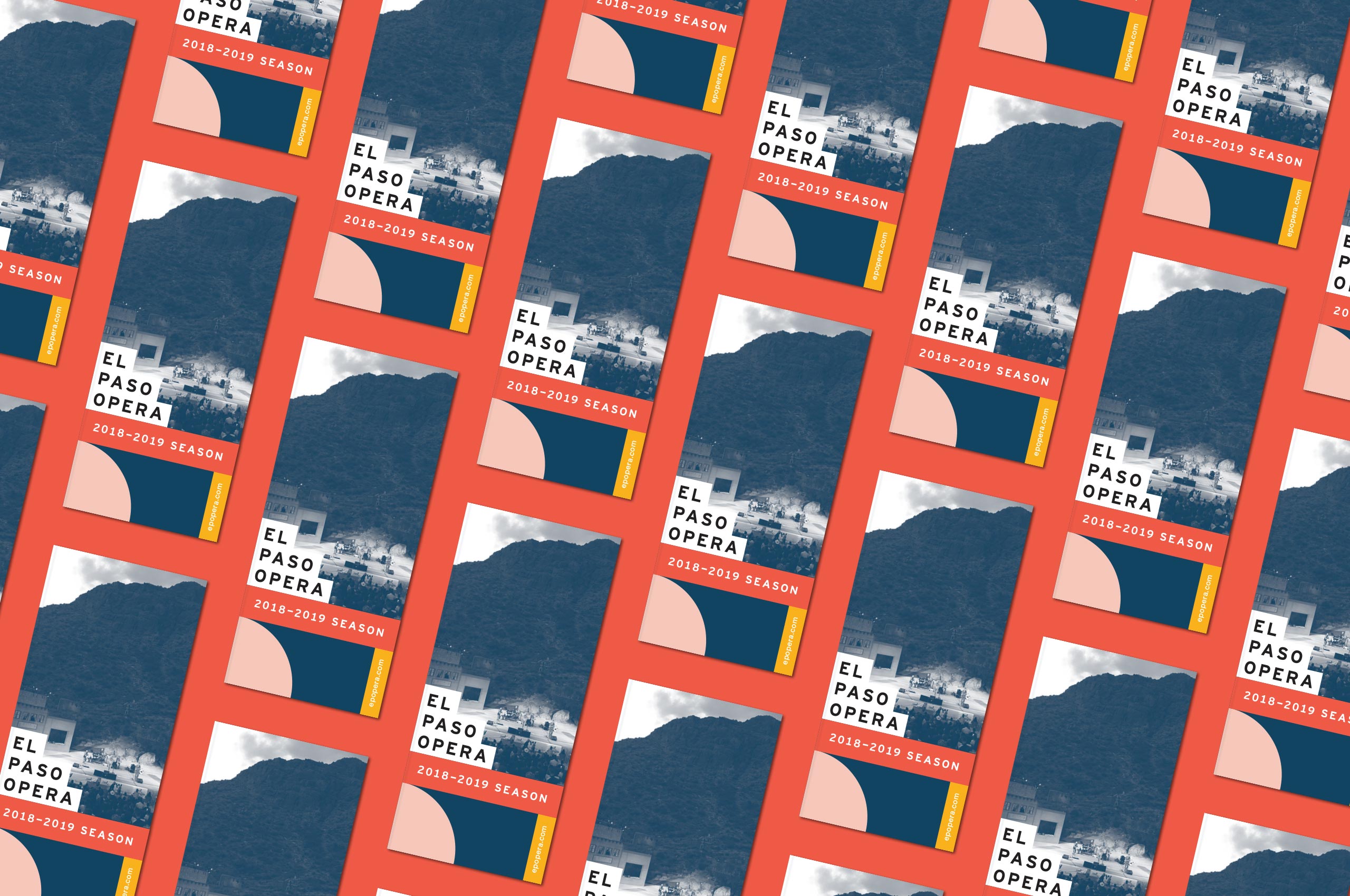
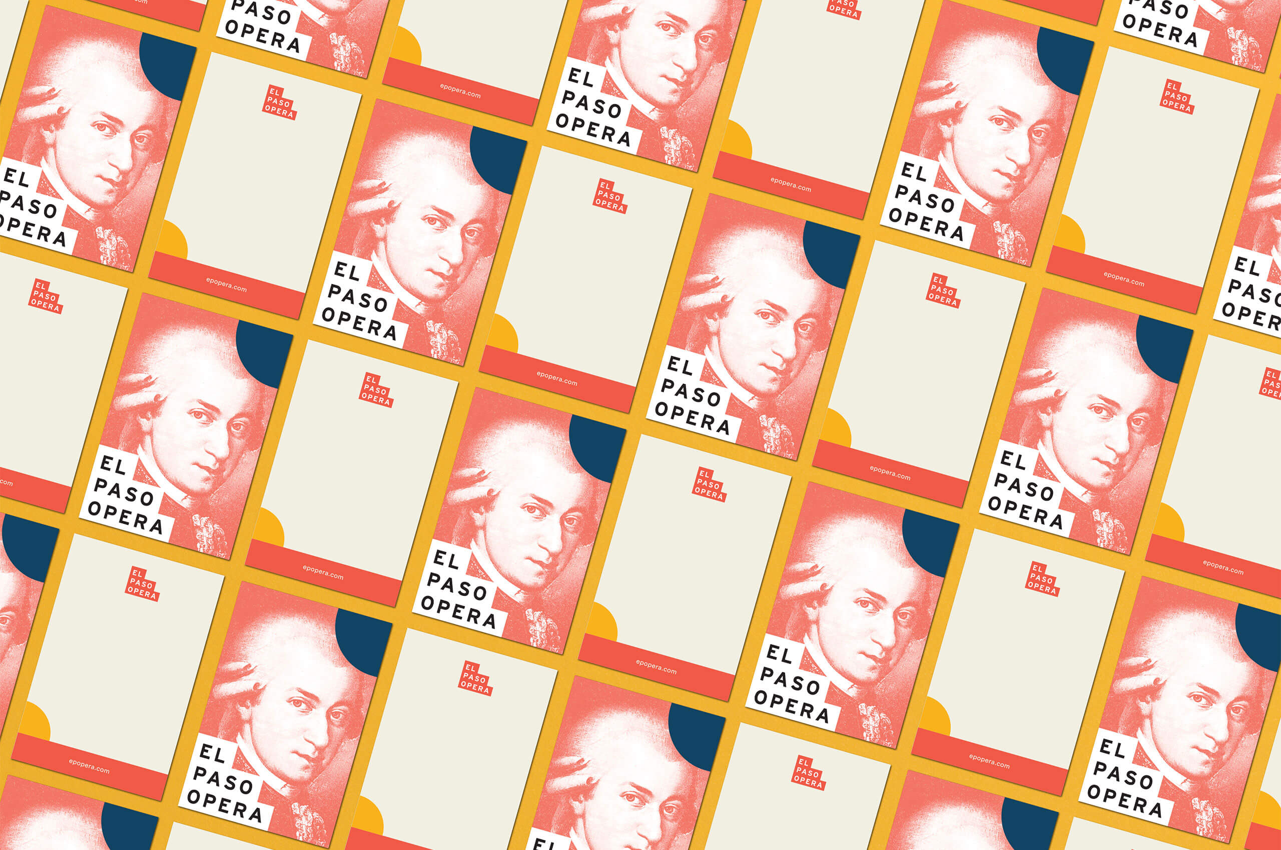
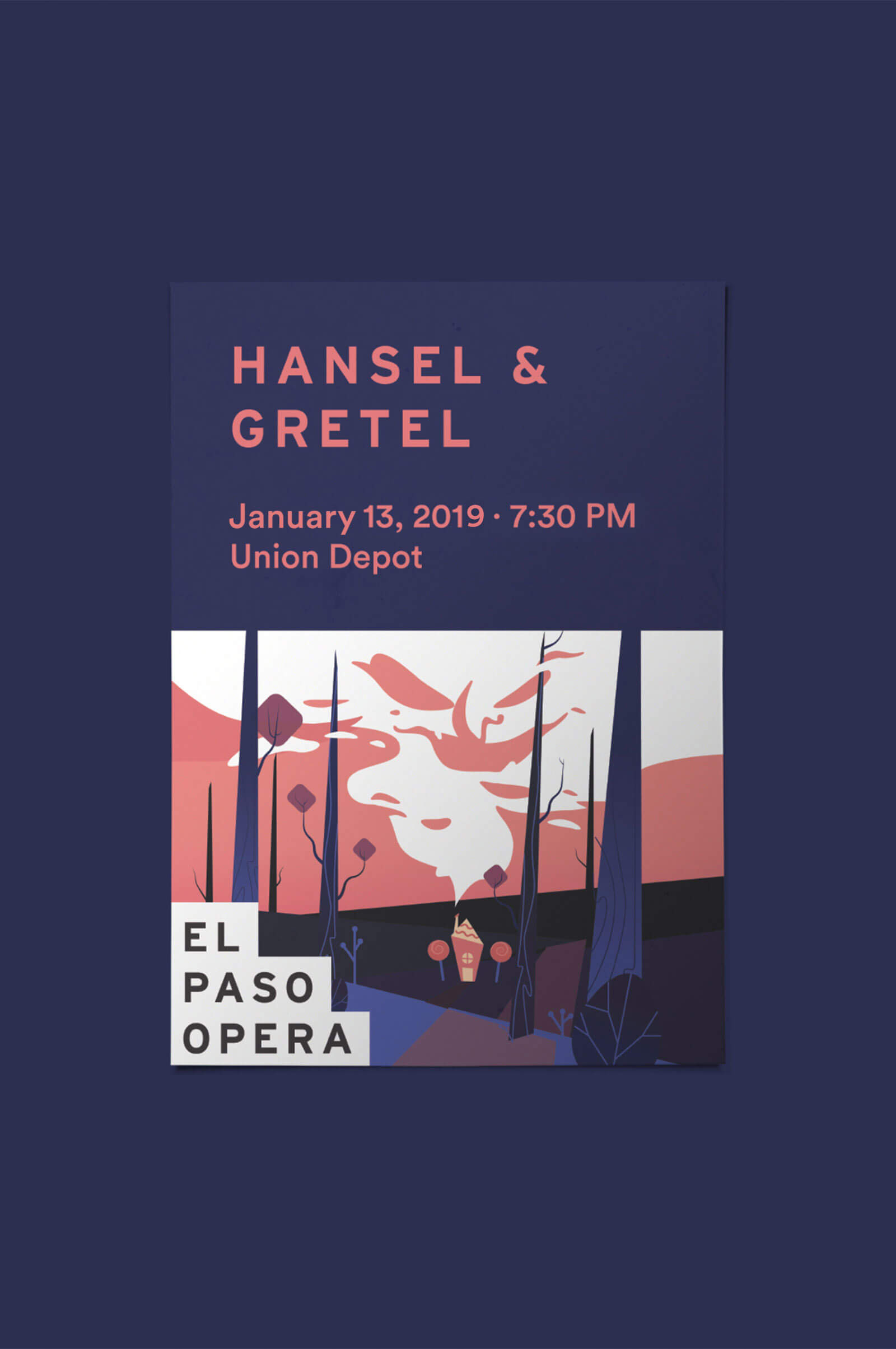
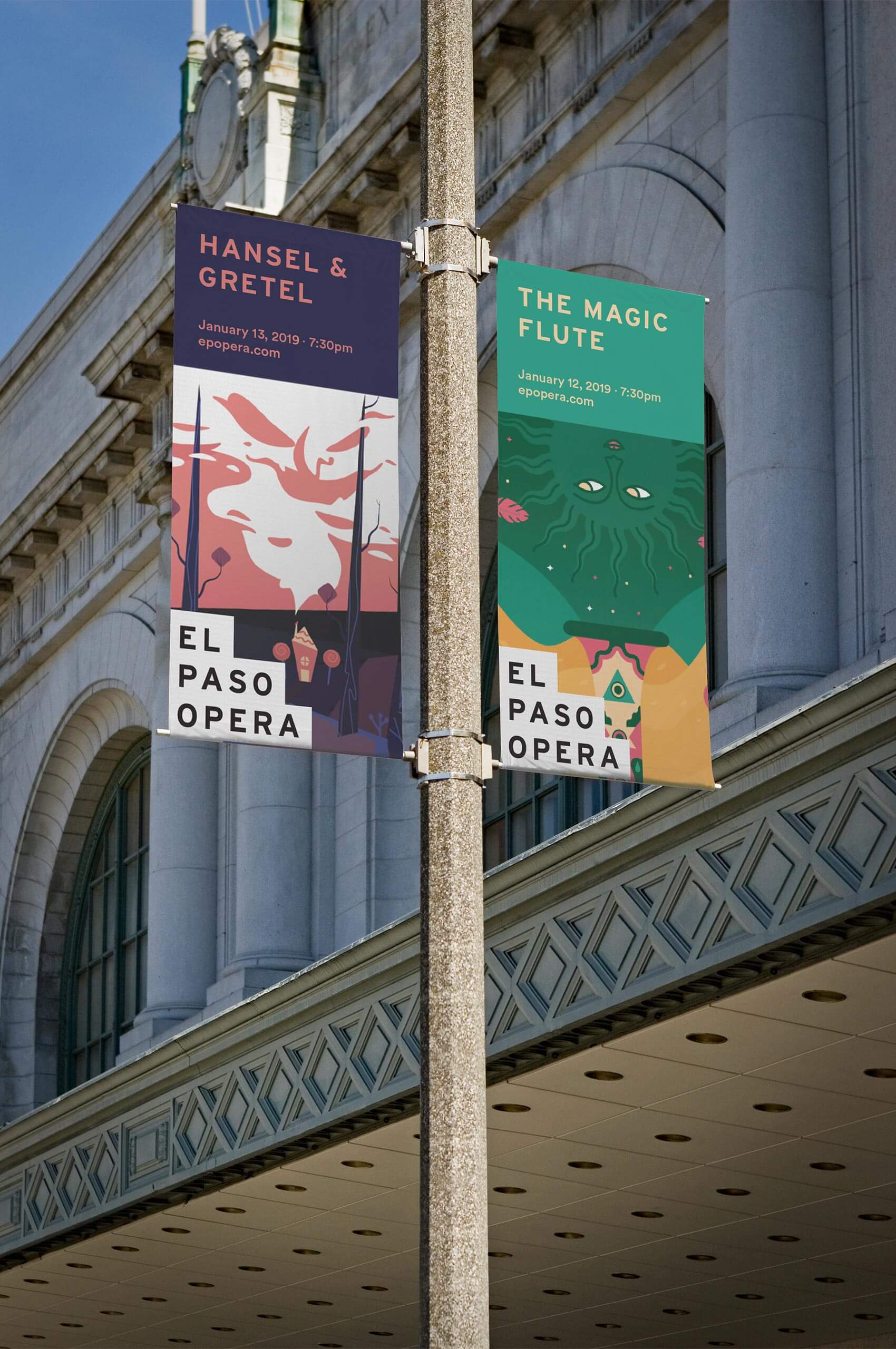
It was important for the show-specific artwork to have its own personality. If the core brand palette was used every time, it could clash with the color palettes of the artwork.
To combat this, we developed a system that allows the color to be changed depending on each show. By allowing the colors to be taken from show-specific artwork, we’ve ensured that each show will have a fresh palette that won’t compete. This also ensures that the palettes won’t feel stale over time, creating excitement and intrigue with each new production.
Here you can see, we repurposed the art from Hansel & Gretel and The Magic Flute, pulling light, mid, and dark tones to be used throughout the materials. Creating unique, one-of-a-kind promotional materials for each show.
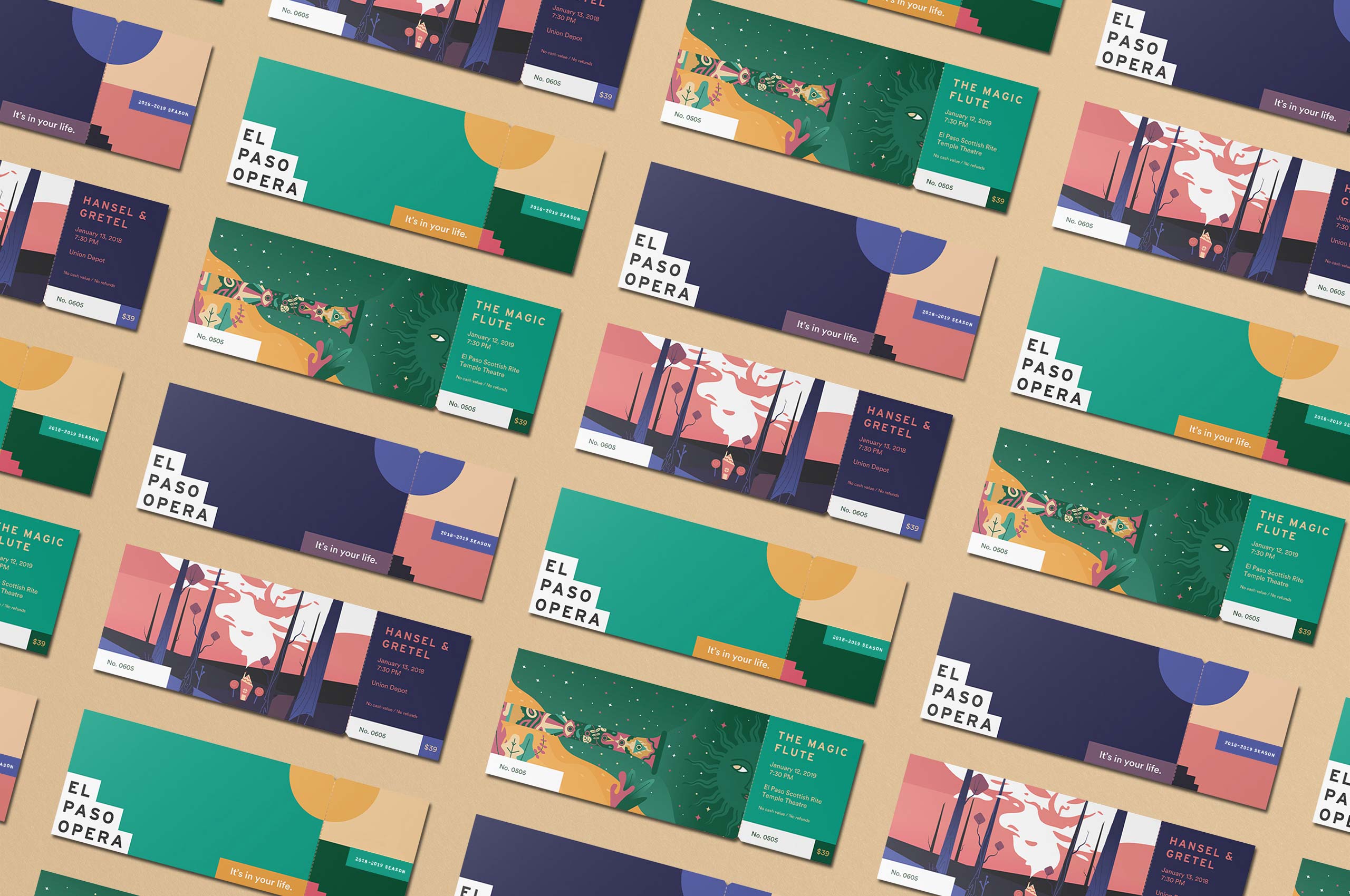
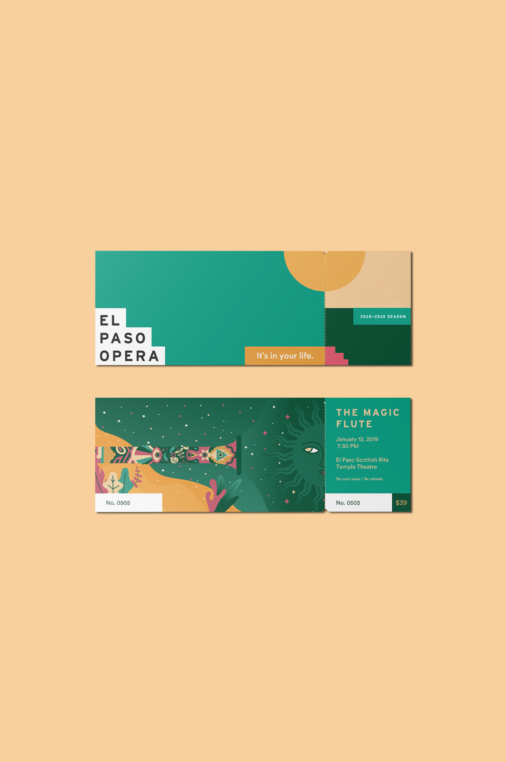
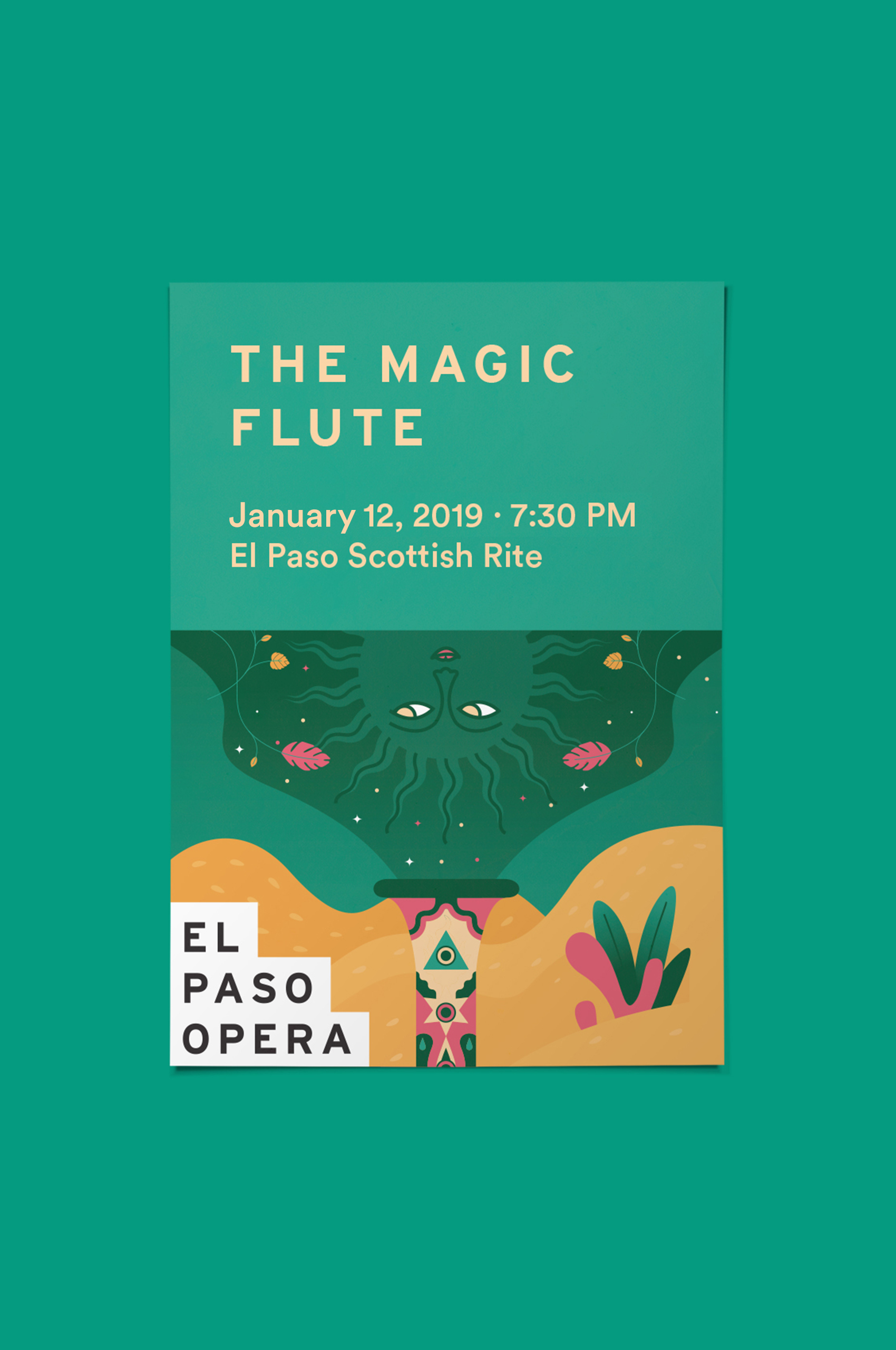
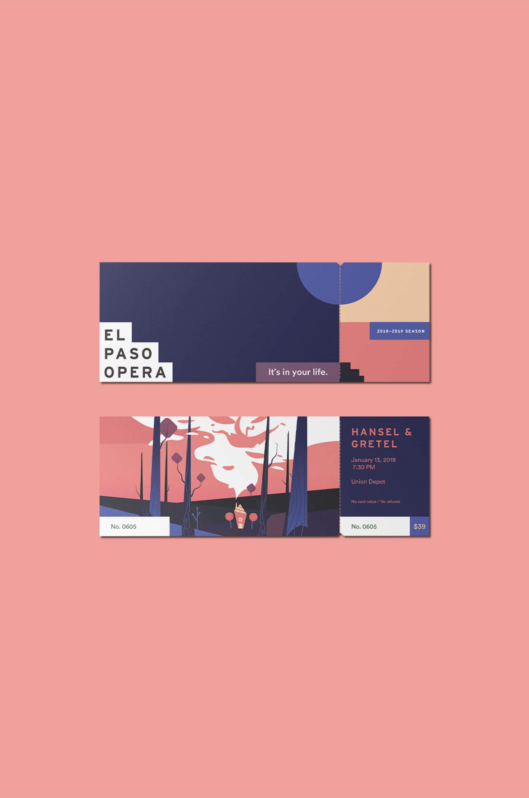
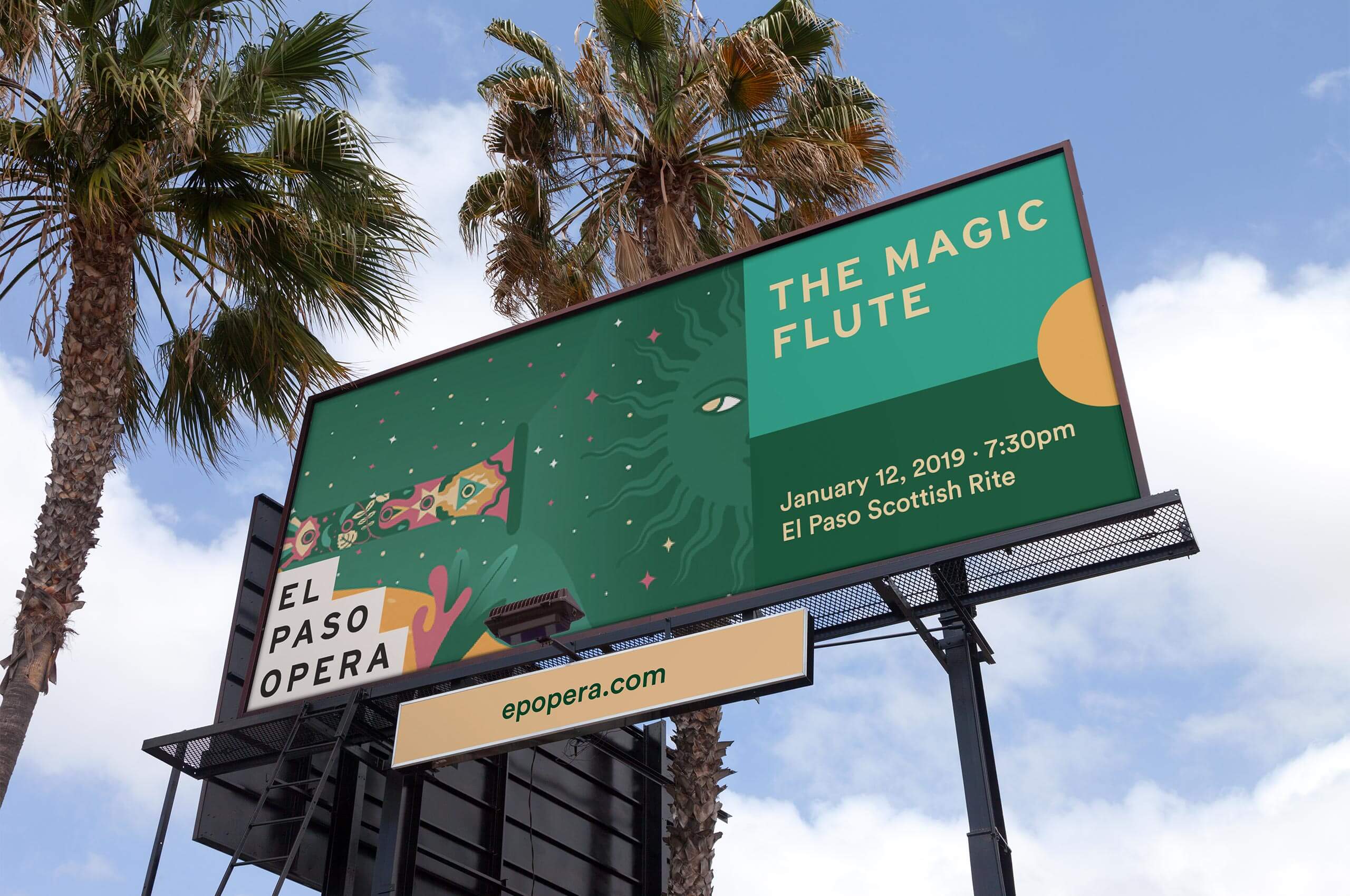
The system was designed to flex into any medium. By combining the show artwork with the brand pattern, the materials can feel fresh and new with each show, while still feeling like part of the same identity system.