Parallel
Transformative, timeless spaces that elevate communities.
Transformative, timeless spaces that elevate communities.
Parallel creates meaningful, enduring environments through adaptive reuse, historic preservation, tenant improvements, and ground-up construction. Their hands-on, collaborative approach respects the story of each building and the vitality of the surrounding community, delivering spaces that inspire, endure, and add value.
They partnered with Mast to redefine their identity and align their brand with their evolving vision and expertise. Formerly known as Downtown Property Services, their previous name and identity felt transactional and outdated, failing to reflect the company’s forward-thinking ambitions. Through strategic research and analysis, we guided the transformation to Parallel, a name that embodies convergence, growth, and collaboration—values central to their ethos.
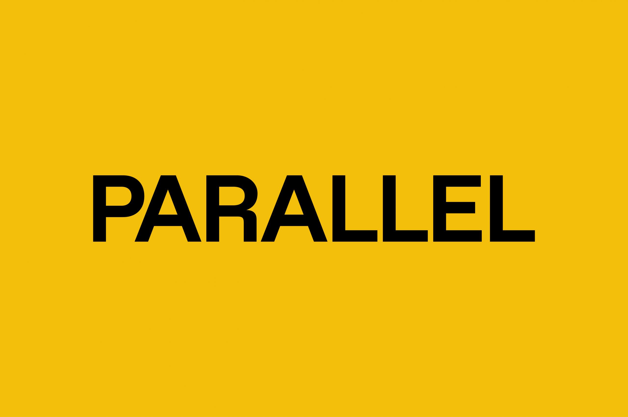
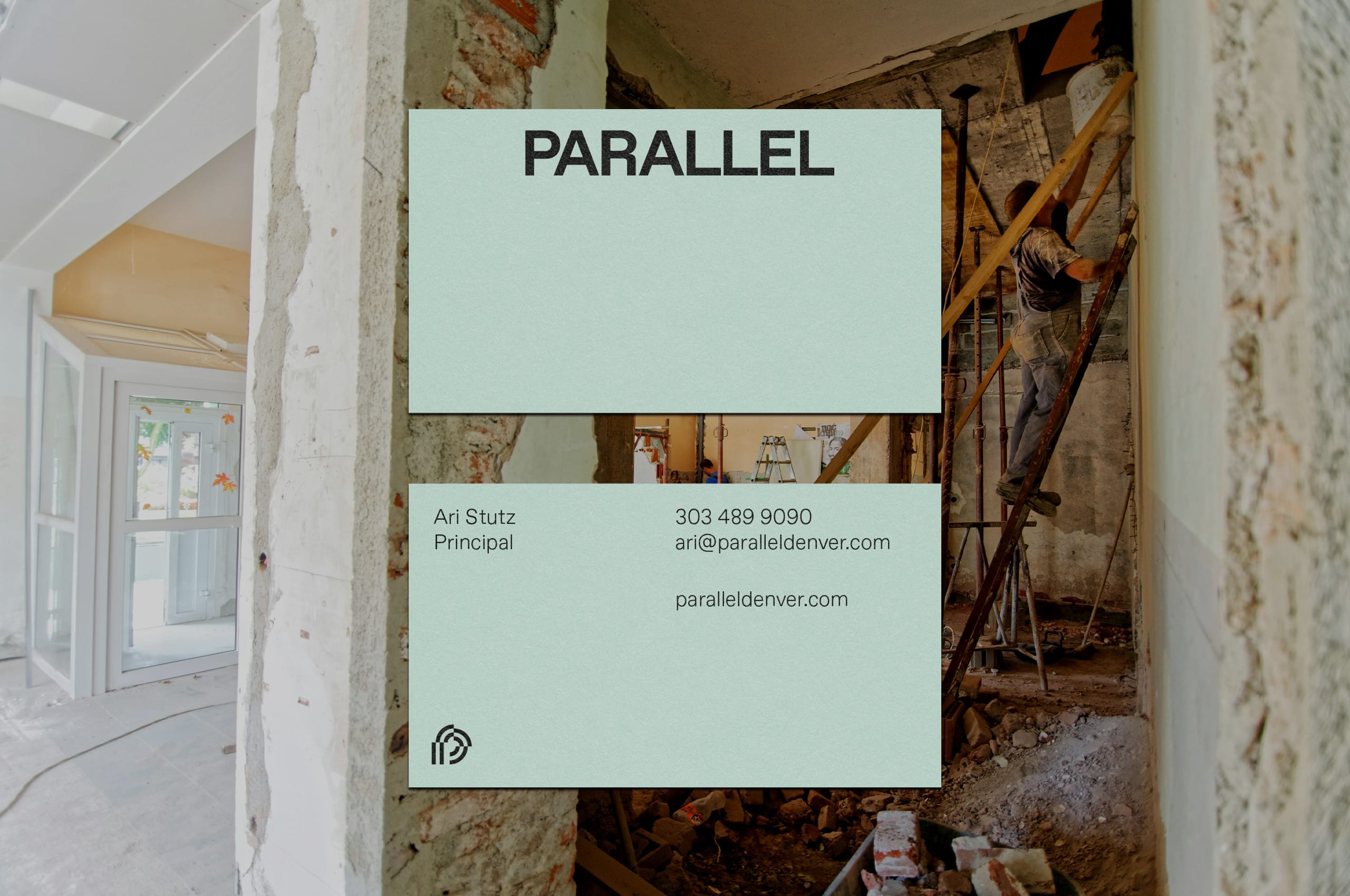
The new identity blends bold authenticity with timeless authority, positioning Parallel as a leader in general contracting and property management in Colorado. A cohesive system of elements—including a striking symbol, confident wordmark, versatile color palette, and thoughtful iconography—reinforces their commitment to innovation, craftsmanship, and sustainability. With this reimagined identity, Parallel inspires trust, fosters connection, and transforms spaces with quiet strength and enduring impact.
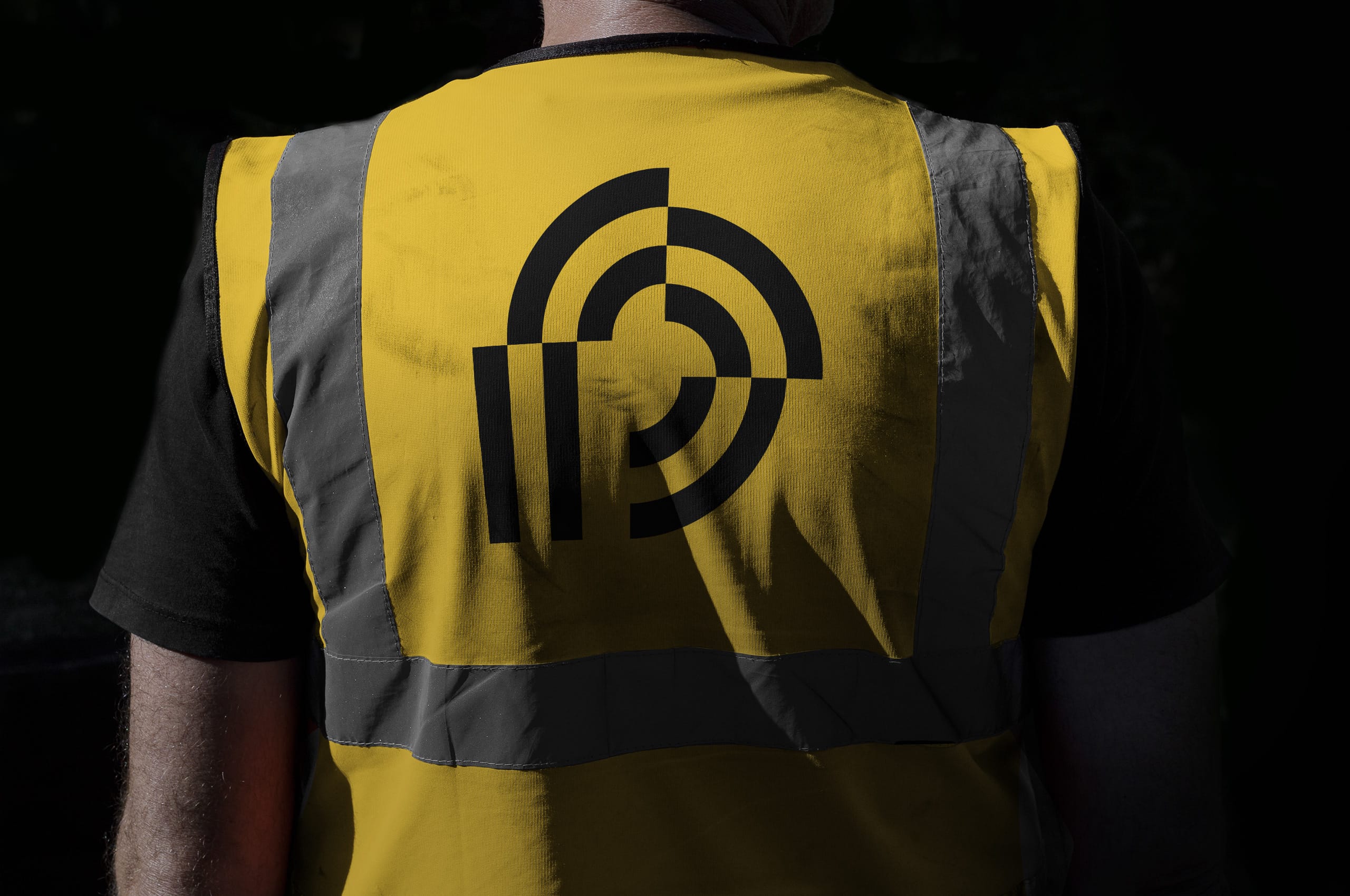
By aligning closely with clients, architects, and subcontractors, they approach every project as a unique opportunity to balance precision, craftsmanship, and thoughtful solutions. Their work honors their clients’ vision while enhancing the vitality of surrounding communities, delivering spaces add lasting value to the neighborhoods they inhabit.
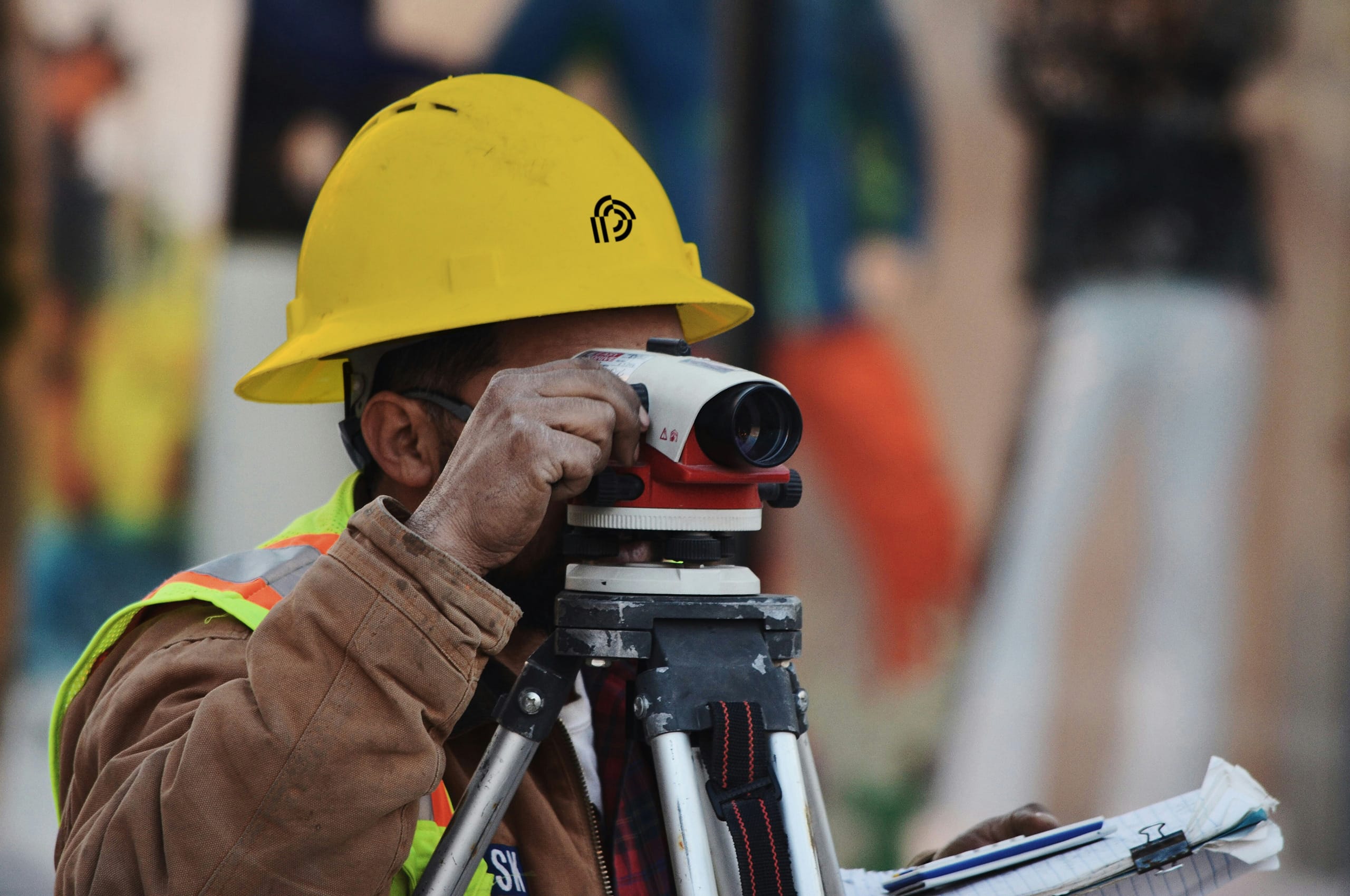
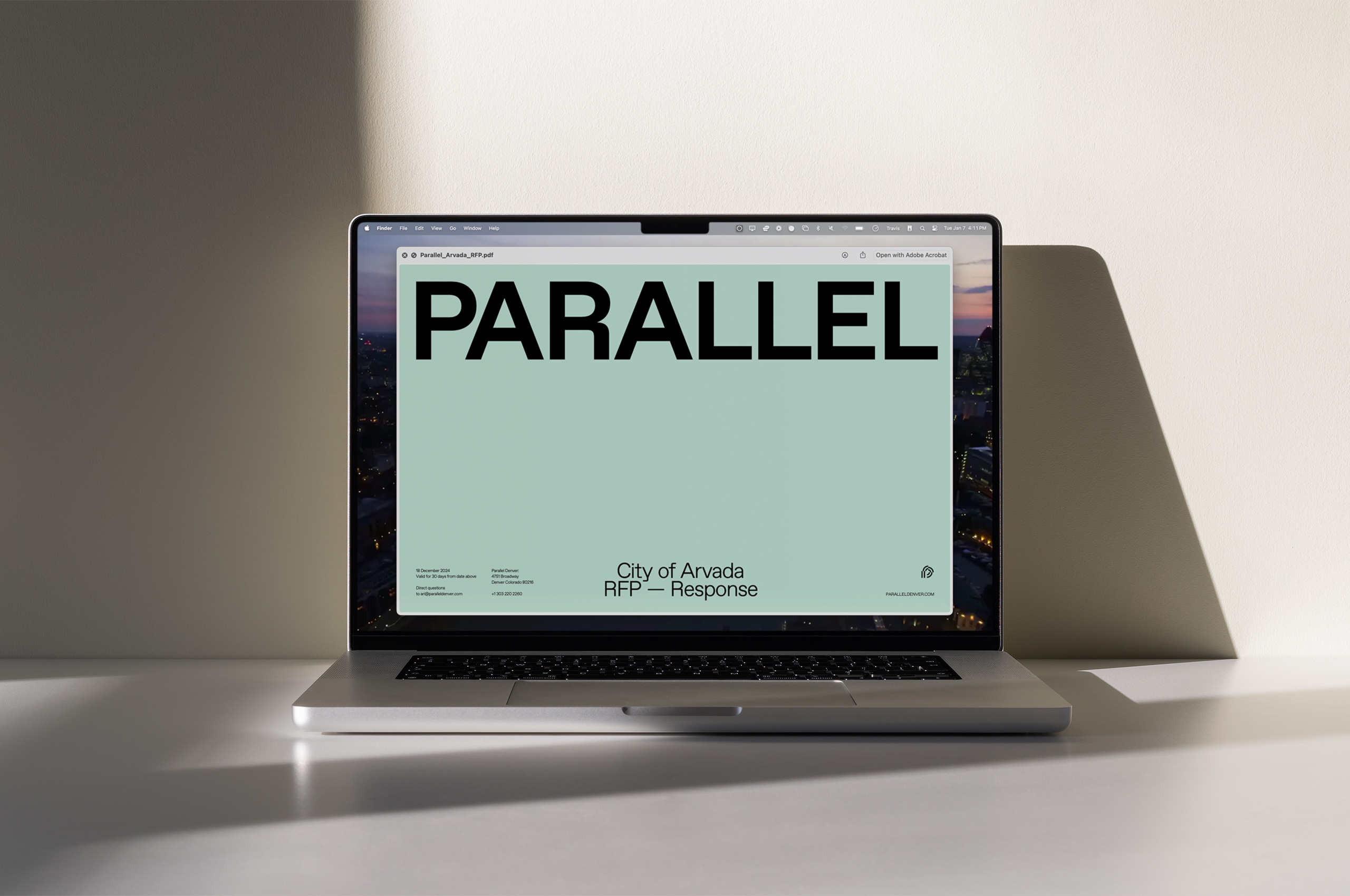
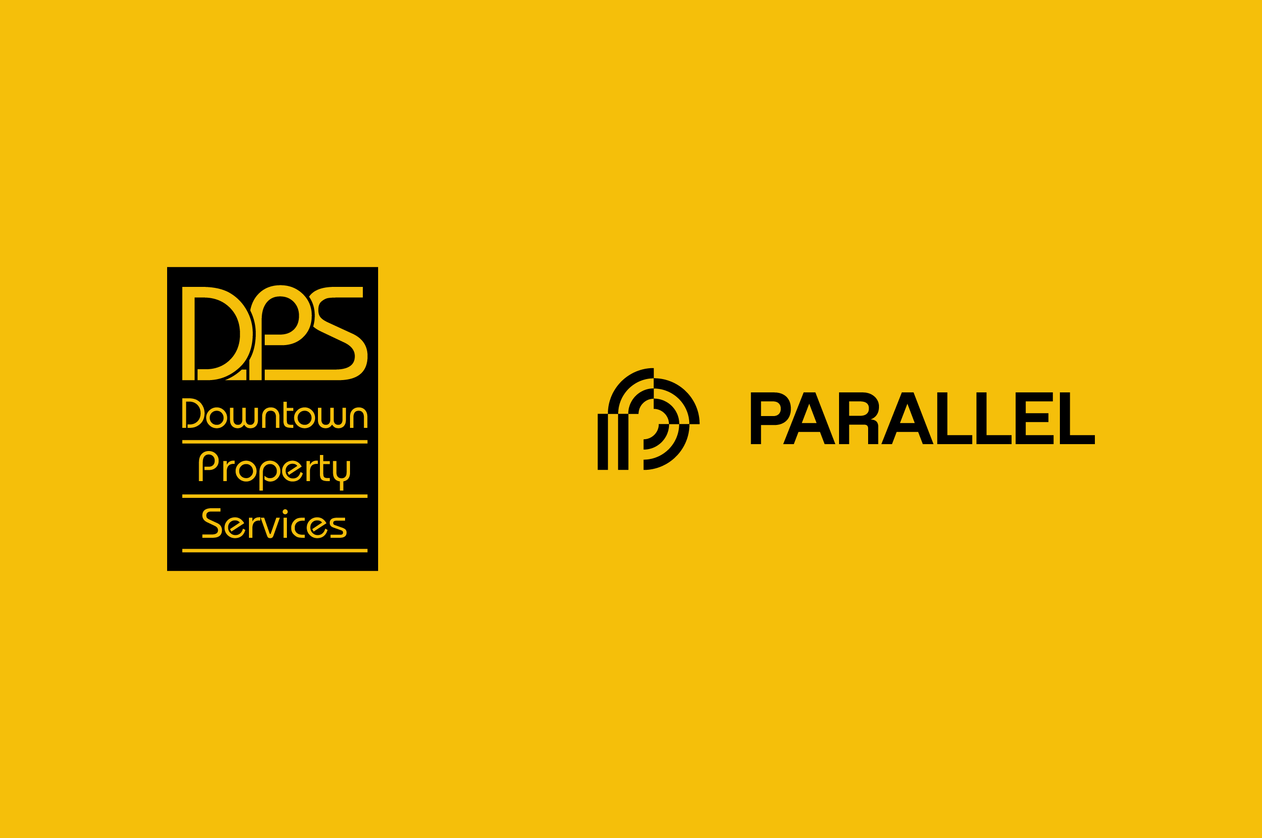
Formerly known as Downtown Property Services (DPS), the name and identity felt constrained by its transactional tone and lacked alignment with the team’s forward-thinking ambitions. The team knew that this had to change; our process started with comprehensive research, strategic analysis, and a vision to redefine the brand’s position in the market, resulting in a rename to Parallel—marking a significant shift, embracing a name that symbolizes convergence, growth, and collaboration—values central to the company’s ethos.

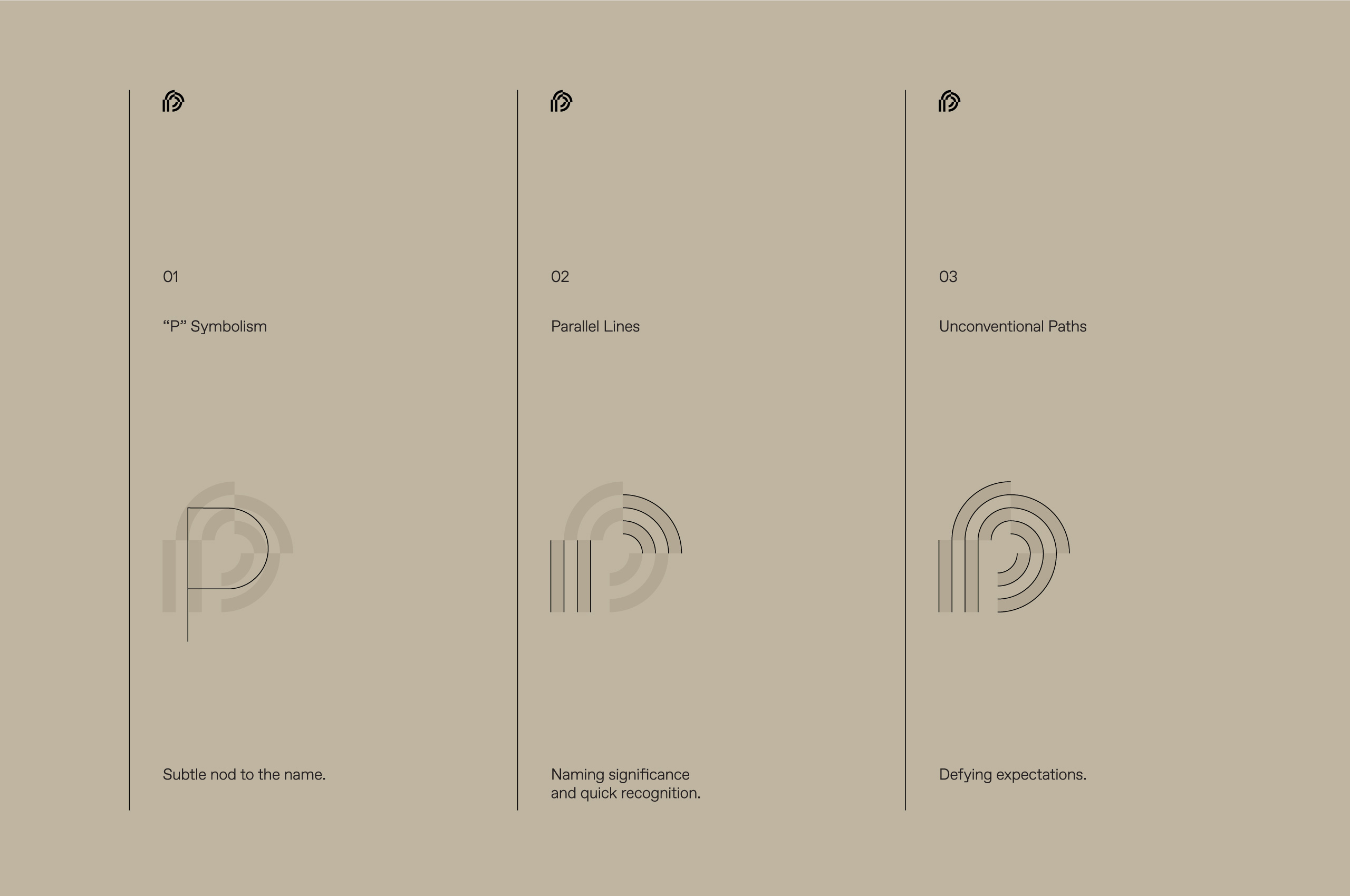
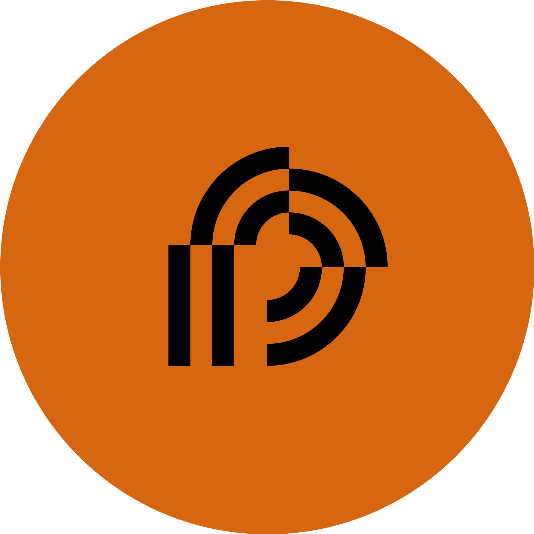
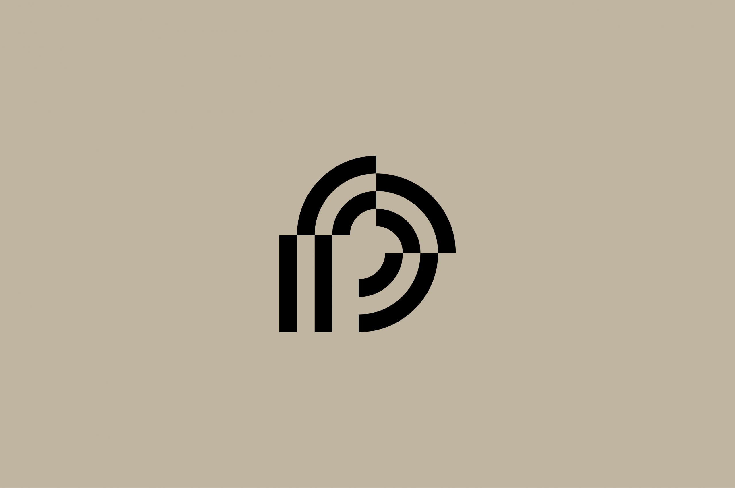
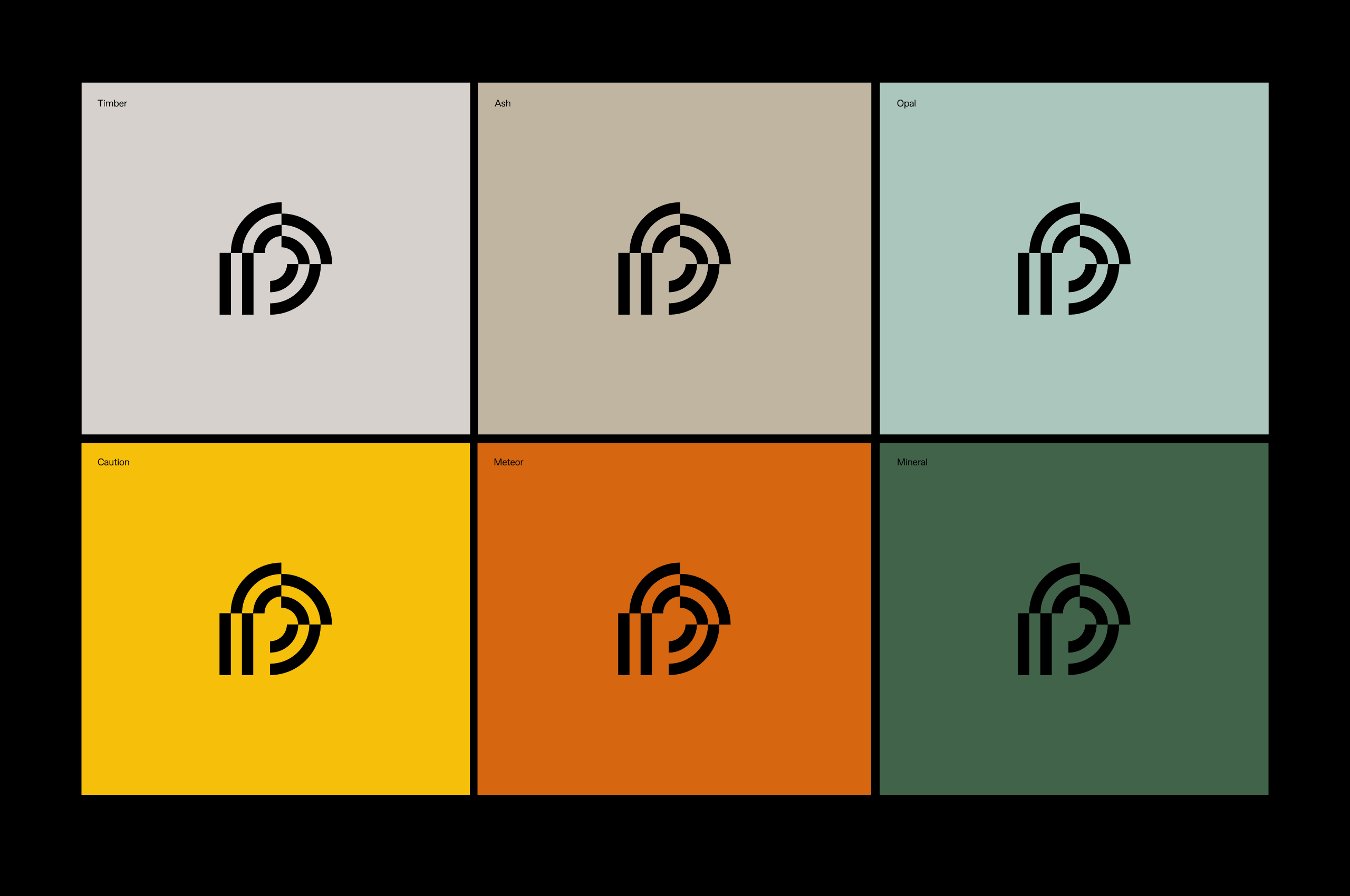
When developing the symbol for Parallel, we wanted to create something that would connect the audience to the updated name and build equity. The mark visually redefines the concept of Parallel lines with a modern and unexpected approach, weaving parallel lines, unconventional paths, and a subtle nod to the letter ‘P’ to convey the innovation, authority, and growth that the Parallel team sought to convey with their updated identity. This mark was designed to be striking and versatile, anchoring the brand with a confident yet understated presence.
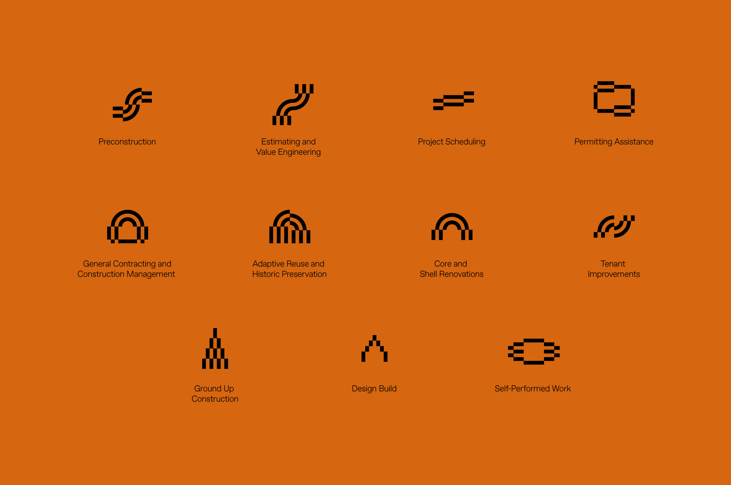
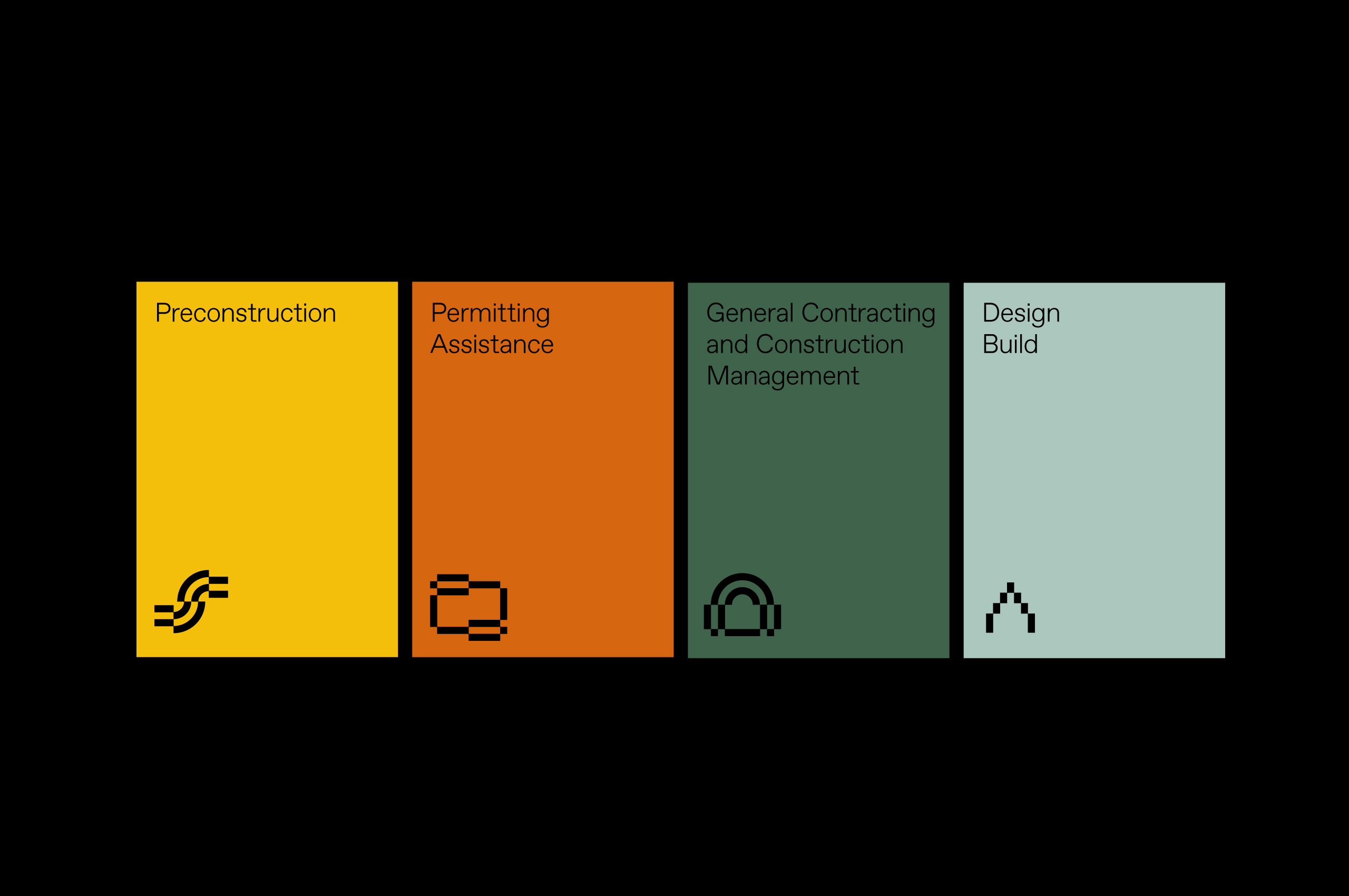
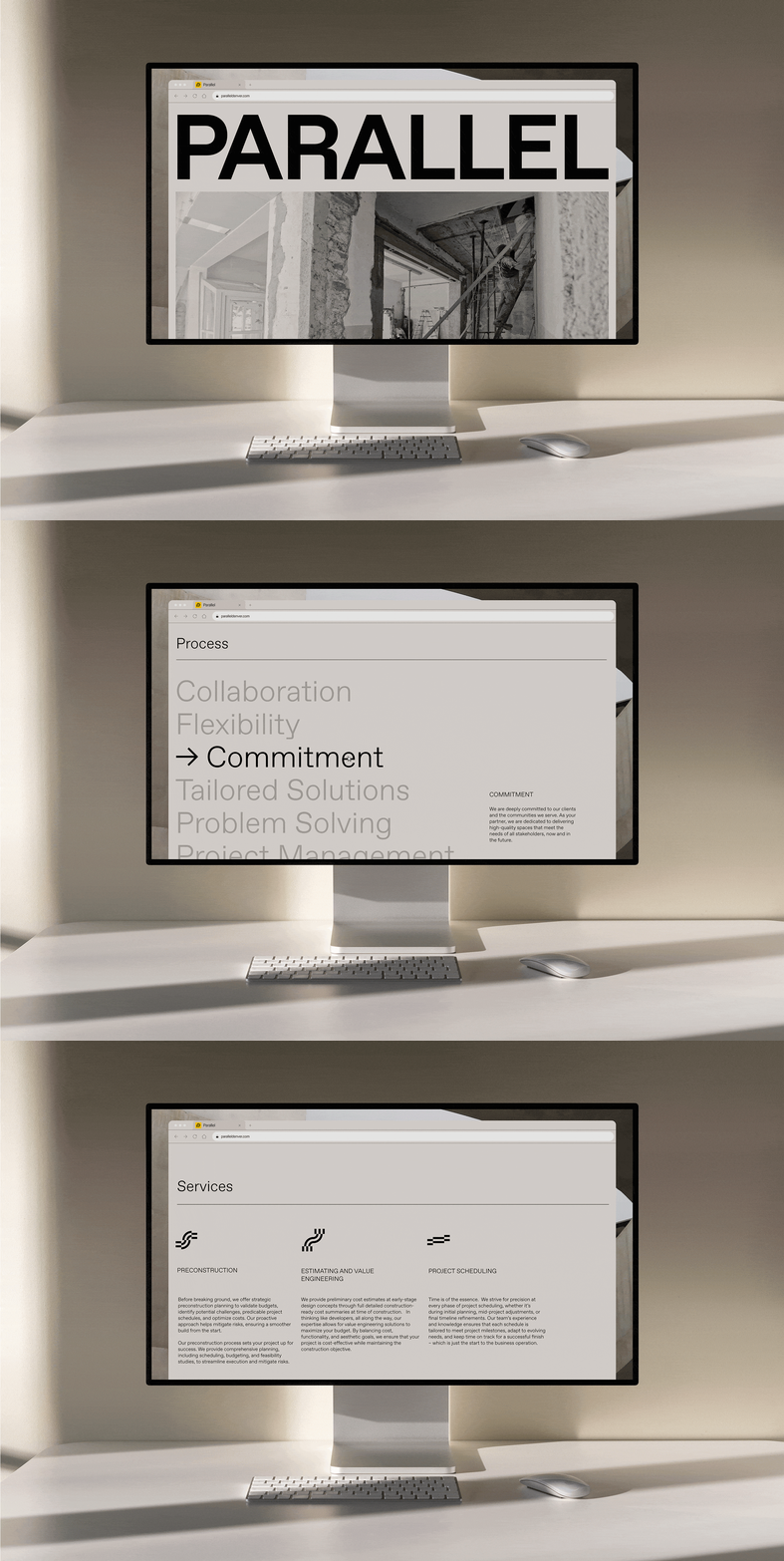
We developed a bespoke iconography suite— rooted in the symbol’s form, which serves as a visual representation of the brand’s core capabilities. Each element is intentionally designed to convey the precision, expertise, and innovation that Parallel brings to every project while creating a strong connection to the symbol.
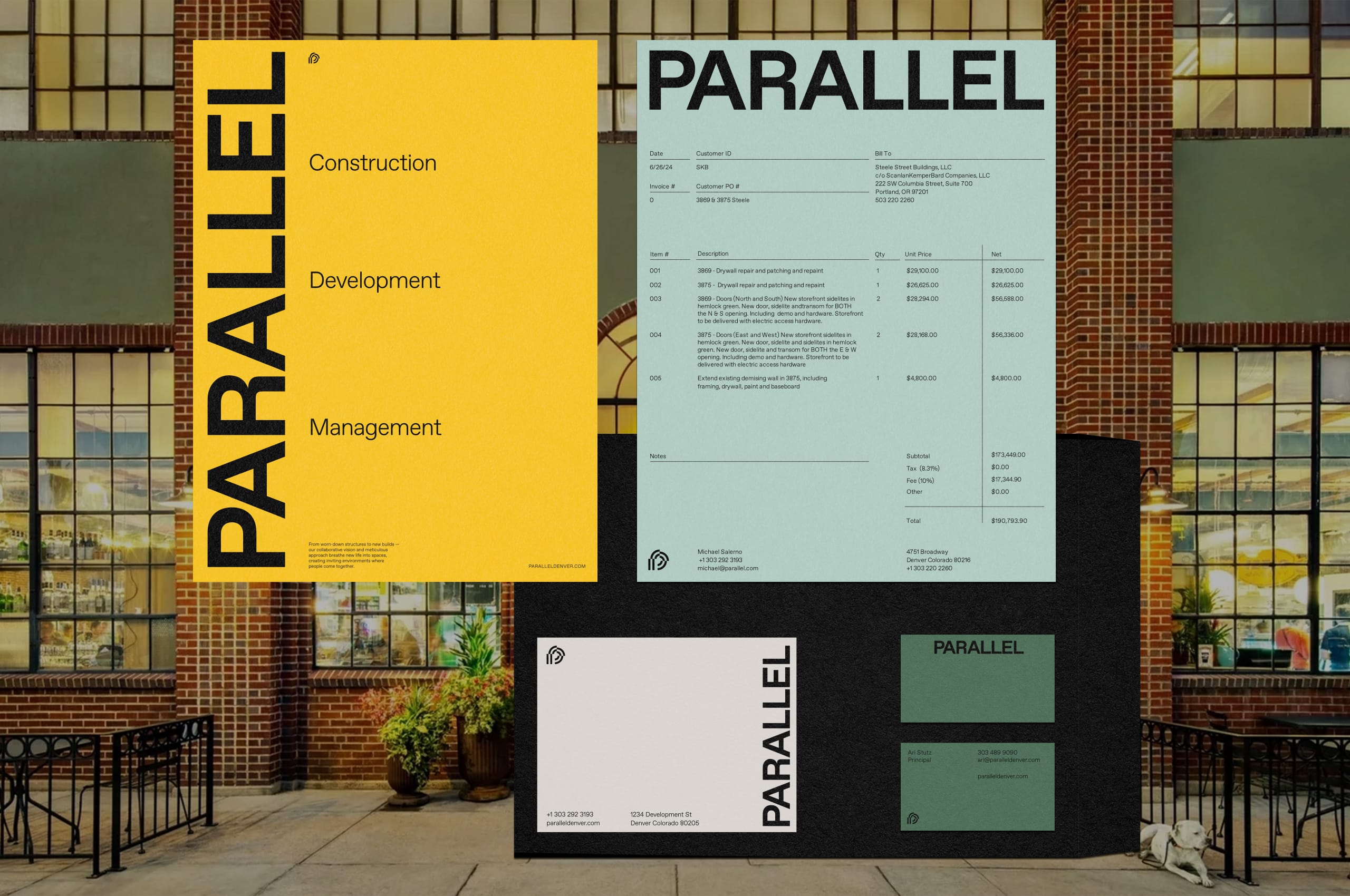
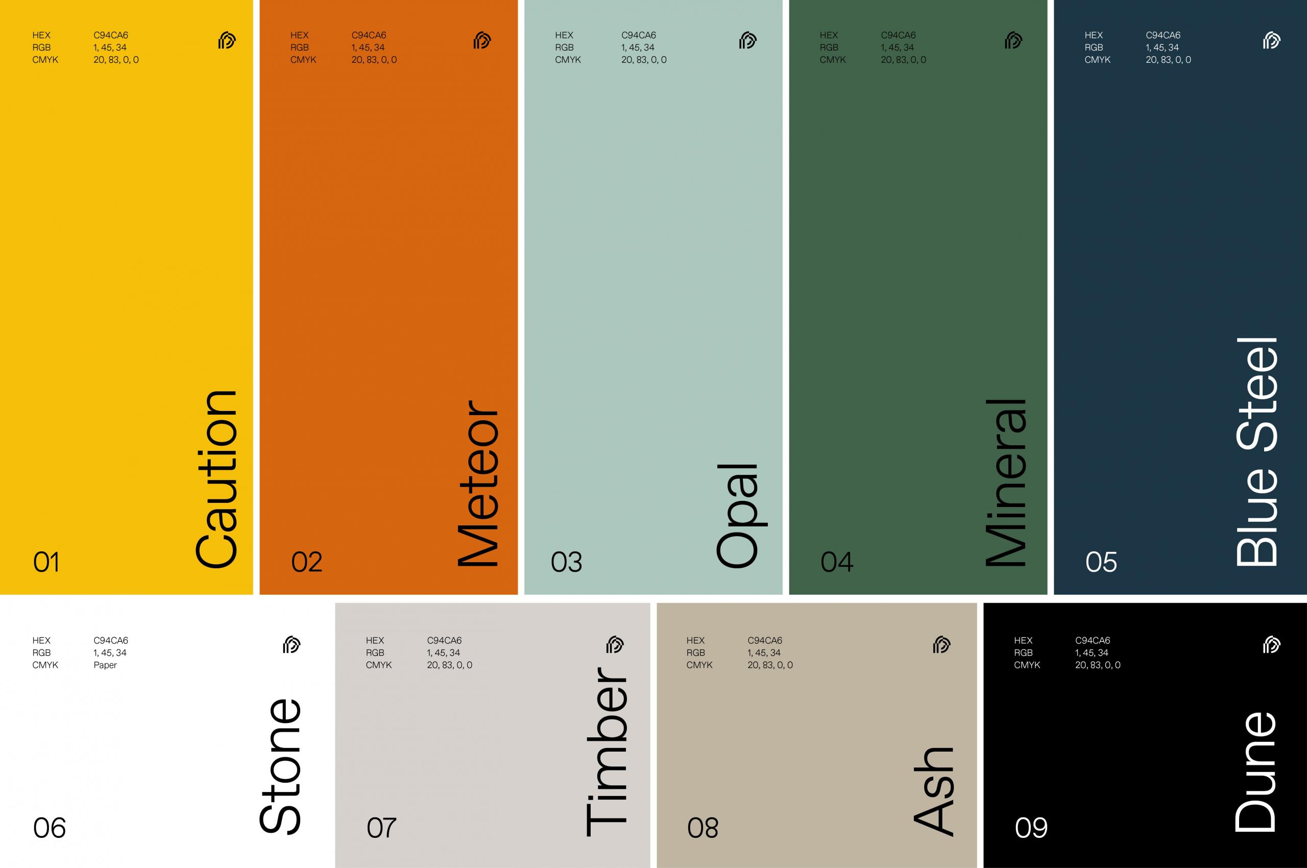
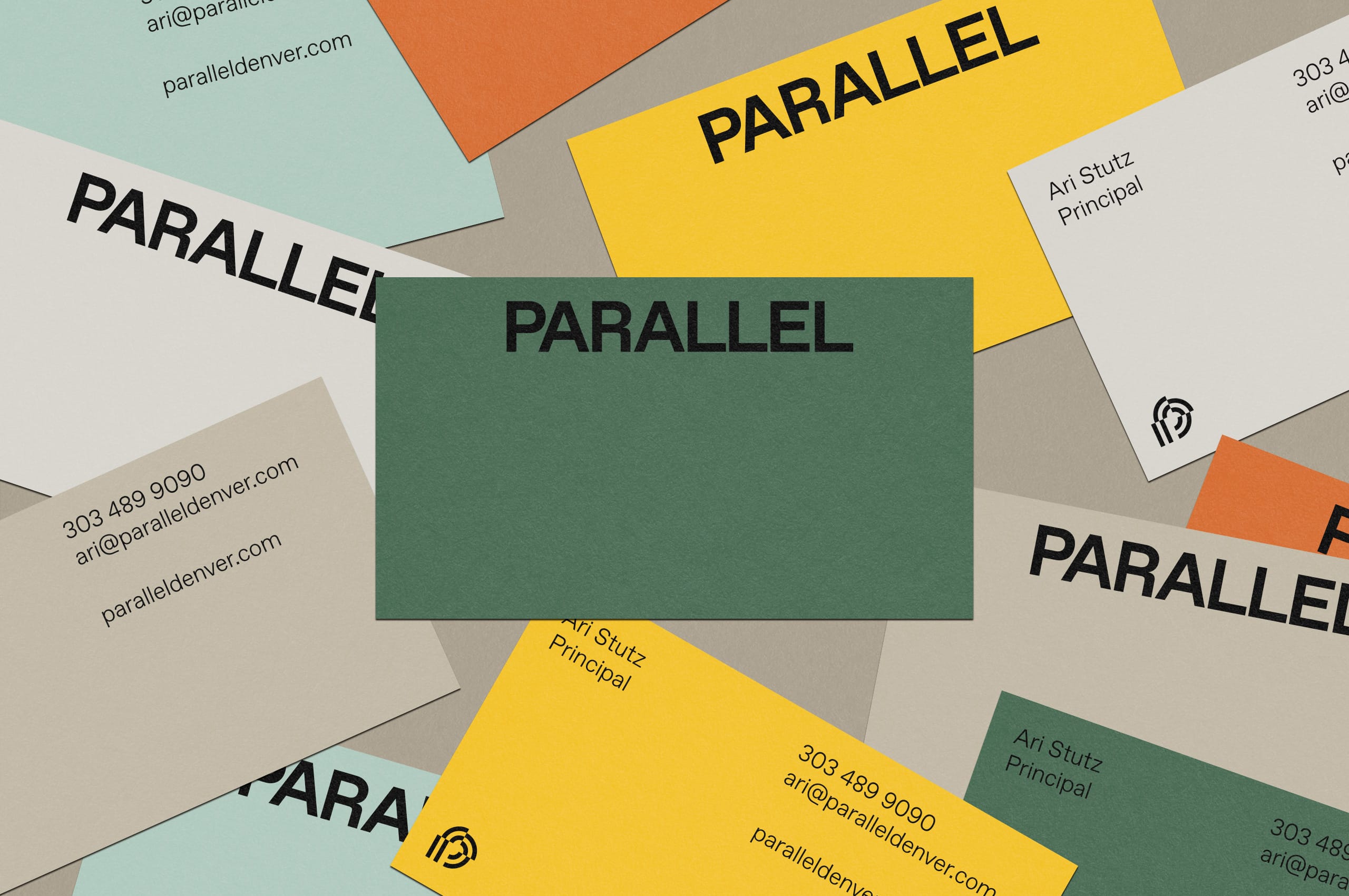
When developing the palette, we wanted to create a subtle nod to palettes commonly found in the development sector while pushing the brand further into the realm of approachability without alienating themselves in the industry. The palette embraces warmth and versatility through a carefully balanced suite of colors. We thoughtfully selected these hues to create balance, offering an understated sophistication that feels grounded yet modern and adaptable to any application.
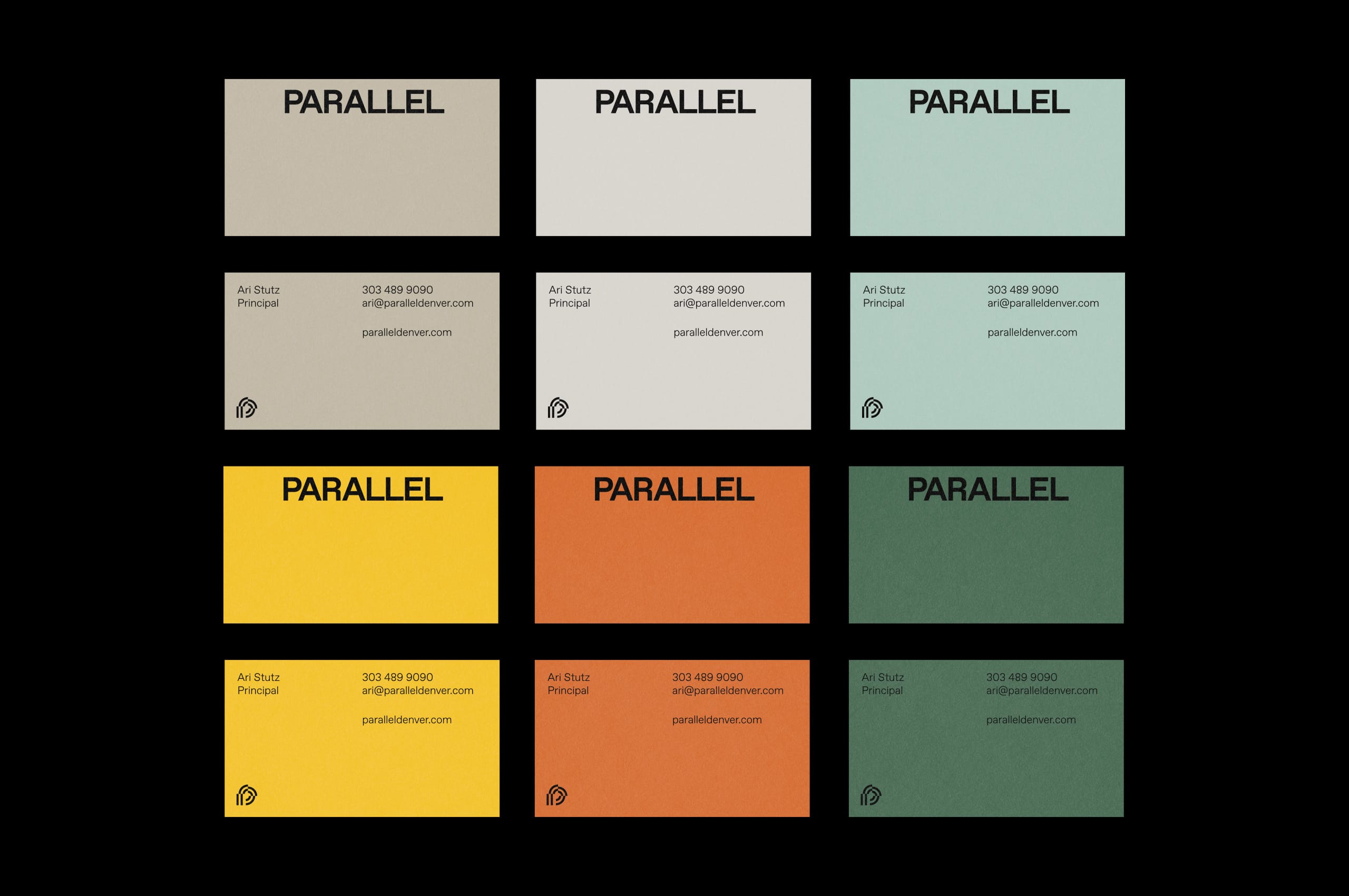
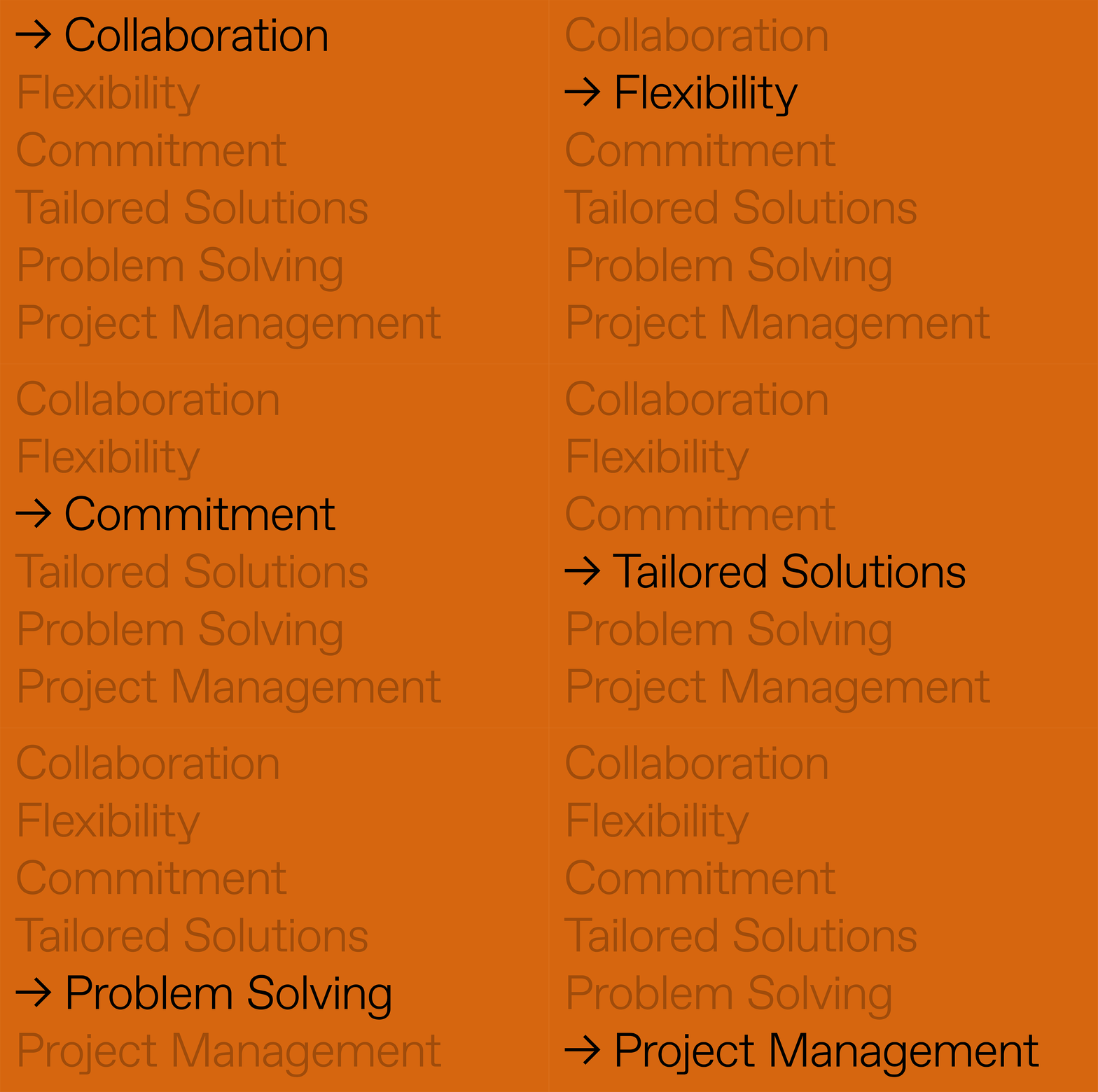
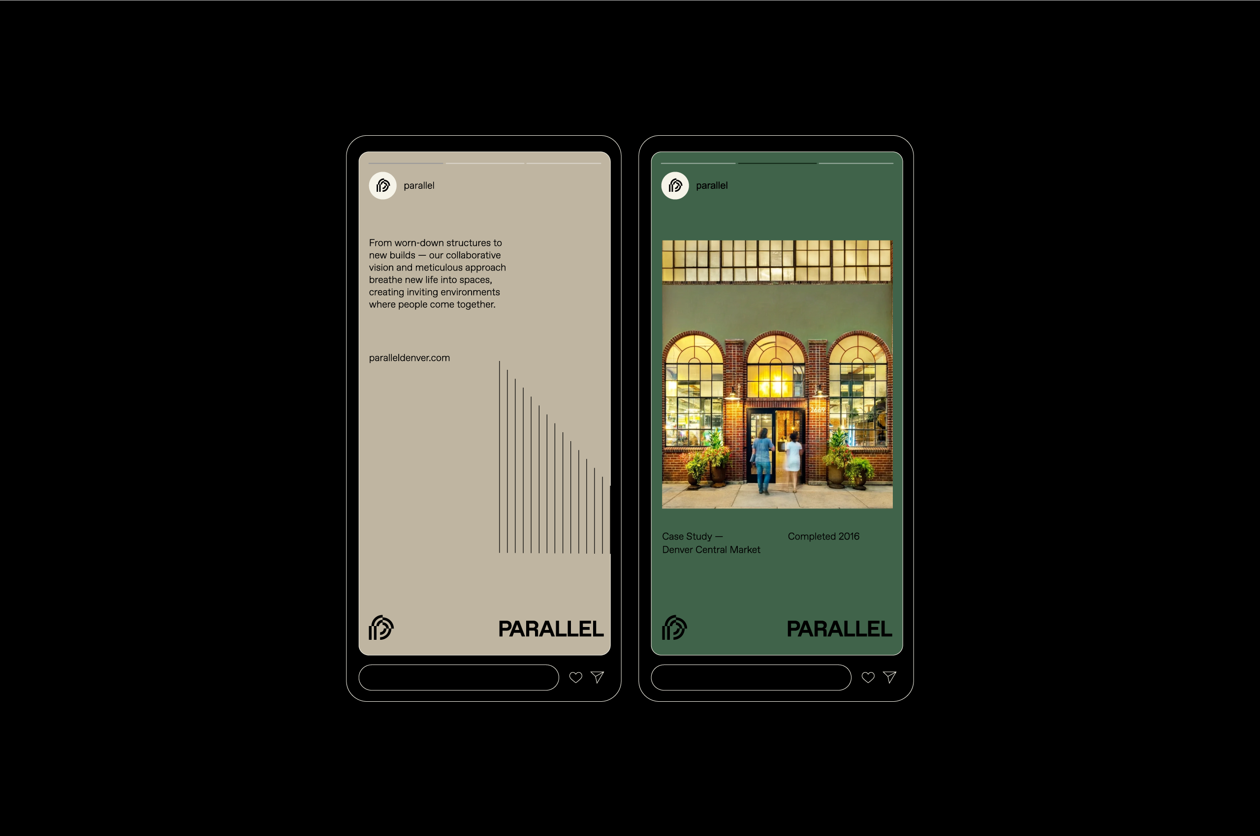
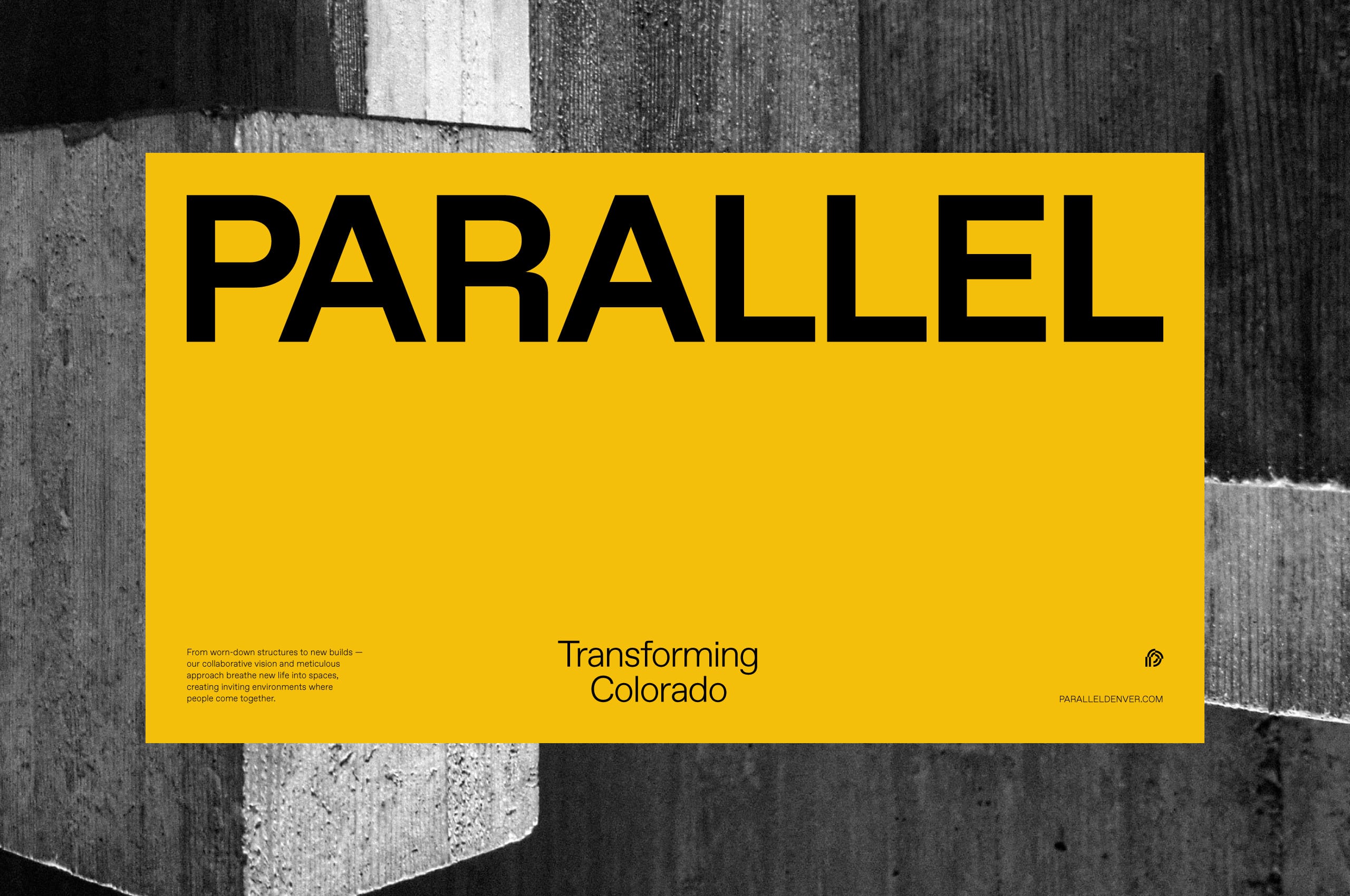

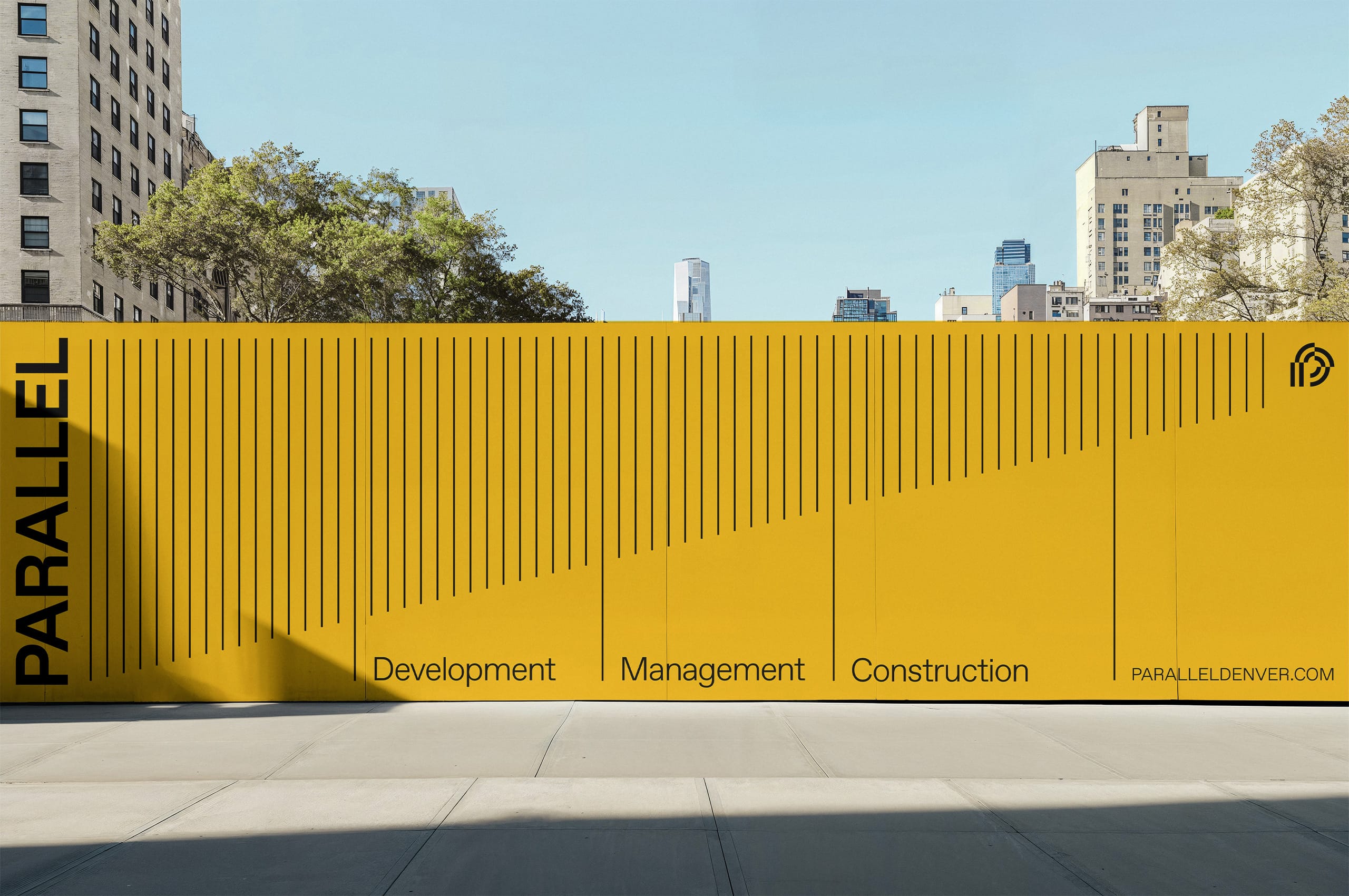

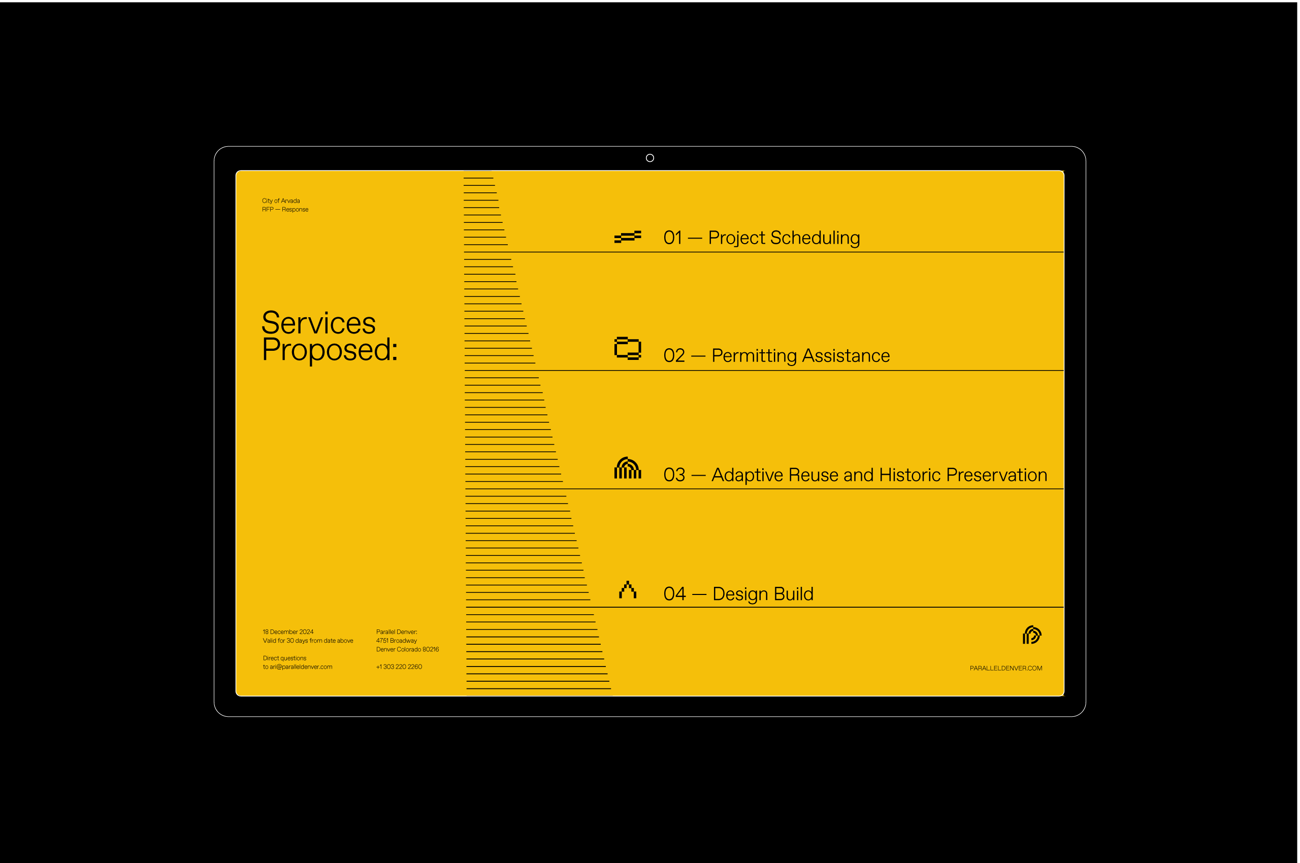
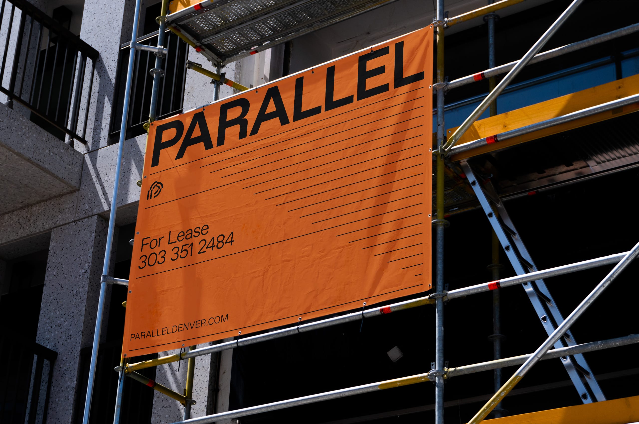
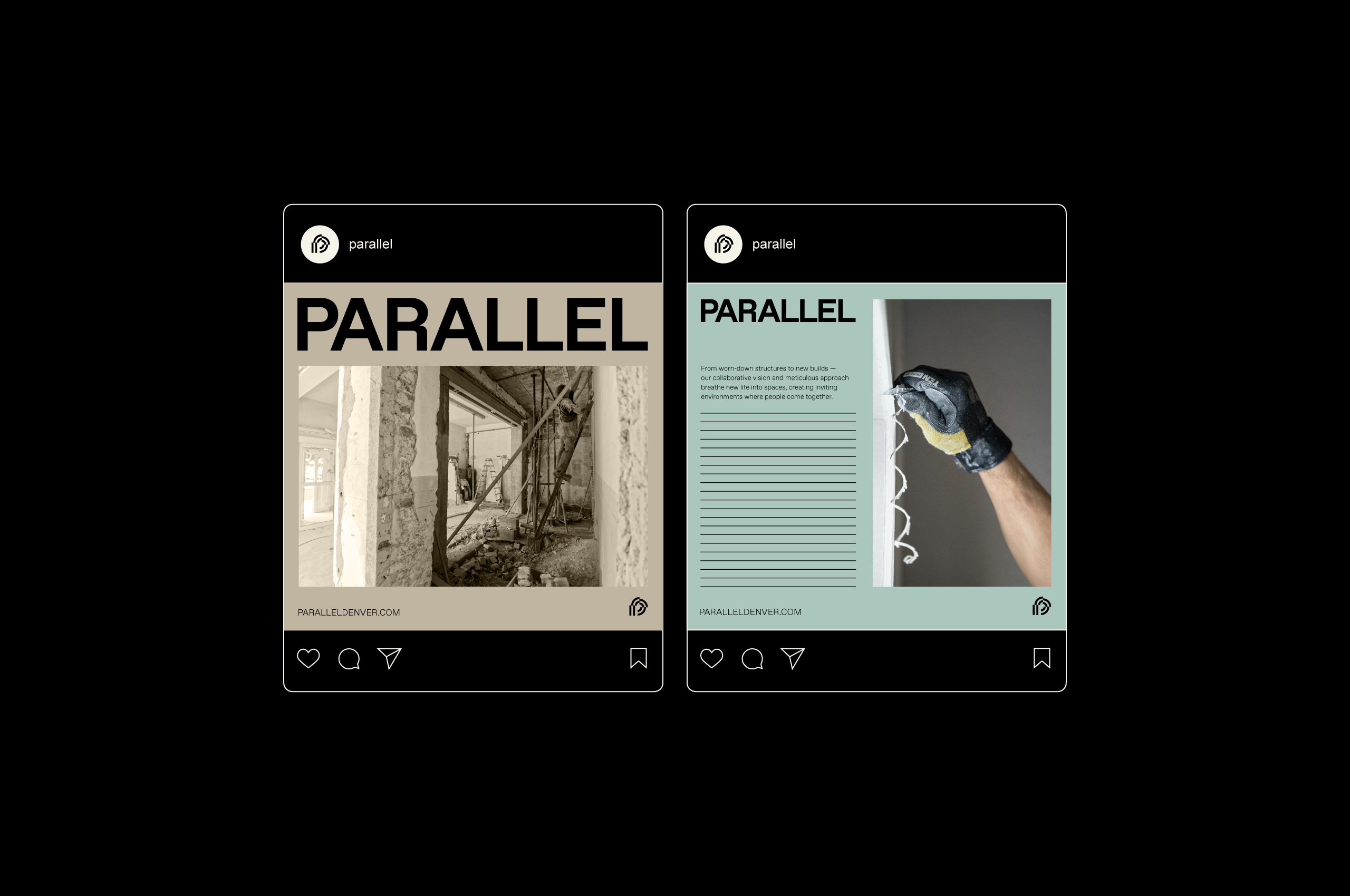
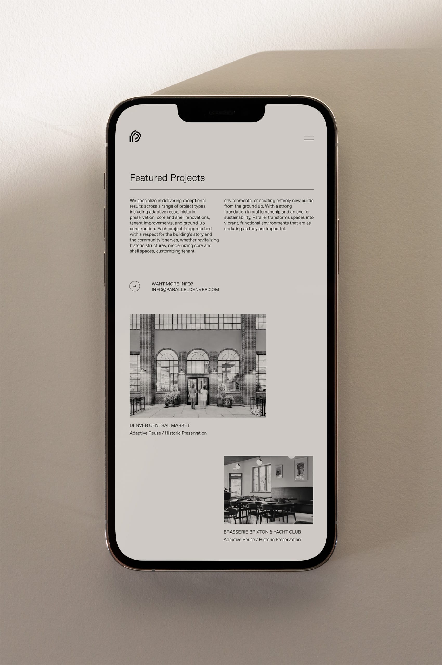
Parallel’s system extends the brand’s narrative through a mixed use of patterns, typography, and iconography. Repetition of parallel lines in an exciting way, paired with geometric harmony, evoke the essence of “Parallel,” while the iconography, rooted in the symbol’s form, highlights the brand’s core capabilities. These elements create a cohesive and scalable system that integrates seamlessly across digital and physical platforms.
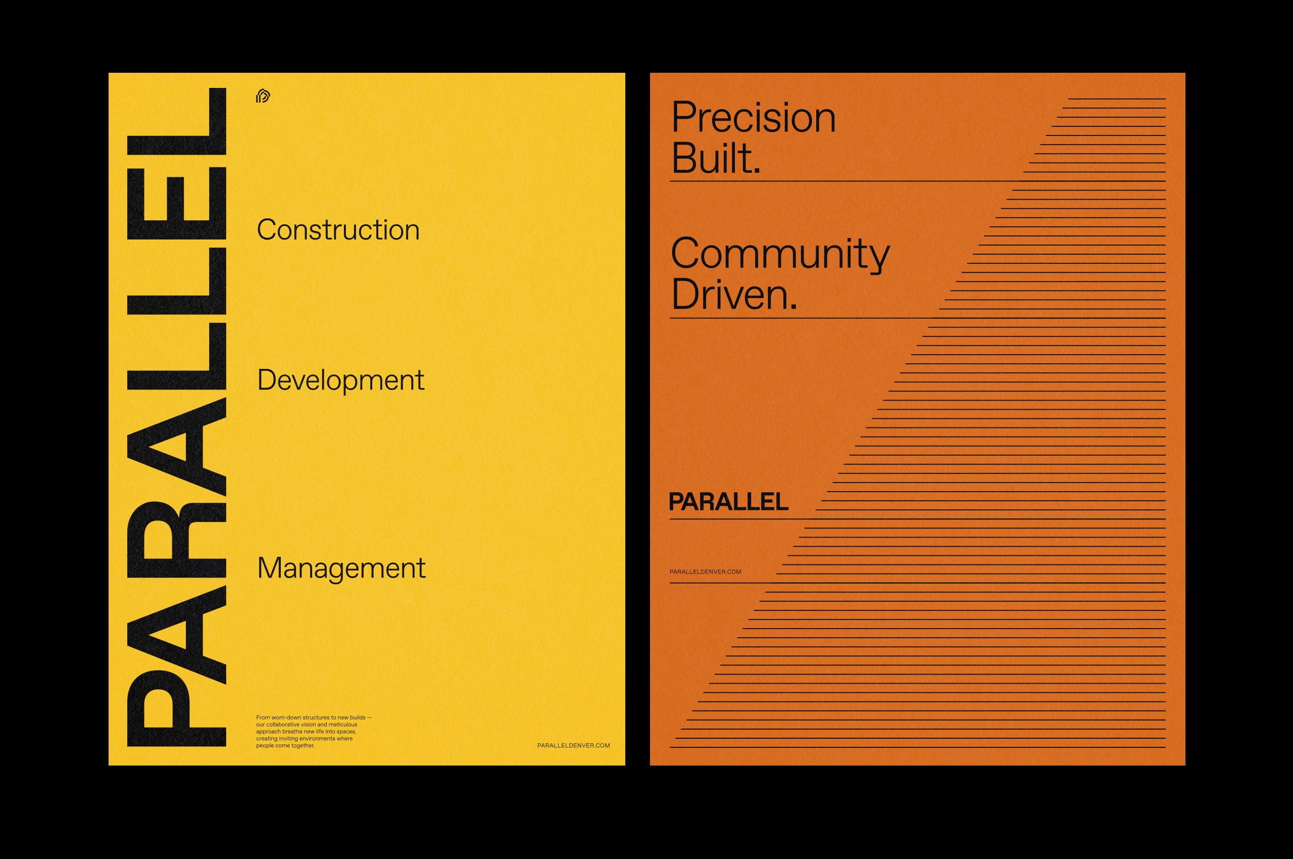
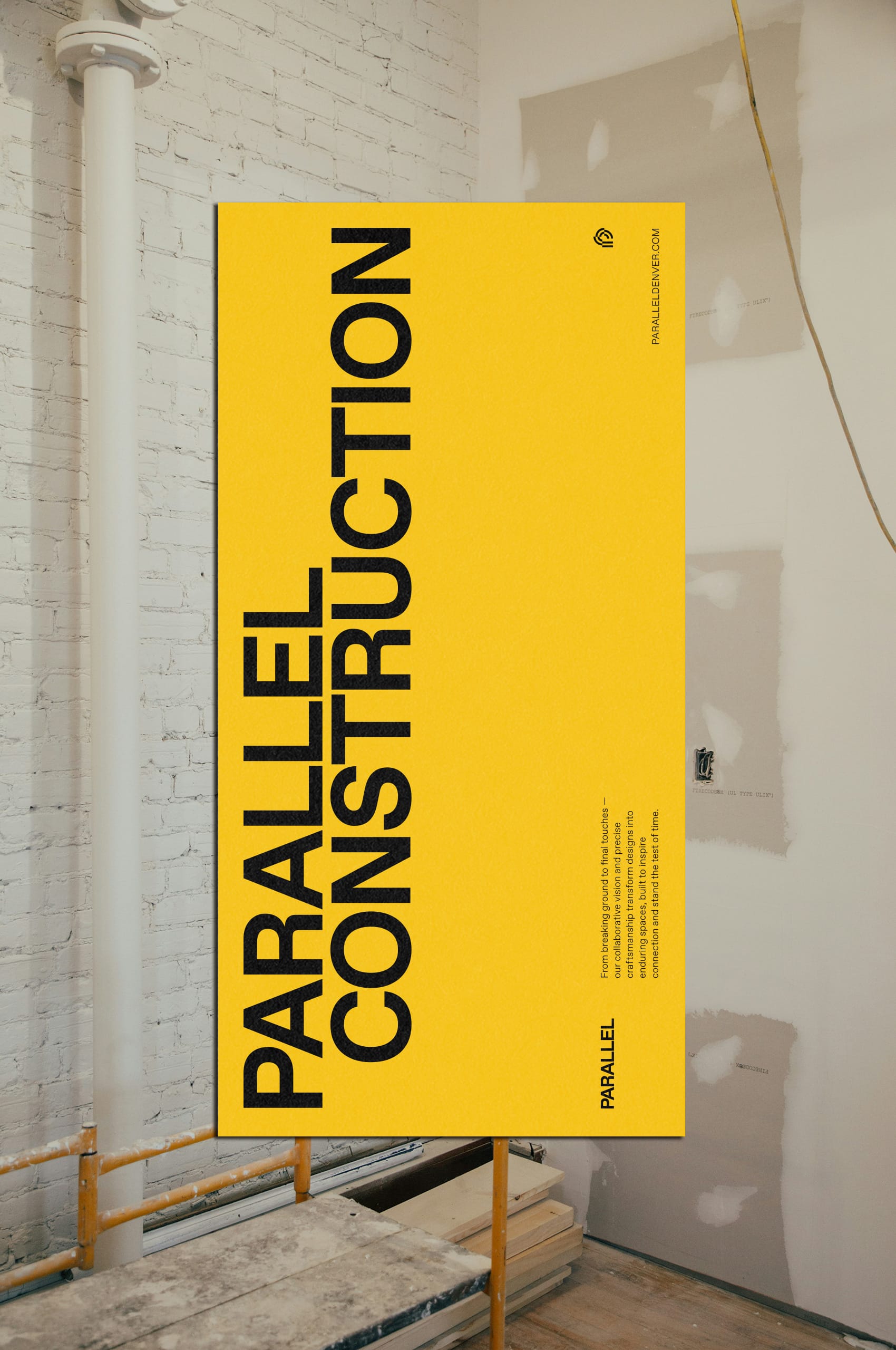

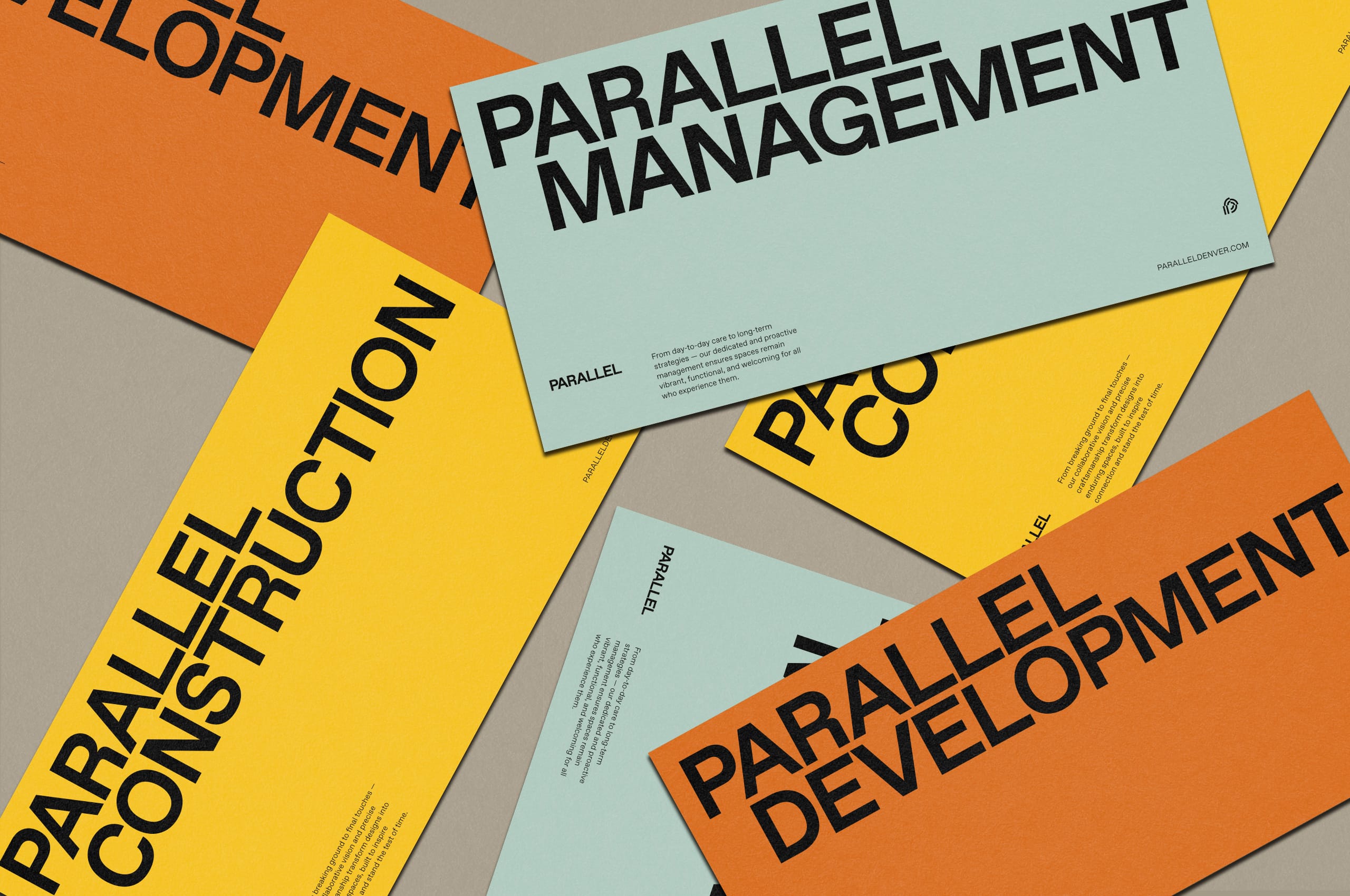
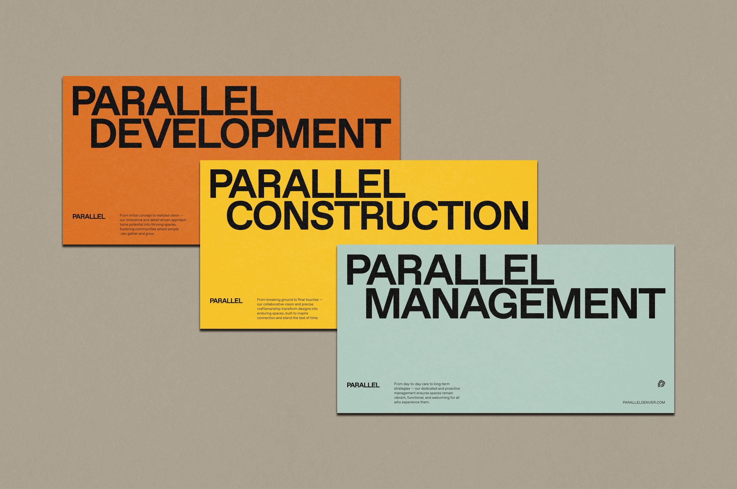
As Parallel works in three main areas: construction, development, and management, they wanted to create a suite of sub-brands that leverage the strength of the wordmark to develop a natural extension of the brand. While Parallel’s primary brand is used most often, it was essential to be able to utilize sub-brands when needed.
