KEW
A modern rebrand that reflects sustainability, expertise, and a client-focused approach to real estate.
A modern rebrand that reflects sustainability, expertise, and a client-focused approach to real estate.
After decades in the market, KEW recognized the need to update its identity to better align with its clients, ethos, and modern perspective to comprehensive real estate services. They approached Mast to build an identity that straddled the line of modernity and history. Their goal was to create a visual identity that reflected their commitment to sustainability, expertise, and an approachable, hands-on process for property management and leasing.
Our partnership resulted in a refined identity that combined strong typography, a purposeful color palette, and the addition of hand-drawn illustrations to add warmth and personality. This rebrand effectively communicates KEW’s credibility and dedication to both environmental responsibility and client-focused service, while also showcasing their full range of in-house capabilities in a clear, cohesive way.
The result is a unified visual identity that is as strong as it is flexible. The rebrand balances the rigorous professionalism of KEW’s services with a human, sustainable touch, providing a lasting, approachable, and distinctive presence in the market.

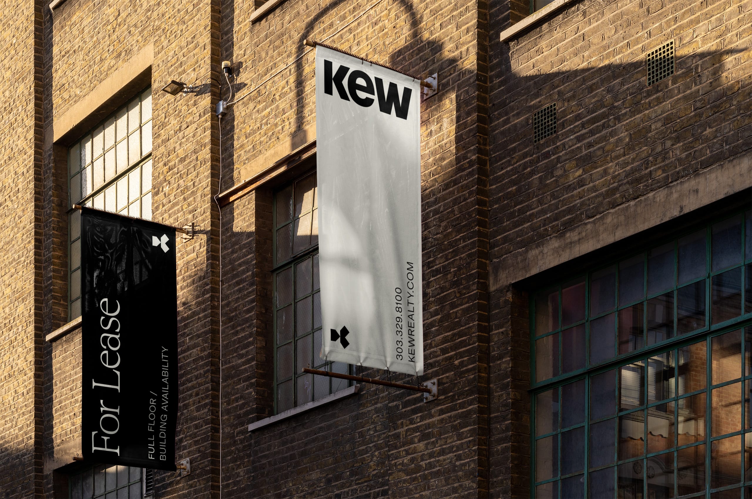

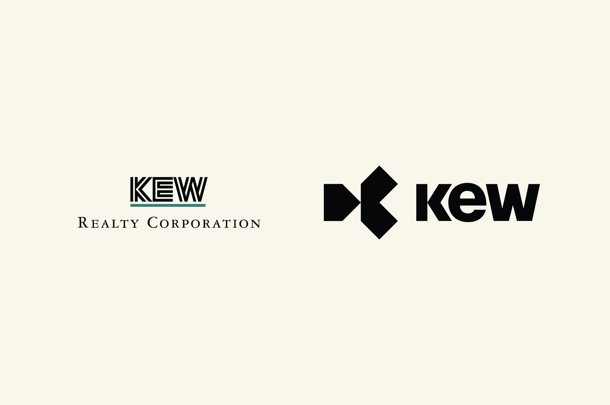
After decades in the market, KEW recognized the need to update their identity to align with their approach of total real estate. The previous identity no longer positioned them effectively in the market and felt outdated.
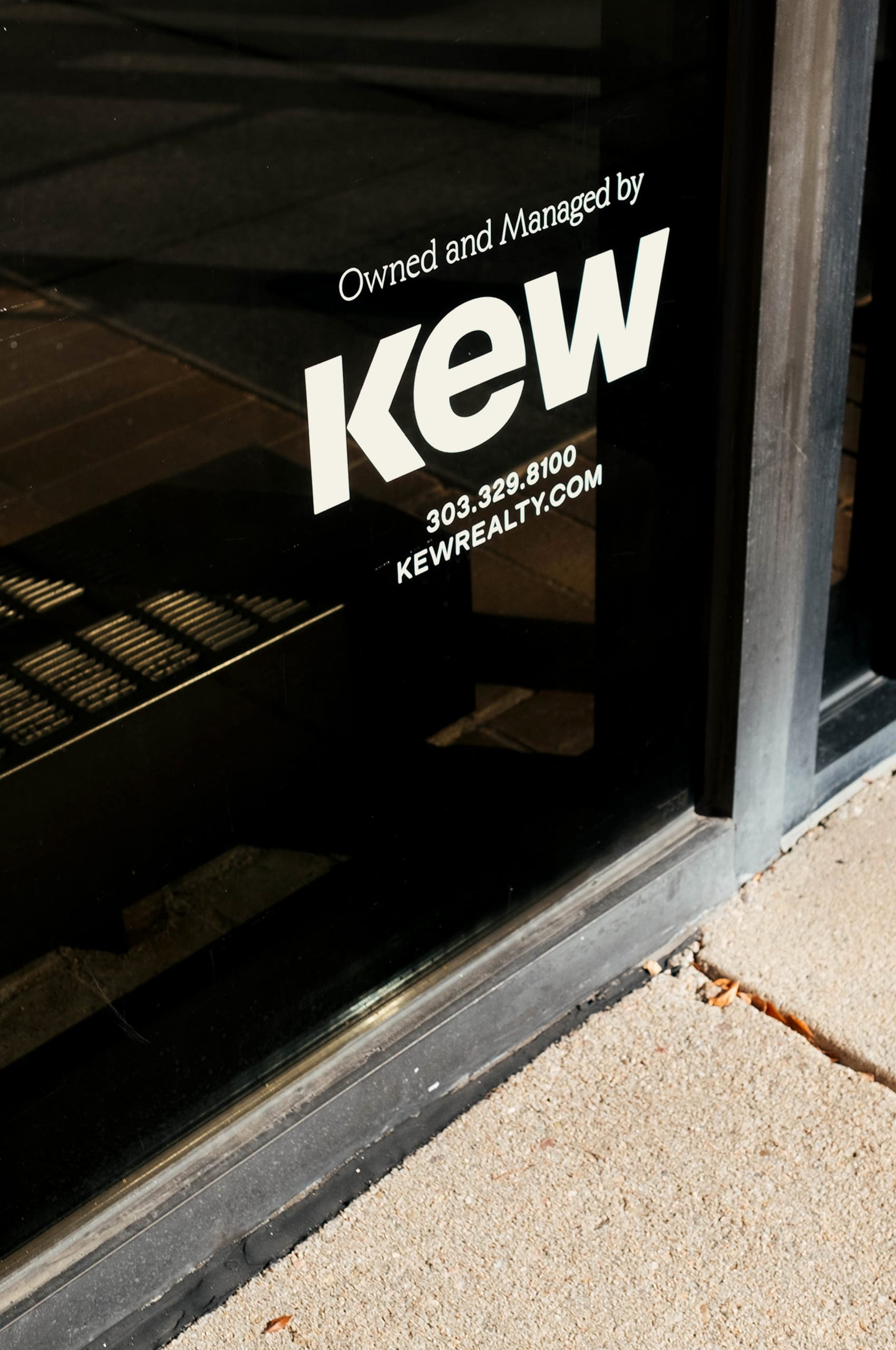
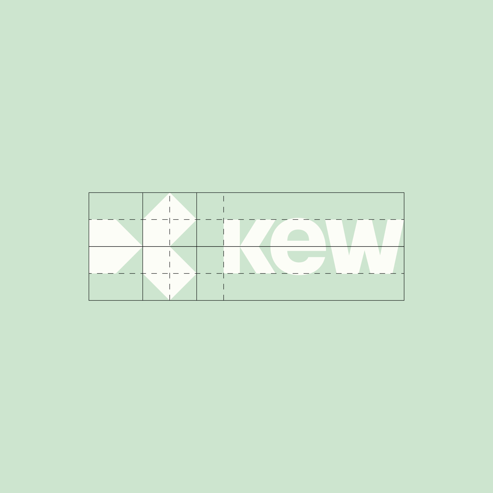
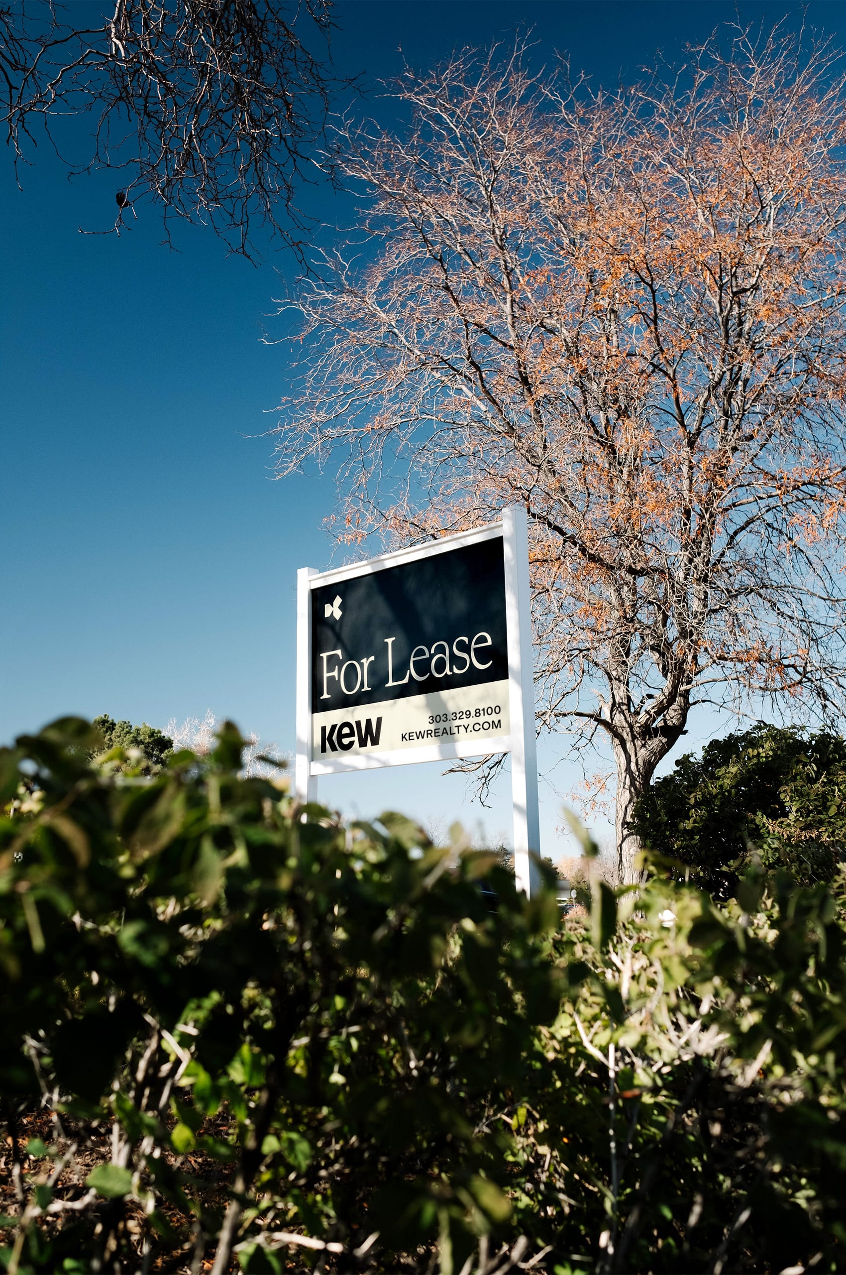
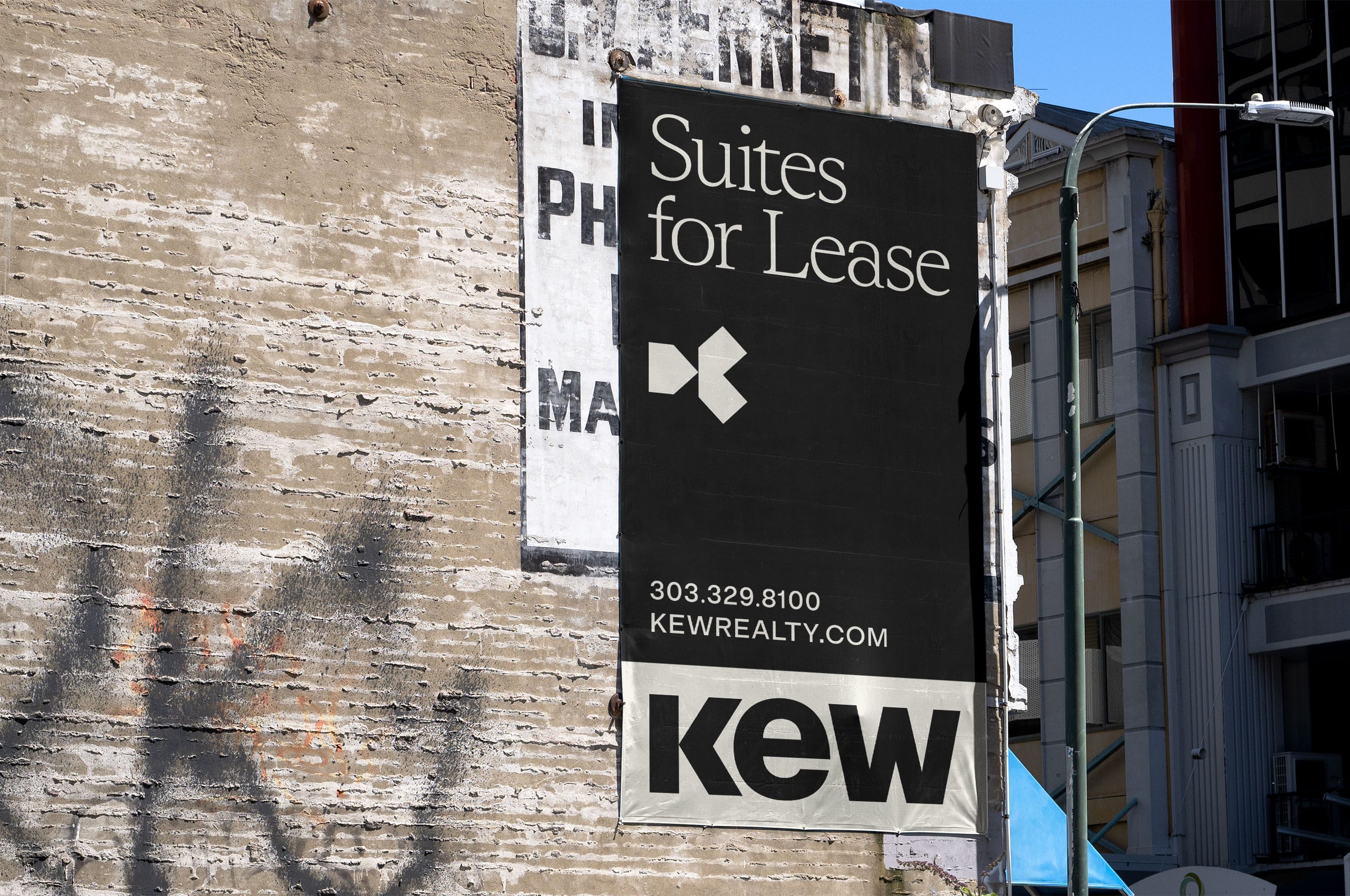
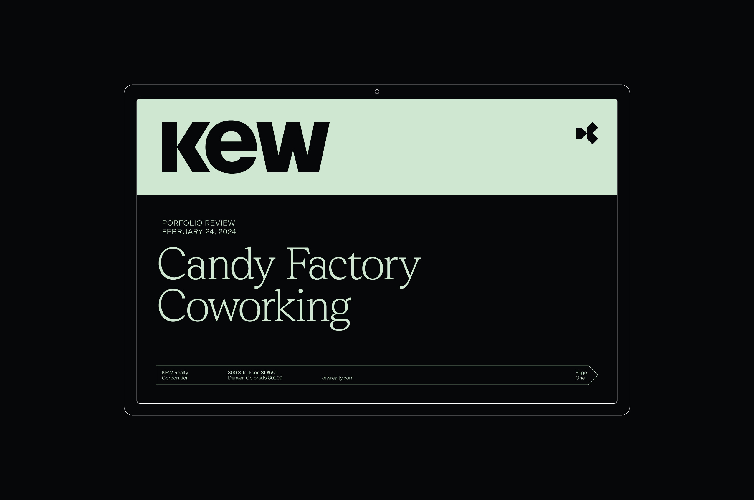
The new wordmark, with its mix of upper and lowercase characters, introduces a unique and human touch balanced with the strong, structural nature of the accompanying symbol. This combination creates a sense of approachability without sacrificing the brand’s professionalism. The wordmark itself conveys instant credibility, evoking the feeling of an established entity that clients can trust. Together, the wordmark and symbol reinforce a unified, harmonious identity that exudes both strength and reliability. Separately, each element stands as a testament to KEW’s credibility, and combined, they elevate the brand, creating a lasting impression of expertise and trustworthiness.
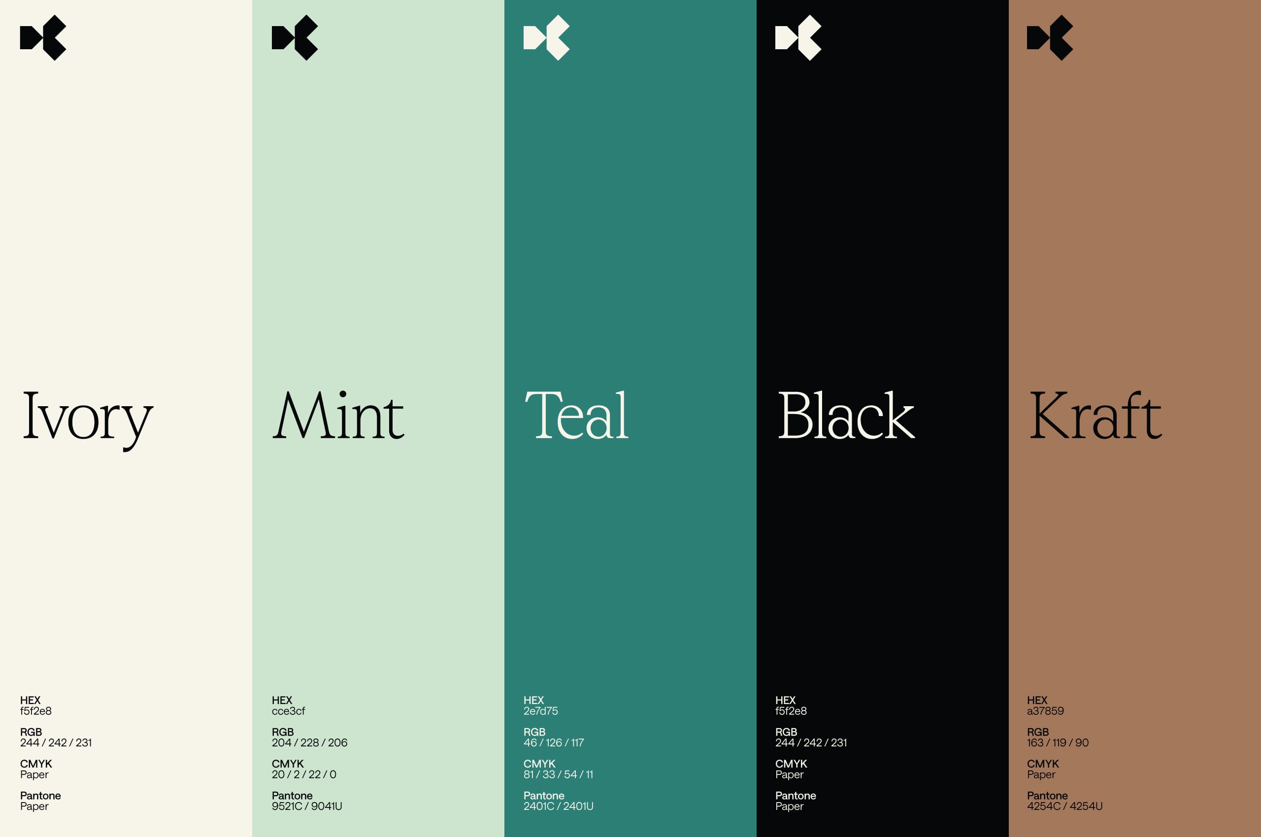
Maintaining the current KEW green was essential as much of the brand evolved to align with future goals.
This color has become a recognizable and integral part of KEW’s identity, offering strength and consistency during the transition for clients and the broader community. In addition to the legacy green, we developed a warm, inviting palette, staying true to KEW’s sustainability and relationship-building core values. Lastly, the seriousness and trustworthiness of black anchor this approachable palette.
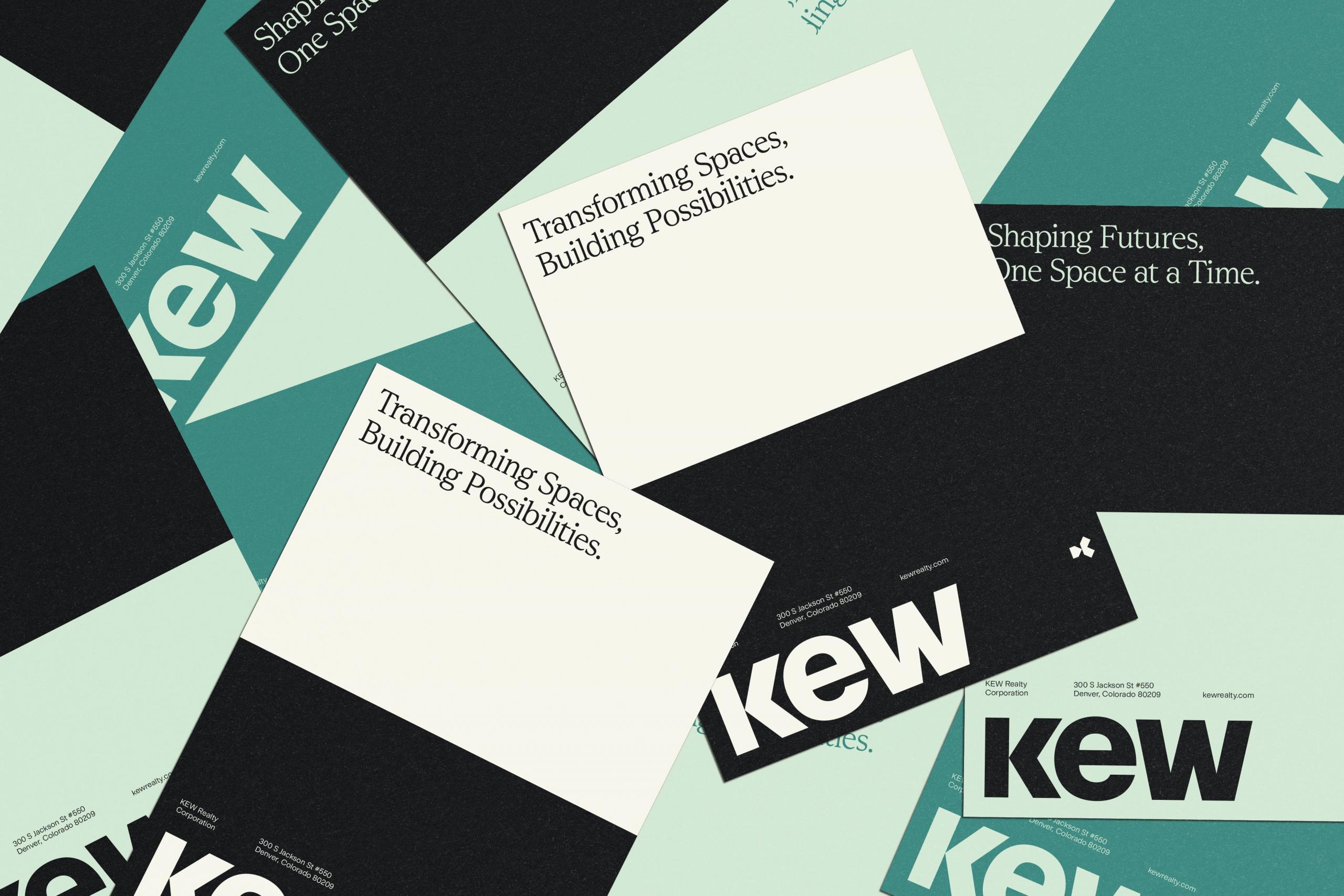
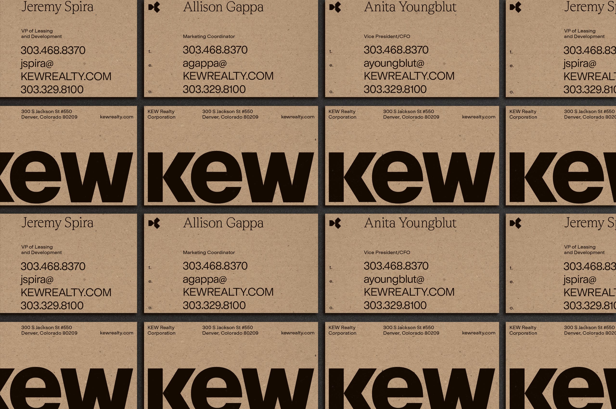
The palette is complemented by natural and recycled paper stocks and algae inks, further emphasizing KEW’s commitment to environmental responsibility. These choices enhance the brand’s connection with those it works with and reinforce its dedication to sustainability. These elements provide a seamless shift that strengthens KEW’s established presence while aligning with its forward-looking vision.

The symbol itself focuses on KEW’s comprehensive approach to management, reflecting both the process and the values behind it.
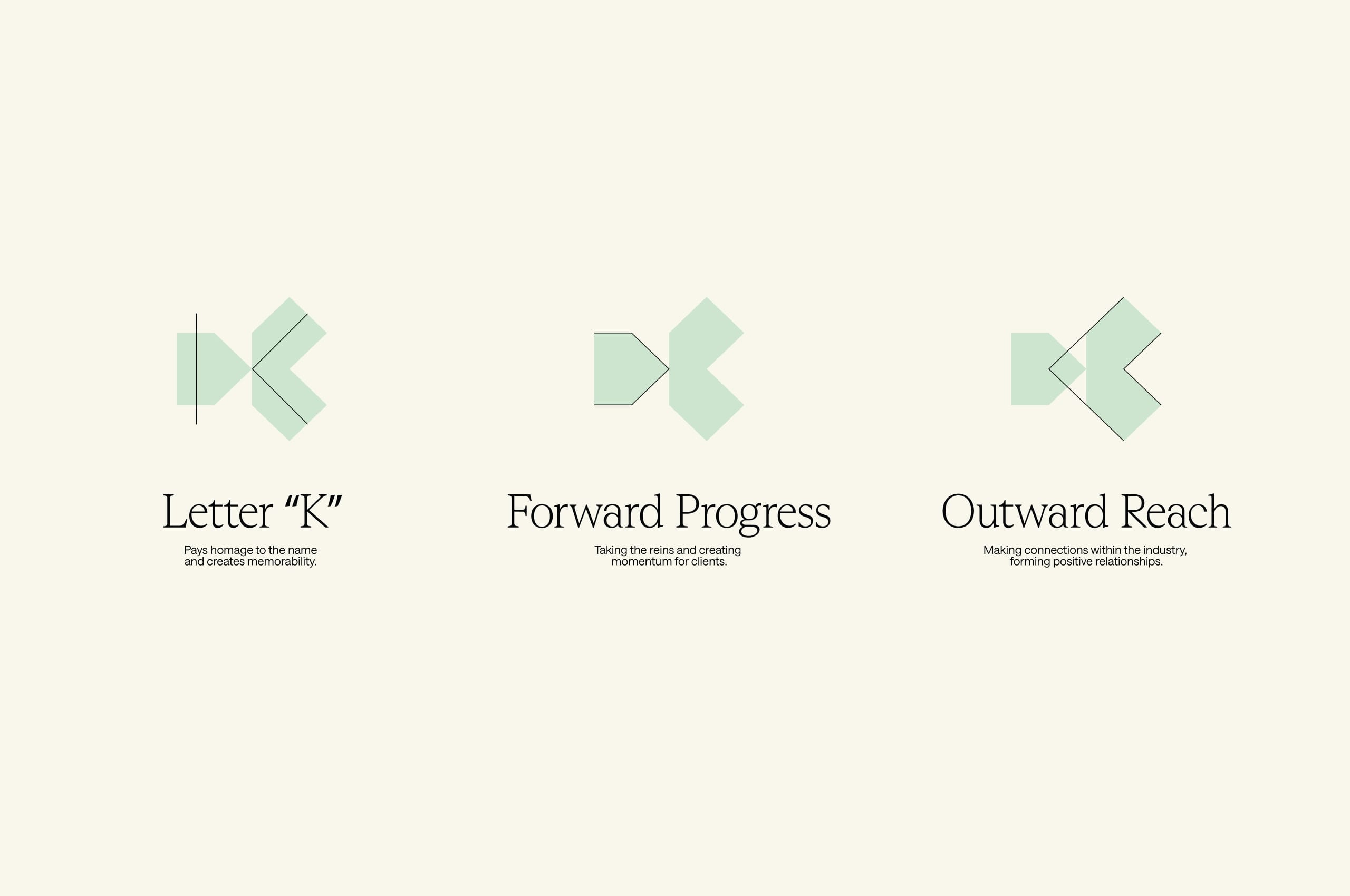
The letter “K” pays homage to the company’s name, ensuring memorability while symbolizing forward progress through its dynamic form—capturing KEW’s role in taking the reins and creating momentum for tenants. It also signifies outward reach, representing KEW’s ability to forge connections within the industry and build positive relationships. The symbol exudes confidence and expertise in its modern forms, fortifying the strength that KEW already embodies.

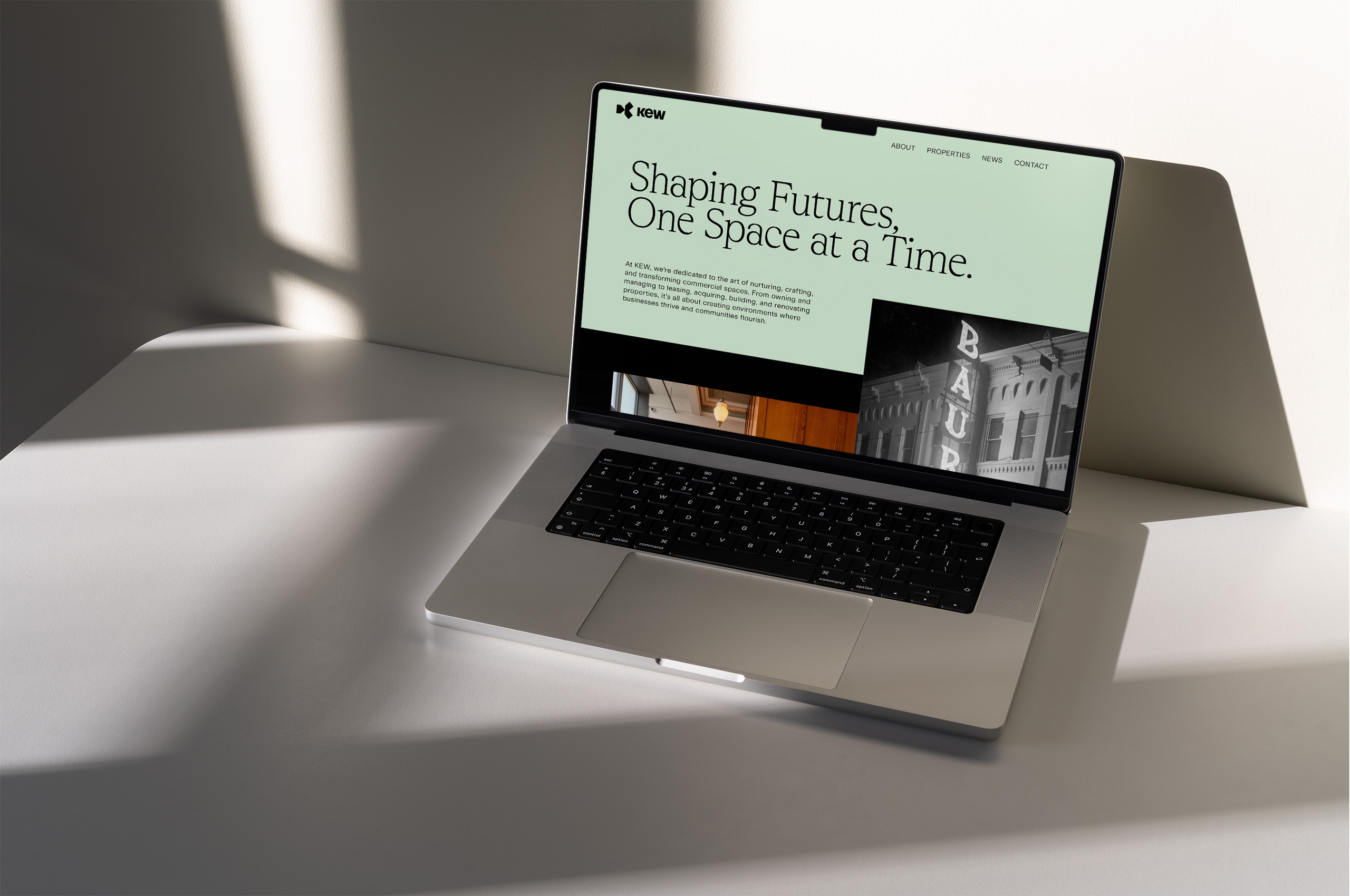


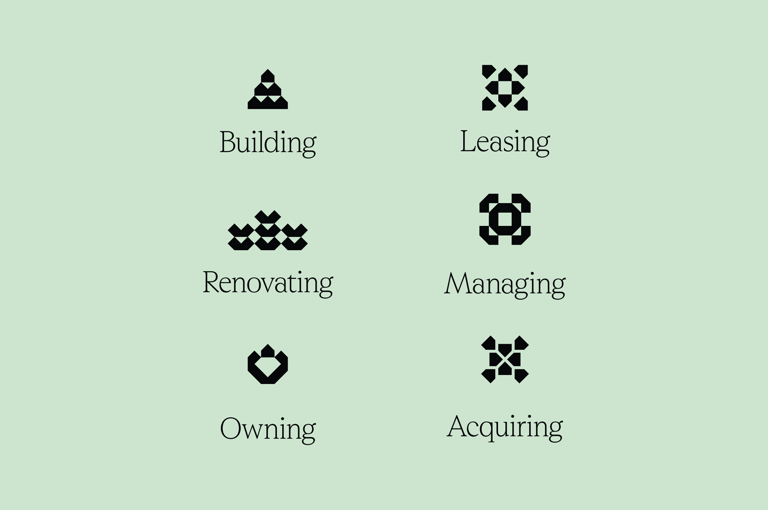
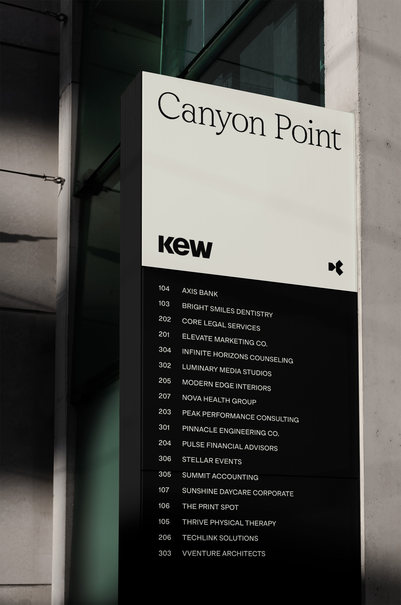
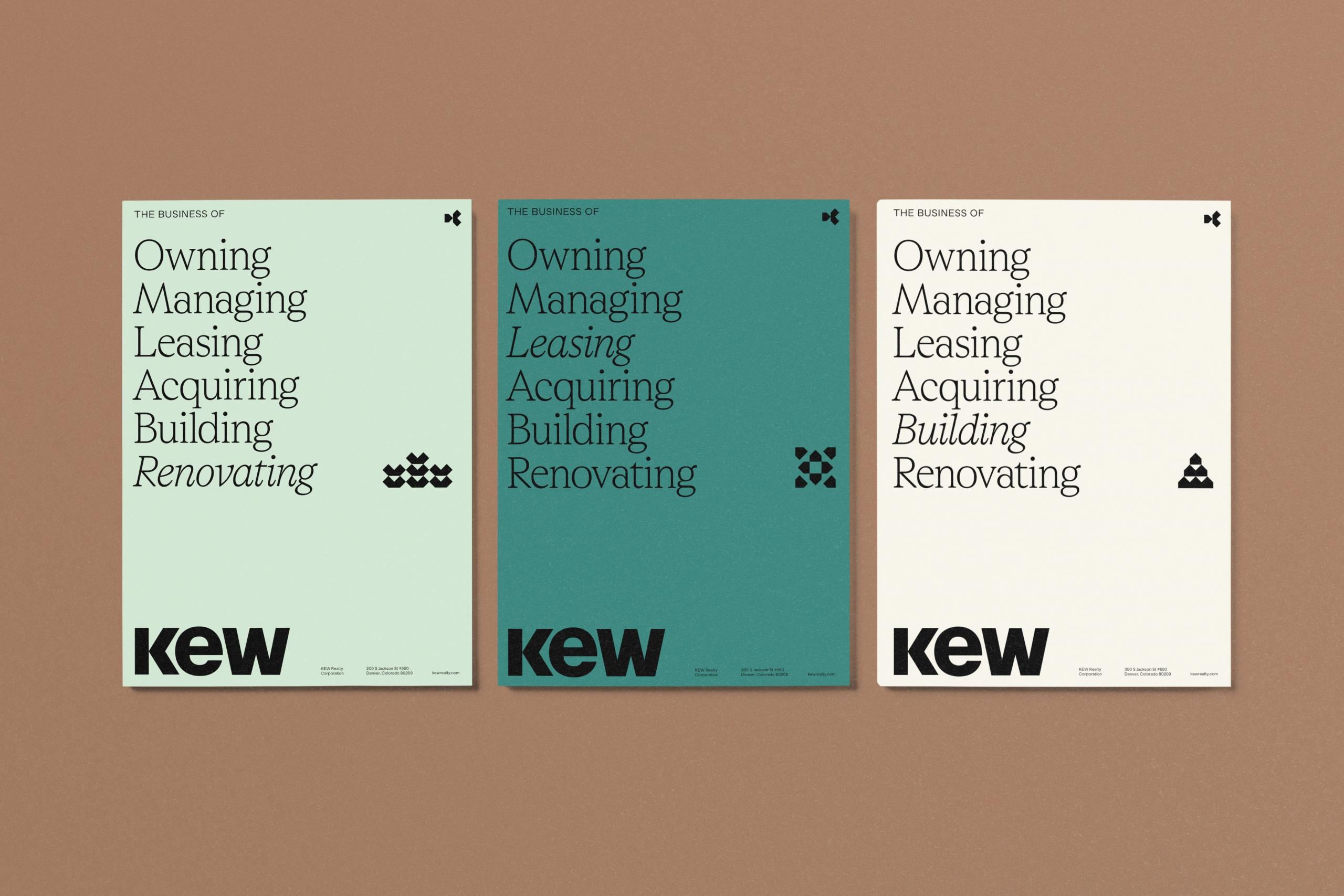
We created a suite of geometric icons to add an added layer of information, visual interest, and sophistication to the brand, inspired by the forms within the symbol. These shapes bring depth while maintaining a structure and form that aligns with KEW’s symbol. The geometric forms reflect the brand’s focus on precision and balance, enhancing its modern aesthetic. This versatile iconography can be used across various touchpoints, bolstering KEW’s forward-thinking presence.
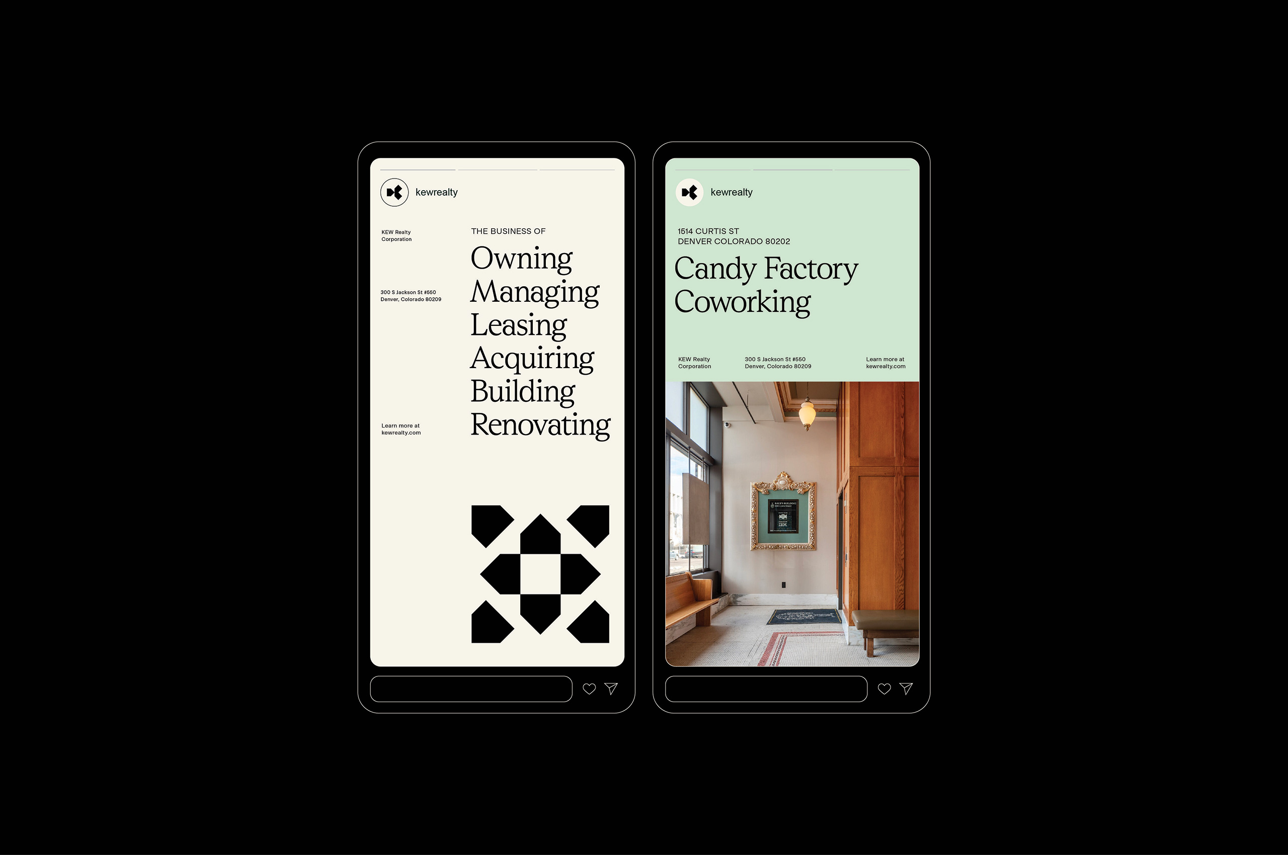

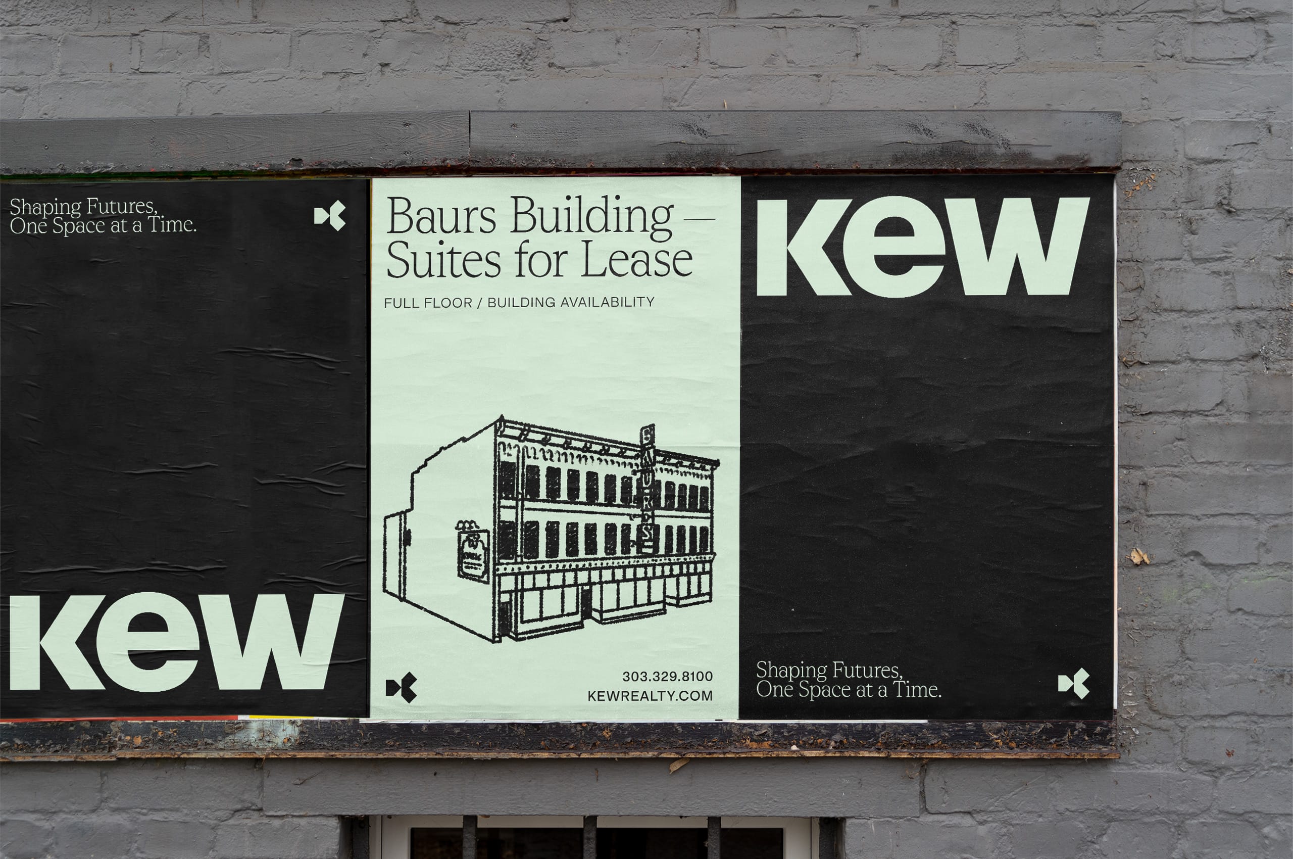
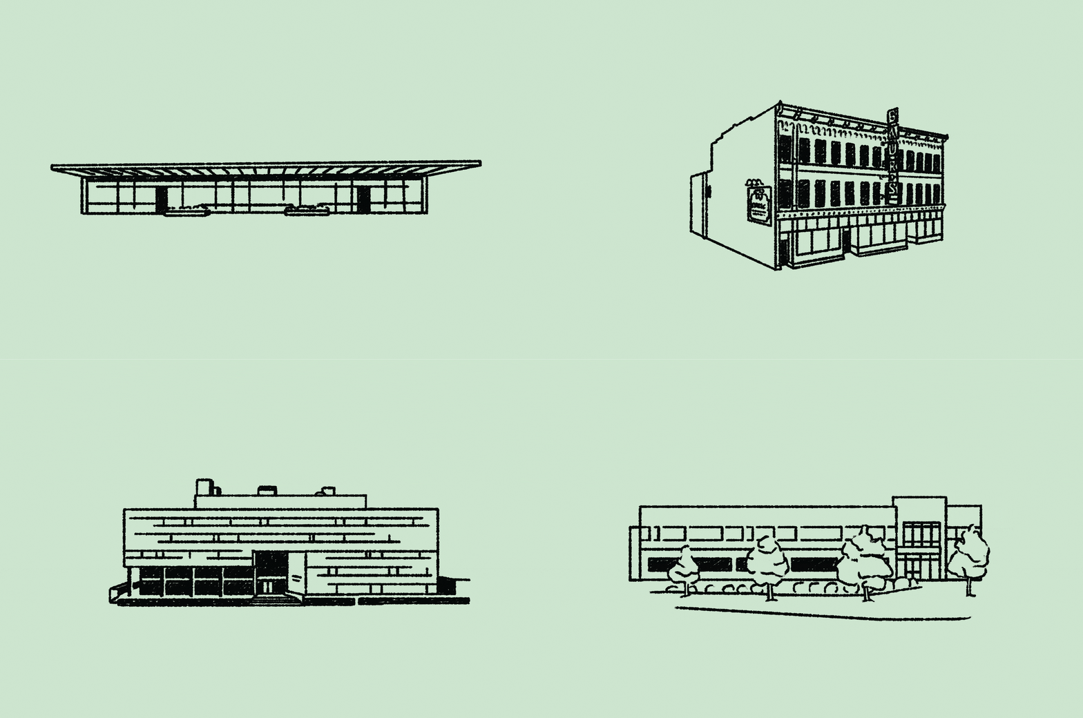
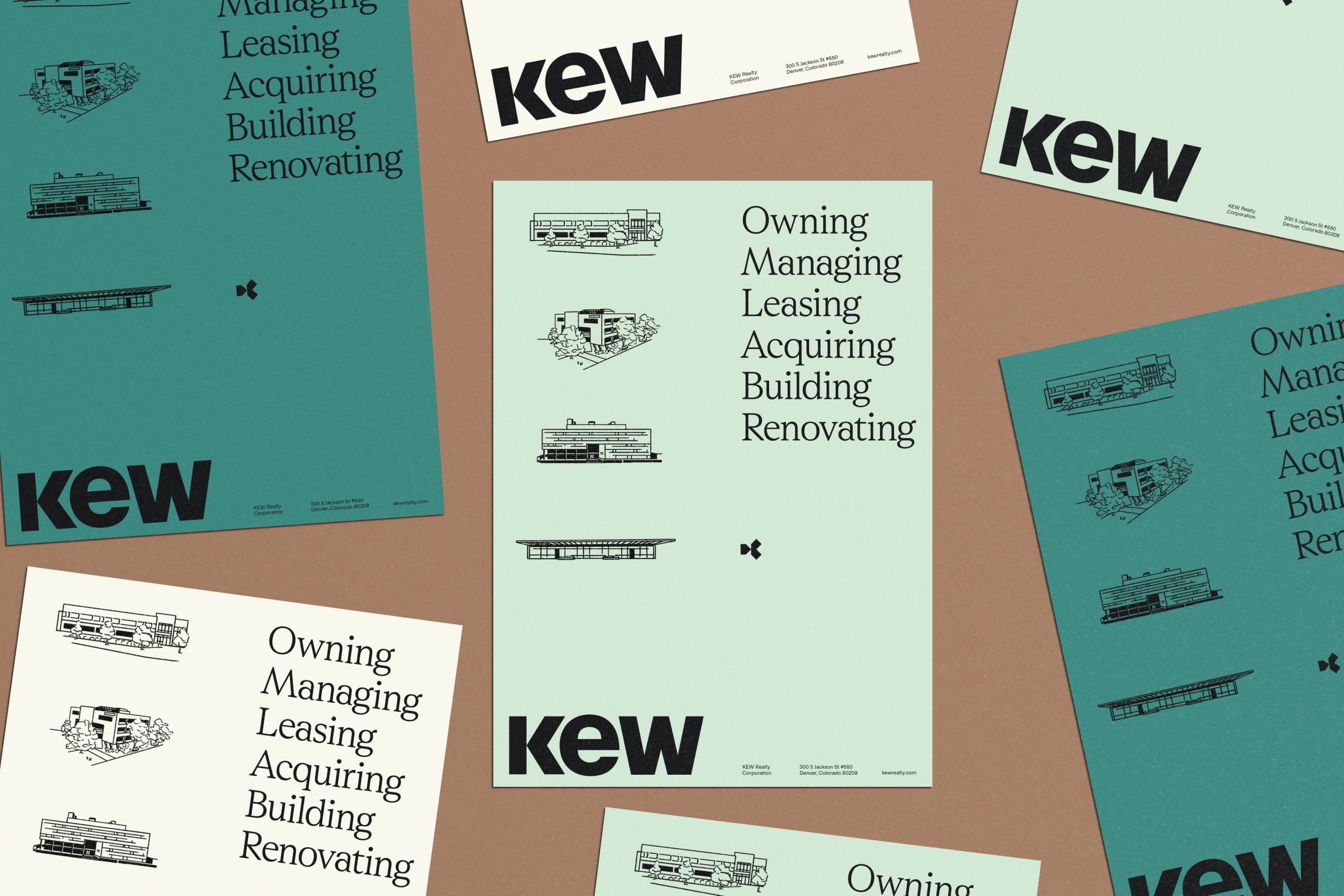
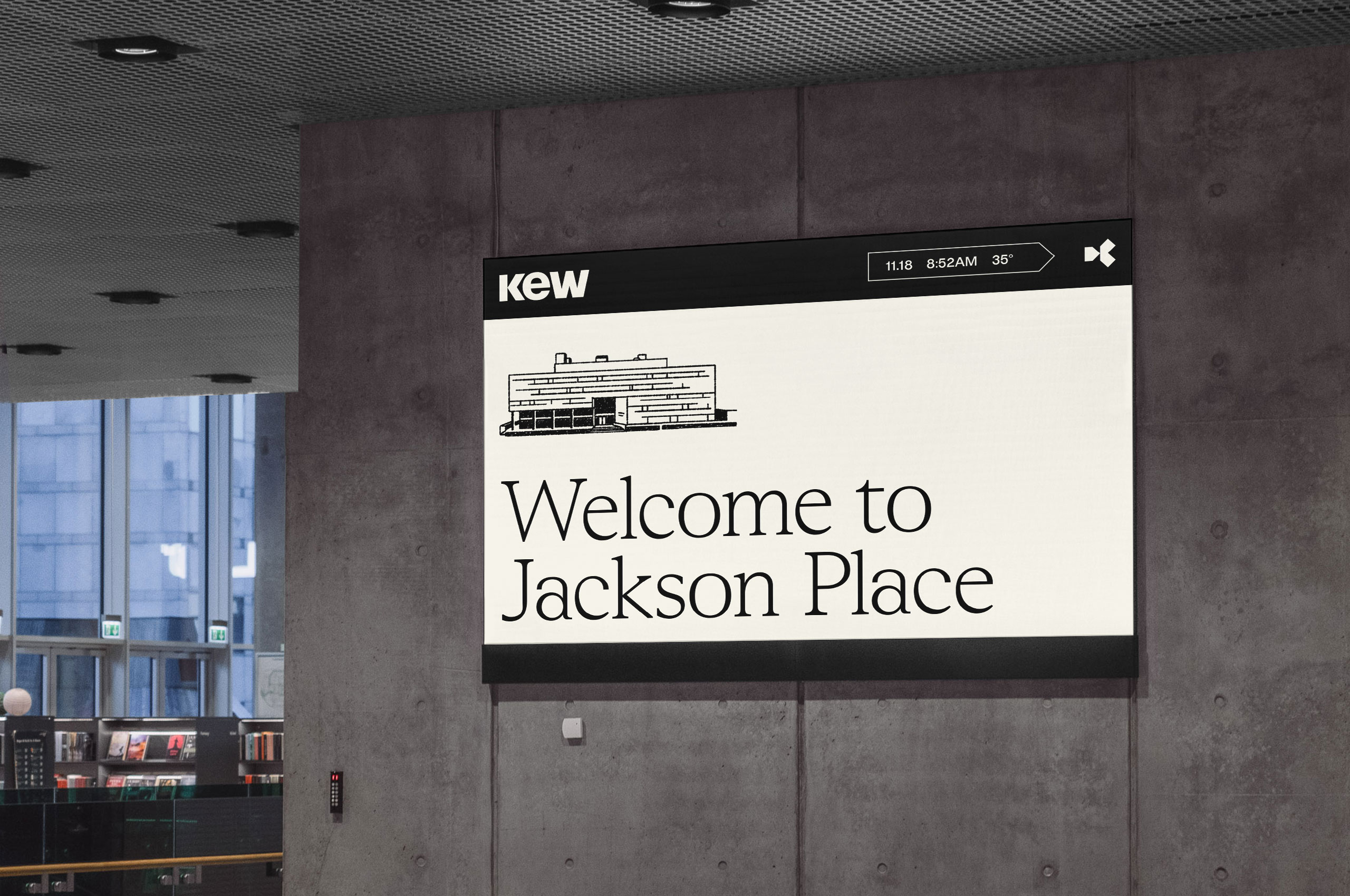
We also created a suite of hand-drawn illustrations depicting KEW’s properties to introduce an organic, human touch that contrasts with the identity’s otherwise rigid and structured elements.
These illustrations bring warmth and character, offering a more personal connection to the buildings and reinforcing KEW’s commitment to craftsmanship and attention to detail.
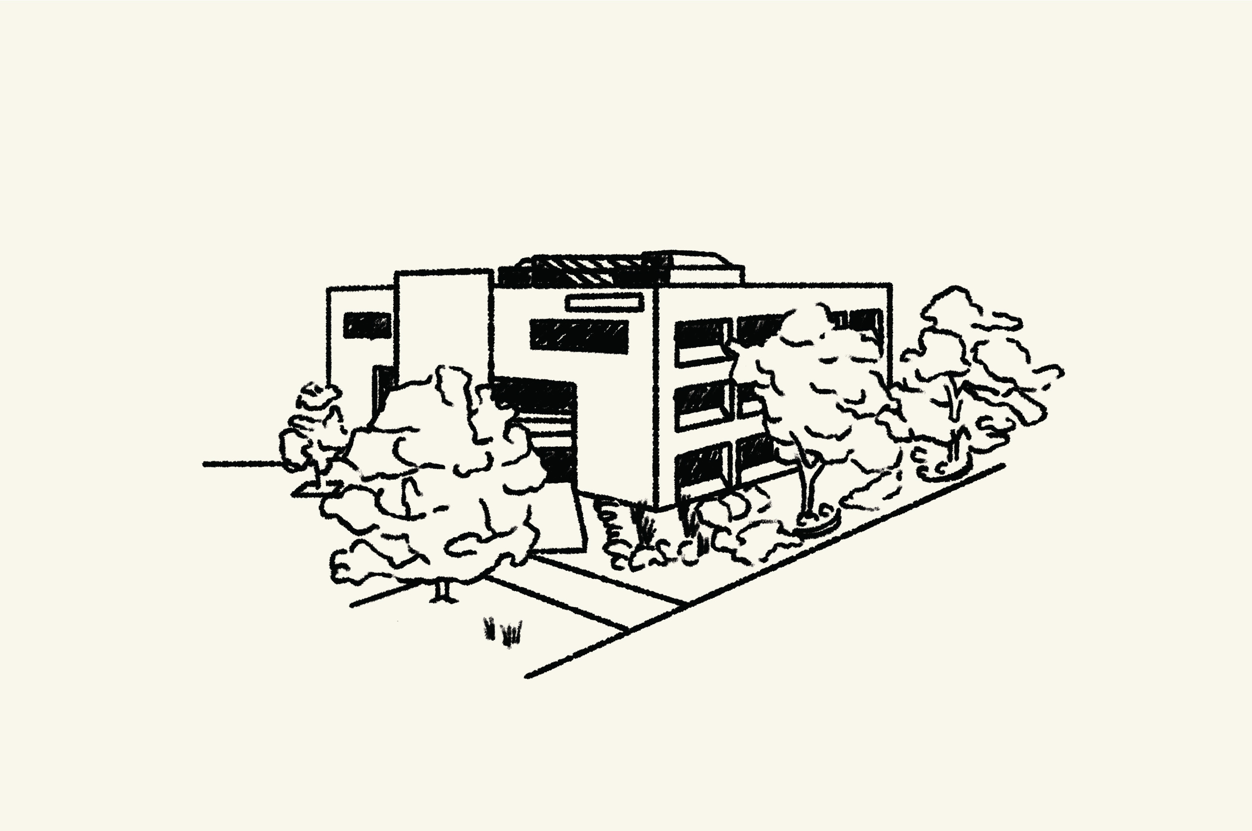
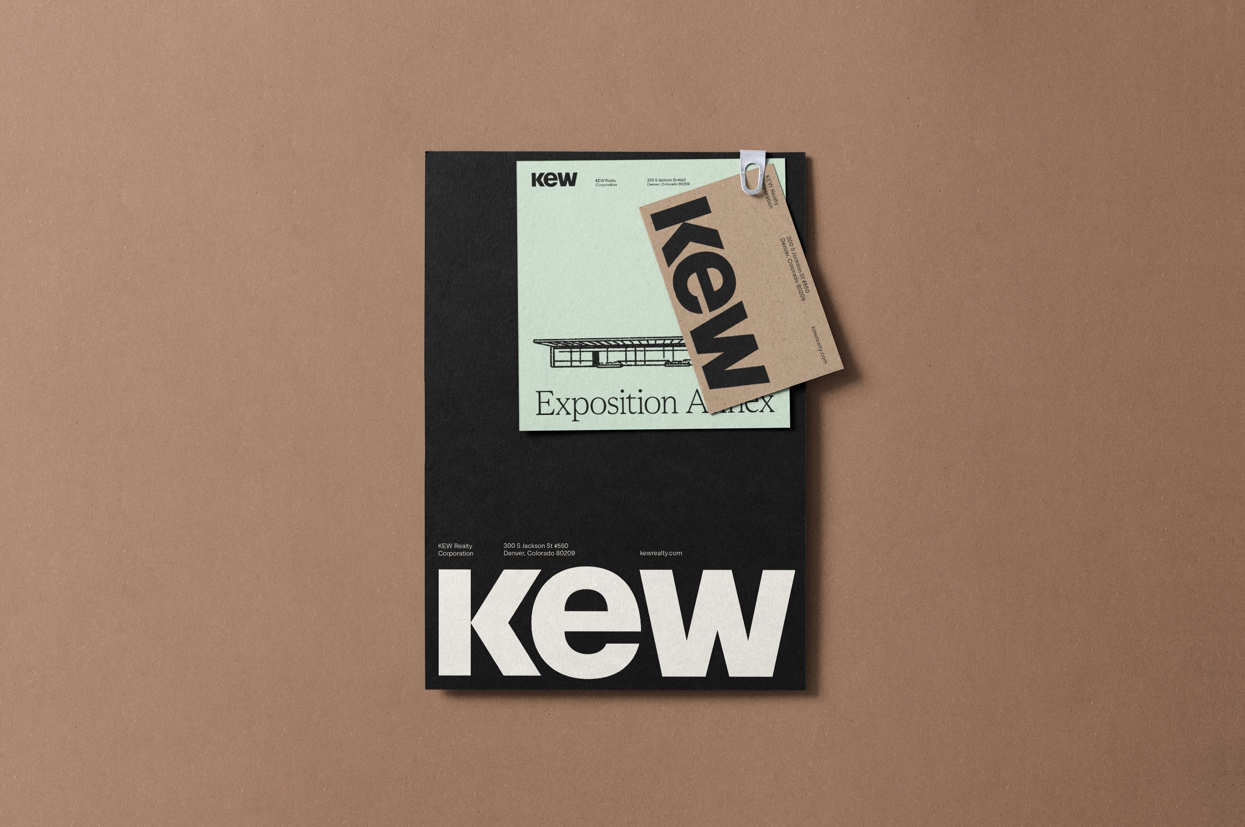
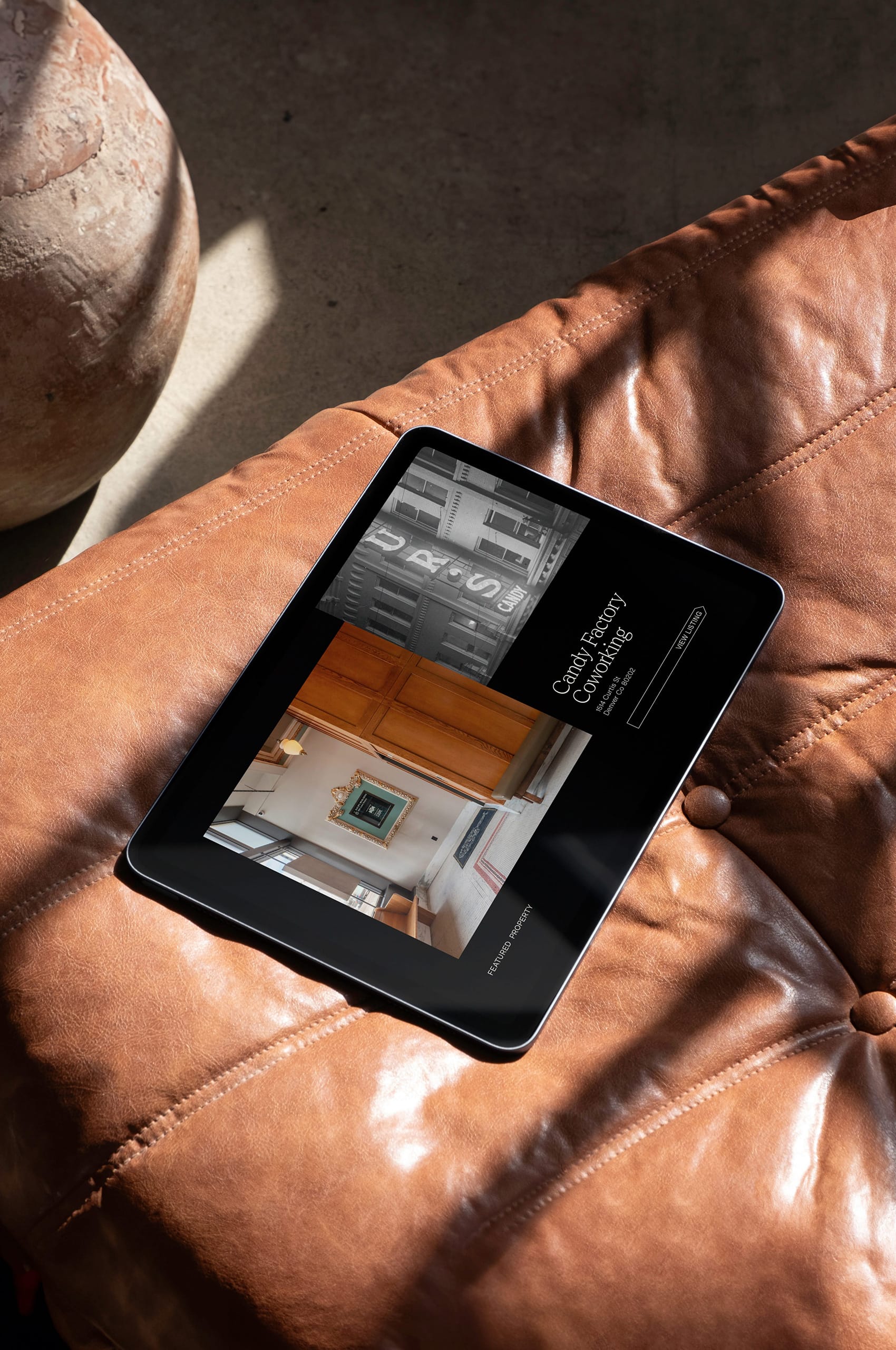
Through these hand-drawn illustrations, the KEW identity system creates a unique visual language that doesn’t rely on photos for every property. Instead, these illustrations provide a flexible and distinctive suite of assets that can be used across various applications, ensuring the brand maintains its integrity. This addition enhances the brand’s storytelling, balancing the precision of the overall design with an inviting, more tactile aesthetic.
