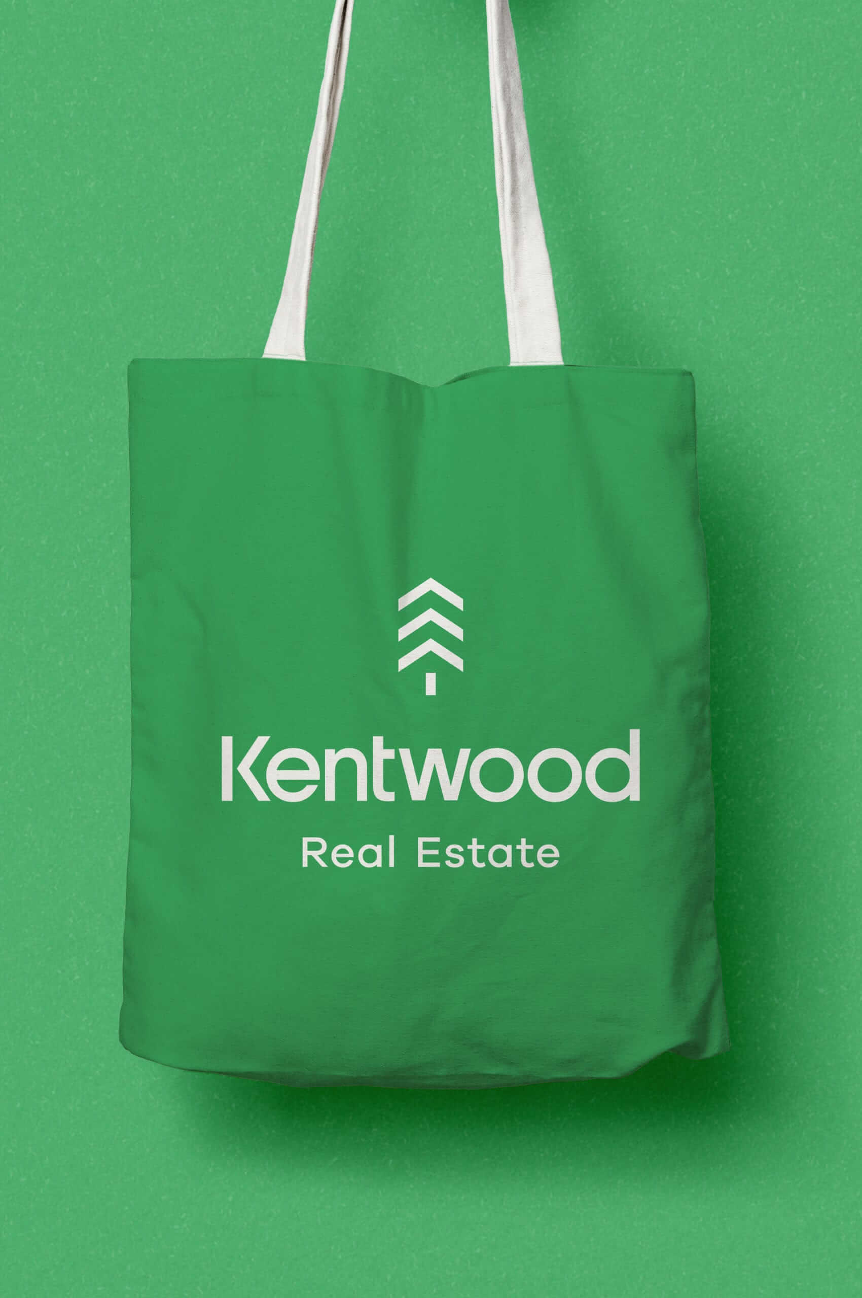
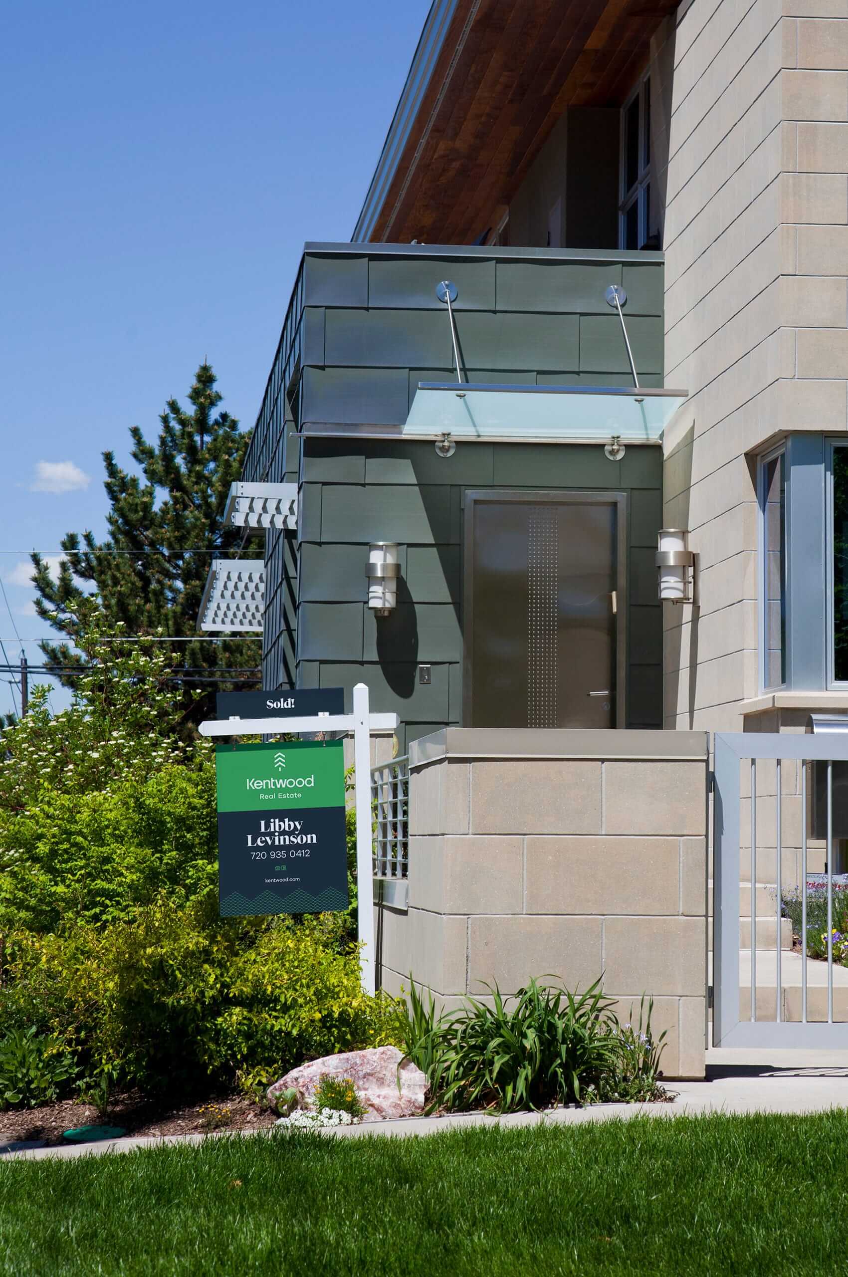
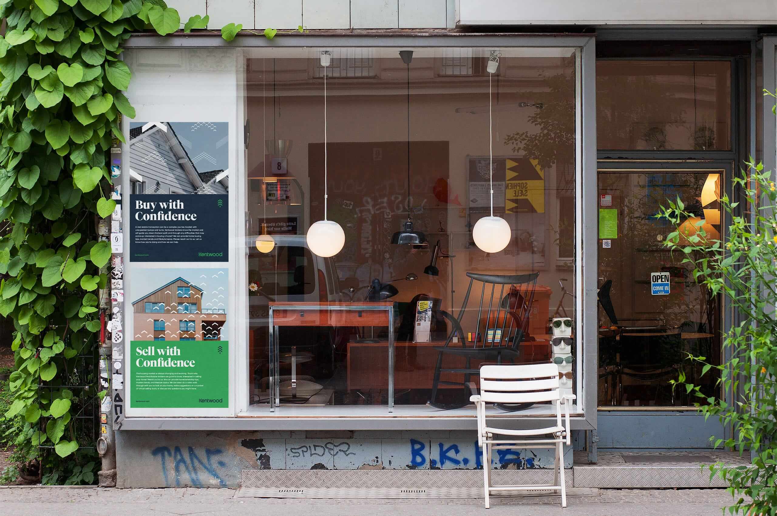
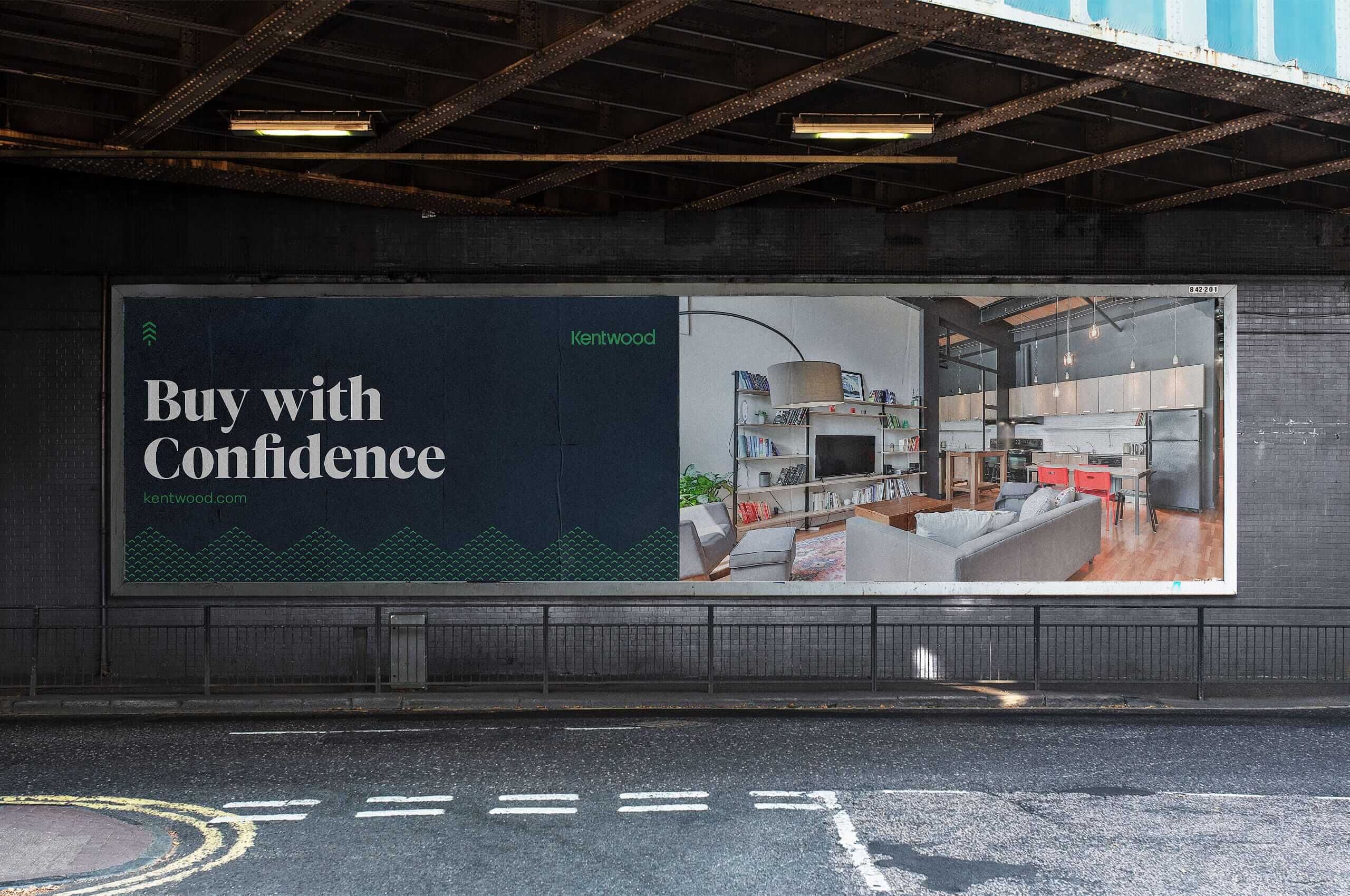
Kentwood Real Estate
One of the most prominent and respected real estate agencies in the state of Colorado.
One of the most prominent and respected real estate agencies in the state of Colorado.
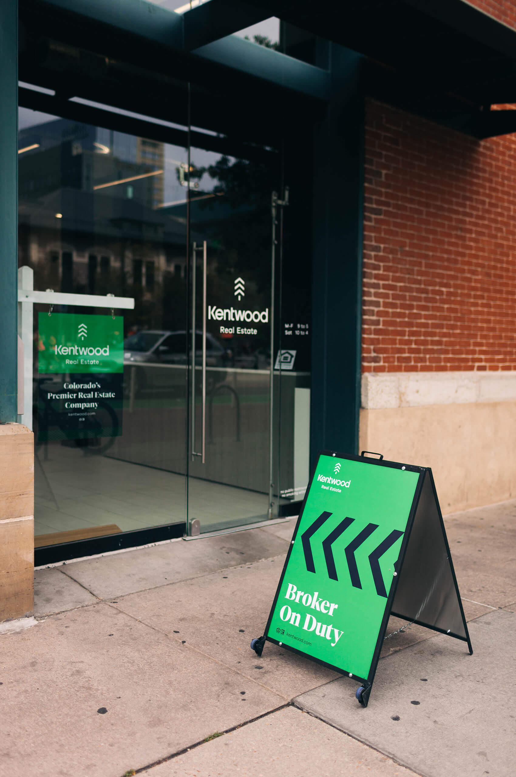
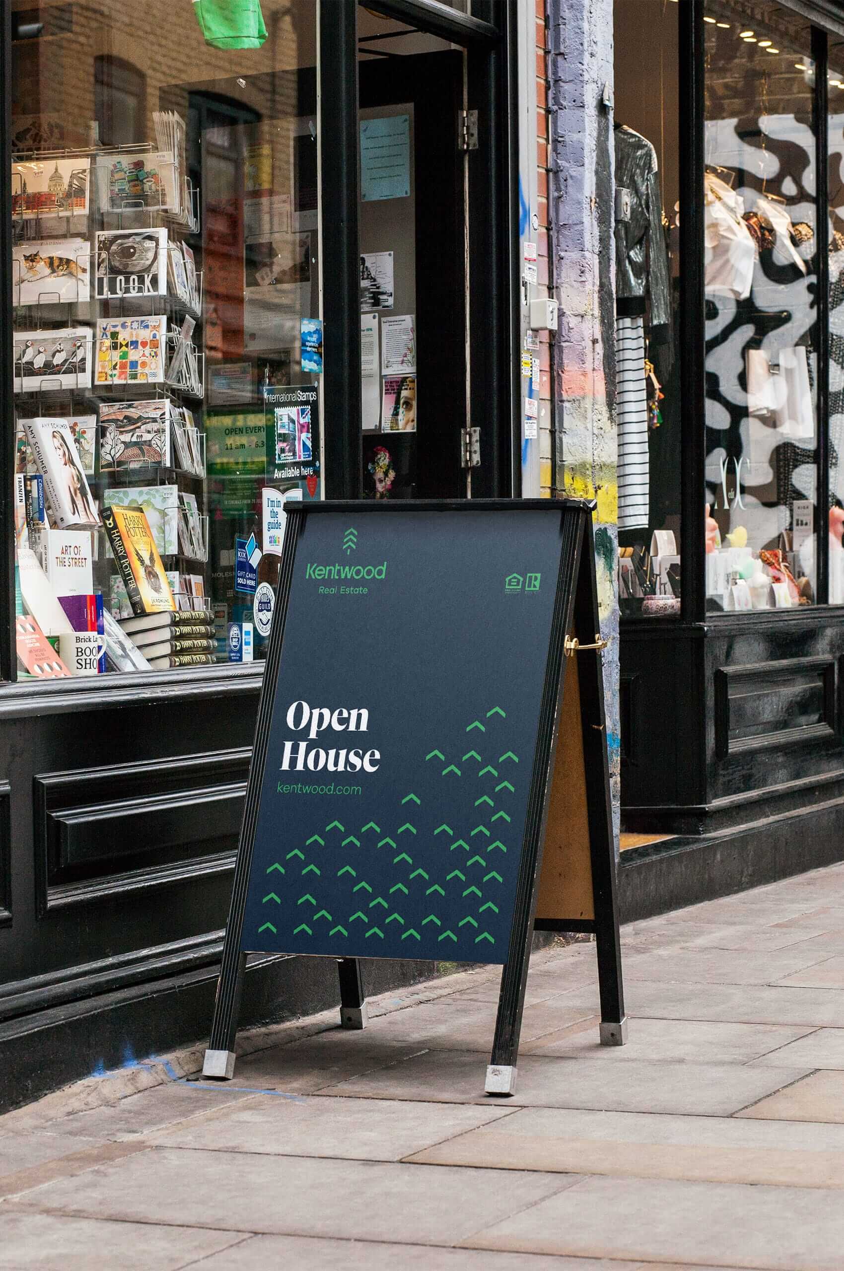
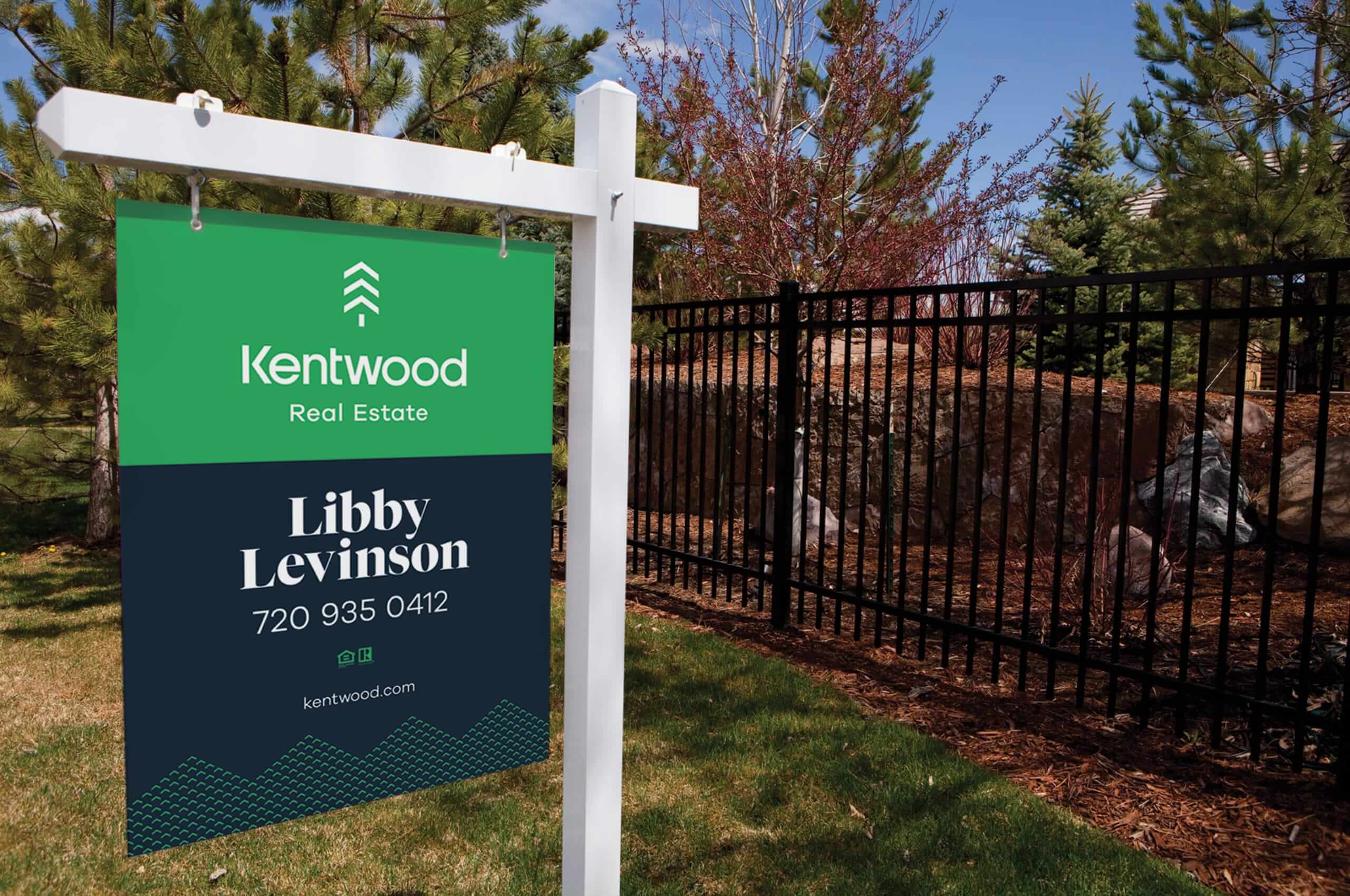
After nearly four decades in business, Kentwood knew it was time to update their identity. As one of the most recognizable real estate agencies in Colorado, they wanted to update and modernize without having their consumers relearn the brand. Building upon their well-established equity to usher in the new era for the Kentwood.
After almost three years of planning internally, Kentwood approached Mast to help achieve their vision of a modernized version of their identity. We worked closely with their internal team to update the iconic brand. Resulting in a modern refresh that pays homage to their decades in Colorado.
“We’ve turned the corner into the first decades of the 21st Century and we believe it’s time to retell our story. Only we control our story, and only we can shine a light on how proud we are to be here. Without the support of our clients and their belief in what we have to offer, we would not be the brand we are today.” – Gretchen Rosenberg, Kentwood CEO

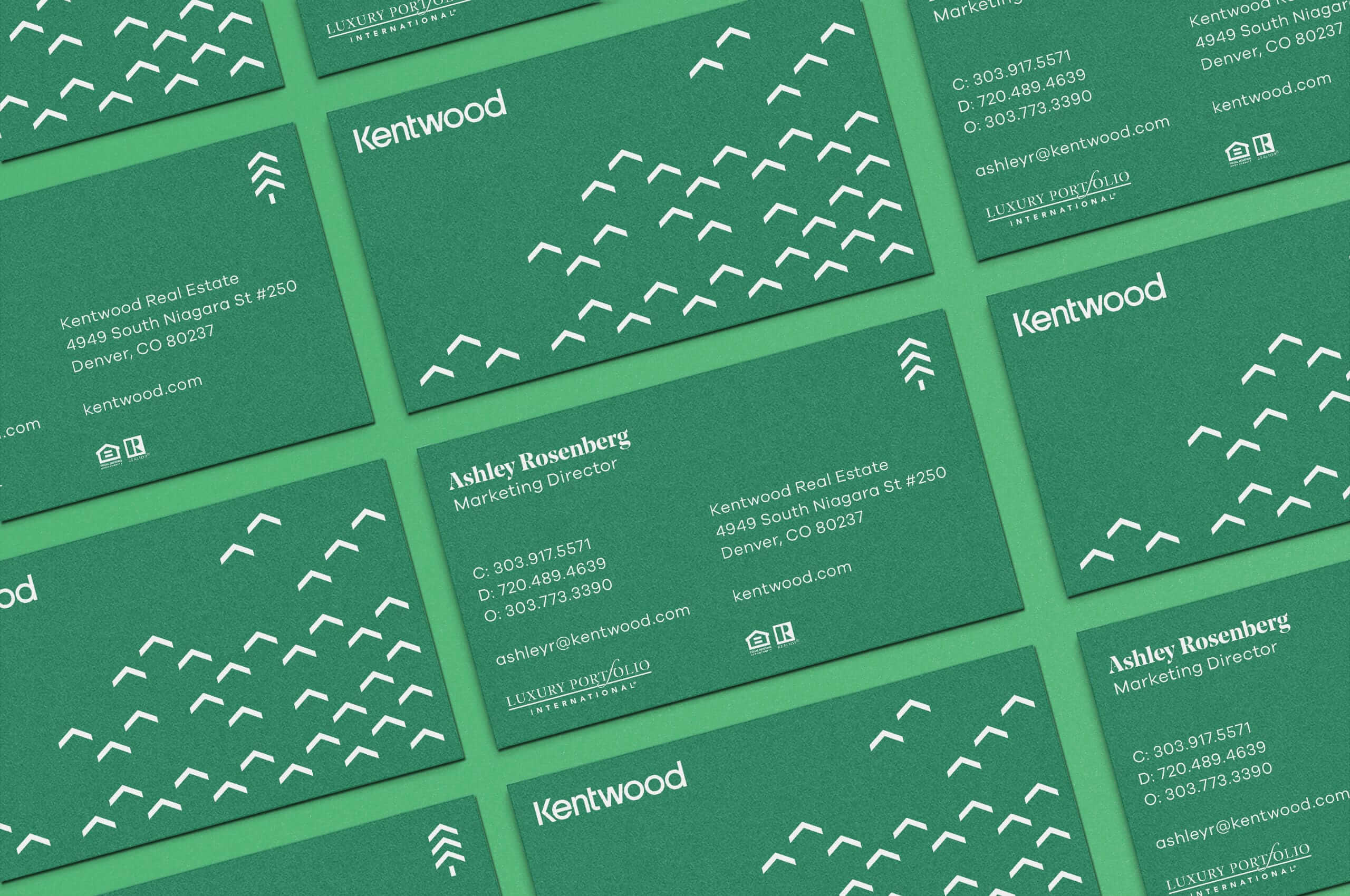
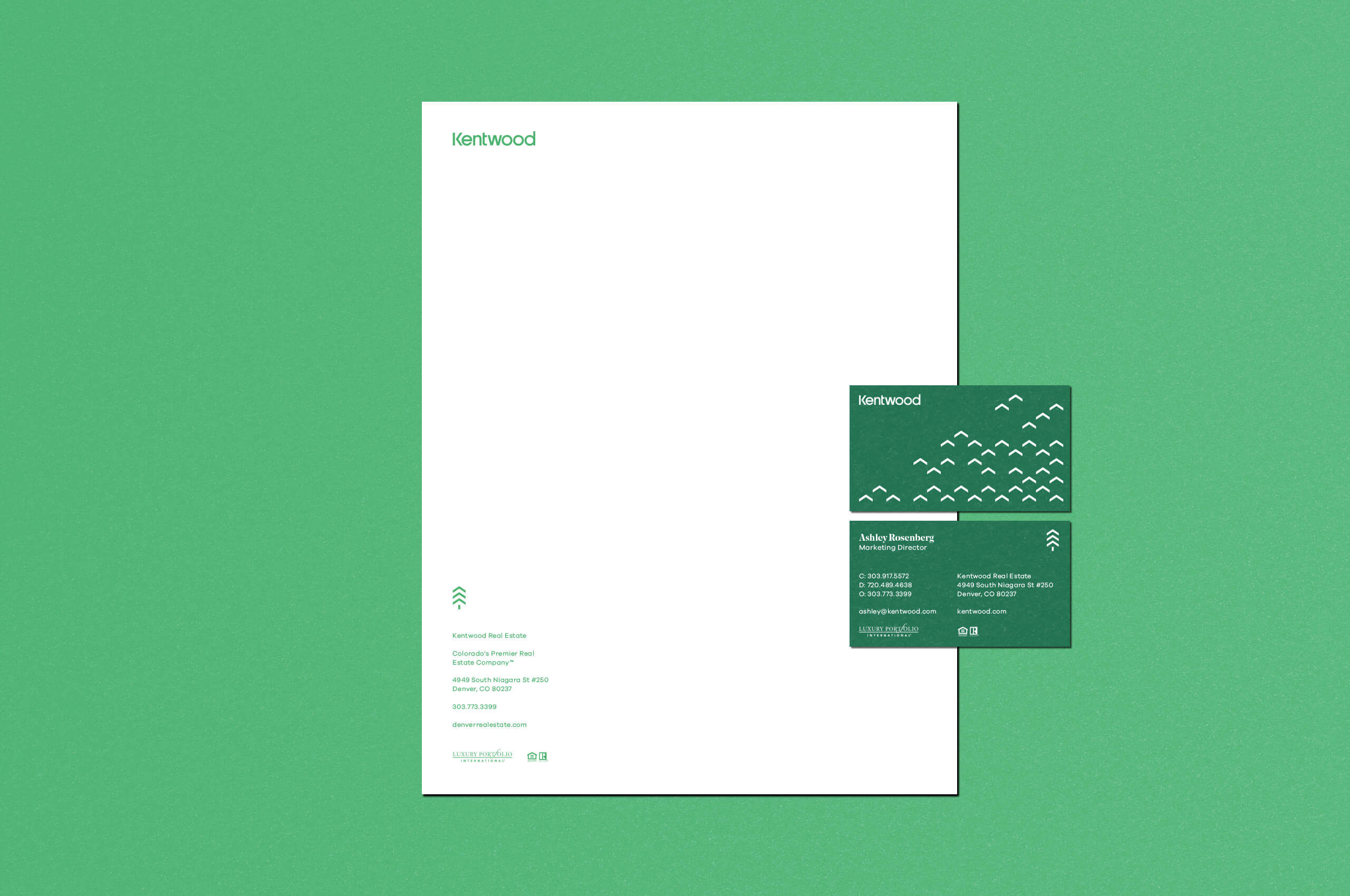

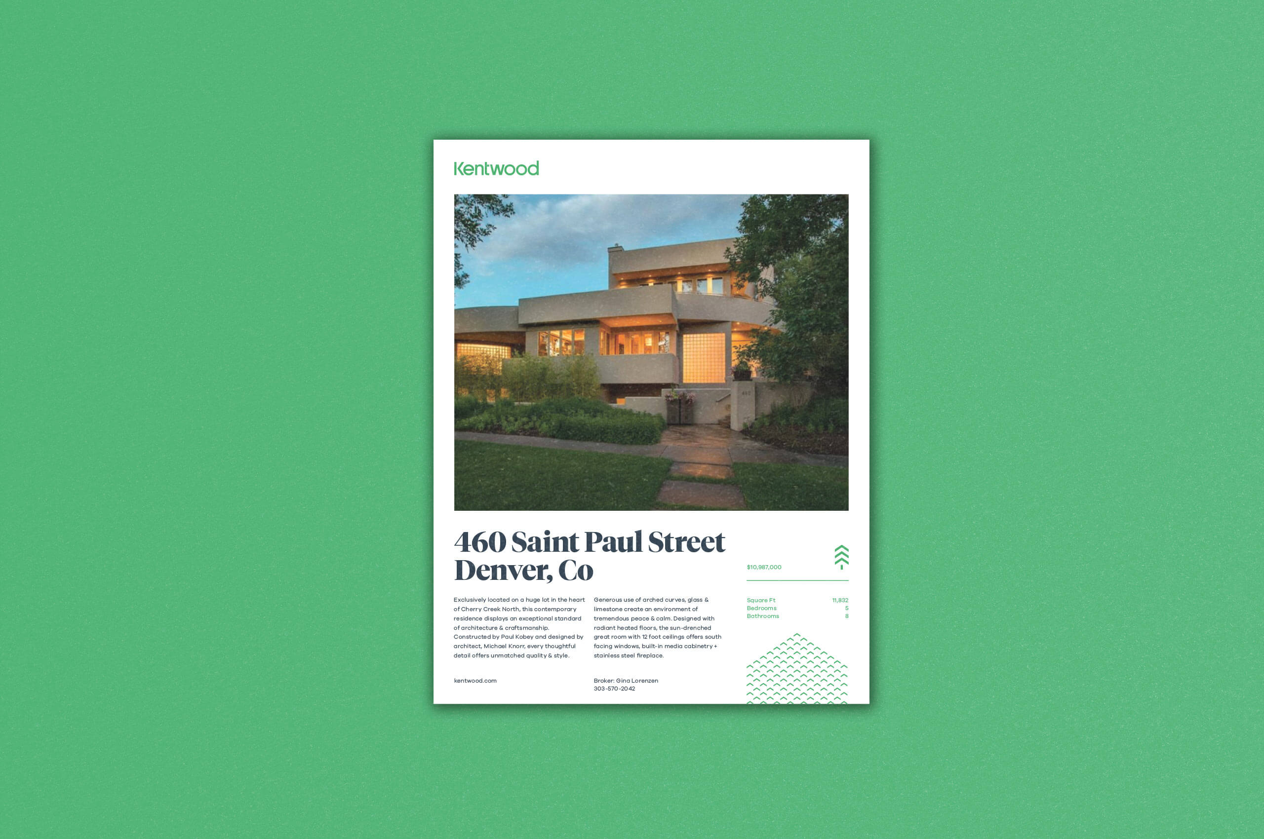
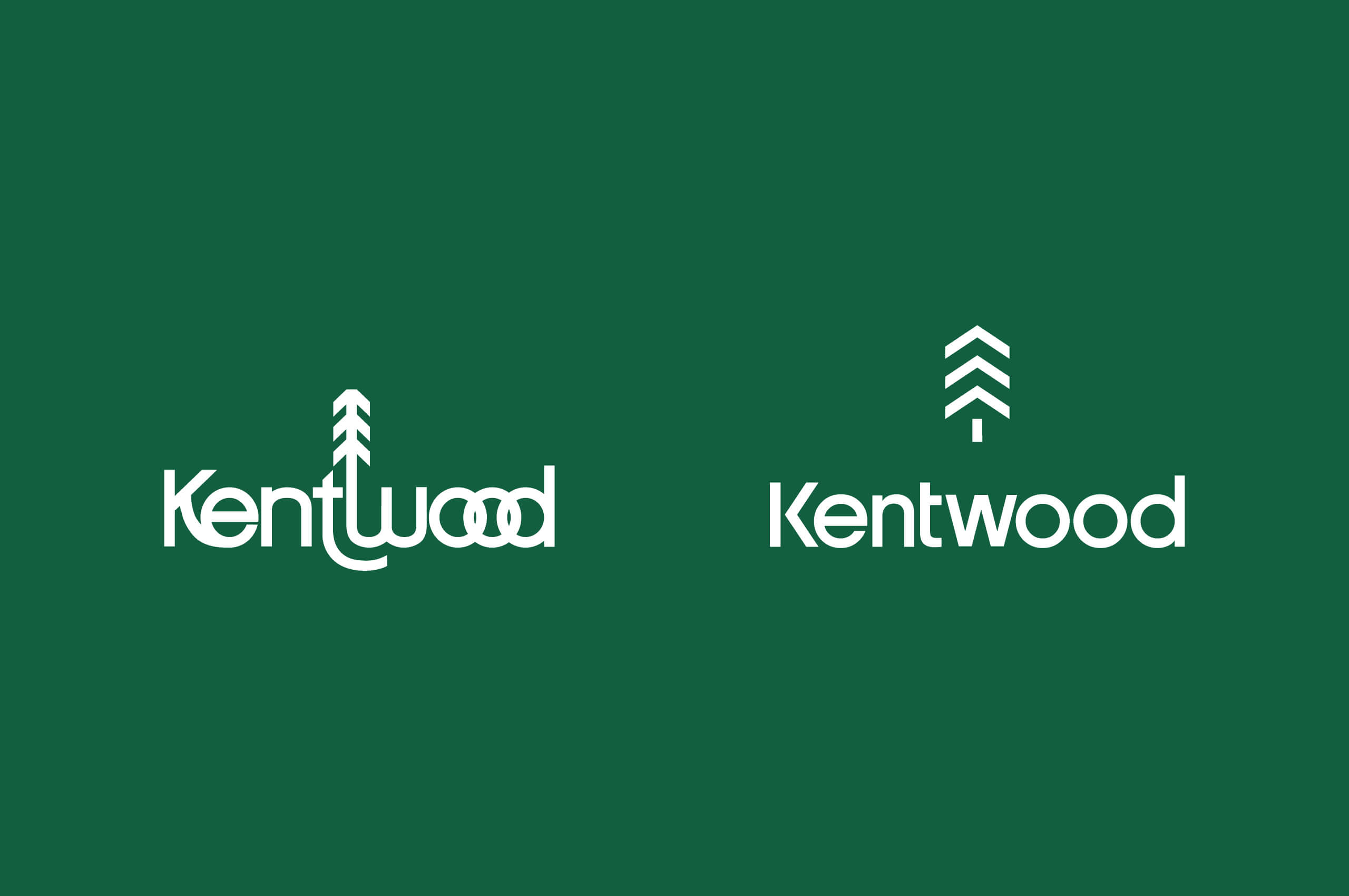

Already widely regarded within the organization and the community at large, the evergreen tree has strong equity and ties to the Kentwood name. It has geographical connotations but it also provides a message of stability and longevity.
“Our tree is the symbol of our roots in Colorado. Of our commitment to the building blocks of home and the strength of community. It represents the foundation of life, landscape, and an evergreen mentality. Trees breathe life into this world and remind us to slow down and take the long view.”
The evergreen also inspired the update to the color palette. Previously the palette heavily leveraged forest green and gold. The internal team felt this palette no longer aligned with the mission of Kentwood. It was imperative to modernize and expand the palette. Using the forest green as a base, we introduced a light energetic green and blue into the palette. Creating a modern palette rooted in the landscape.

