Harmonic Discovery
A company focused on creating a new generation of therapeutics that embrace the complexity of diseases.
A company focused on creating a new generation of therapeutics that embrace the complexity of diseases.
Harmonic Discovery is a startup like no other; they are actively working to create a new generation of therapeutics that can target multiple disease-causing proteins simultaneously to treat disorders such as cancer and autoimmunity diseases. These diseases are often the result of a constellation of proteins dysregulated in one’s body. Some of the most successful drugs, such as aspirin, metformin, and acetaminophen, act on several proteins simultaneously to exert their therapeutic effect. Notably, many of these drugs came from natural sources, where, through millions of years of evolutionary time, these molecules were optimized to engage multiple proteins.
Modern drug discovery has the tools to design drugs that target a single disease-causing protein at a time. However, to treat complex diseases, such as cancer, medicines must be designed to engage multiple disease proteins simultaneously. At Harmonic, they aim to shift the current drug discovery paradigm by building a suite of computational/machine learning tools to design drugs that embrace the complexity of disease.
Ahead of their launch, they approached Mast to help create a brand to be as serious as their work. While serious, the brand also needed to feel as expansive as their approach to drug discovery.
Collaborators:
Website: Kinetic Studio

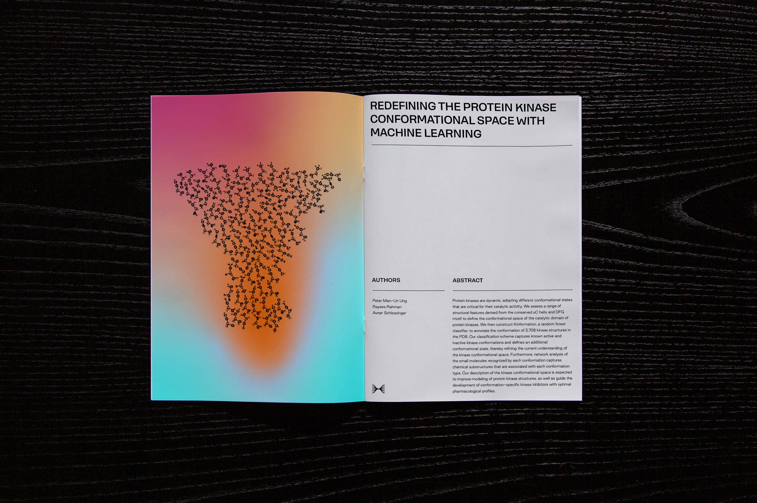
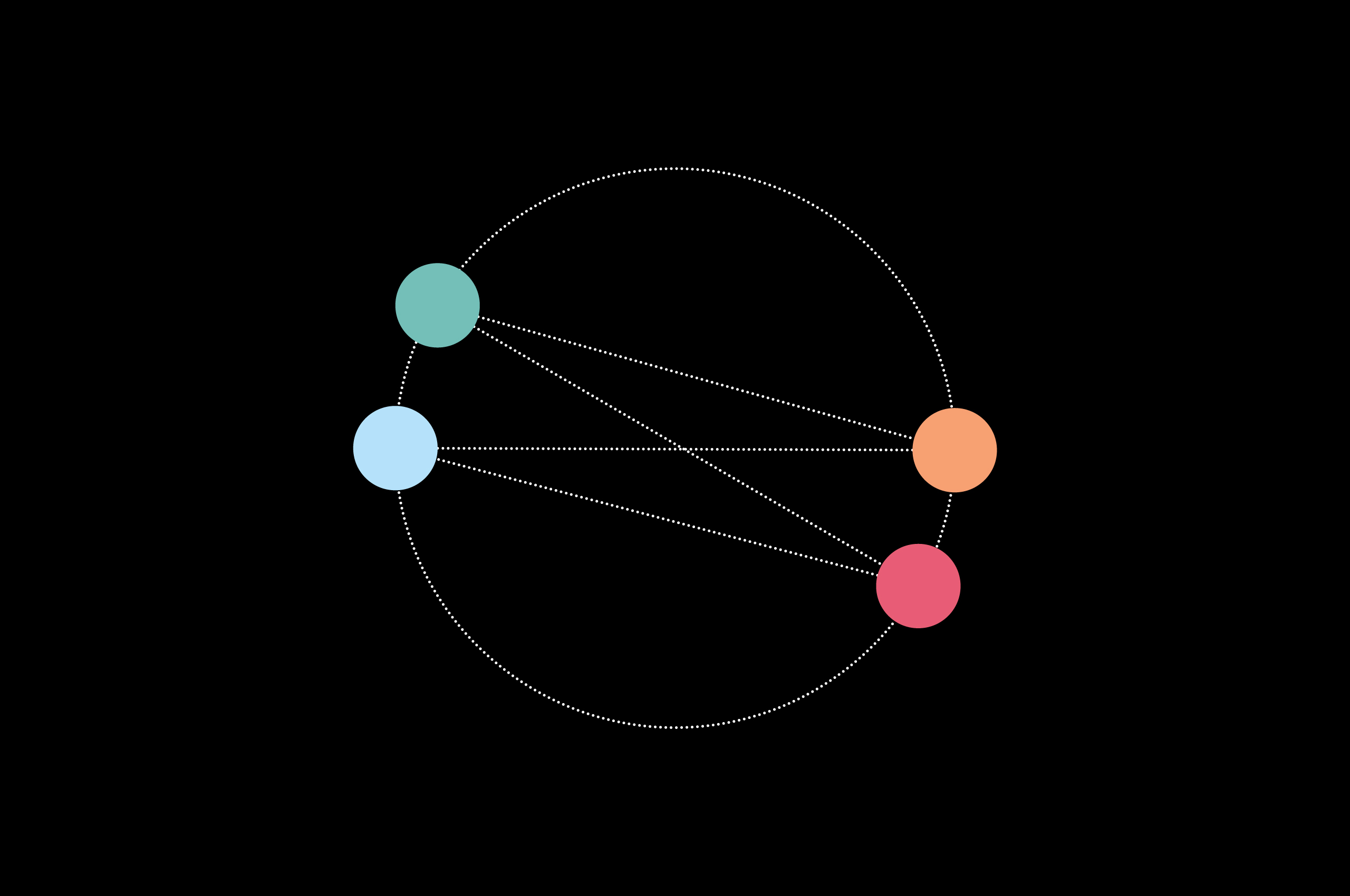
The methodology behind Harmonic is found within the Kinase Tree; while most drug discovery concentrates on a single biological mechanism, they focus on therapeutics within the human kinome, a family of 500 proteins associated with diseases such as cancer, autoimmunity, and neurodegeneration.
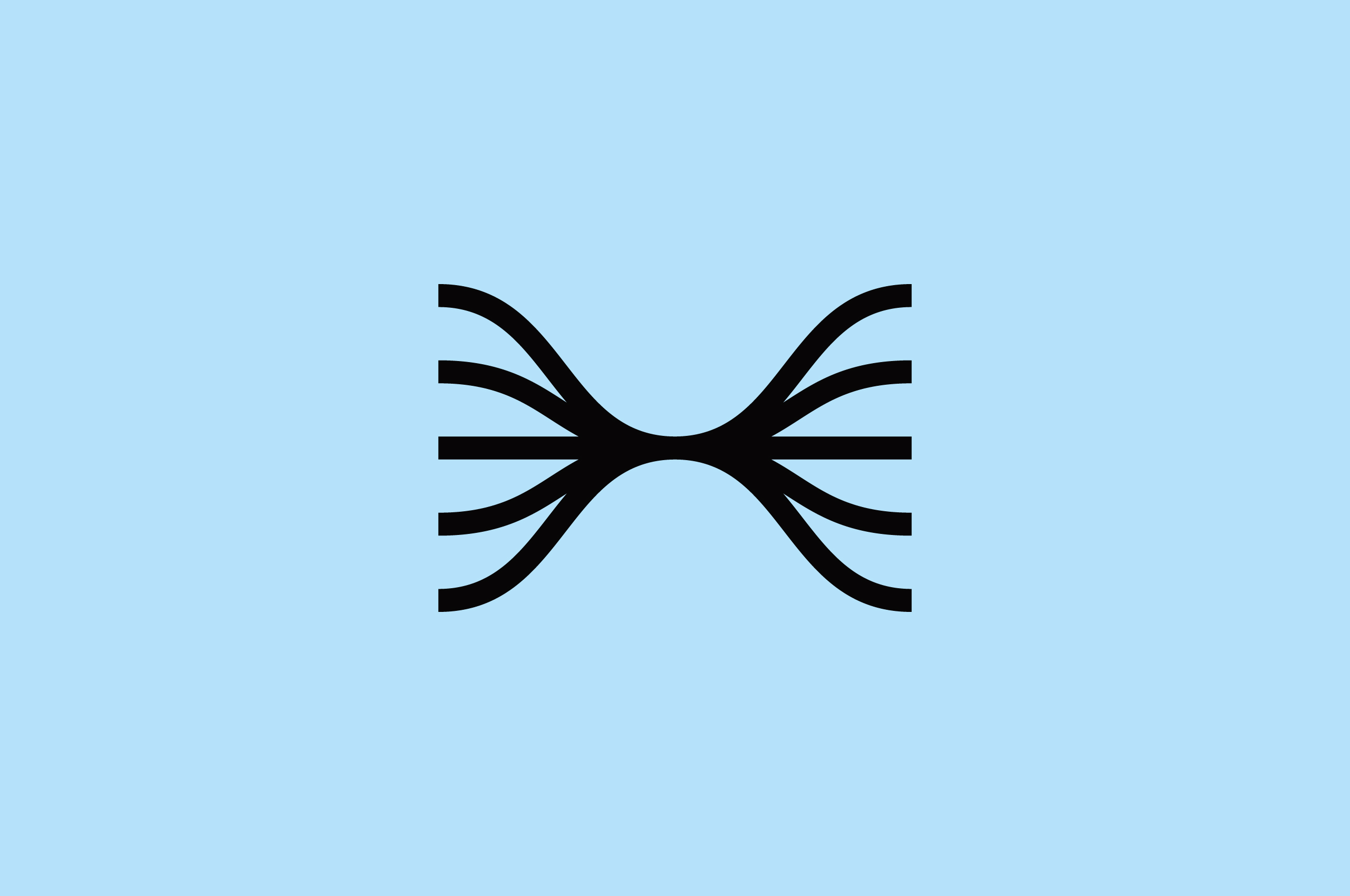
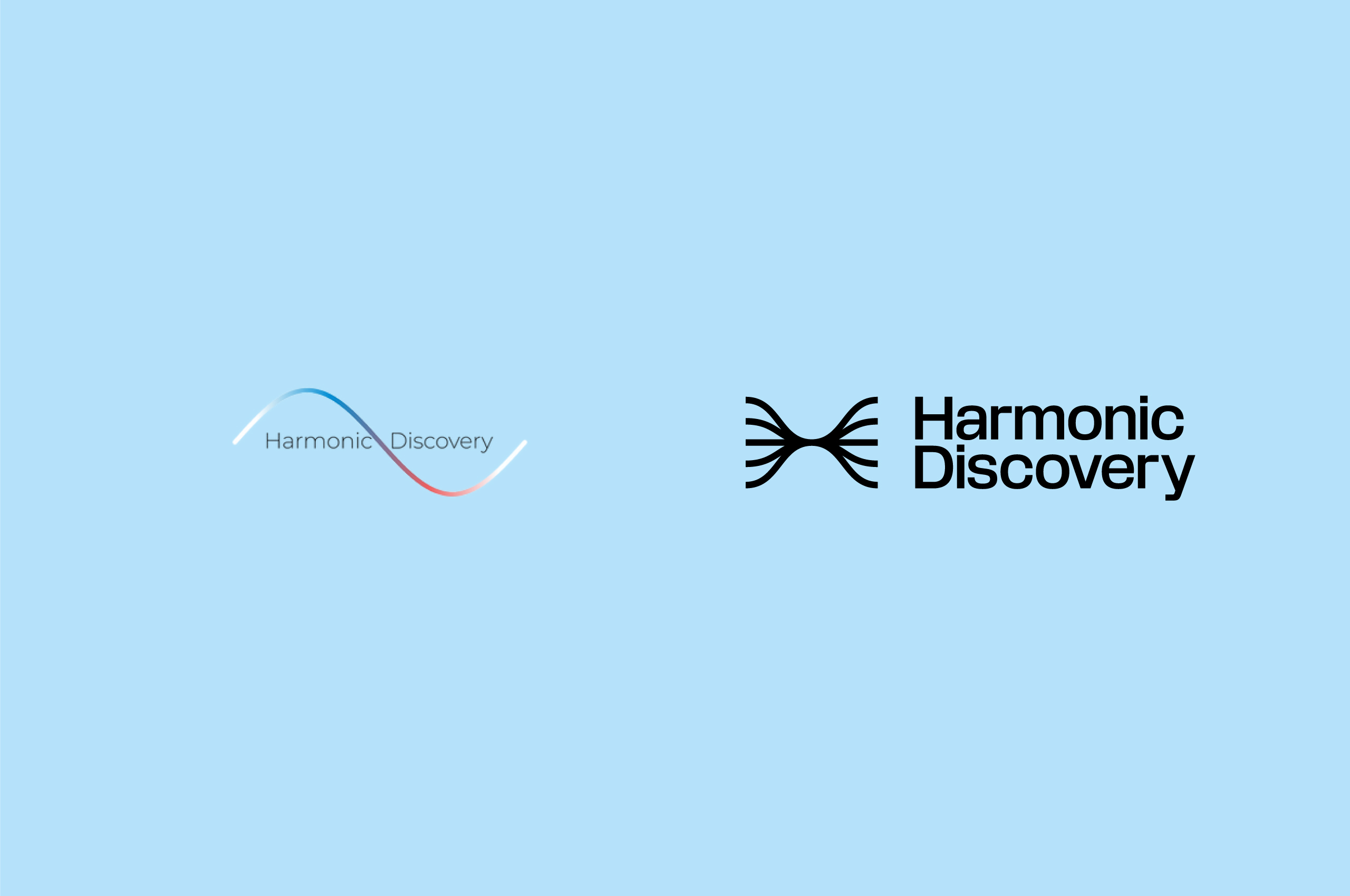
The name comes from the musical Harmonic Series; (the sequence of harmonics, musical tones, or pure tones whose frequency is an integer multiple of a fundamental frequency.)
Rayees Rahman, CEO and Co-founder, says, “It comes from music theory. Modern pharmaceutical companies play just a single note from an array of possible keys. We are pioneering a way to play chords, progressions and harmonics.”
A harmonic tone combines many periodic waves, sine waves, each with its frequency of vibration, amplitude, and phase.
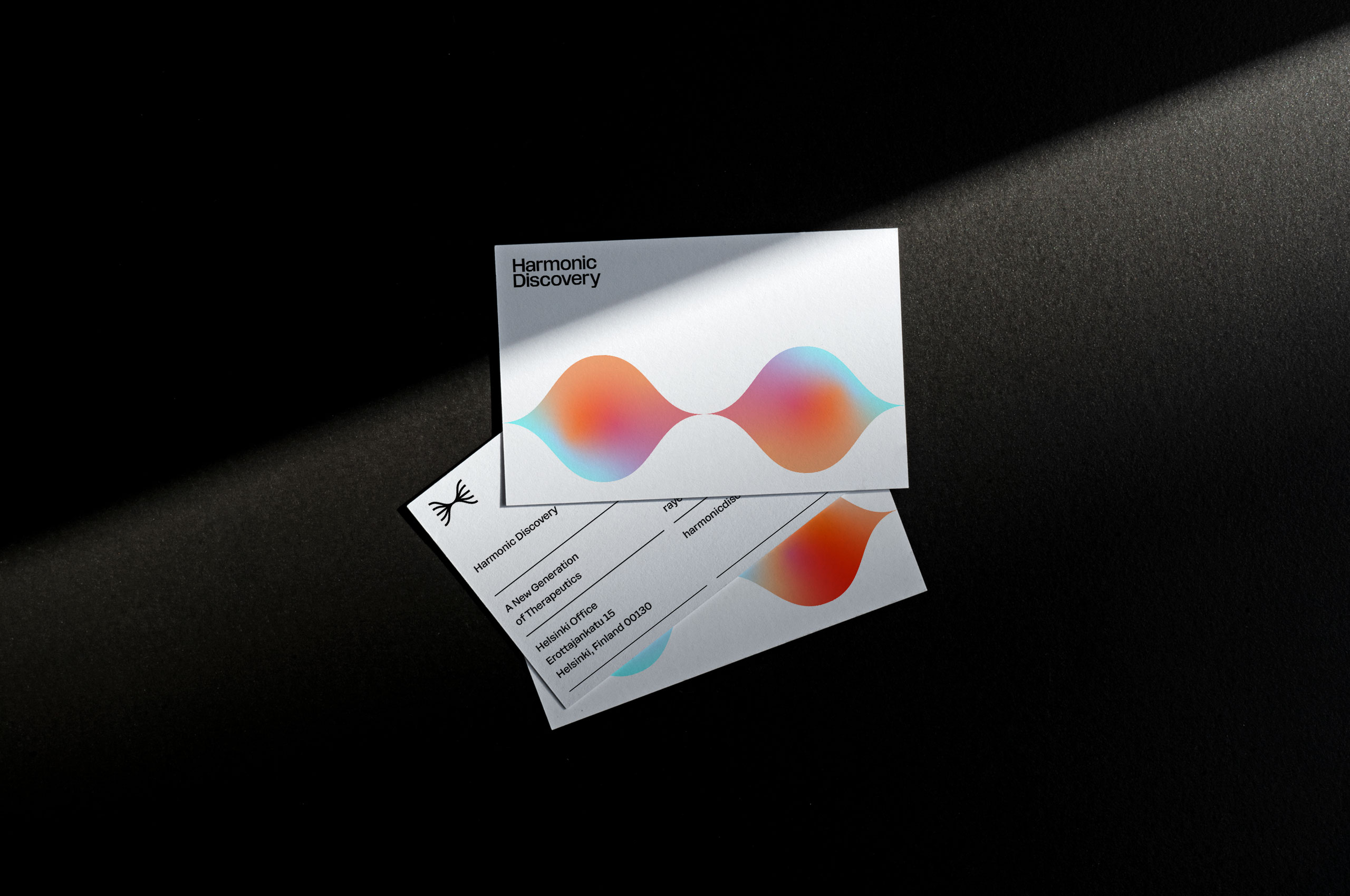
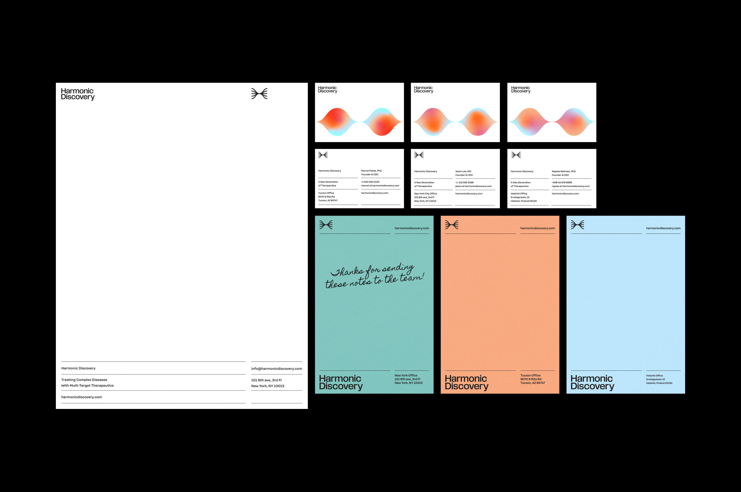
We found tremendous inspiration within the harmonic series and the various sine waves that are located within. We developed a unique symbol that merges the sine wave shapes to create a form that resembles an H. A strong, unique symbol containing multitudes, just like the result of Harmonic’s work.


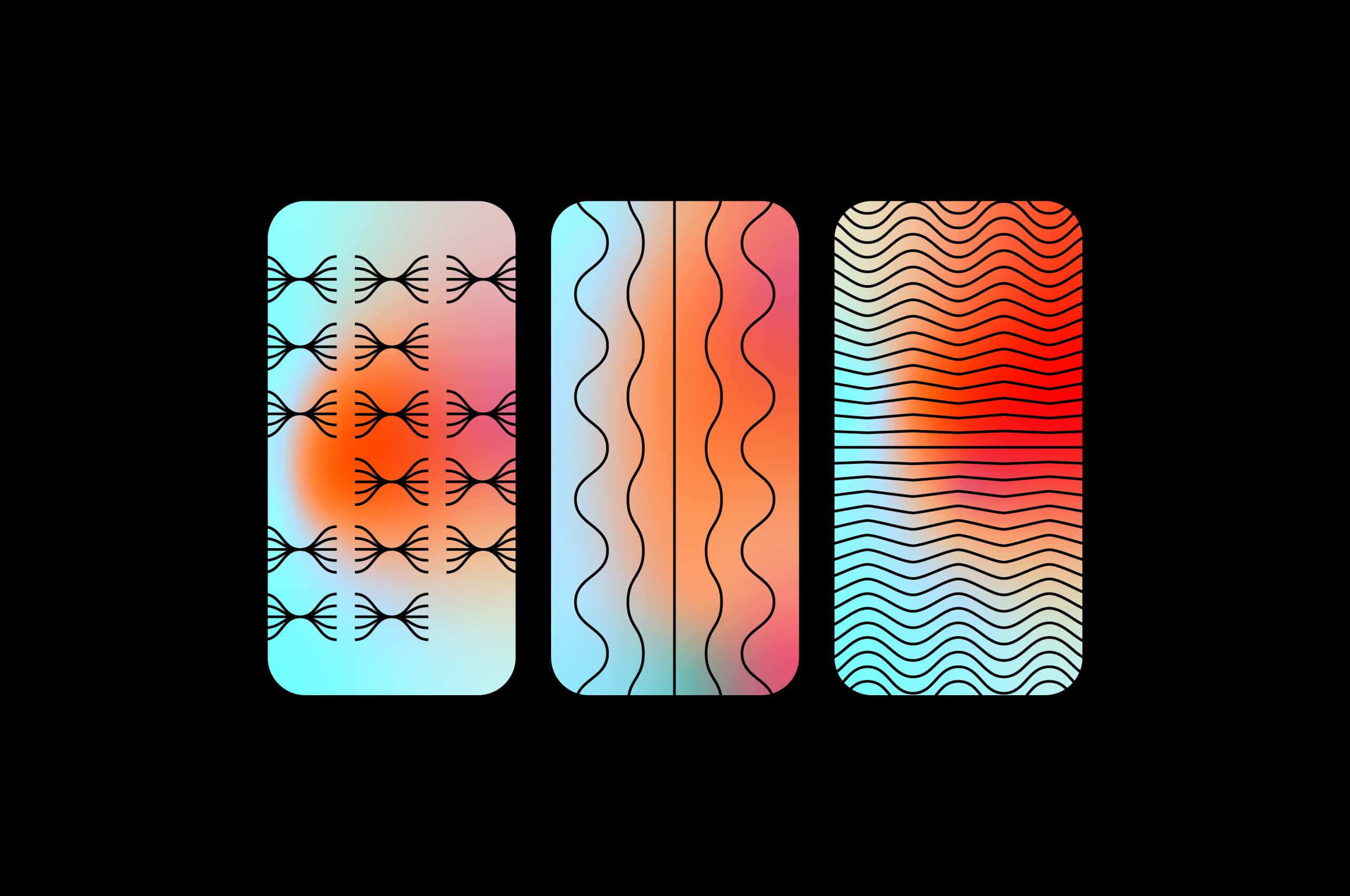
The fluidity and movement of the sine wave curves stood out to us as something extremely graphical and impactful. As an extension to the buildout of the identity, we created a unique set of patterns based on these waves, to help continue to tell the story of Harmonic.


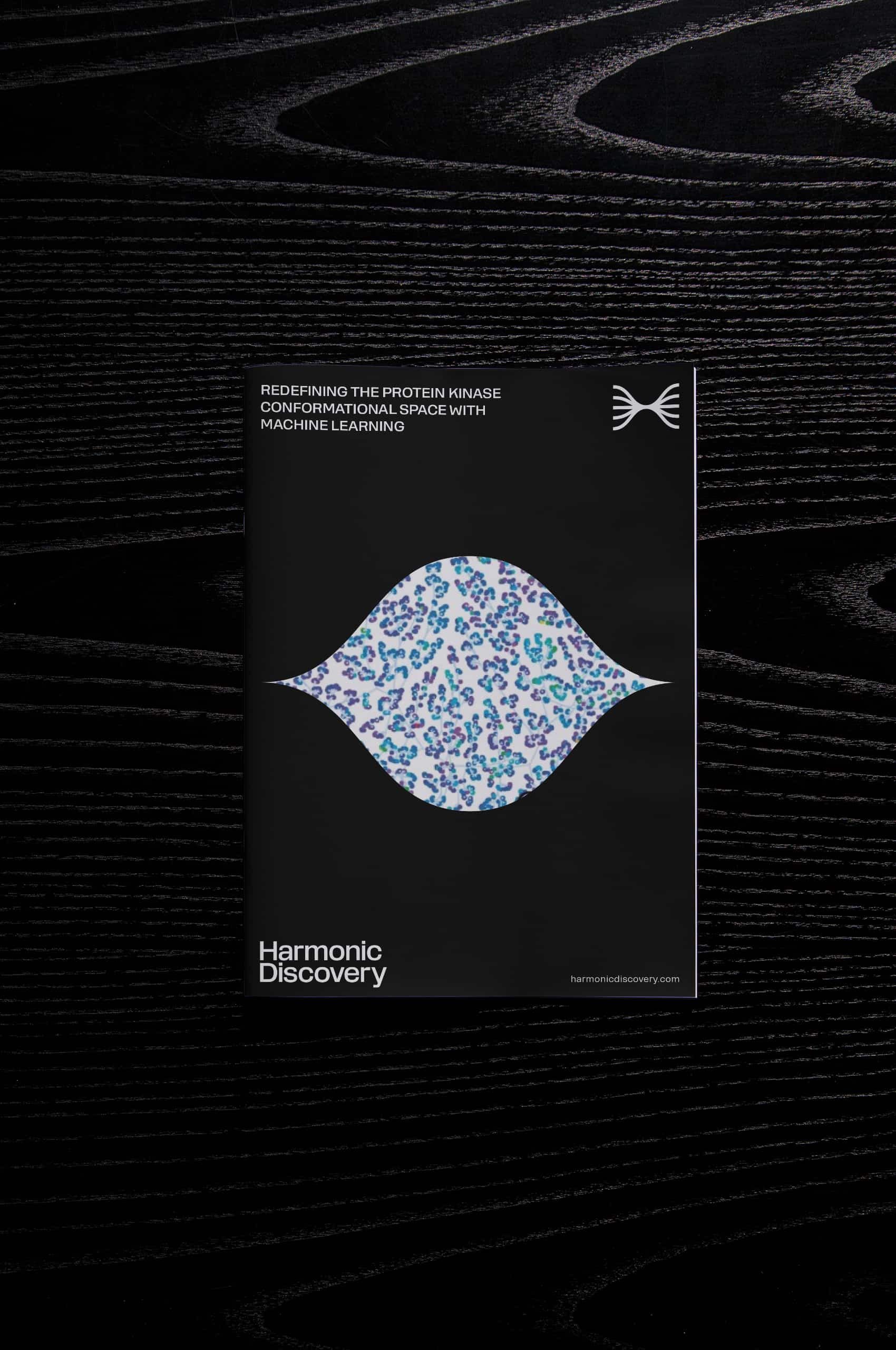
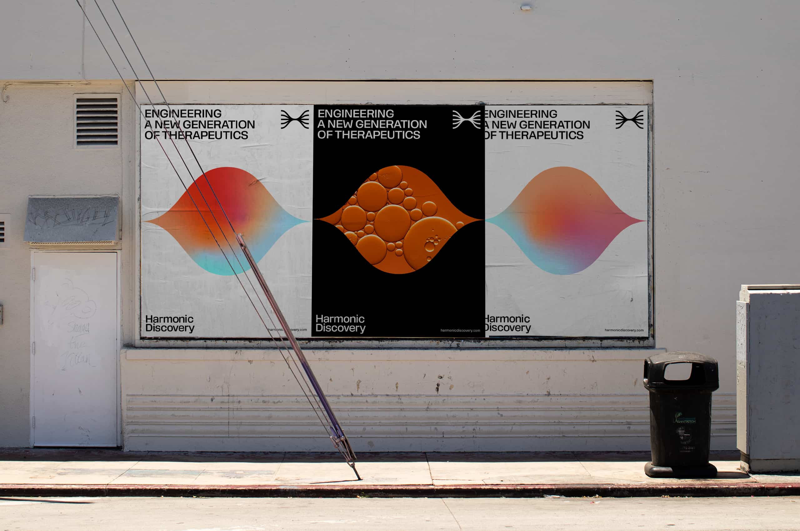

By combining the most drastic sine curves of the symbol, we created a shape that is utilized in multiples for pattern applications and singularly to house photos or graphics—developing a deep connection to the symbol even when not present.

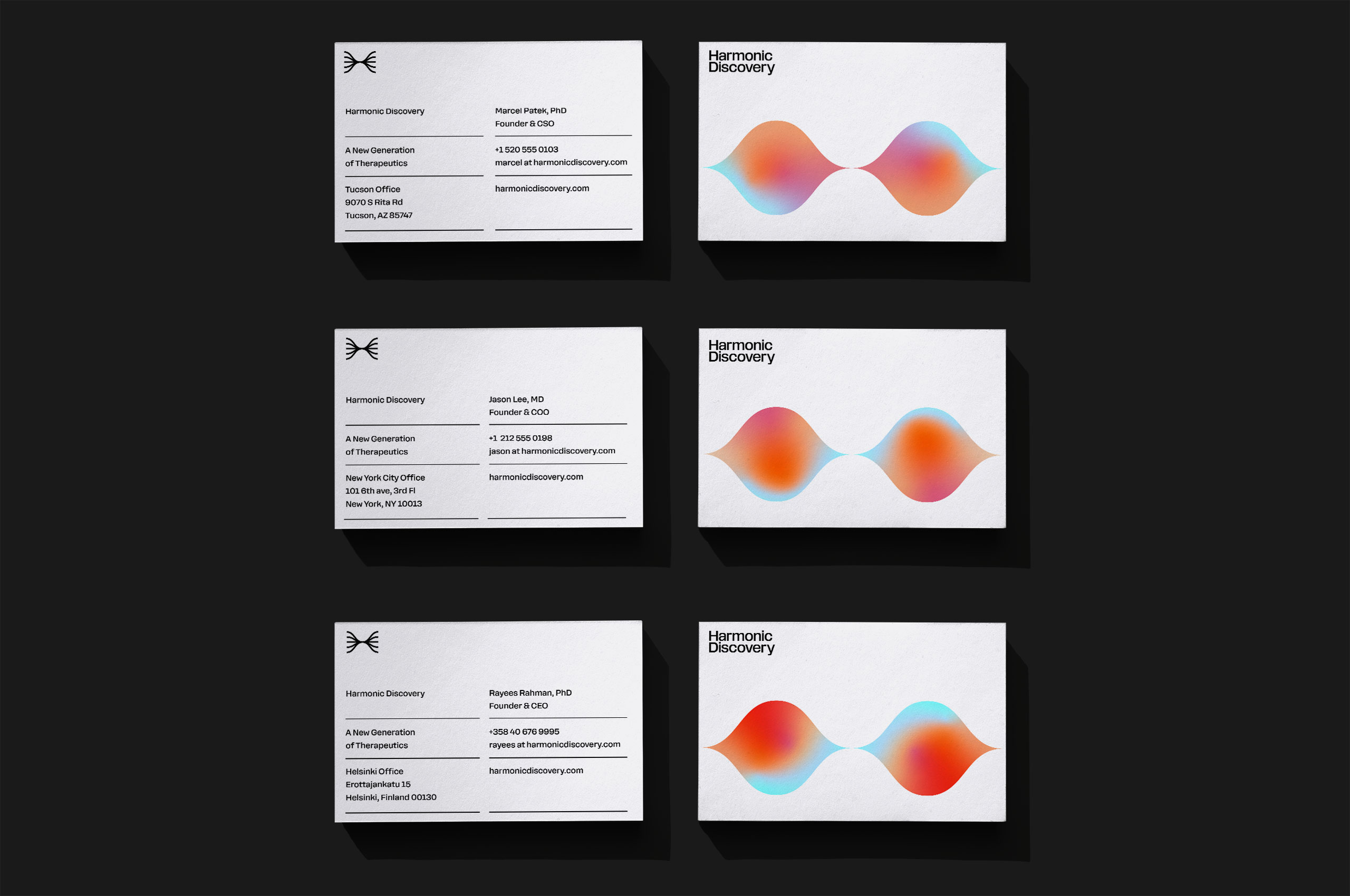
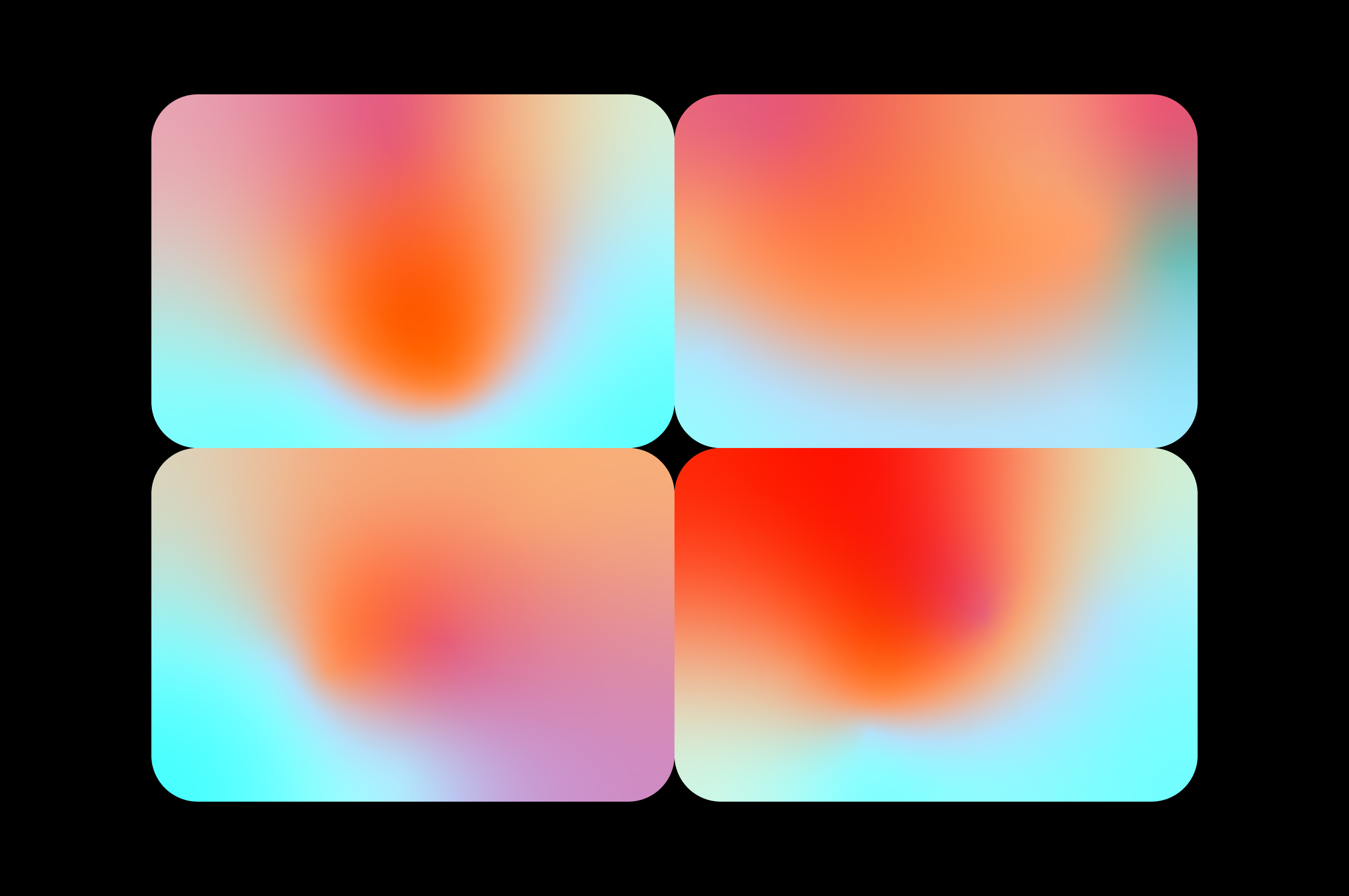
While the core palette of the new Harmonic Discovery identity can be found in black and white to establish the serious and systematic nature to their practice, we have expanded the palette to include a set of four colors that work in complimentary harmony. These colors bring warmth and humanity into the brand applications when necessary.
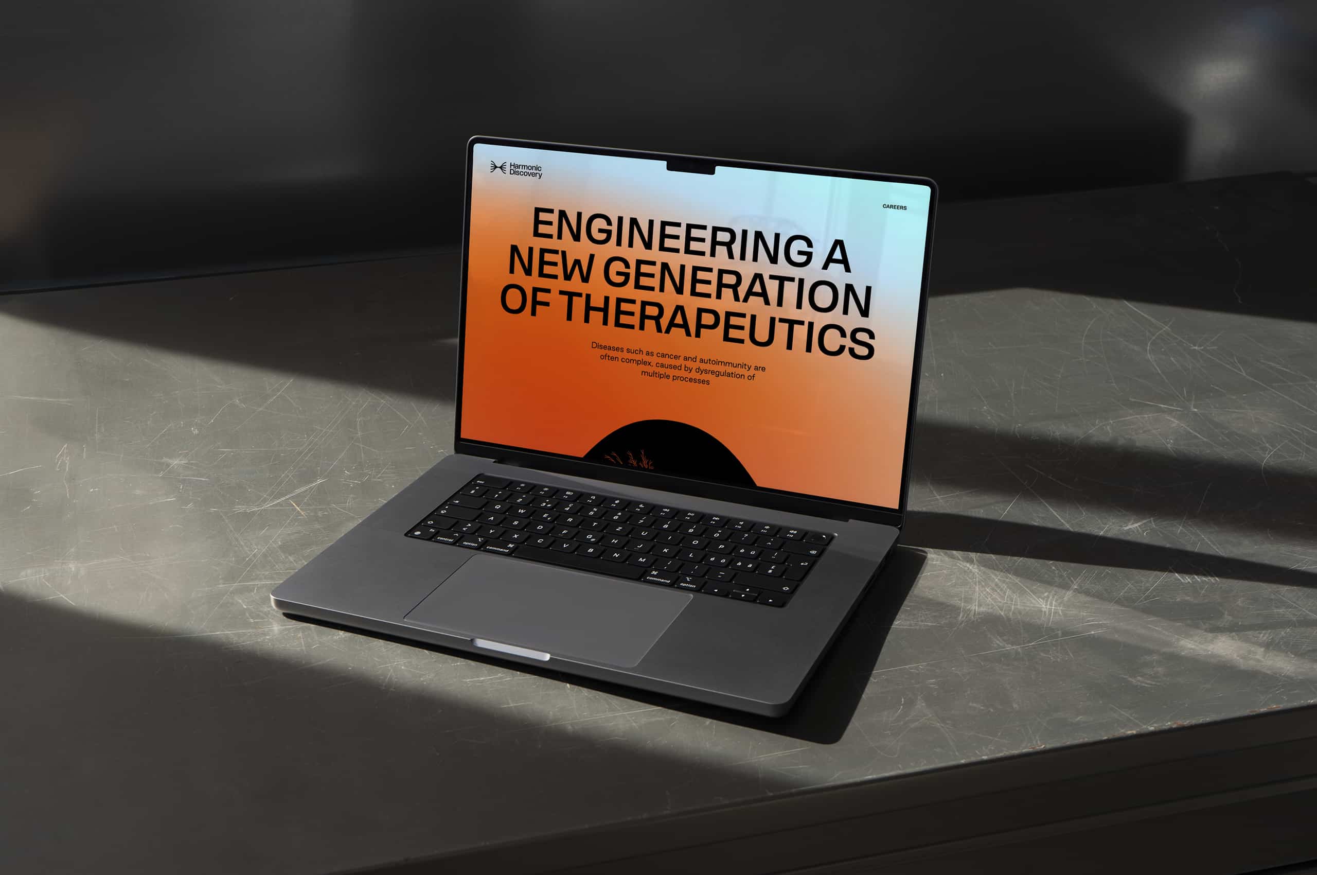
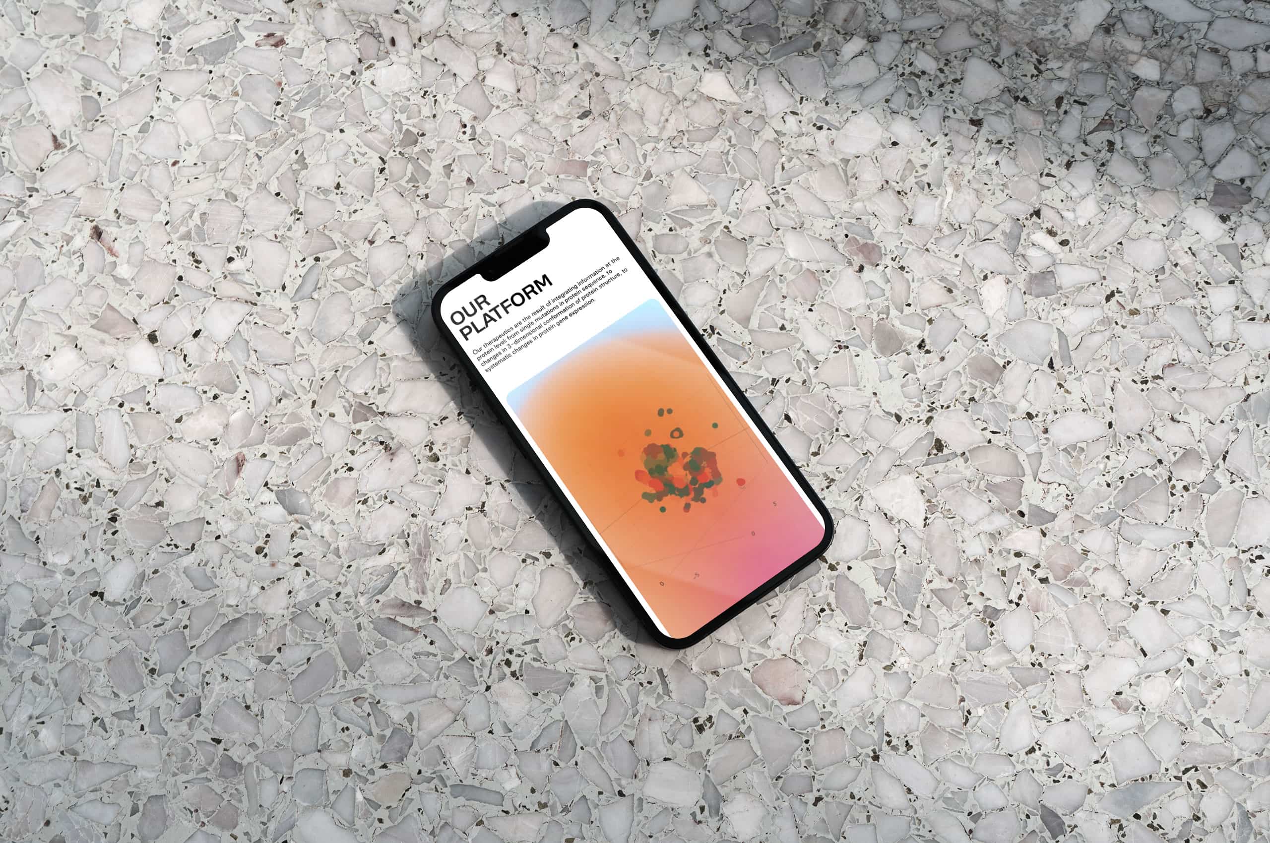
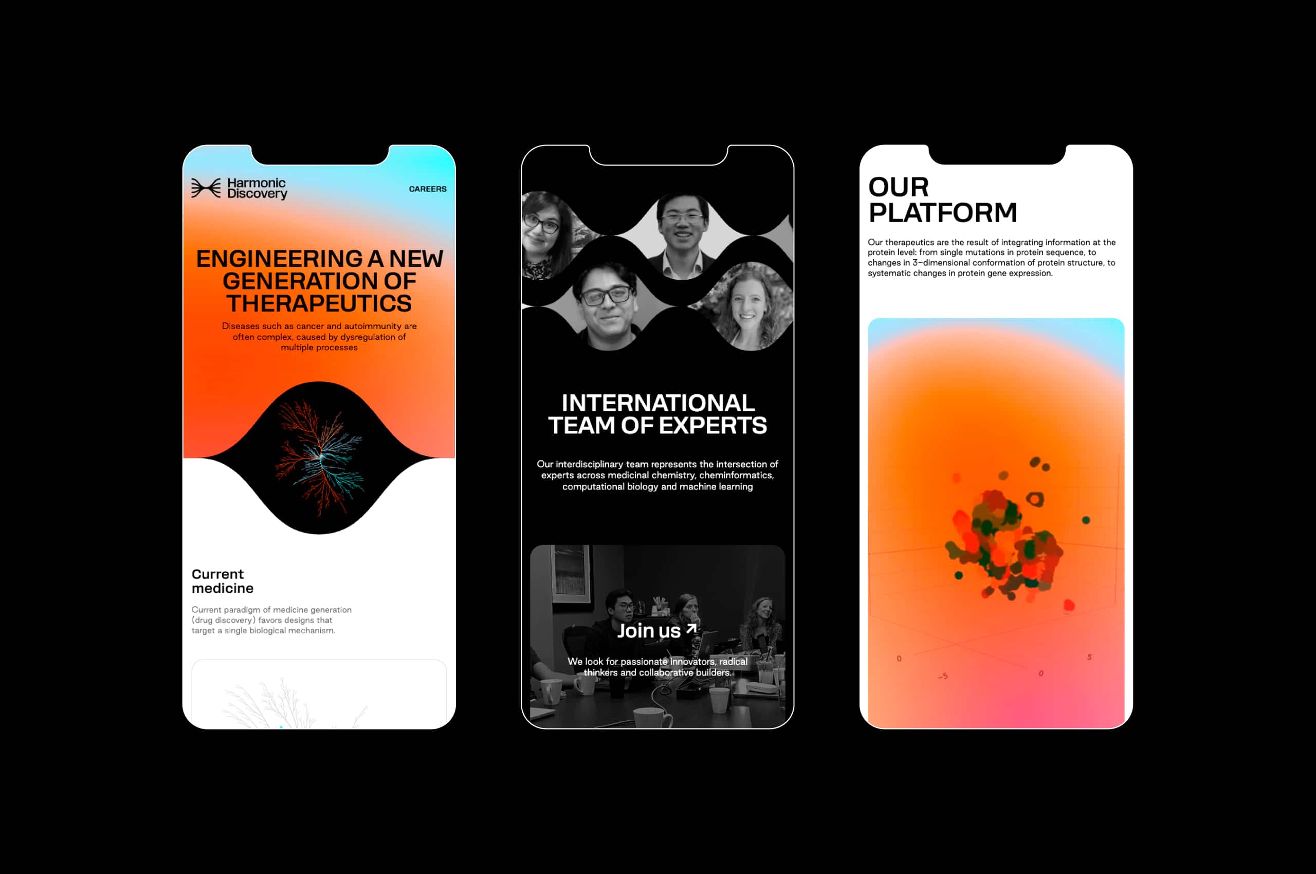
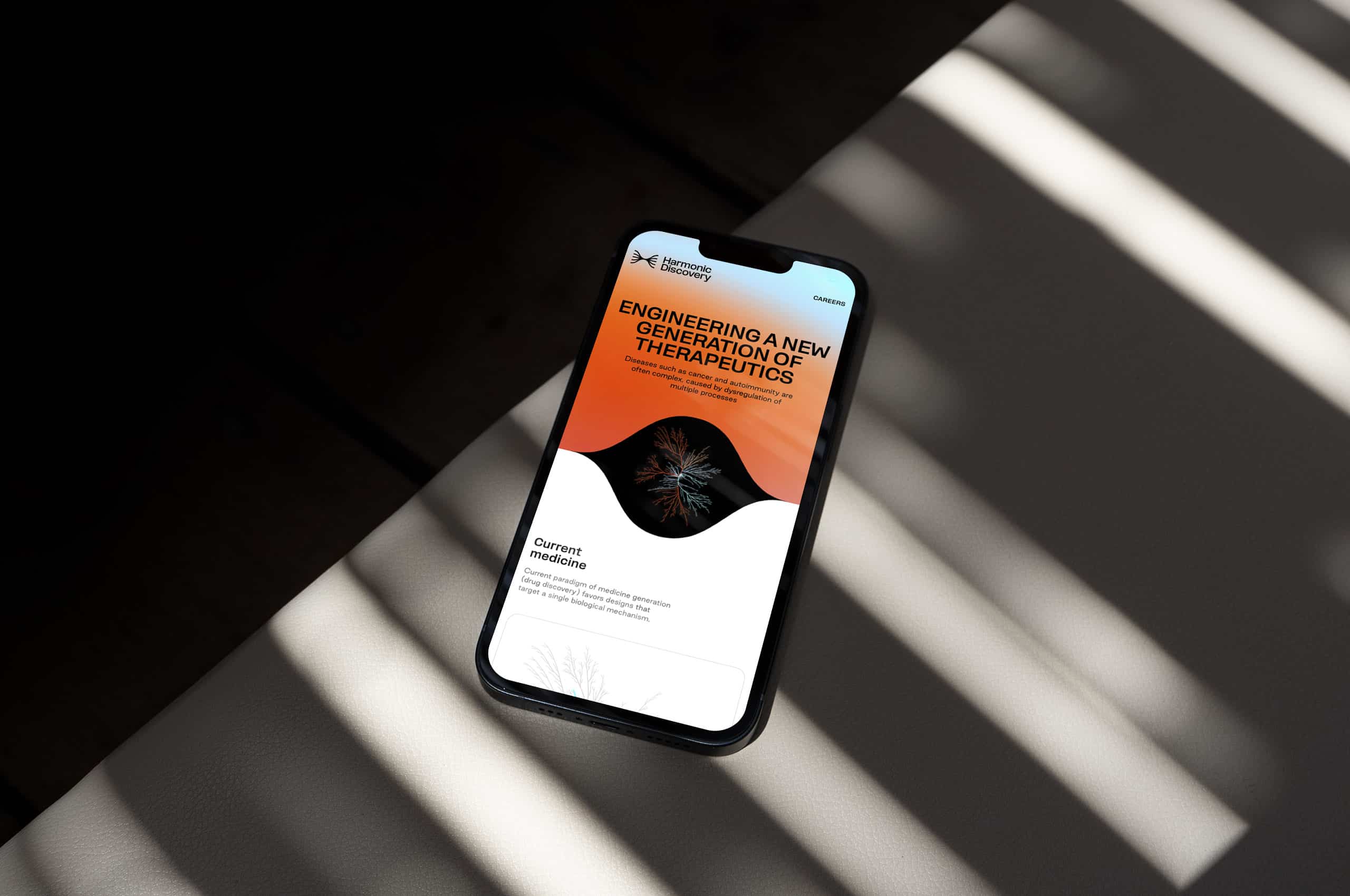
As a startup, the website is the primary touchpoint for most who interact with the company. So we helped create a unique and engaging digital experience that helps describe their work in a digestible and exciting way.
As their work can target multiple diseases and outcomes, we created a set of malleable gradients to echo the blurred lines between their work to help treat diseases. These gradients can help represent the brand, even when the symbol nor wordmark are present.