Foreign Waters
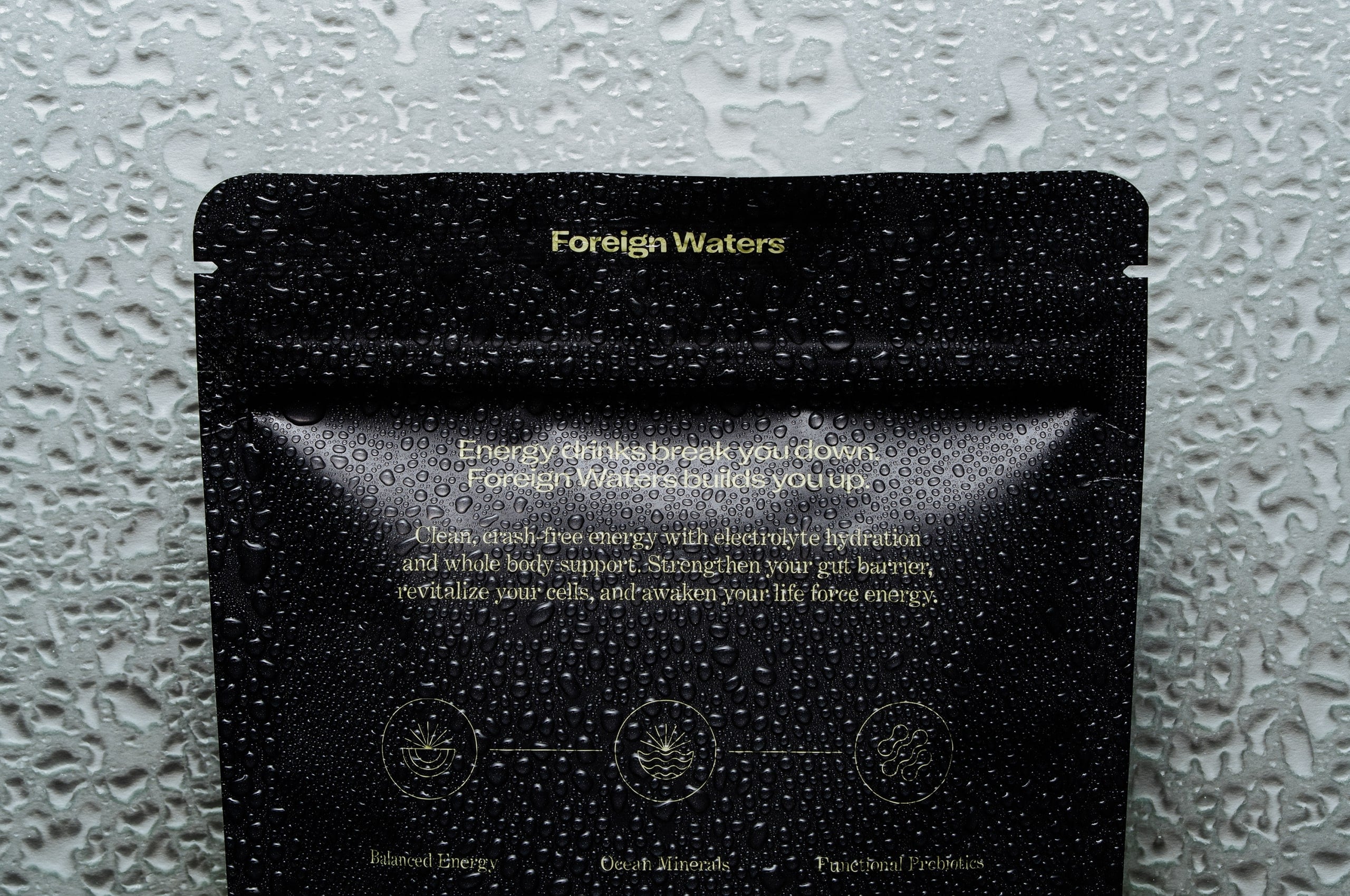
Energy drinks break you down. Foreign Waters builds you up.
Energy drinks break you down. Foreign Waters builds you up.
Foreign Waters creates long-lasting, natural energy by prioritizing gut health optimization and cellular revitalization. Their science-backed approach delivers sustained energy without the aggressive stimulation that defines conventional supplements, positioning them as pioneers in a category dominated by synthetic compounds and short-term solutions.
They partnered with Mast to define their identity and align their brand with their vision and expertise. Through strategic research and analysis, we guided the transformation to Foreign Waters, a name that embodies flow, purity, and the oceanic origins of their mineral-rich formulations—values central to their scientific ethos.
The identity blends authentic innovation with timeless wellness principles, establishing Foreign Waters as a leader in natural energy supplementation. A cohesive system of symbol, color palette, and iconography reinforces their commitment to transparency and sustainable energy. This reimagined identity inspires trust and transforms how people think about energy supplementation with quiet strength and enduring impact.
Collaborators:
Photography: Scott Snyder

Foreign Waters aims to revolutionize how people think about energy supplements. Rather than relying on high doses of caffeine and synthetic compounds, their product strengthens the gut barrier, revitalizes cells, and awakens natural energy through ocean-derived minerals and functional probiotics. They believe that sustained vitality is something that should build the body up rather than deplete it.


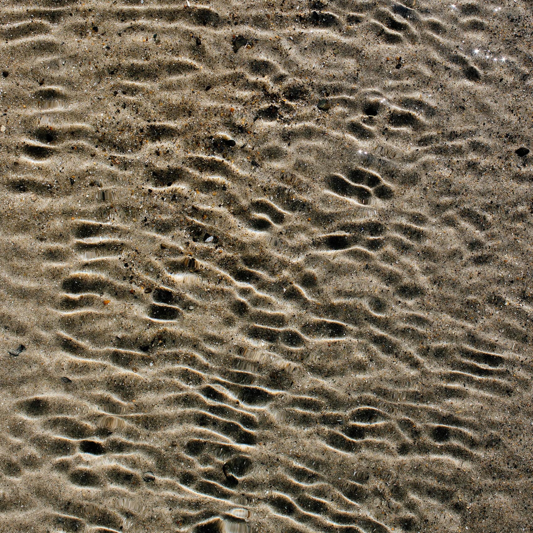
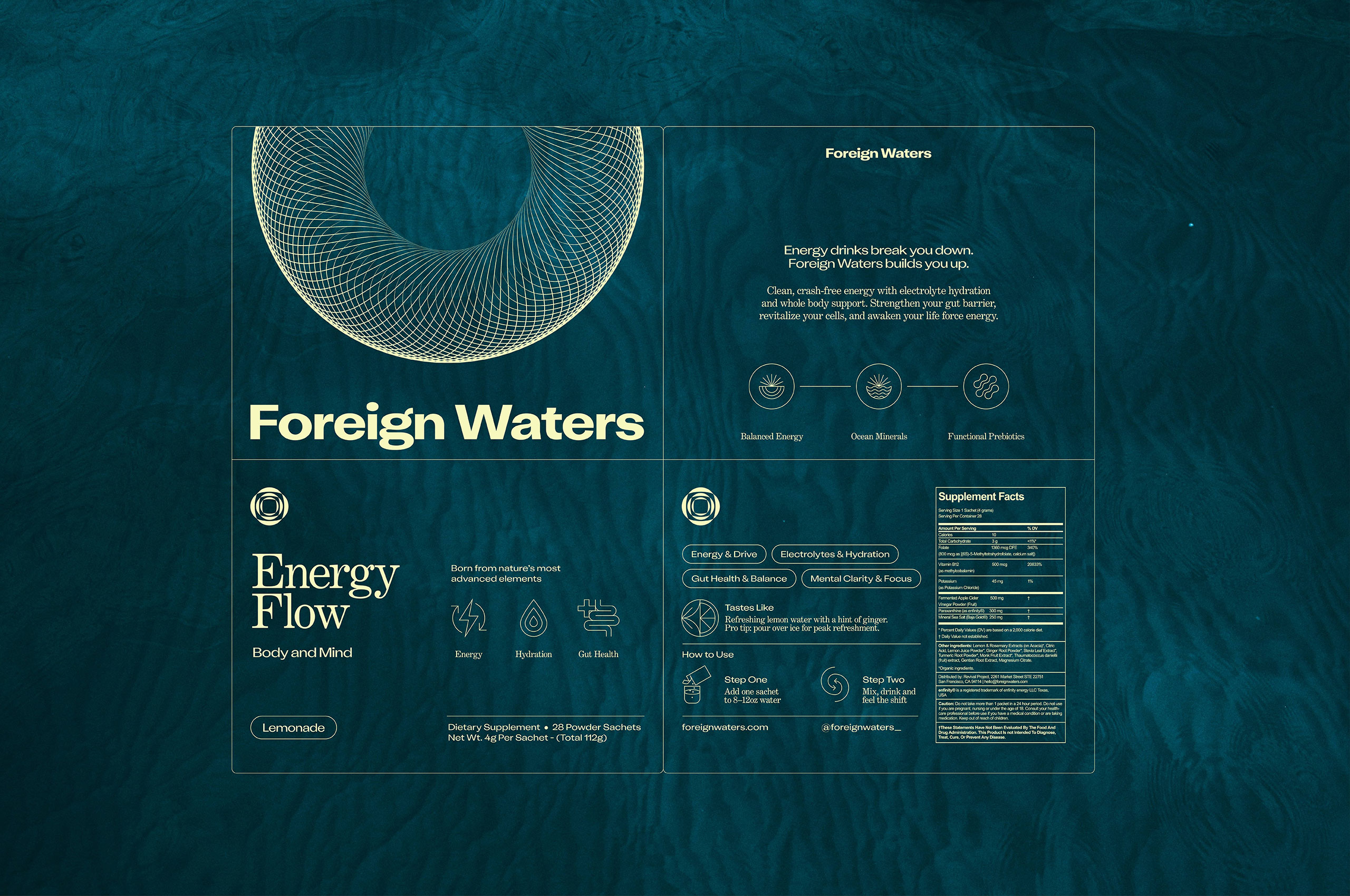
When developing the symbol for Foreign Waters, we wanted to create a mark that would connect audiences to both the name and the product’s oceanic foundation. The symbol visually captures the concept of water’s continuous flow through layered, organic curves that suggest movement and depth.
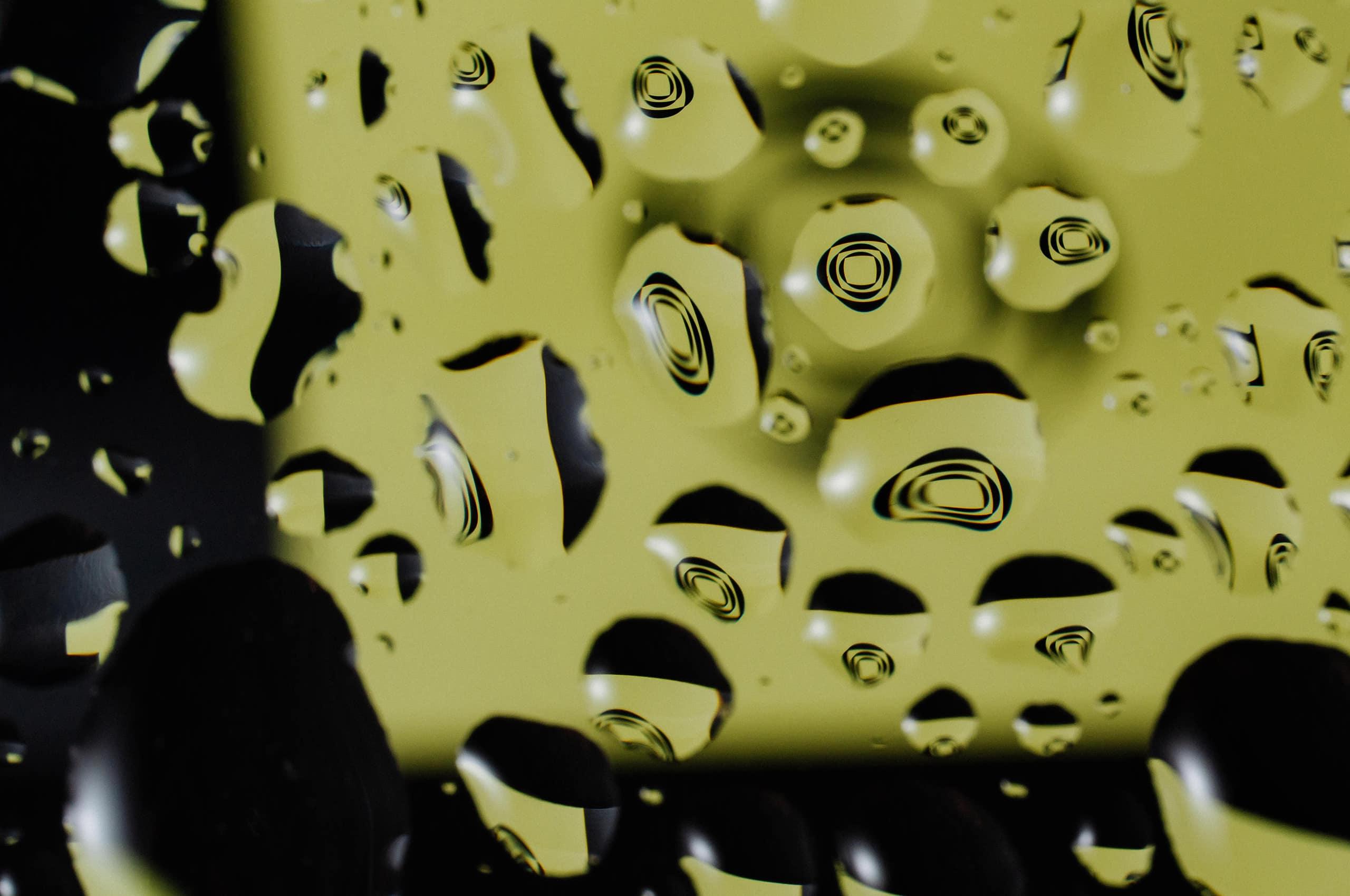

The symbol’s unique approach to representing water creates an immediate connection to the brand’s marine mineral focus while conveying the innovation and purity that Foreign Waters brings to energy supplementation. The symbol was designed to be both dynamic and grounding, reflecting how the product energizes without overstimulation.

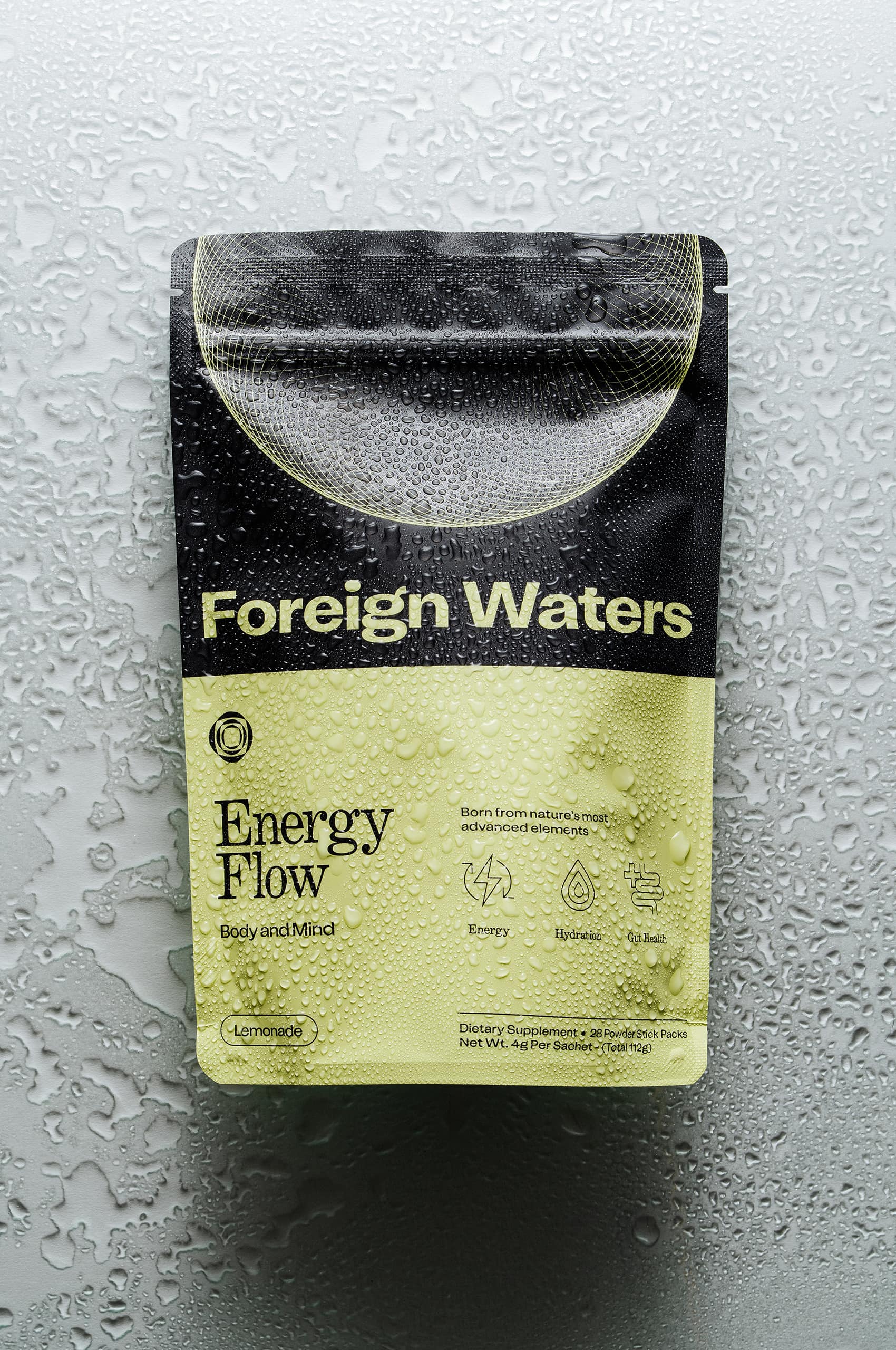
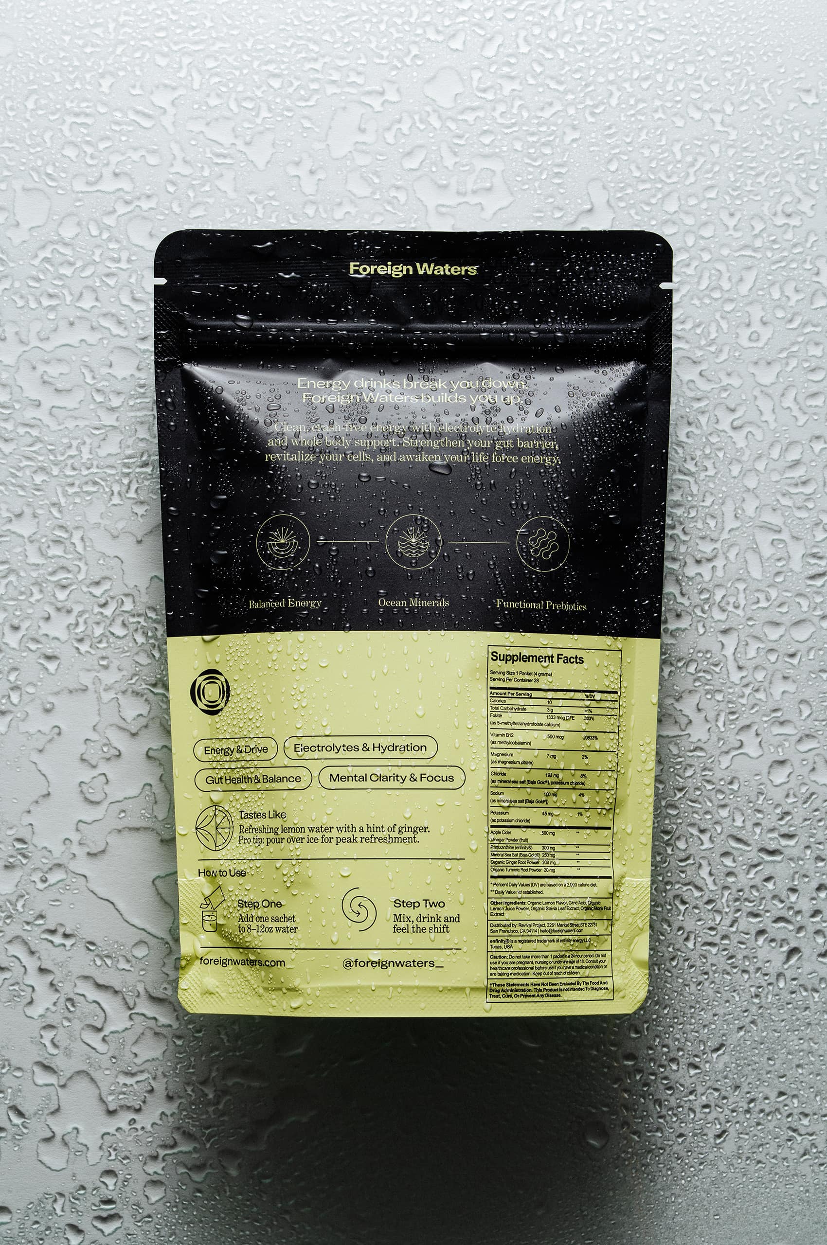

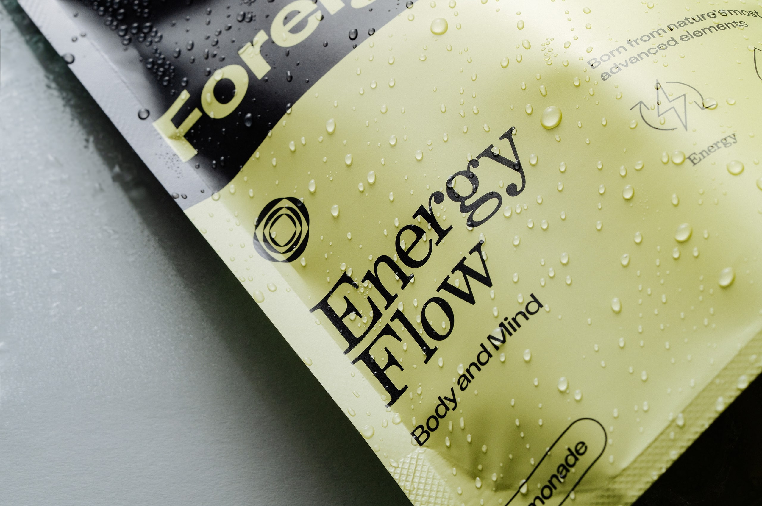
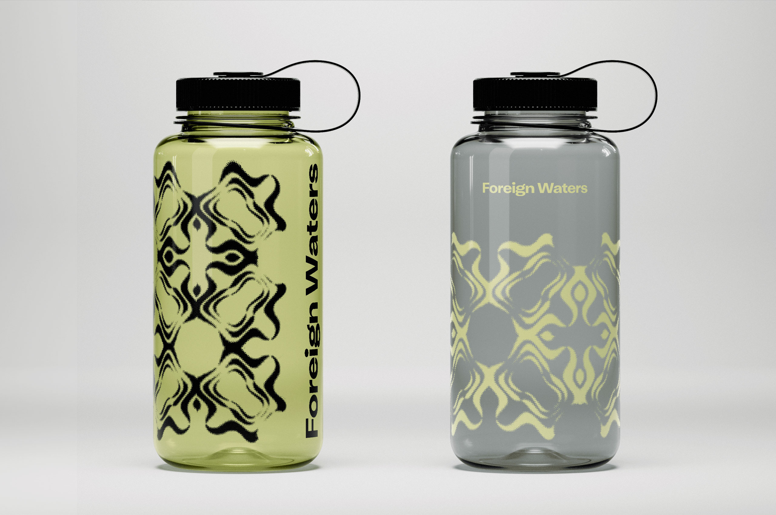
We developed a unique circular line work pattern system that appears prominently across the packaging and brand applications. This distinctive pattern draws inspiration from water’s natural movement—the ripples, currents, and flowing geometries found in ocean environments. Each pattern variation maintains the same fundamental rhythm while creating visual interest and brand recognition. The line work serves as a visual representation of energy flow and the interconnected nature of hydration, gut health, and sustained vitality that defines the Foreign Waters approach.


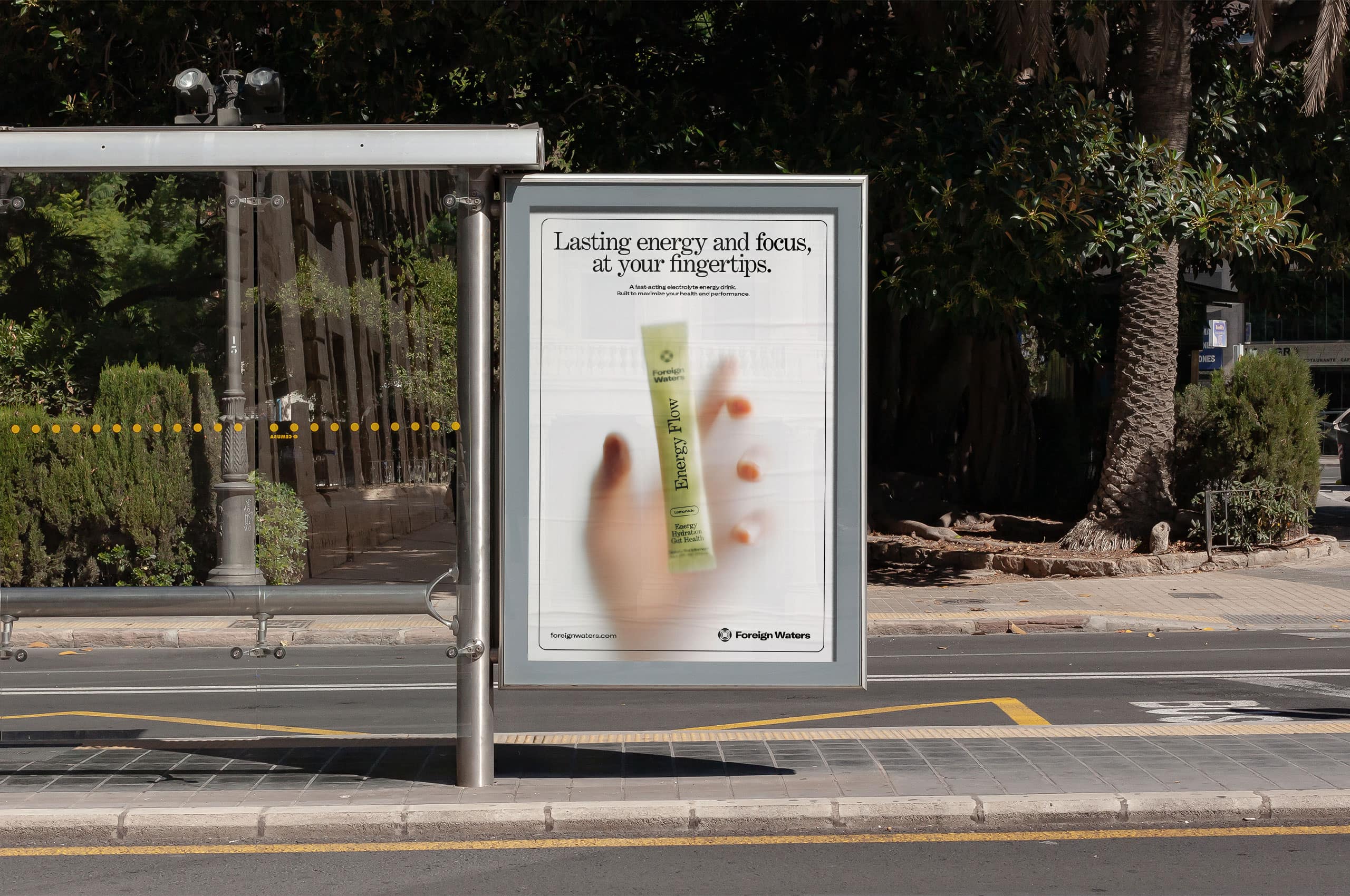
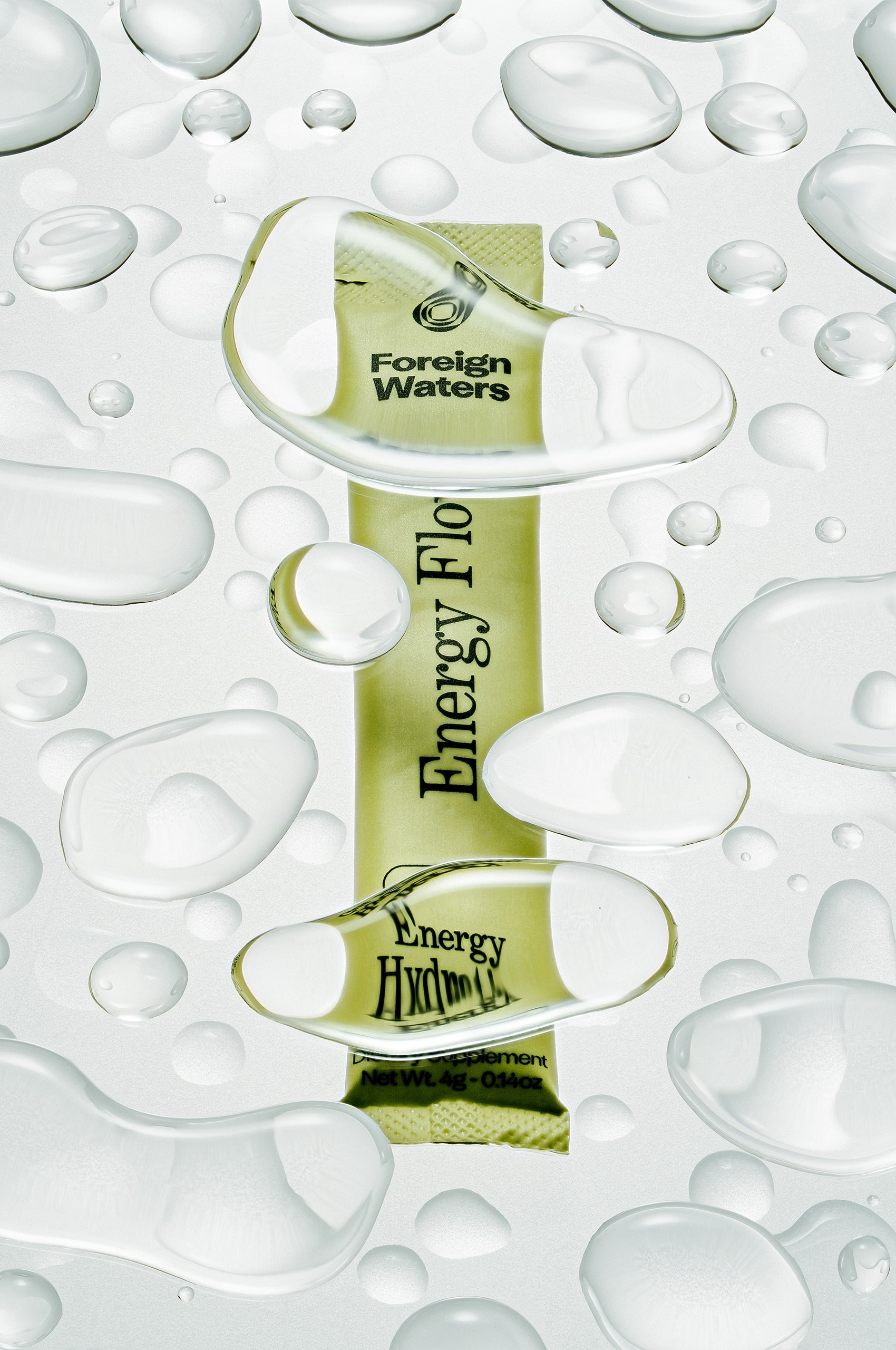
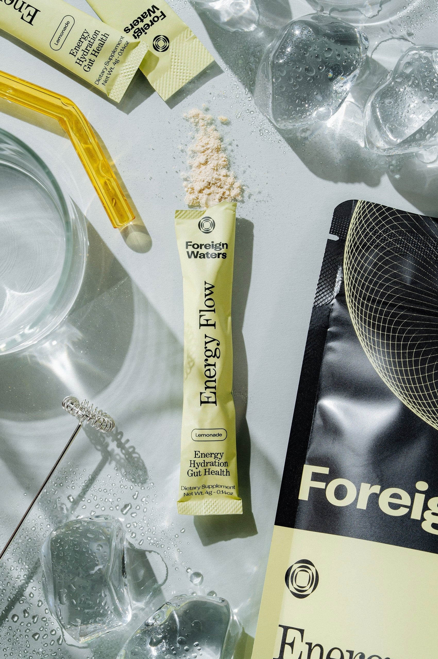
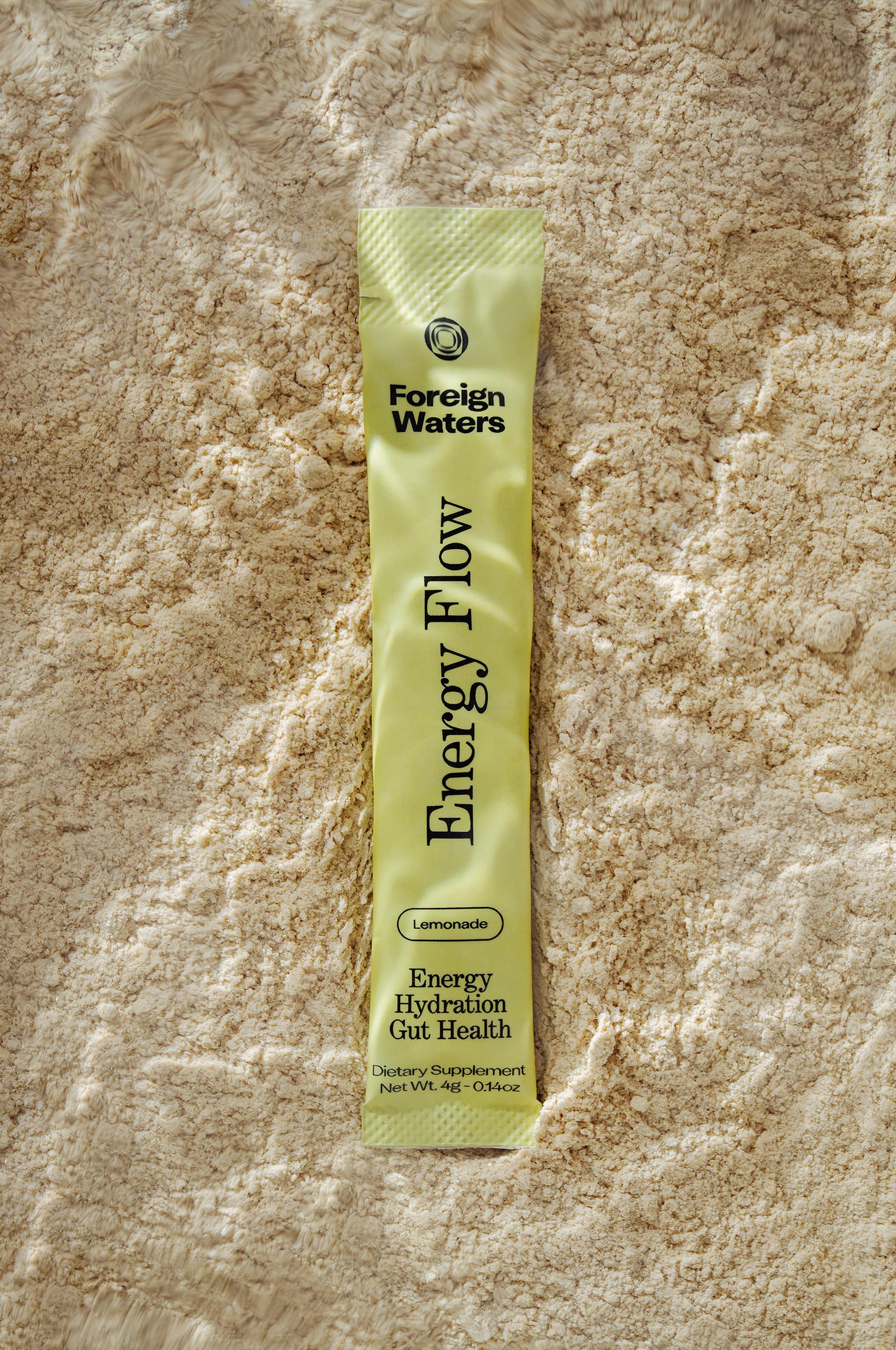
The stick packaging embraces a simplification of the brand while maintaining a unique appeal. The stick design balances functionality with brand expression, ensuring the product communicates both efficacy and sophistication.
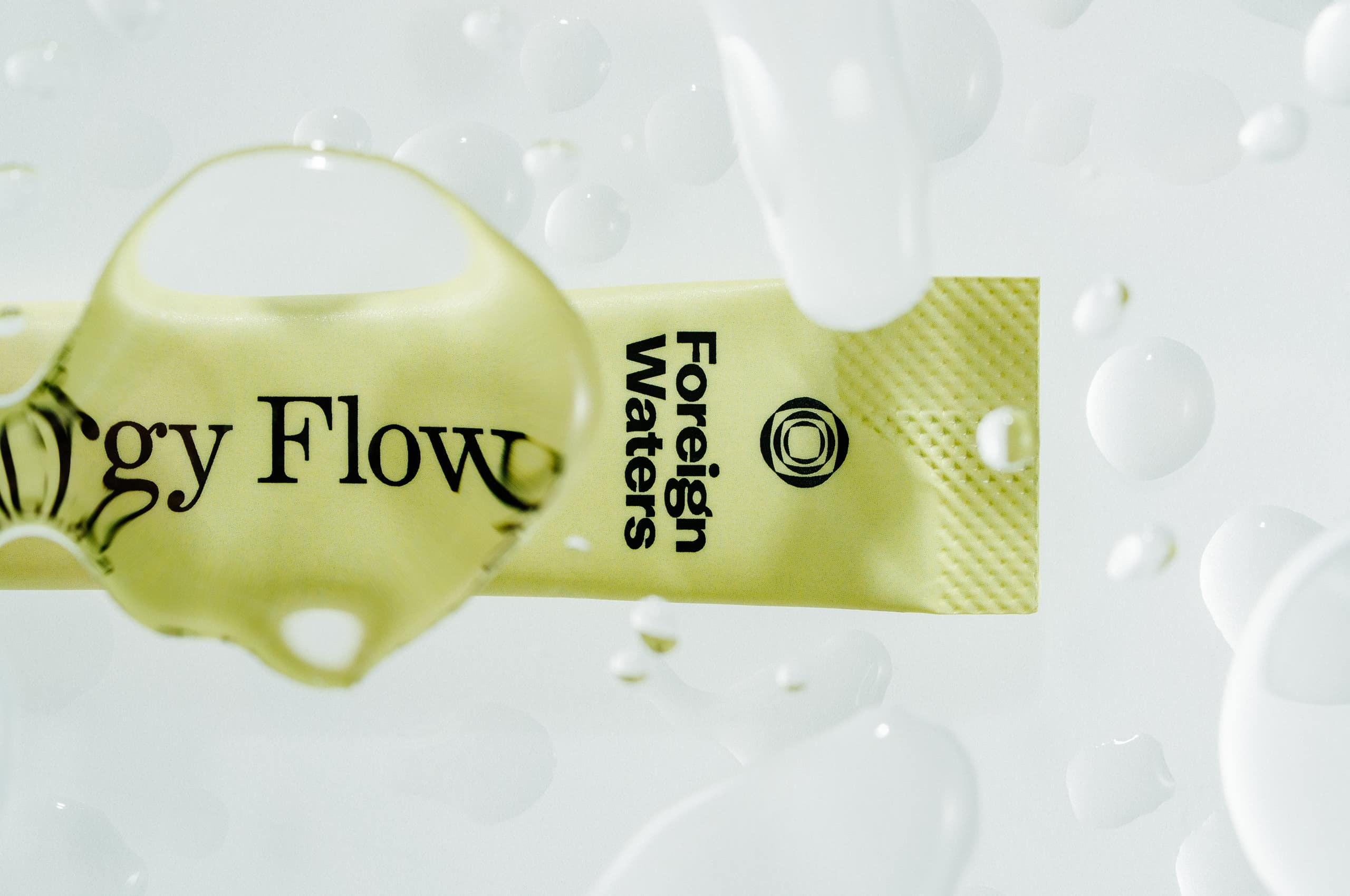
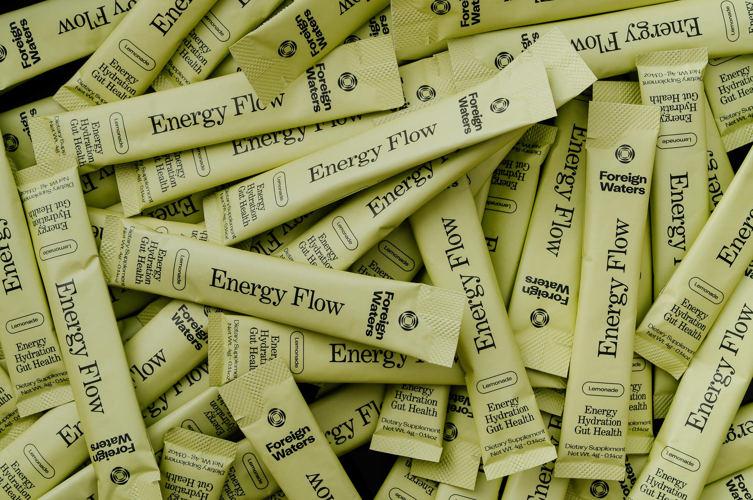
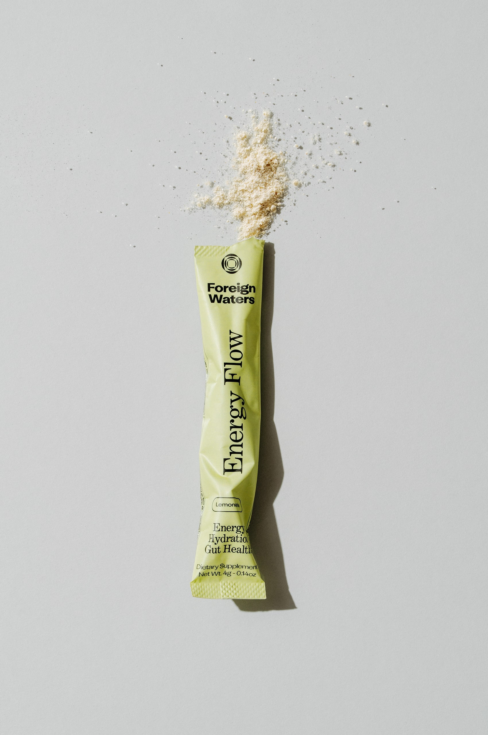
Each package serves as a tangible representation of the Foreign Waters philosophy—refined, purposeful, and distinctly different from the aggressive energy supplement category.

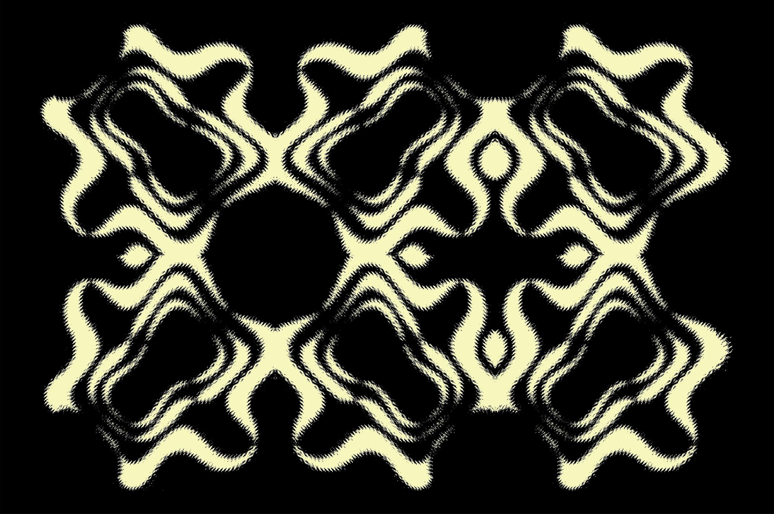
Through an expanded set of rough ripple illustrations, we can translate the core pattern language into more expressive applications for merchandise and marketing materials. These flowing, organic forms maintain visual consistency while allowing for greater creative flexibility across different touchpoints and seasonal campaigns.
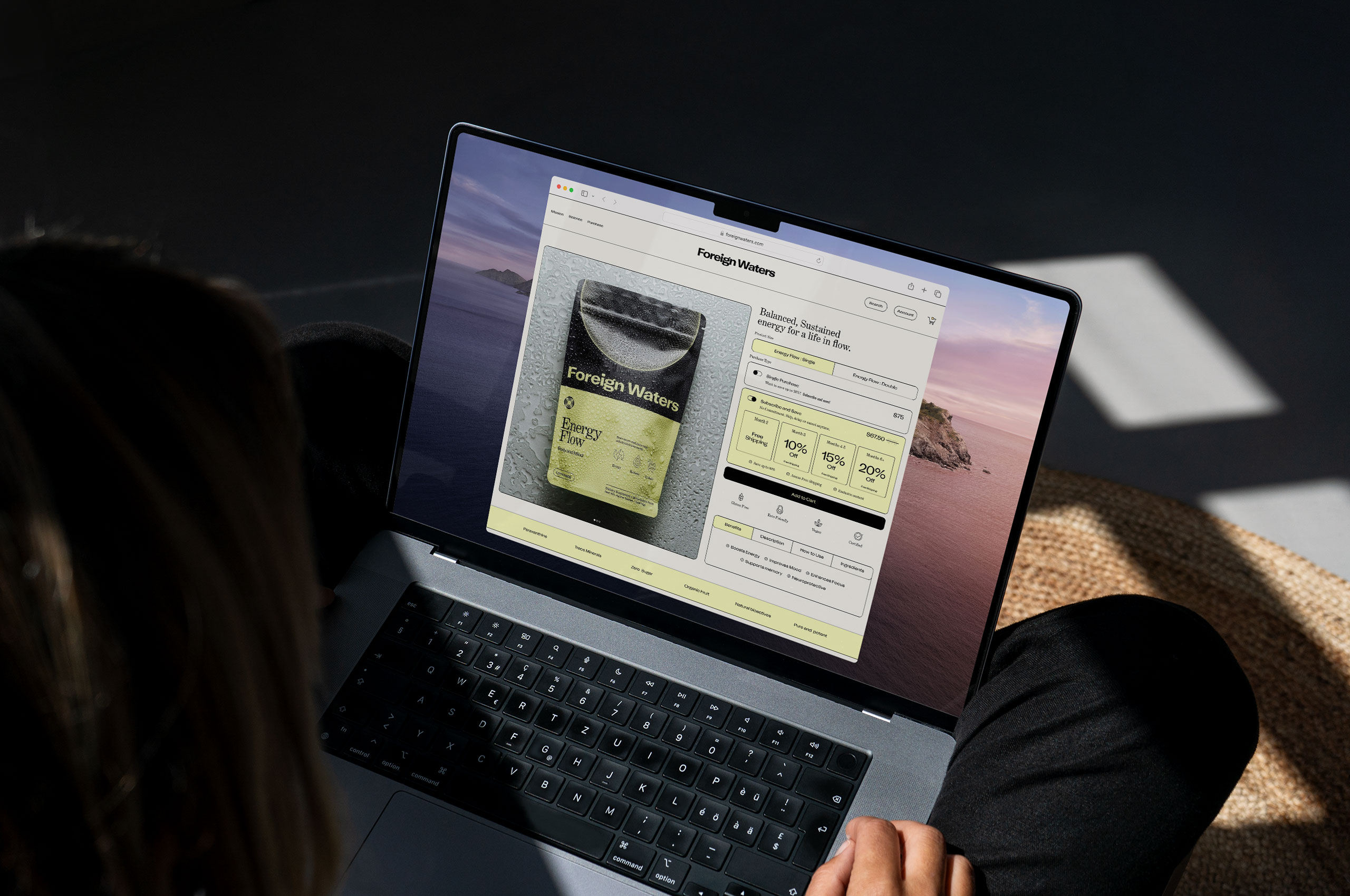
We created a welcoming digital home for Foreign Waters that helps people discover and understand their approach to natural energy. The website makes it easy for visitors to learn about the science behind the products while providing a seamless path to purchase. Working alongside our development partner Baggy, we brought the site to life with the same thoughtful attention that defines the entire brand.
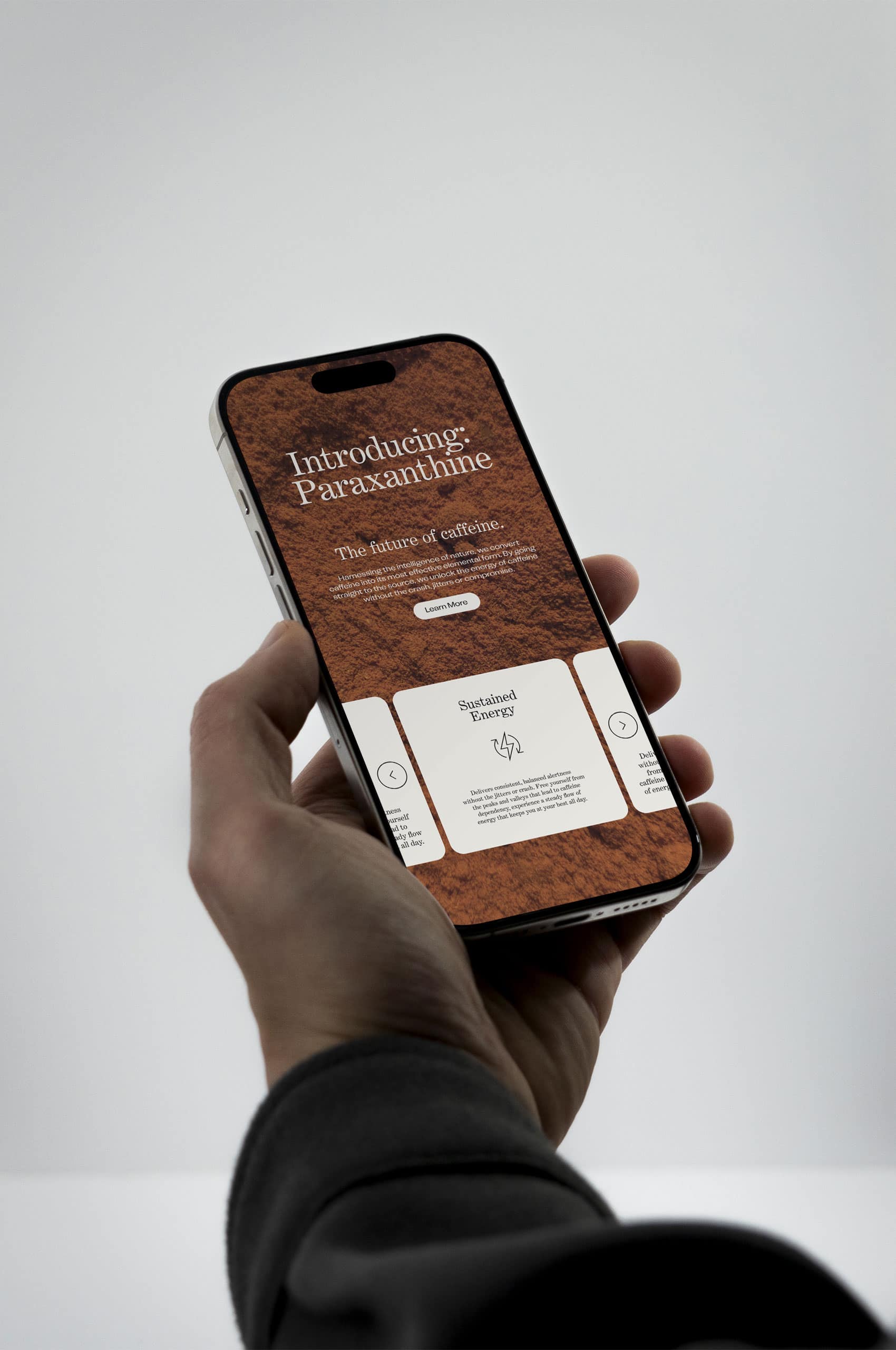
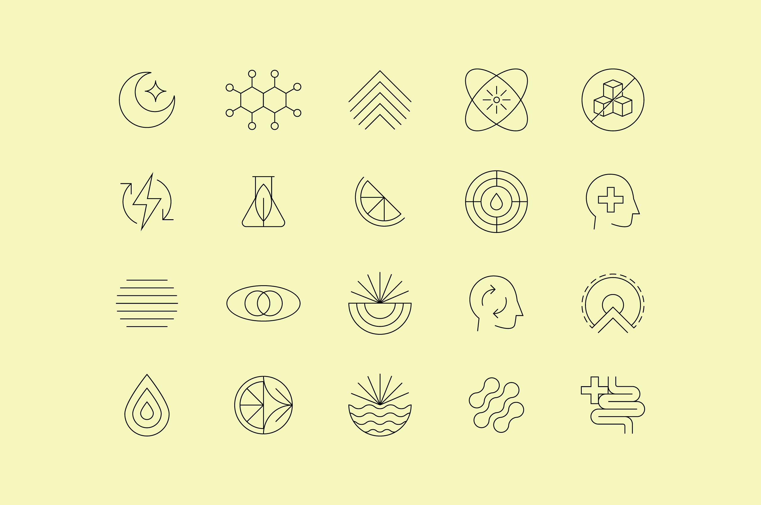
We developed a comprehensive suite of icons to support both packaging and digital needs of the brand. The icons function as both informational tools and brand reinforcement, creating consistency across packaging callouts, website navigation, and educational content.
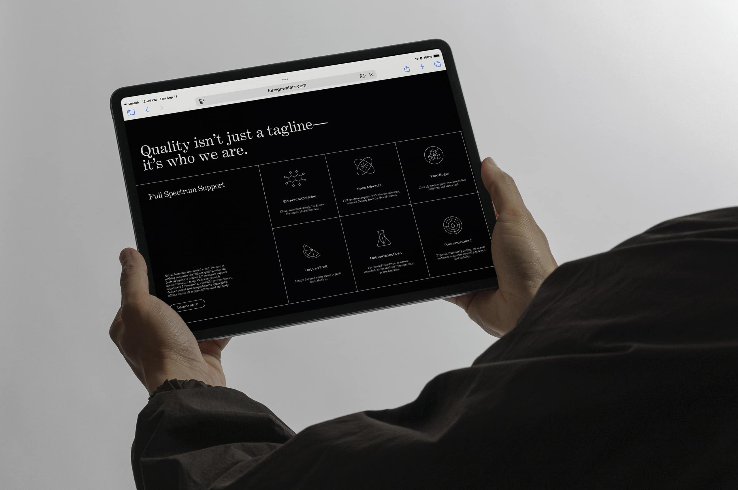
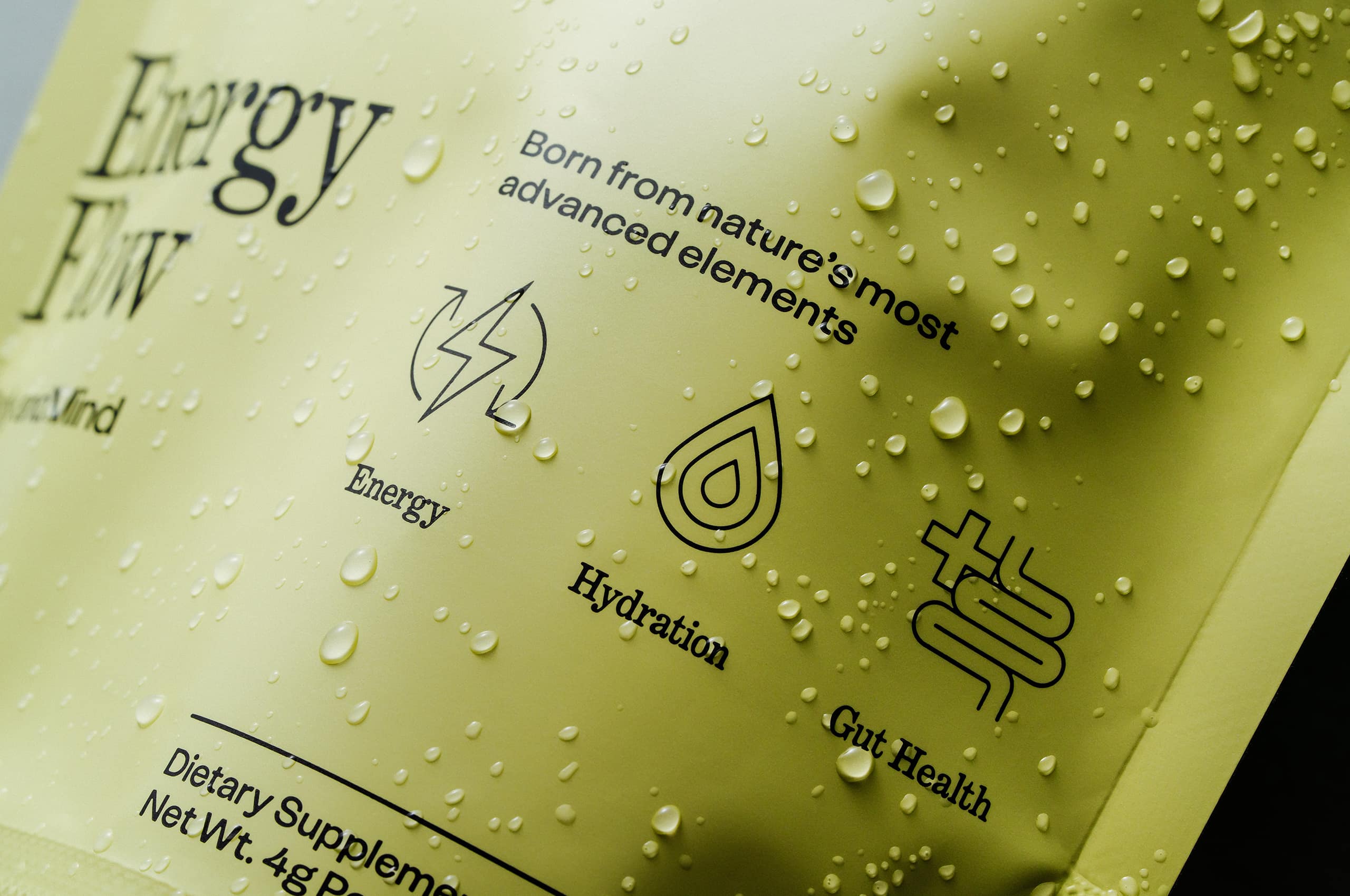
The iconography seamlessly integrates into the packaging system, providing clear product benefits communication without cluttering the design. This systematic approach allows for flexible application across different product formats and future line extensions.


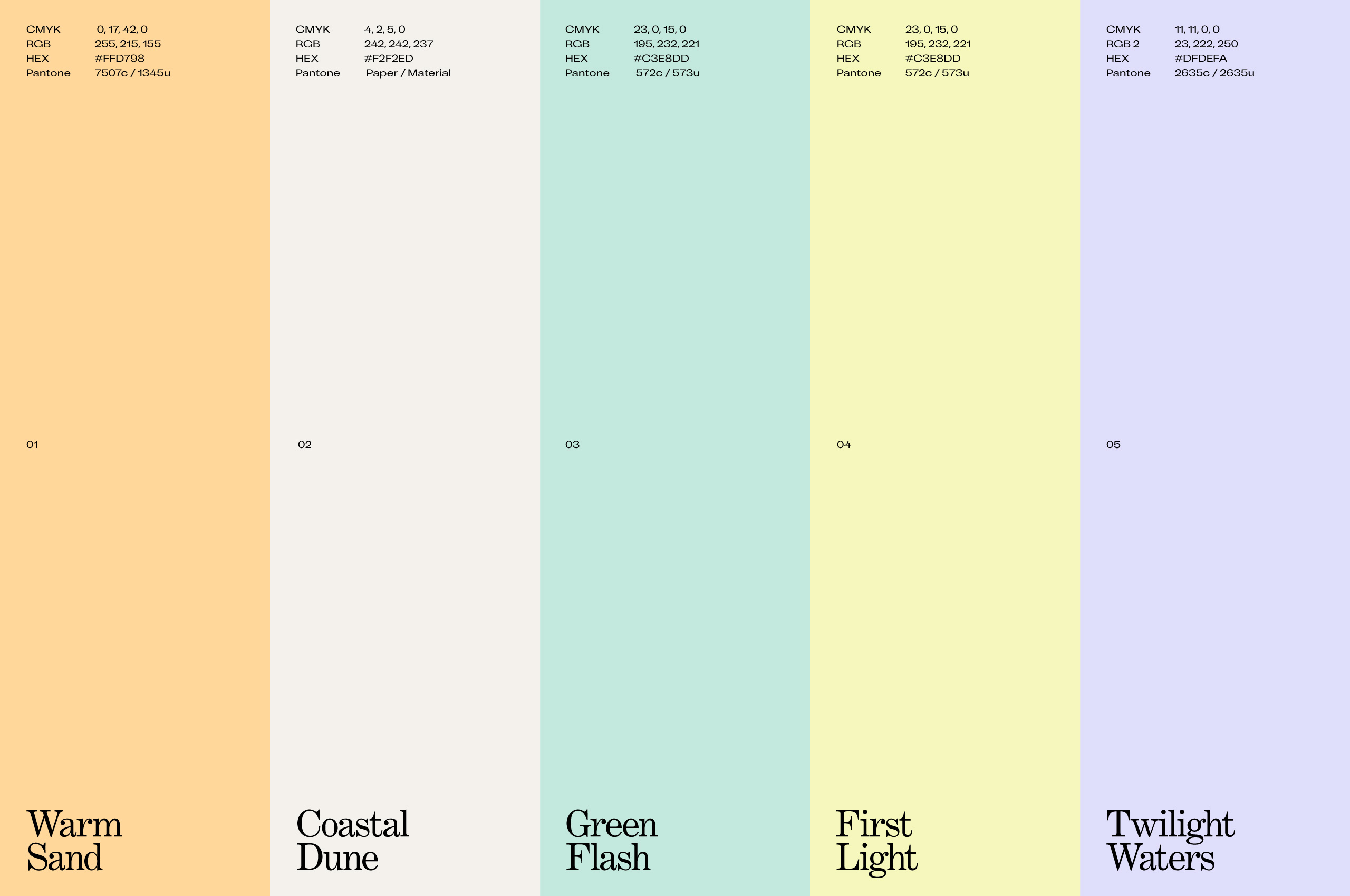
The expanded color system draws inspiration from natural water environments and coastal landscapes. This thoughtful palette ensures the brand maintains visual cohesion while offering enough flexibility to evolve and expand across various product categories and marketing initiatives.