Element
A technology company providing revolutionary modern IT/OT analytics systems.
A technology company providing revolutionary modern IT/OT analytics systems.

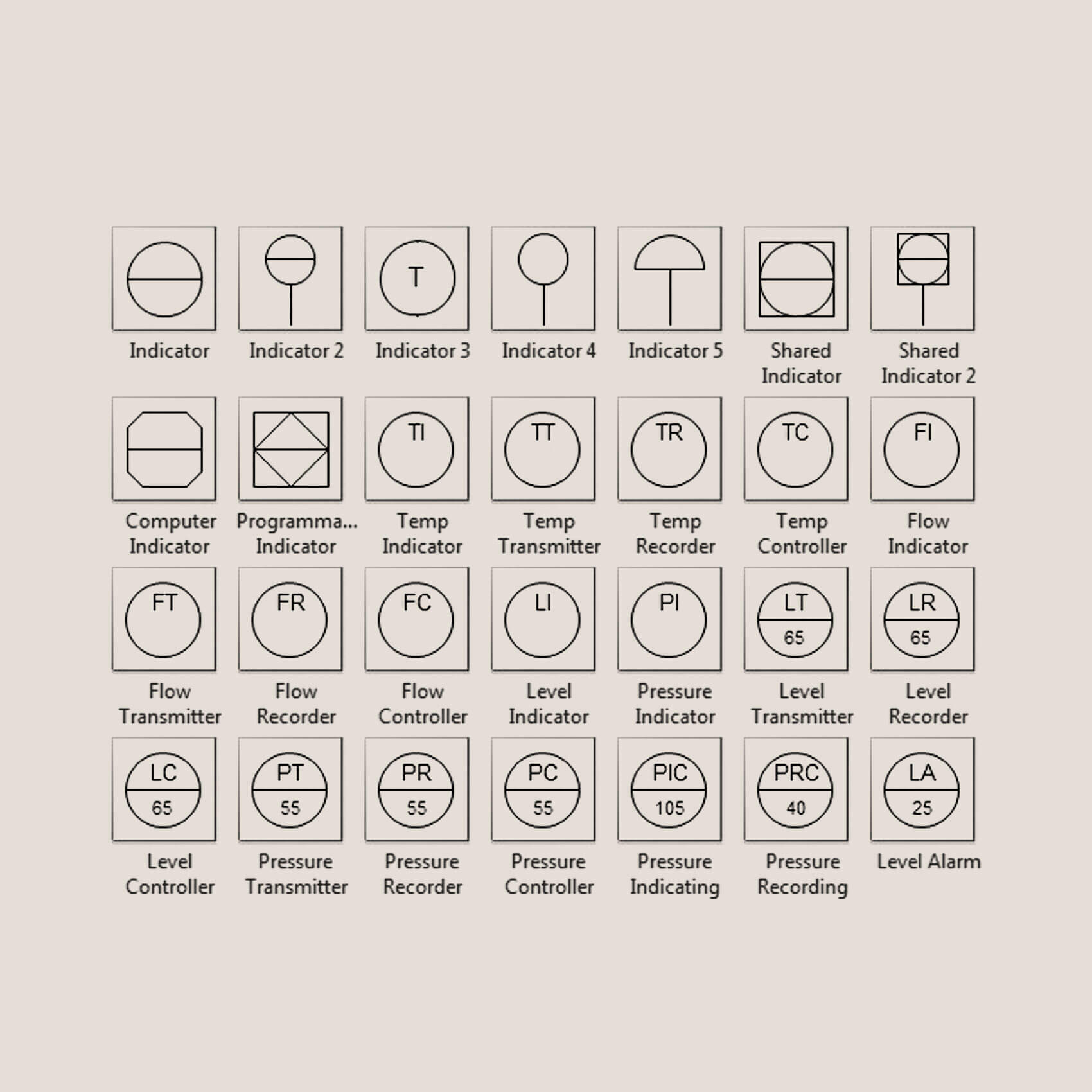
When it came to creating the symbol, we worked with the Element team to develop a mark that would echo their products’ simplicity. We dug into scientific diagrams to find inspiration. We were also looking at process flow diagrams — the blueprints and symbology for industrial assets, equipment, and processes to find inspiration. Ensuring the end-users would be familiar with the mark in a broad sense and subconsciously. When looking through the diagrams, we saw similarities between the diagrams’ structures, laying the groundwork for the final symbol. This symbol is as simplistic as their service and as elemental as their name.


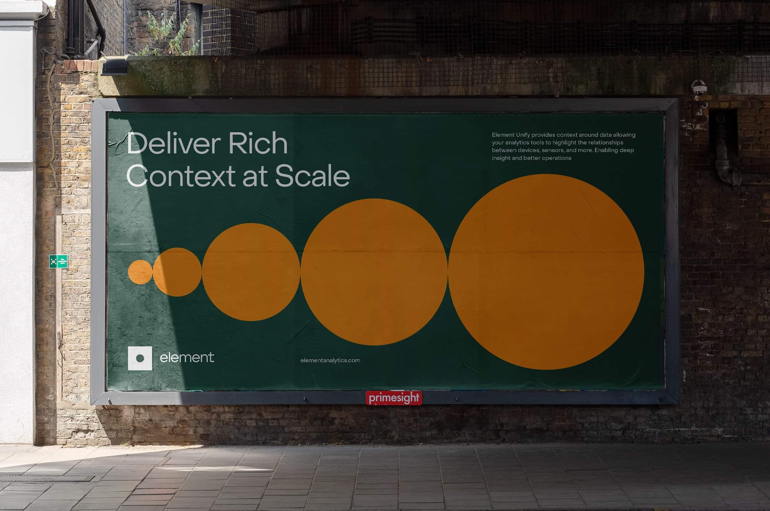
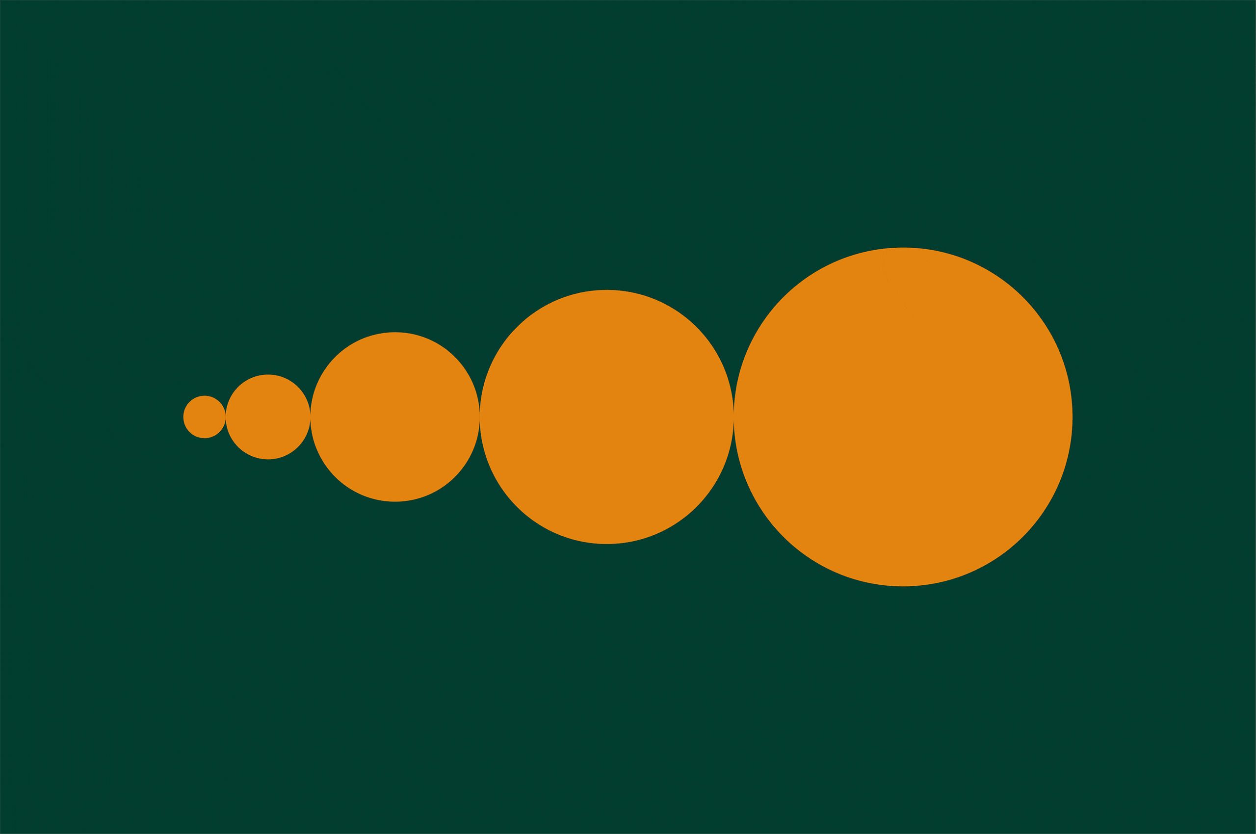
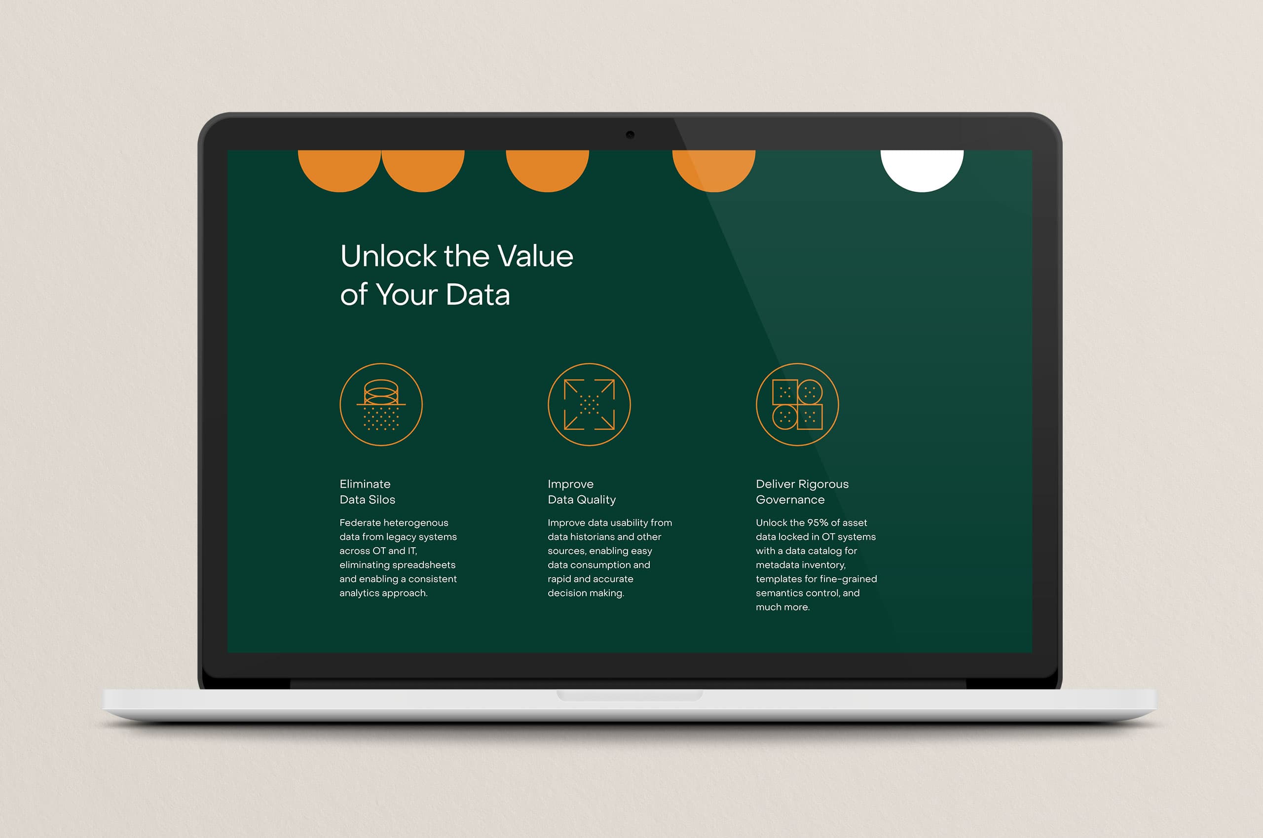
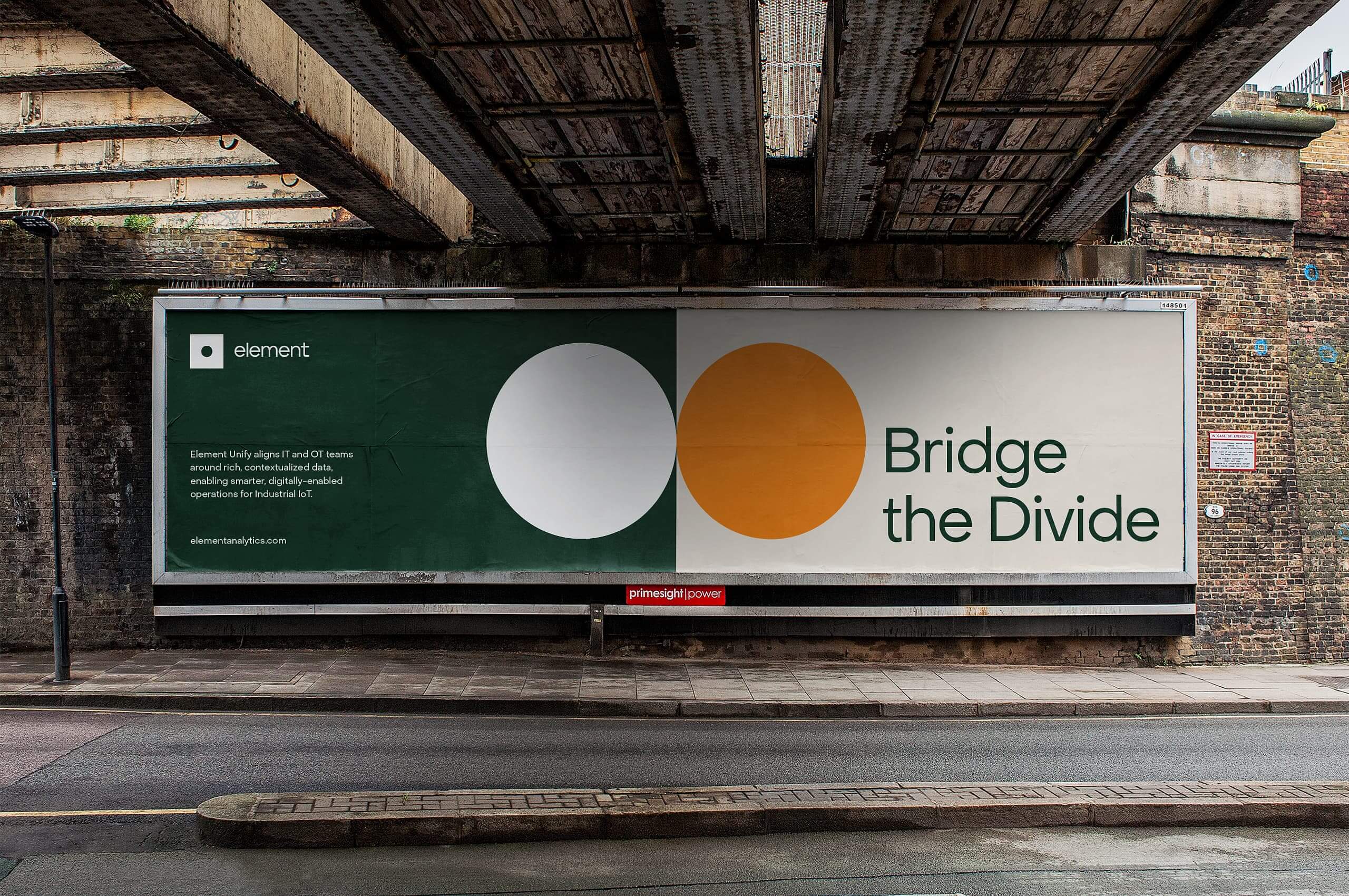
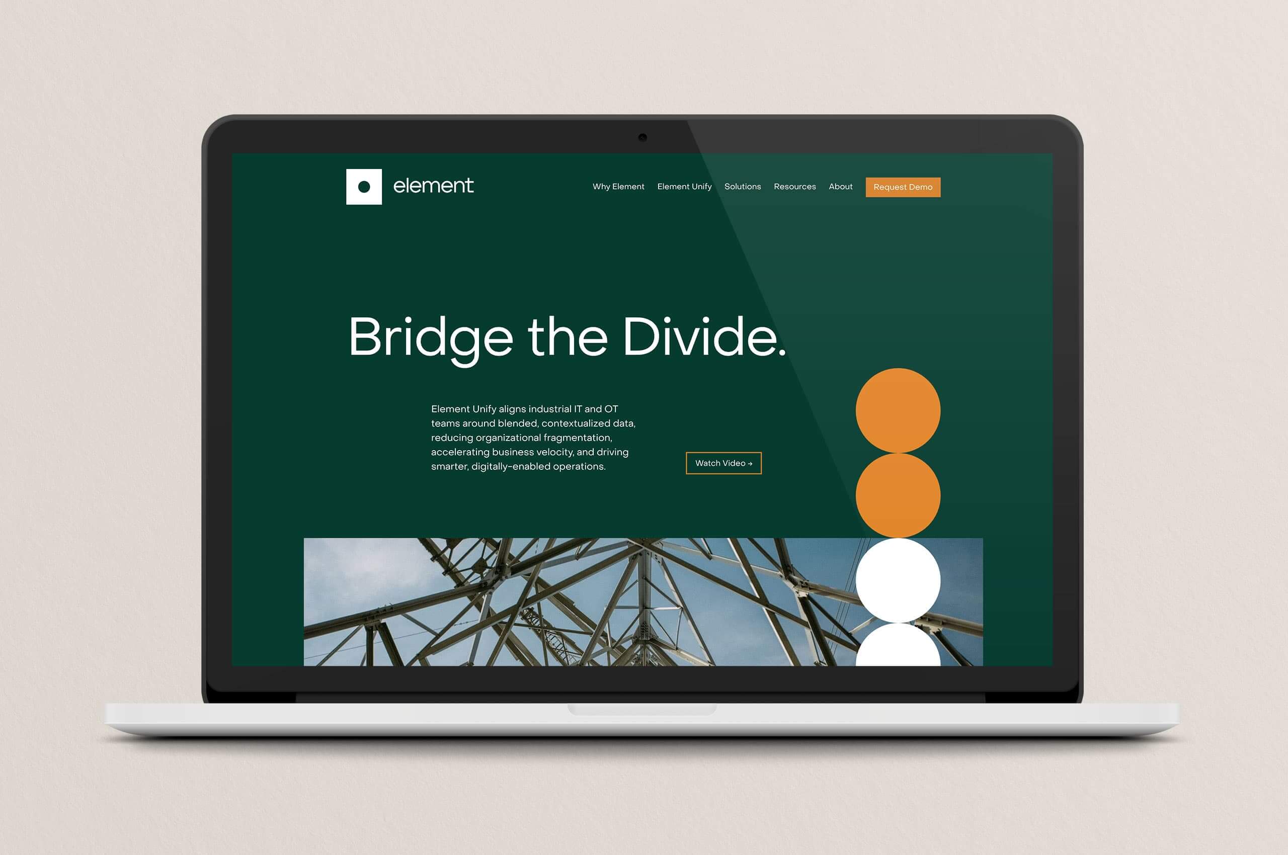
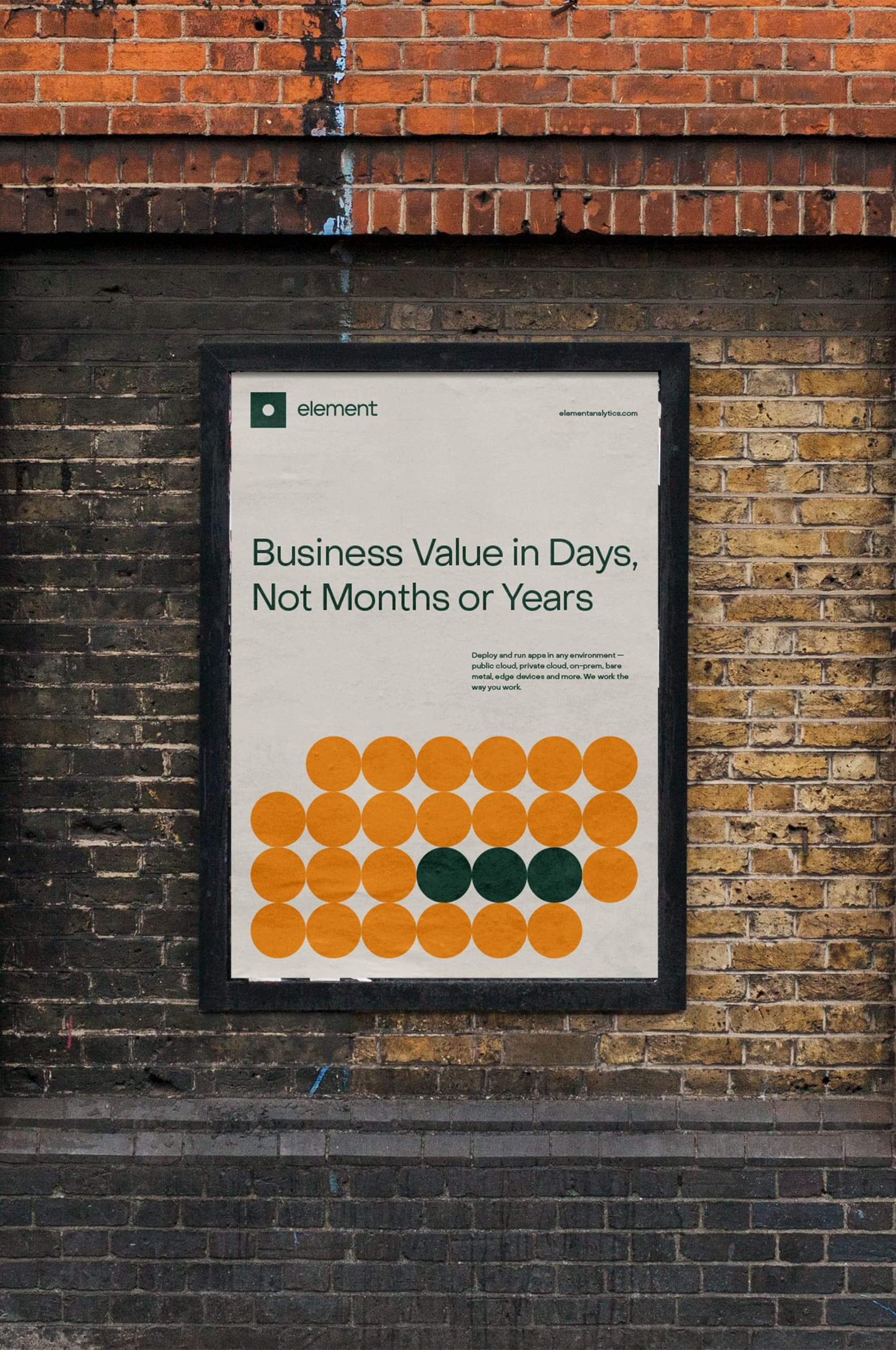
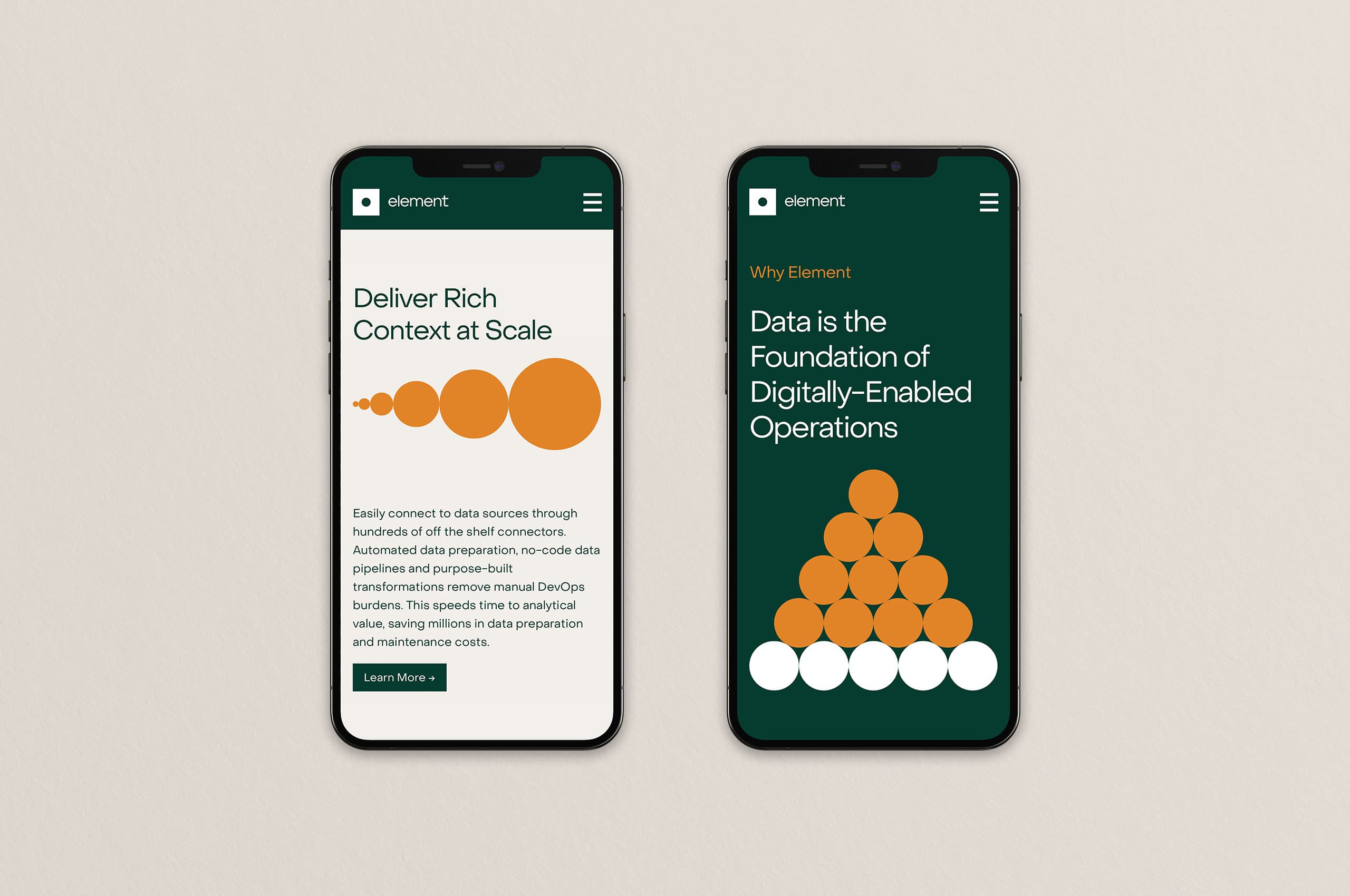
Seeking to help clarify broad or complex concepts in an easily digestible manner, we developed a set of what we call “pattern illustrations” to be used in large scale applications across the website and out-of-home use cases. These illustrations take inspiration from the symbol’s circular form to help create a story-telling narrative; working in conjunction with copy to ensure customers would easily understand the concepts and information.
We worked closely with the Element team to create a robust website update that utilized the comprehensive visual system and conveyed their information in a clean and concise manner.
The current site has been highly altered since our launch, we cannot claim responsibility for its current state.

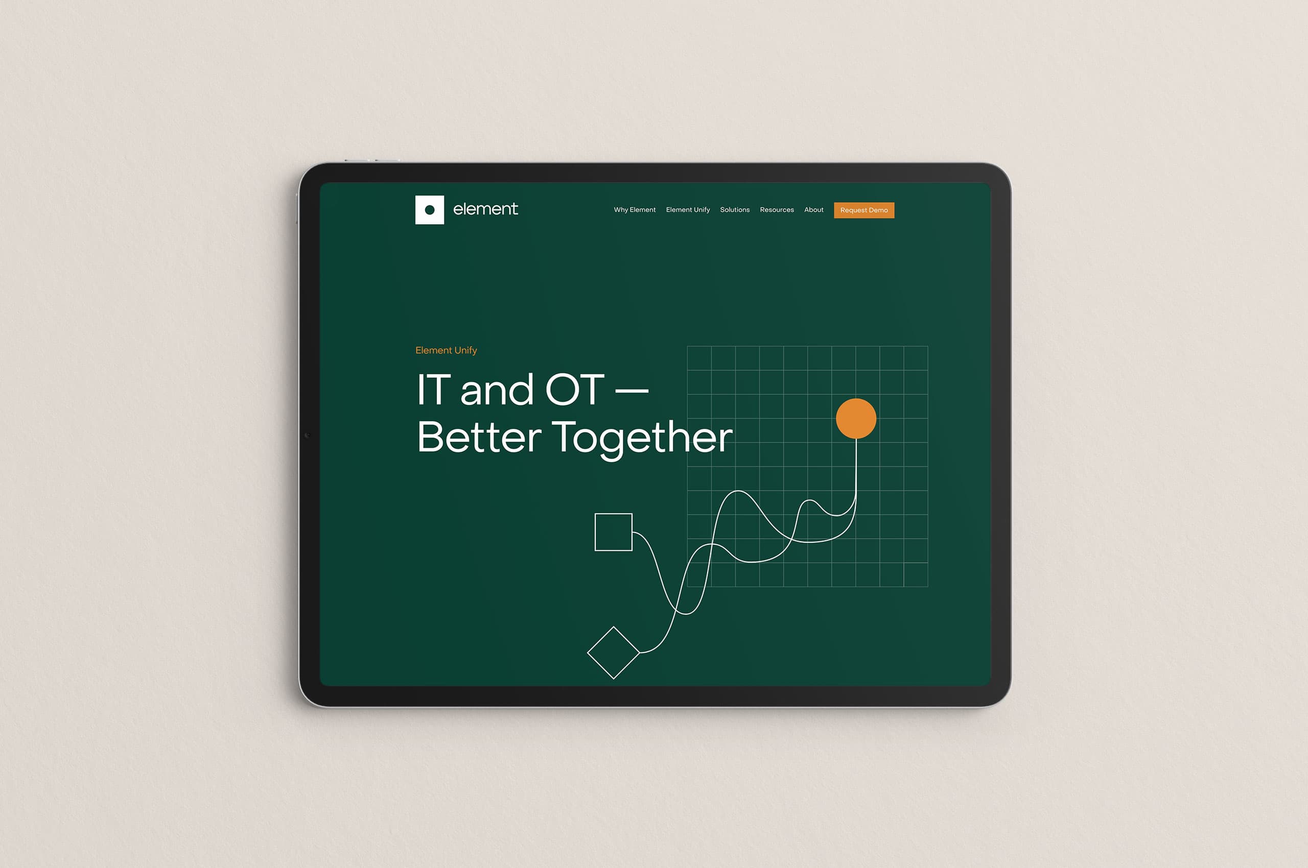

In addition to the more extensive geometric pattern illustrations, we developed a set of illustrations—to help convey more complex or specific concepts. Like the pattern illustrations, these illustrations take inspiration from the symbol’s geometric circular and square forms while injecting a sense of personality and humanity with the addition of non-standard geometric shapes and lines.


With such an extensive product offering, providing solutions to many different markets, it was integral to create a set of icons to help tell Element’s story in greater detail.