Cecilia Halling Howells
An interior design studio based in Buckinghamshire, England, grounded in history.
An interior design studio based in Buckinghamshire, England, grounded in history.
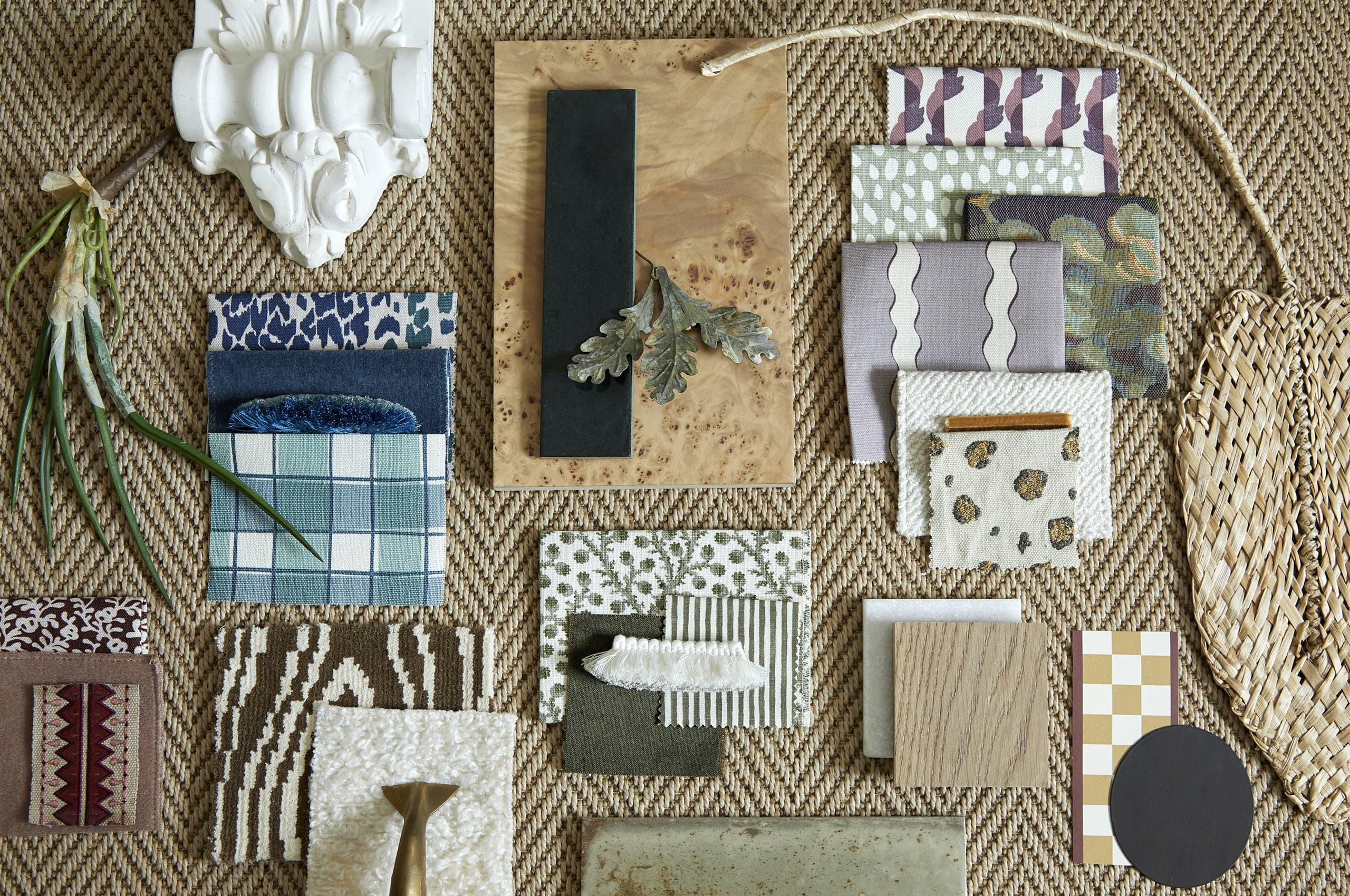
A love of traditional British interiors and craftsmanship, blended with a Scandinavian design sensibility, sets the tone for the work of Cecilia Halling Howells—an interior designer with over 15+ years working in luxury design studios.
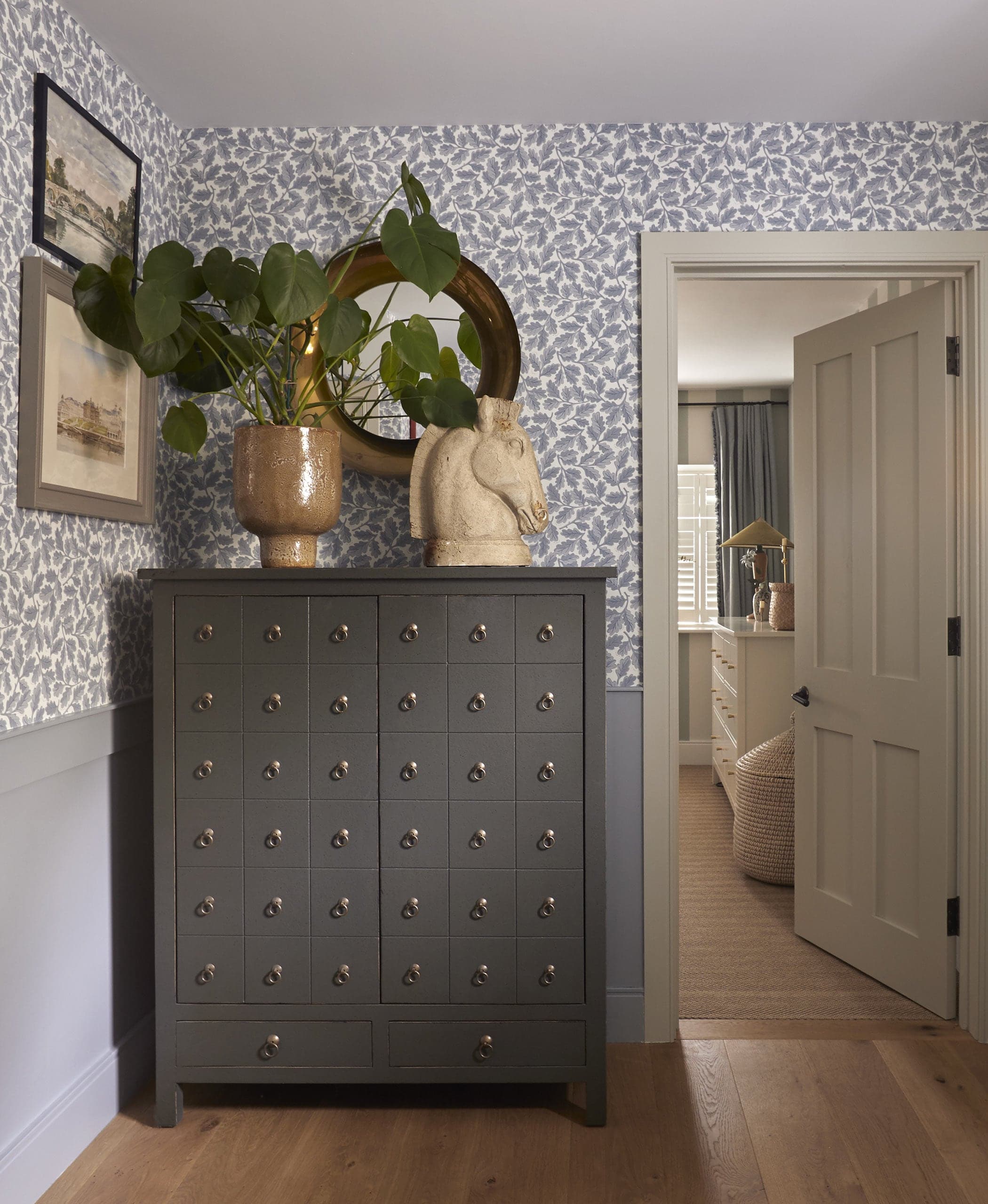
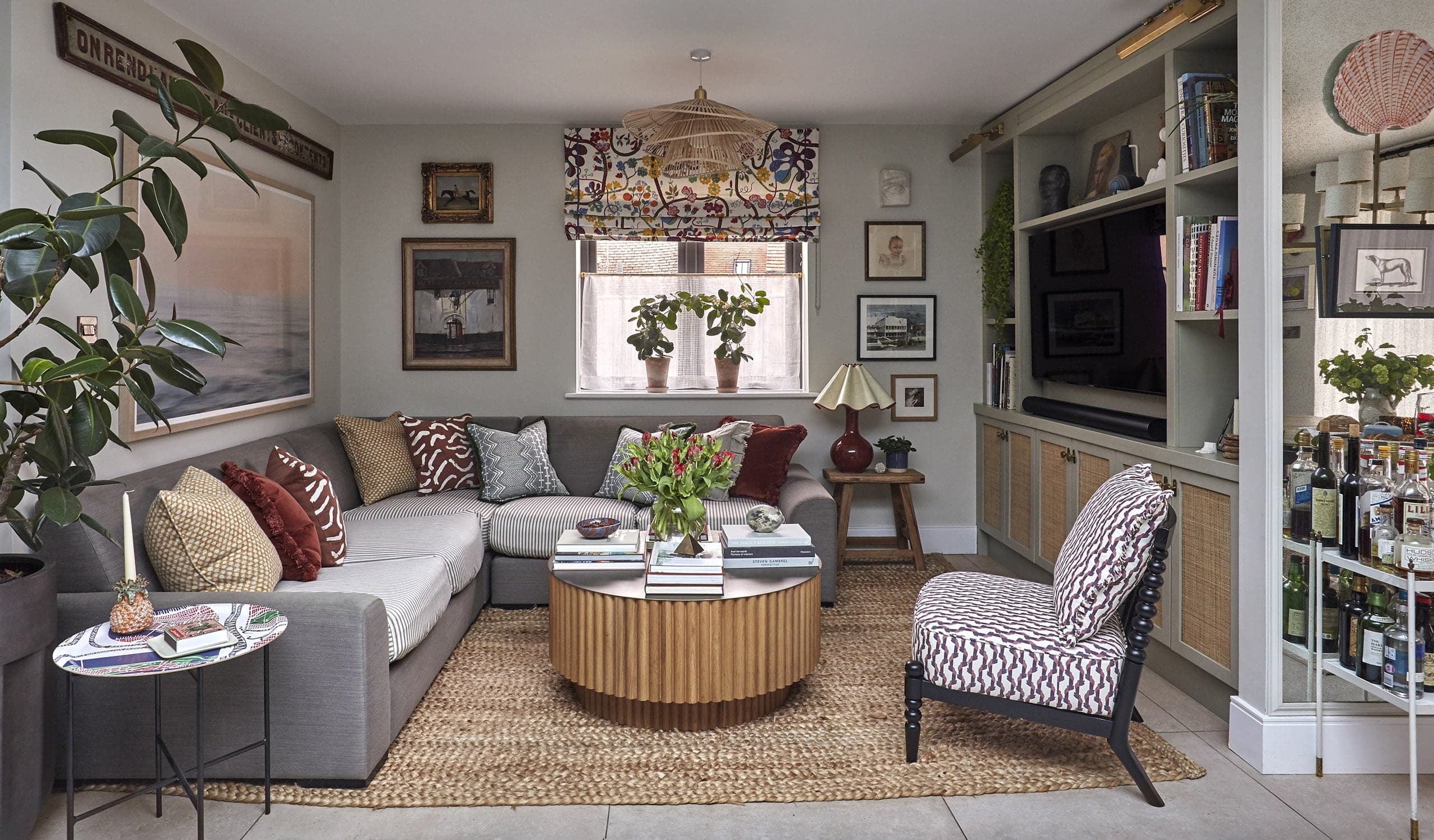
She believes that a successful interior is profoundly individual and rooted in her clients’ unique styles and personalities—this notion, when paired with her expertise, causes extraordinary results to arise. She designs her interiors to possess the feeling of a space that evolved like a treasured collection. Combining bespoke items with those with history and patina, she creates an aesthetic that reflects her British and Swedish roots with simplicity, functionality, and a connection to nature at the forefront.
Ahead of branching out to create her eponymous studio, she approached Mast to help establish a brand as unique and rooted in history as her approach to interior design.
Collaborators:
Website: Howells Studio


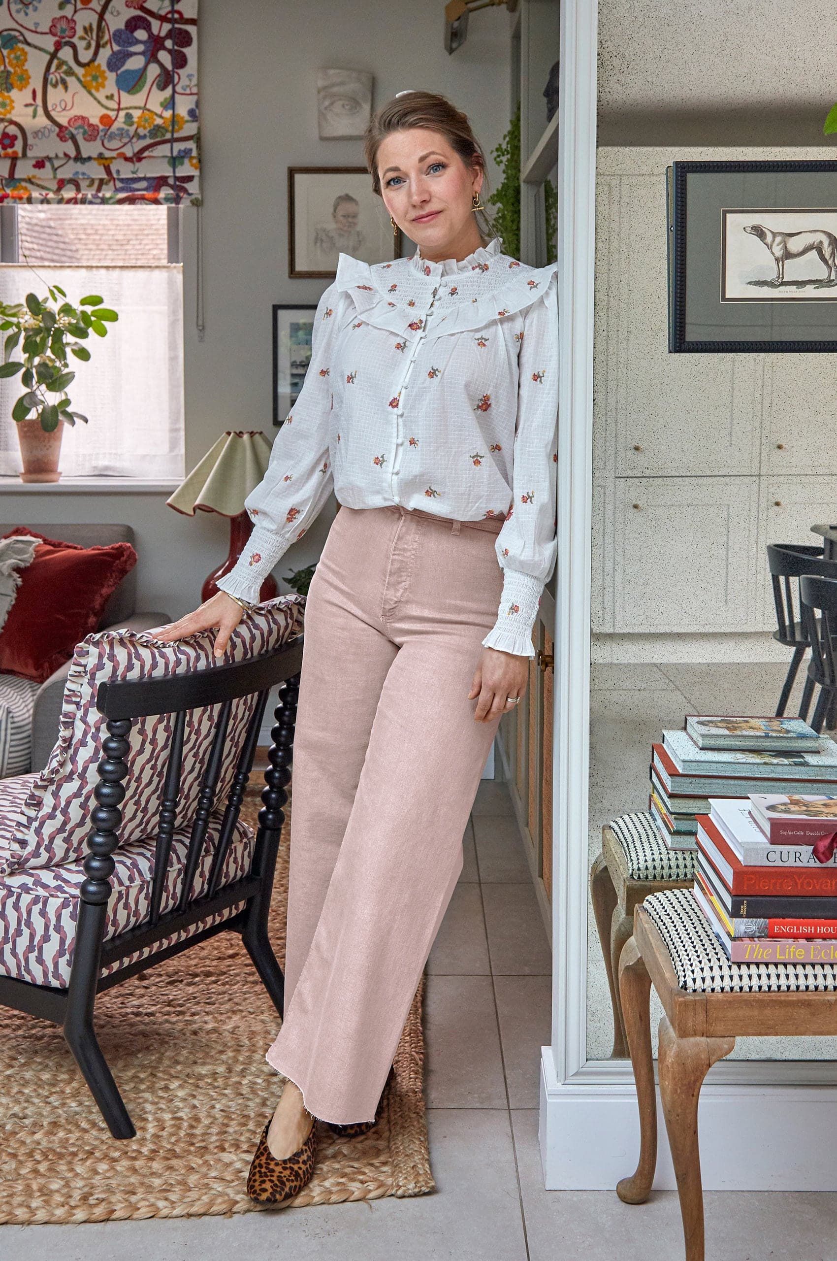
After 15+ years in luxury design studios in London, overseeing the completion of over 50 projects worldwide, Cecilia decided it was time to branch out on her own. Relocating from London to Buckinghamshire during the pandemic, she set out to focus her newly minted practice on interior design for country homes.
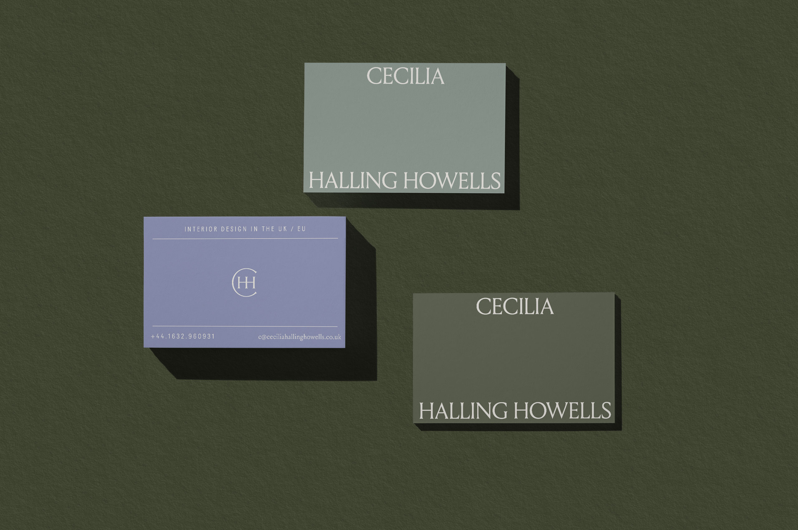
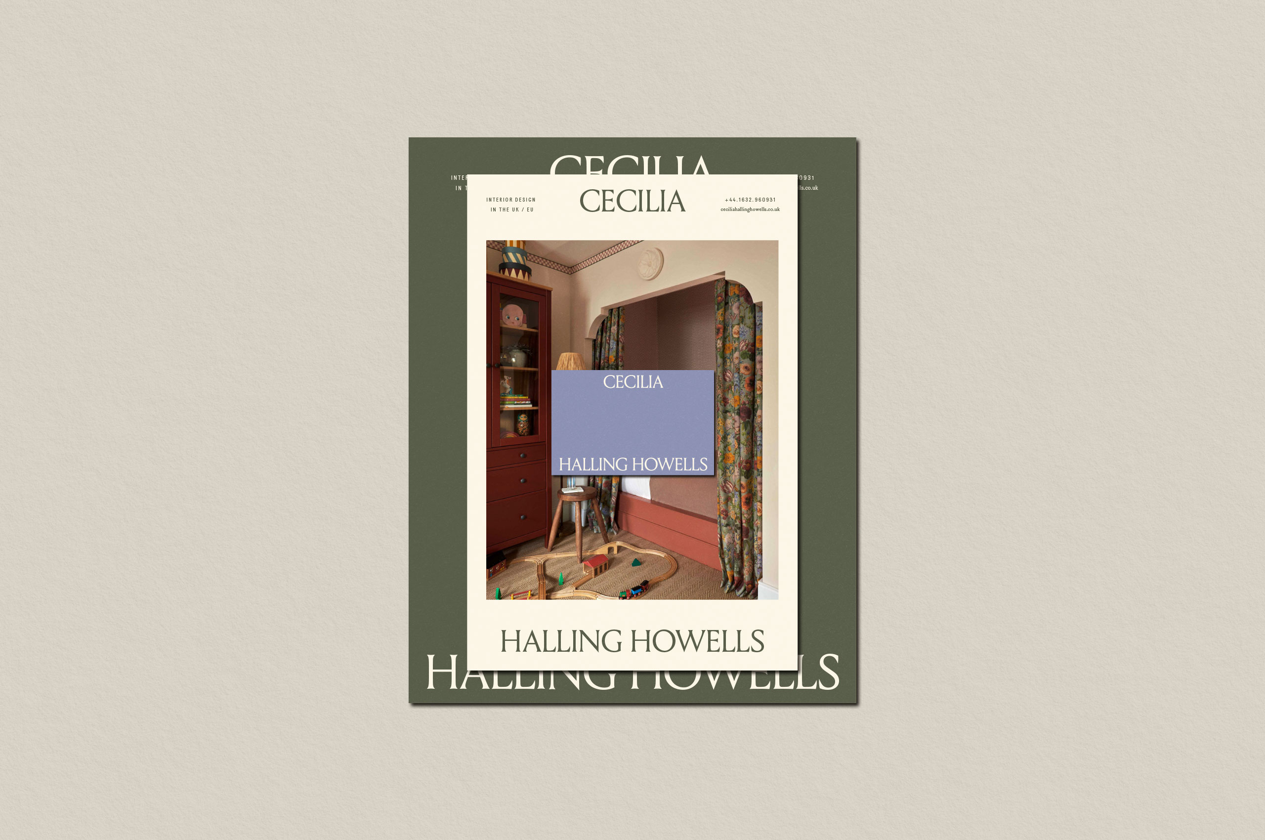

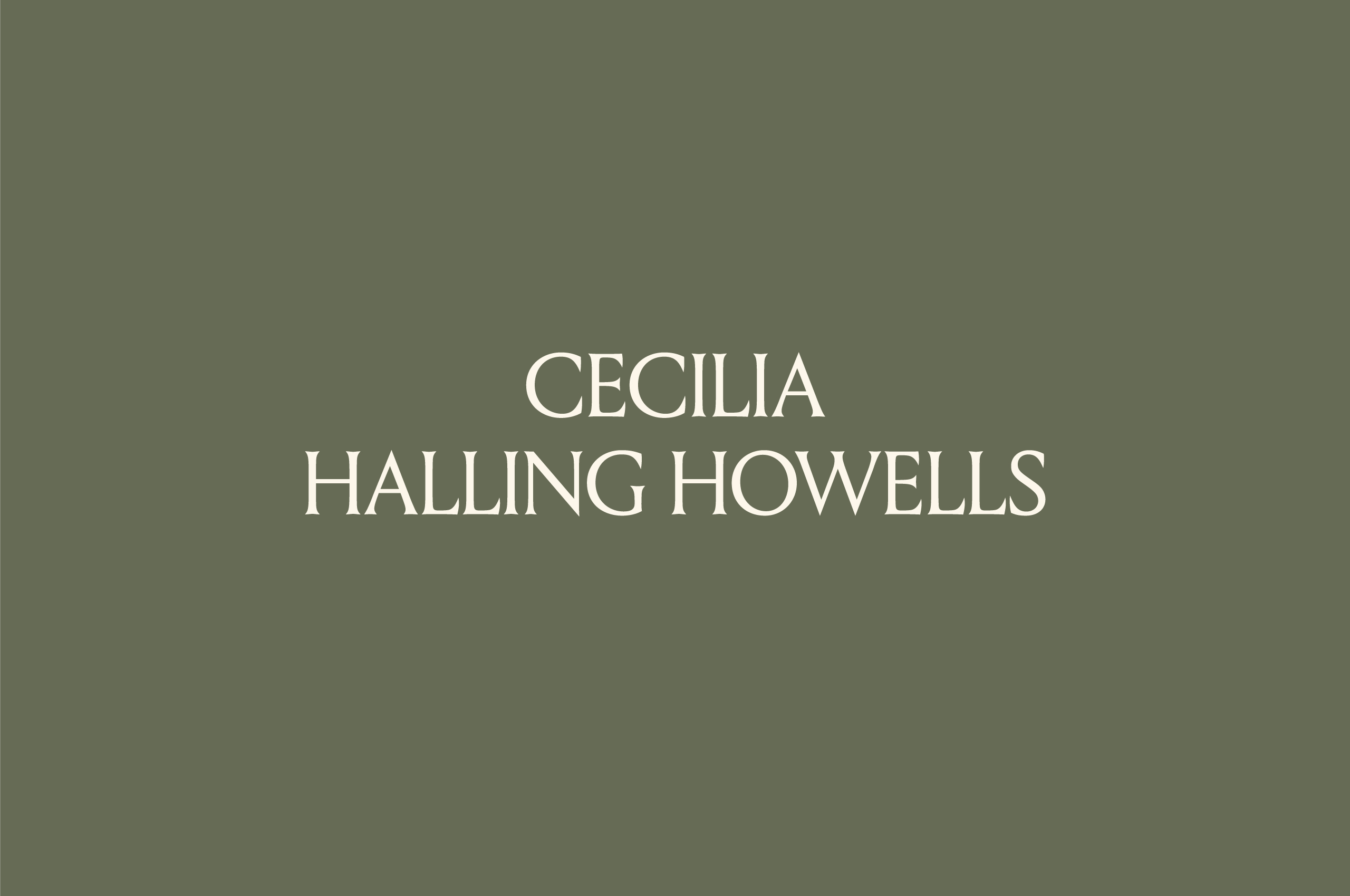
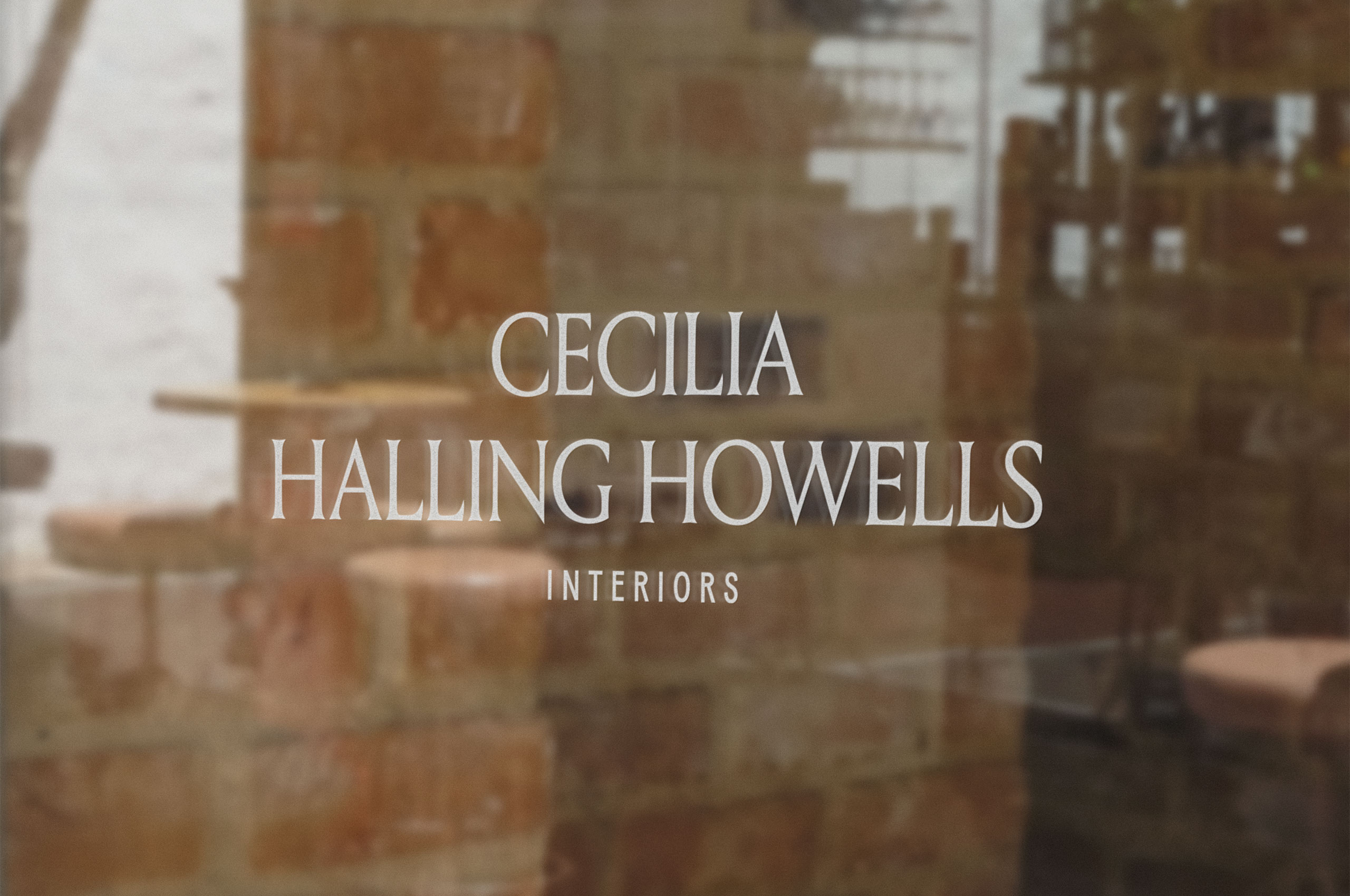
The rich history of stone carving in the UK served as stylistic inspiration for the wordmark. This history has permeated everyday life in Britain, from engraving in the facades of buildings to painted signs. This type provides the sharp look of rigid Roman typefaces, with the organic nature only age can provide. This lettering carries a modern elegance that never feels dated.
These letterforms convey a feeling of a luxury experience while appealing to her clients, those specific ex-London country homeowners.

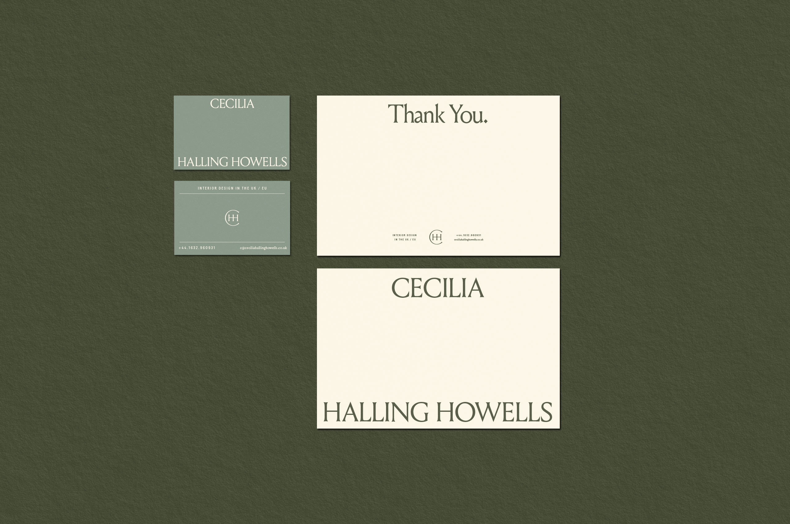

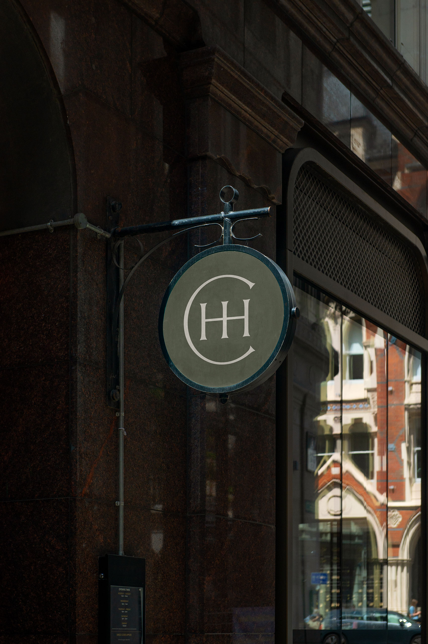


Originating with the origin of type—monograms have always provided a way to mark an individual’s work. They carry a unique approach to combining letterforms. One of the original artist’s monograms, dating to the 1500s, Albrecht Dürer’s monogram took inspiration from his engraving roots and set the tone for subsequent artists. After this, the monogram became synonymous with artists.
With such a rich history, we knew we had to create a monogram for Cecilia that combined the unique history of the monogram with engraved letterforms.
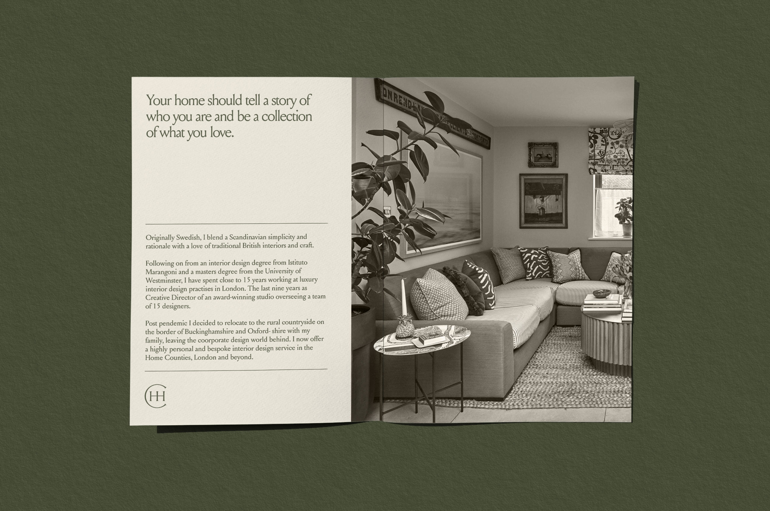
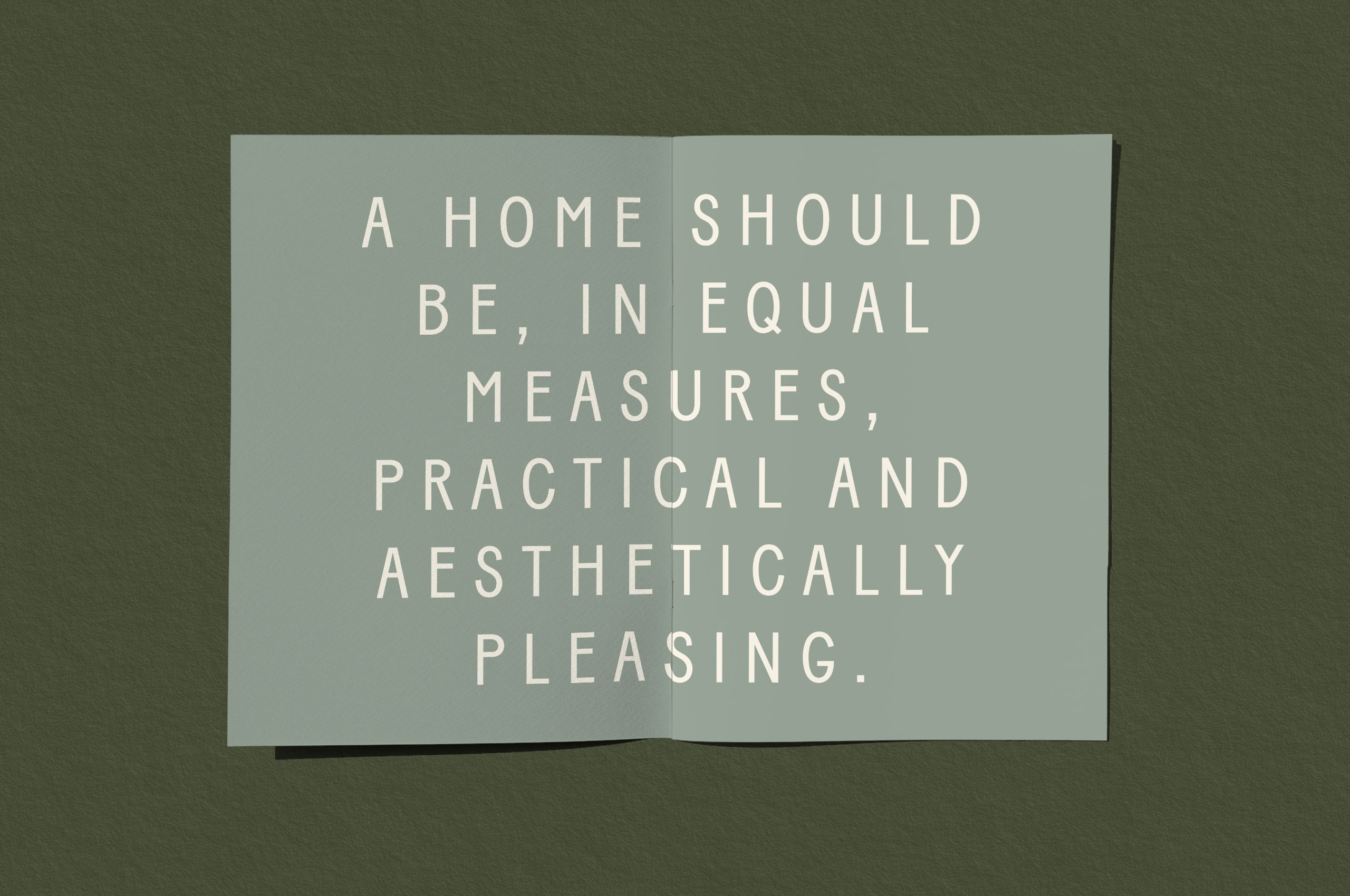

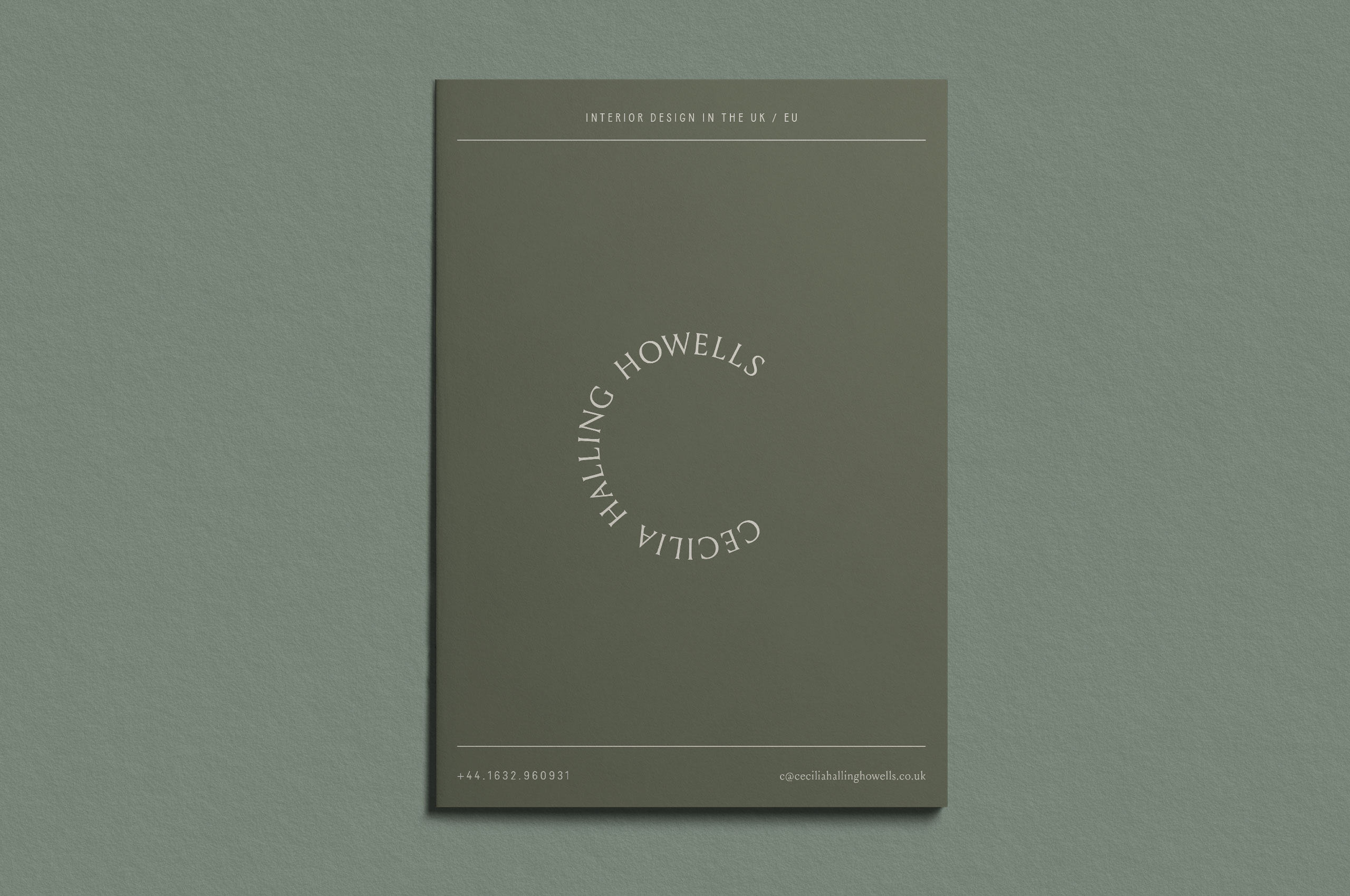
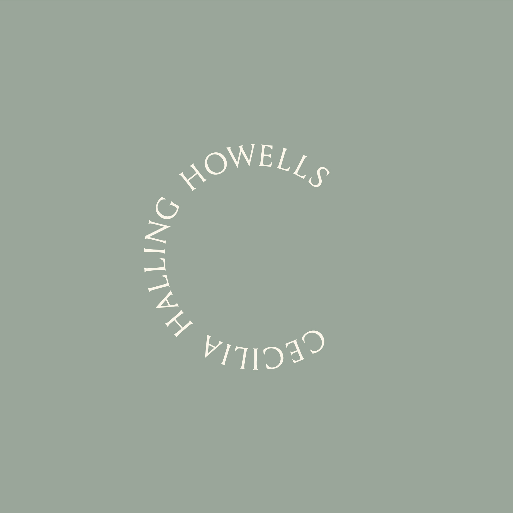
In addition to the mark wordmark and monogram, we created a tertiary mark to bring delight and a connection to the name, allowing for multiple identity use cases in the future.
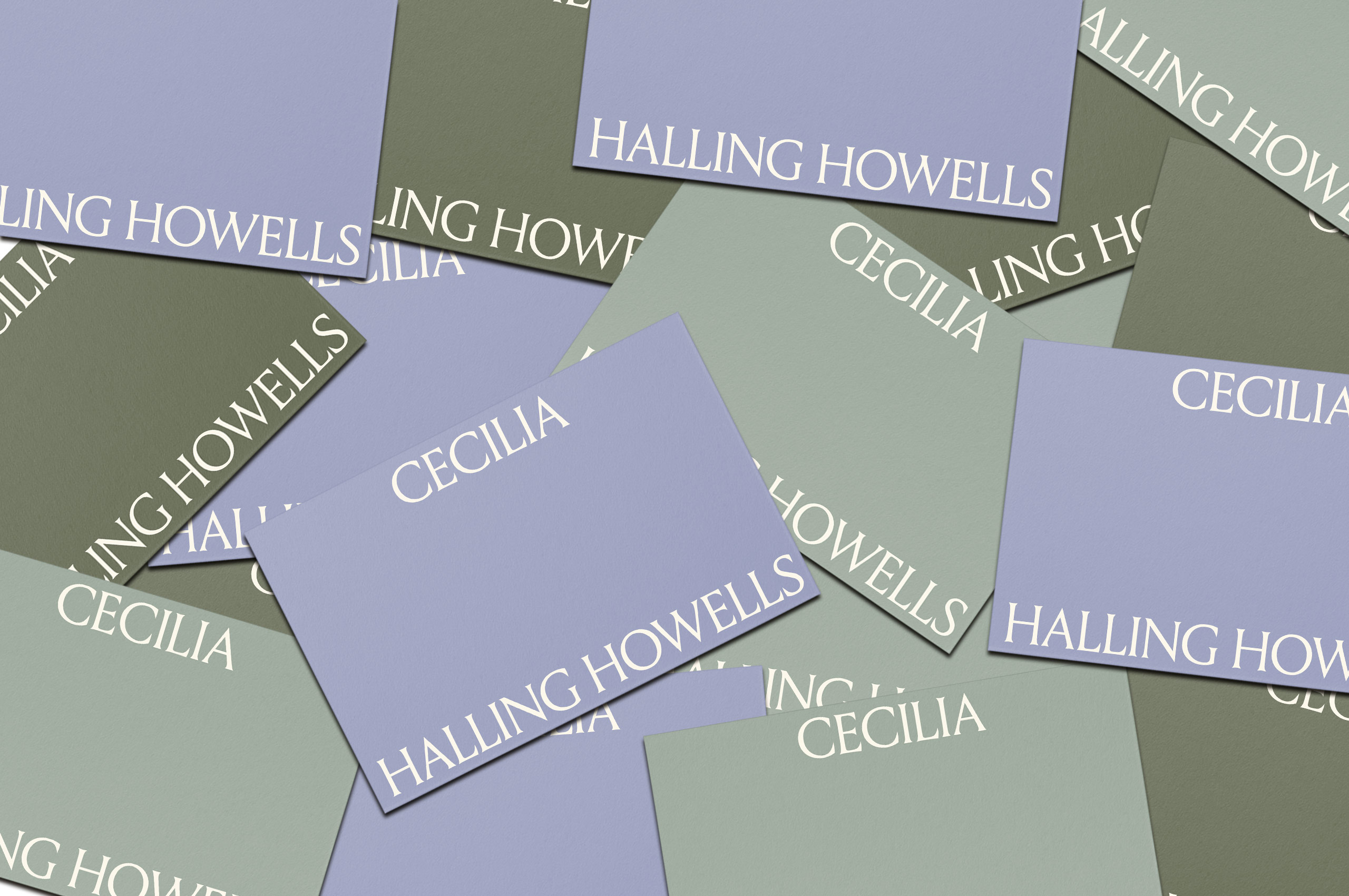
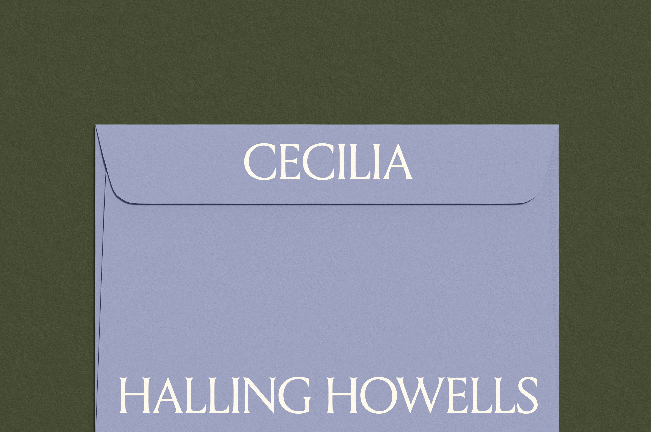
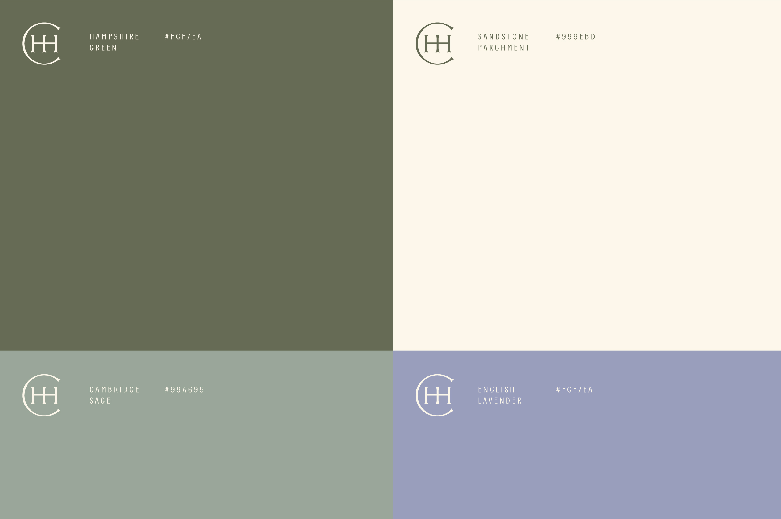
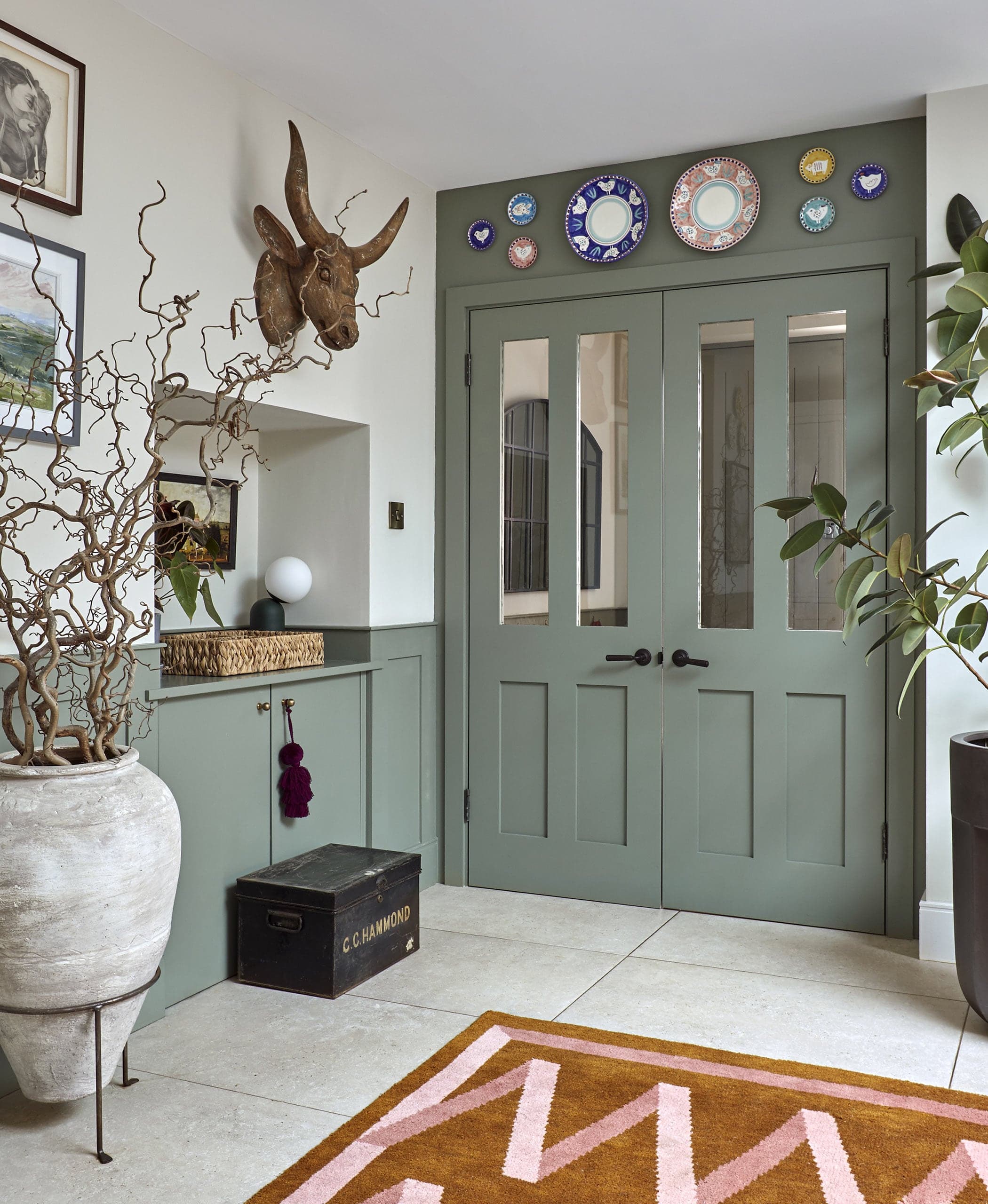
Inspired by the surrounding landscapes in the areas she operates—the palette marries the area’s greenery and the ubiquitous stone with a bright, lively accent color paying homage to something uniquely British; English Lavender. Establishing a palette that feels approachable yet established.
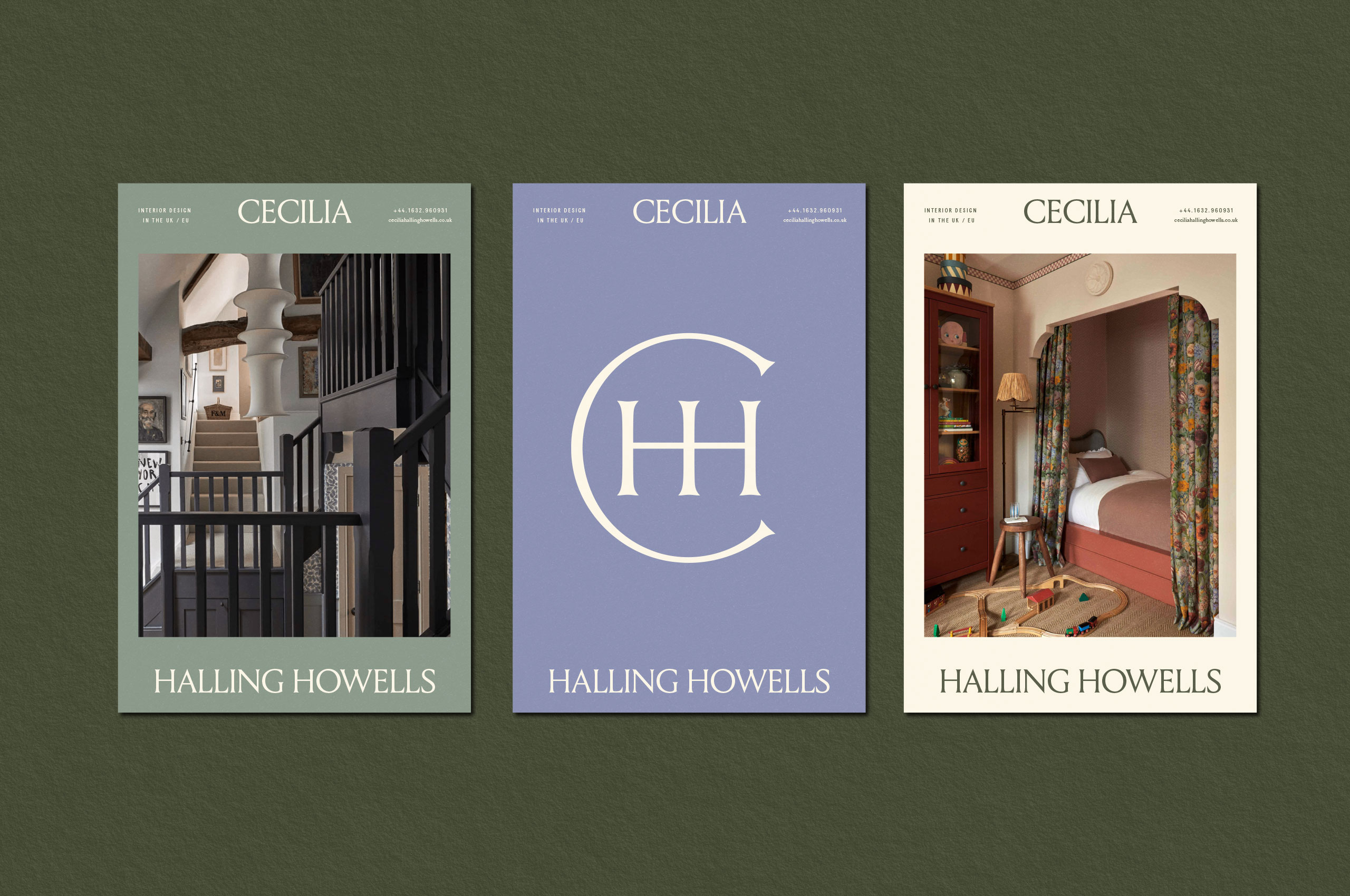
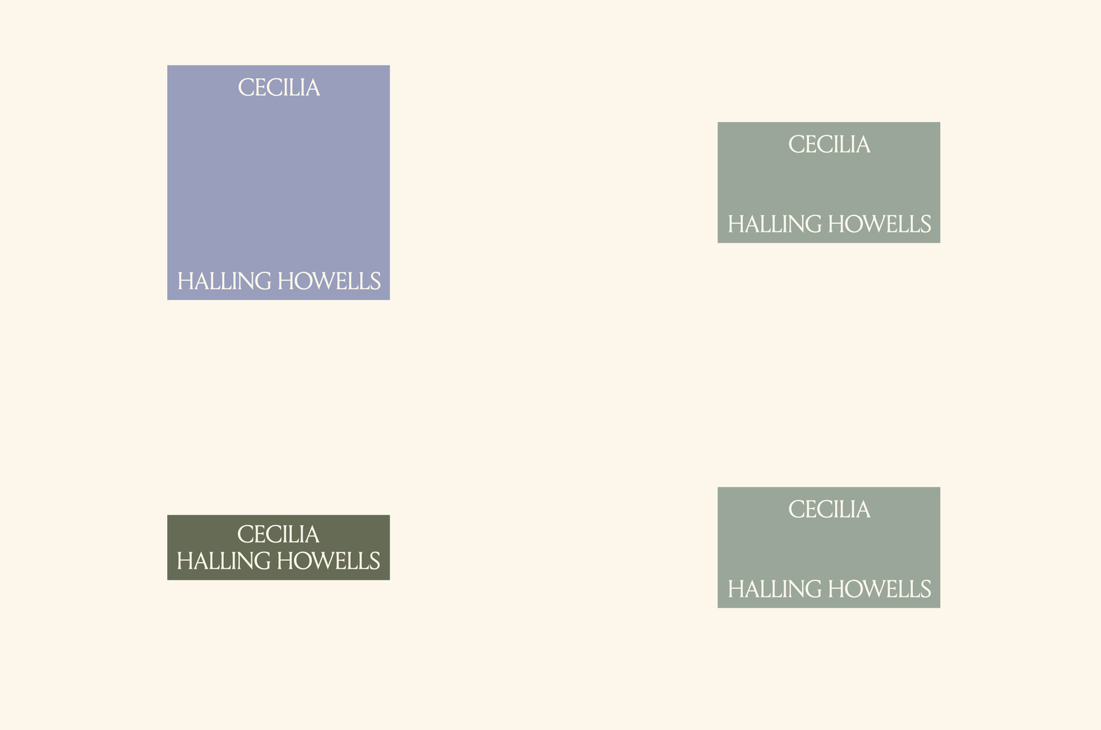
We created a suite of wordmarks that flex and change based on the unique need. These marks transform based on the demand while establishing a more significant brand presence.
By creating a split, we allow for defined name recognition and establish a frame for content—forming vertical and horizontal flexibility for all possible use cases.

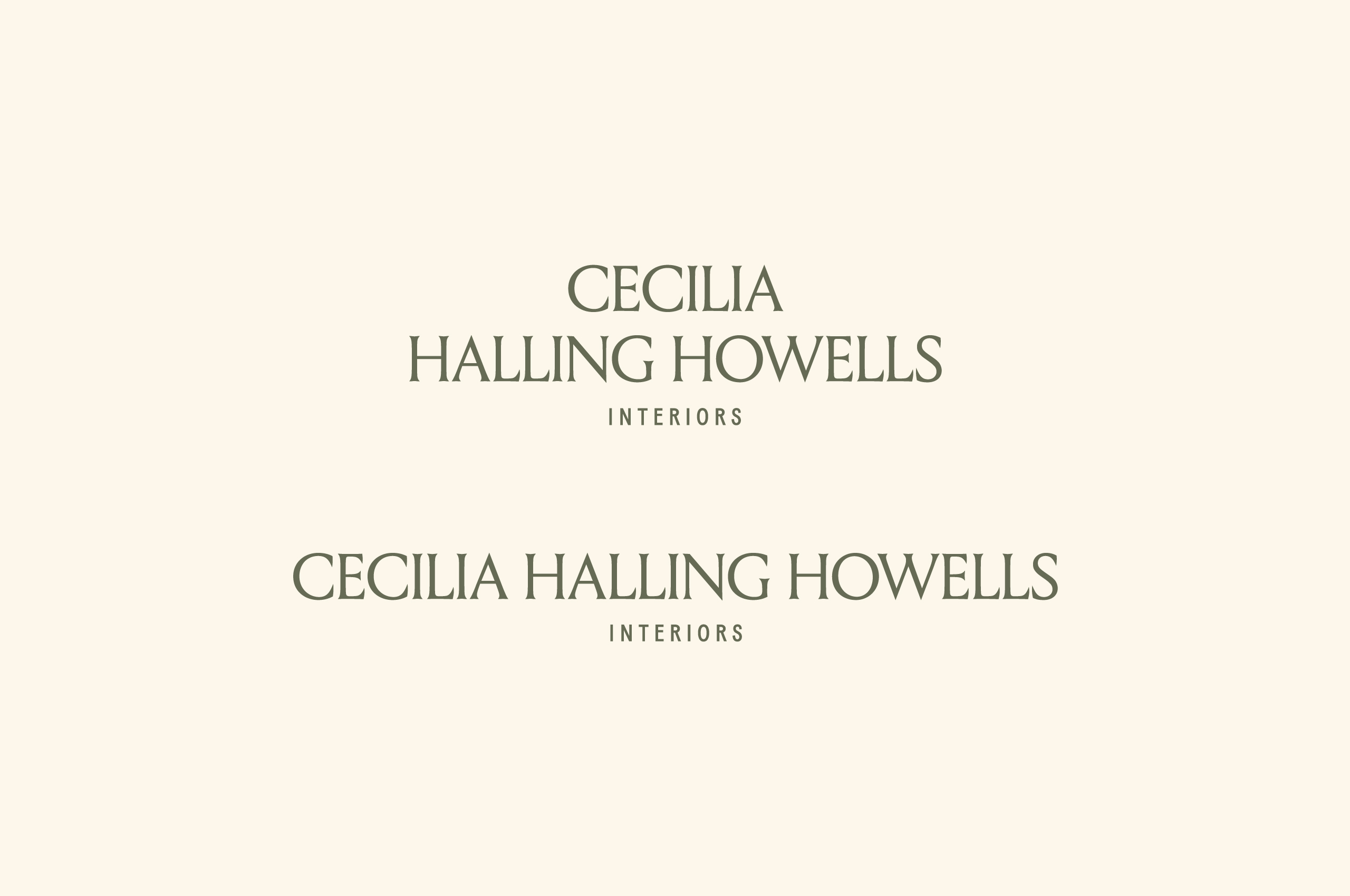
When needed, we can utilize modifiers to include “interiors” when it is not stated elsewhere on the specific material.
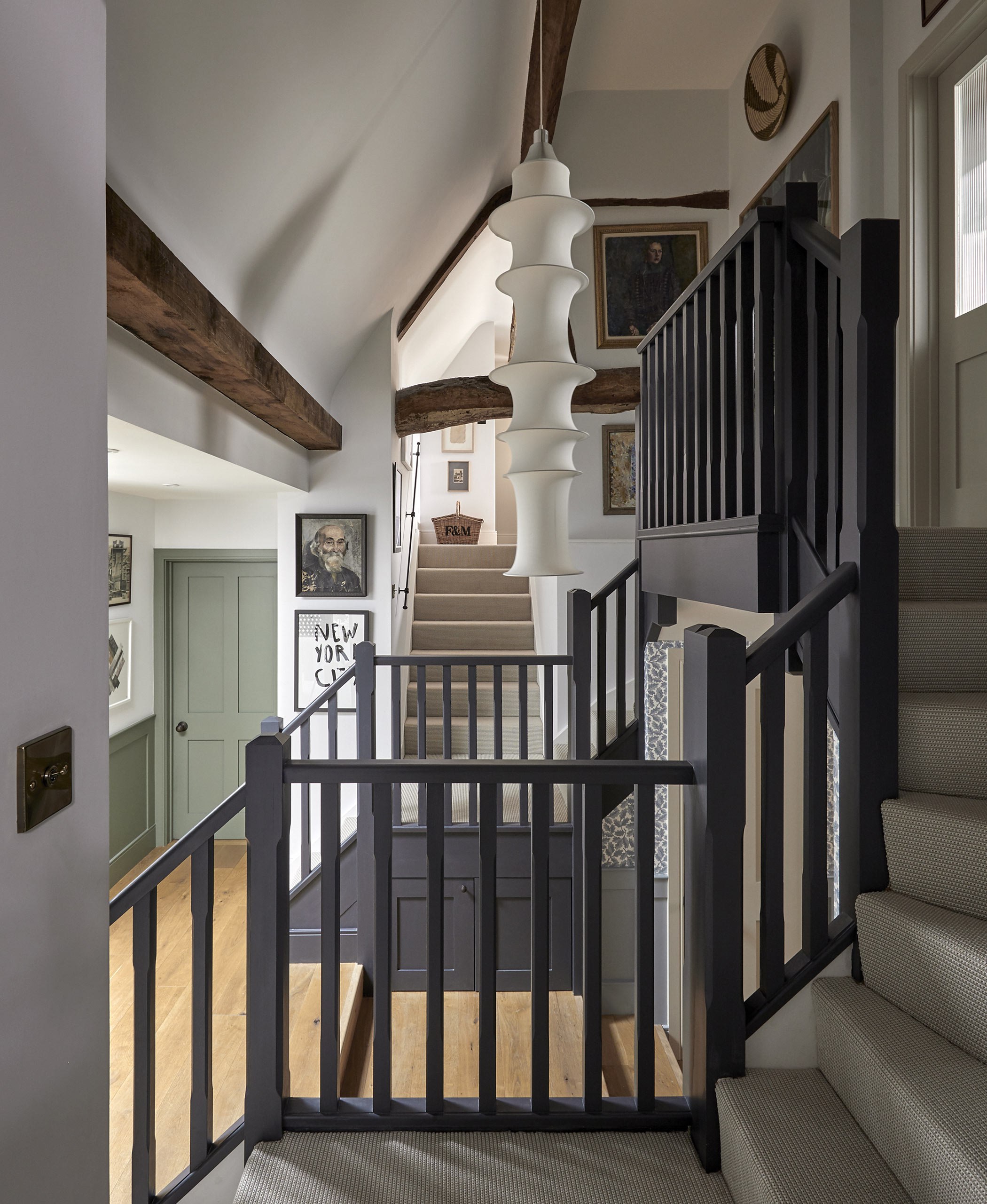
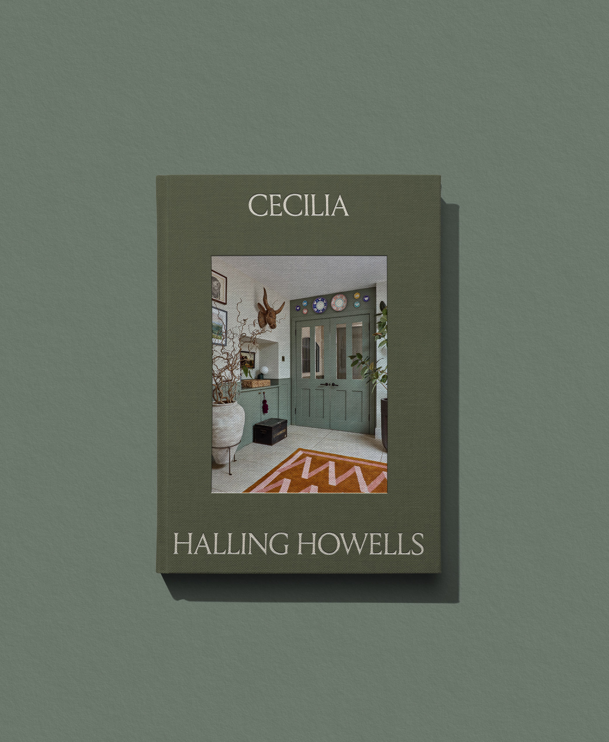
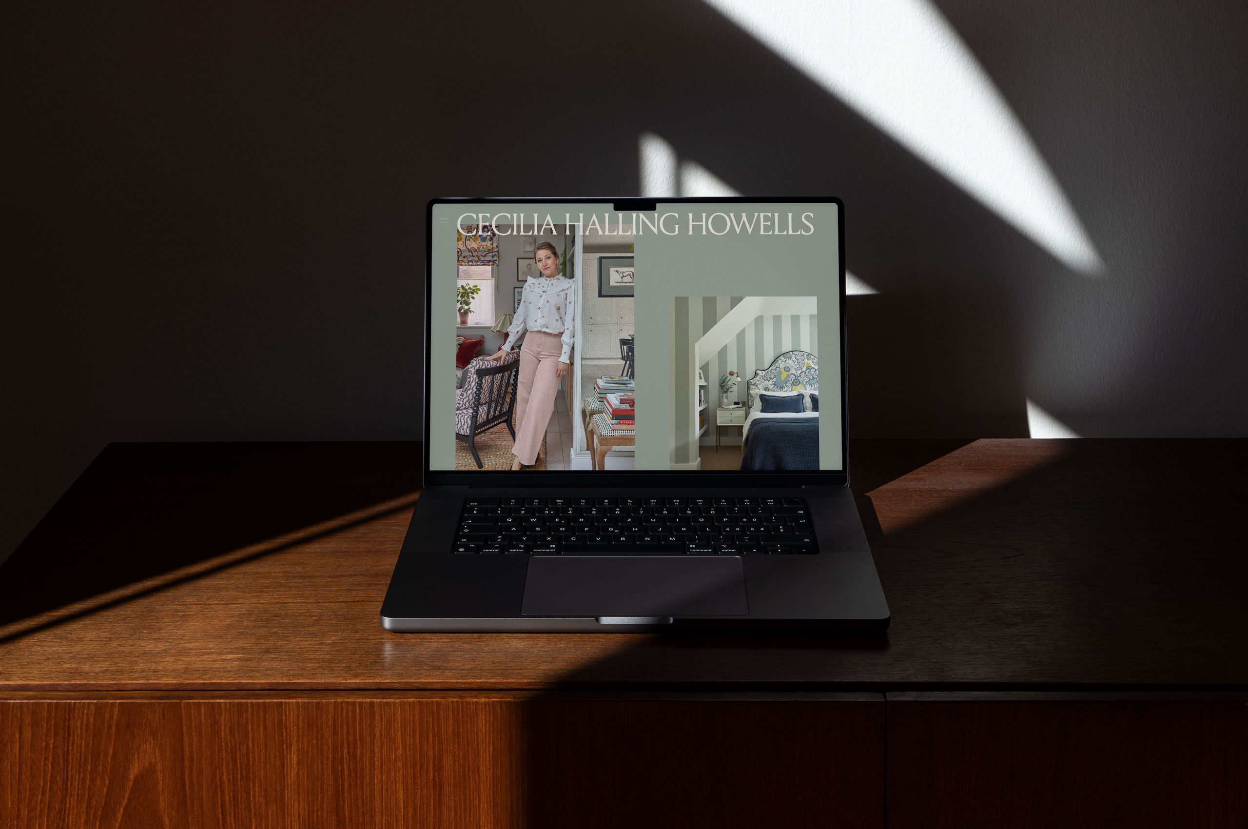
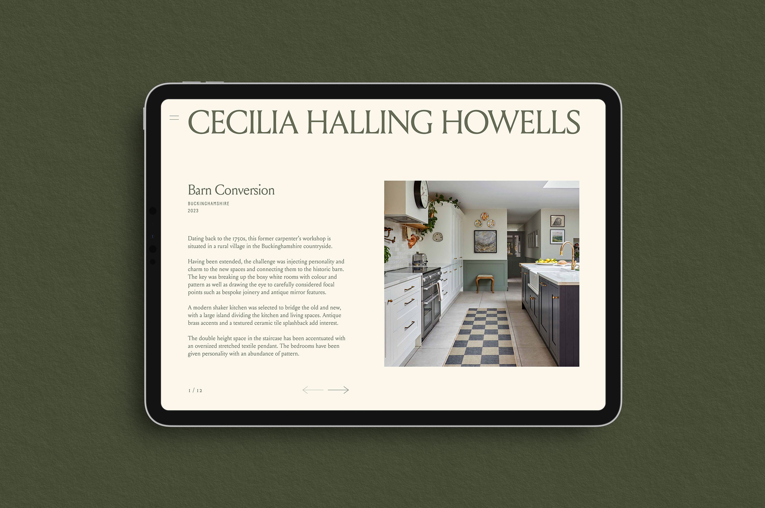
We worked with Howells Studio to create a steadfast online presence for the identity—effortlessly translating the look and feel of the brand into the digital world.
