Bridges to Prosperity
Working to solve global isolation poverty,
one footbridge at a time.
Working to solve global isolation poverty,
one footbridge at a time.
Through infrastructure, Bridges to Prosperity is working to solve global isolation poverty. Helping communities thrive and grow in sustainable ways.
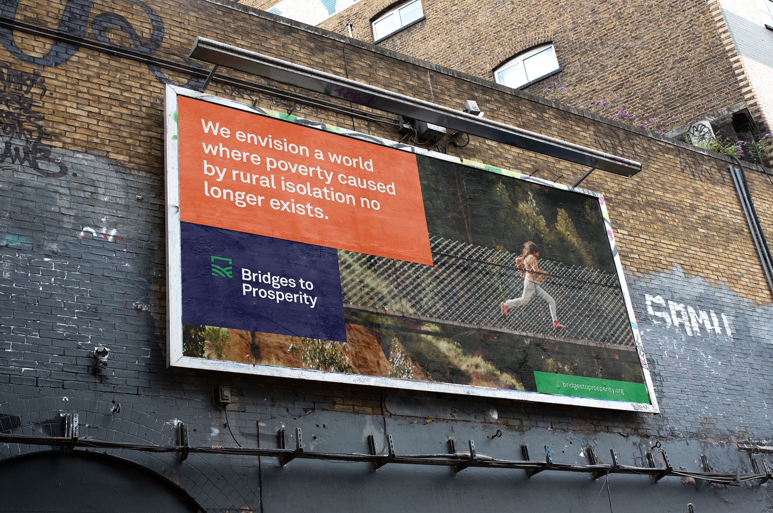
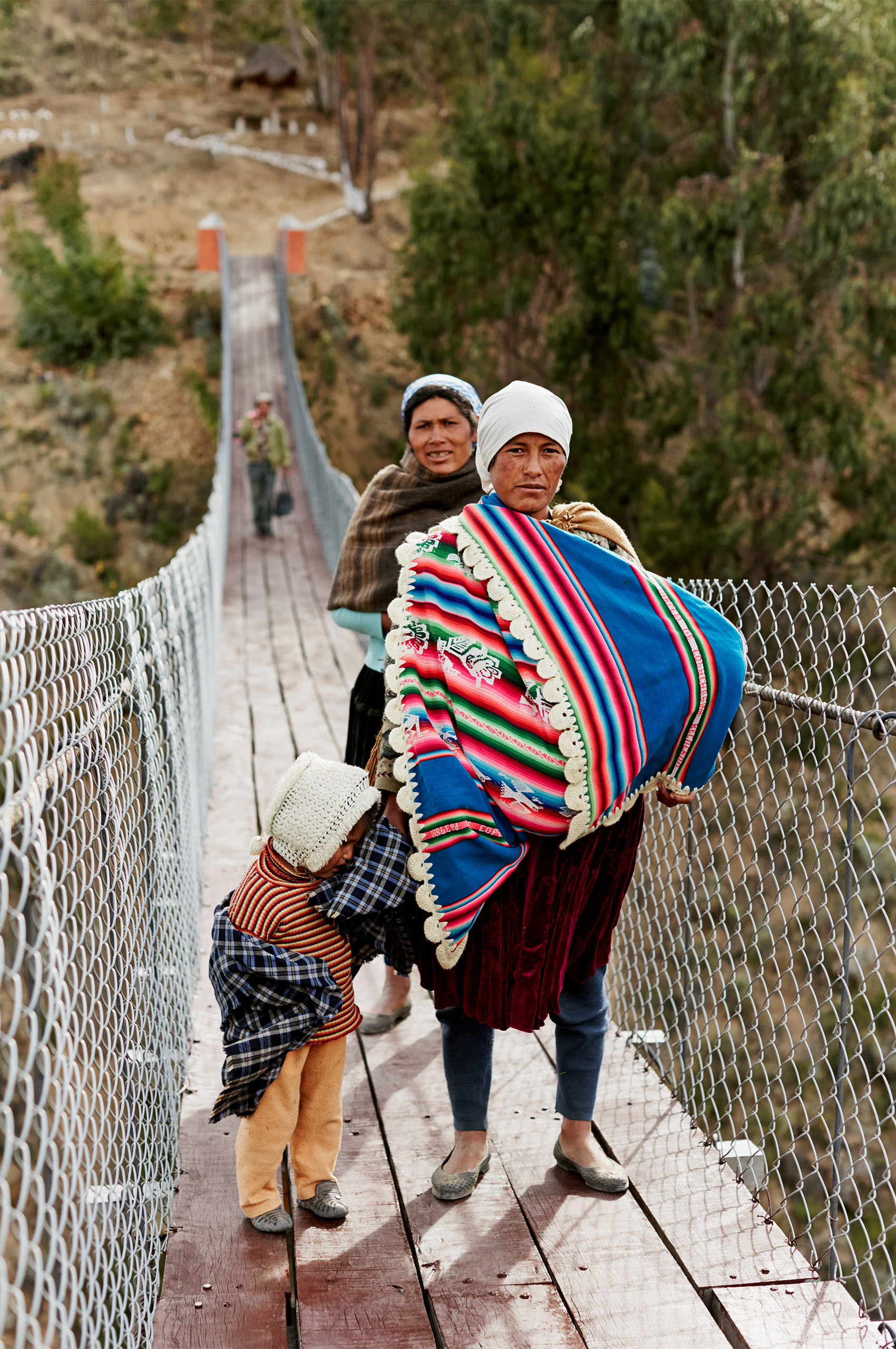
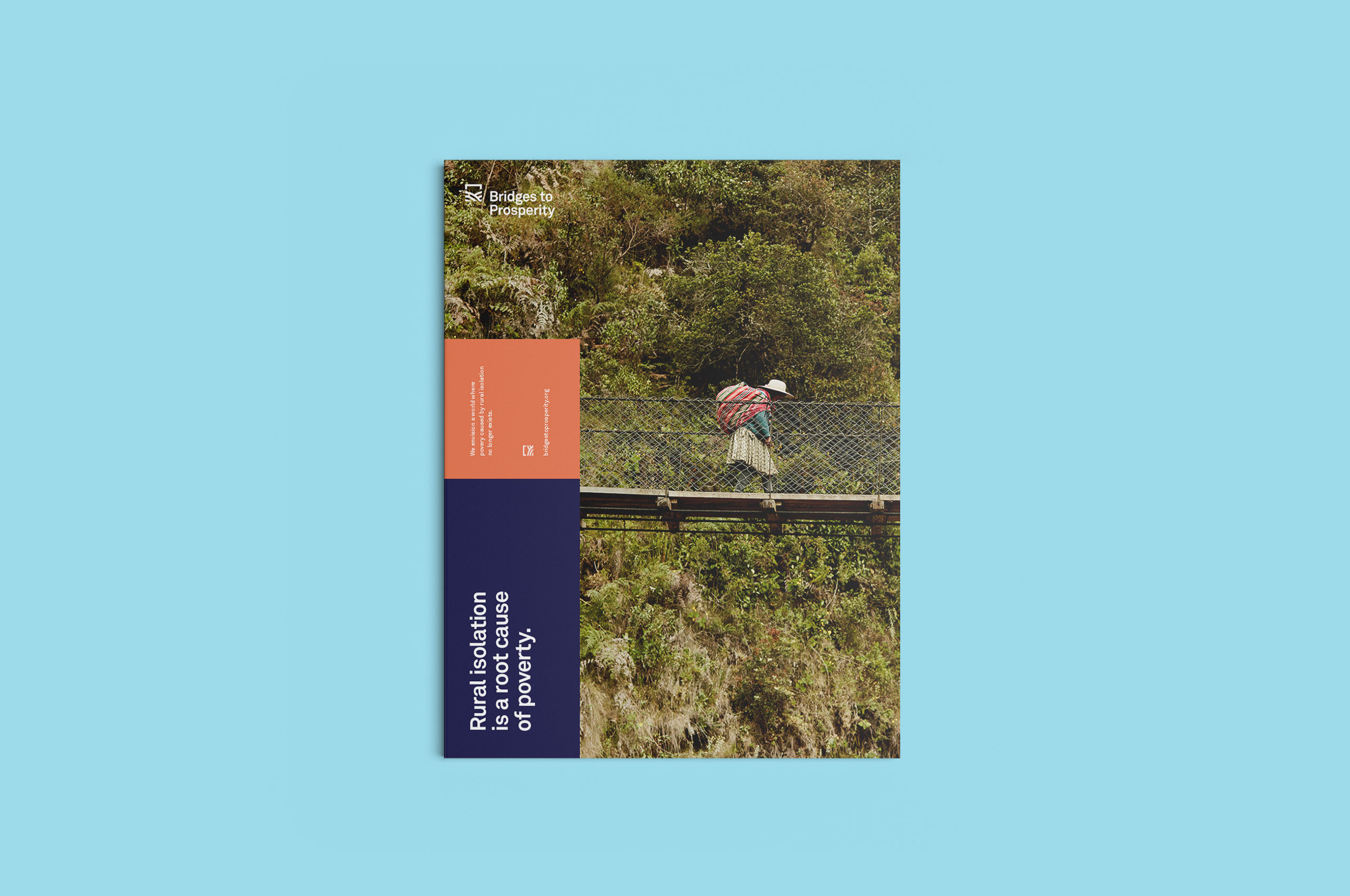
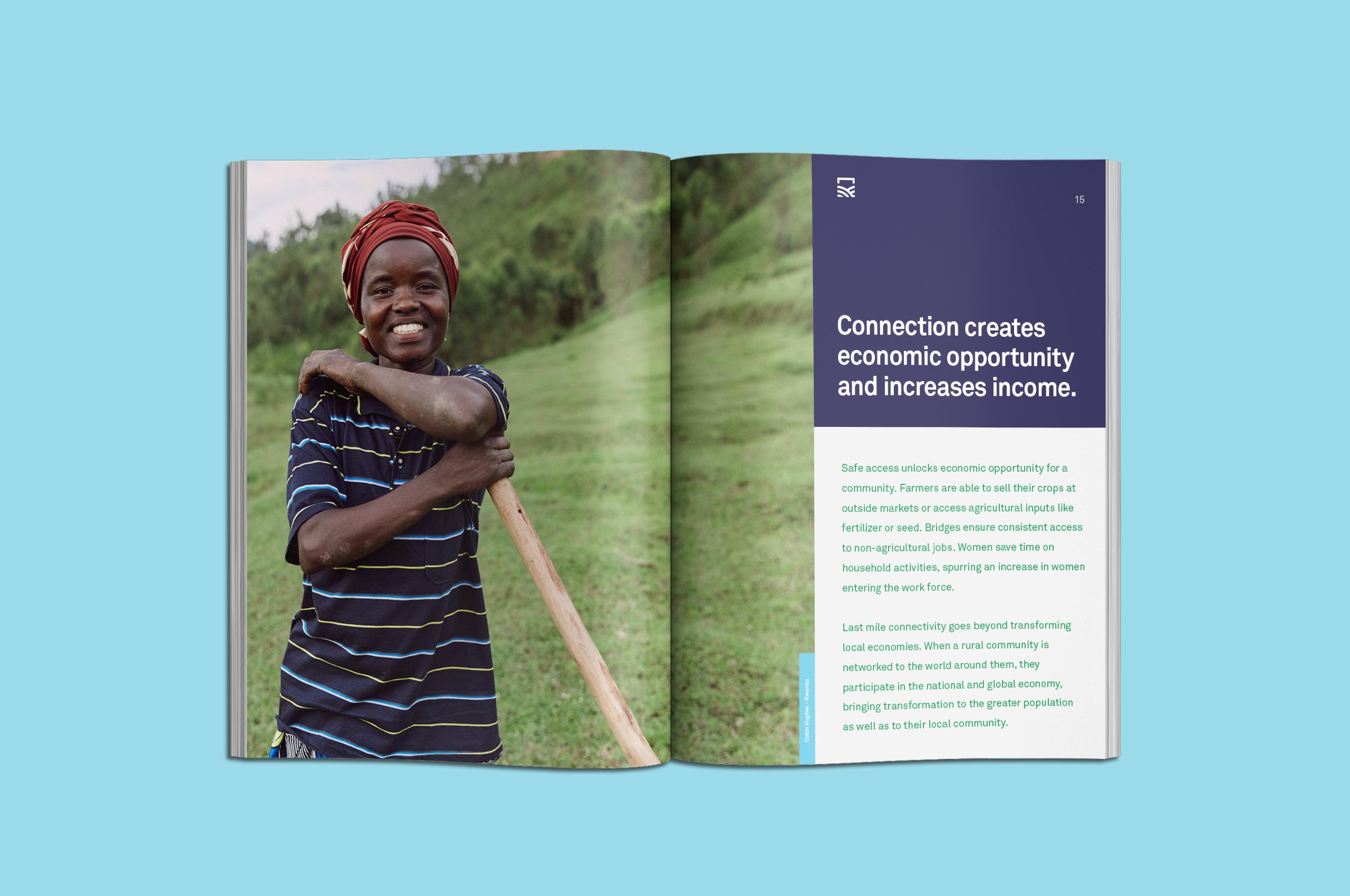
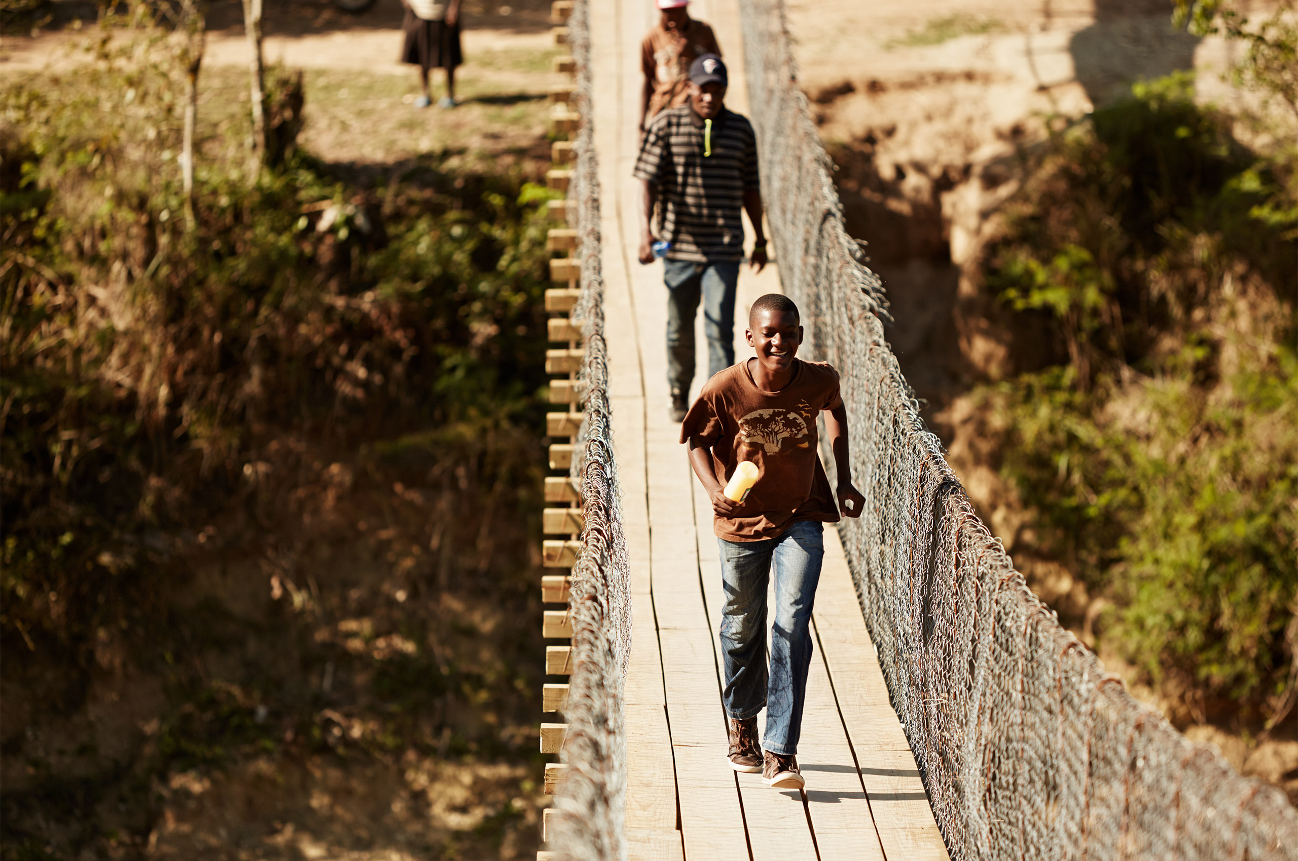
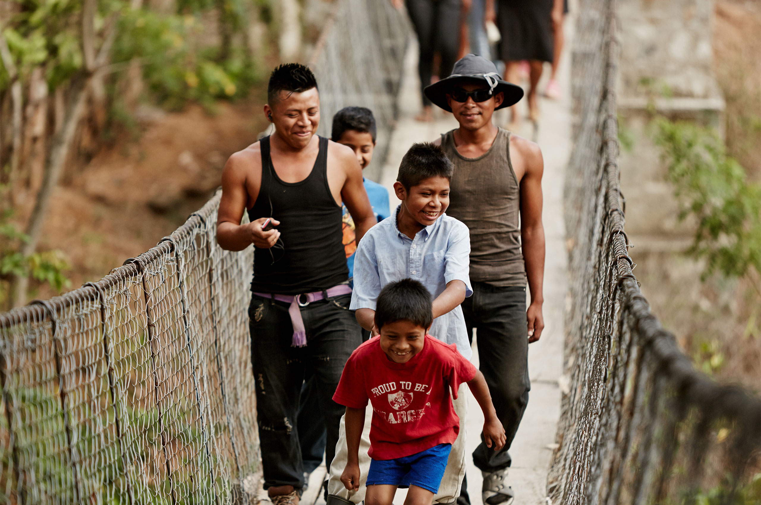
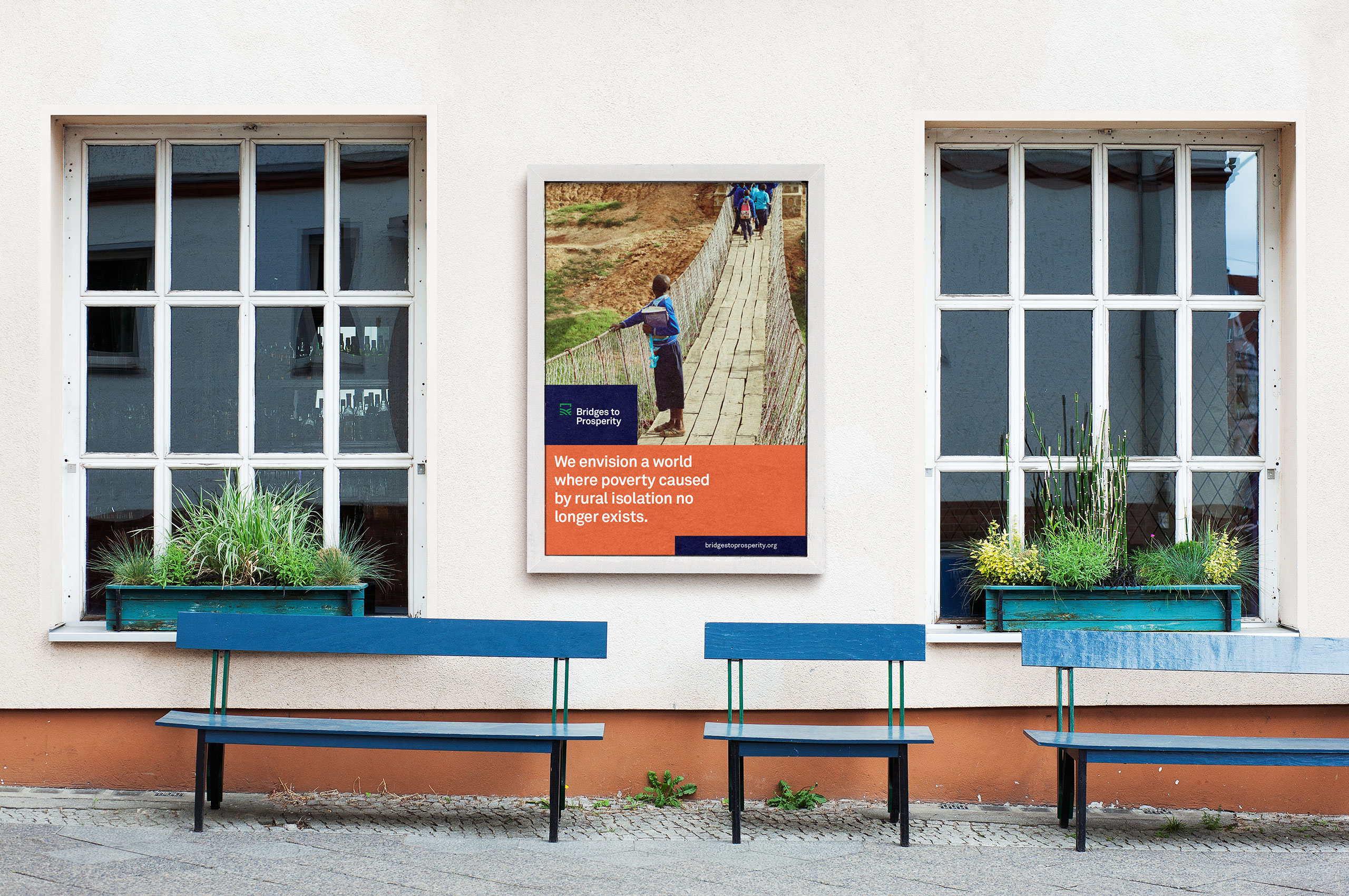
Almost 1 billion people around the world don’t have safe access to critical resources due to an impassable river. With a single innovation, footbridges, Bridges to Prosperity is able to impact households across multiple dimensions. Providing access to health care, education, and economic opportunity; they transform the way people plan for and invest in their future.
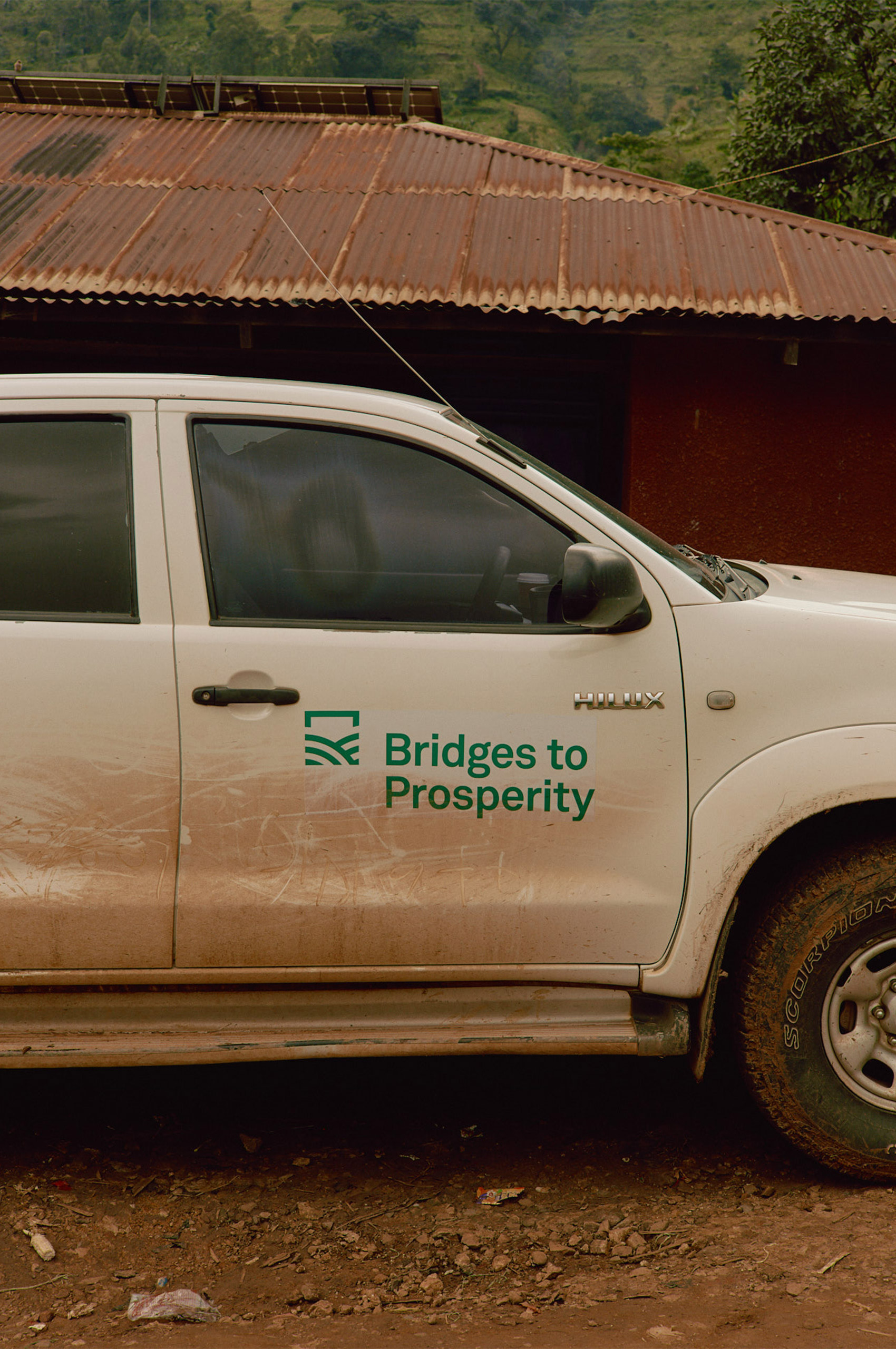
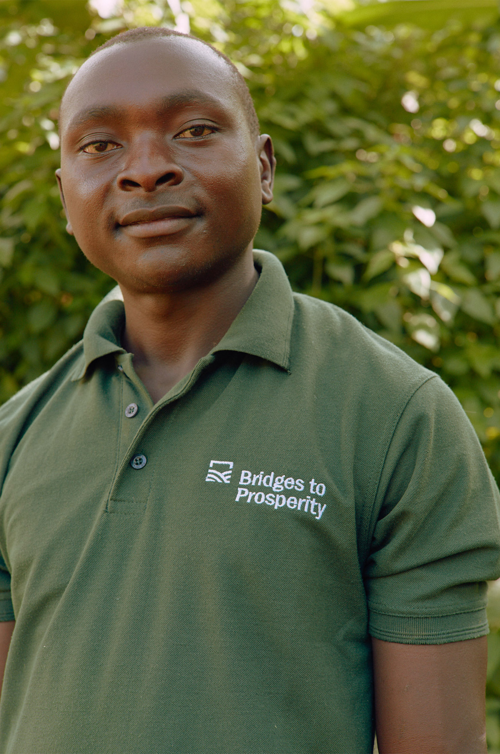
The Bridges to Prosperity team came to Mast with a goal of elevating and enhancing their entire identity system. Creating a new identity that built upon the equity already established, but fell in line with the craftsmanship and quality of the bridges they were building.
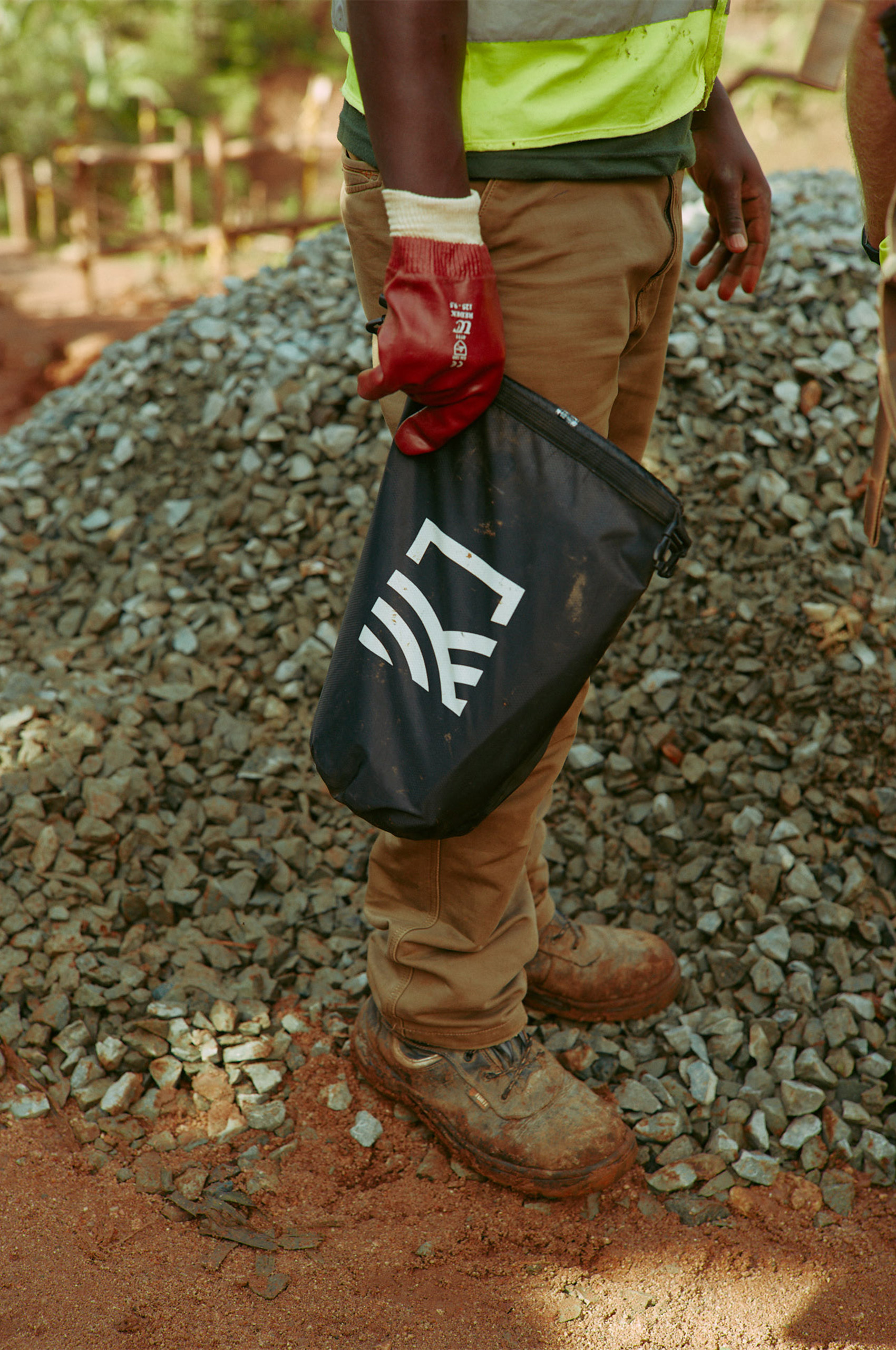
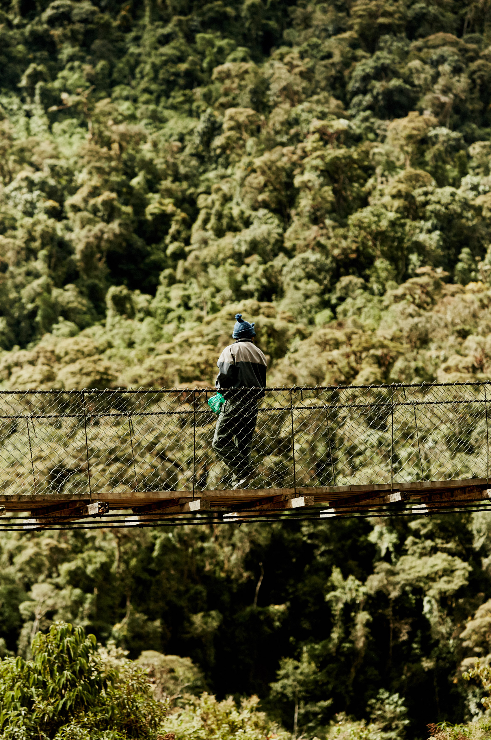
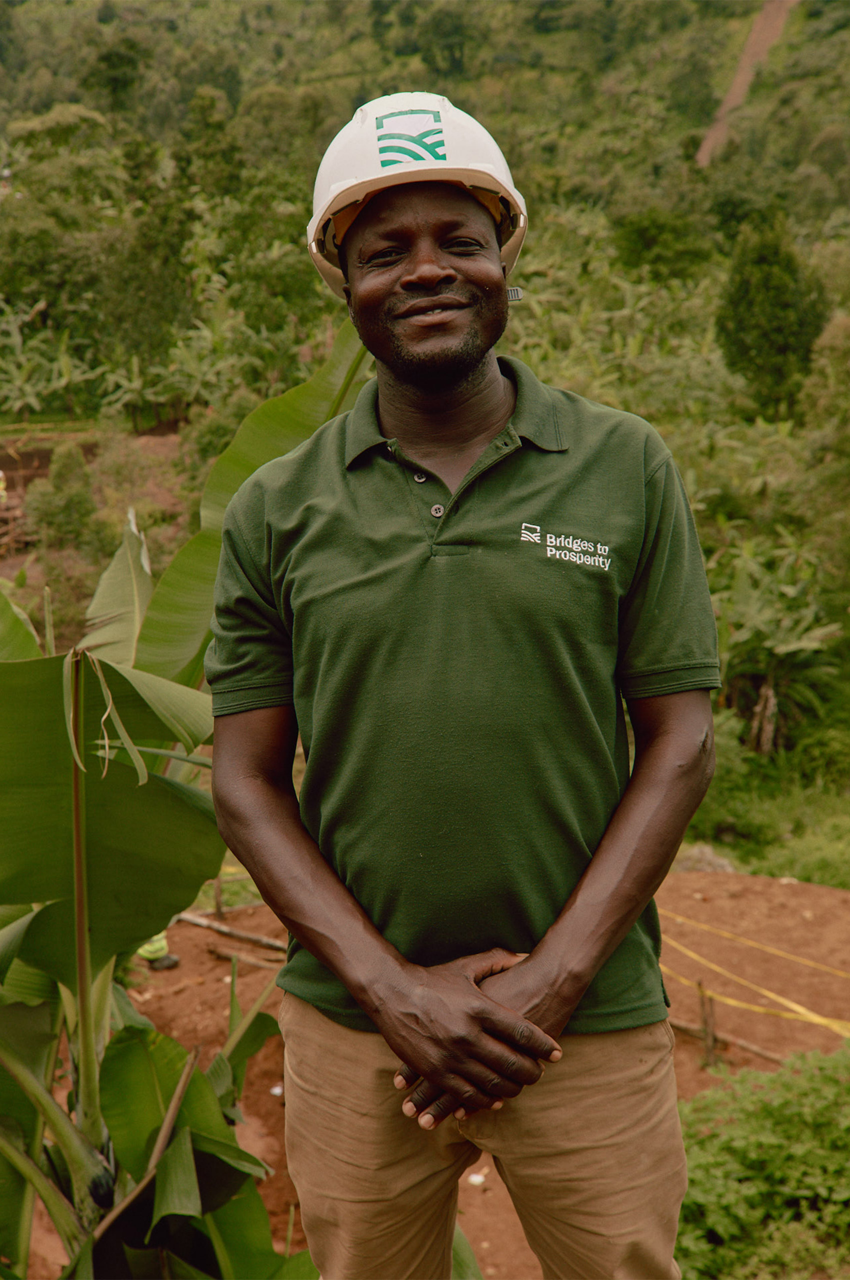
Photos by Collin Hughes.

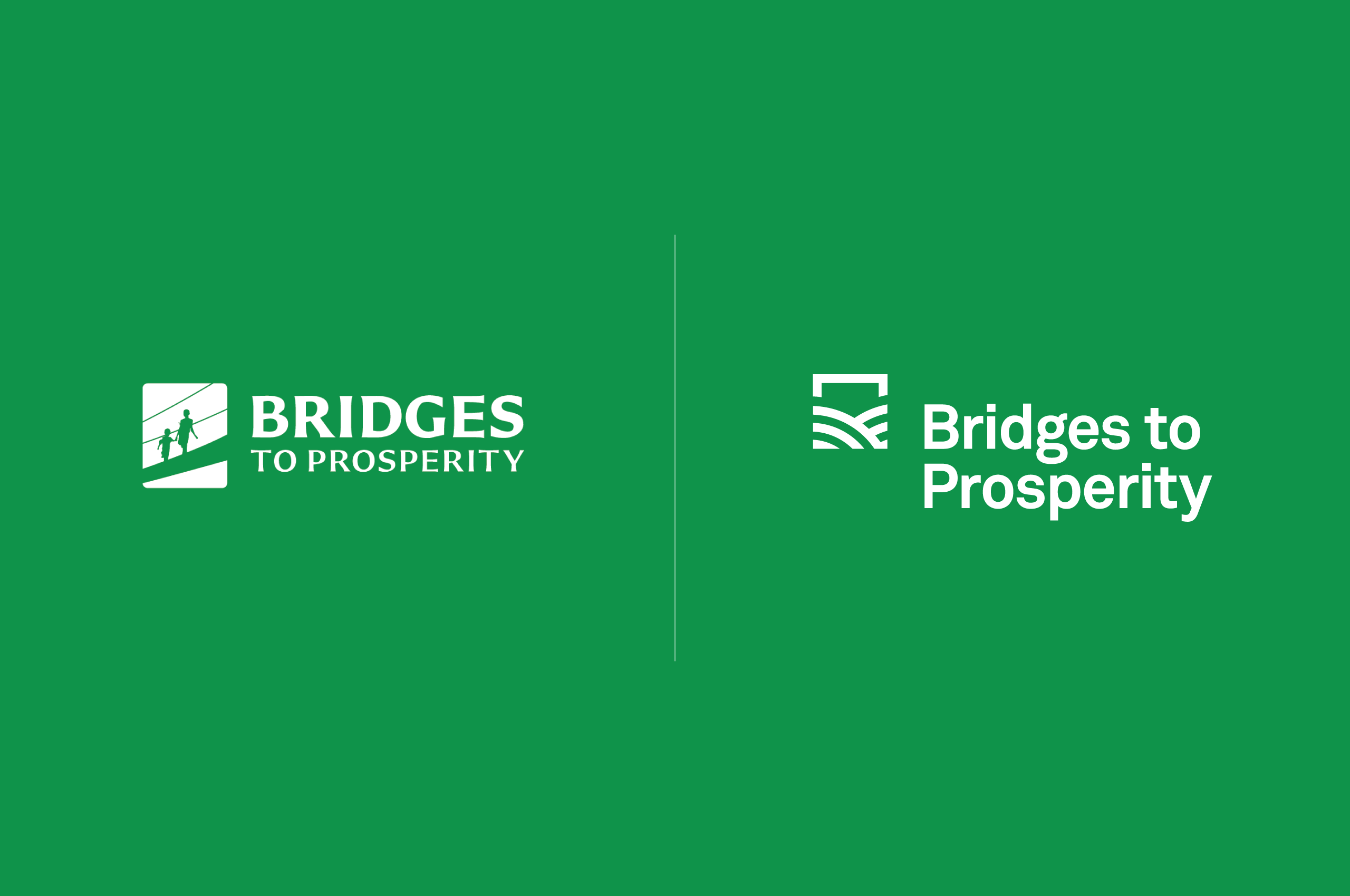
The previous logo served them well but was too illustrative, could not be scaled, and could possibly become obsolete if bridge technology changed in the future. We worked with the team to develop a bold, abstracted logo that will serve them for years to come, and in many different markets.
When building the color palette for Bridges to Prosperity, we started with their green. Brightened it and built a palette around it. Taking cues from the vibrant colors of the scenery and the communities they serve.
Resulting in an exciting, engaging, and uplifting palette that can stand on its own or pair with their imagery.
When developing the symbol, we wanted to portray the name in a visual manner by showing the result of these bridges. Allowing the symbol to be as ownable when detached from the wordmark.
We knew the symbol had to be architecturally sound. To match the quality of the bridges themselves. The result of that thinking was a strong symbol with a square structure, defining the core values of Bridges to Prosperity through the use of clear imagery:
Rolling Hills of Prosperity — an instantly recognizable form. The hills embody the idea of agriculture, life, growth, nature, etc.
The Bridge — a semi-square is used to portray an abstracted bridge; looking deeper, the semi-square brings forth the motifs of long-term strength and stability.
These two elements are combined to give this symbol a message of growth and stability facilitated by a nurturing and welcoming environment.

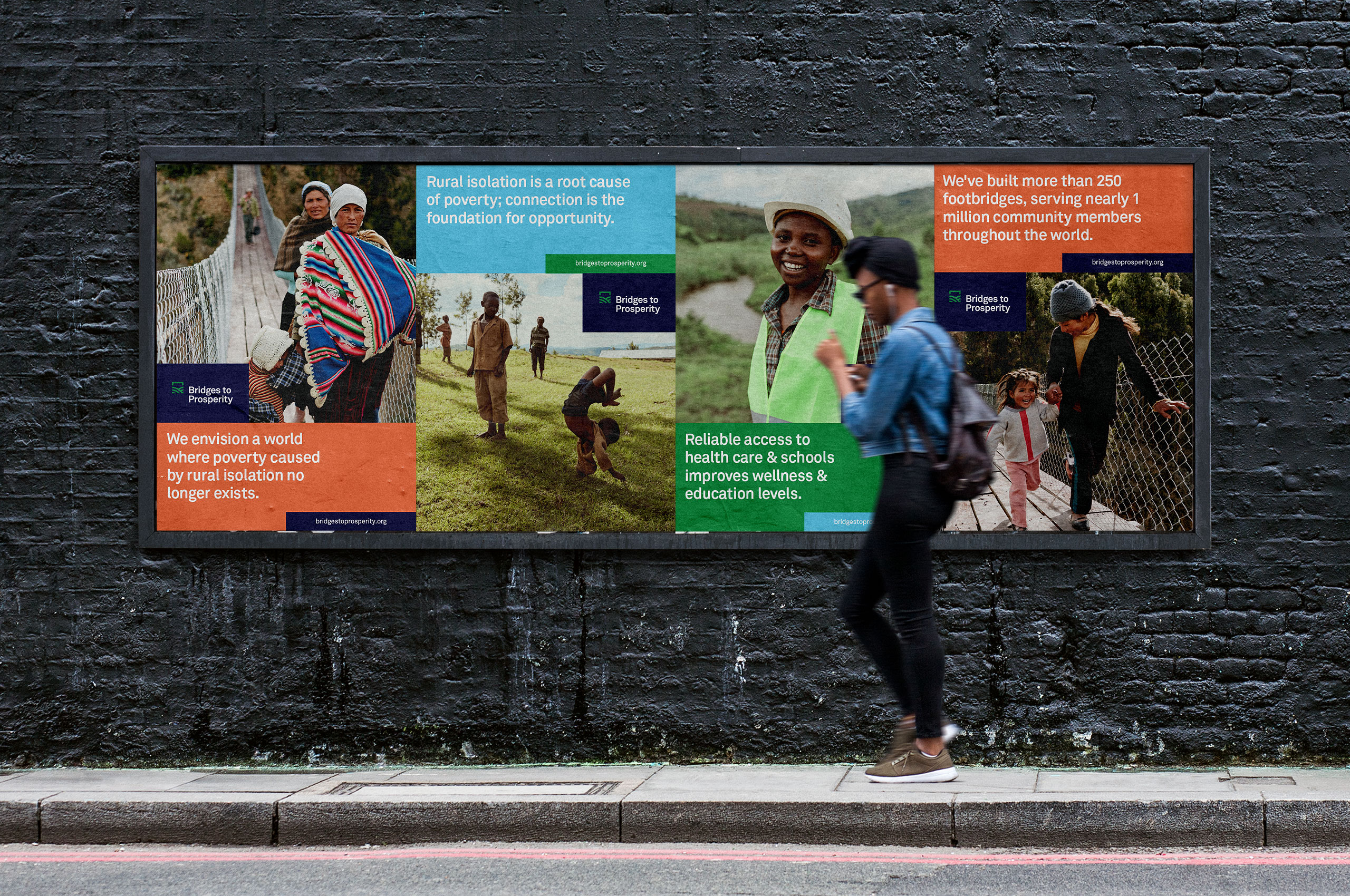
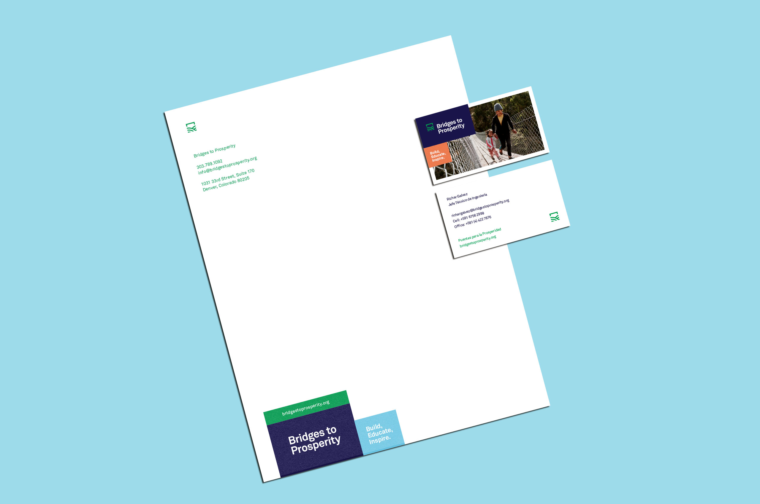

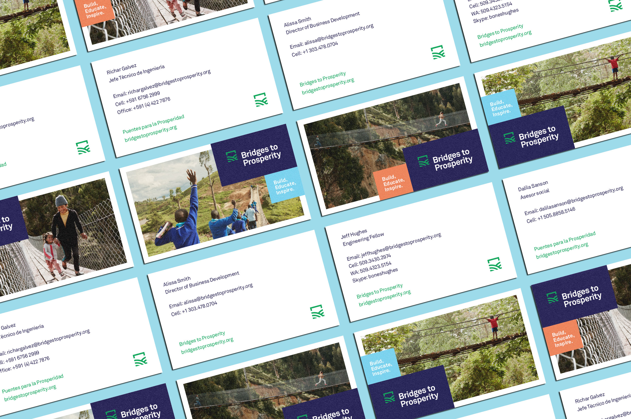
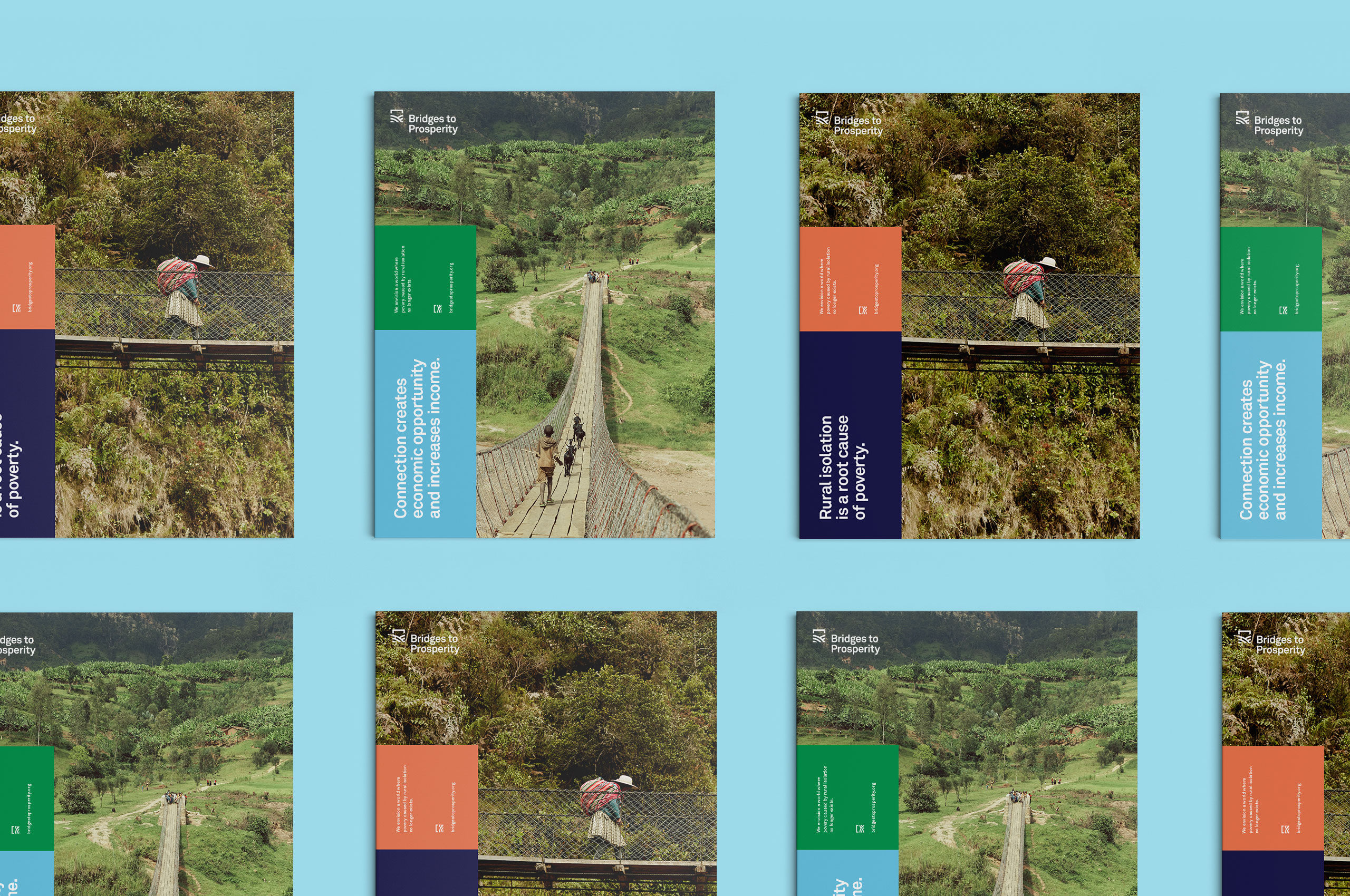
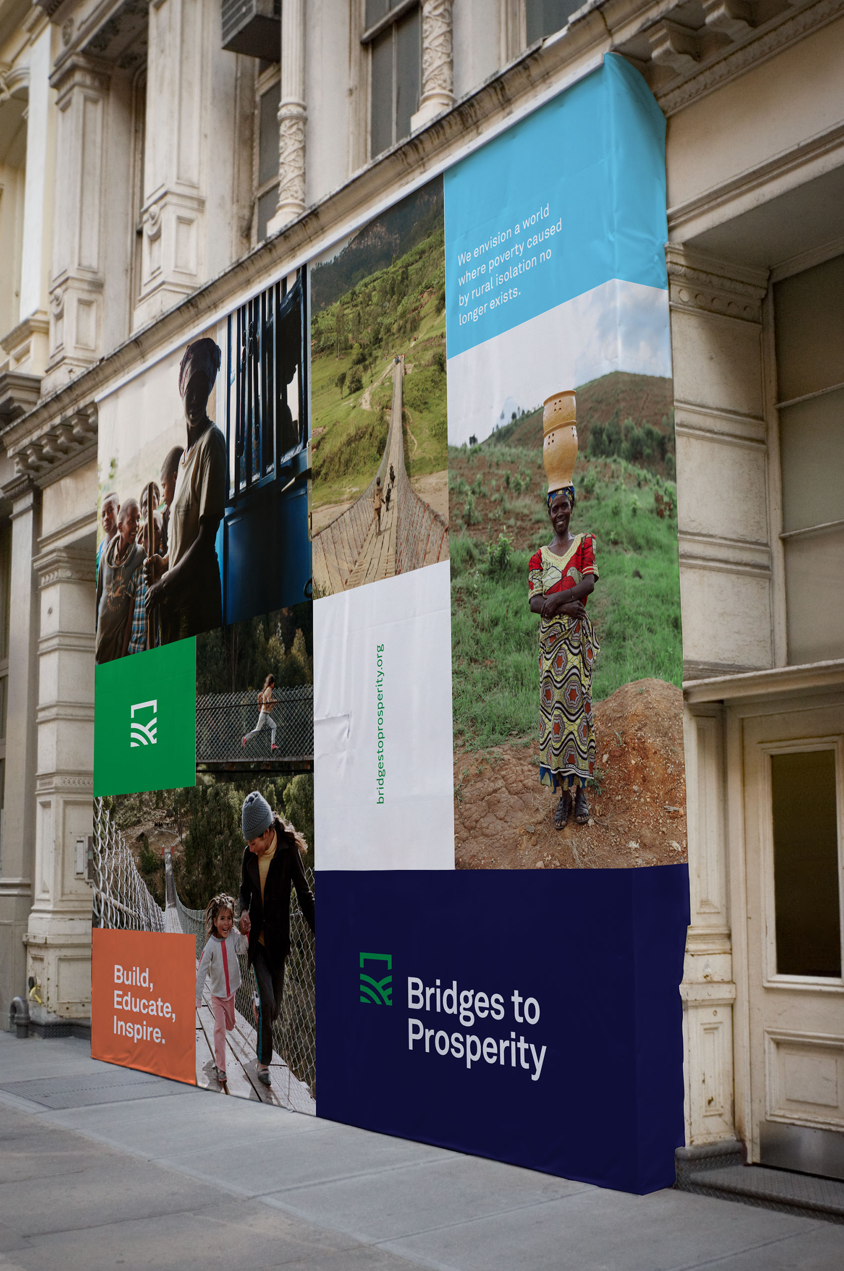
Once the logo was developed, we worked to build a modular system that could naturally expand to fit any size and any medium. Again, taking cues from architecture, we built a grid-based system. While initially, it seems that this might be an overly rigid system. When it is paired with color, type, and imagery it comes to life.

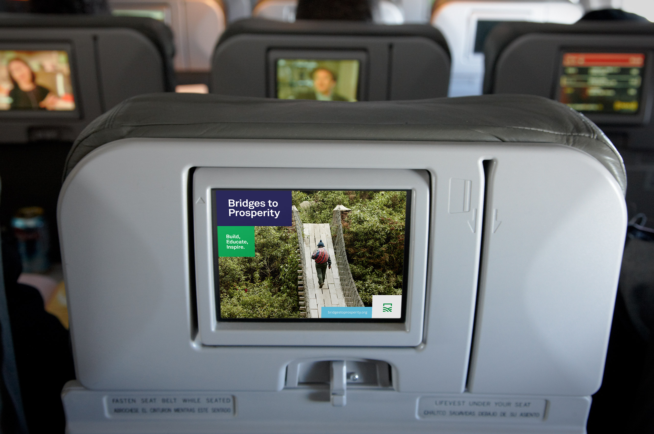
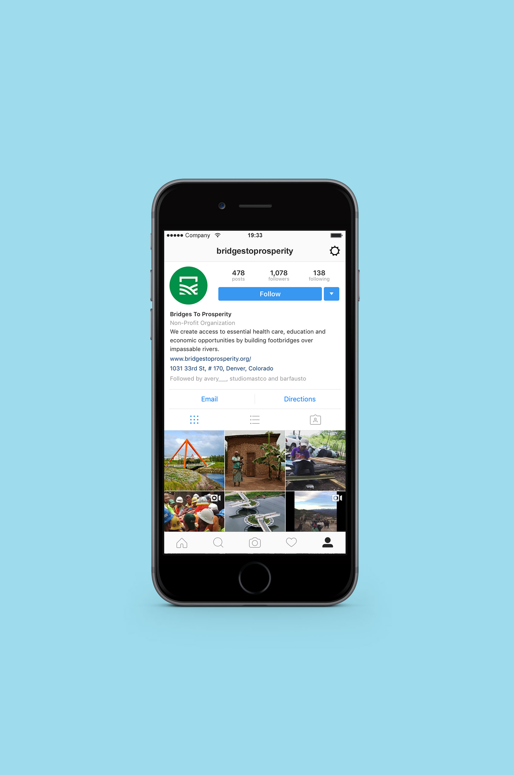
Faithful execution of the brand online by the team at Briteweb.
After the initial launch of the Bridges to Prosperity identity, we worked with them to develop sub-brands based on the main symbol. Creating a unique set of brands that can naturally live together.

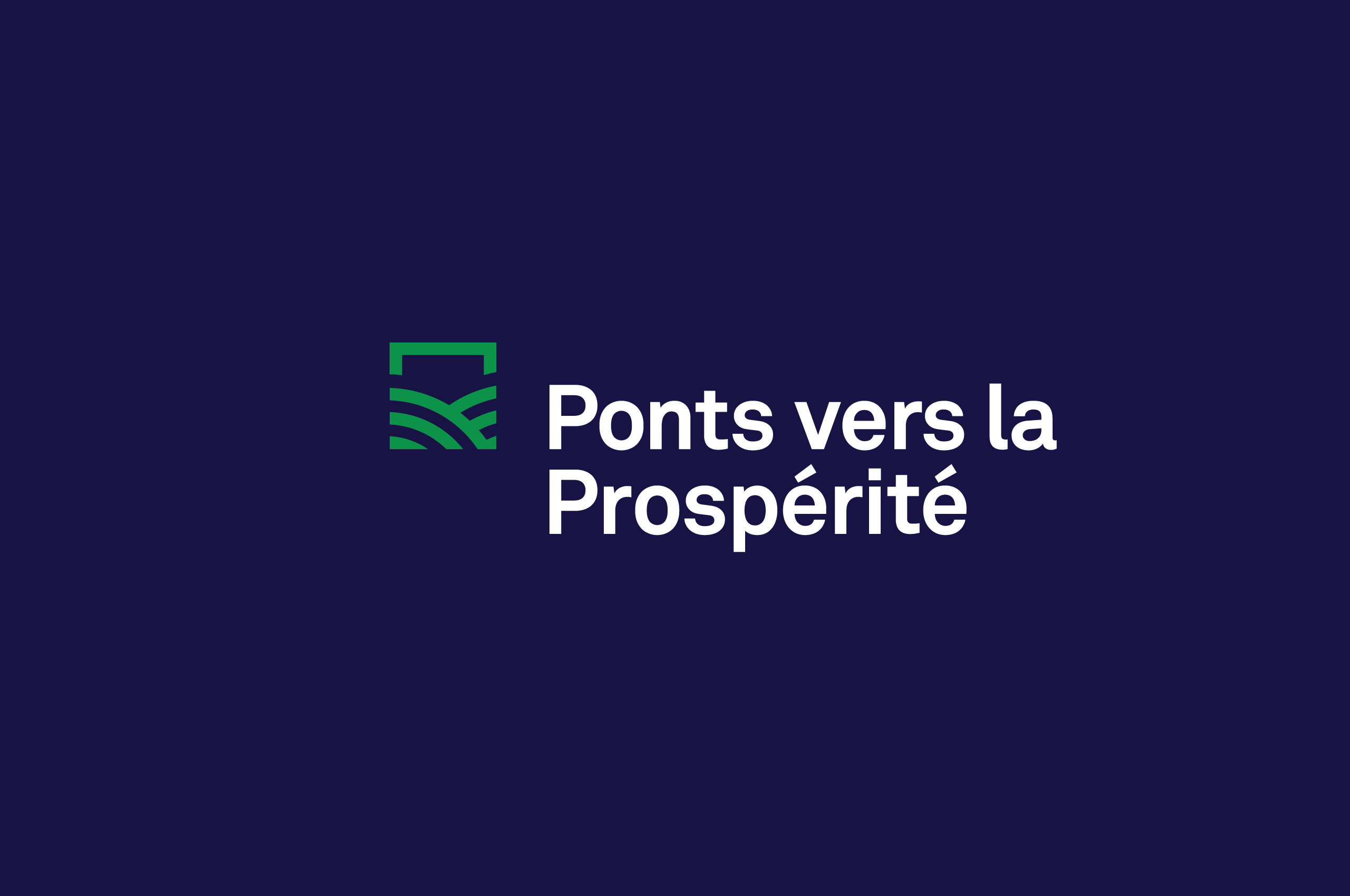
Bridges to Prosperity works in many different countries, many that do not speak English. We worked with them to develop a unique set of wordmarks in Spanish, French, and Haitian Creole that fit seamlessly within the system.