Big Compass
Working to harness the power of integrated data systems to provide long-lasting results.
Working to harness the power of integrated data systems to provide long-lasting results.
Big Compass helps companies harness the power of integrated data systems to streamline operations. Allowing their clients to move faster, make fewer mistakes, achieve even greater customer satisfaction, and reduce cost. All of this is achievable by building bespoke integration solutions for companies of all sizes. They develop intelligent and reliable solutions that accelerate businesses’ productivity and simplify their day-to-day operations, creating real, lasting, long-term transformation for their clients.
Working in such a seemingly complex industry, they wanted to create an evolution to their brand that echoed the simplicity of their solutions and the clarity they provide for their clients. We worked with them to build upon their established brand equity to create an elevated update to their core identity, ushering in a new chapter for the company, one that embodied their high-quality streamlined work, balanced with their fun outlook on work.
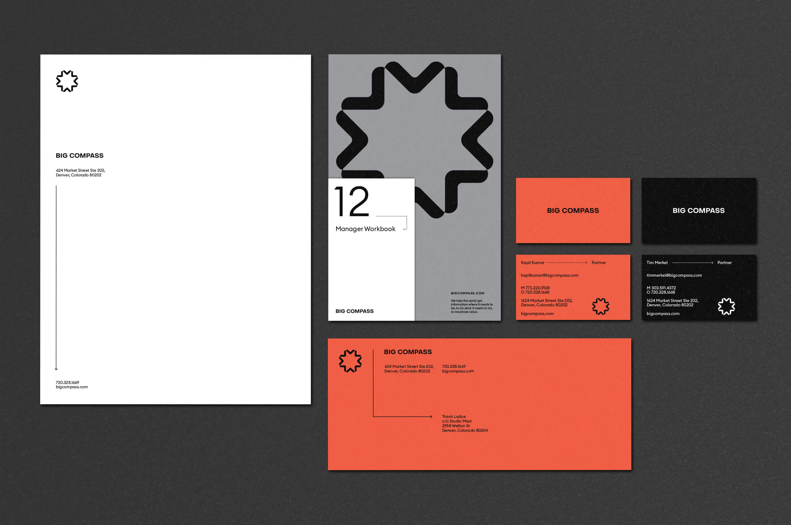
With an updated symbol and wordmark, we created a clean, modern, and streamlined buildout to mirror the clarity Big Compass provides. By utilizing their established color palette, we ensured the brand equity and emotion of the current brand was intact while maintaining their clear market distinction. The result is a clear, concise, and dynamic update.

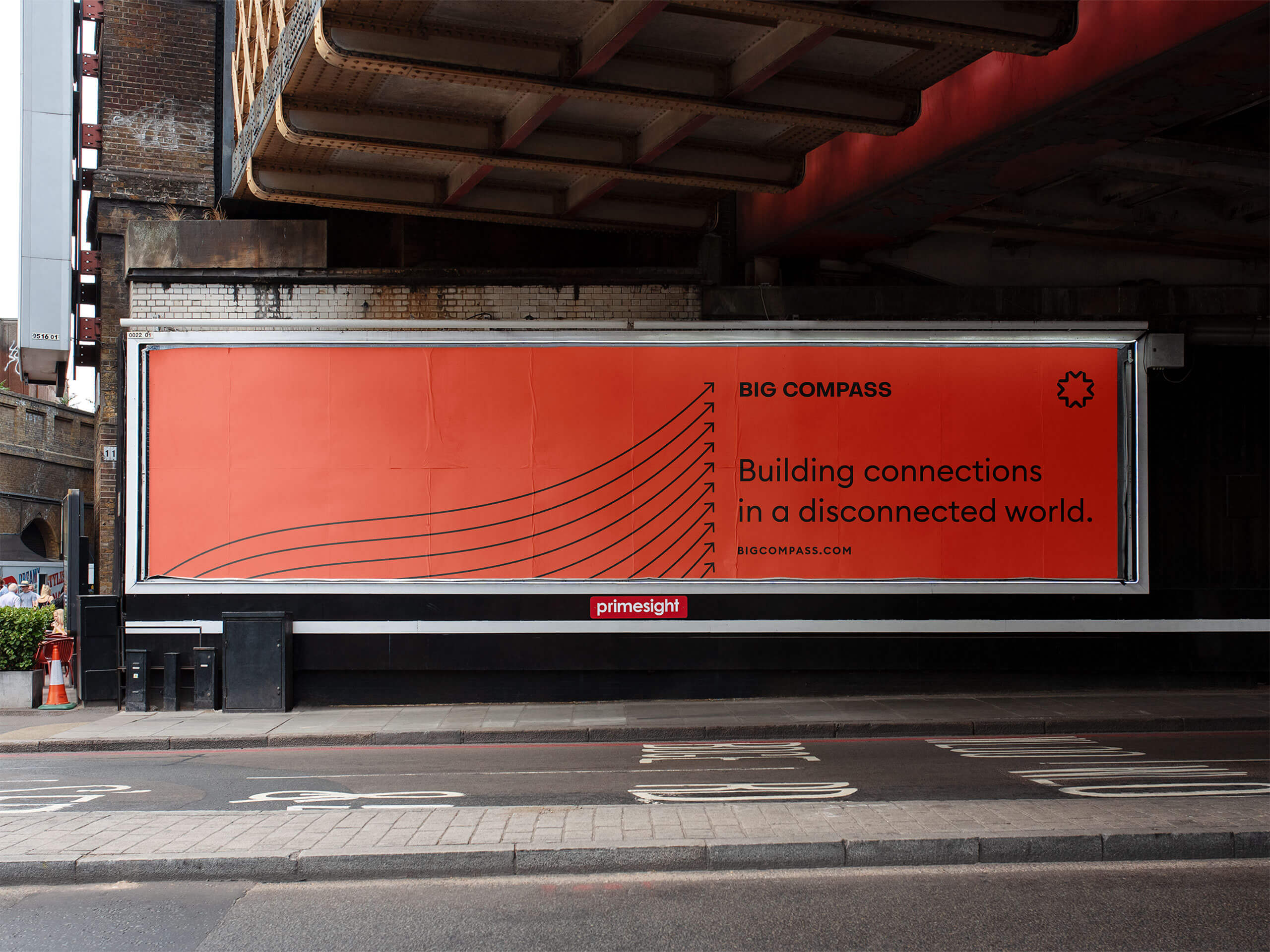
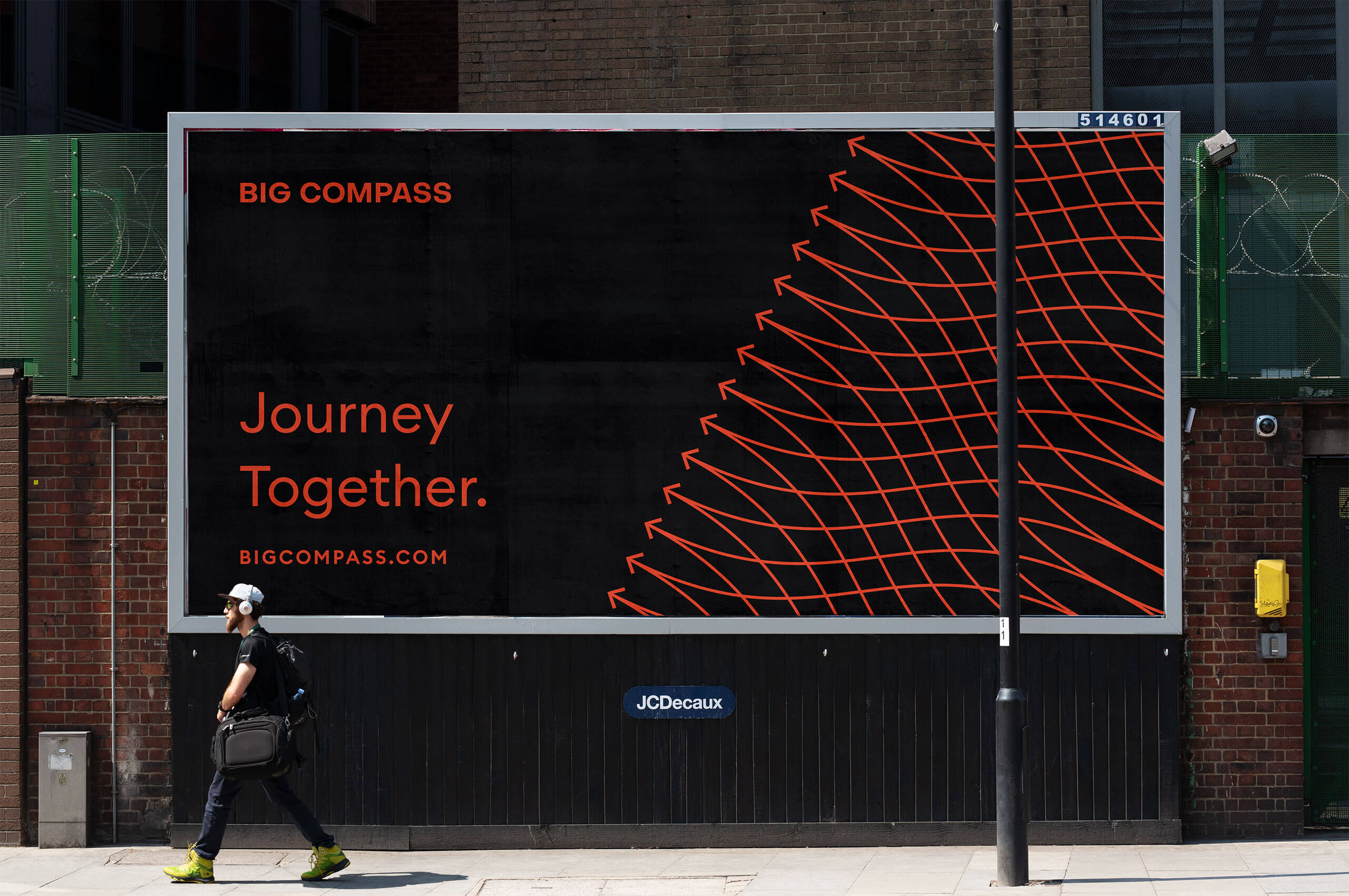
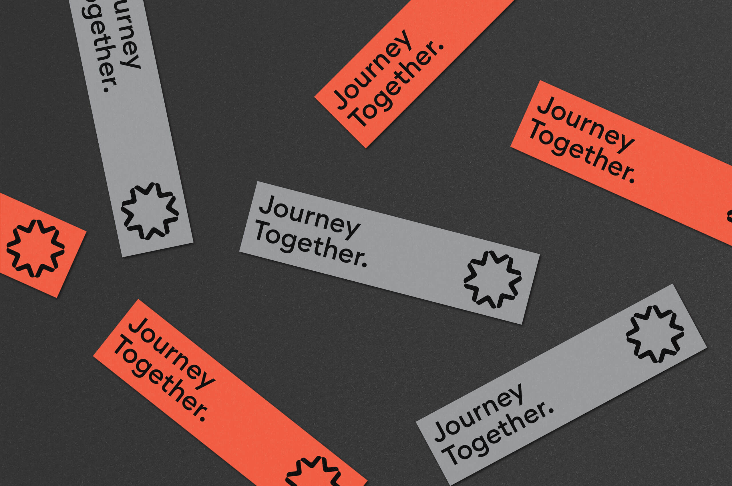
Big Compass isn’t concerned with quick fixes or fast solutions. They partner with companies for the long term, working together every step of the way; Big Compass calls it, the journey. This notion of a journey is paramount to their process and their partnerships. They are committed to finding the best solutions for their clients, even if that means pivoting down the road to adjust for changes.
We took great inspiration from this collaborative journey and knew it had to be present in the visual identity. We created a system that puts the focus on information while ensuring the journey as an integral part of the story.
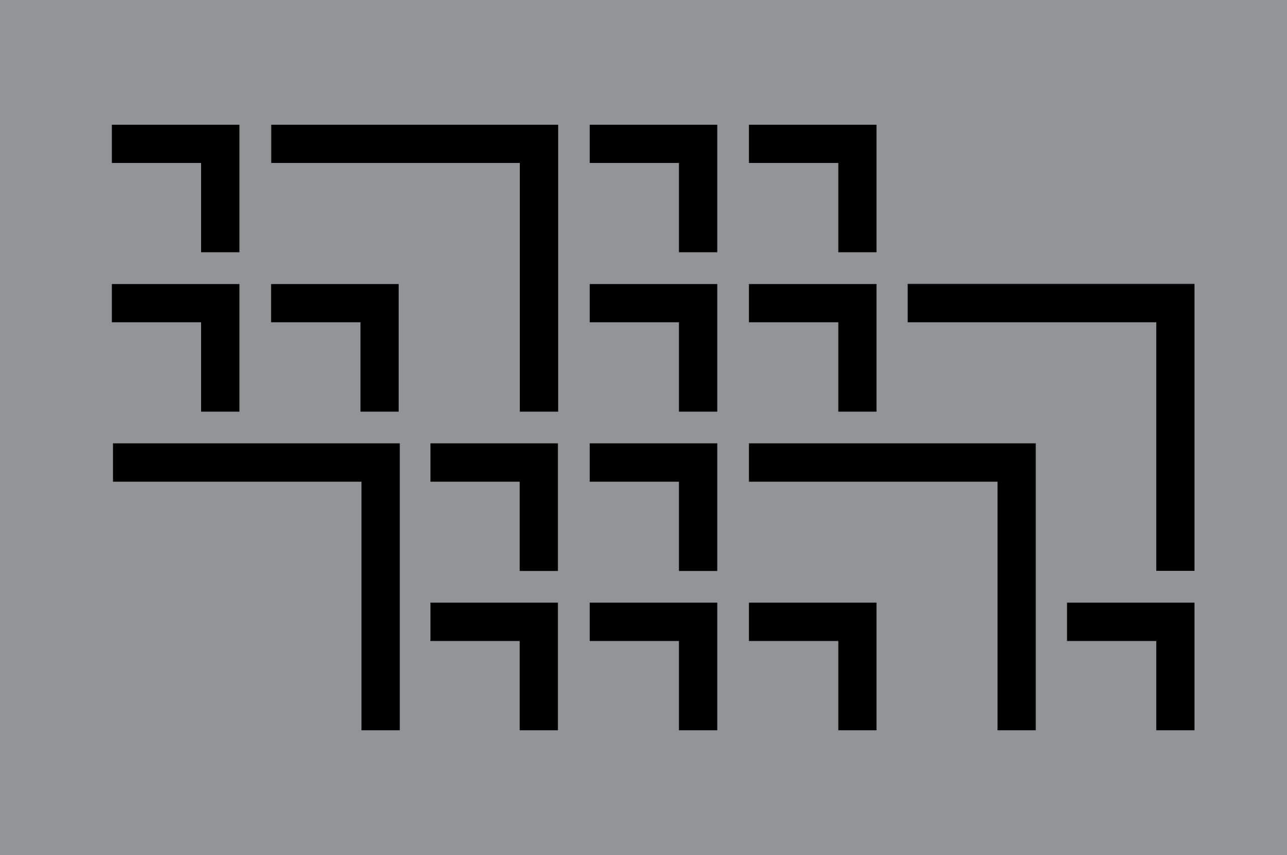
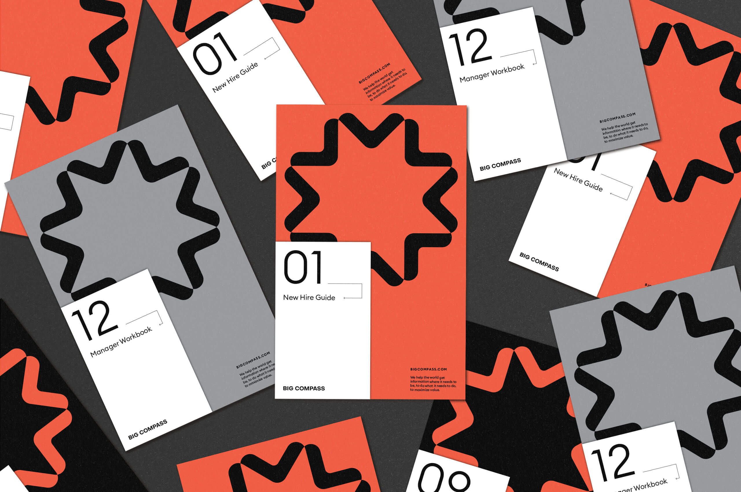
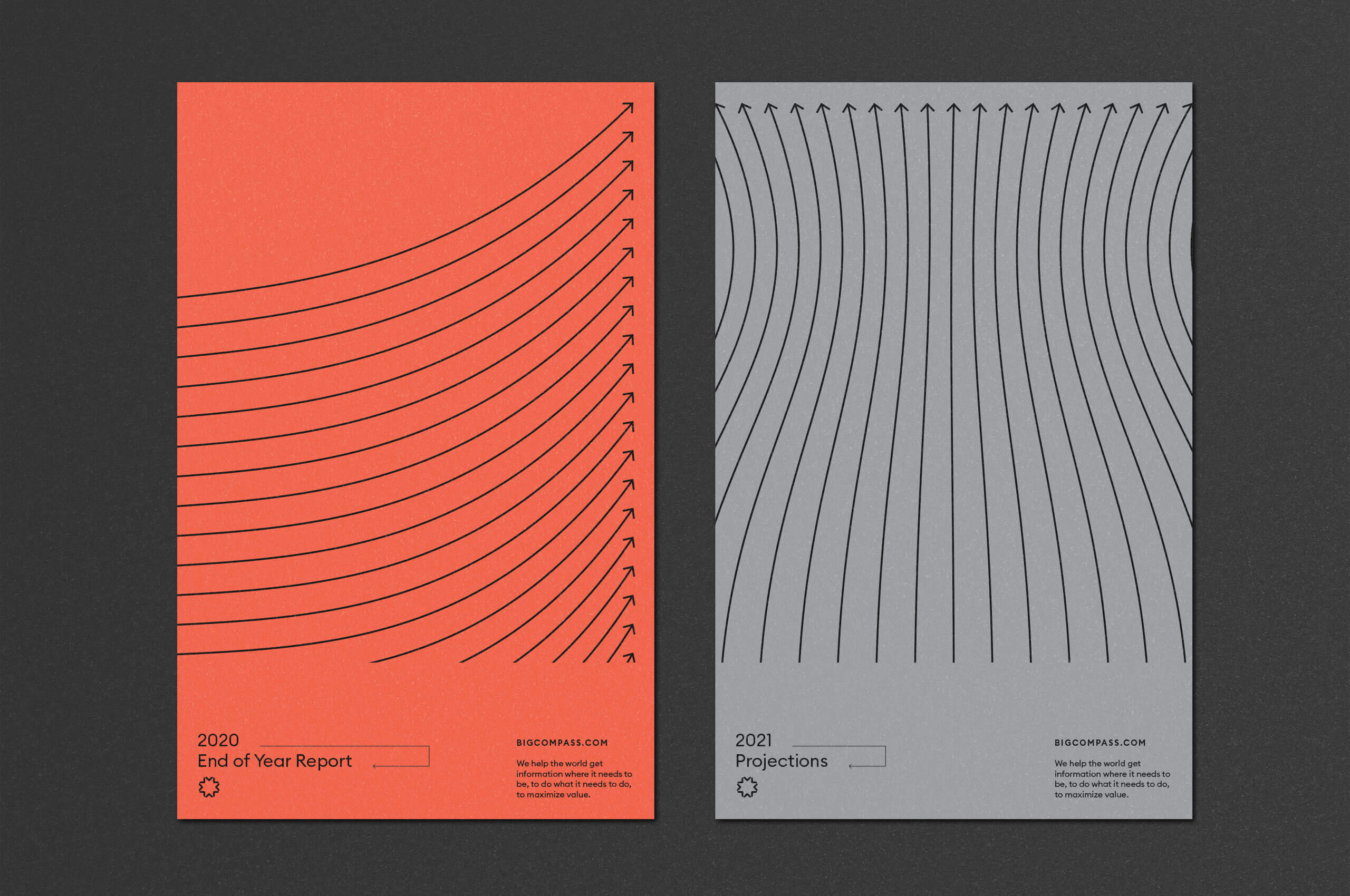
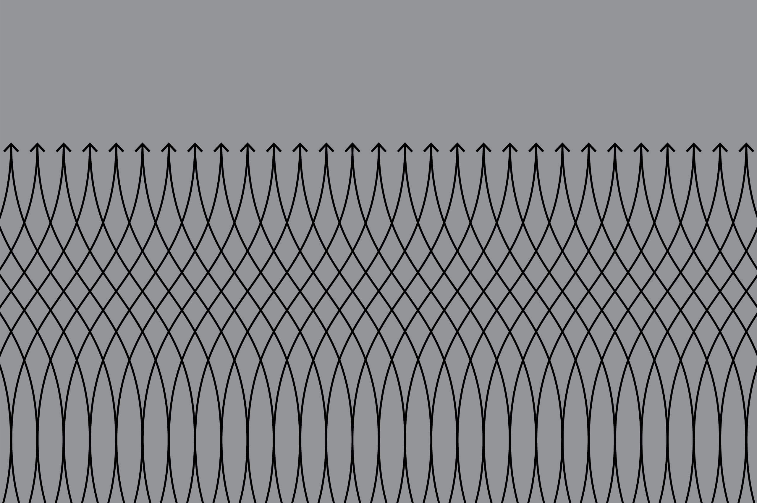
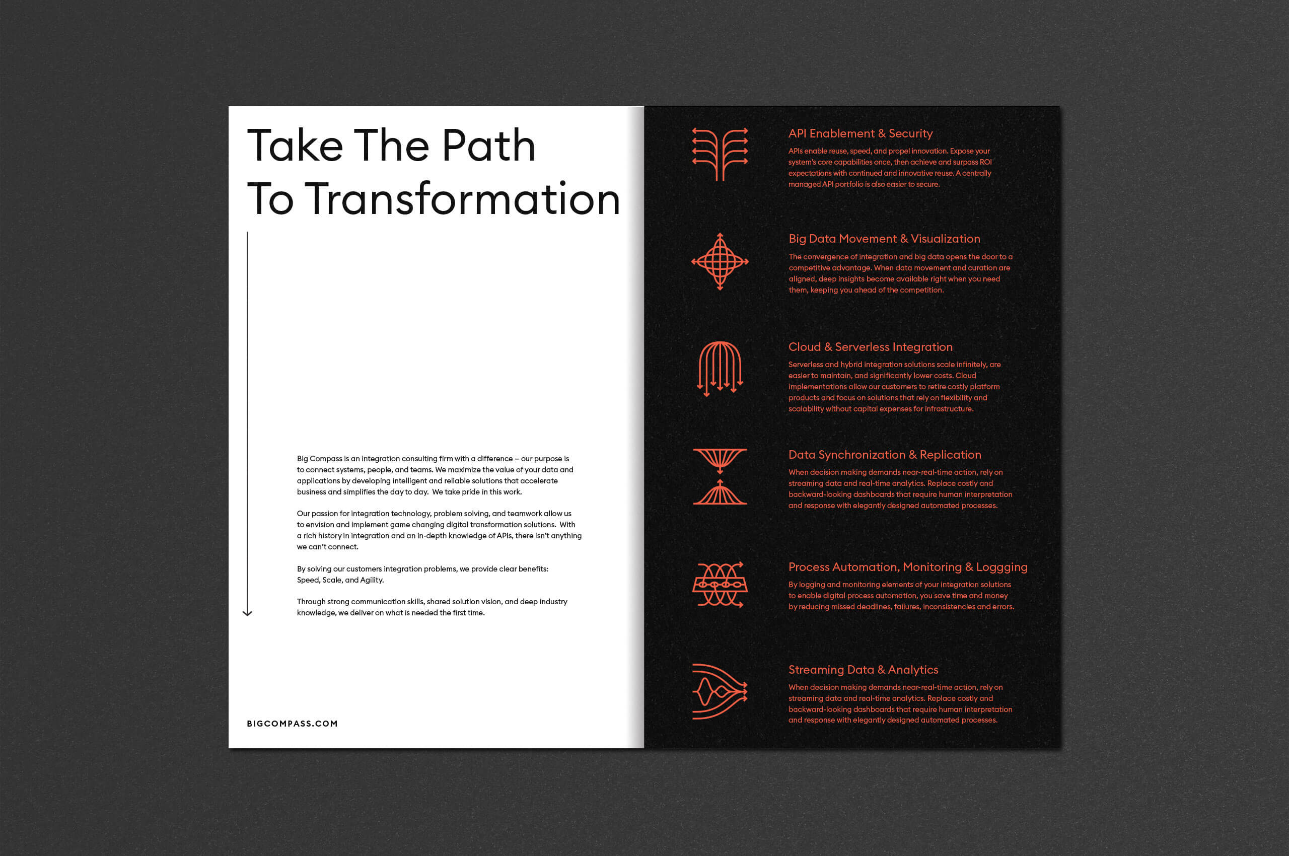
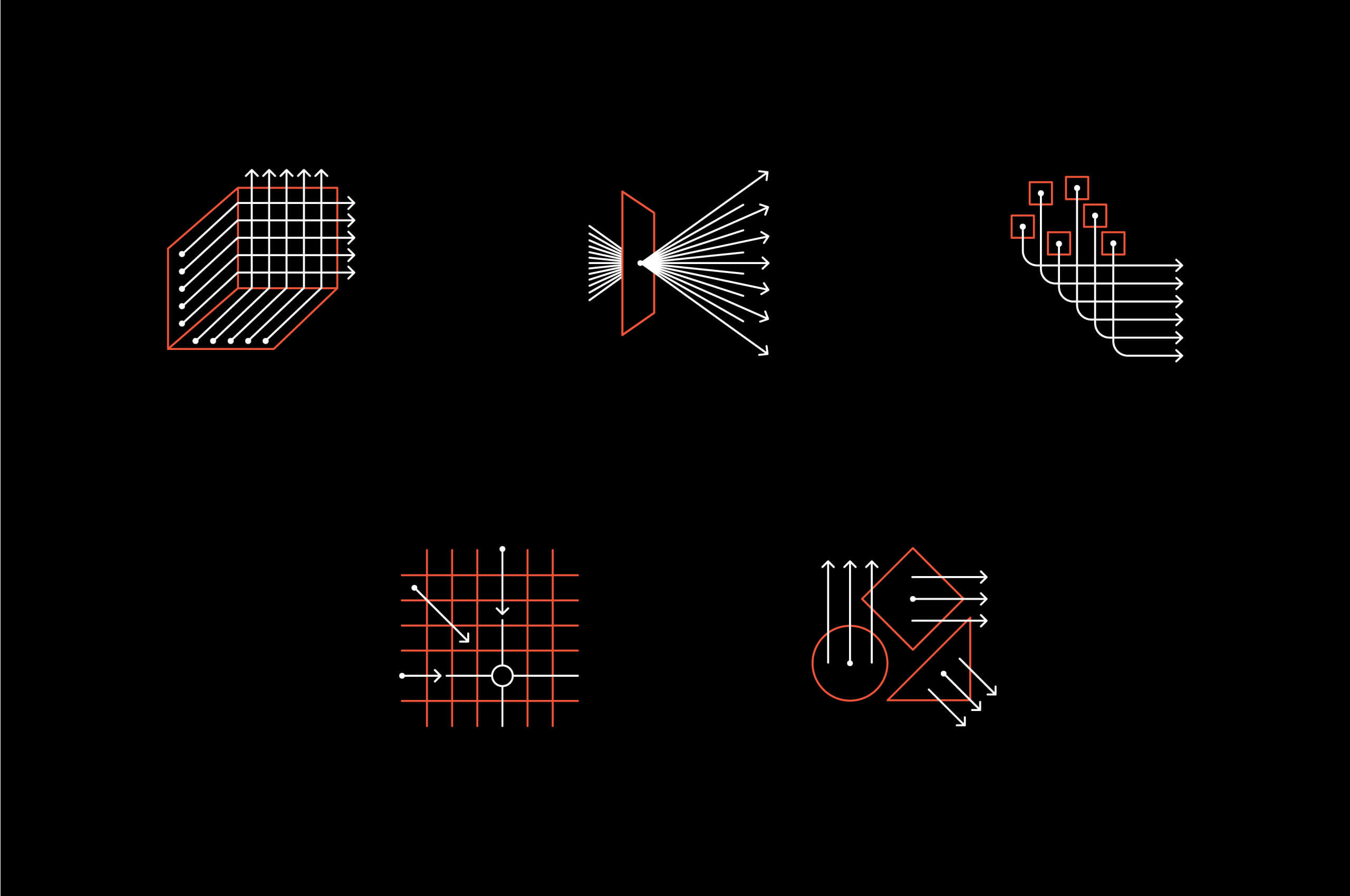
We designed a dynamic suite of directional linework elements to be used within the system, when needed, to tell the story of a journey. This linework structure is also present as an arsenal of unique patterns, which conveys the concepts of order, disorder, and partnership.

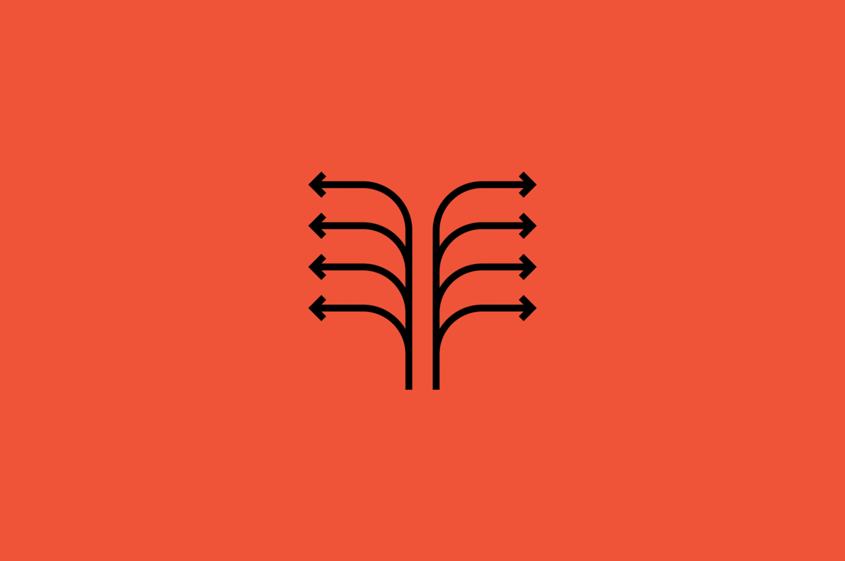
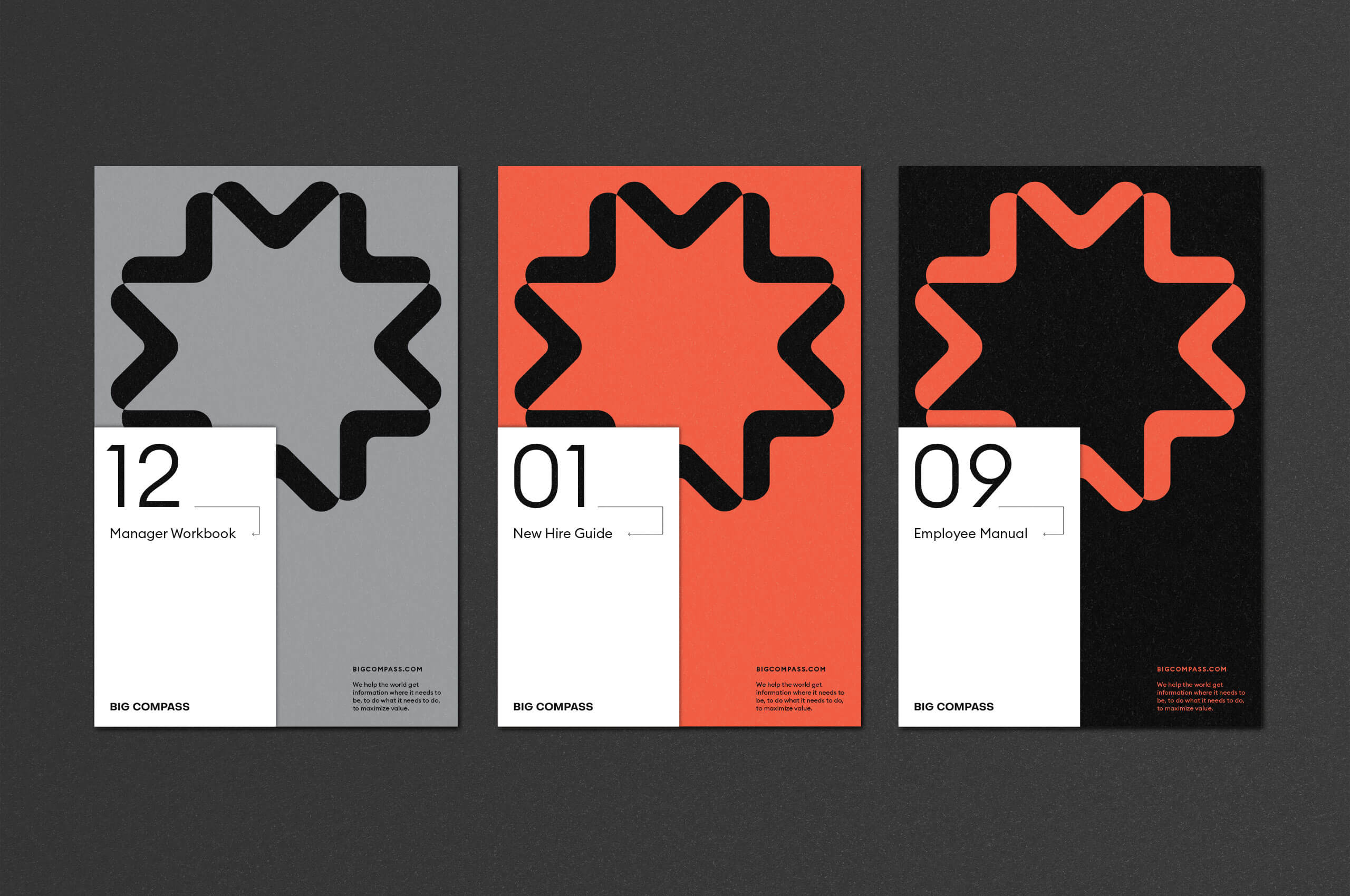
The linework was extended into a unique suite of icons to be used in print and online, establishing a natural connection within the system as a whole.
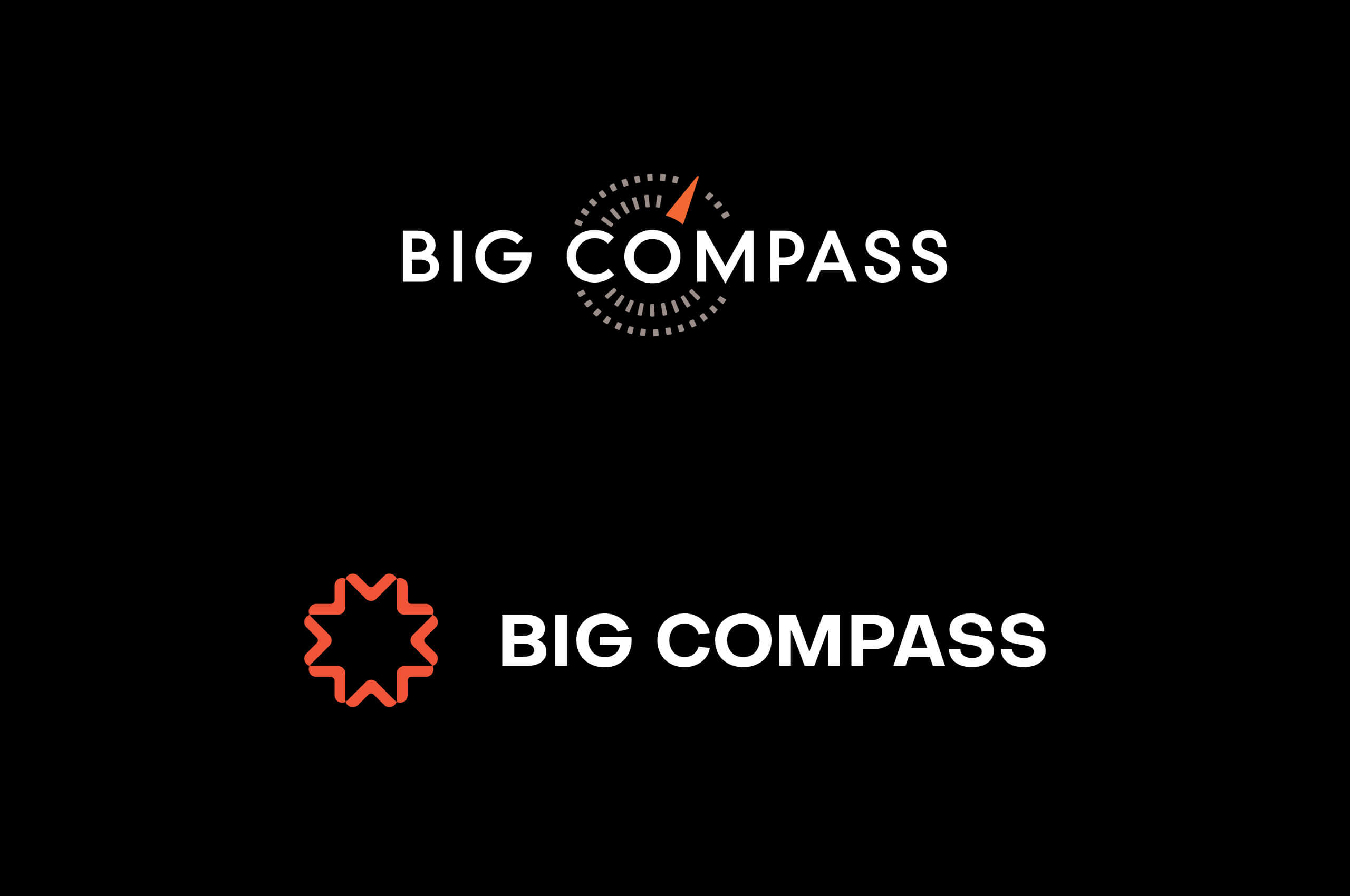
Before / After
The usability of the previous mark suffered, as the symbol was anchored within the wordmark. Creating difficulties across the board.
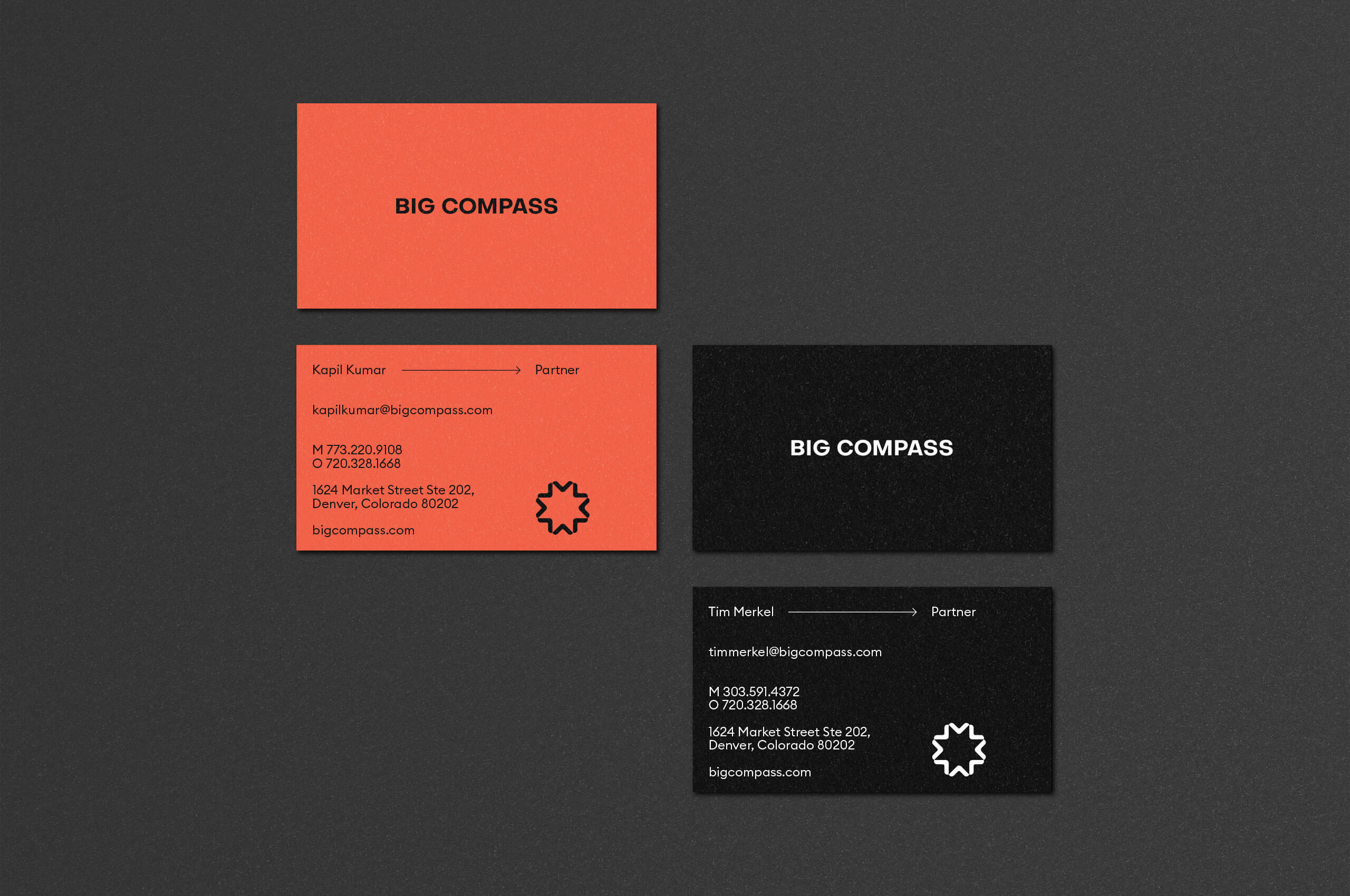
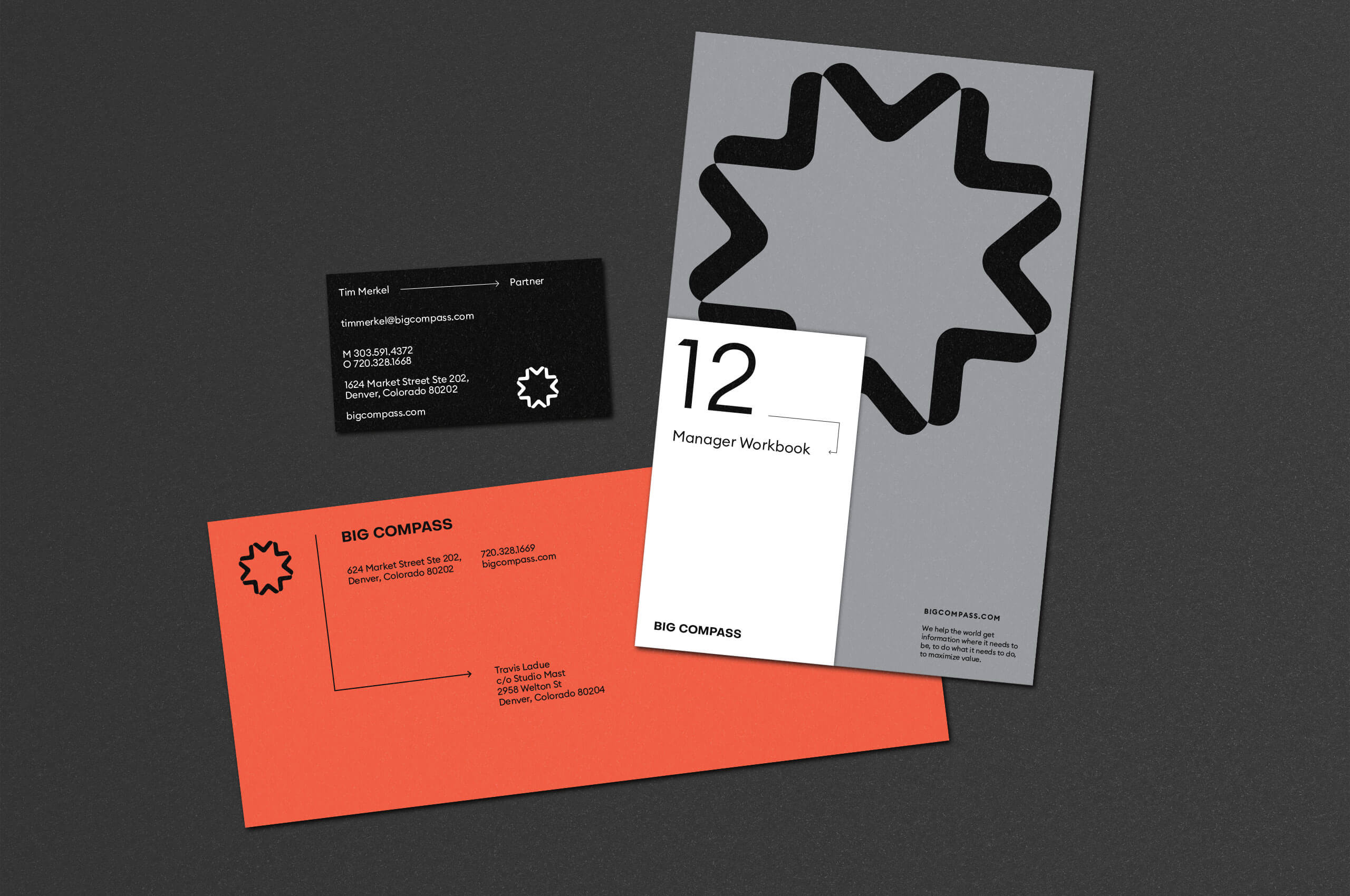
We worked to remove the symbol from the wordmark, enabling a wider range of flexibility within the identity, while creating strong equity for the individual elements when used throughout all touchpoints.
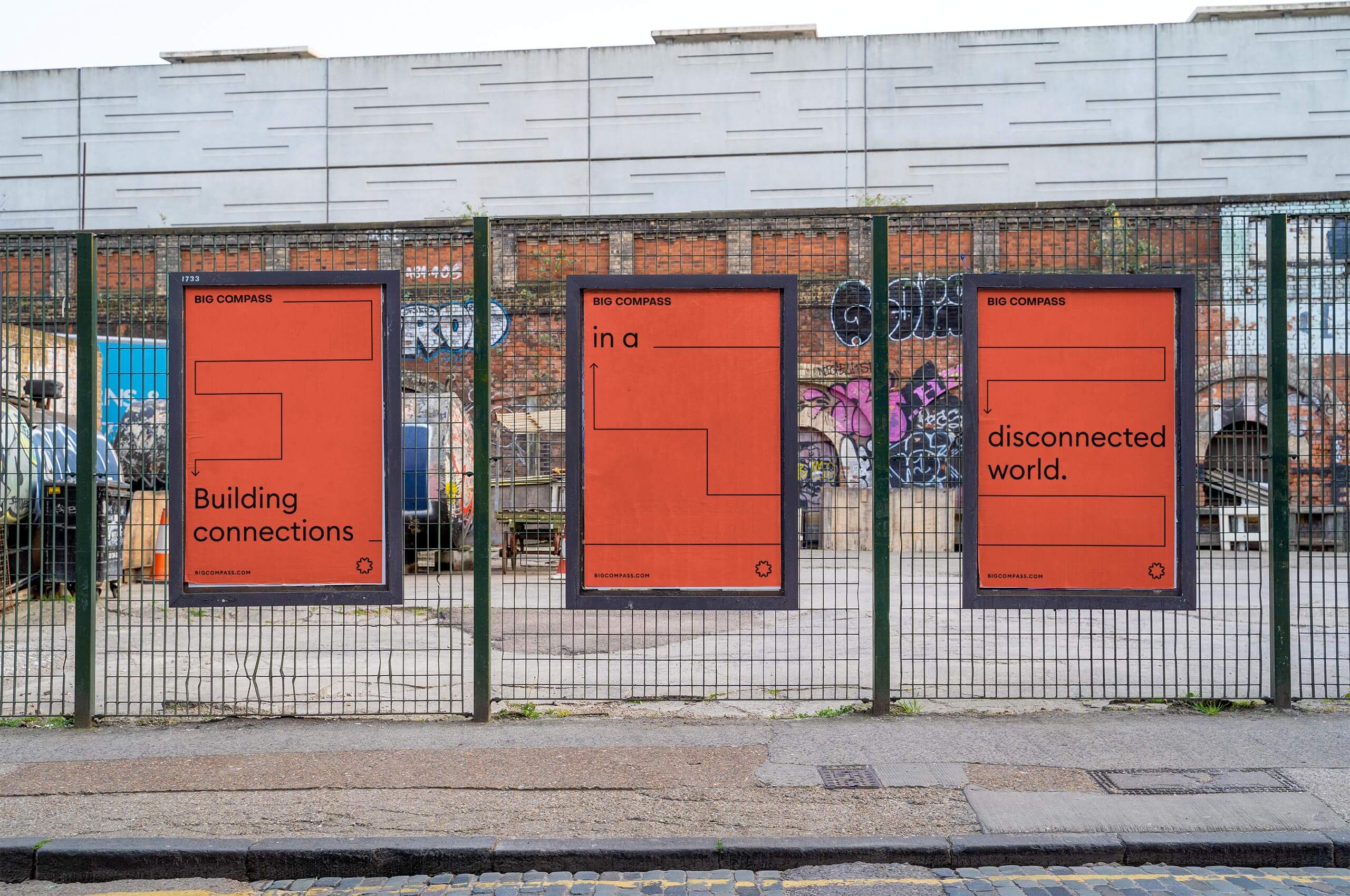
The linework system can be expanded and contracted when needed, depending on the specific application. We developed a straightforward application based on the idea of building connections, and the journey Big Compass takes with their clients. This particular linework application often works to tell a story by intermixing with text.
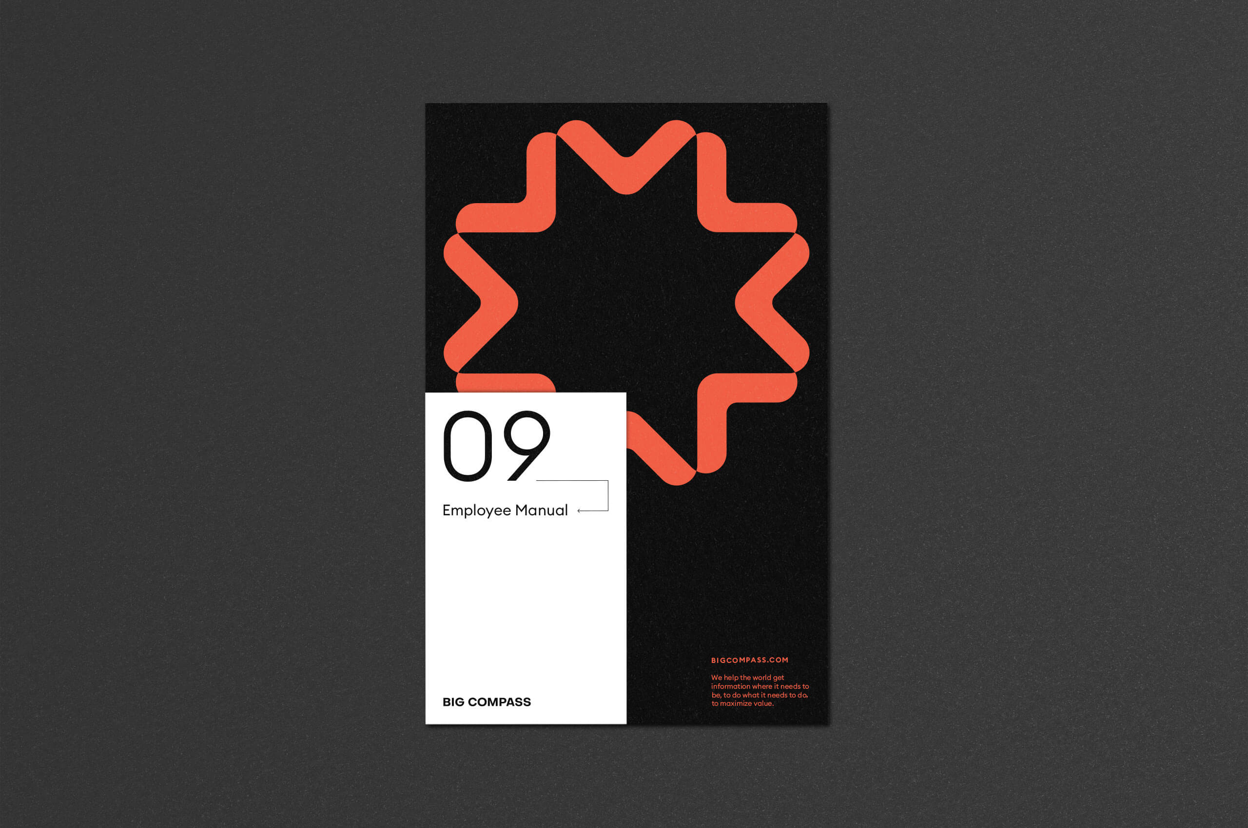
A more playful application, it is often used in small applications throughout the printed and digital buildout of the brand.
We worked closely with Chad Morgan to ensure the updated brand was faithfully executed throughout the digital experience and website. Design and development by Chad.
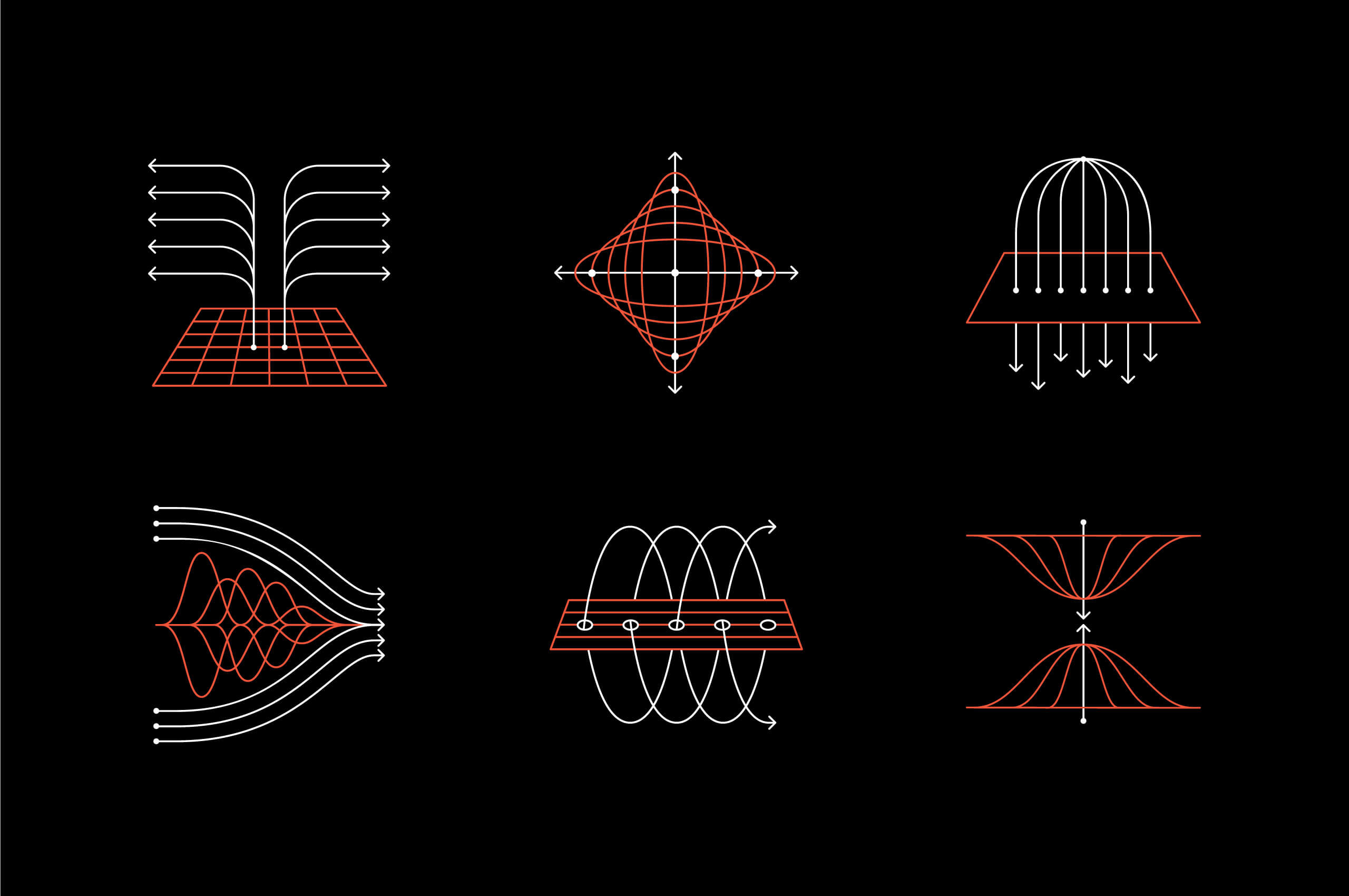
The linework system was further extended into a set of illustrations to be used across the website. We built upon the iconography system to create more substantial illustrations to help convey more complex topics while ensuring visual cohesion across the site. We worked with Bryan Butler to develop these larger illustrations.
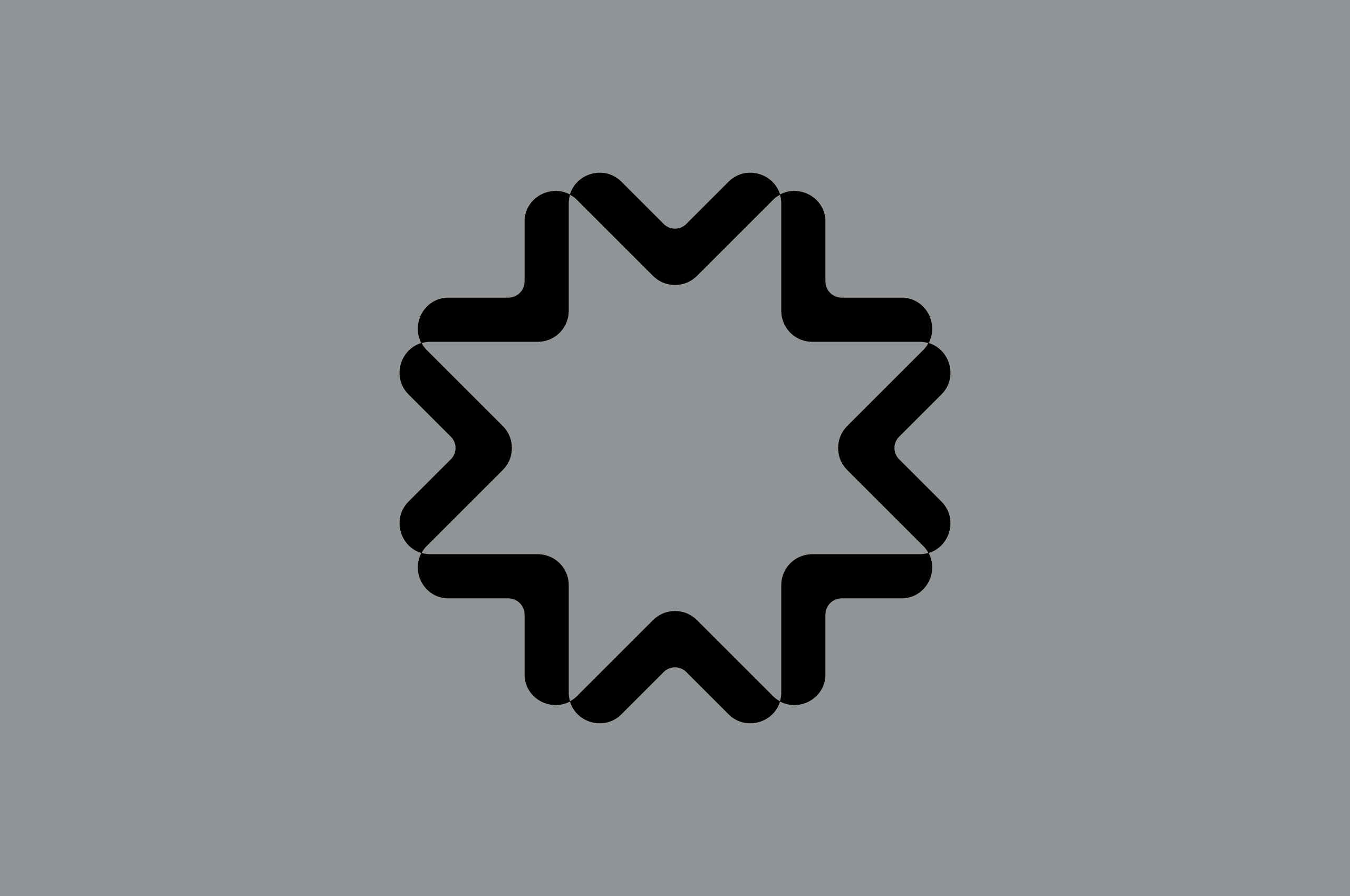
When developing the symbol, it was essential to develop a natural progression informed by the previous symbol — in an entirely new visual form. Previously they utilized a more literal compass as their symbol. The team wanted to move away from the representational nature of this symbol to create a new more abstracted symbol, informed by the overarching visual motifs found within a compass.
The end result was a symbol that references the directionality of a compass while pointing outward and inward. Simplifying the directional forms to showcase the journey and the importance of an internal focus and partnership.
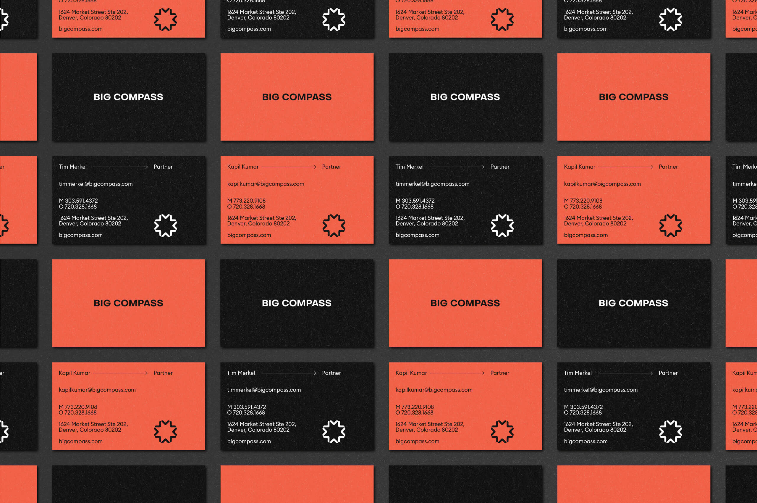
With the modularity of the system, it was important to develop a symbol that has the same impact when utilized on its own, or with system elements.

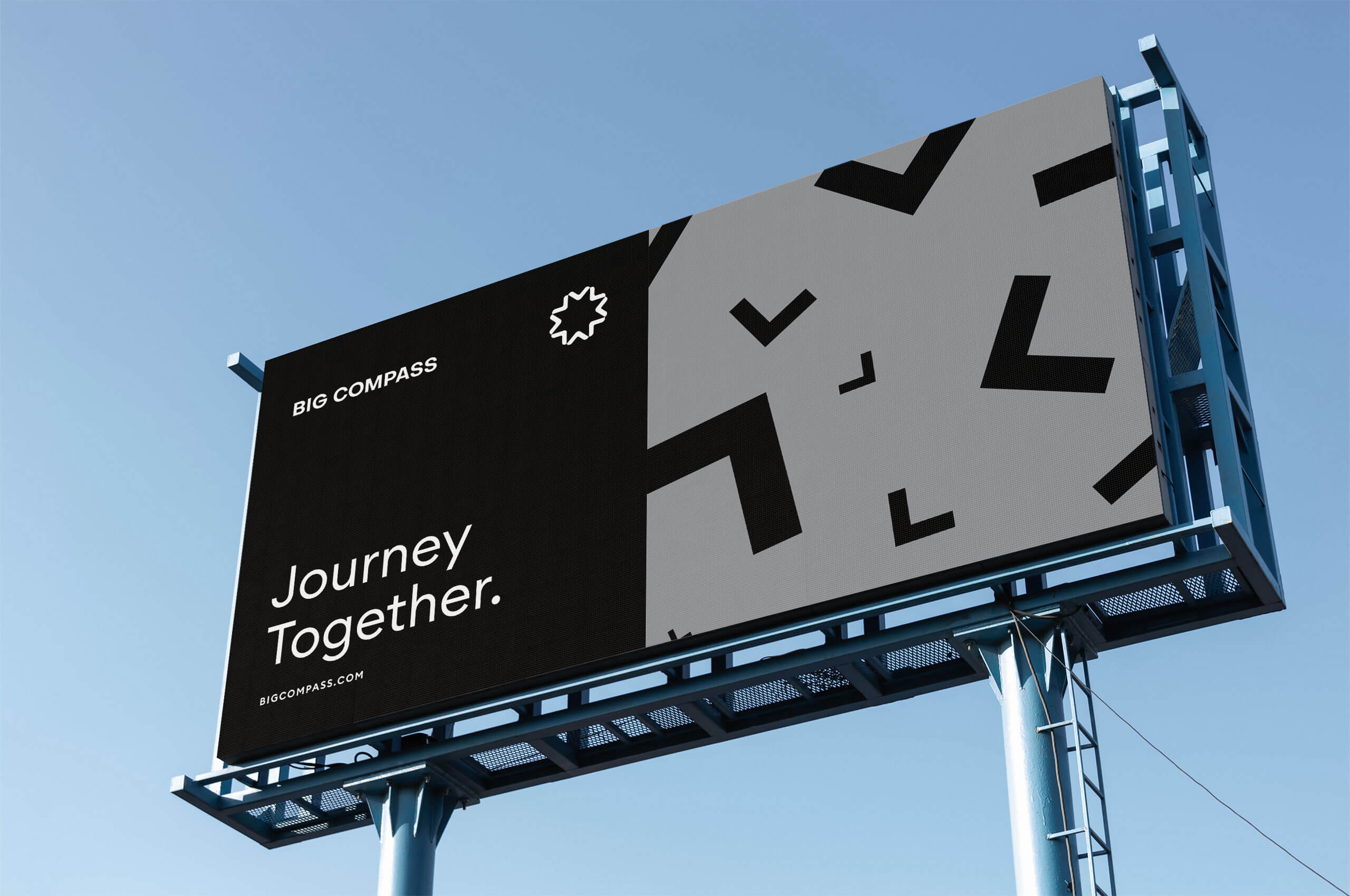
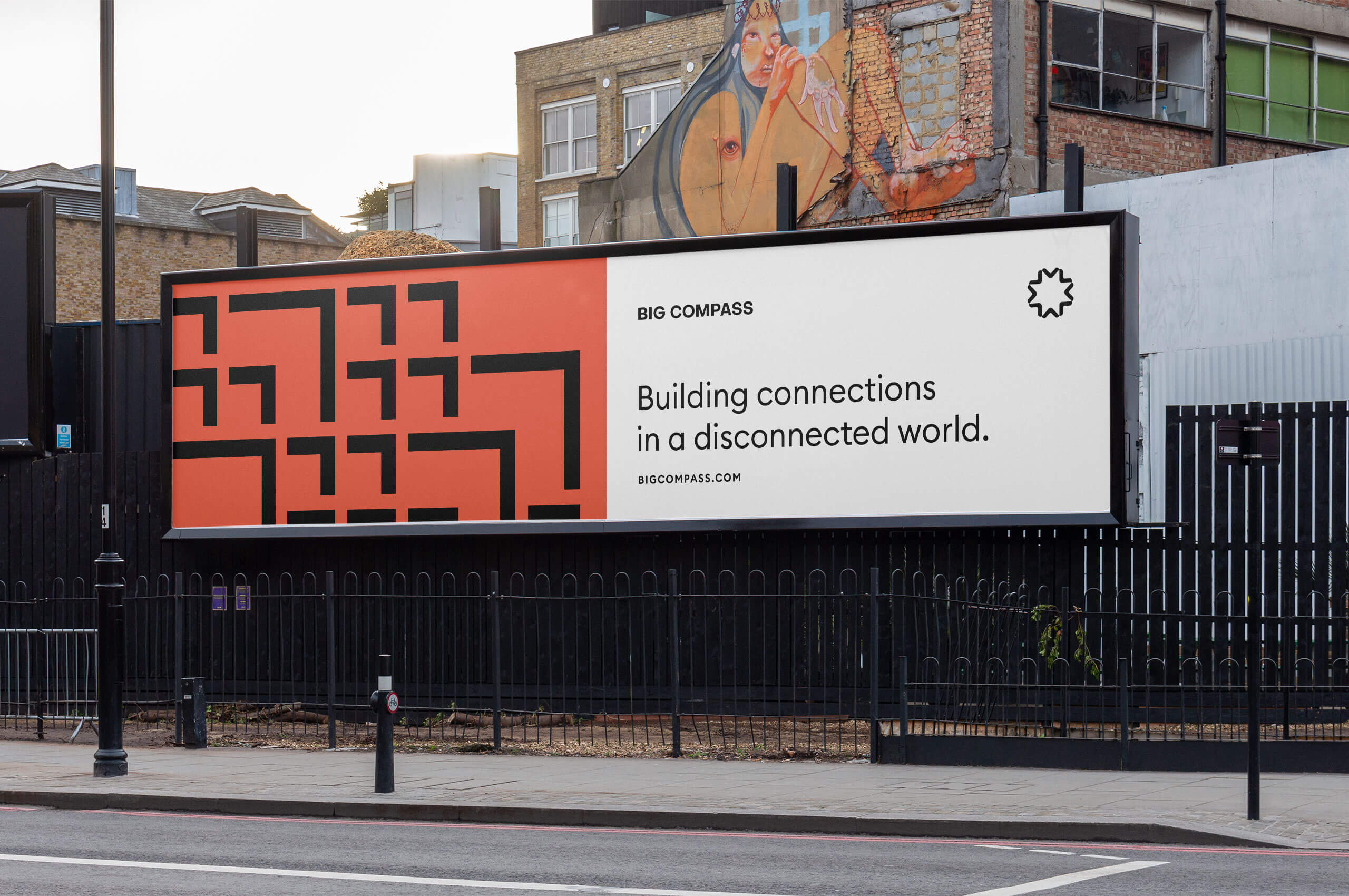
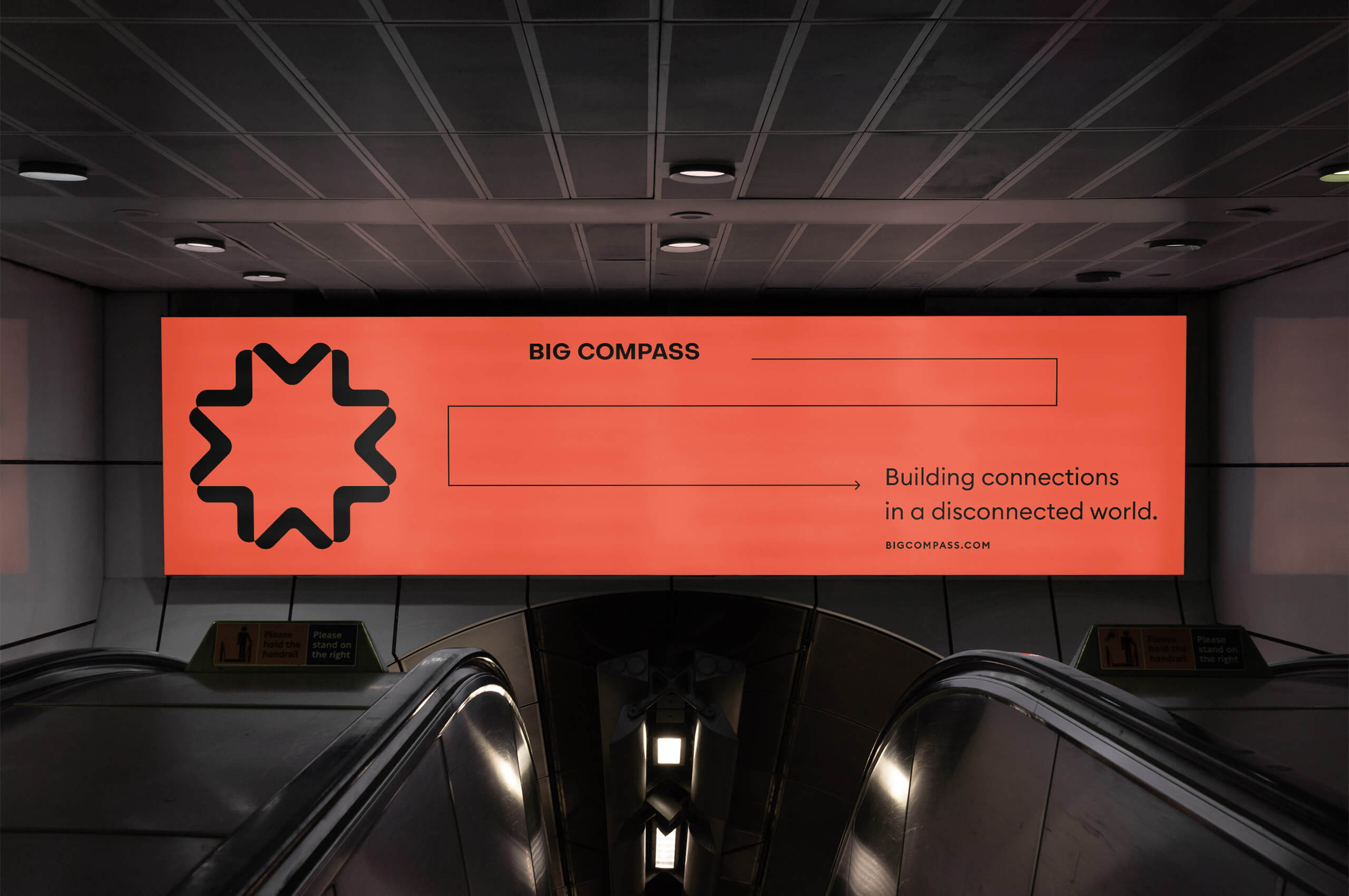
Based on the directional arrows of the symbol and the concepts of order and disorder, we developed a set of large-scale impactful patterns to be used in physical outward-facing brand applications; mostly in advertising and in-person events, such as tradeshows.