Santa Fe Vintage
A world-renowned vintage collection in New Mexico.
A world-renowned vintage collection in New Mexico.
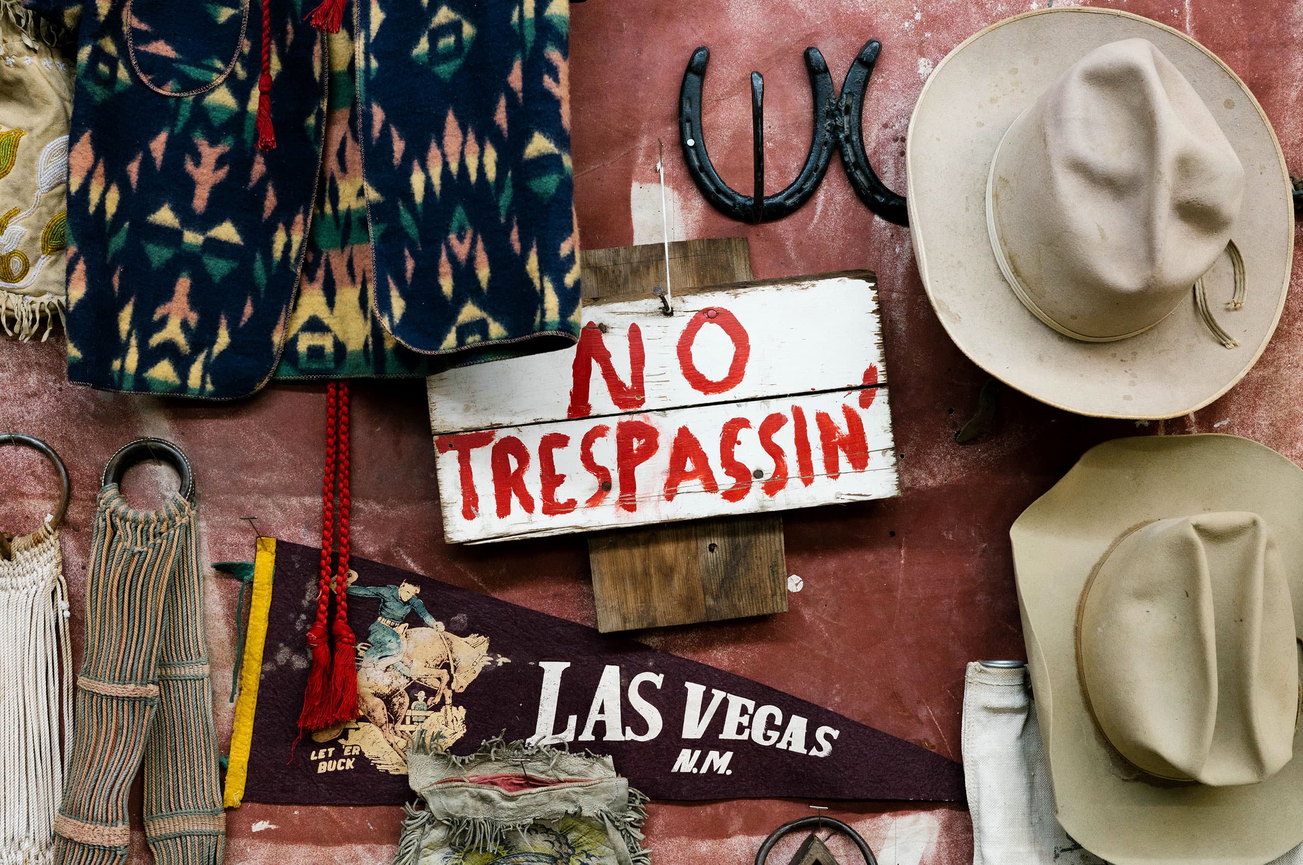
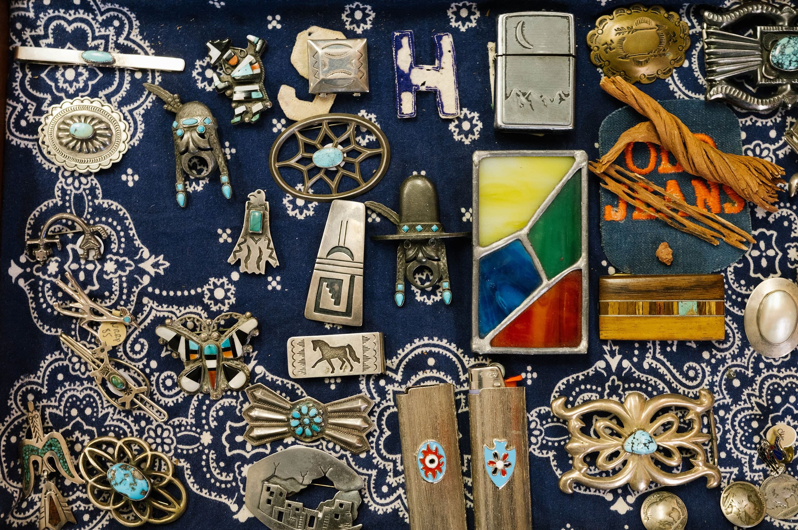
Founded by Scott Corey, Santa Fe Vintage is an appointment-only showroom with a carefully curated collection of Americana clothing, art, and objects. After over 30 years of collecting, Corey cemented Santa Fe Vintage as a world-renowned showroom. Sadly, in 2019 Scott passed away, handing the reins to his longtime collaborator and buying partner, Teo Griscom to continue Scott’s legacy.
In 2020, Griscom contacted Mast to help create an identity for the showroom. After never having an identity in the past and doing more and more work digitally, developing a recognizable brand was essential. We worked closely with Teo to create a brand that would pay homage to the history of the business, the place, and Scott.
The result is a brand inspired by the rich history of Santa Fe and the spirit of collecting good, simple things that are designed to last.

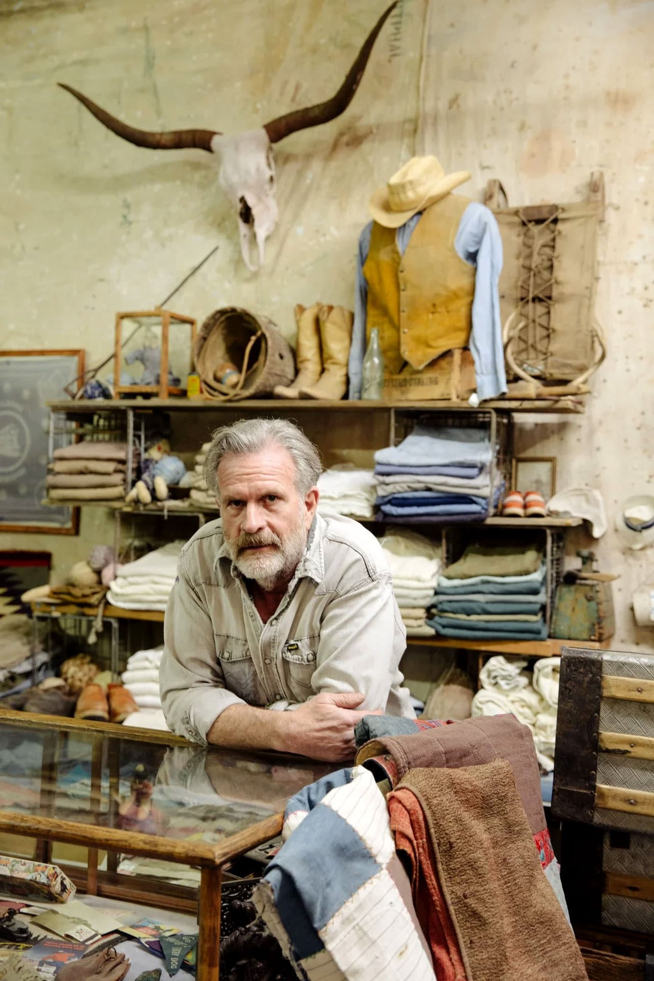
After a successful music career that ended in a hand injury, Scott Corey found himself in Santa Fe in the early 90s at the start of a vintage clothing career. With a background as a cowboy in Oregon, his knowledge of the vintage West played a significant role in this career shift.
He expanded the collection far past western wear and into vintage military, biker jackets, rare denim, and mountain wear to become one of the foremost vintage showrooms in the country.
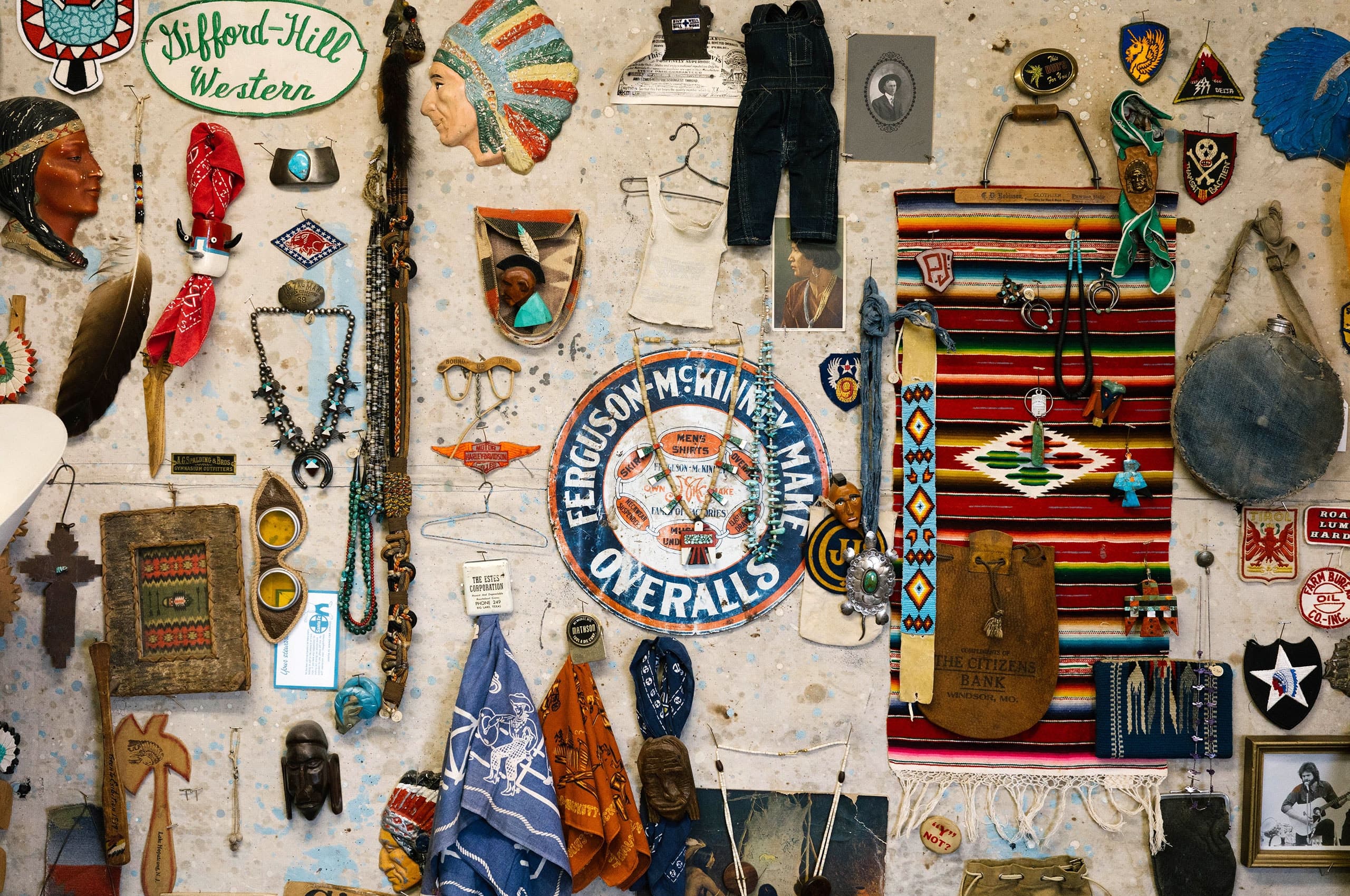
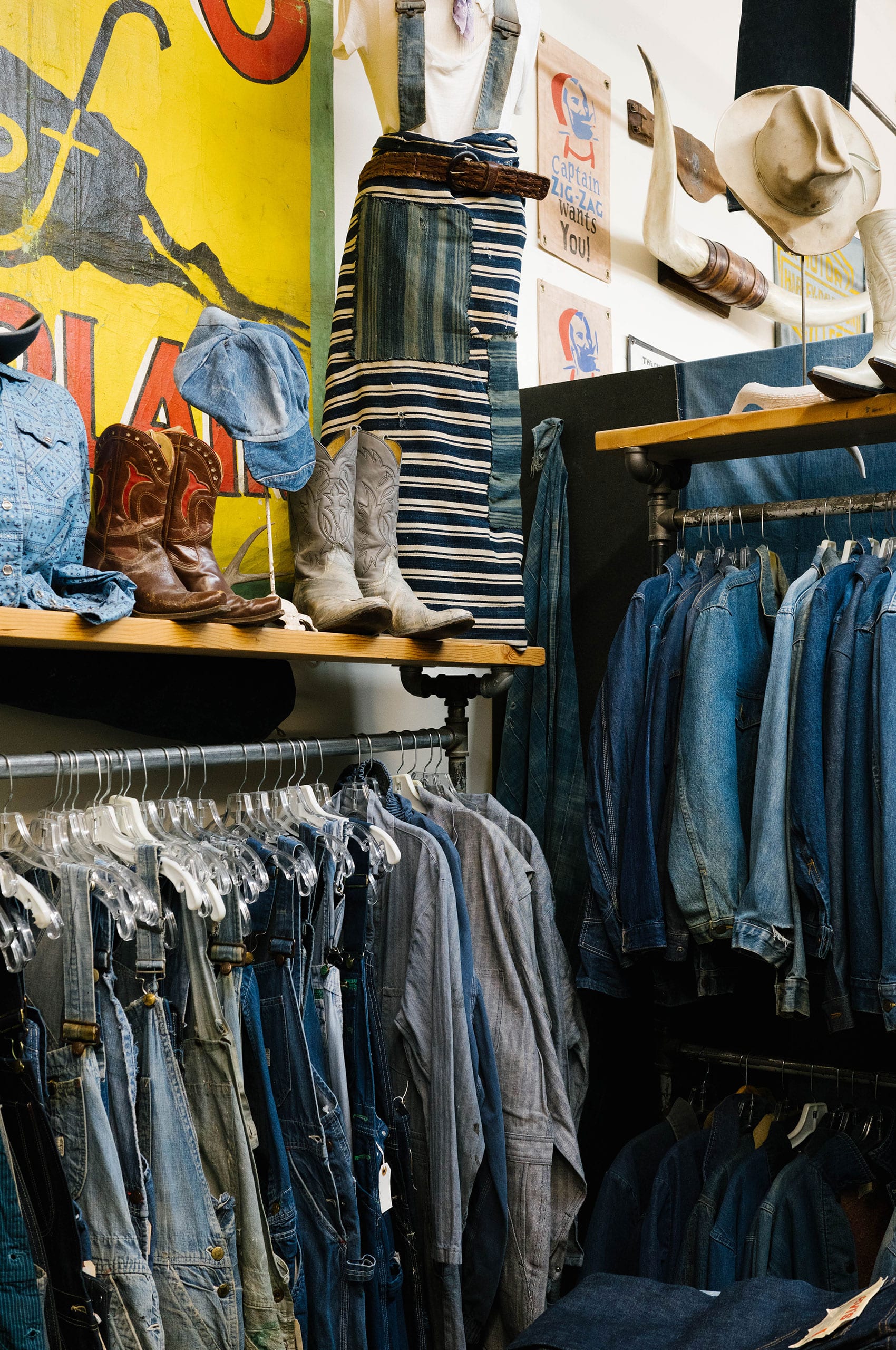
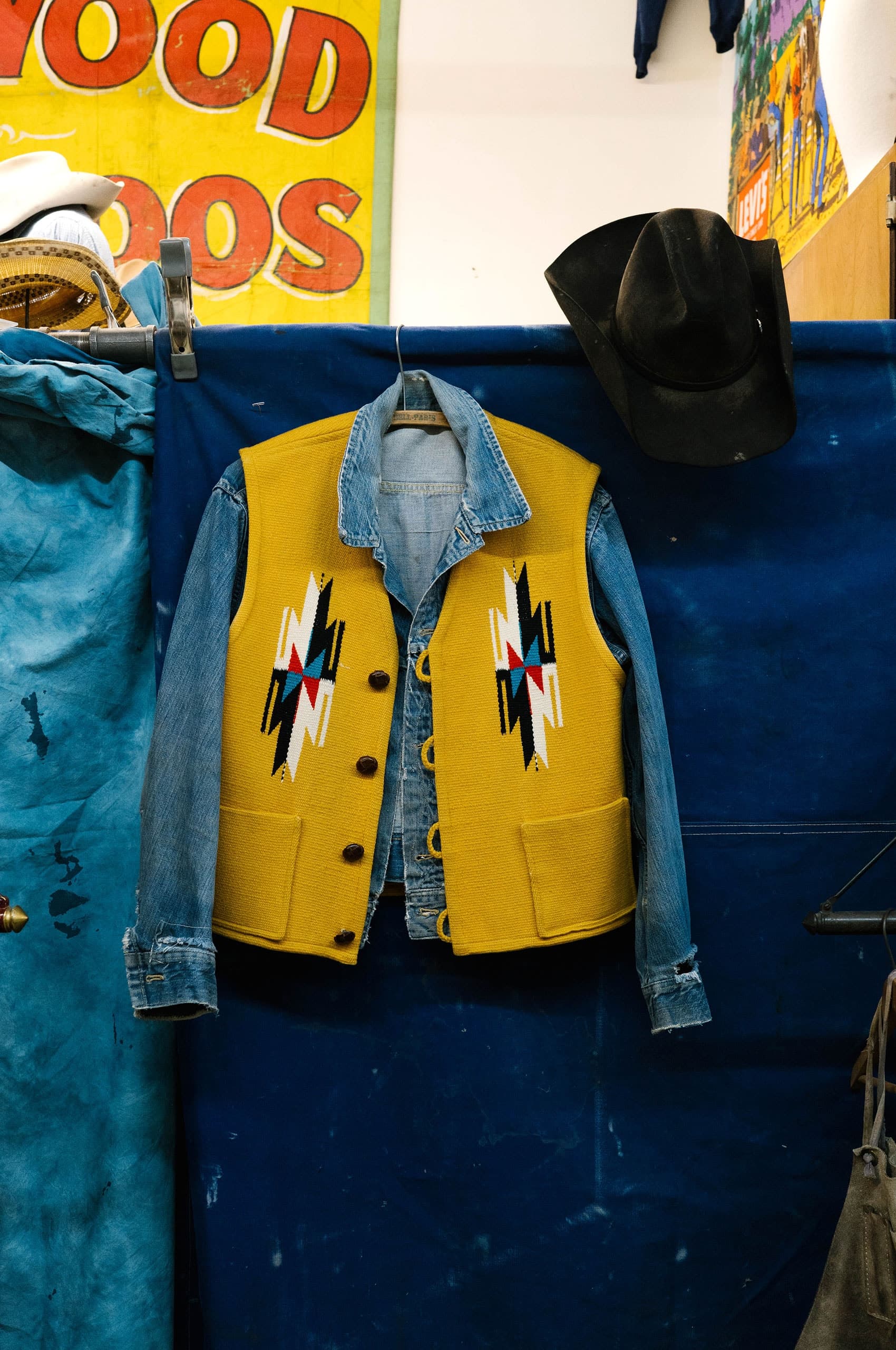
After almost a decade of working together, Teo Griscom and her husband took over Santa Fe Vintage after Scott’s passing. Working in fashion and design for over 20 years, Griscom was no stranger to the history and construction of quality garments. In addition to running the showroom, Teo works as a wardrobe and prop stylist for photoshoots and movies.
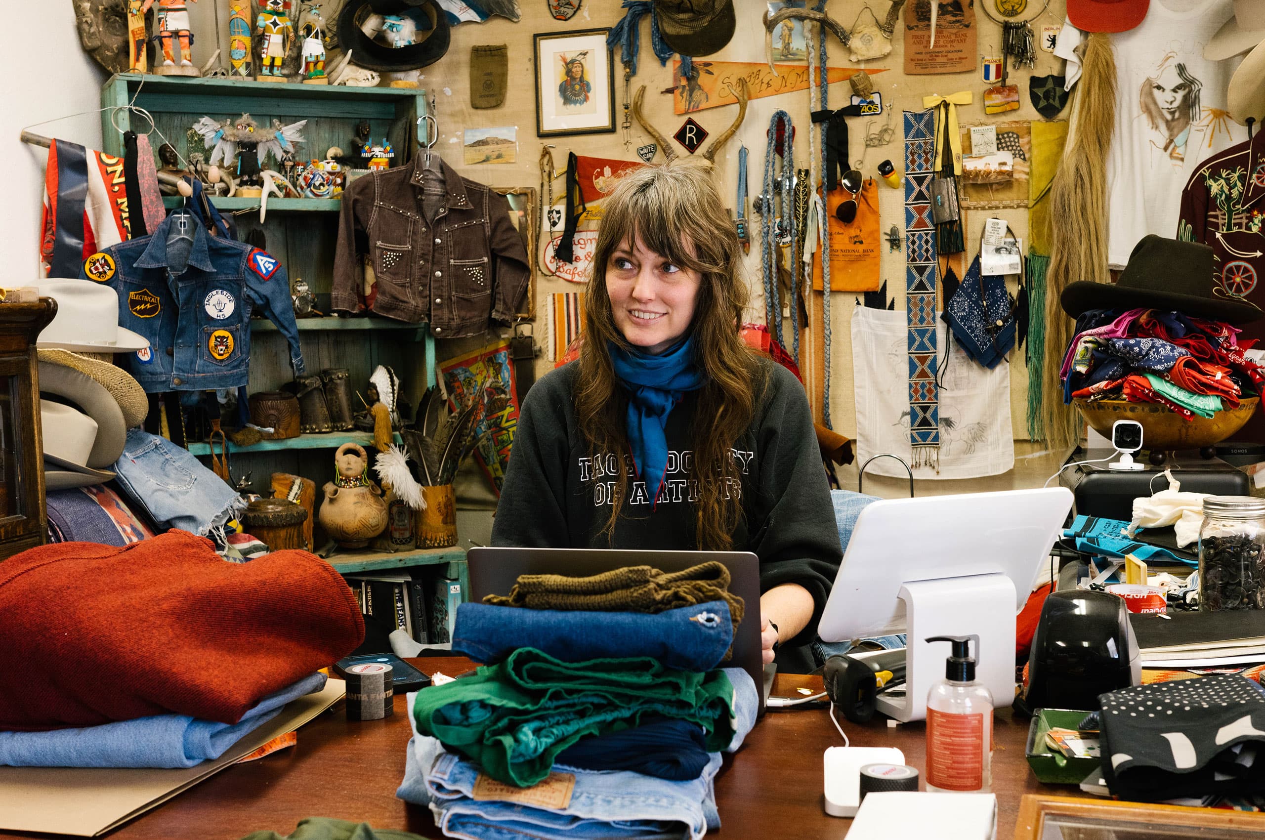
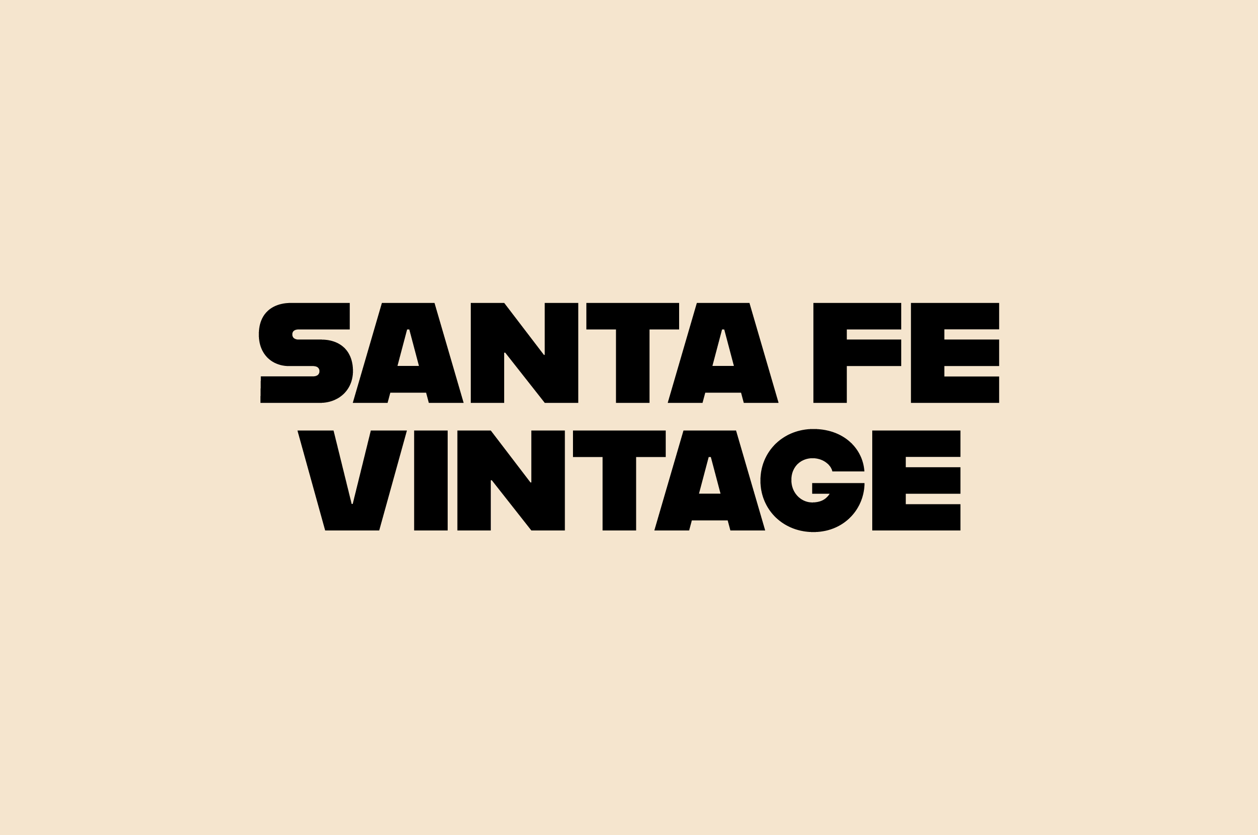
Teo approached Mast with the notion of making a brand born in the days before. She found inspiration in the simplicity and functionality of the early 1900s typography. Creating a mark that felt at home in Santa Fe and did not feel trite was paramount, one that would feel at home today, tomorrow, and yesterday.
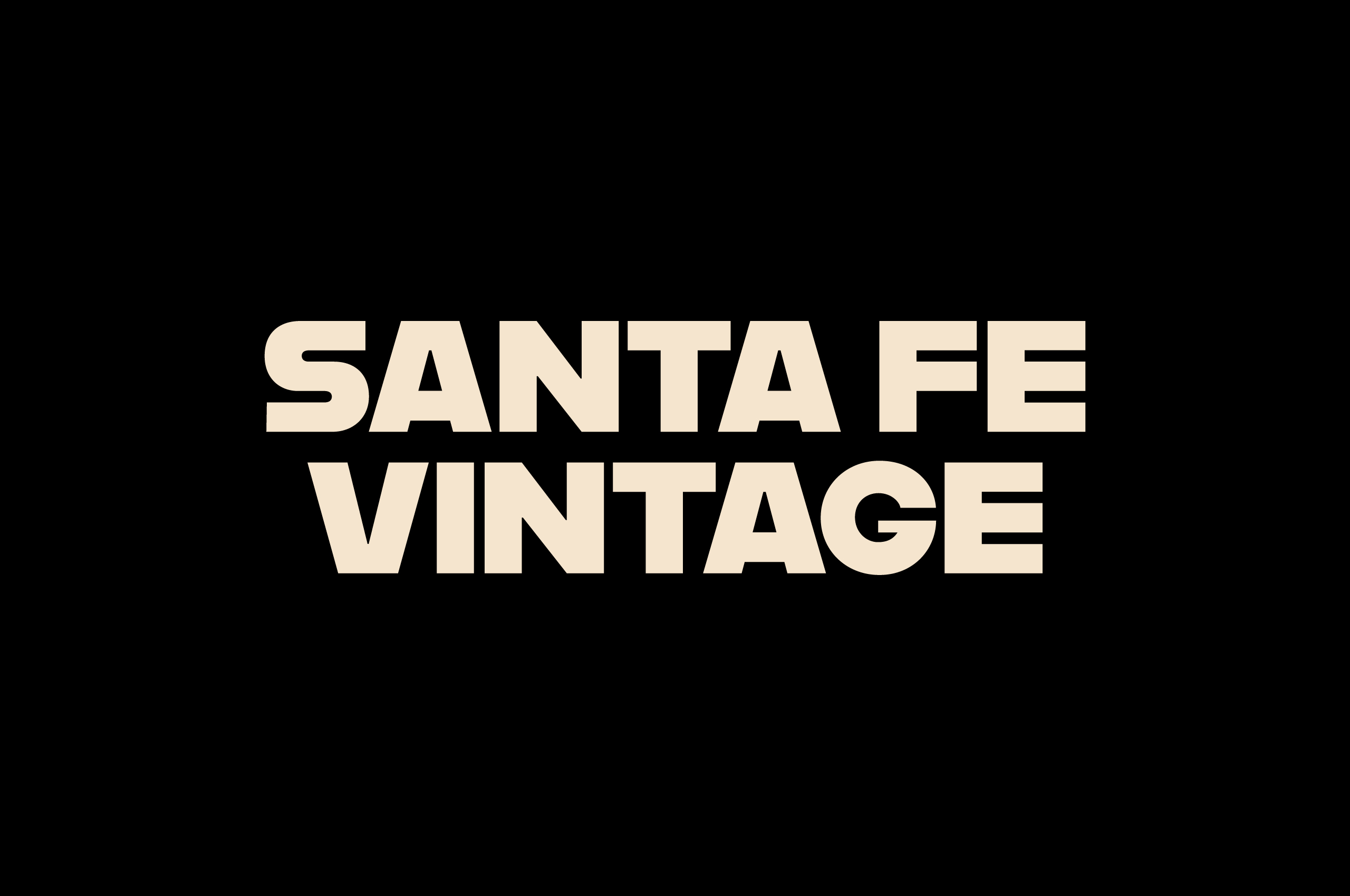
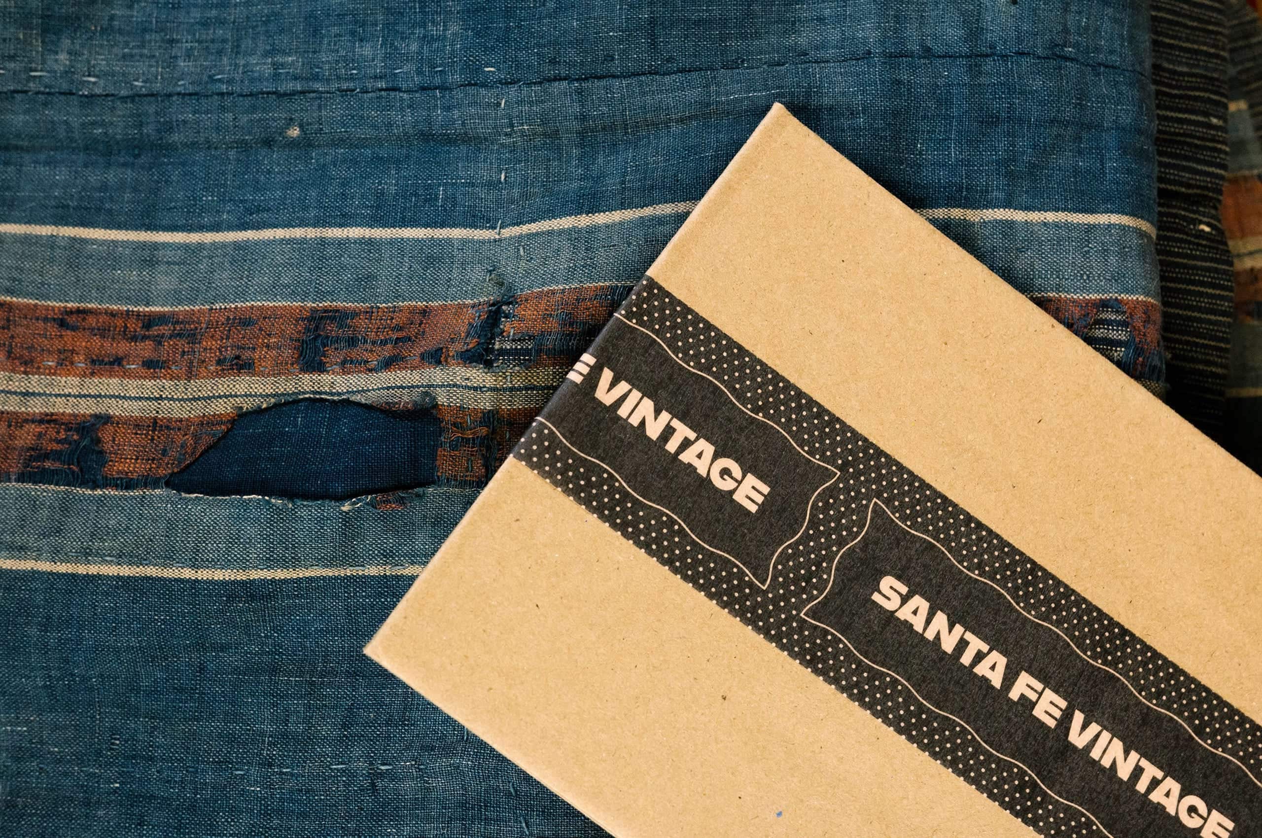
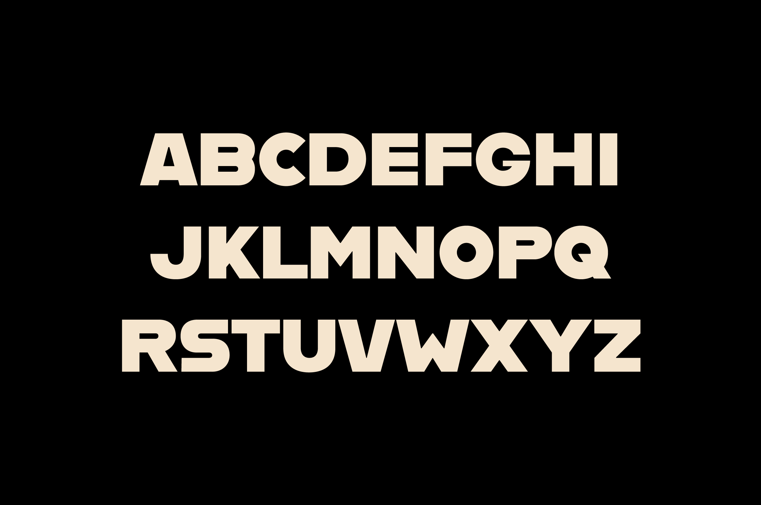
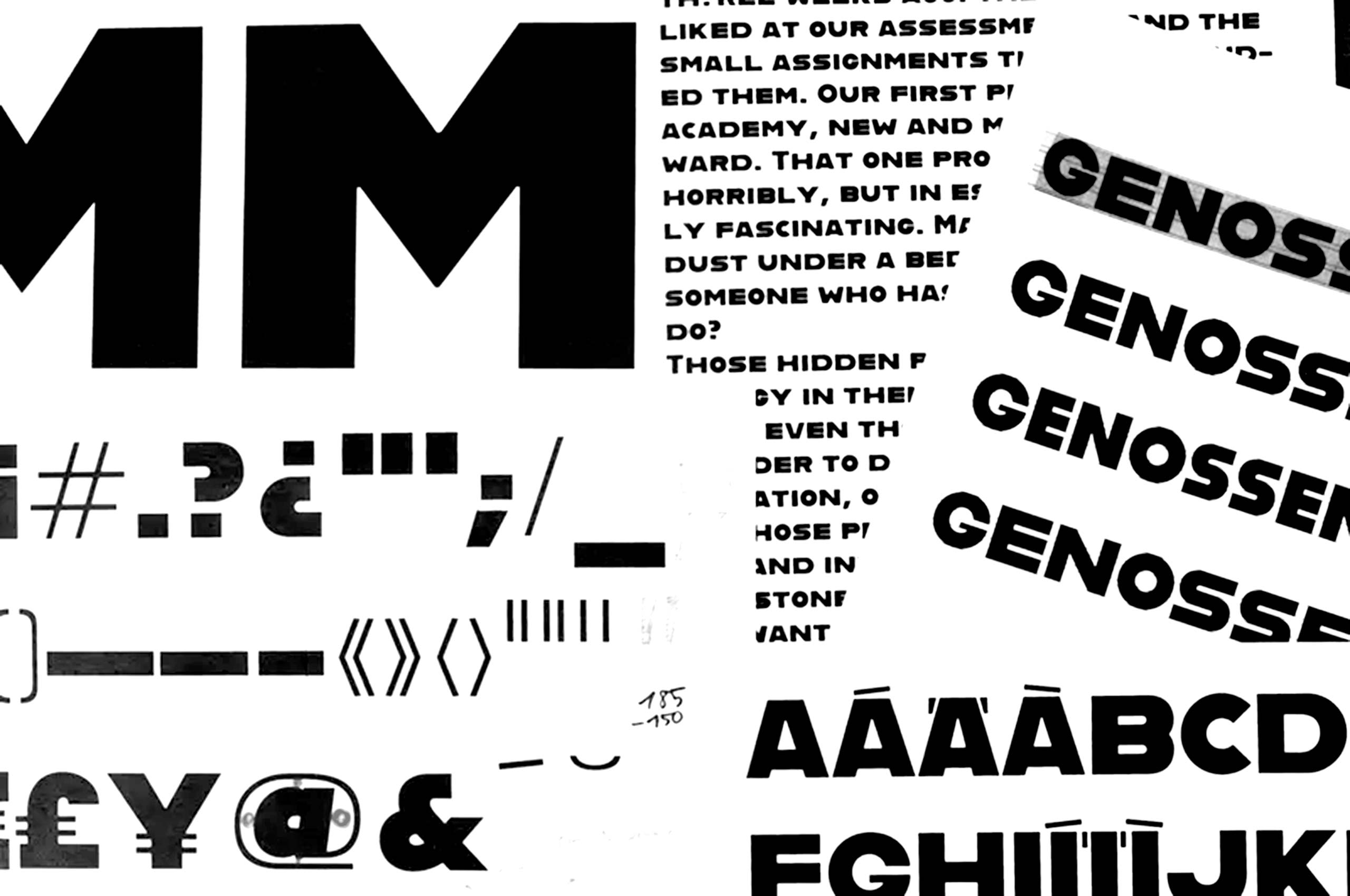
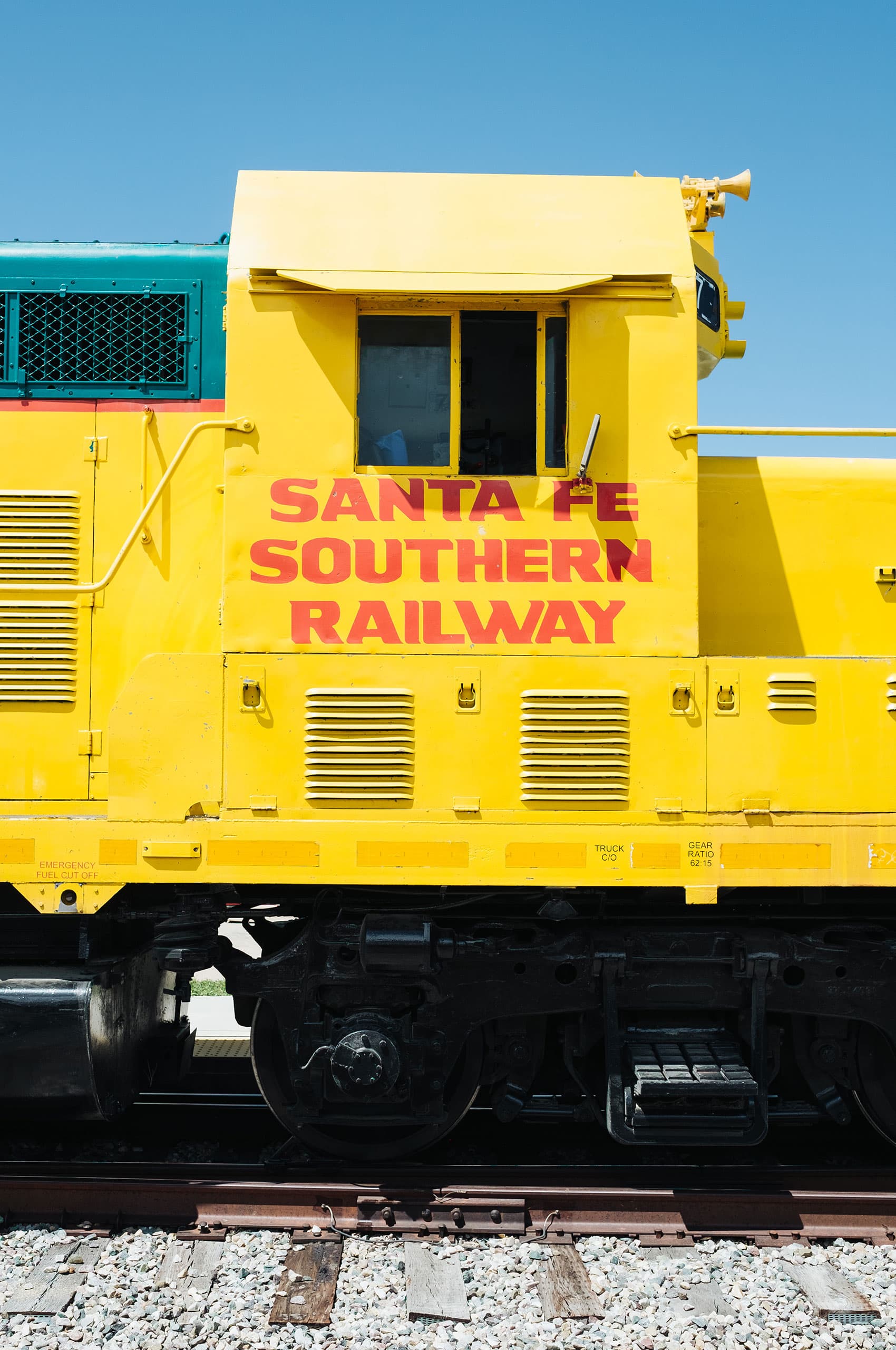
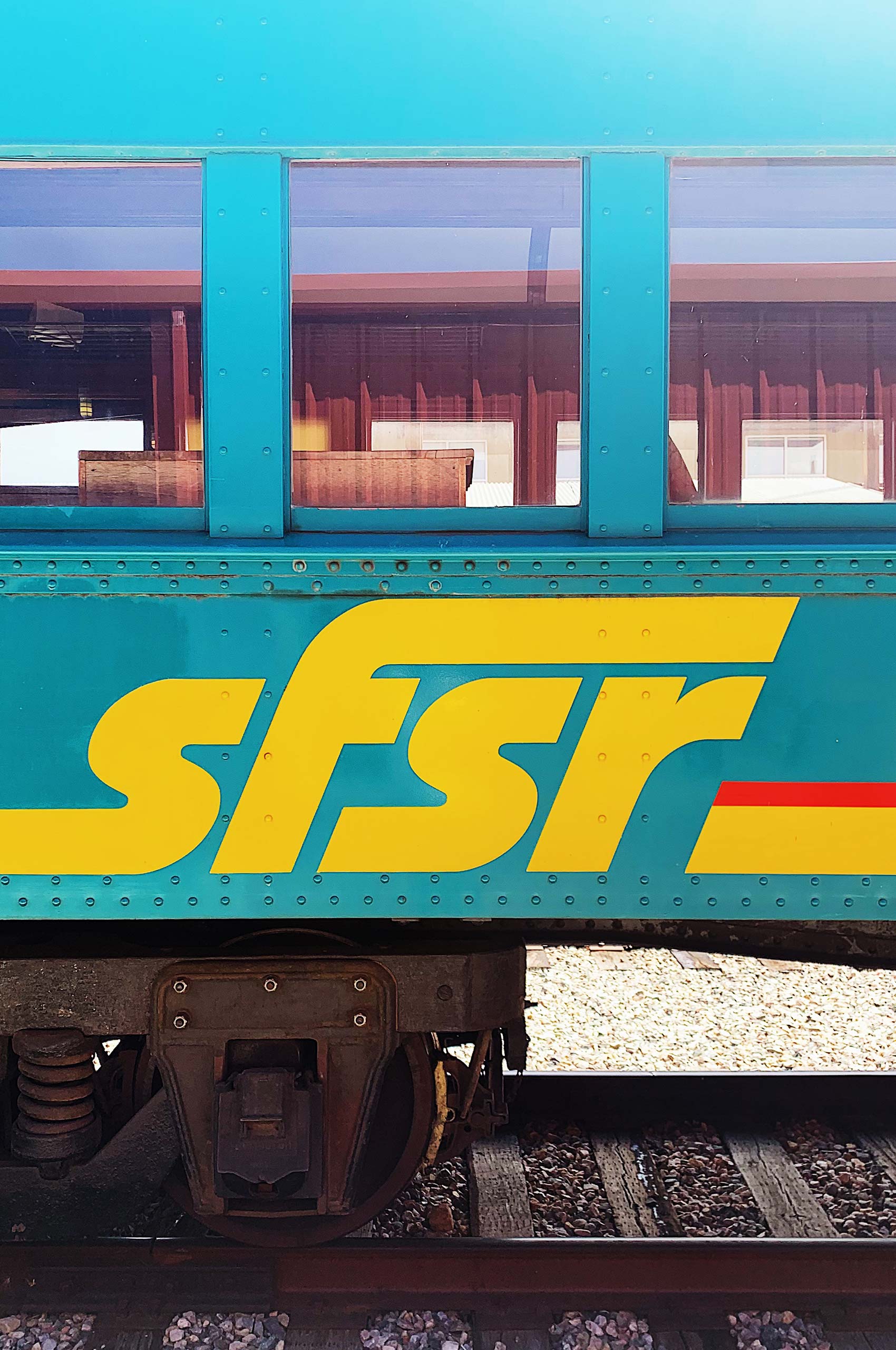
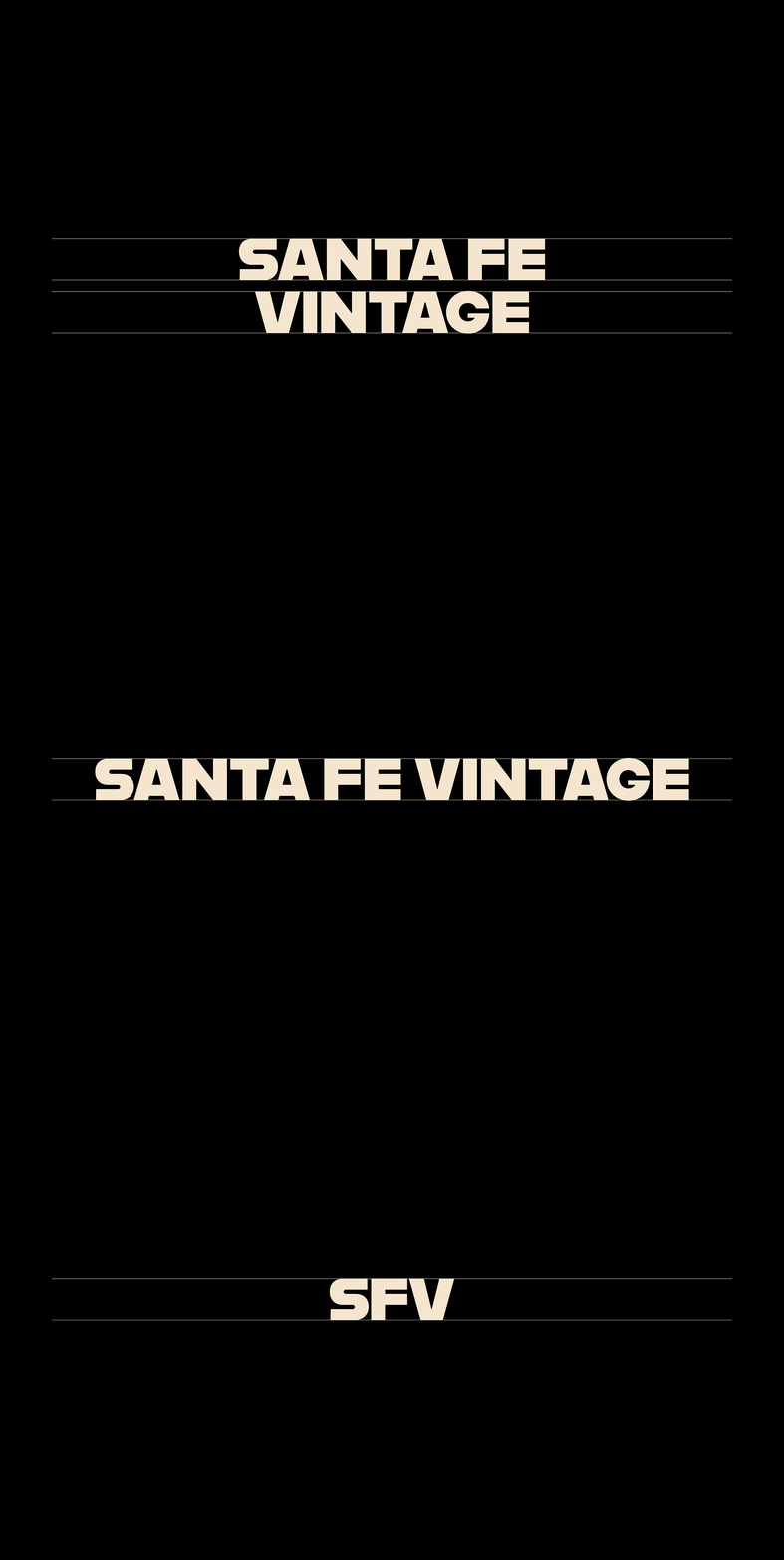
Utilizing the face Alfarn, drawn by Alfred Arndt in 1923, we developed a wordmark that’s akin with the historic Santa Fe Southern Railway logo often seen around town. Without the embellishments, the Santa Fe Vintage wordmark feels like a modern cousin to that of the SFSR.
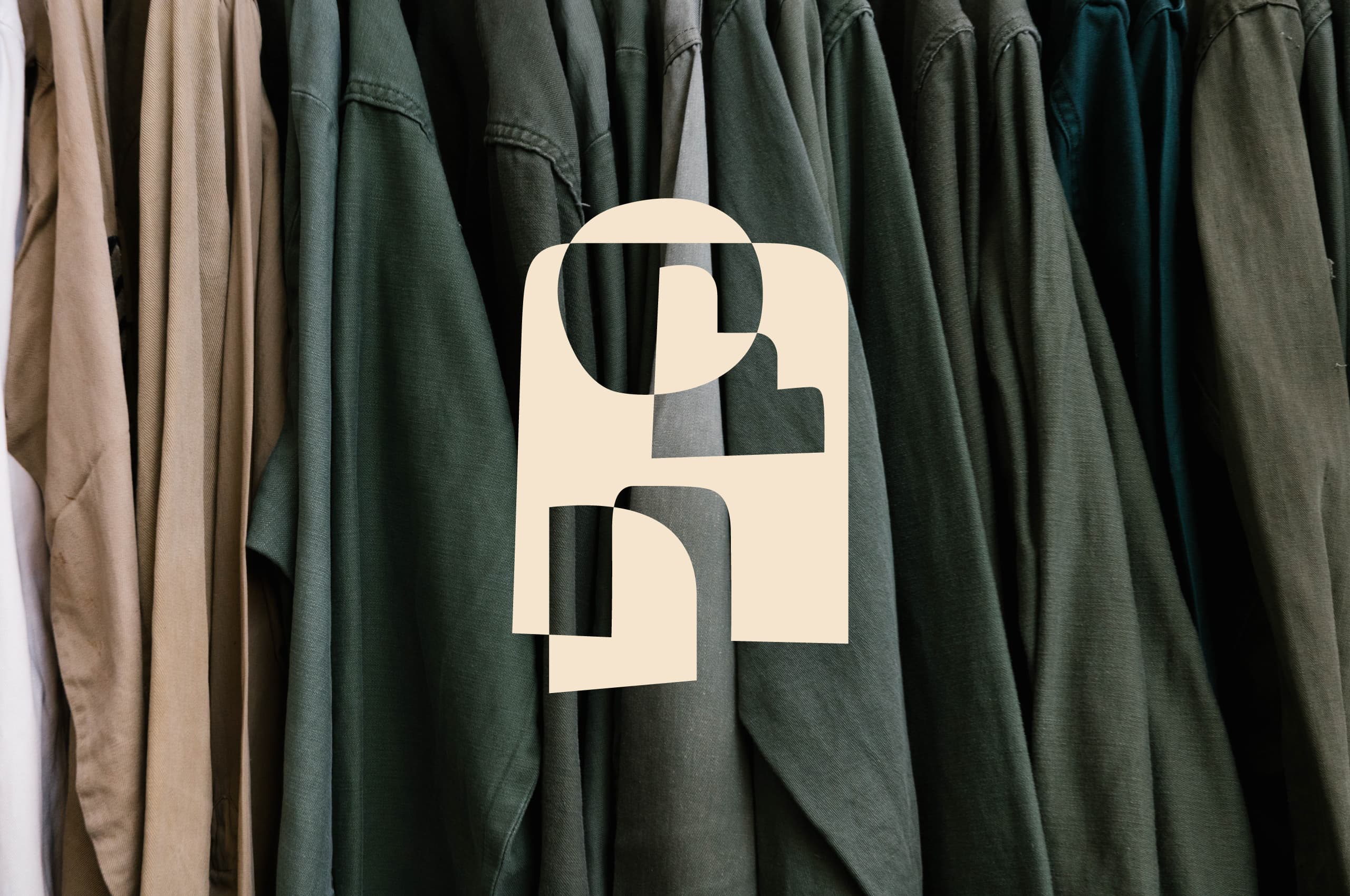


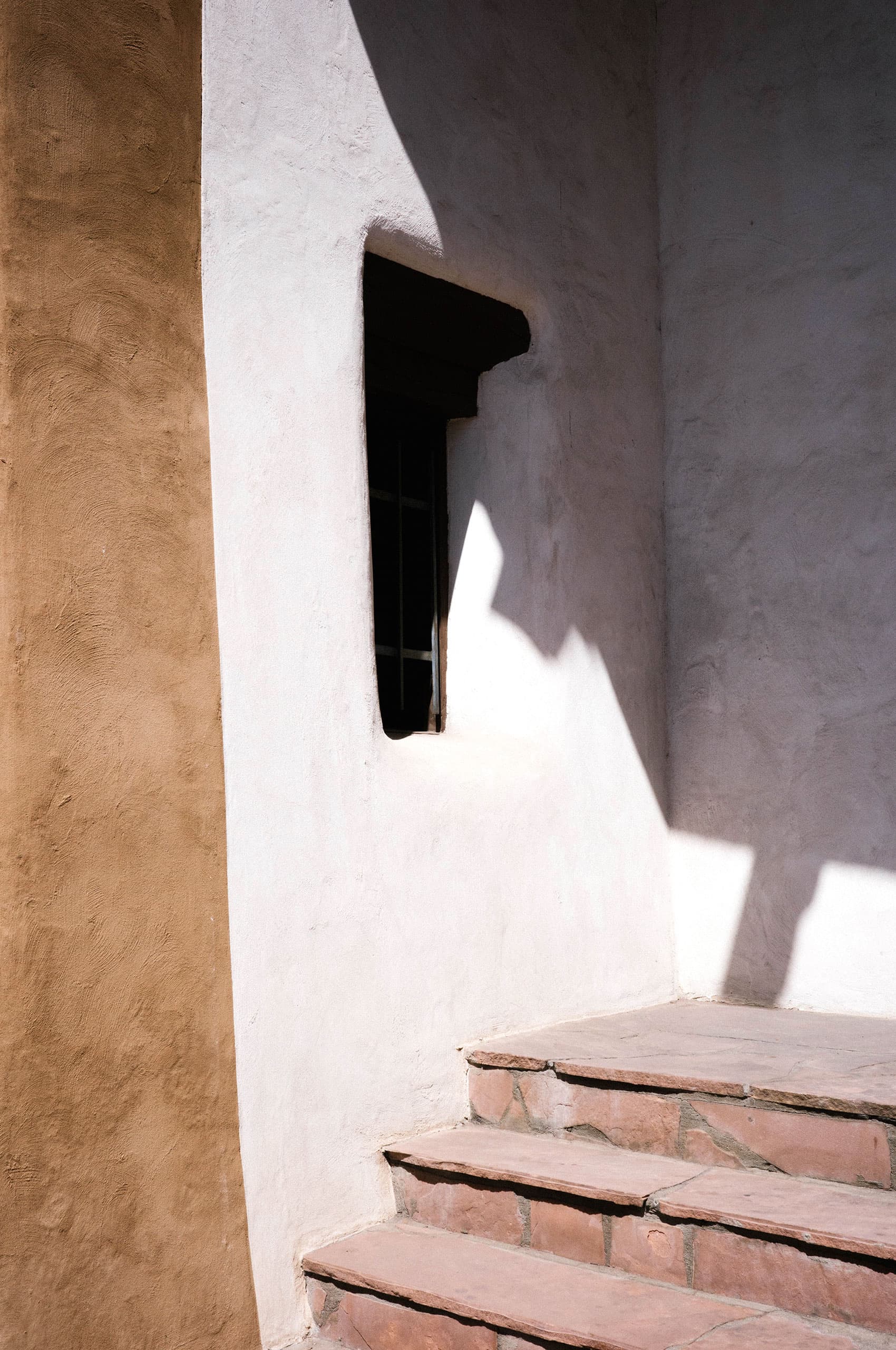
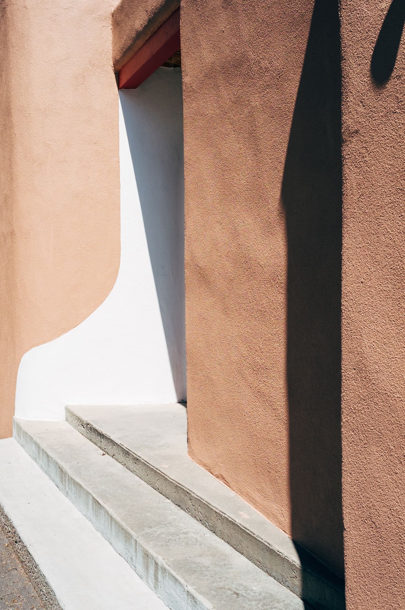
Anyone who has spent time in New Mexico can tell you that the light, the sky, and the shadows are like nowhere else in the world. When developing the symbol, we wanted to capture the spirit and feeling of the light in New Mexico. Walking around the plaza, you can become engulfed in the sharp shadows cast throughout the day. The contrast between the light and shadow creates such a special feeling.

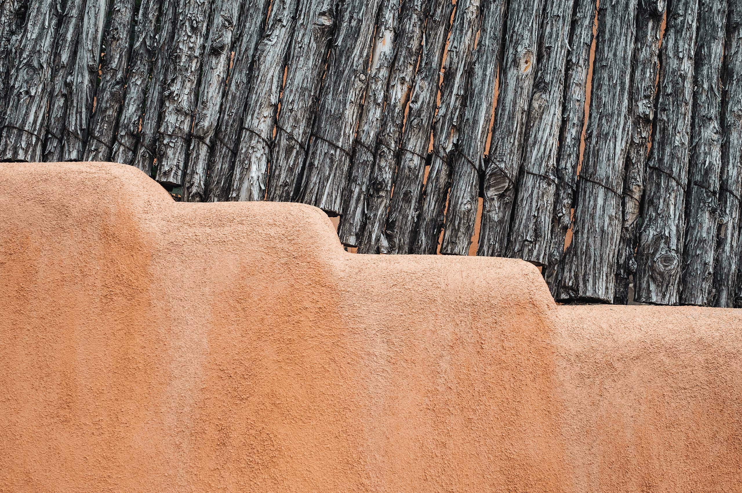
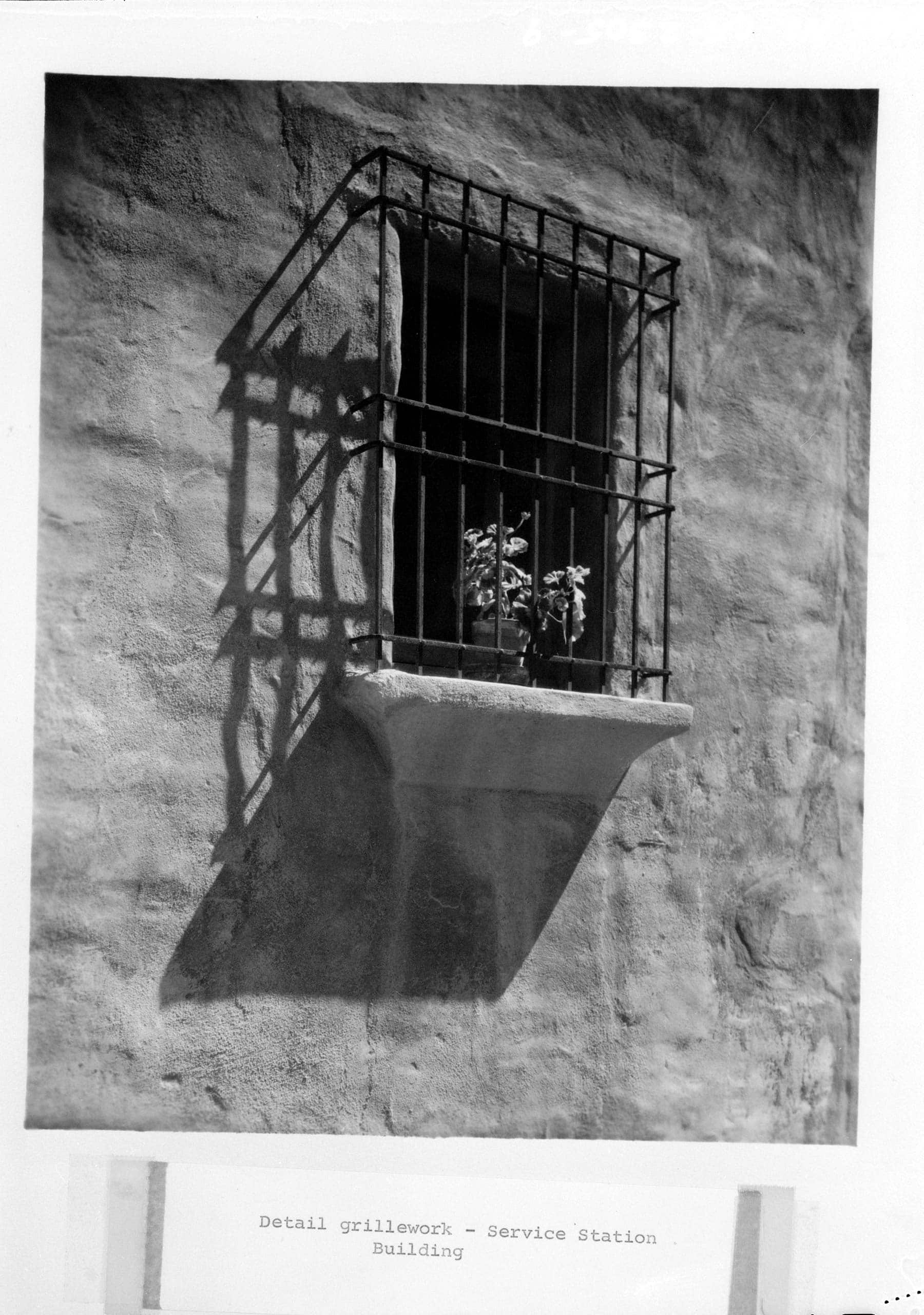
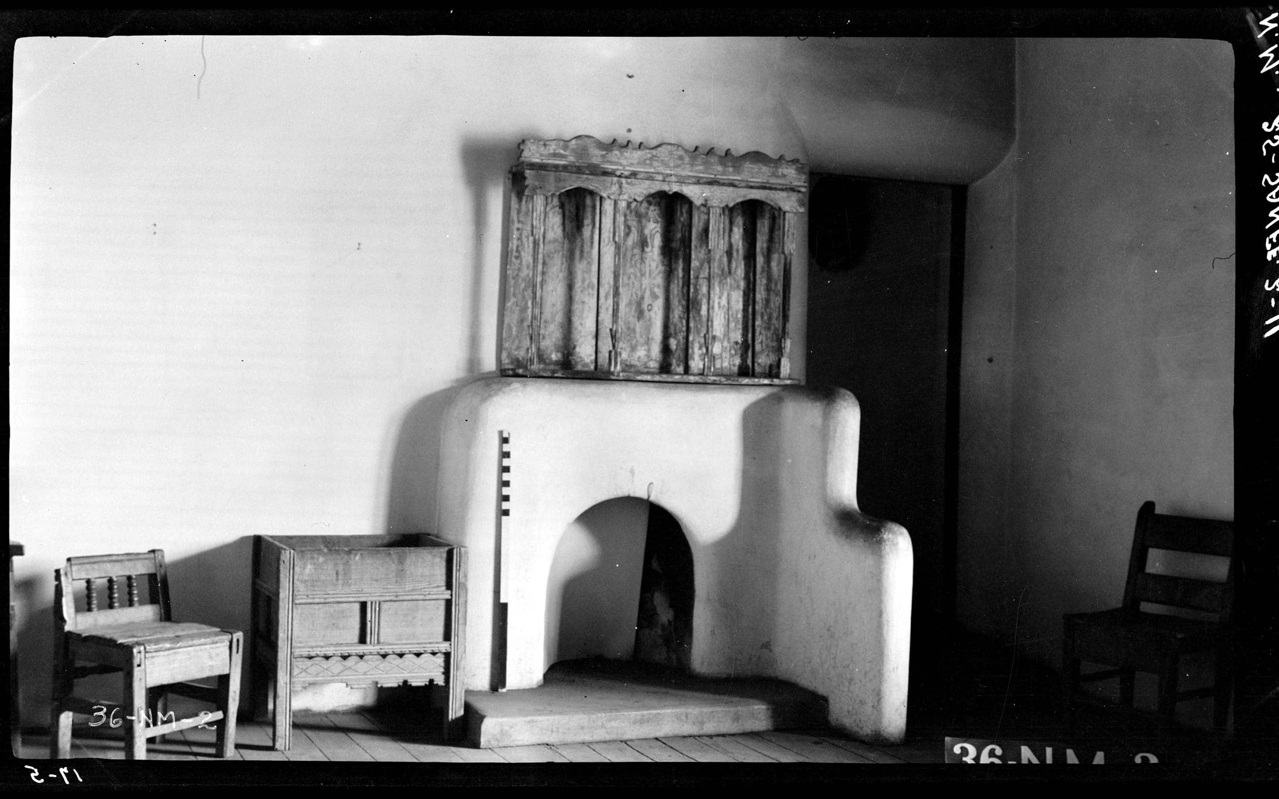
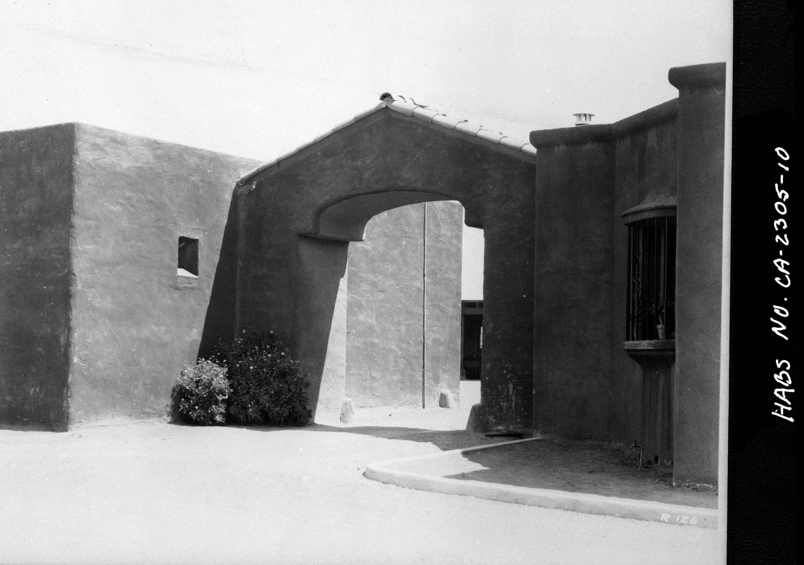
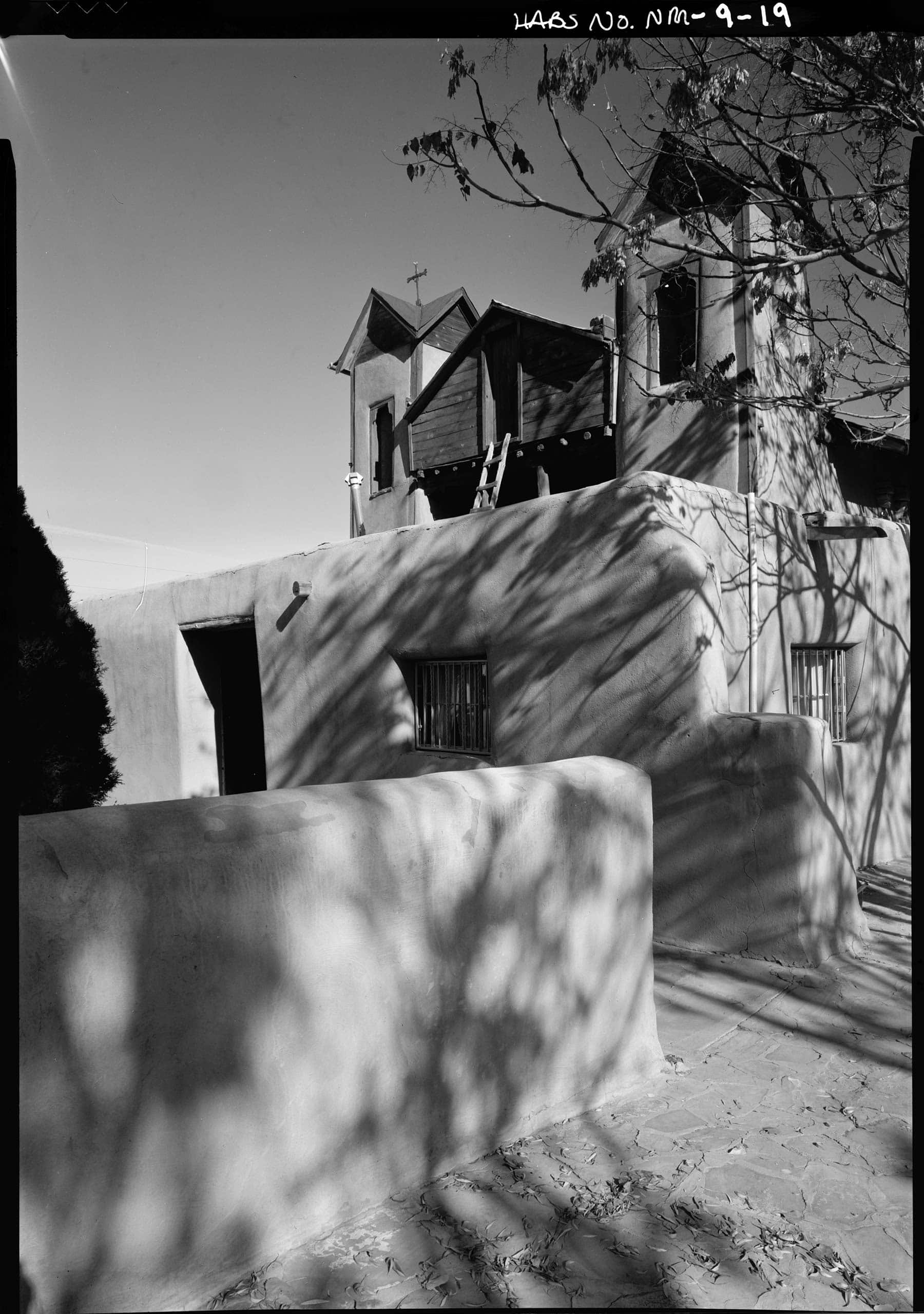

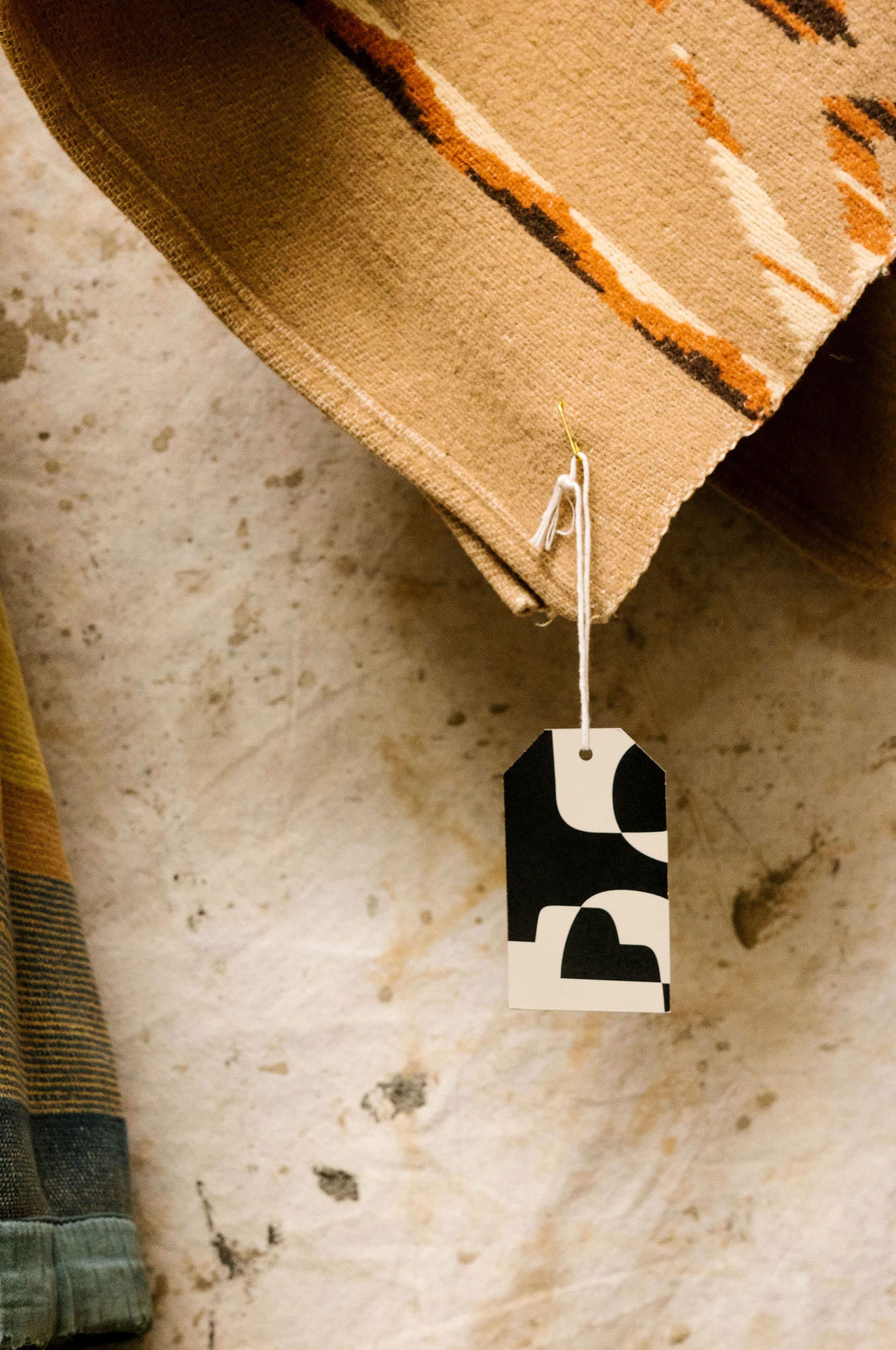
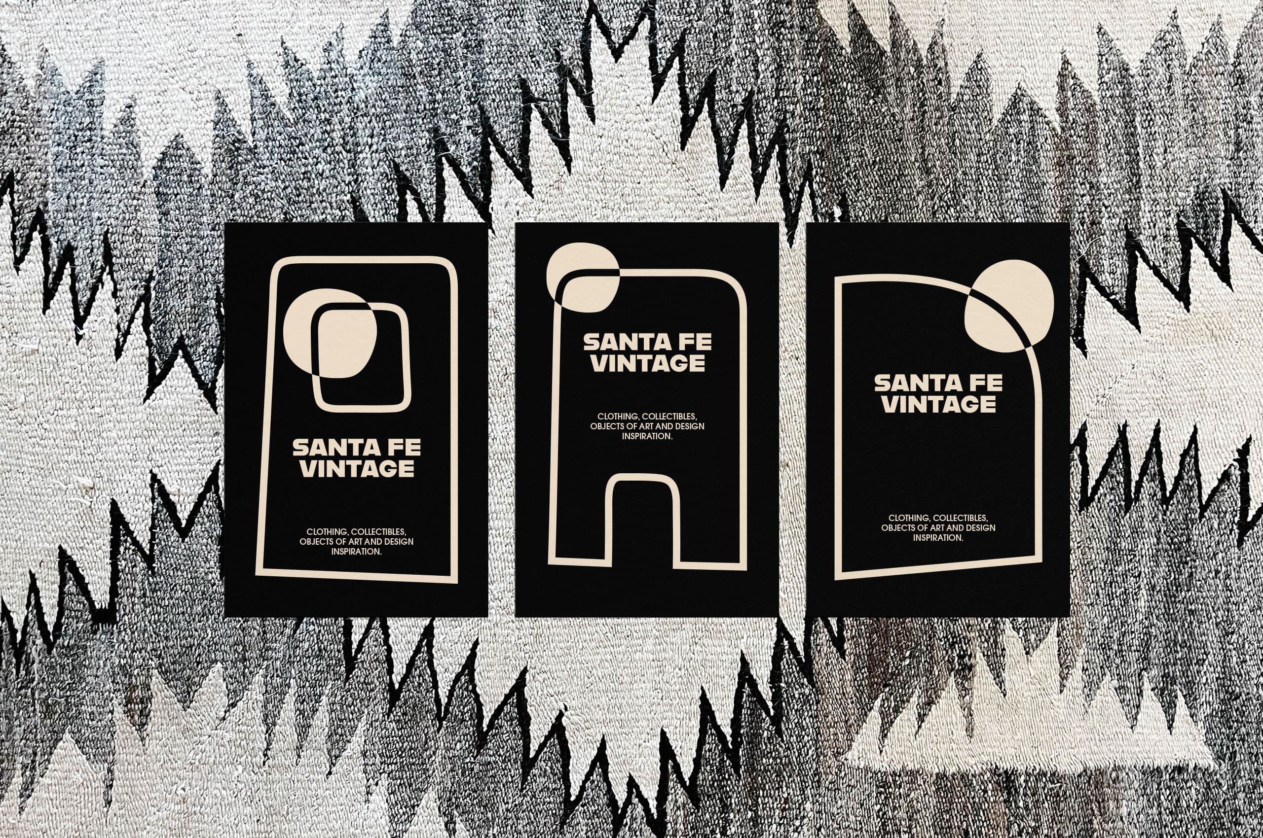
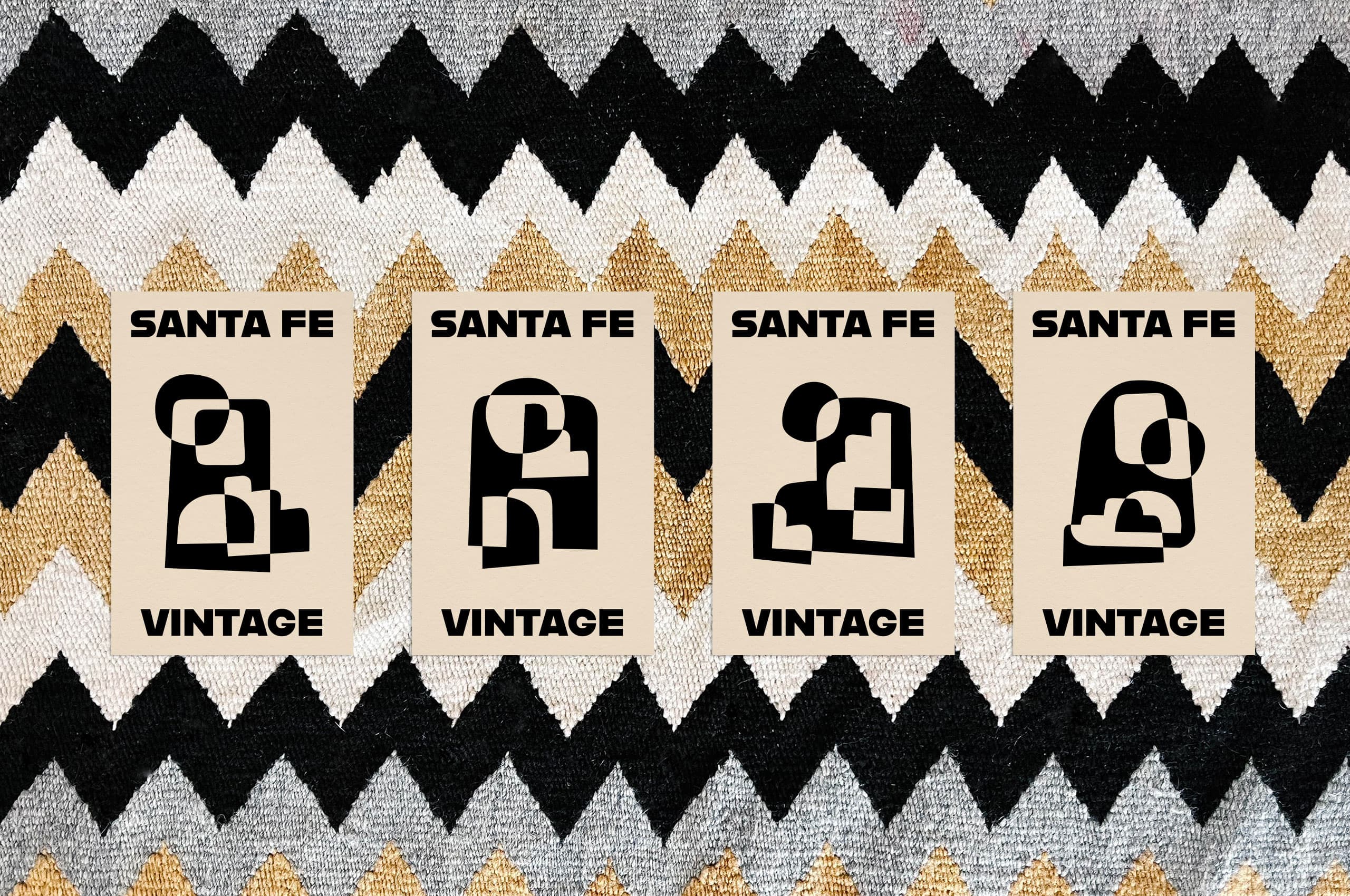
By combining historic building forms found in the adobe buildings in the area, we created a set of flexible symbols to help tell the story of the special place, Santa Fe. The simplicity, uniquity, and intrigue of the shapes create the feeling of a piece of art.
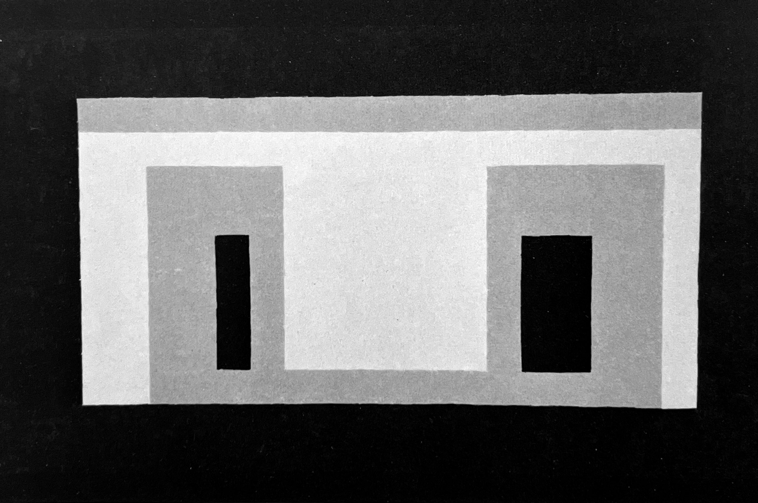
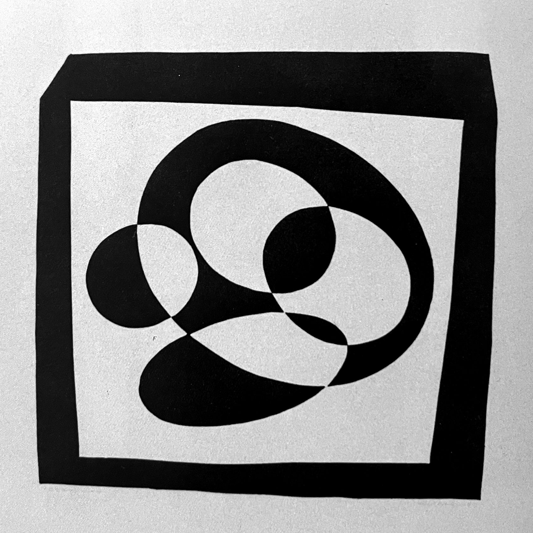
We were initially inspired by Josef Albers and his series based on the simplification of adobe buildings. But, during our research, we found the interplay between figure and ground in his woodblock prints more fitting. We used these prints paired with adobe forms to create a set of flexible symbols that can morph and change whenever necessary.

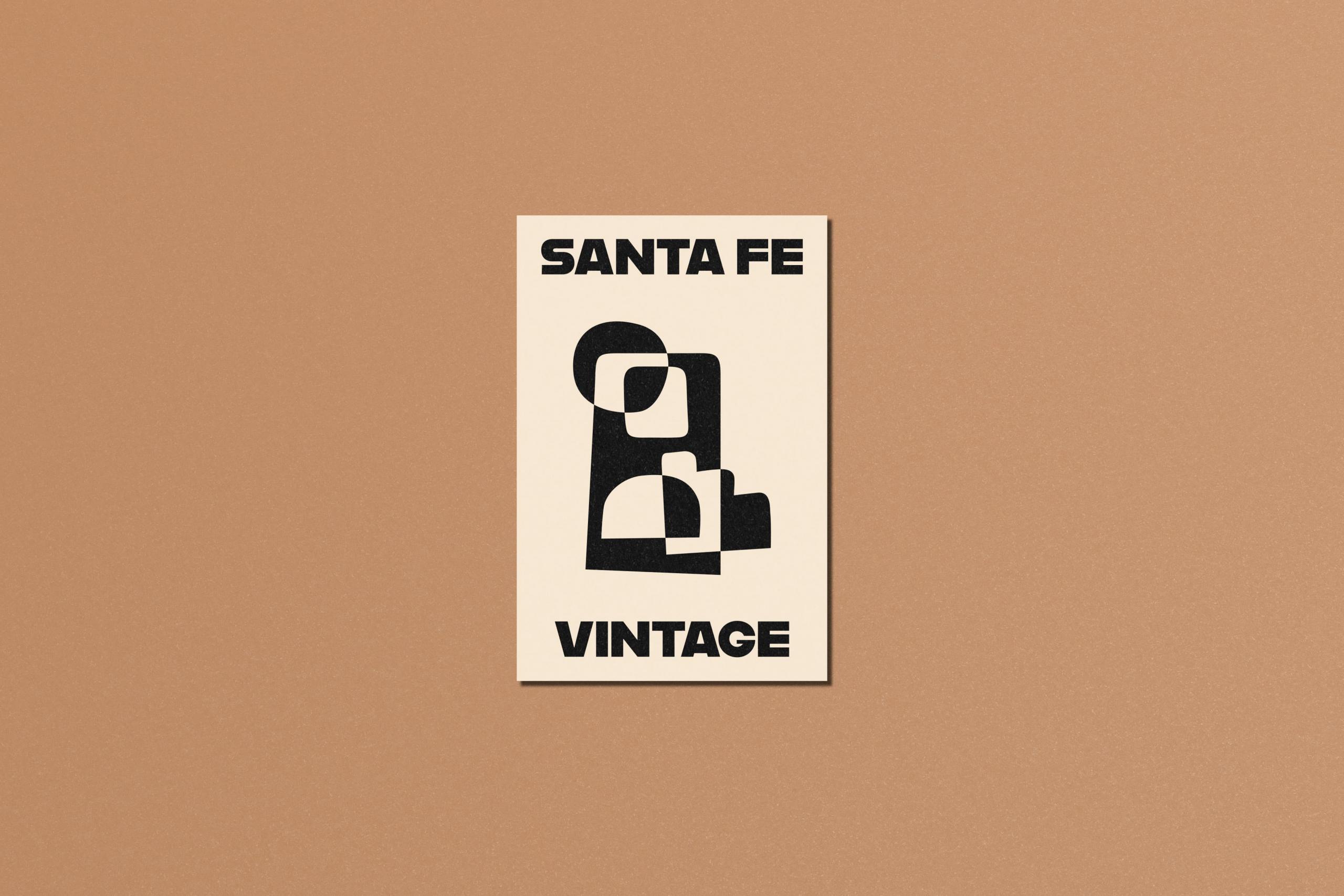
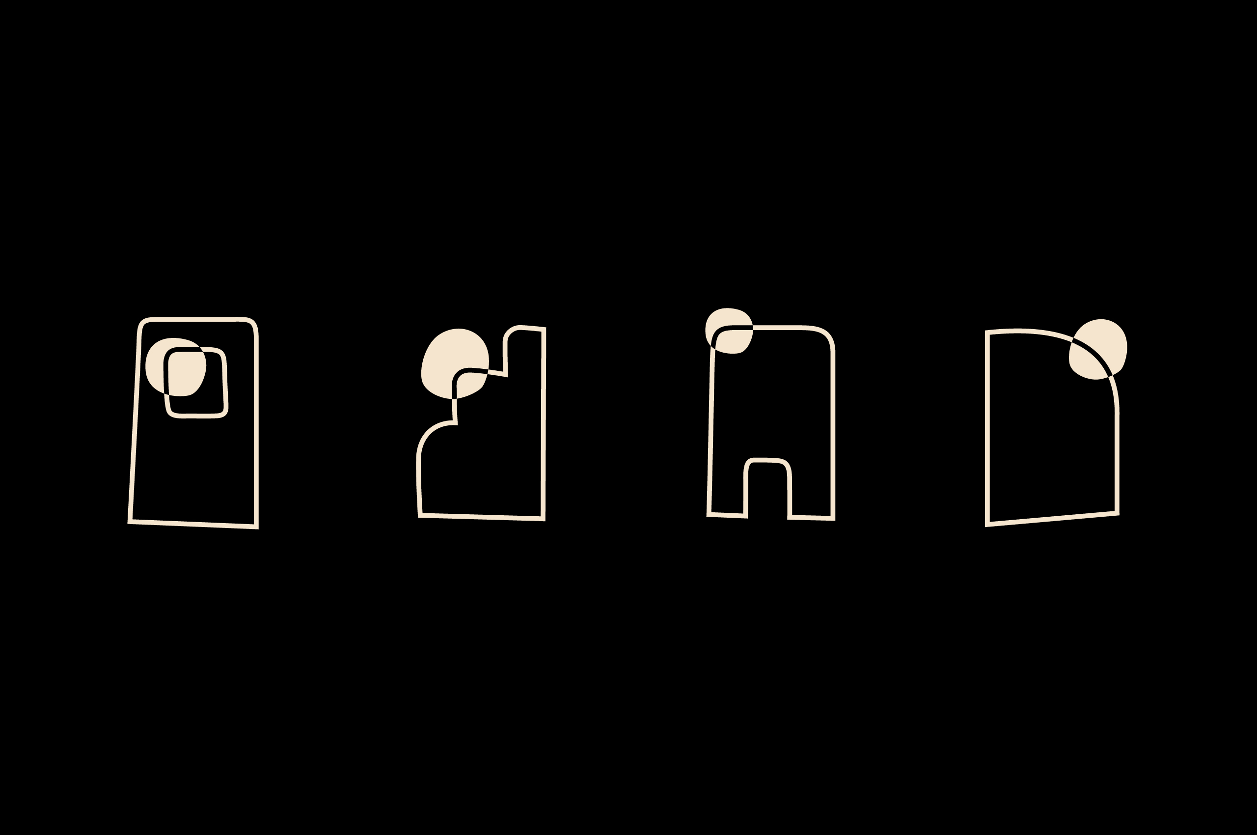
We created a secondary set of illustrations based on the symbols themselves that simplify them down to two forms to showcase the interplay between light and dark in the most simple way.
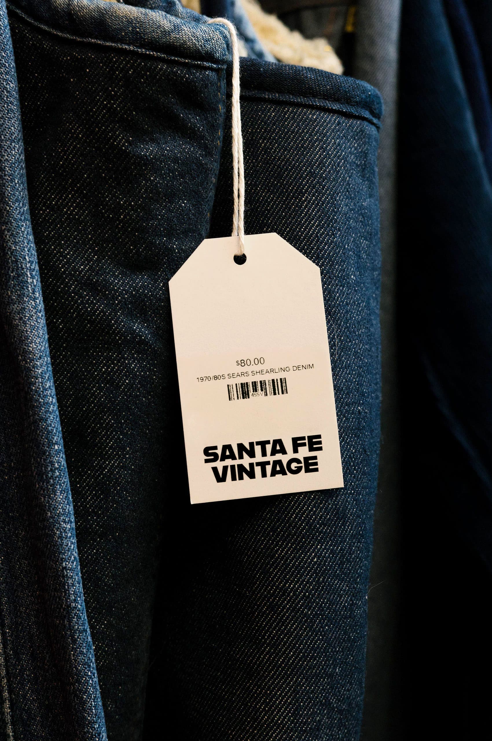
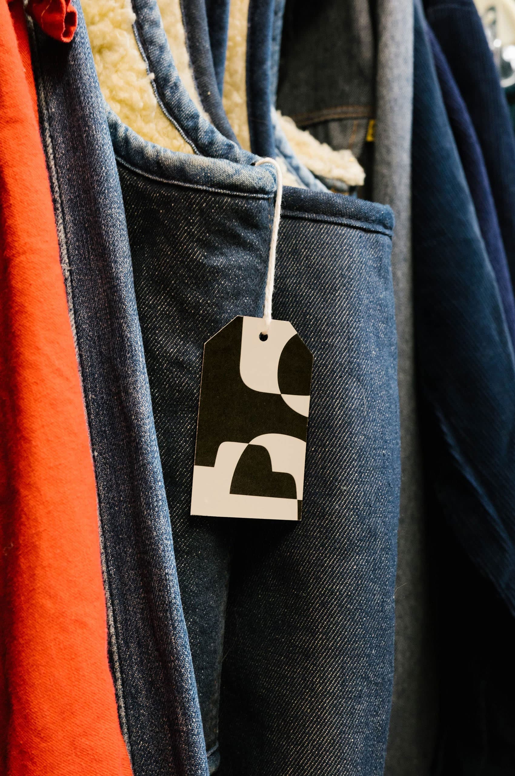
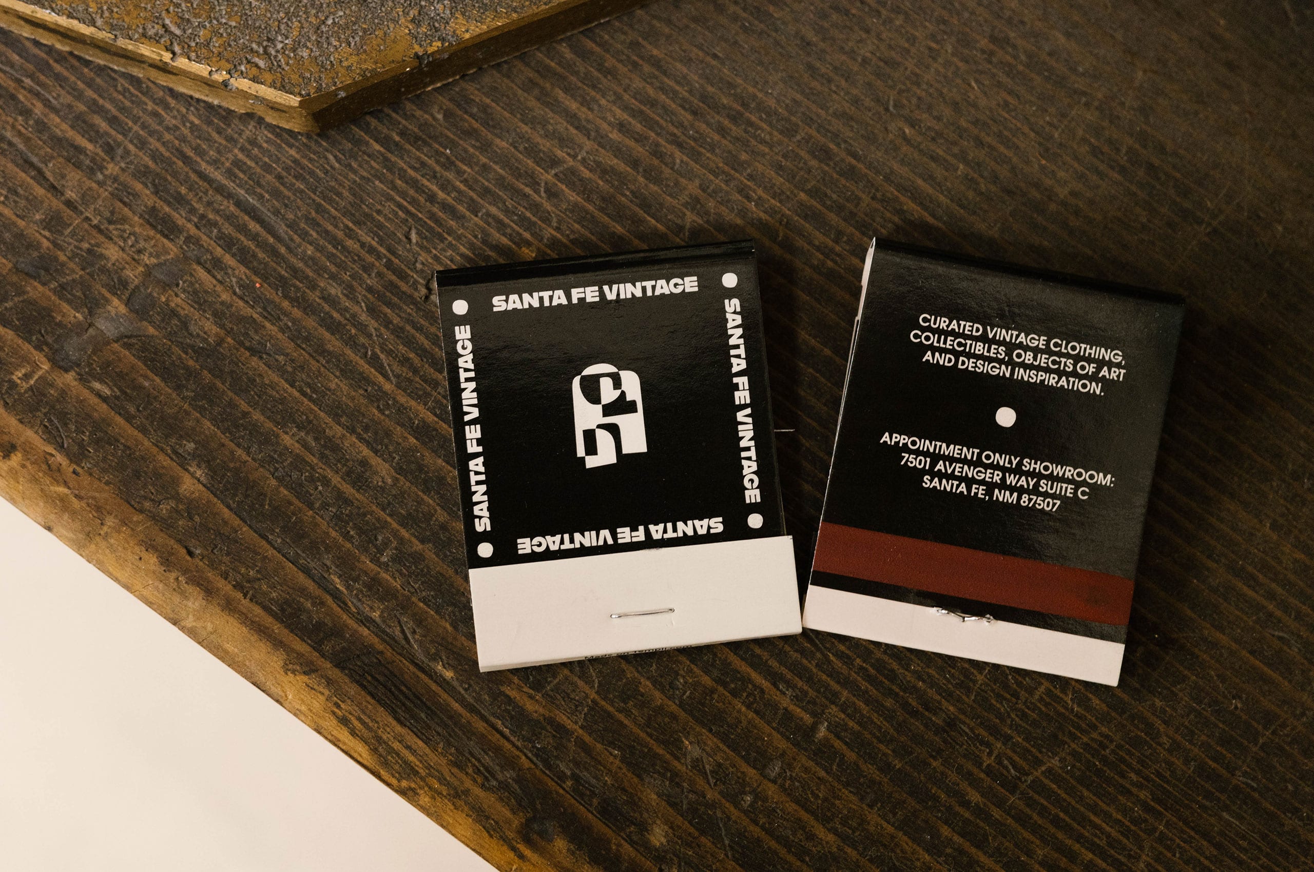
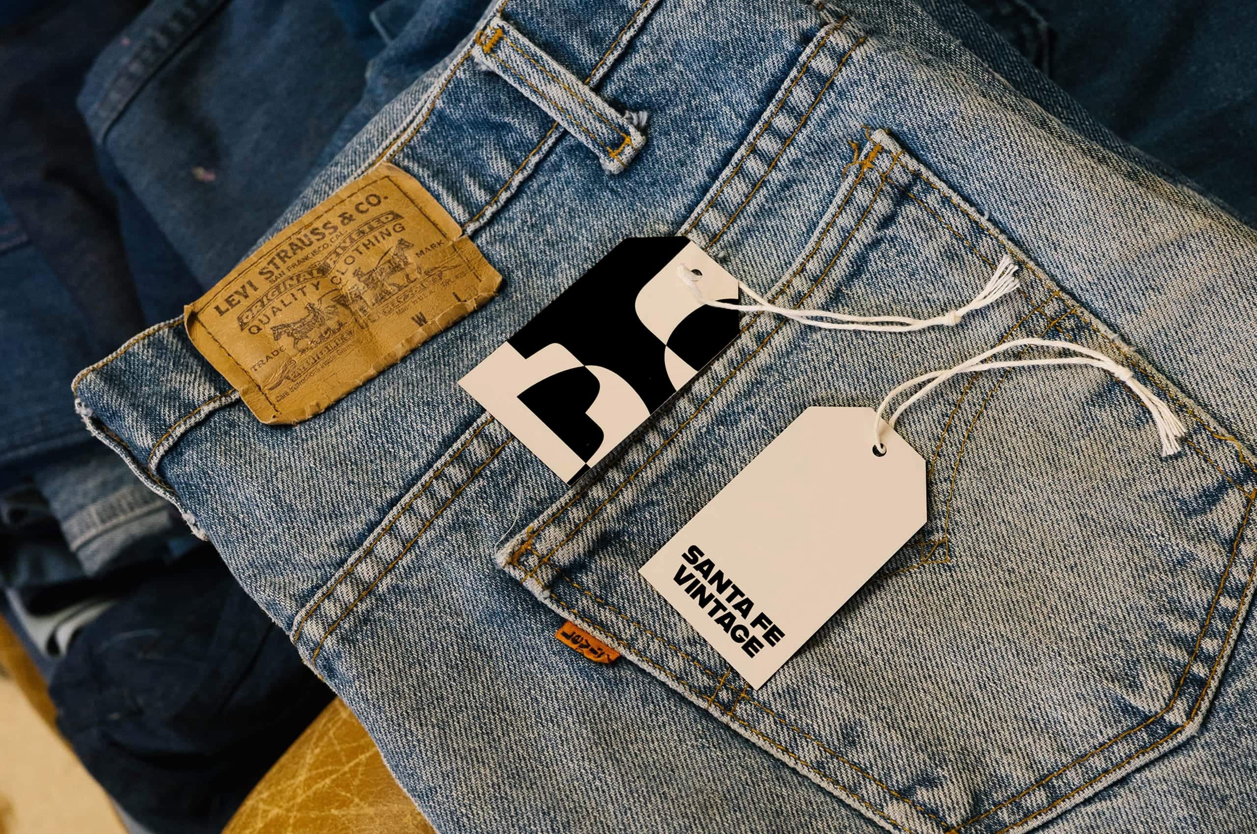
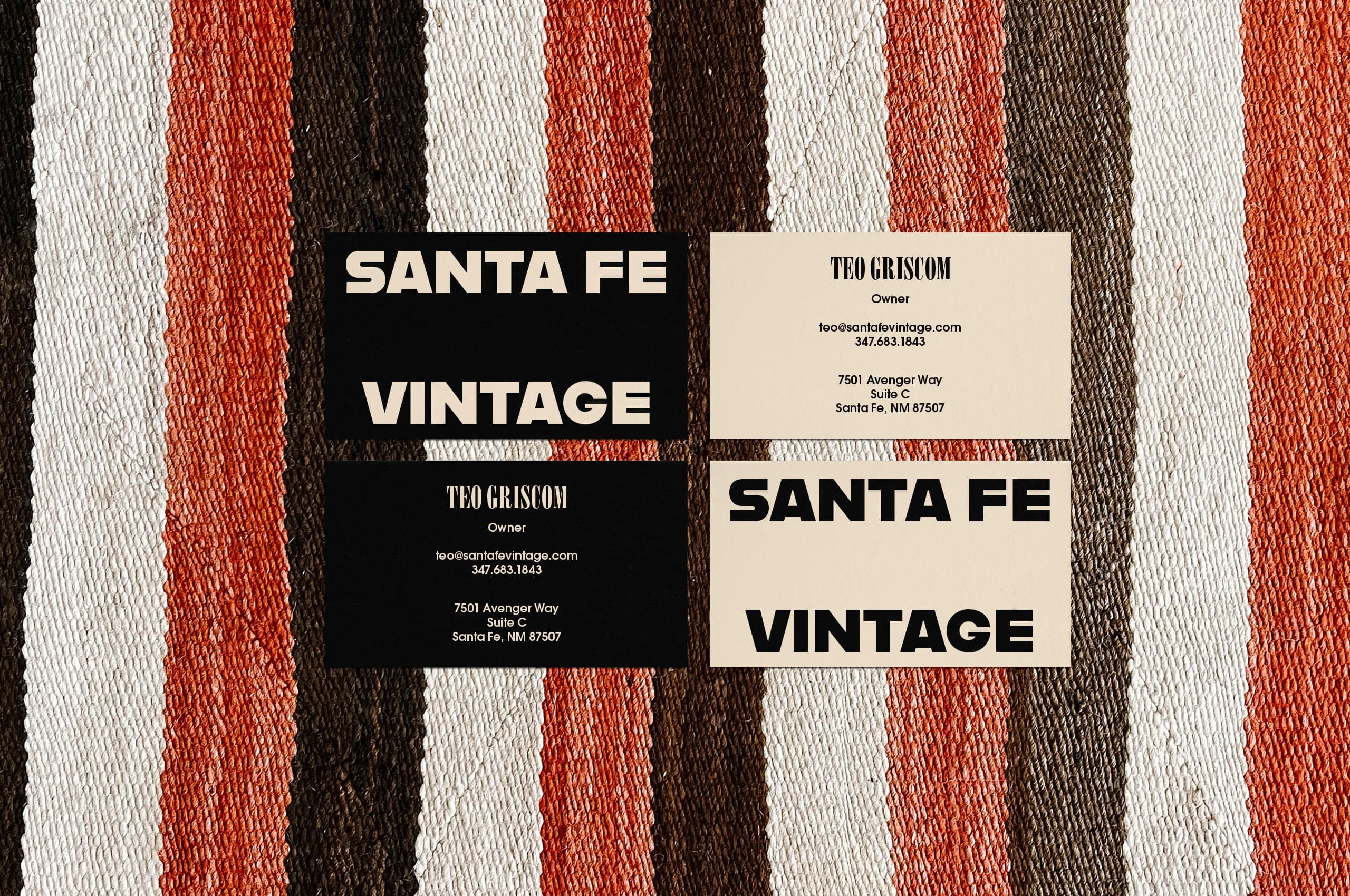
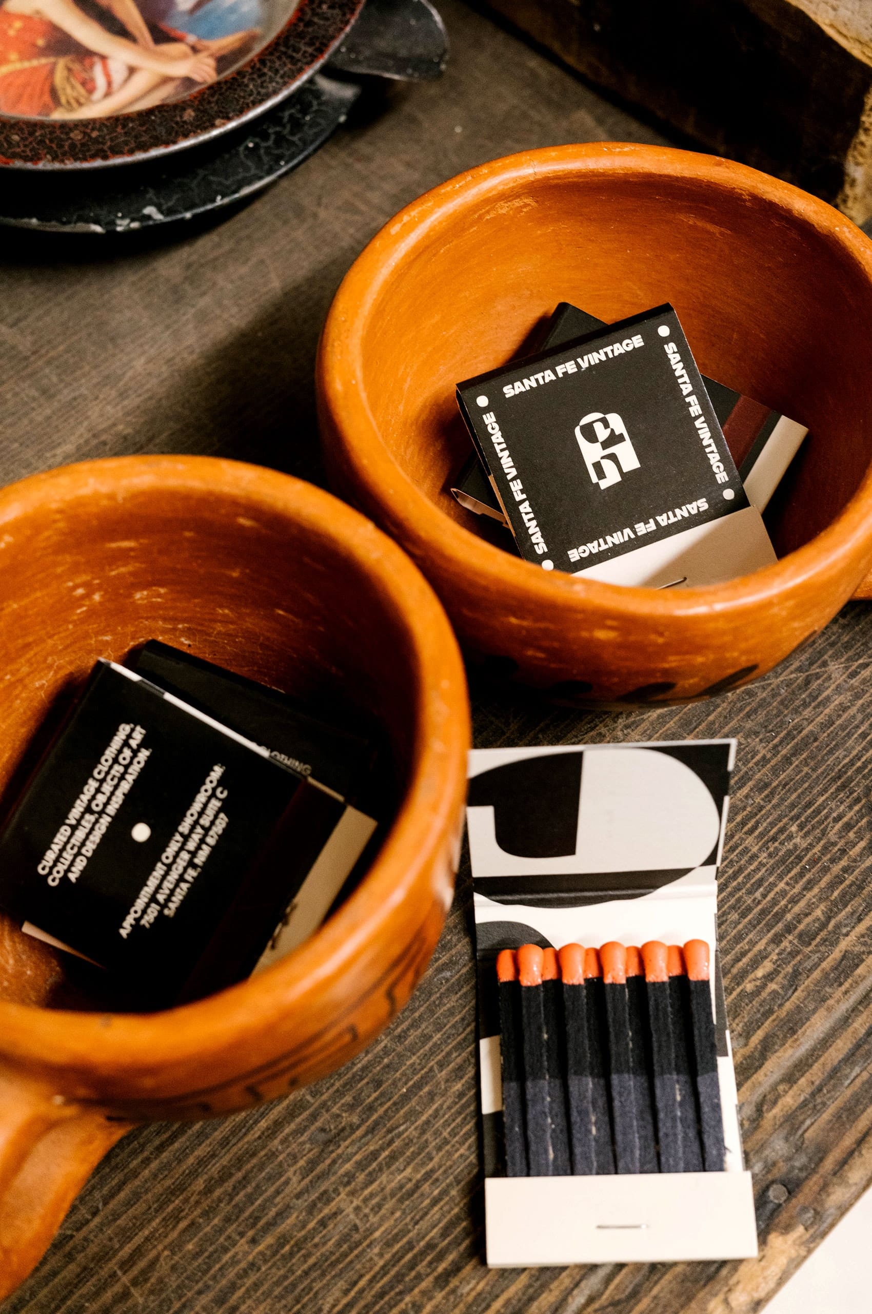
We worked with SFV to create a suite of printed collateral for shipments and in-person appointments, ensuring that everyone can bring a little piece of Santa Fe into their lives. Wether it be postcards, business cards, packing tape, or matchbooks, we wanted every part of the collateral to be as thoughtful and considered as the space.
Depending on the use, the system can be scaled up or down. The system is flexible, fluid, and inspired by the place. We created a visual device that mimics the space using overlapping and ever-changing shapes.
We have created a paired-down color palette that embodies the crispness of the light and shadow unique to New Mexico.
The cleanliness of the palette feels vintage without feeling forced—this is especially true when printed.
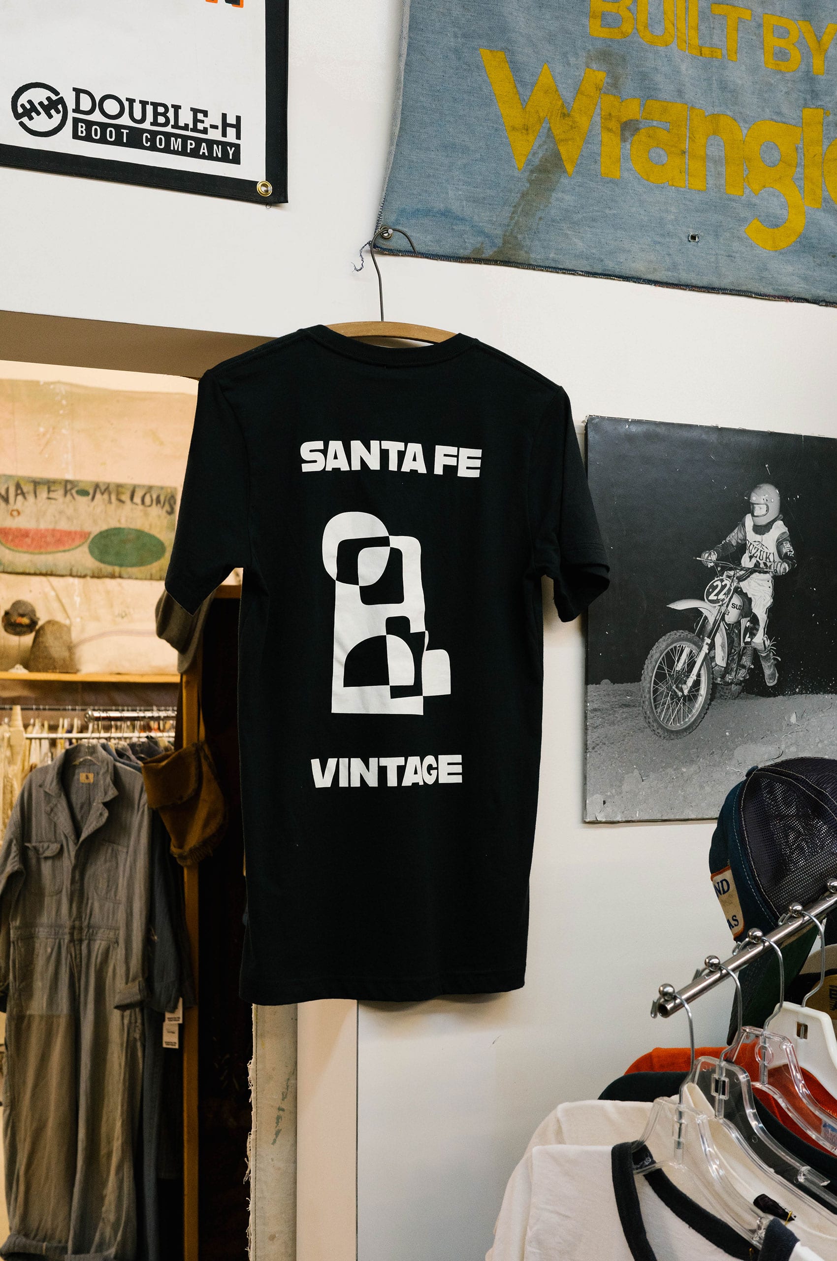
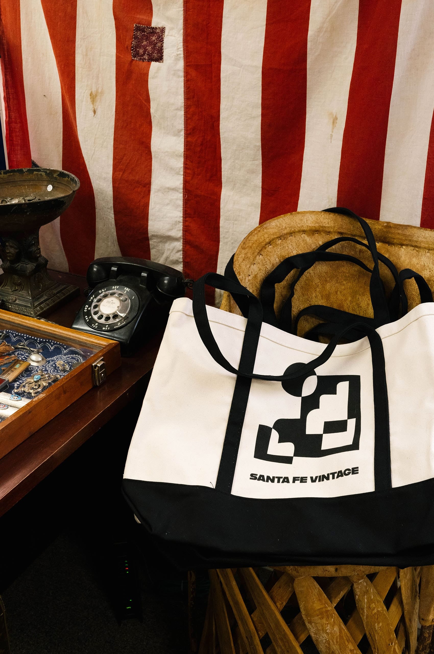
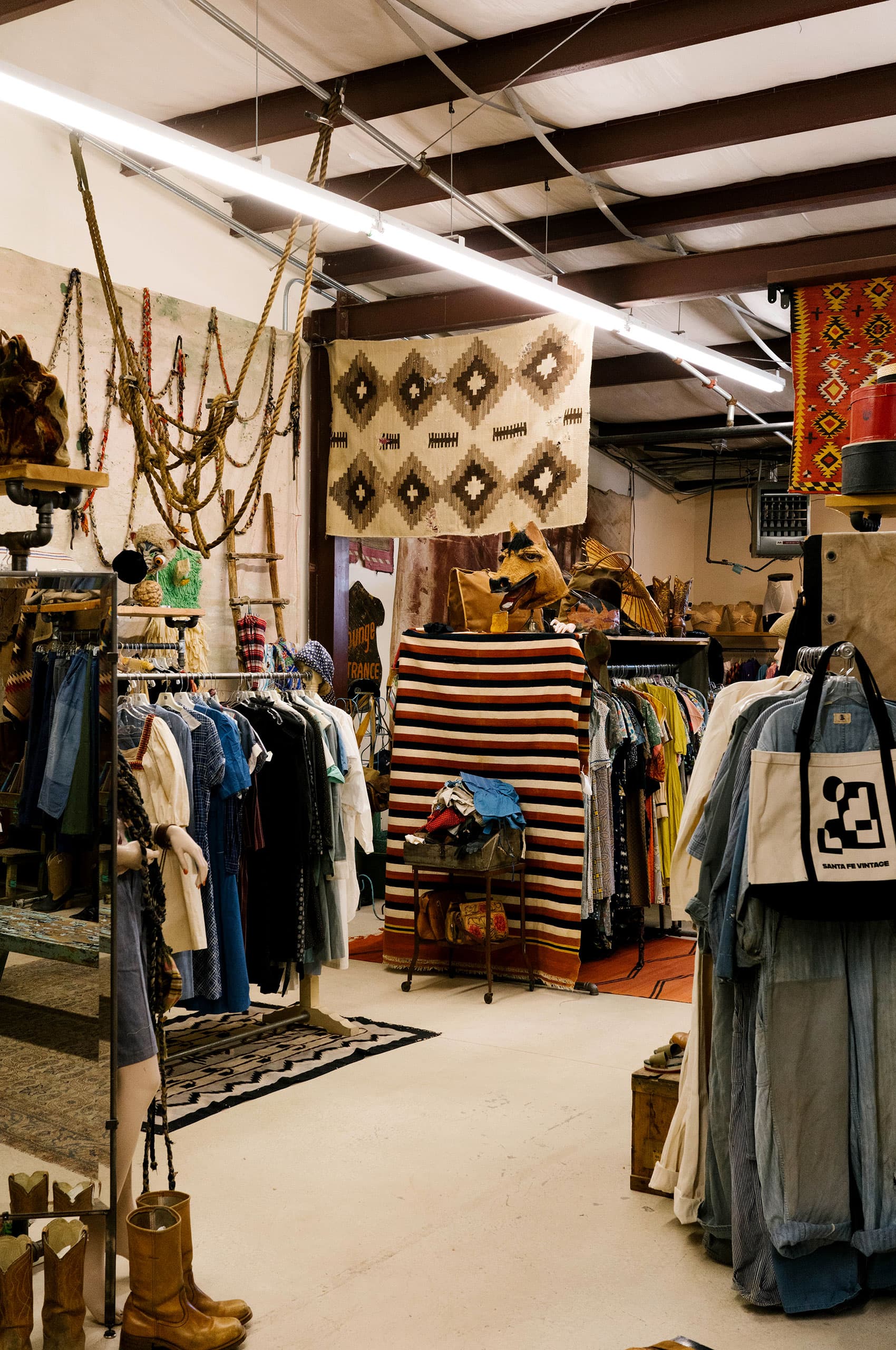
In addition to the printed collateral, we designed a set of branded shop shirts and totes. As anyone that has shopped for vintage clothes can tell you, you often walk away empty-handed. Teo wanted to create these items to allow all visitors to feel like they could take something home with them, even if those pants didn’t work out.
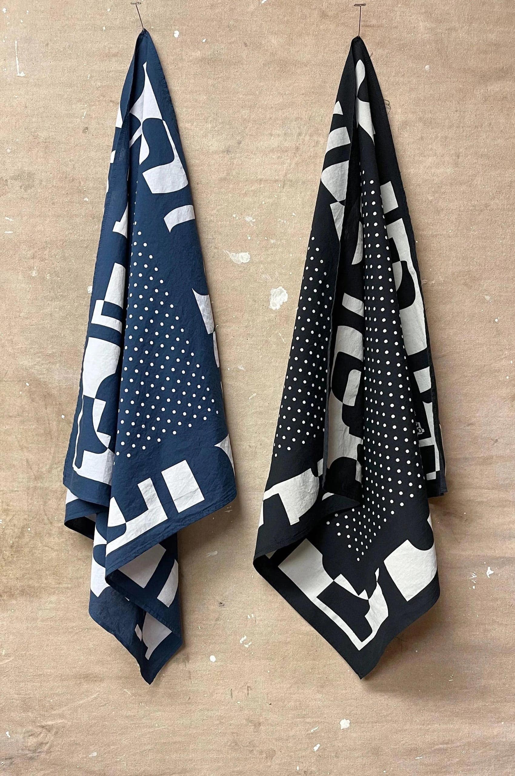
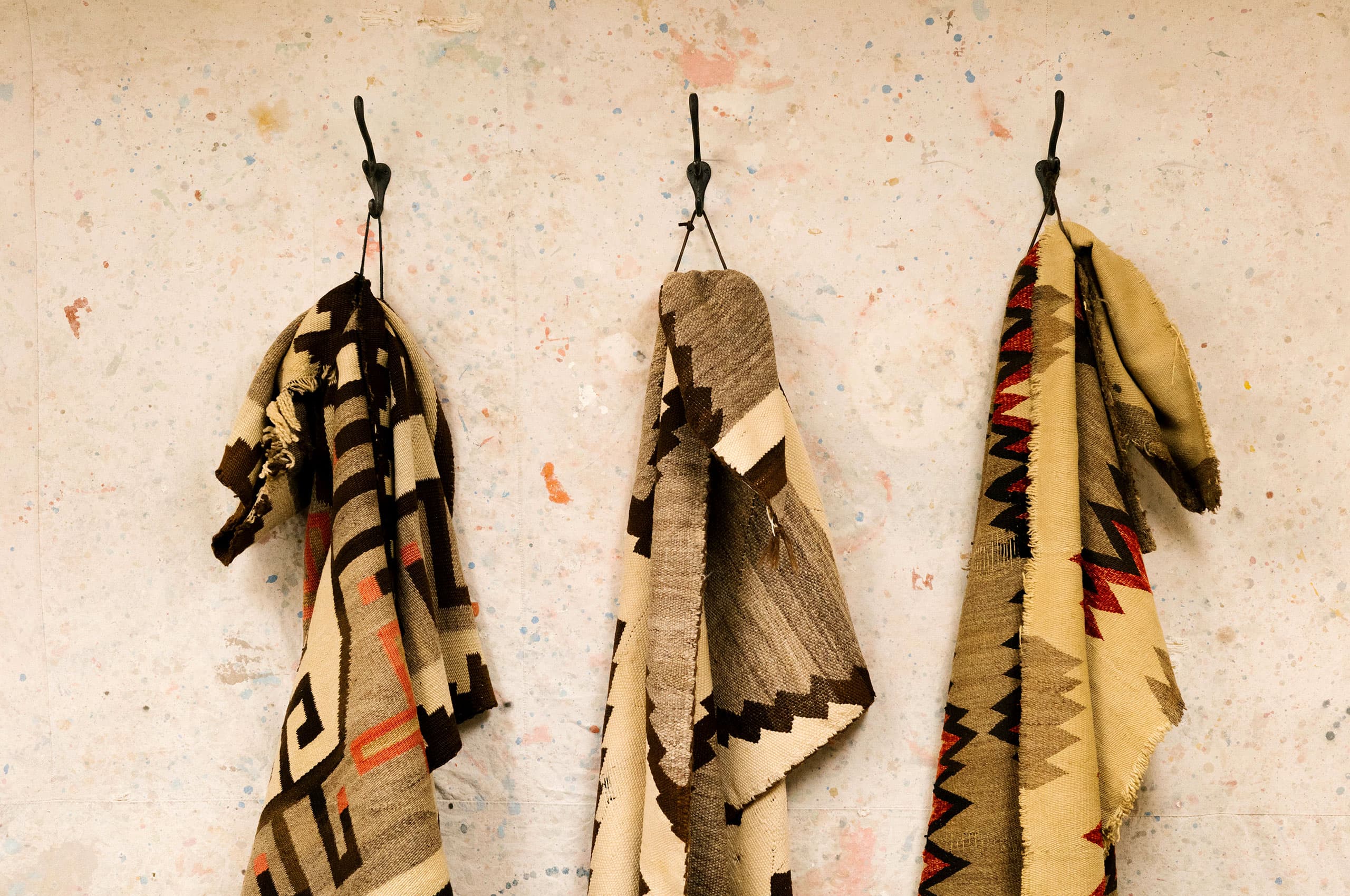
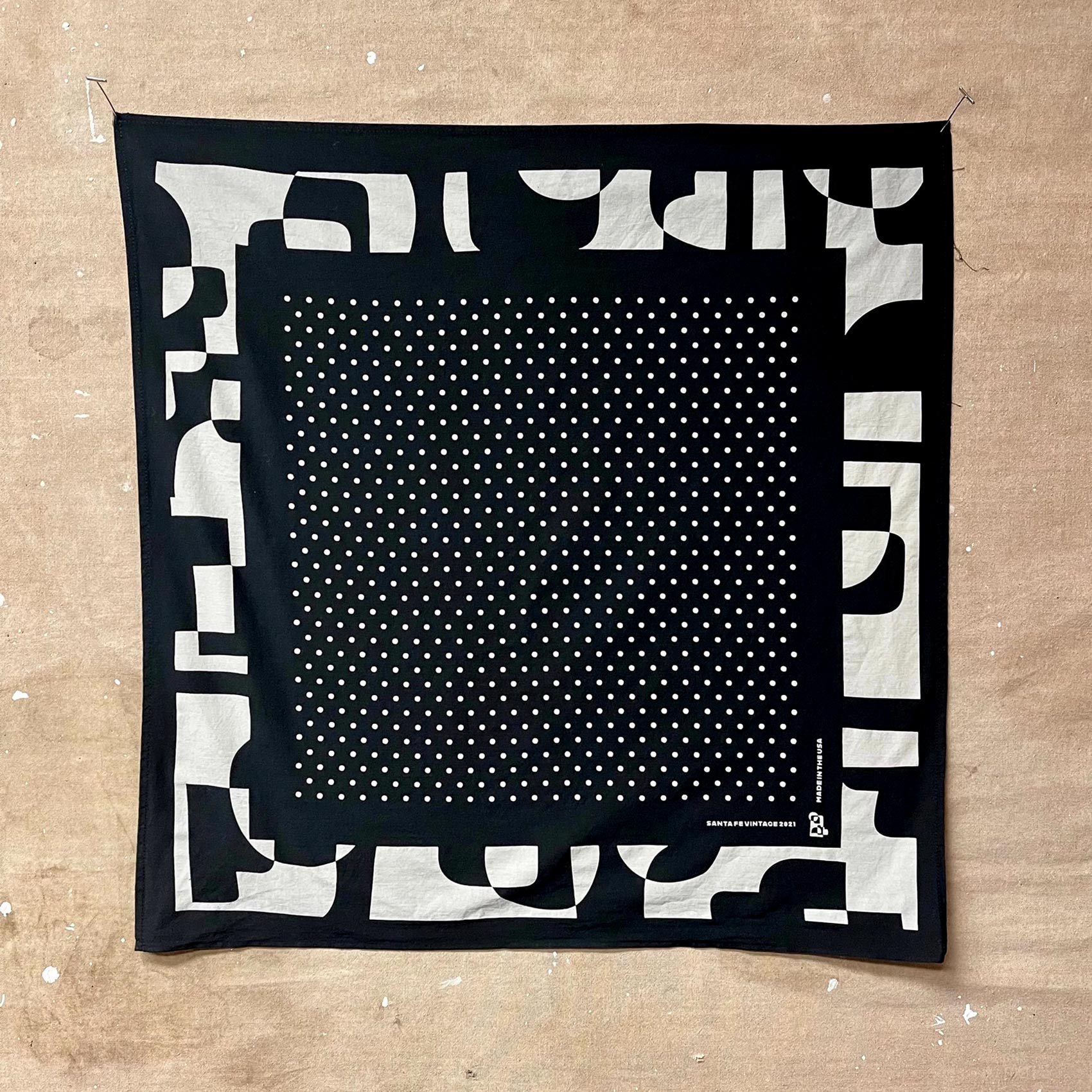
We also worked to create a set of bandannas that mimic the stacks and stacks found in the showroom itself.
