CIRD
The Citizens’ Institute on Rural Design. An initiative focused on empowering local citizens to shape the future design of their communities.
The Citizens’ Institute on Rural Design. An initiative focused on empowering local citizens to shape the future design of their communities.
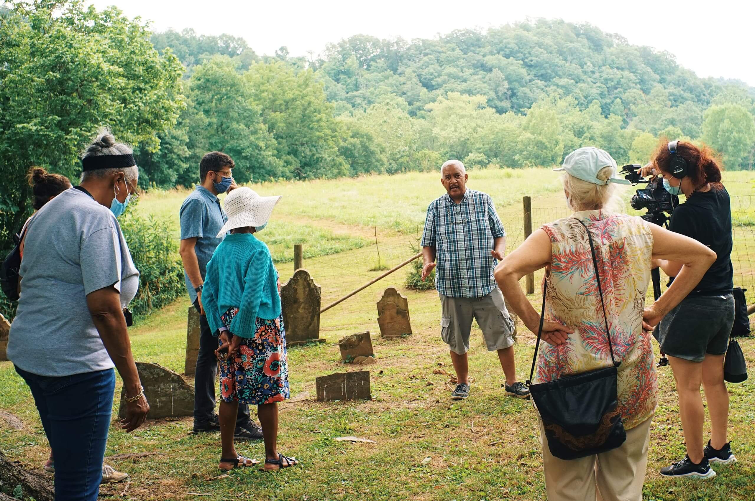
The Citizens’ Institute on Rural Design is a leadership initiative of the National Endowment for the Arts in partnership with the Housing Assistance Council. Focusing on communities with populations of 50,000 or less, CIRD empowers local citizens to use their unique artistic and cultural resources to guide local development and shape the future design of their communities.
Established in 1991 by the National Endowment for the Arts, CIRD offers competitive funding to host multi-day community design workshops guided by design, planning, and creative placemaking professionals, as well as design-driven peer learning programs and events.
Over the last 30 years, they have supported over 100 communities in all regions of the country, empowering residents to leverage local assets for the future to build better places to live, work, and play.
In need of an update, CIRD approached Mast to create an elegant, natural evolution and expansion of their identity to coincide with a wholly modernized web presence.
Collaborator: Hunter Thompson
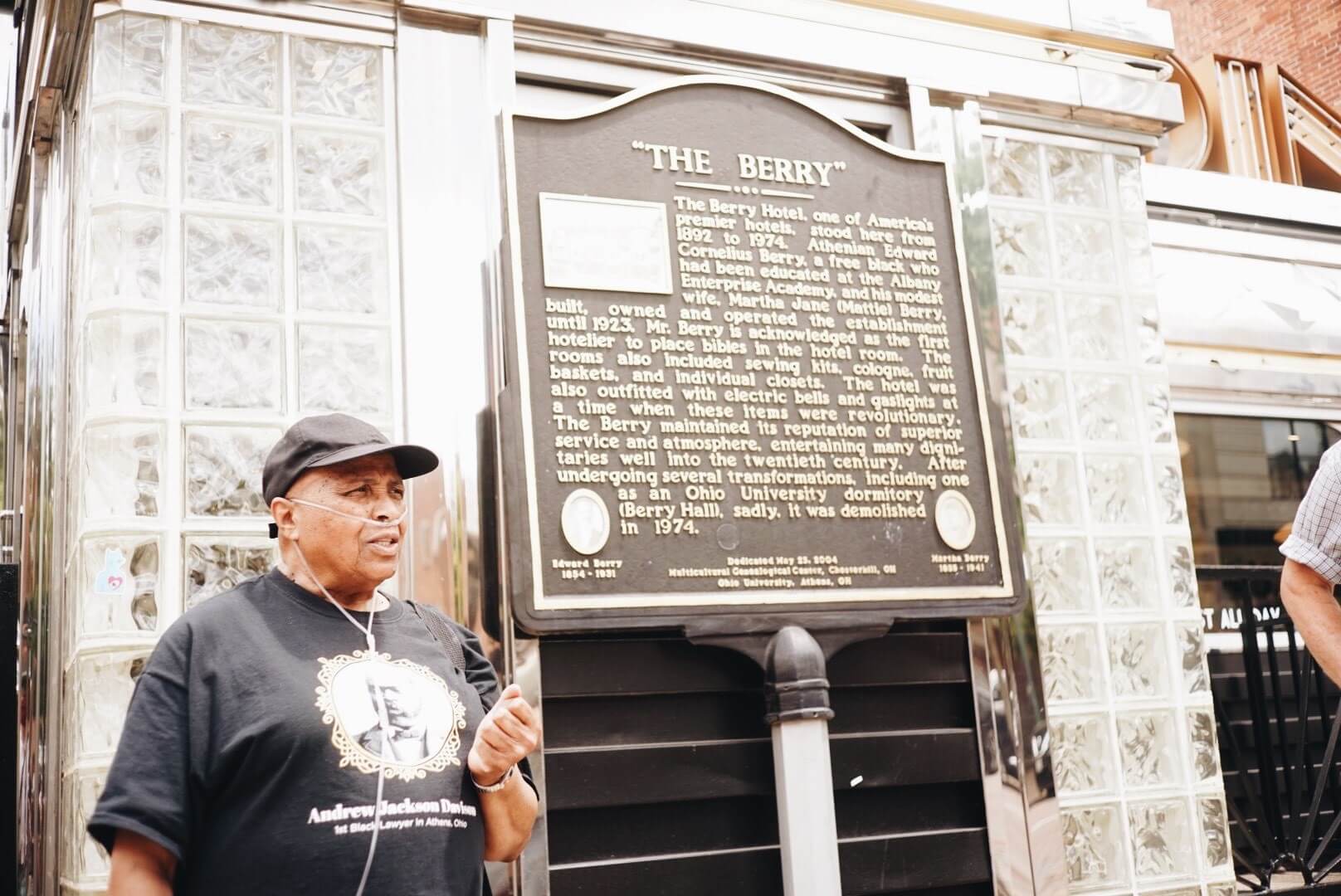
CIRD works with a geographic cross-section of communities that demonstrate community capacity and strong partnerships, a commitment to diverse participation and engagement of all the demographic groups present in their community, and the potential to achieve actionable results.
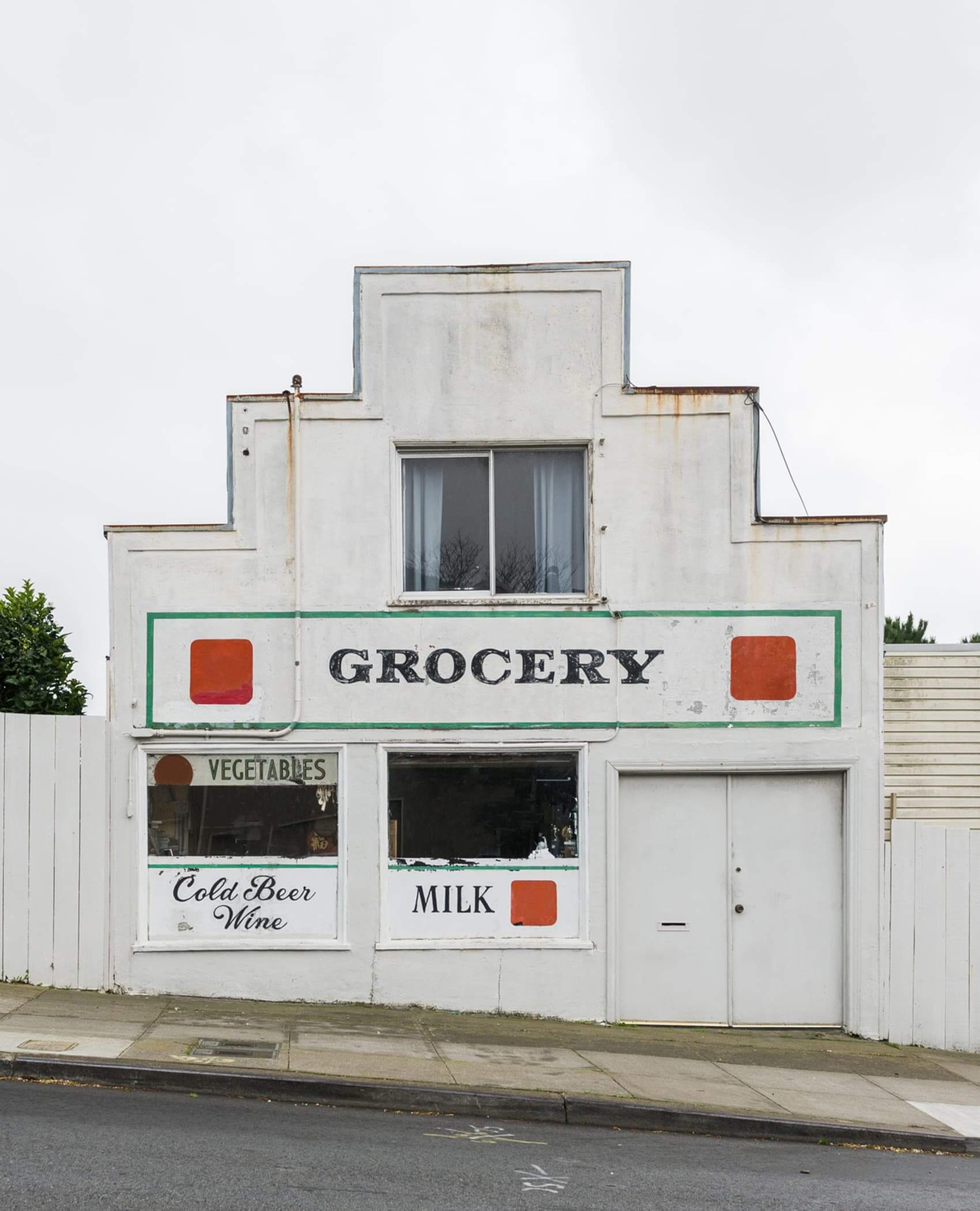
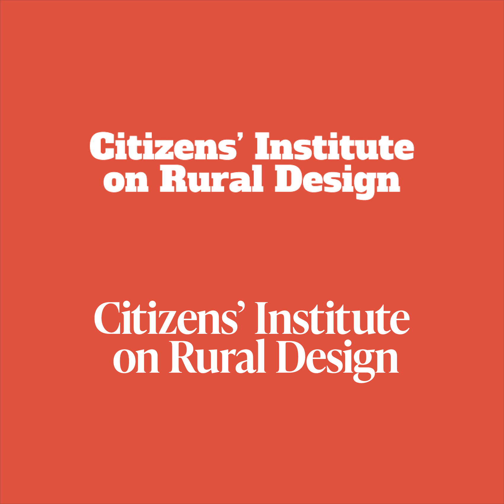
CIRD needed to create an evolution of their wordmark that provided increased legibility and usability while conveying their rich history and meaningful impact as an organization. Inspired by the historical signage found in the communities they support, we created a natural, elegant evolution of their wordmark without losing any existing brand equity.
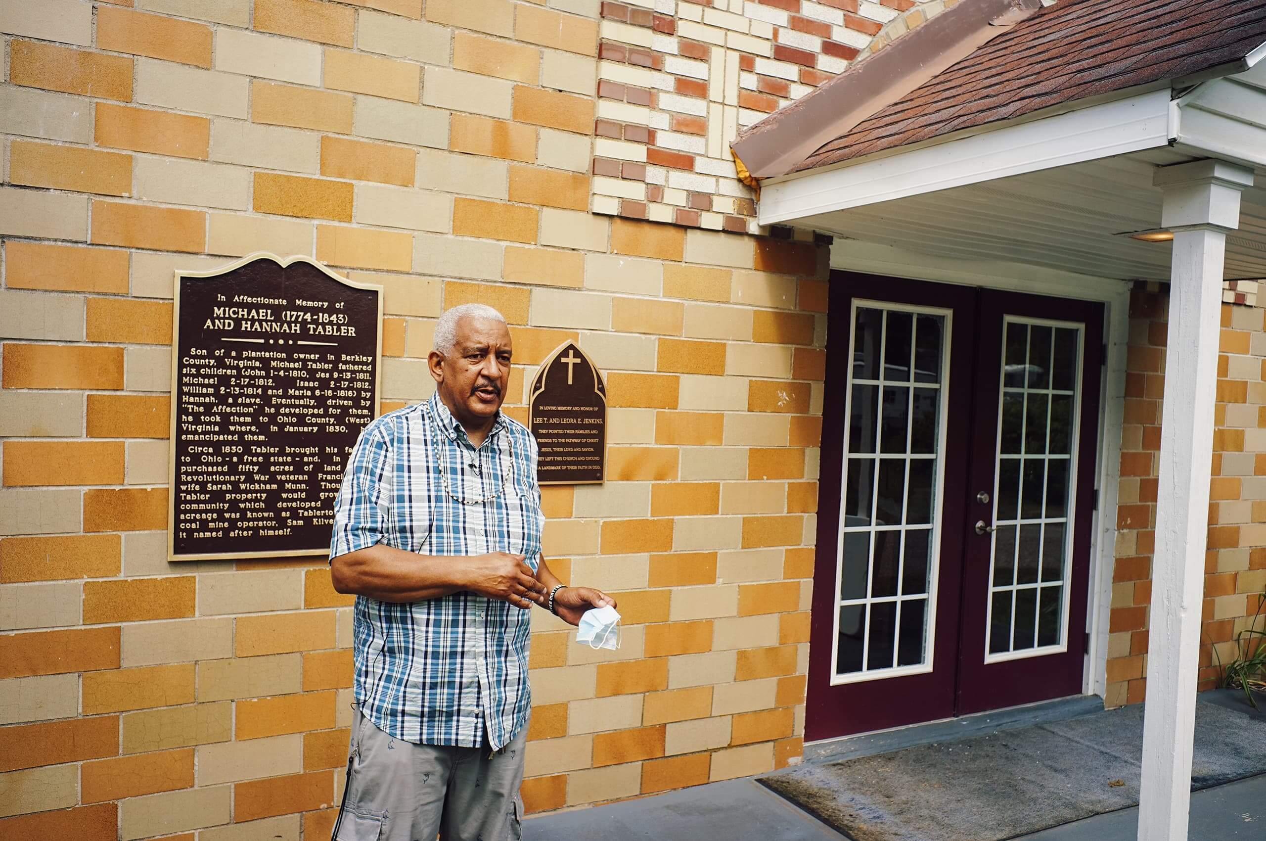

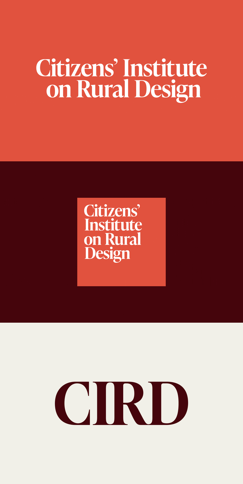
We needed to create a modular, flexible logo system to account for the longer name—resulting in a holistic set for all current and future use-cases for the brand.

We worked closely with the CIRD team to plan, design, and launch an updated website that better aligned with the legitimacy and legacy of the organization while prioritizing usability and functionality.
See more of the website we created for CIRD → here
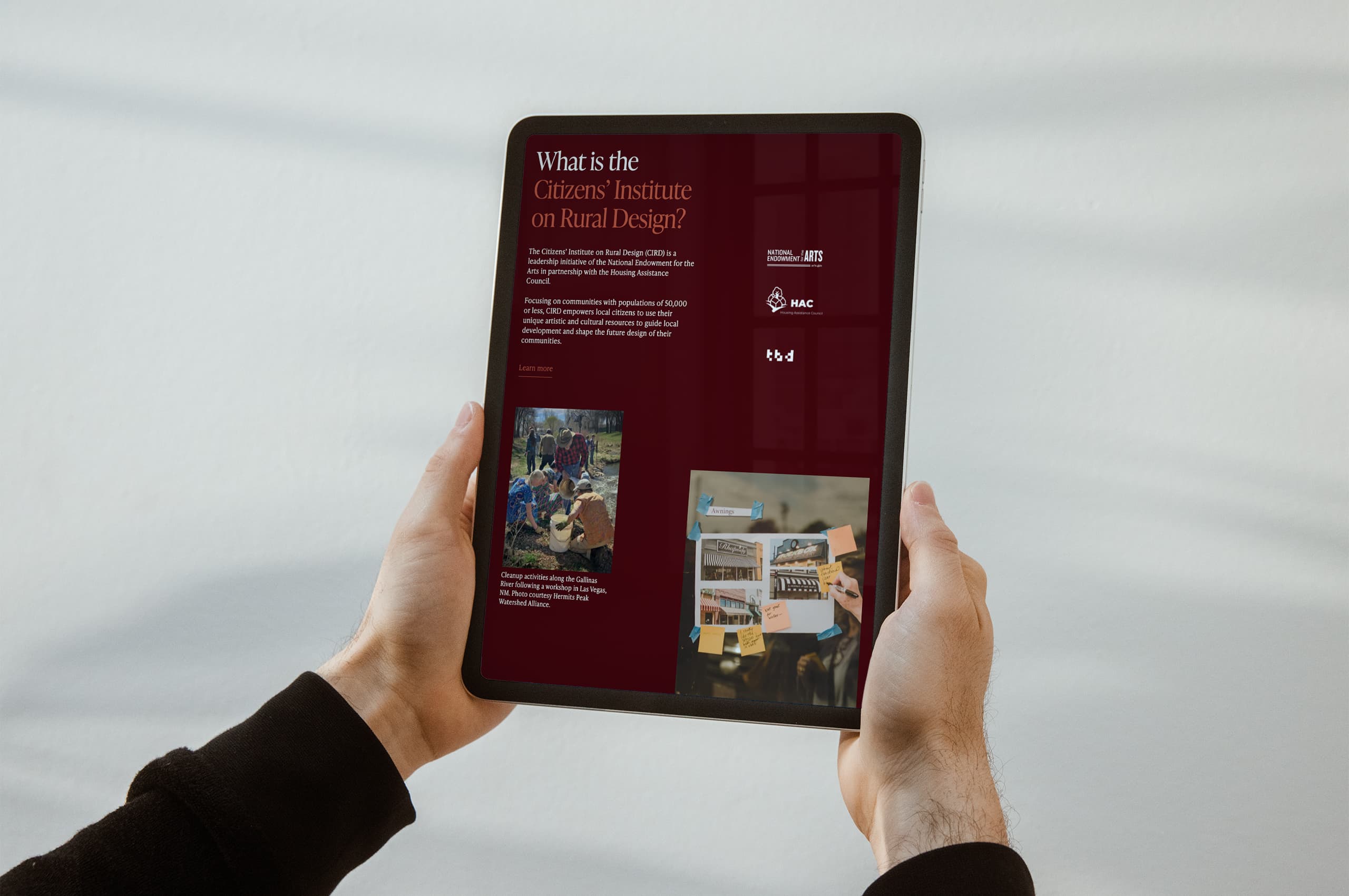
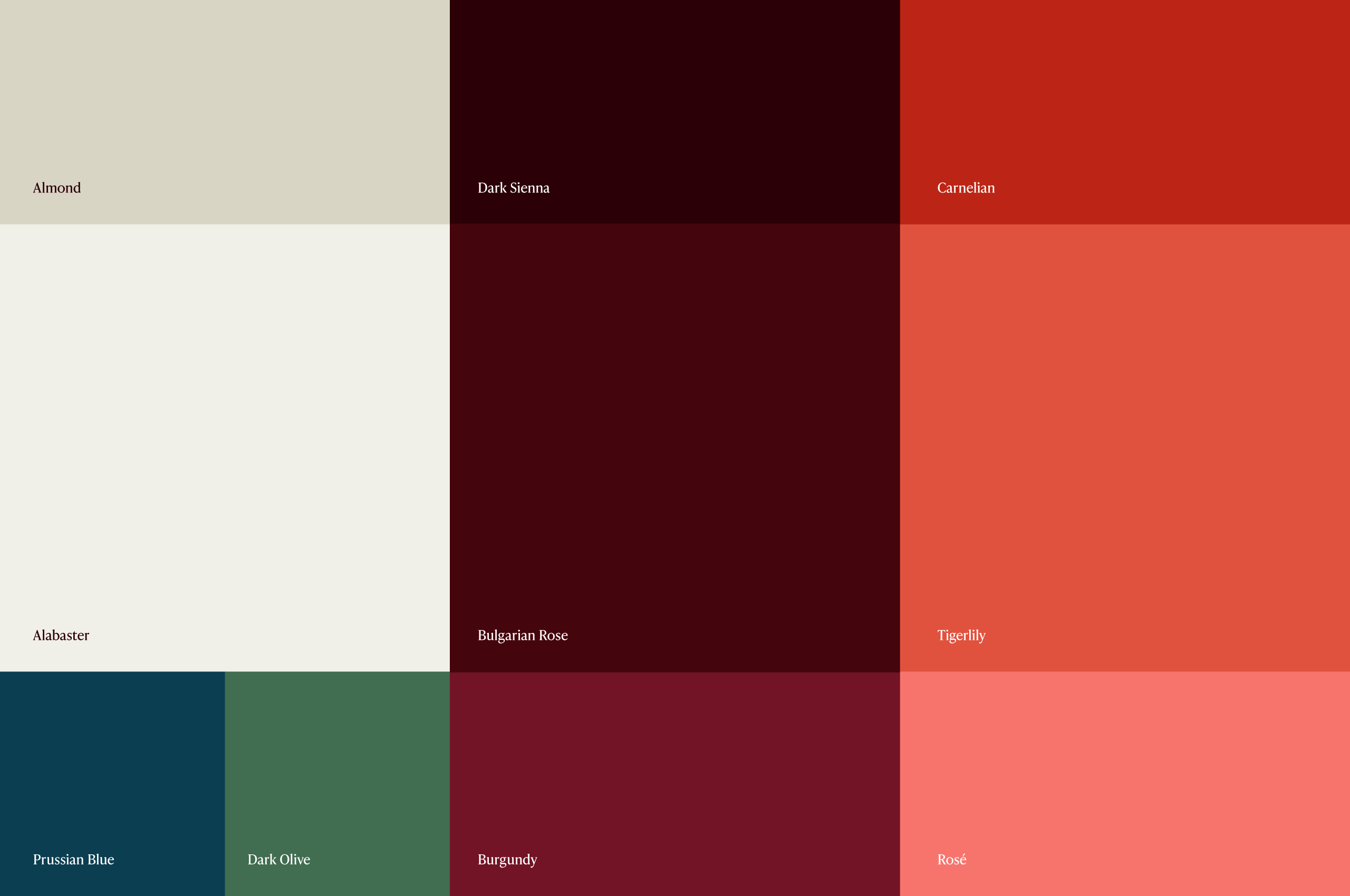
In a continued effort to preserve existing brand equity, we retained the CIRD core orange, developing a robust, warm, and inviting secondary palette to be utilized throughout the website.
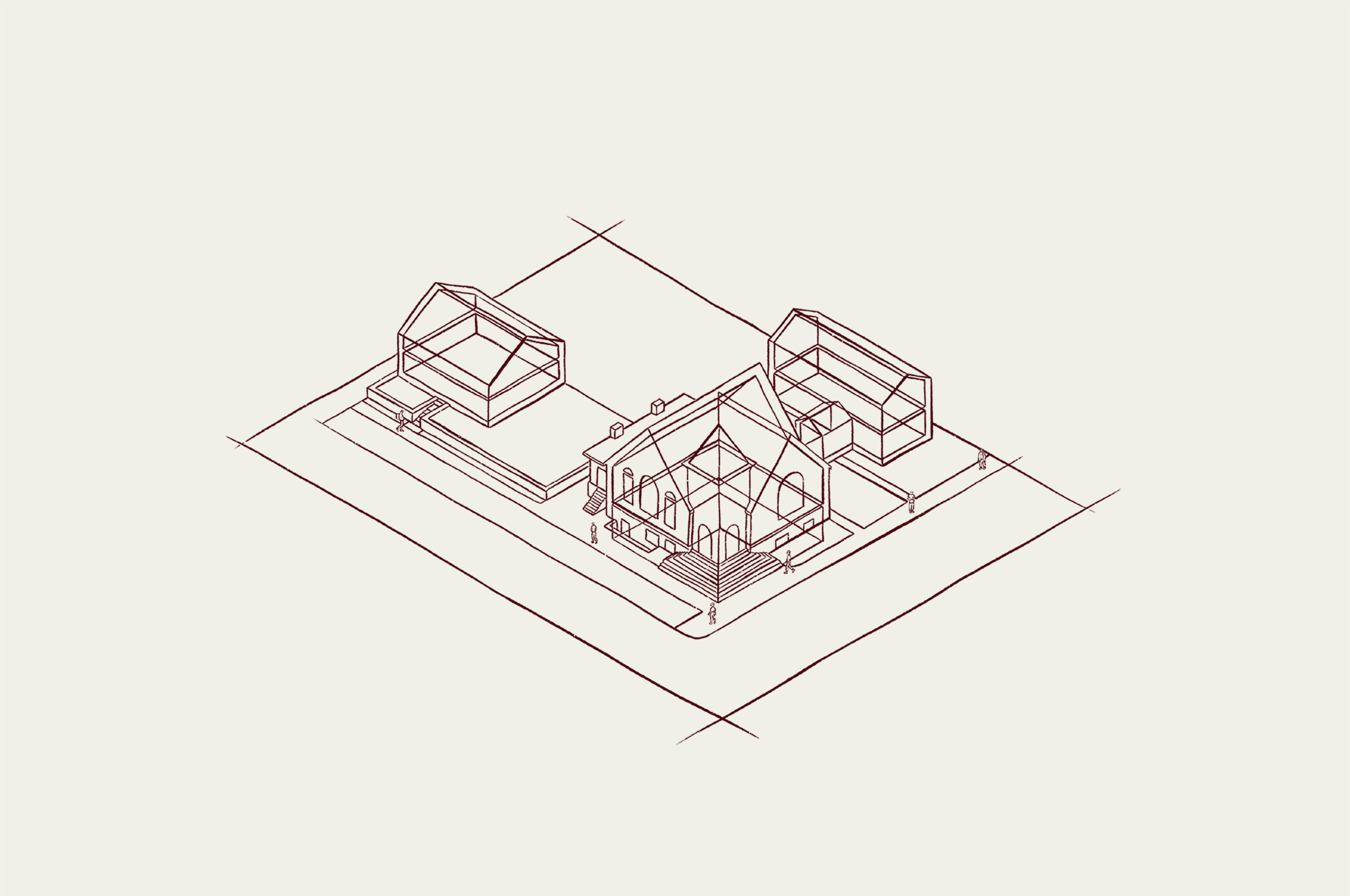
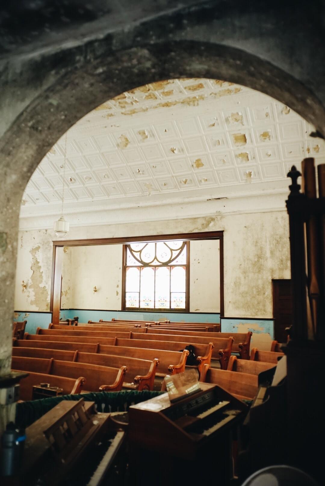
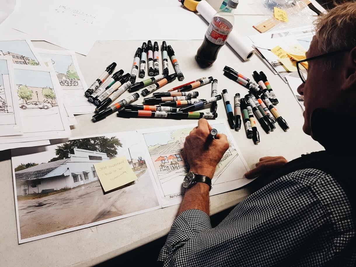
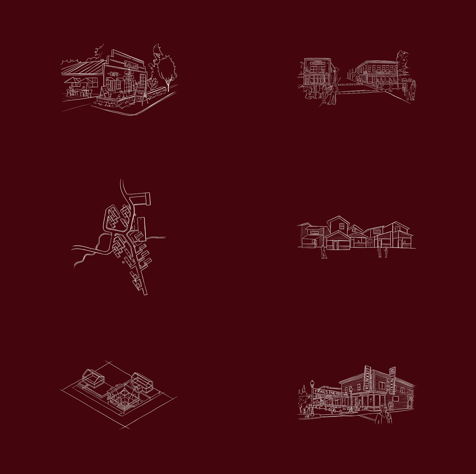
We developed a suite of illustrations to help tell a broader story and convey more complex ideas on the website to accompany their photographic assets. Modeled after architectural sketches of the communities, these illustrations bring a solid and expressive personality to the website.

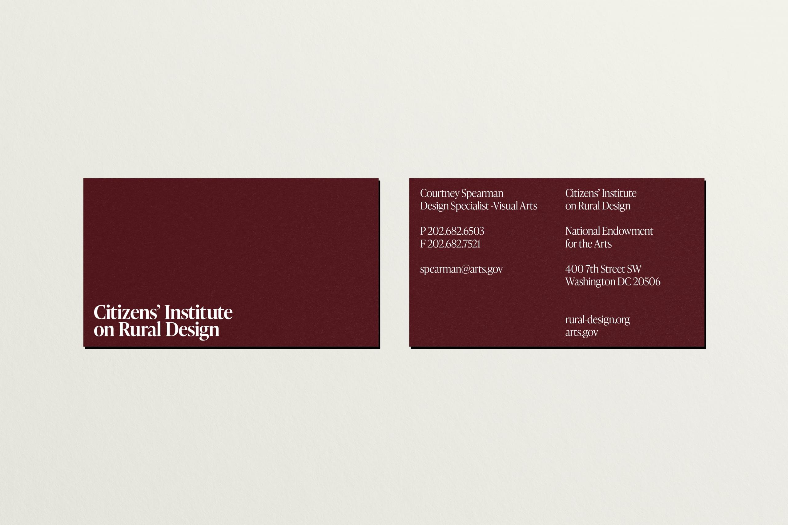
Often present in conjunction with the NEA and HAC logos, the CIRD logo needed to fit into this set while maintaining its own personality.
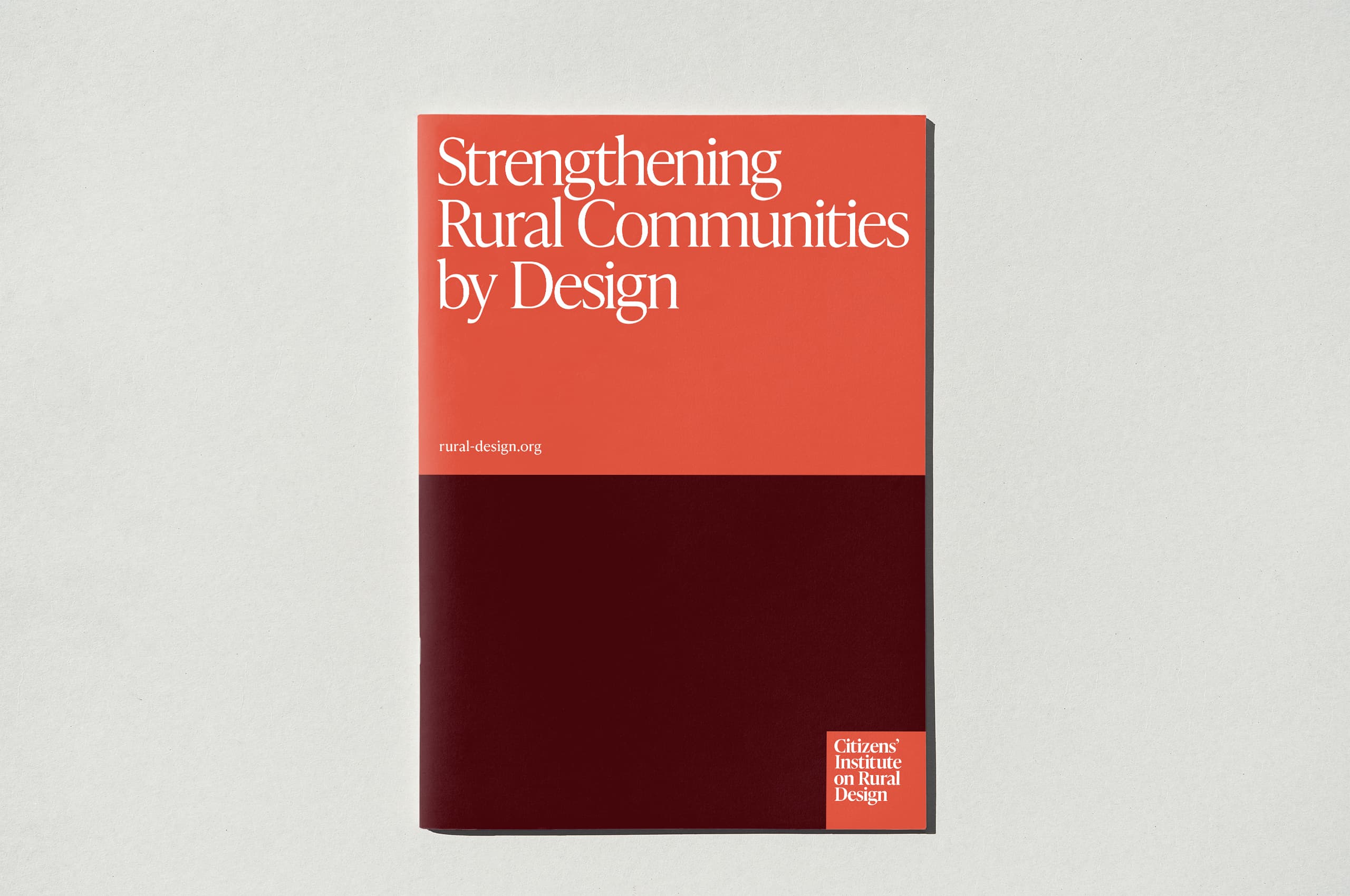
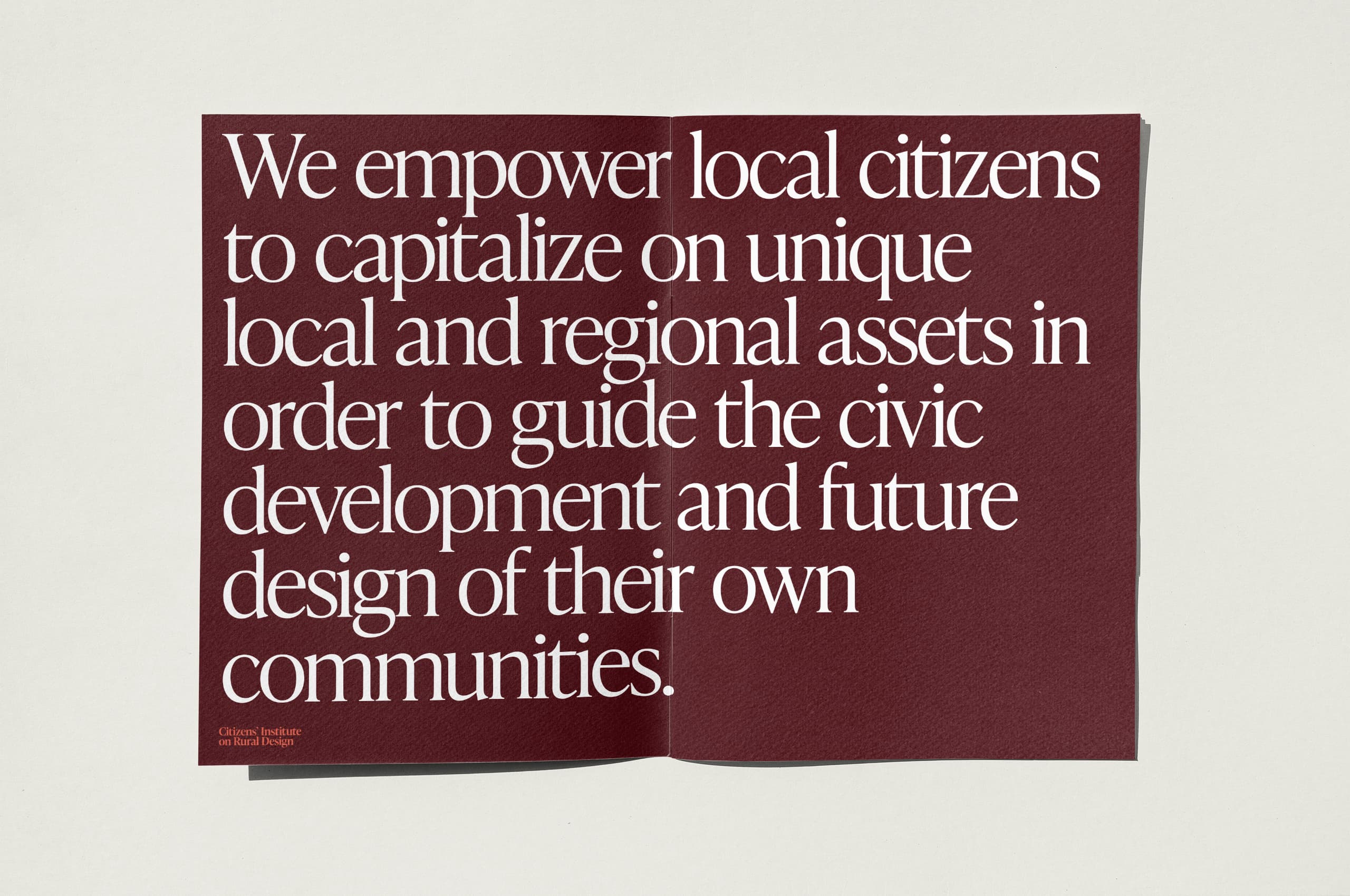
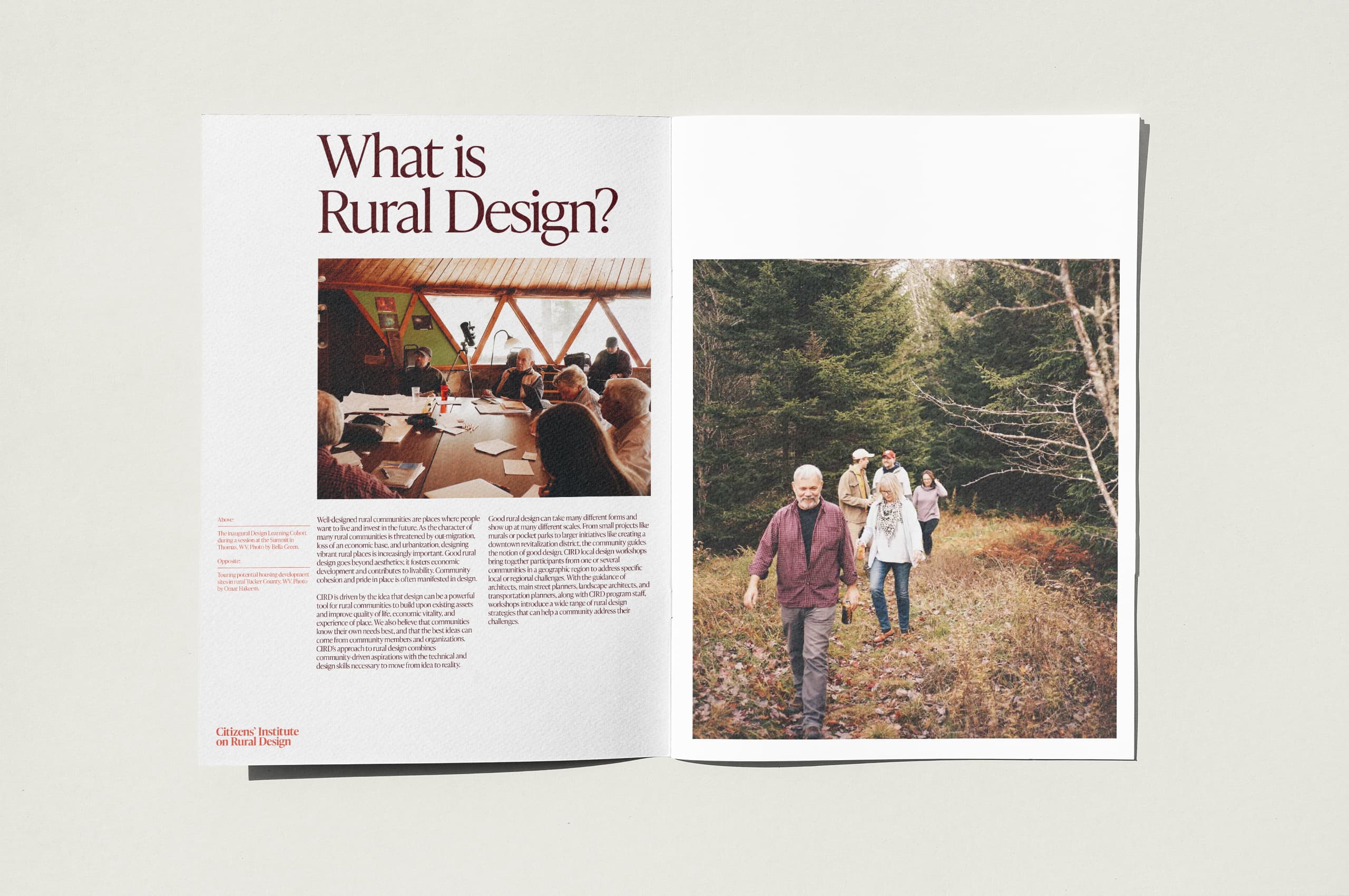
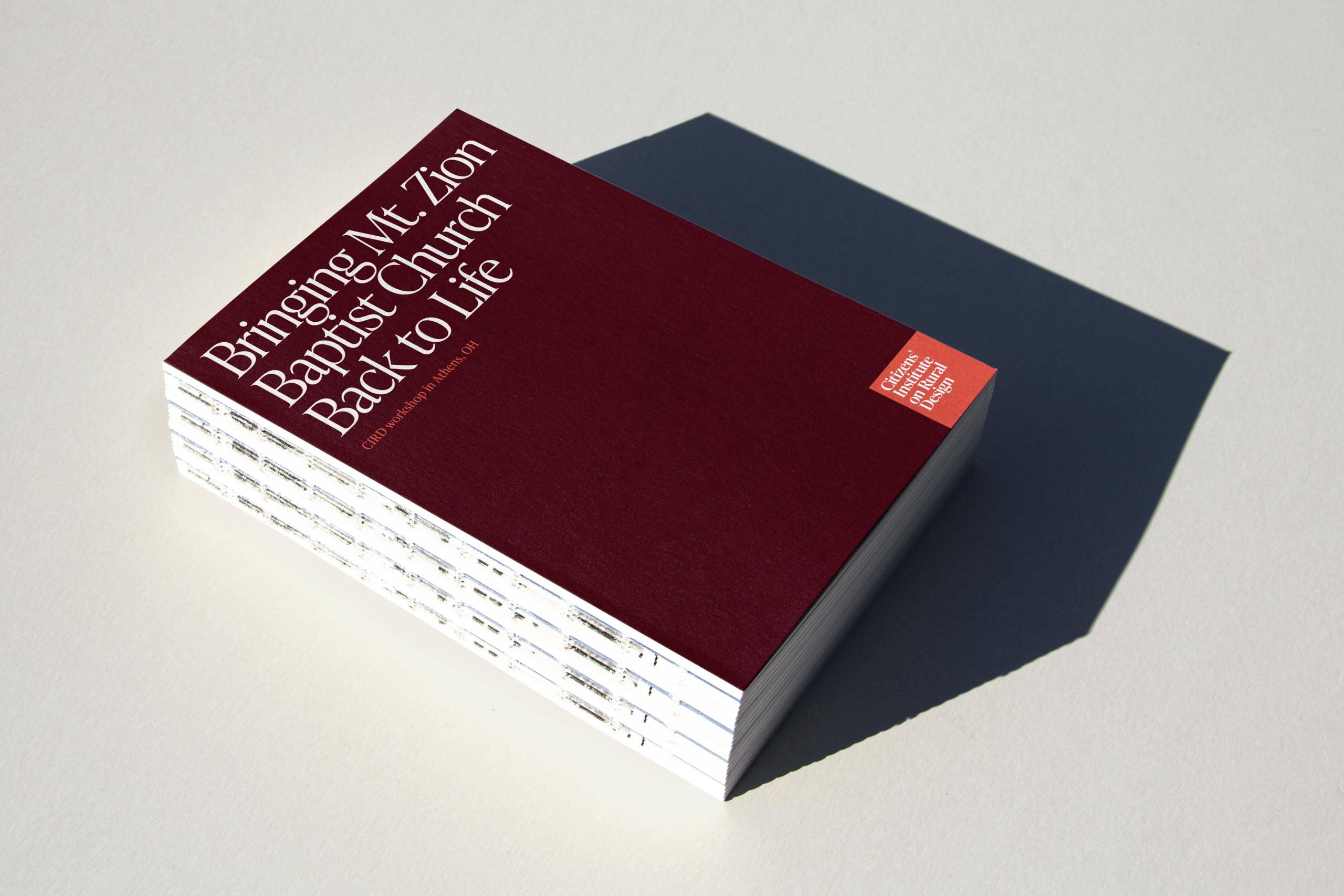
The updated wordmark set the tone for the typographic system at large, resulting in an elegant, refined system to be utilized throughout the physical and digital applications of the brand.
