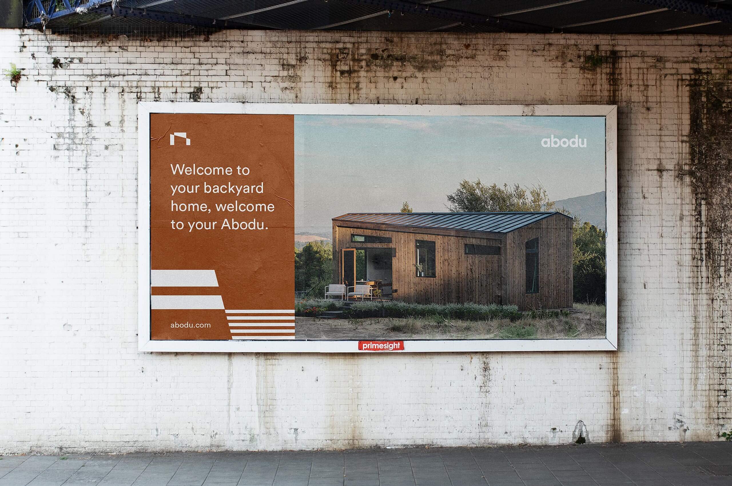
Abodu
Working to create more affordable housing in the Bay-Area through beautifully designed backyard homes, installed with ease.
Working to create more affordable housing in the Bay-Area through beautifully designed backyard homes, installed with ease.
The current availability of housing in the Bay-Area does not support the ever-growing population, causing a serious lack of affordable housing, and housing in general. With new regulations in California, many areas have recently made it legal and easy for homeowners to add Accessory Dwelling Units or ADUs to their property. These ADUs are a perfect way to add an affordable rental, guest house, or a studio to an existing lot.
After Eric McInerney and John Geary saw this need for more housing, they decided to quit their jobs and found Abodu. They were determined to create a high-quality, beautiful, and functional product that would do away with the traditional woes of construction projects to create more livable space.
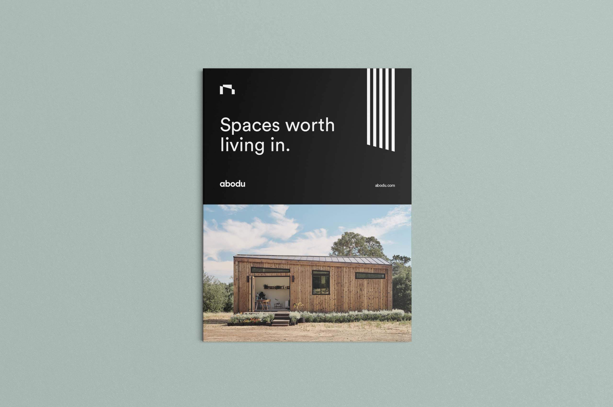
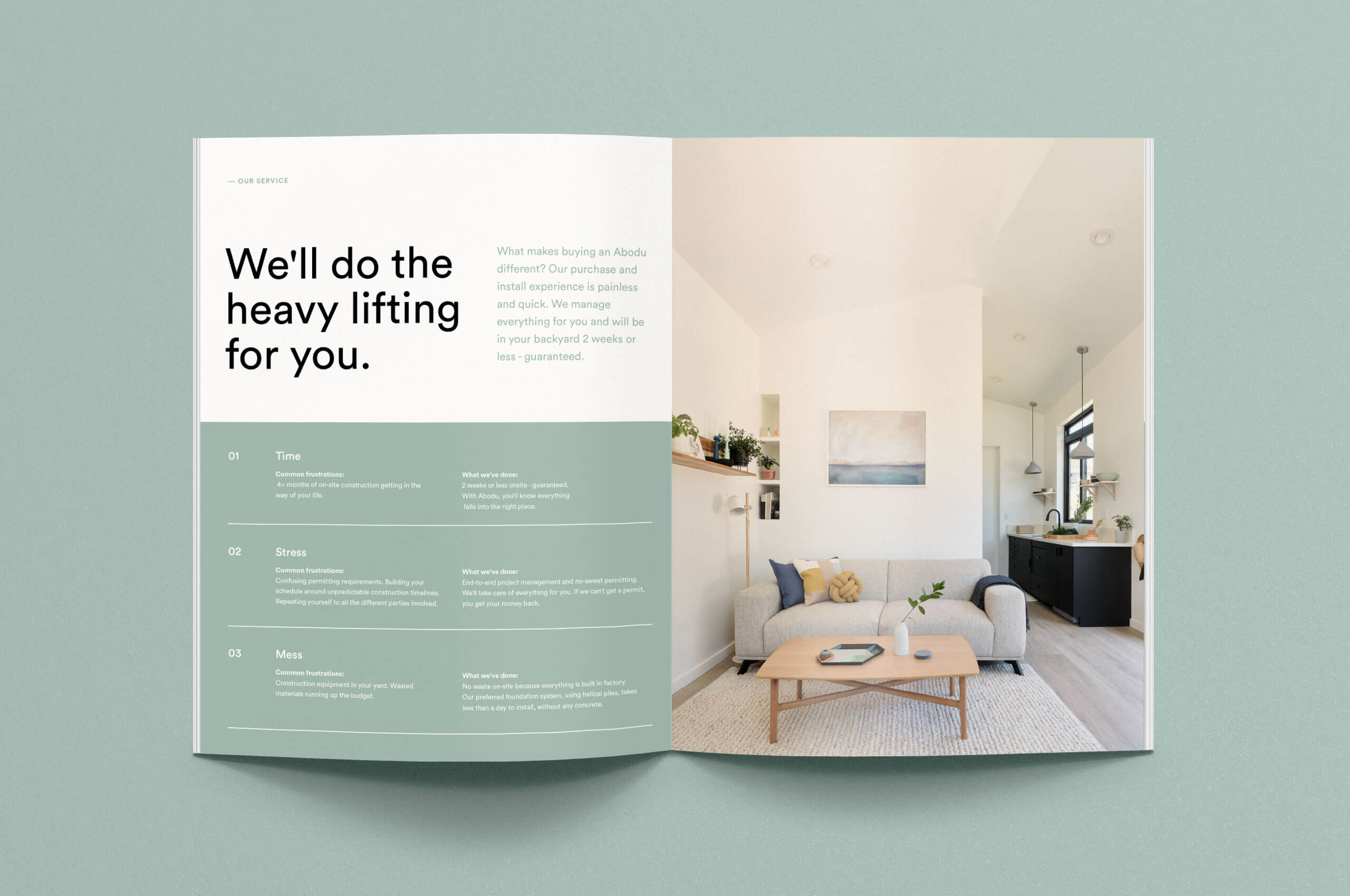
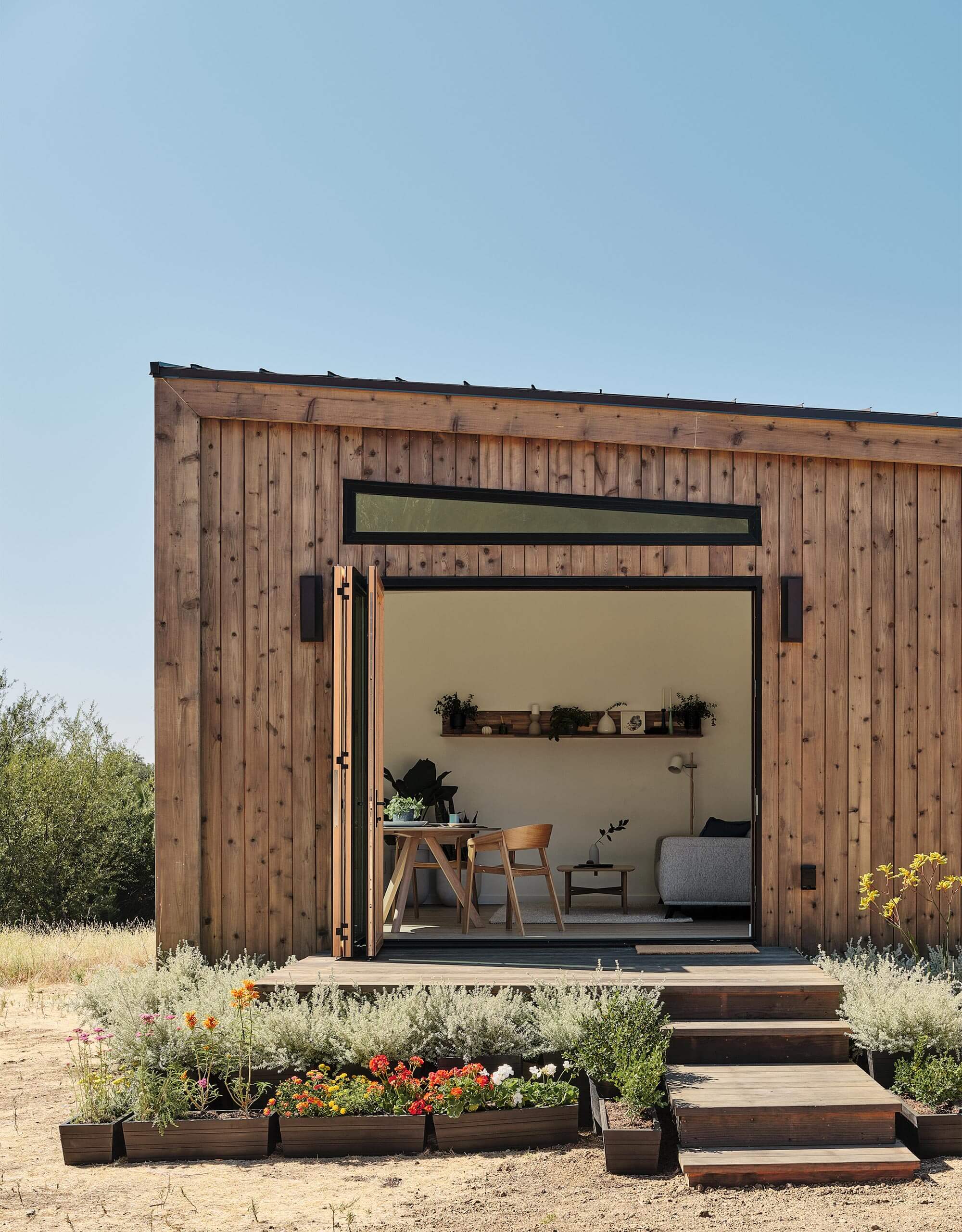
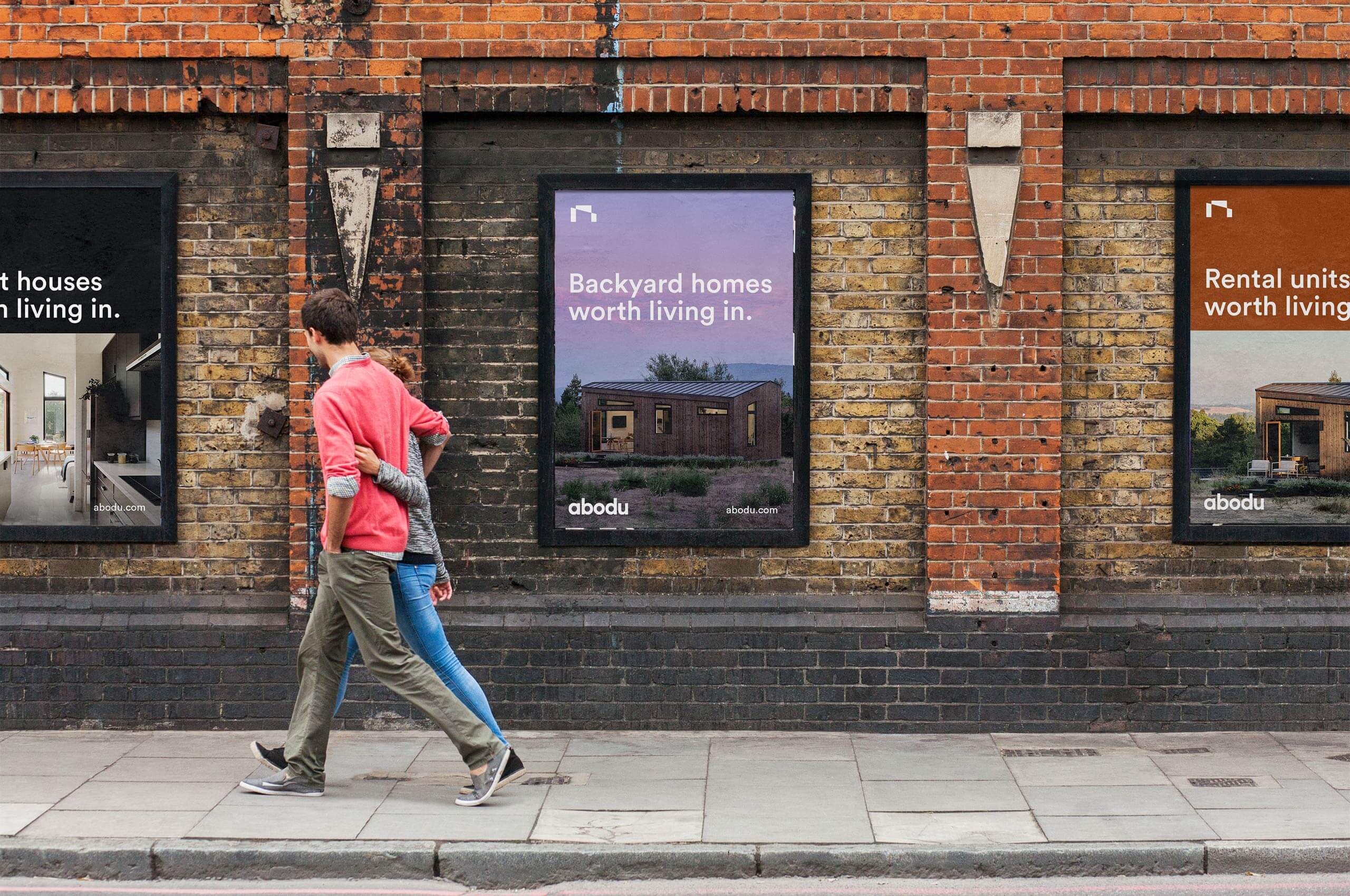
With this goal in mind—and pencil sketches in hand, Eric and John came to Mast at the very onset of the project to help create an identity as functional, approachable, and modern as the units themselves. By starting the project so early in the process, we were able to create a brand that was informed by the units themselves, as well as having an influence on the aesthetics of the units. This created a strong bond between the identity and the physical spaces ultimately resulting in a brand that married the geometric lines and figures found in the units with a natural, approachable palette.
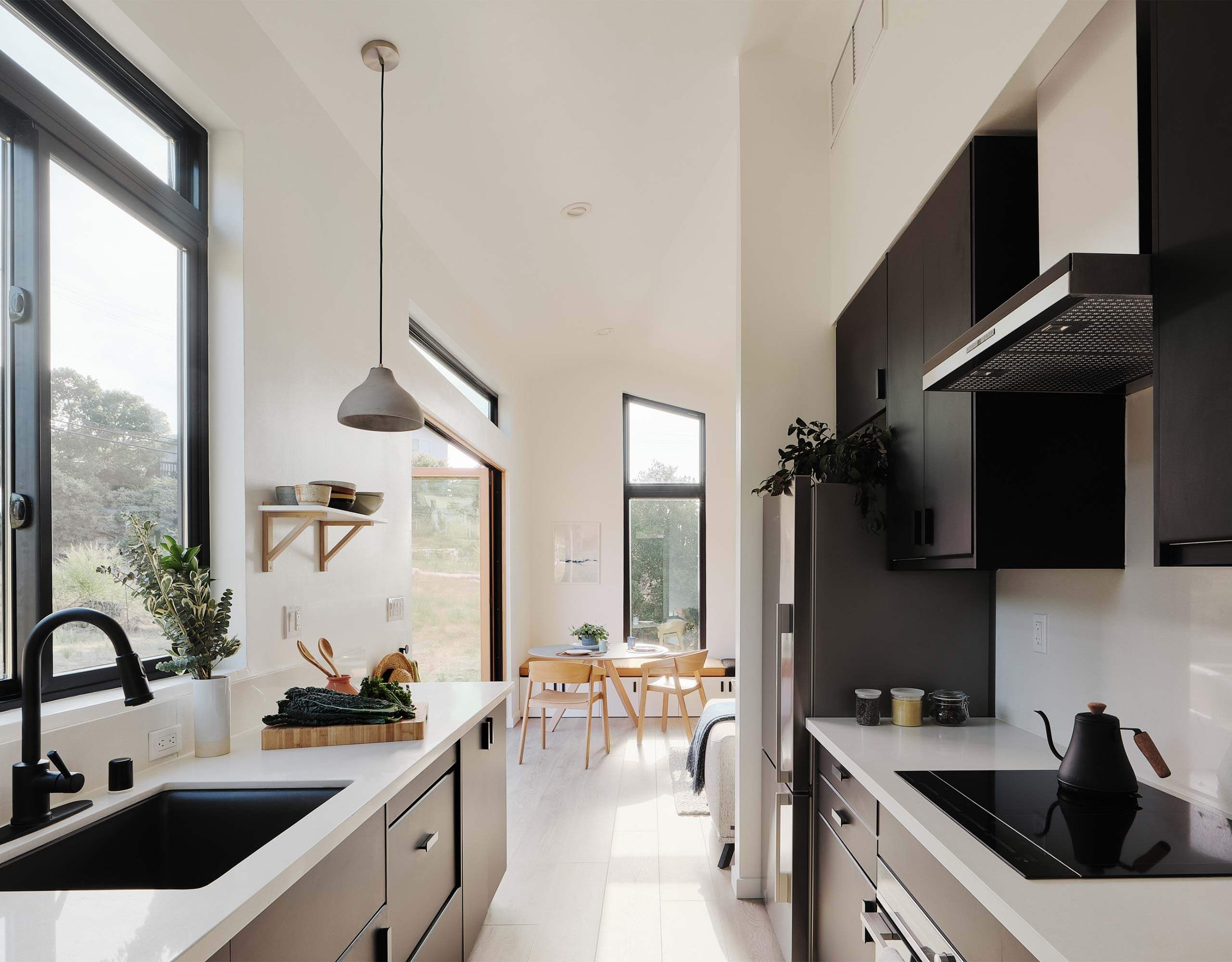
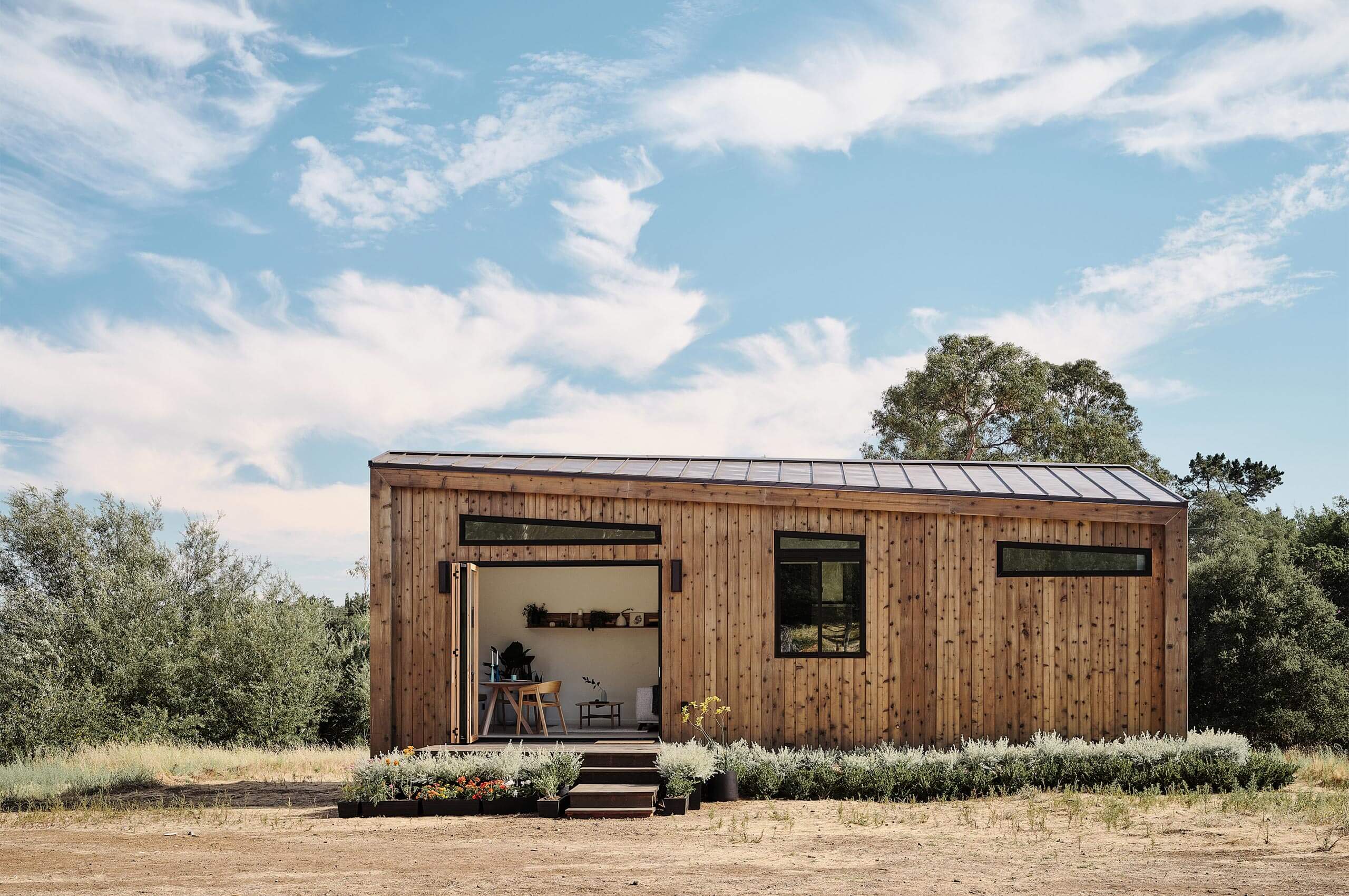
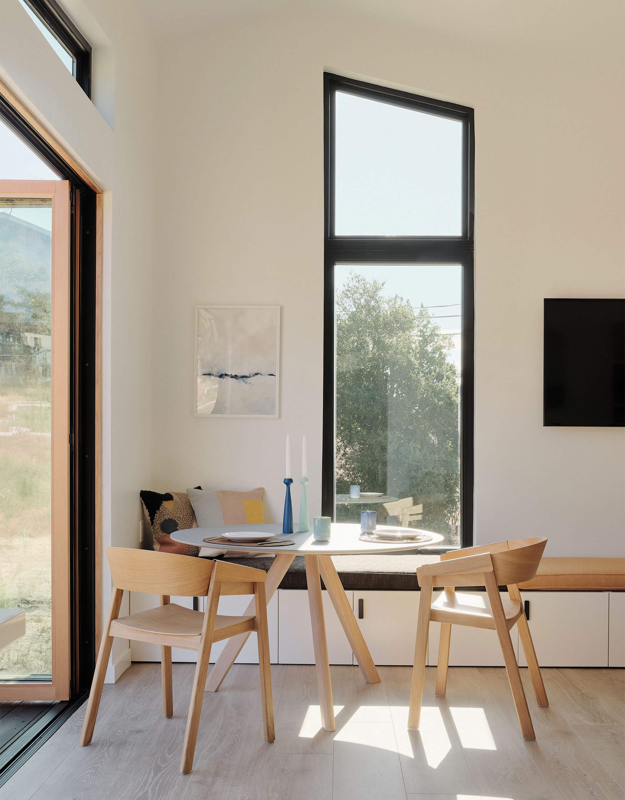
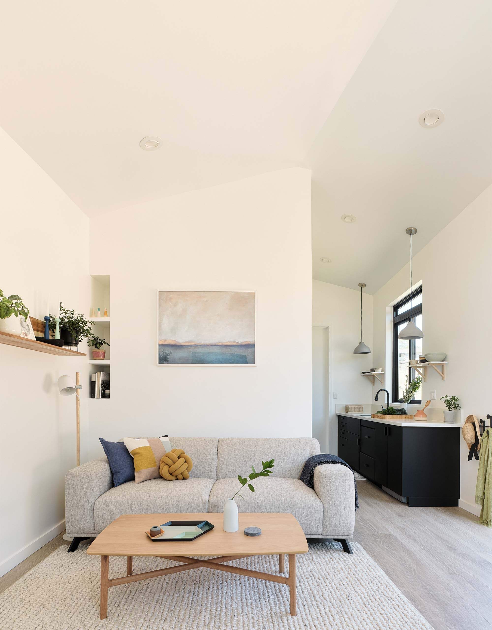
Unit photos by Joe Fletcher.


When developing the symbol, it was important to capture the essence of the forms found in the units, rather than a more direct interpretation. Allowing for a symbol that could grow with Abodu if they choose to add more designs in the future.
We developed an abstracted “A” that takes inspiration from the sharp angles and straight lines of the units to create a symbol as unique as the units themselves.
Working on the identity while the units were still being designed allowed for small moments throughout the space that harken to the symbol itself. These can be especially seen in the windows and ceiling lines. Creating these “ah-ha” moments that create a strong connection to the symbol.
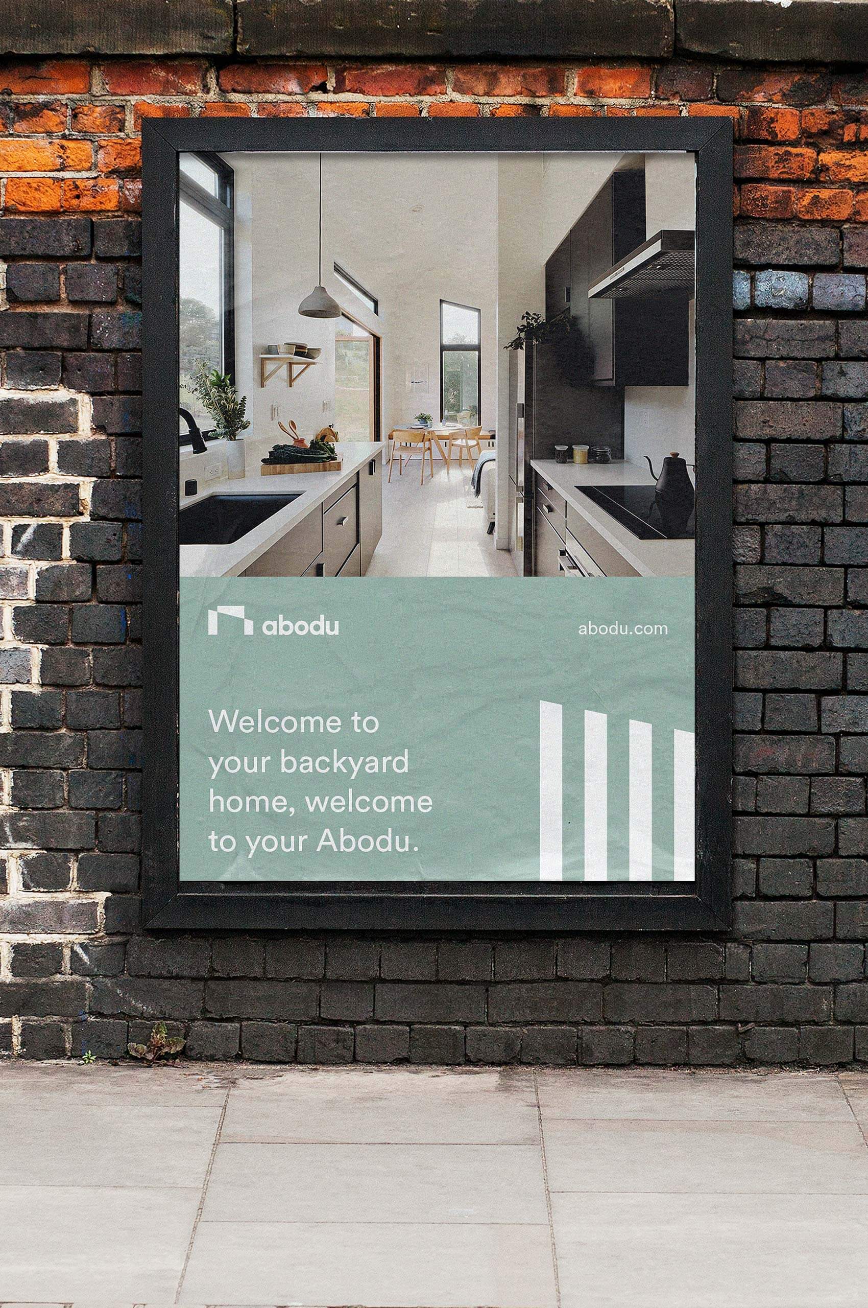
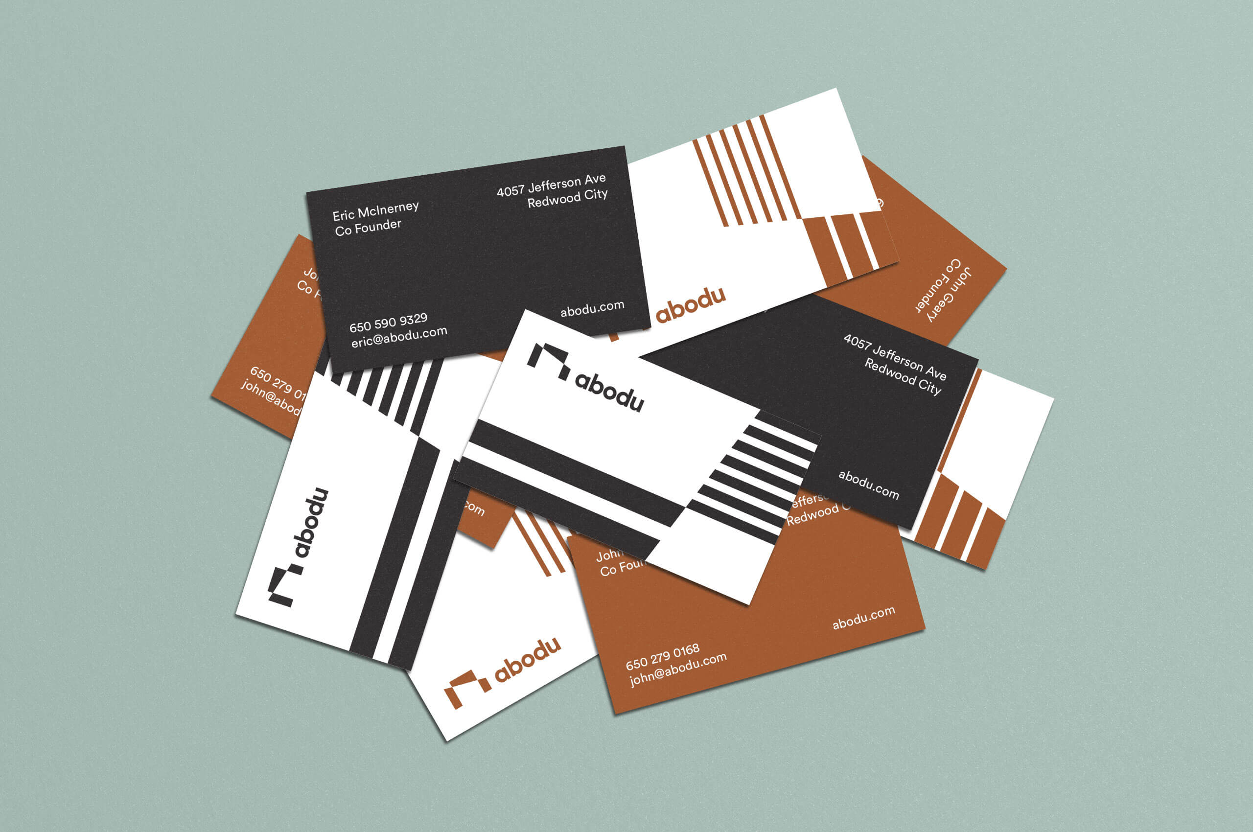
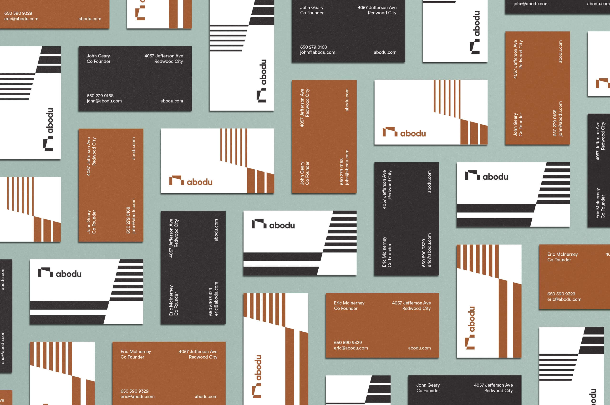
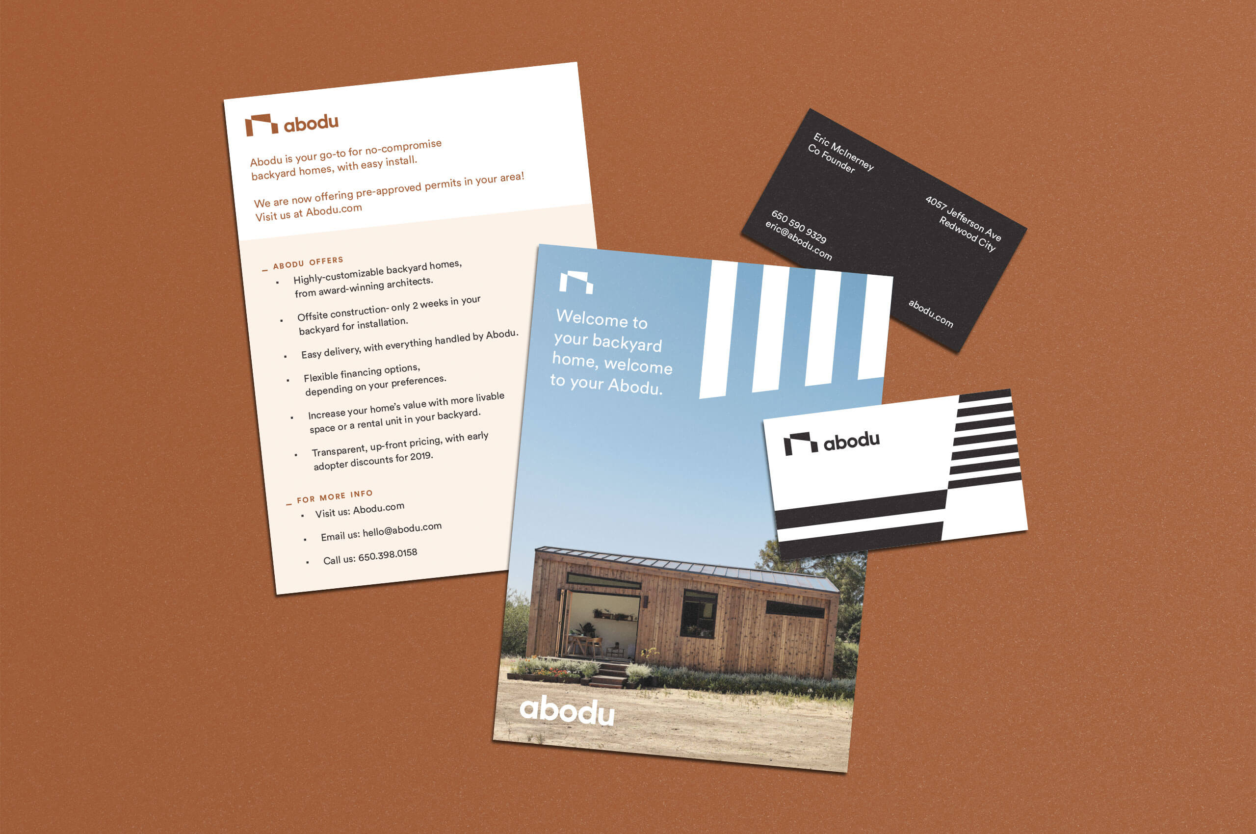
By marrying the angles found in the units with the straight lines of the exterior, we were able to create a distinct patterning system to be used in the physical and digital buildout of the identity.
These elements paired with the muted palette create a sense of balance within the brand ensuring that the brand feels approachable while still feeling modern.
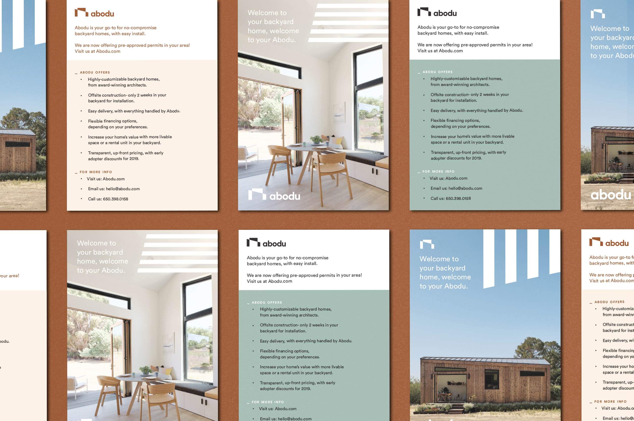
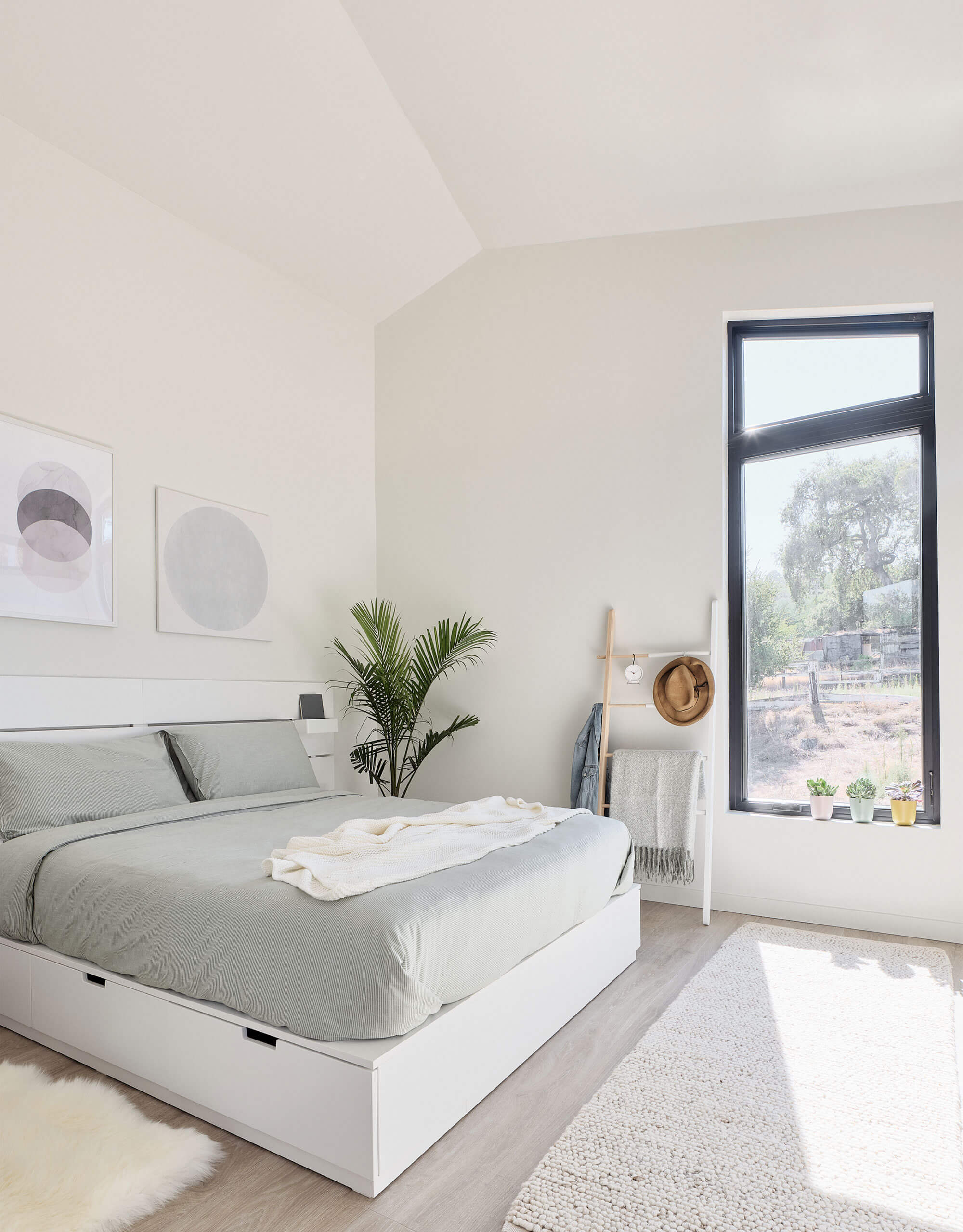
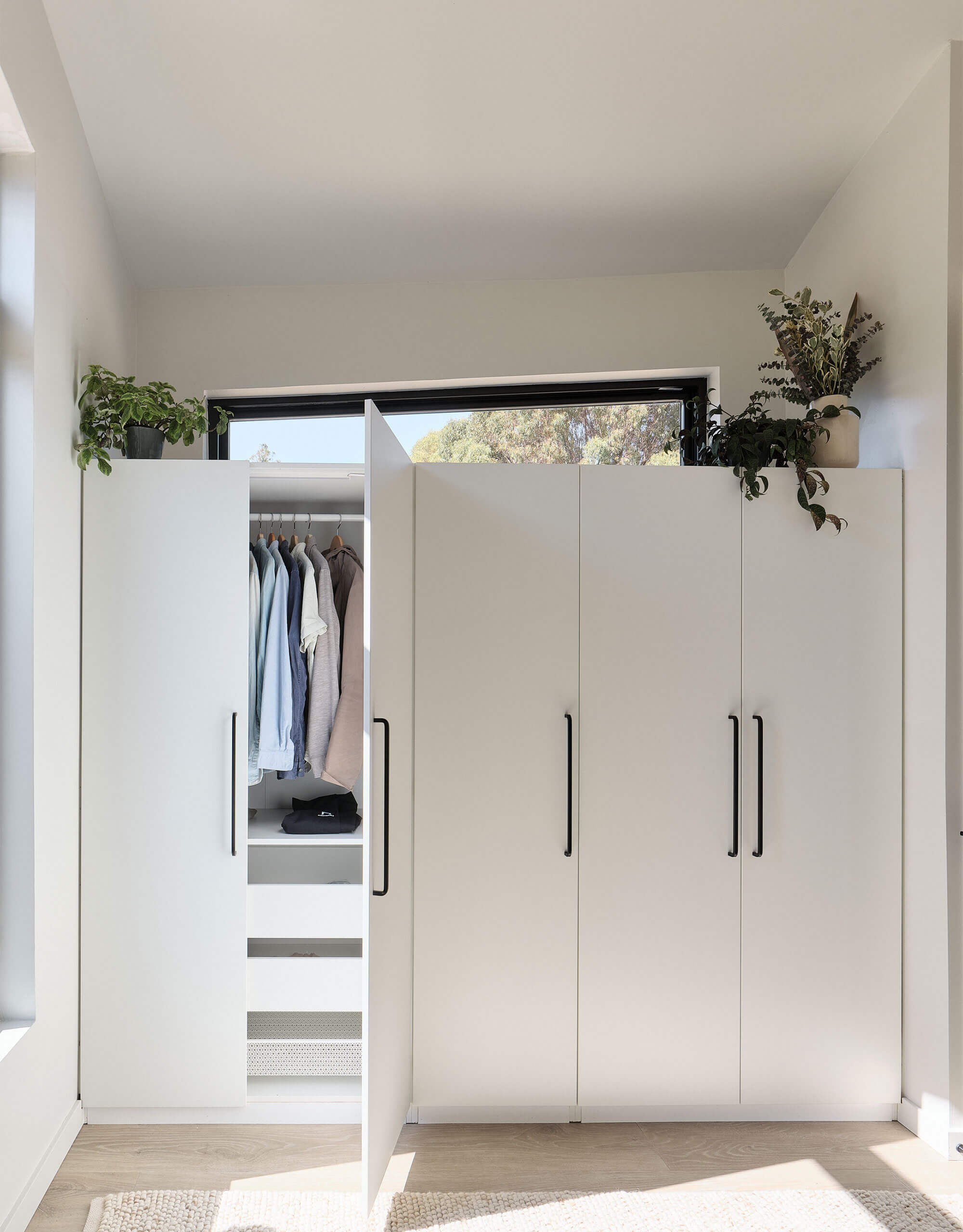
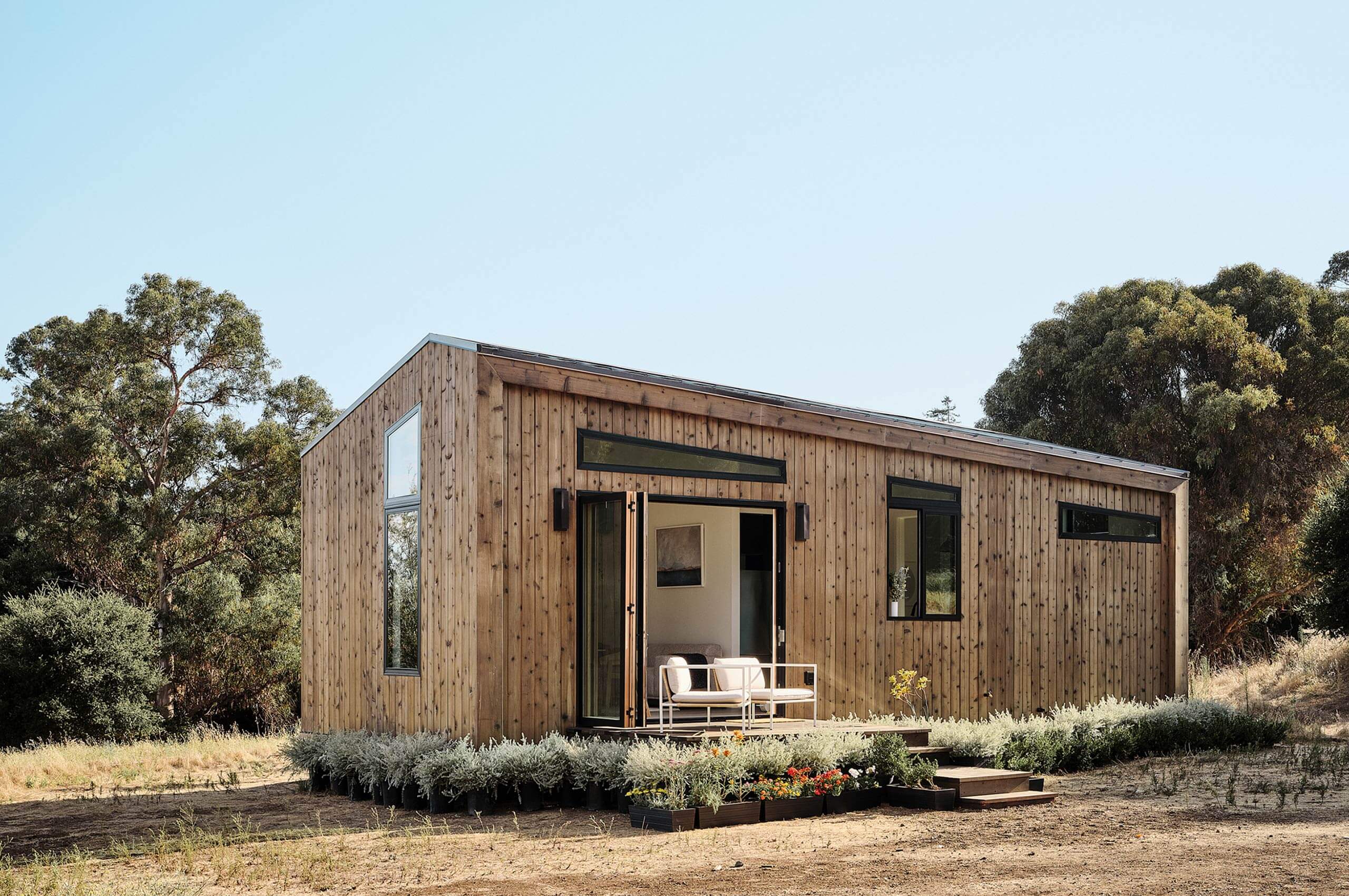
The units themselves were designed by UK-based architecture studio Koto Design. They married their design expertise with California’s coastal influence to develop a backyard home that is both beautiful and functional.
They are constructed off-site, delivered in one piece, and are fully functional in two weeks or less. Creating a timeless backyard home design — without compromising quality or space.
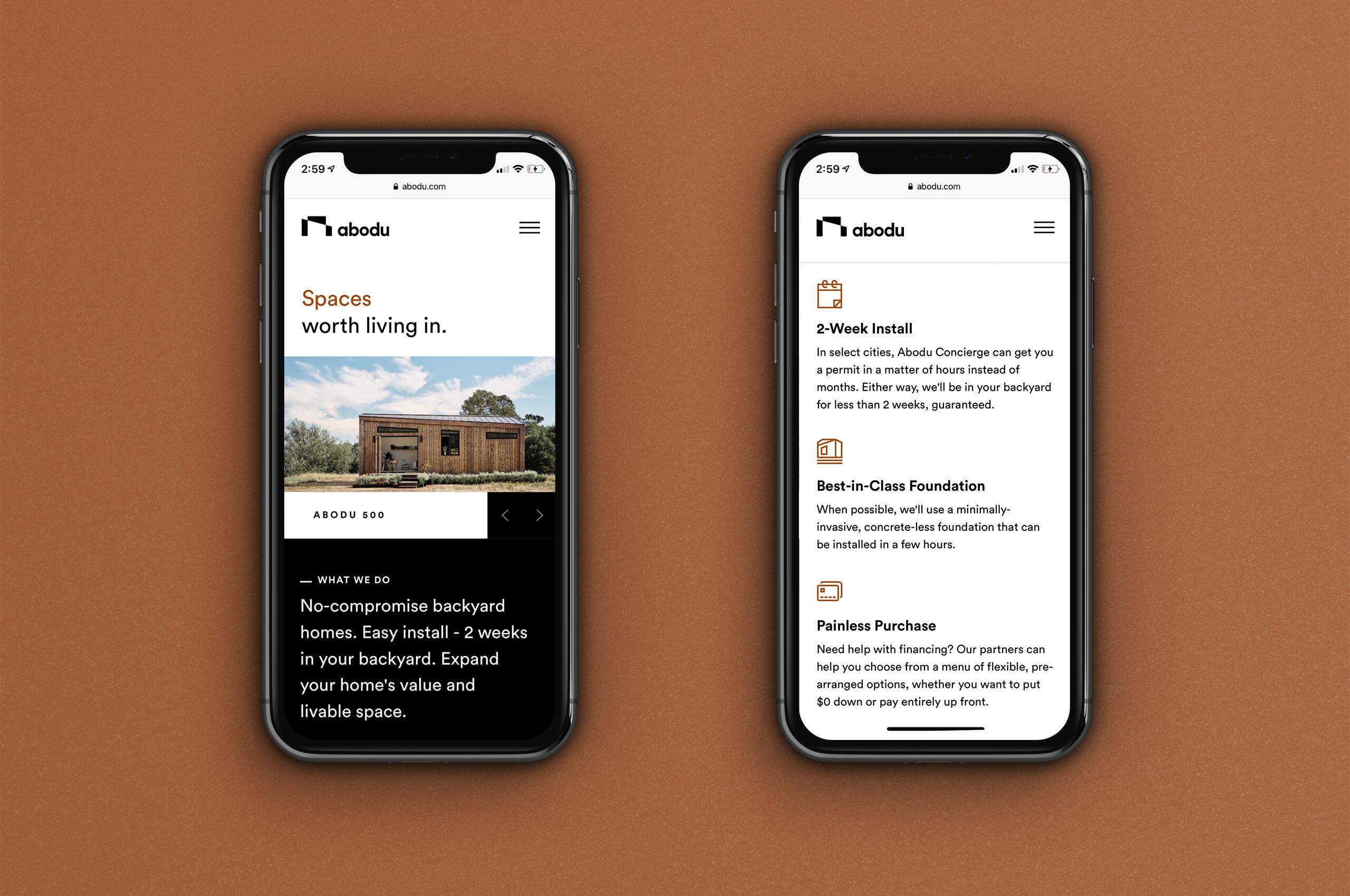
We brought our friends and collaborators Telegraph on board to handle the design and development of the website. We worked closely with the Telegraph and Abodu teams to ensure the ethos of the brand was faithfully executed in the digital experience.
