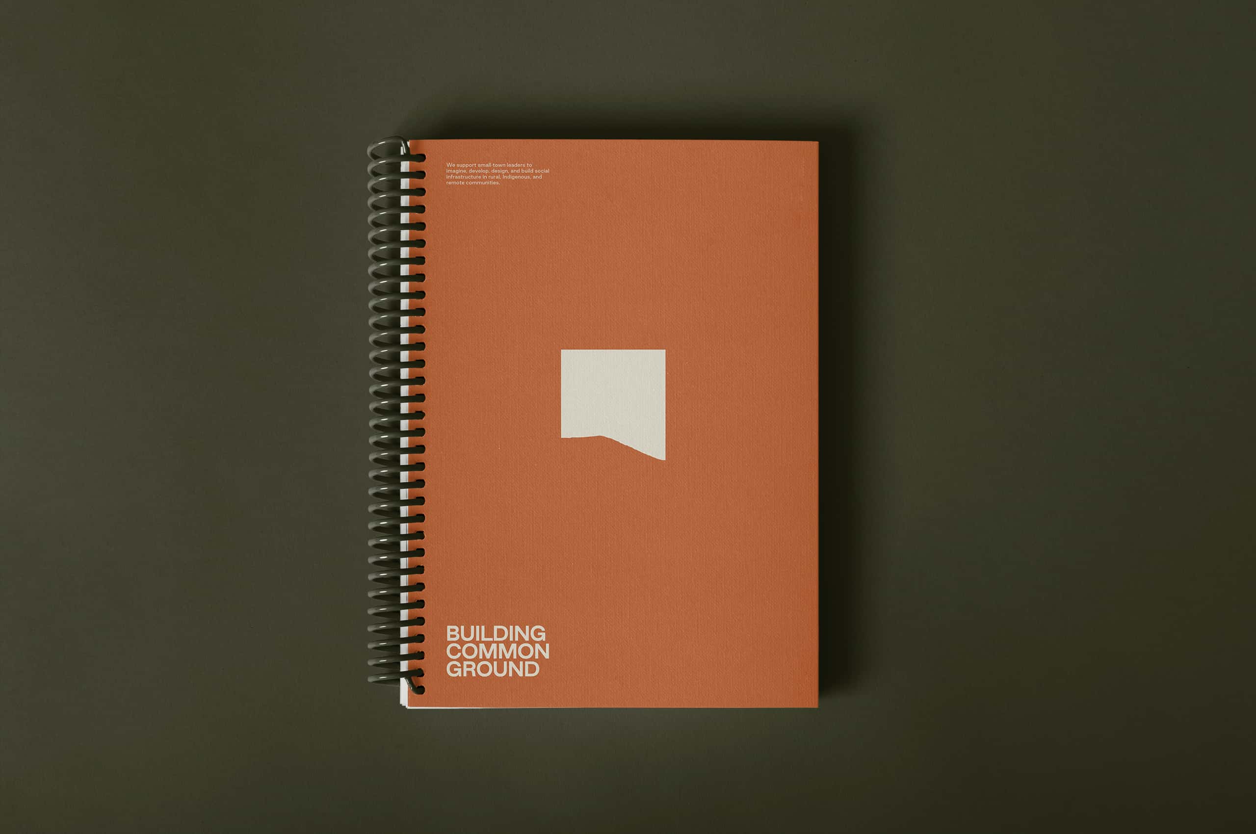
Building Common Ground
A new brand for a collective advancing social infrastructure and design excellence in rural communities.
A new brand for a collective advancing social infrastructure and design excellence in rural communities.
Building Common Ground is a collective of three studios spanning design, community engagement, and project realization, united by a shared commitment to rural places and the people who live in them. Their work sits at the intersection of planning, construction, and community-building, creating resilient infrastructure that reflects the specific character of the places it serves rather than imposing solutions from the outside.
After a significant partnership with CIRD supported by the National Endowment for the Arts, BCG came back to Mast to help shape the next chapter of their work, this time funded by the Mellon Foundation. That returning trust meant something. It asked for an identity equal to the ambition of the work: one that could represent three distinct studios without flattening them, speak to rural communities without condescending to them, and hold up across every context from a jobsite to a foundation boardroom. The task was the same one BCG brings to every community they enter: show up with intention, build something that lasts, and leave the place stronger than you found it.

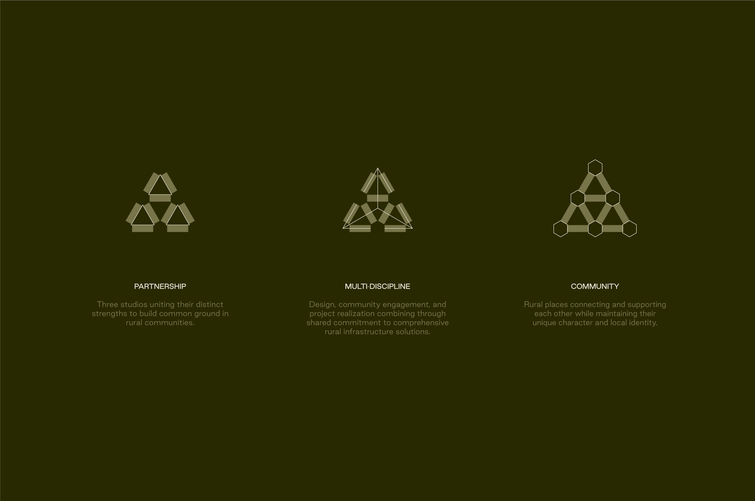

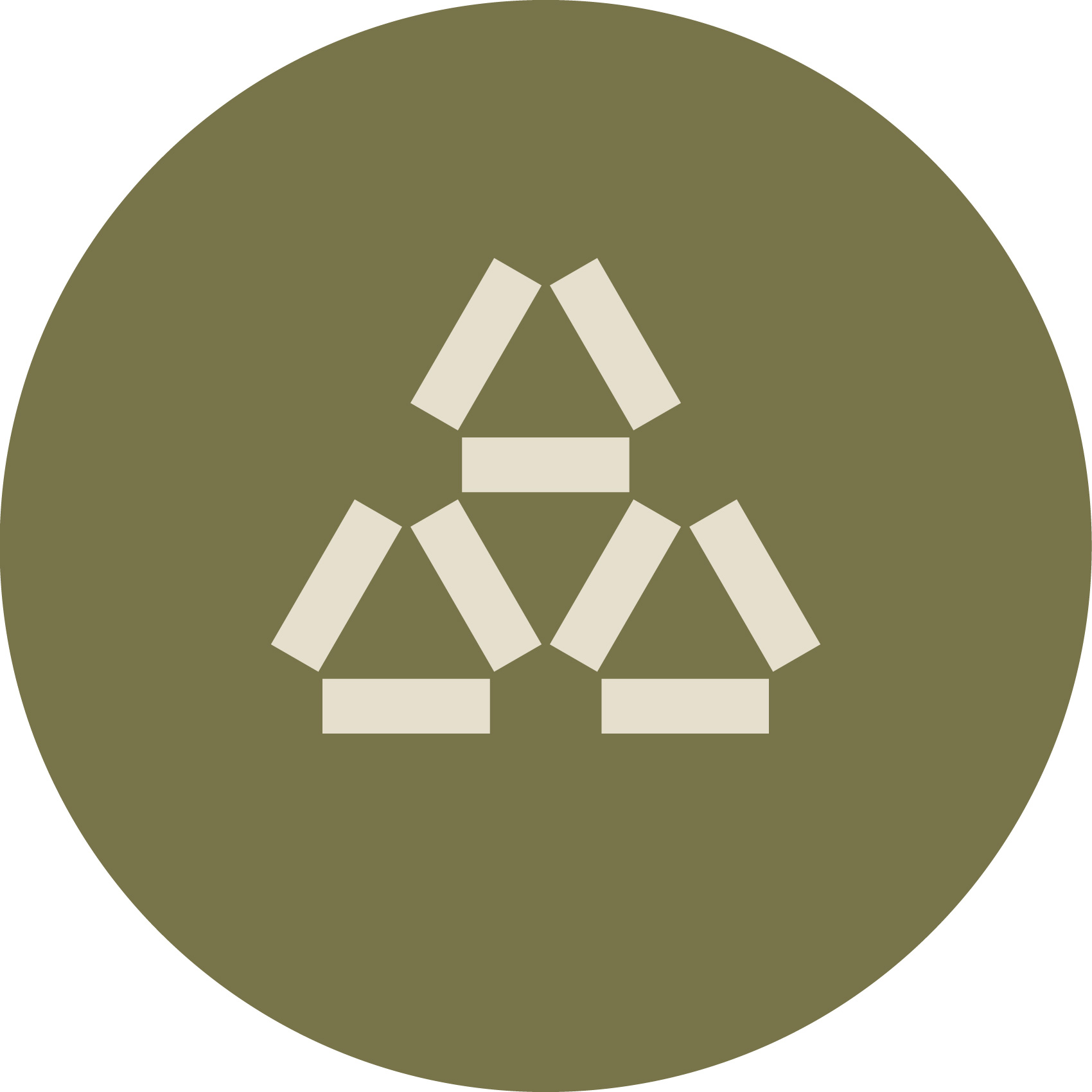
Uniting individual strengths while letting each remain distinct was the tension that drove every decision behind the mark. Three forms converging at a shared center, each one independent, each one part of something larger, reflecting the authentic rural partnership at the heart of how BCG operates. An exploration of the bonds that connect communities across geographic and cultural differences, made into a single, scalable shape.
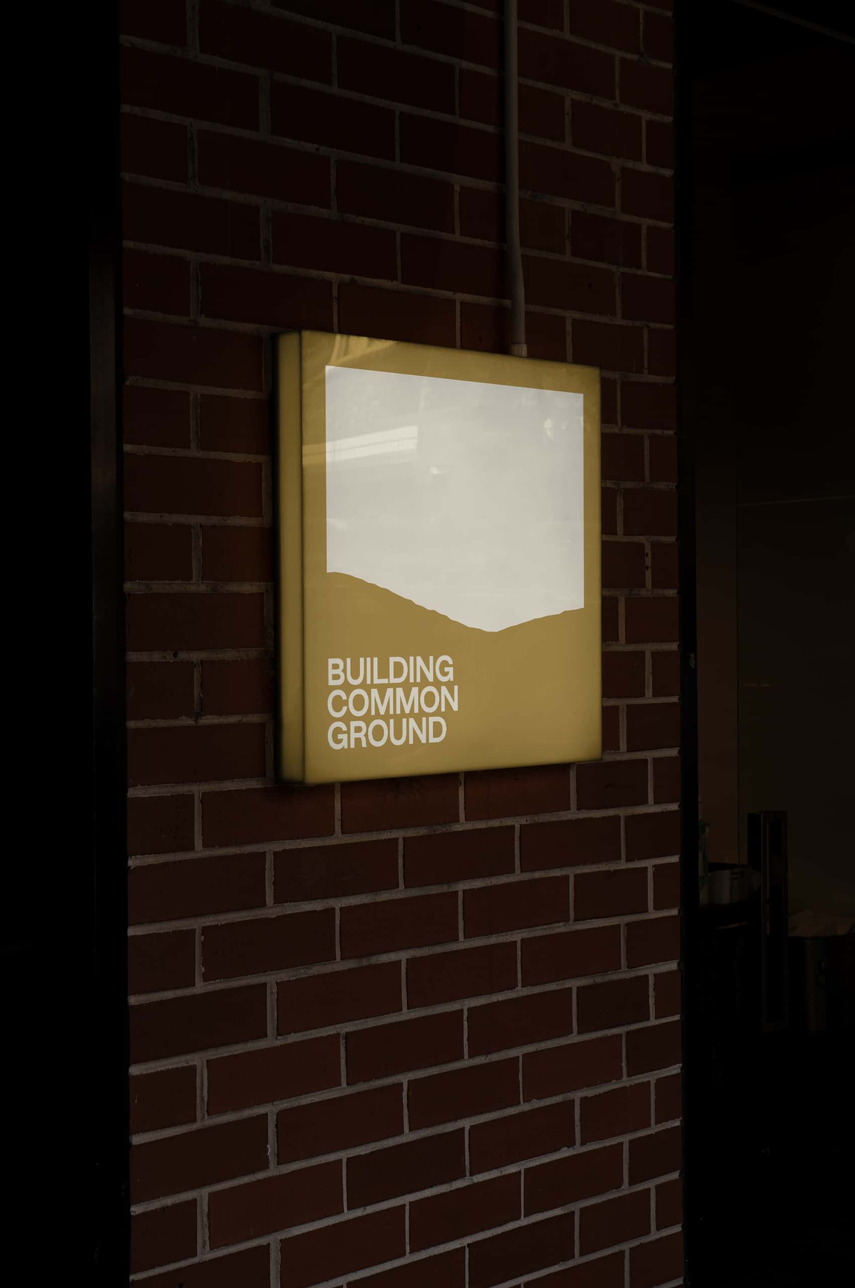
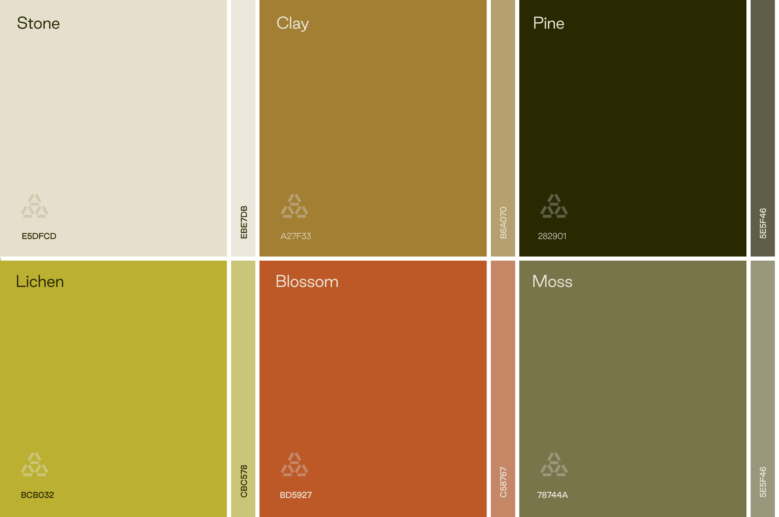
Authentically place-based without falling into expected rural clichés: that was the standard for the palette. Each color was chosen as much for utility as feeling, drawn from the land without announcing it.
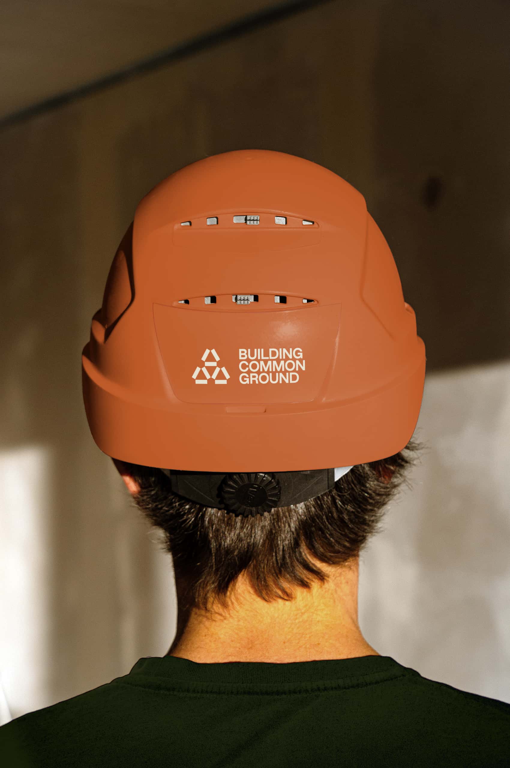
The symbol was built to work everywhere it lands, at any scale, in any context, without adjustment or compromise.
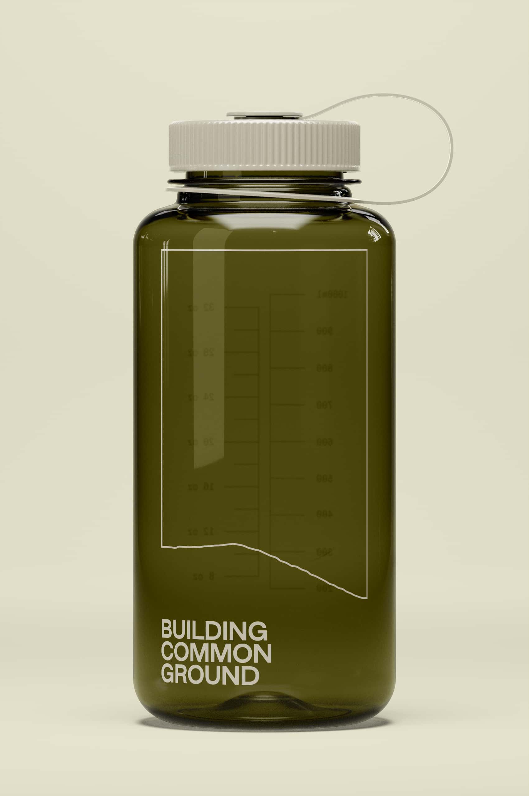
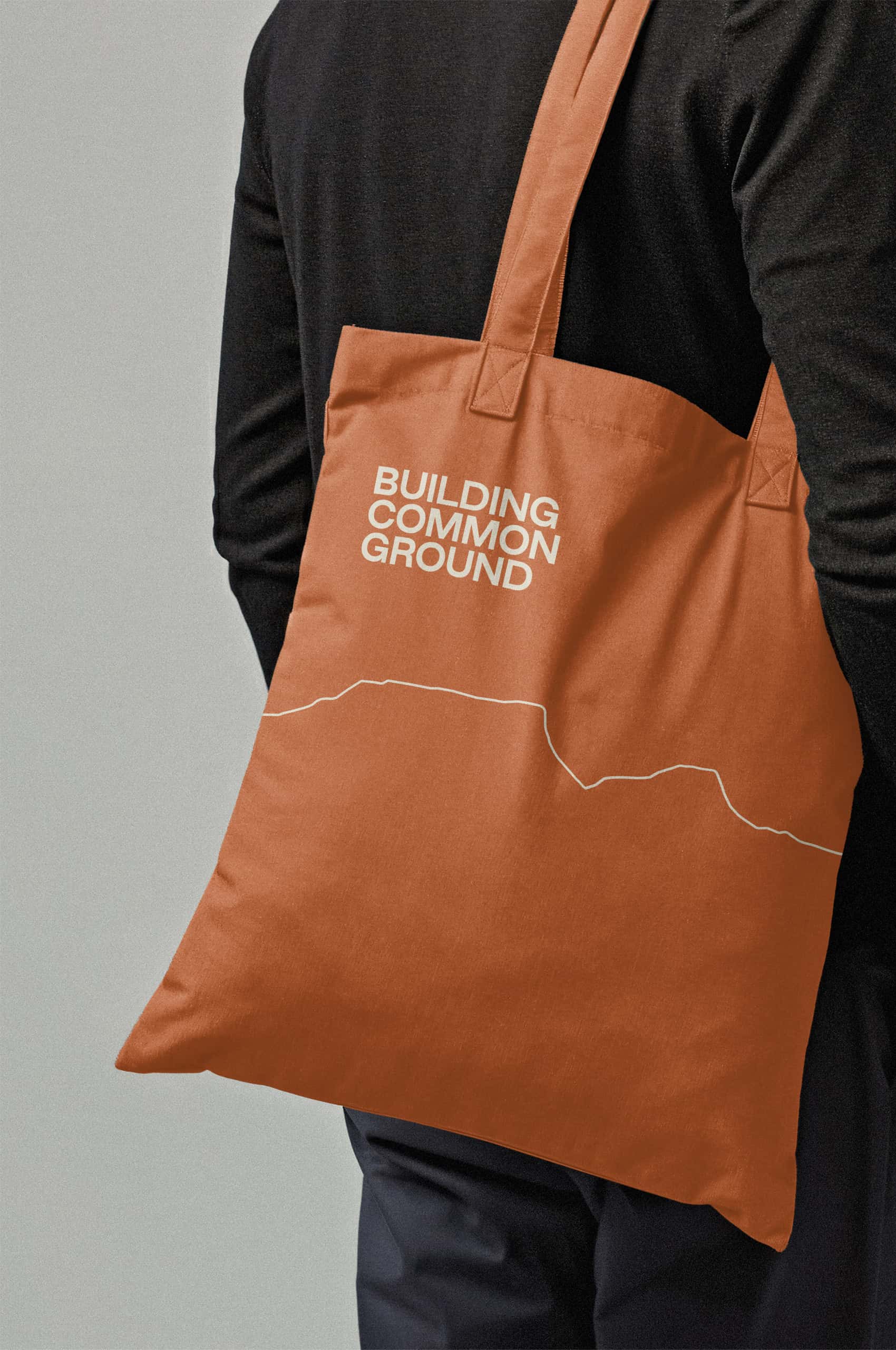
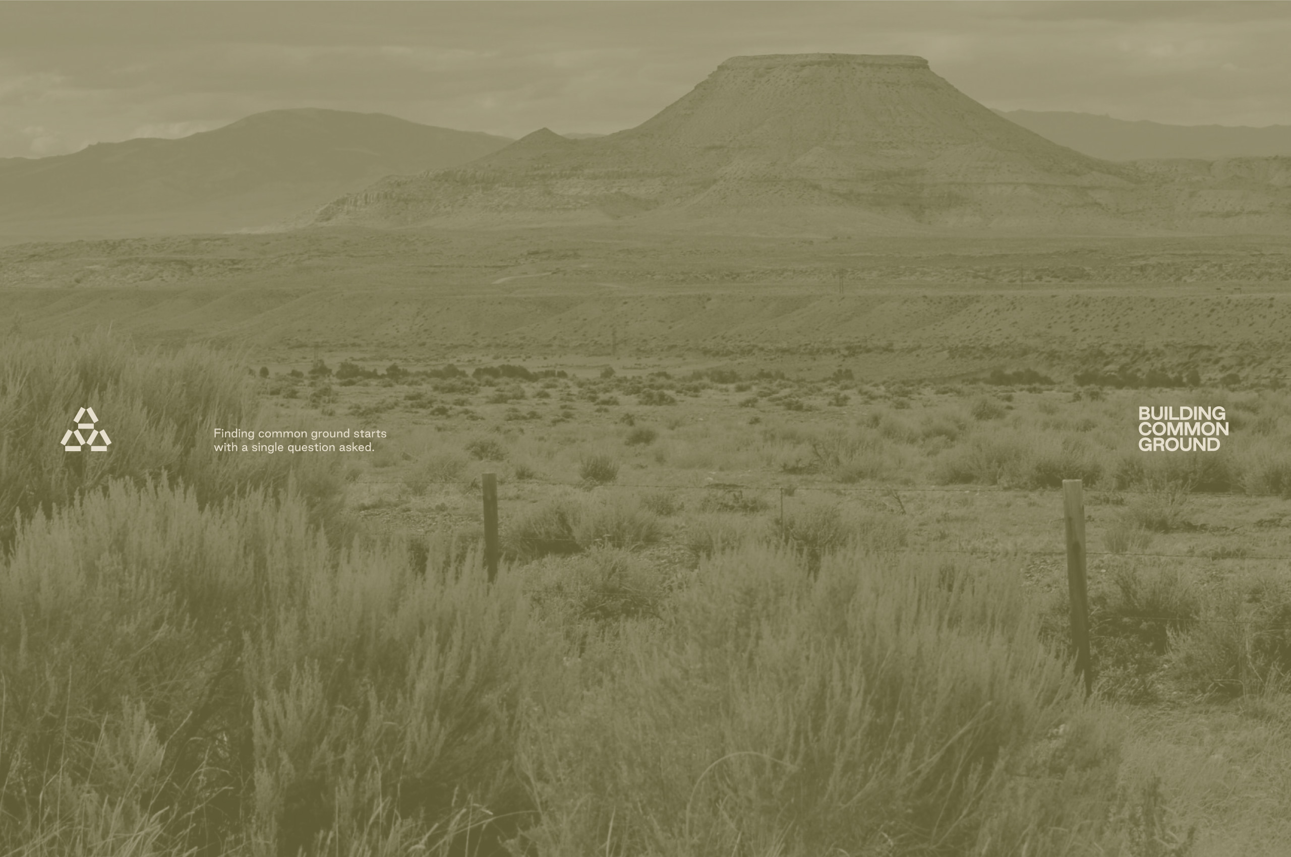
Intrigued by the forms of the places where BCG works, we wanted to build a rich vocabulary of organic shapes drawn directly from those landscapes: rolling terrain, open sky, the specific character of rural places. But leaning too heavily on literal landscape imagery risks becoming a cliché. By simplifying and abstracting, we turned those forms into a unique visual system, adaptive, generative, and rooted in real places without being documentary. The bottom edge stays open, leaving room to build common ground.
Each landscape configuration is traced from a specific geography: a county, a horizon, a place where BCG has done the work. As the organization grows into new regions, so does the library. The system never runs out because the places never run out, giving BCG a visual language that expands alongside their reach without ever feeling disconnected from where it comes from.
Given the symbol’s strong geometric form, the wordmark needed to balance it rather than compete with it. A geometric sans serif brings softness and approachability to a core identity that could otherwise read as too austere. Building from that same geometry into the broader typographic system kept the language unified: easier to use, easier to recognize, easier to maintain across everything BCG produces.
The system earns its place at every scale, cinematic where the format calls for it, structured where it doesn’t, and abstract where the context demands less.

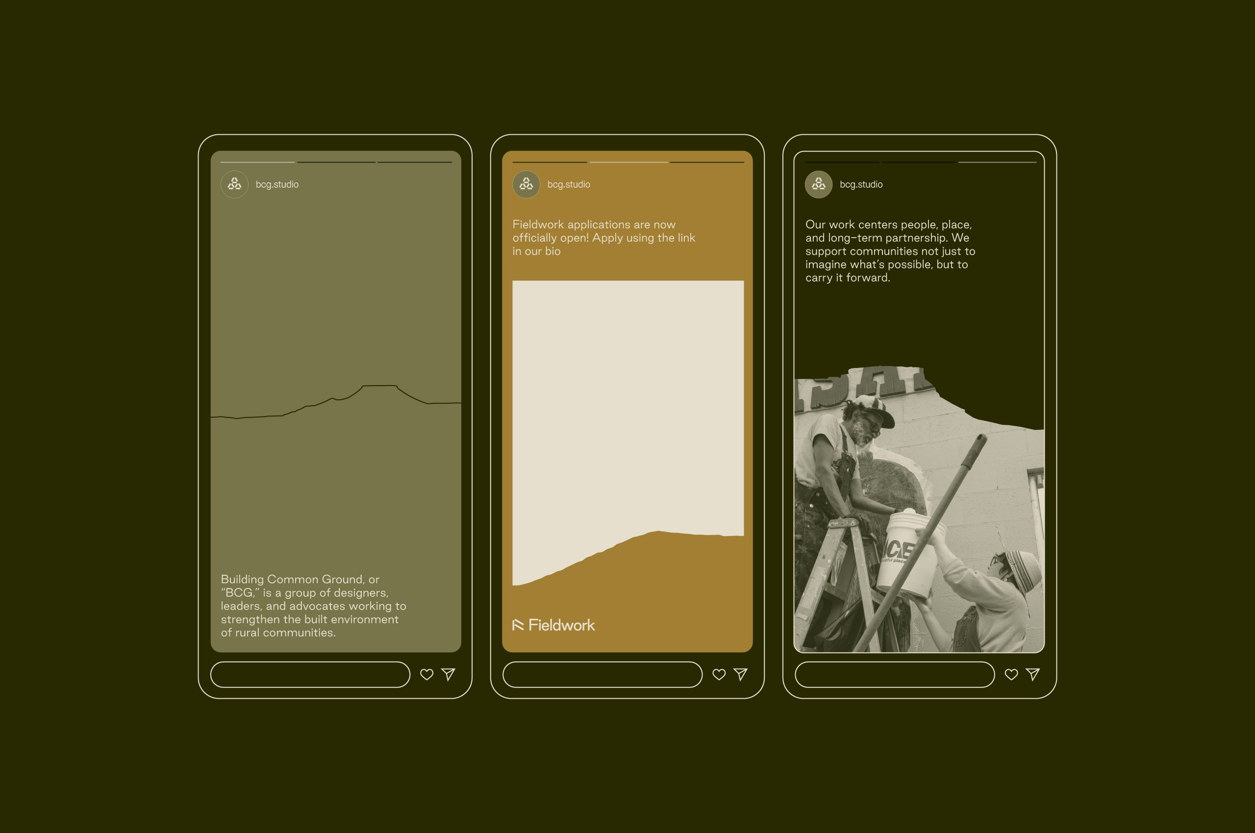
For social, the graphics adapt and shift, filling vertical formats, layering with type, letting color take over as the horizon settles into place. Simple, replicable mechanics that create visual intrigue without demanding a production team. A cohesive presence across platforms that moves the way BCG moves: present, flexible, rooted.
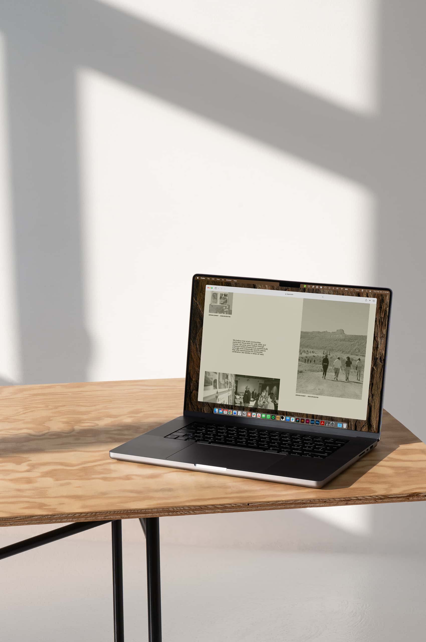
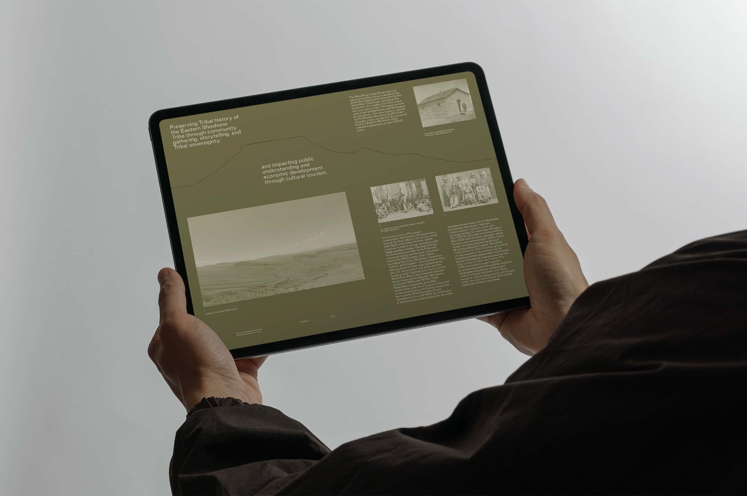
Immersive but focused, the website brings the full identity into motion and introduces BCG’s mission, people, and work without overcomplicating the story. From the first scroll, visitors have a sense of place.

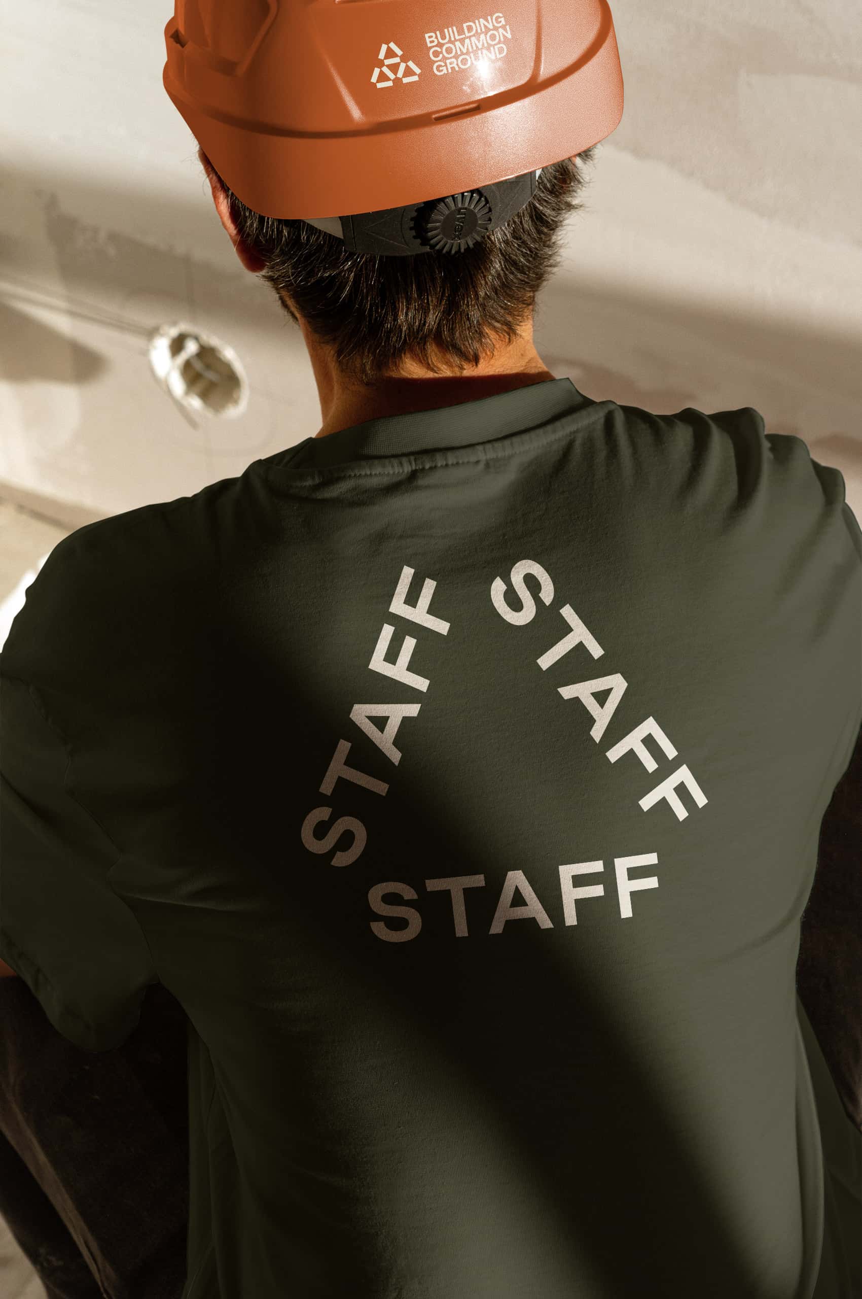
Rather than photography, we created hand-drawn portraits for everyone at BCG. The sketch quality is intentional, unifying people from different cities and regions under a single visual language
Drawing from the geometry of the primary mark, a suite of icons extends the visual language across the full range of BCG’s work: planning, design, community engagement, construction. Each one carries the same direct, unpretentious quality as the symbol itself.
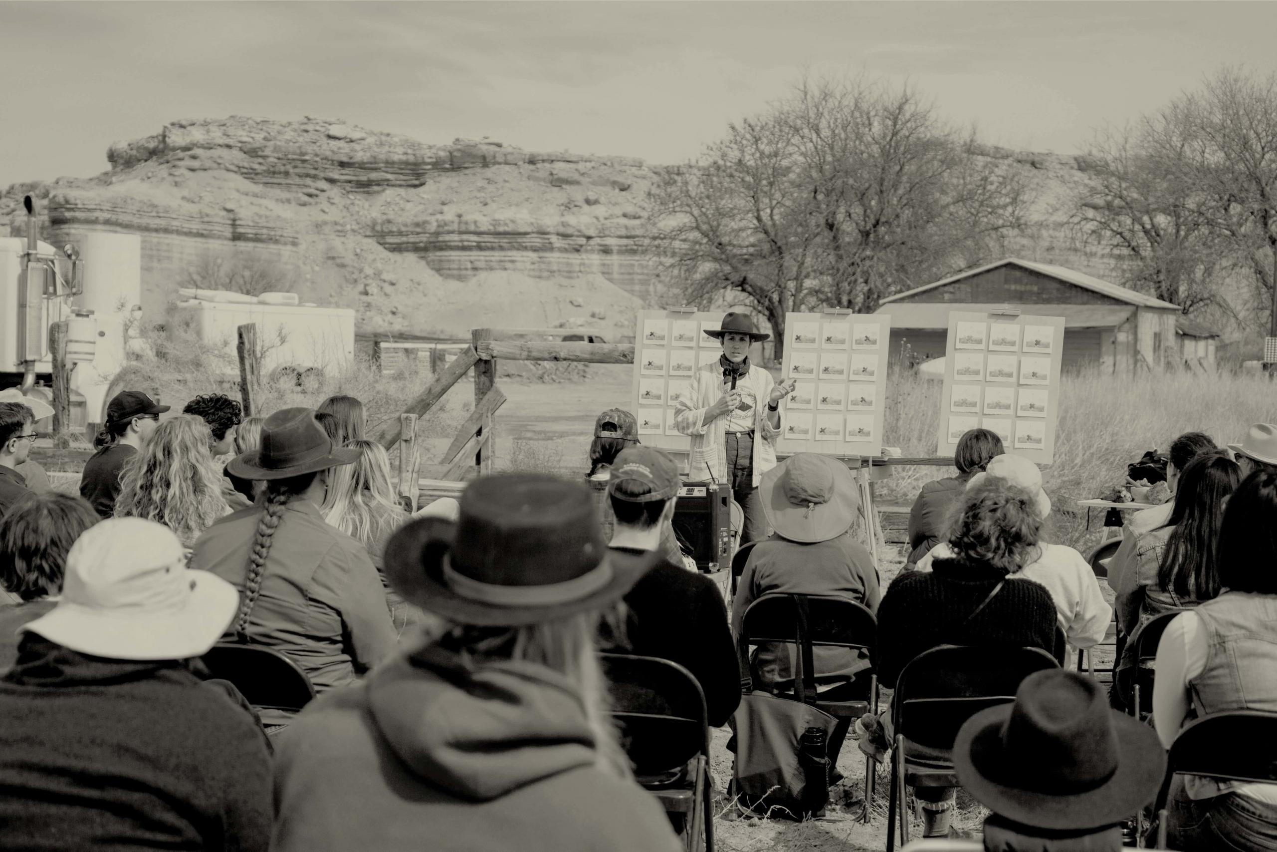
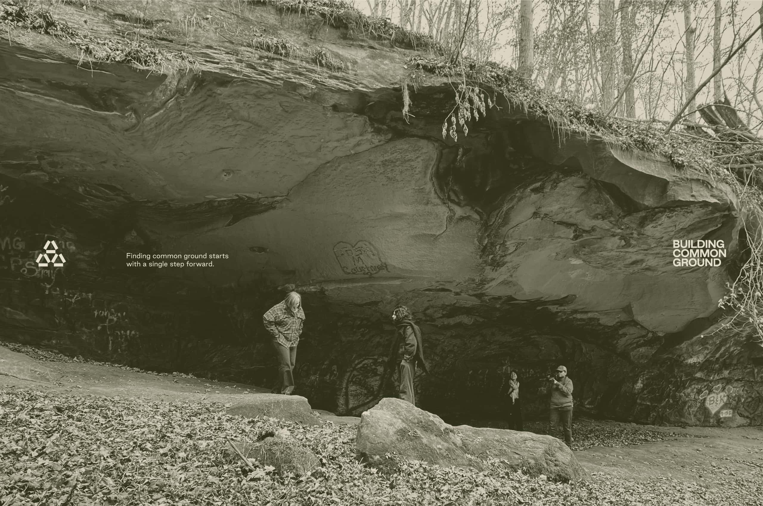
Photography extends the identity’s expressive range through subtle, consistent treatment. Greyscale anchors the base, restrained and documentary in tone. From there, photographic blend space opens up, layering brand color into the field to create visual intrigue through mechanics anyone on the team can replicate. The images feel like they belong to the same world as the landscape graphics because they do.
For BCG’s first initiative, we developed Fieldwork: a sub-brand built from the primary identity and grounded in the reality of the work. The name says exactly what it is.