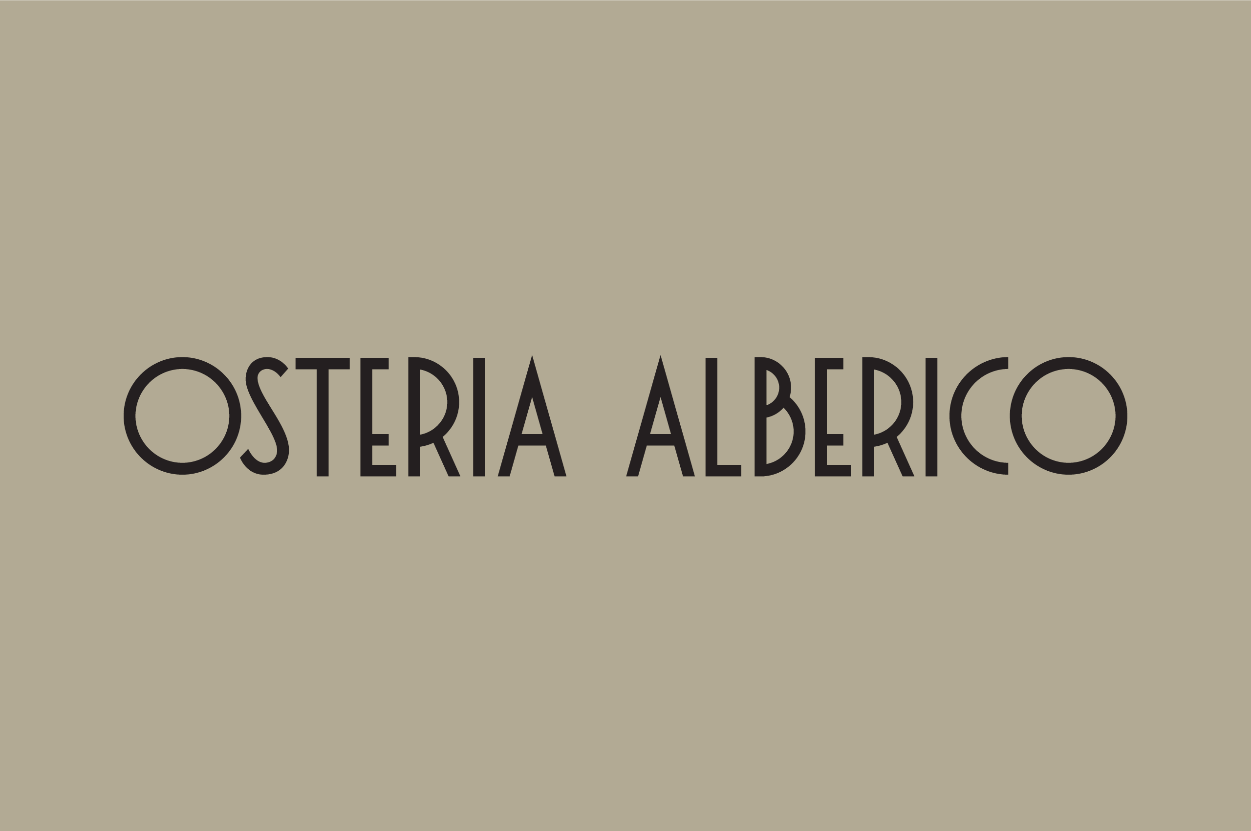
Osteria Alberico
Bringing the essence of a traditional Osteria to life.
Bringing the essence of a traditional Osteria to life.
Osteria Alberico, the latest addition to the Alberico family, reflects a deep commitment to delivering authentic Italian experiences. The Frasca Group has faithfully captured the essence of a traditional osteria, creating a perfect complement to its sister establishment, Pizzeria Alberico.
In Italy, the osteria has long been a cornerstone of culinary culture, offering a curated selection of wines and simple yet flavorful dishes that highlight local specialties. Osteria Alberico embraces this tradition, thoughtfully adapting it for Denver’s vibrant food scene. The Frasca Group’s vision was to introduce high-quality, straightforward food in a welcoming, casual setting, all while maintaining accessible prices.
Carrying forward the Alberico name for this new venture was a natural choice, reinforcing the familial connection with Pizzeria Alberico. This continuity honors the family’s legacy and ensures patrons a consistent standard of excellence across both establishments.
To establish a distinct brand identity for the osteria, the Frasca Group partnered with Mast to develop a visual language that aligns with Pizzeria Alberico while carving out its own unique space. The result is a brand that seamlessly blends approachability with elegance, drawing inspiration from the rich Italian heritage of both the cuisine and the Alberico family.

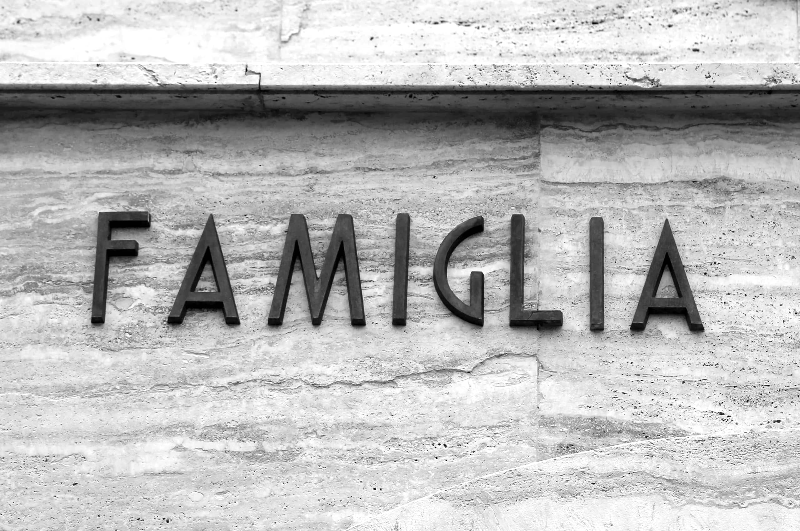
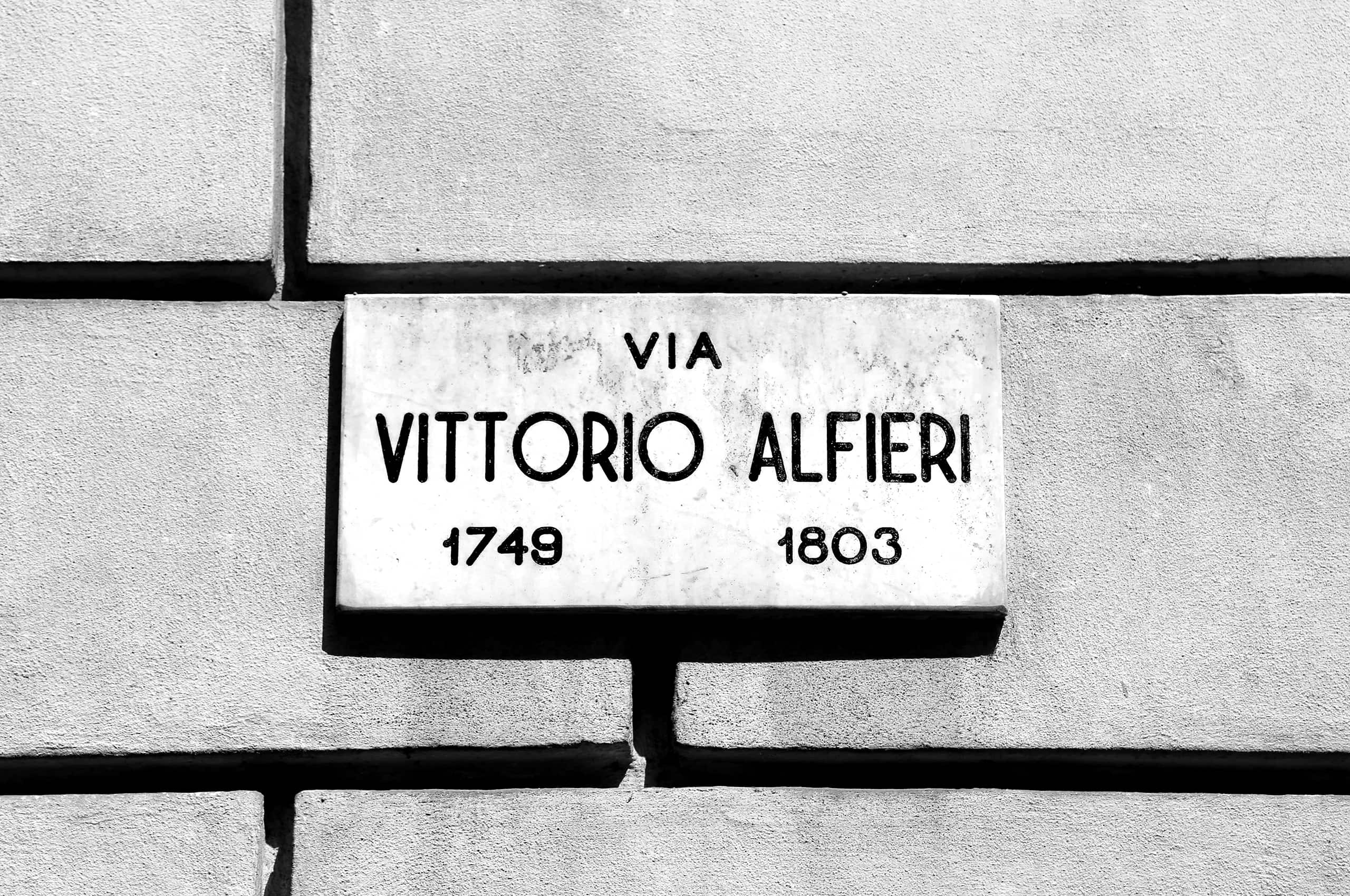
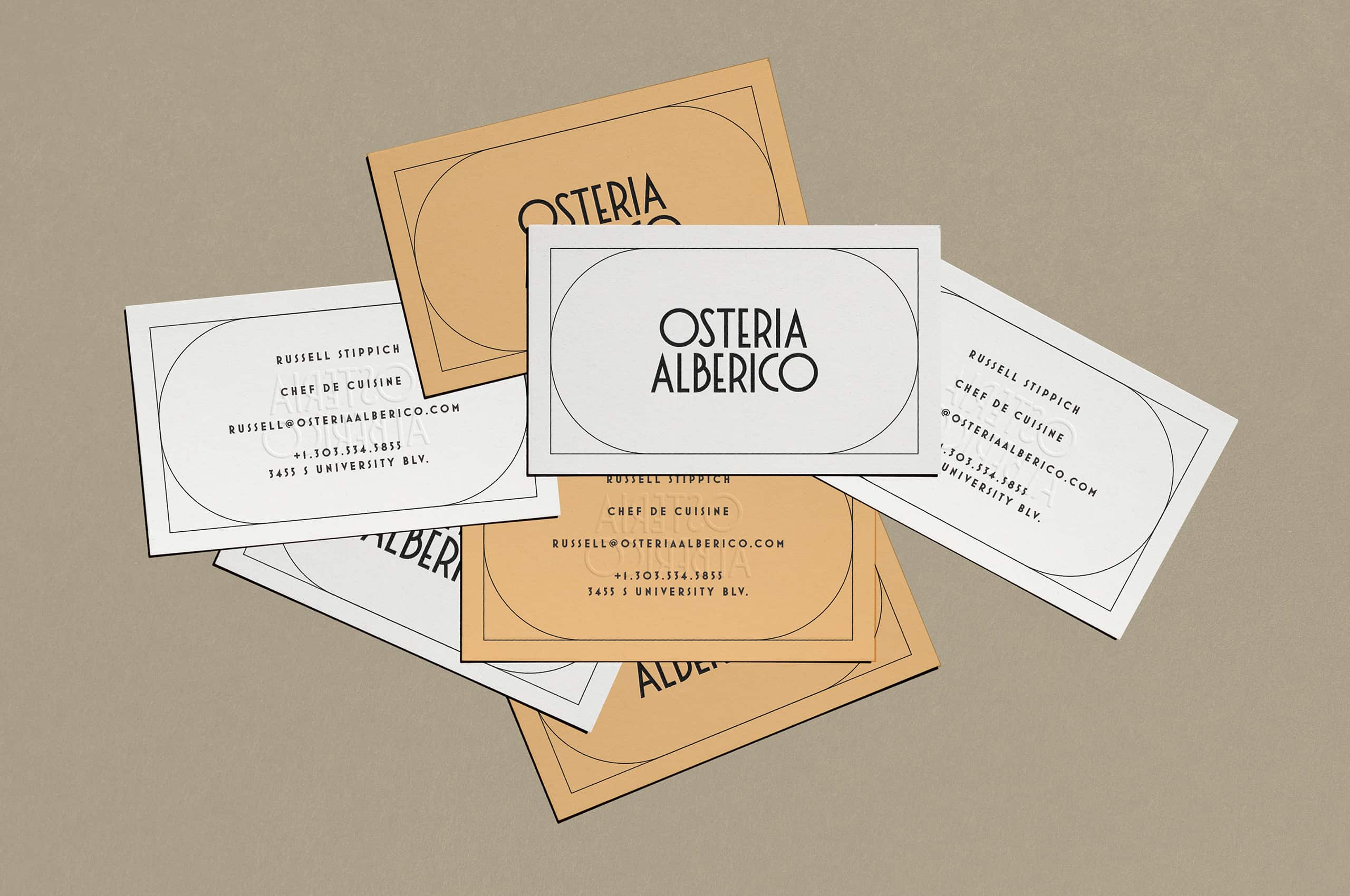
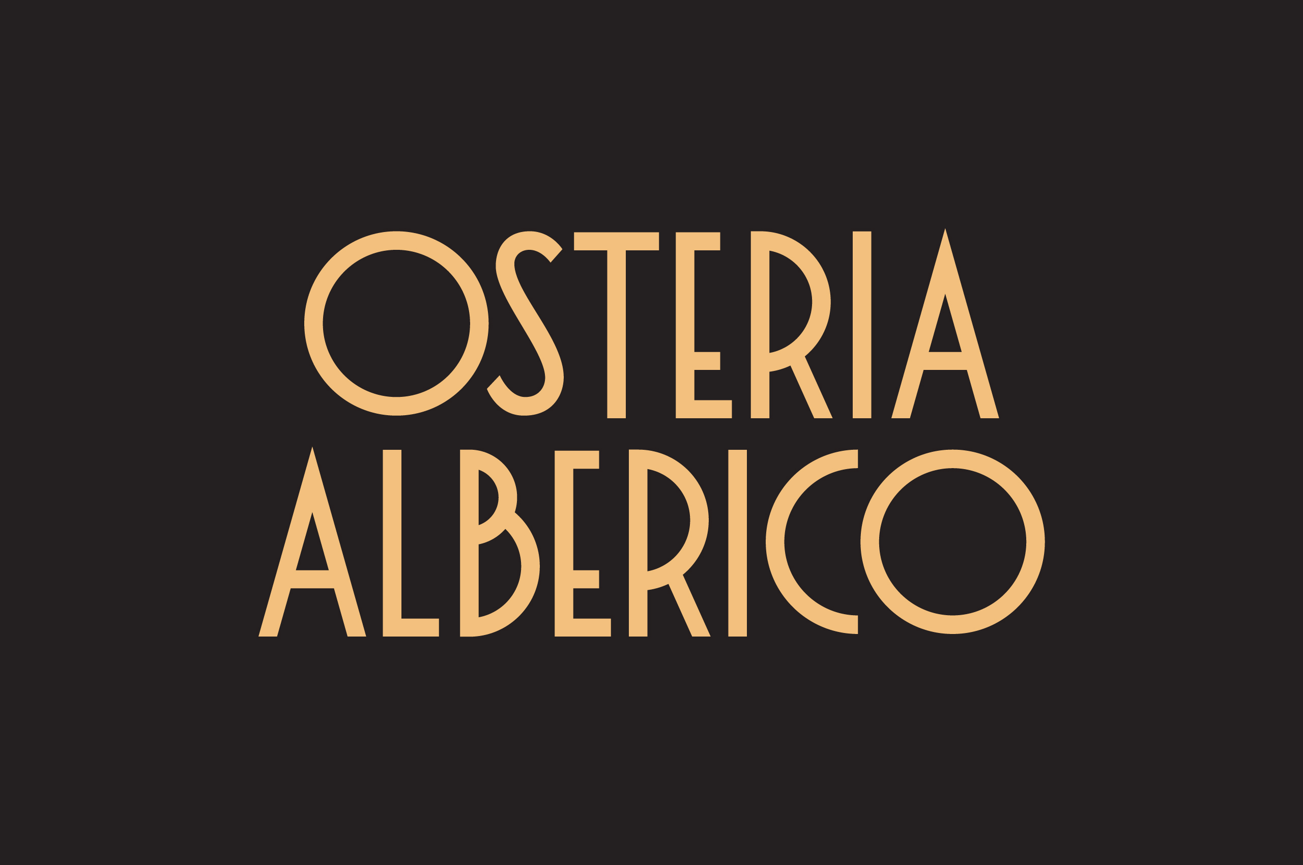
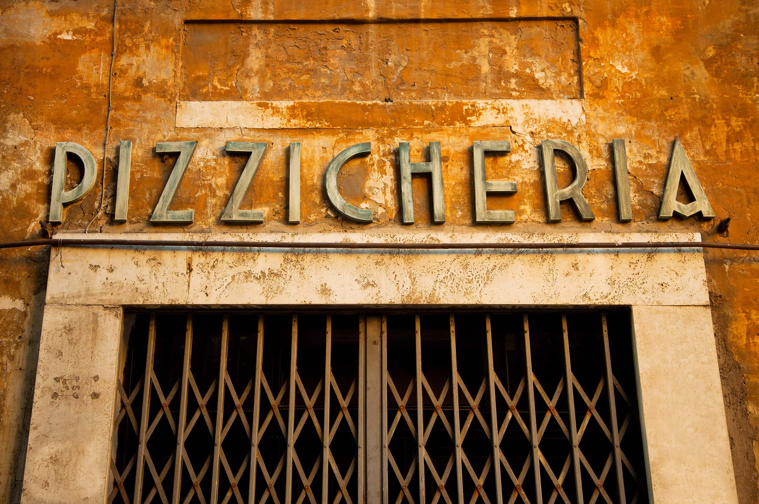
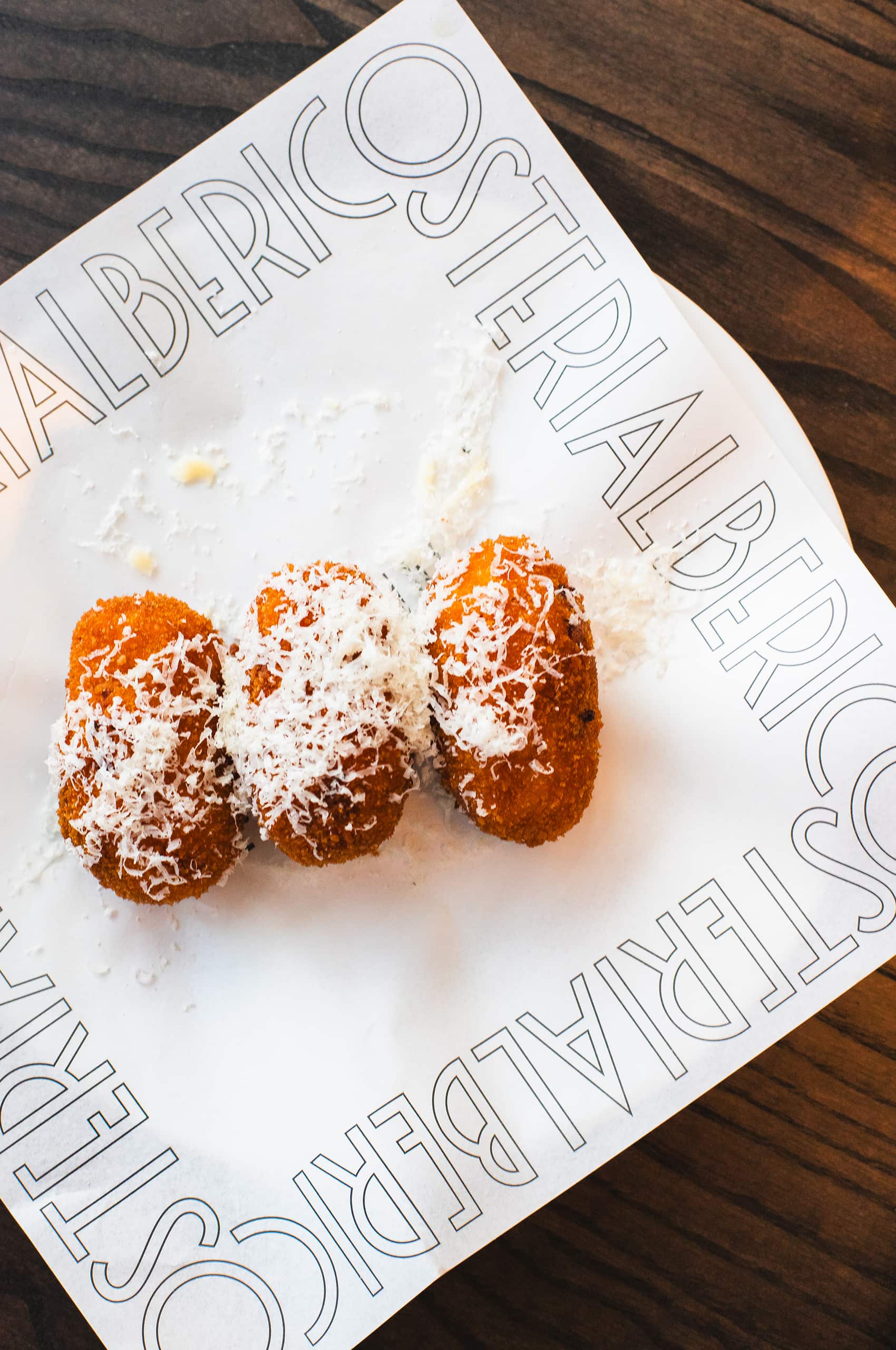
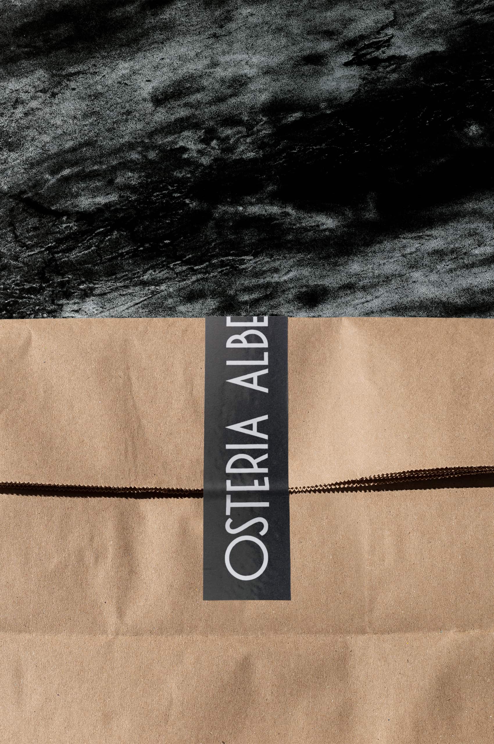
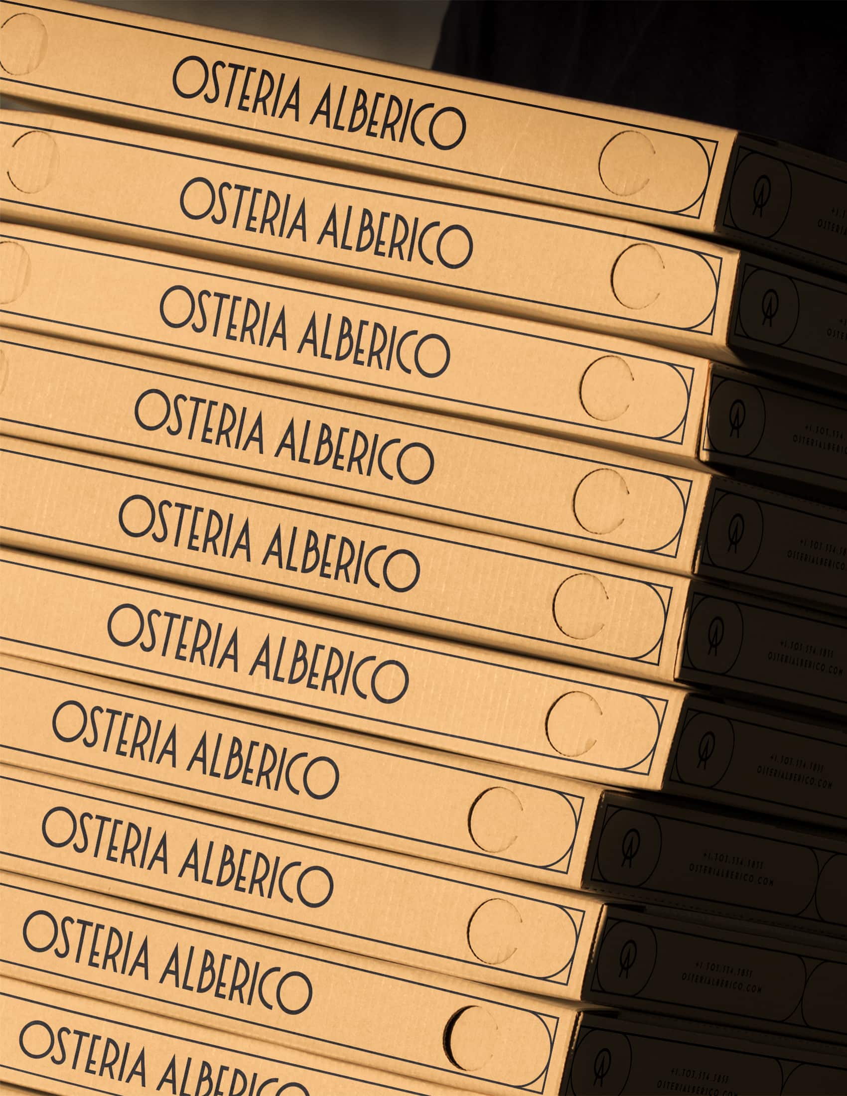
Similar to Pizzeria Alberico, we drew inspiration from the rich heritage of traditional Italian signage when designing the Osteria Alberico wordmark. This approach was more than a stylistic choice—it was a deliberate effort to link the restaurant’s visual identity with centuries of Italian culinary tradition.
Our process included an in-depth study of vintage Italian shop signs, restaurant facades, and street signage. By carefully analyzing the distinctive characteristics of Italian lettering styles, we crafted a wordmark that feels authentically Italian yet distinctly contemporary.
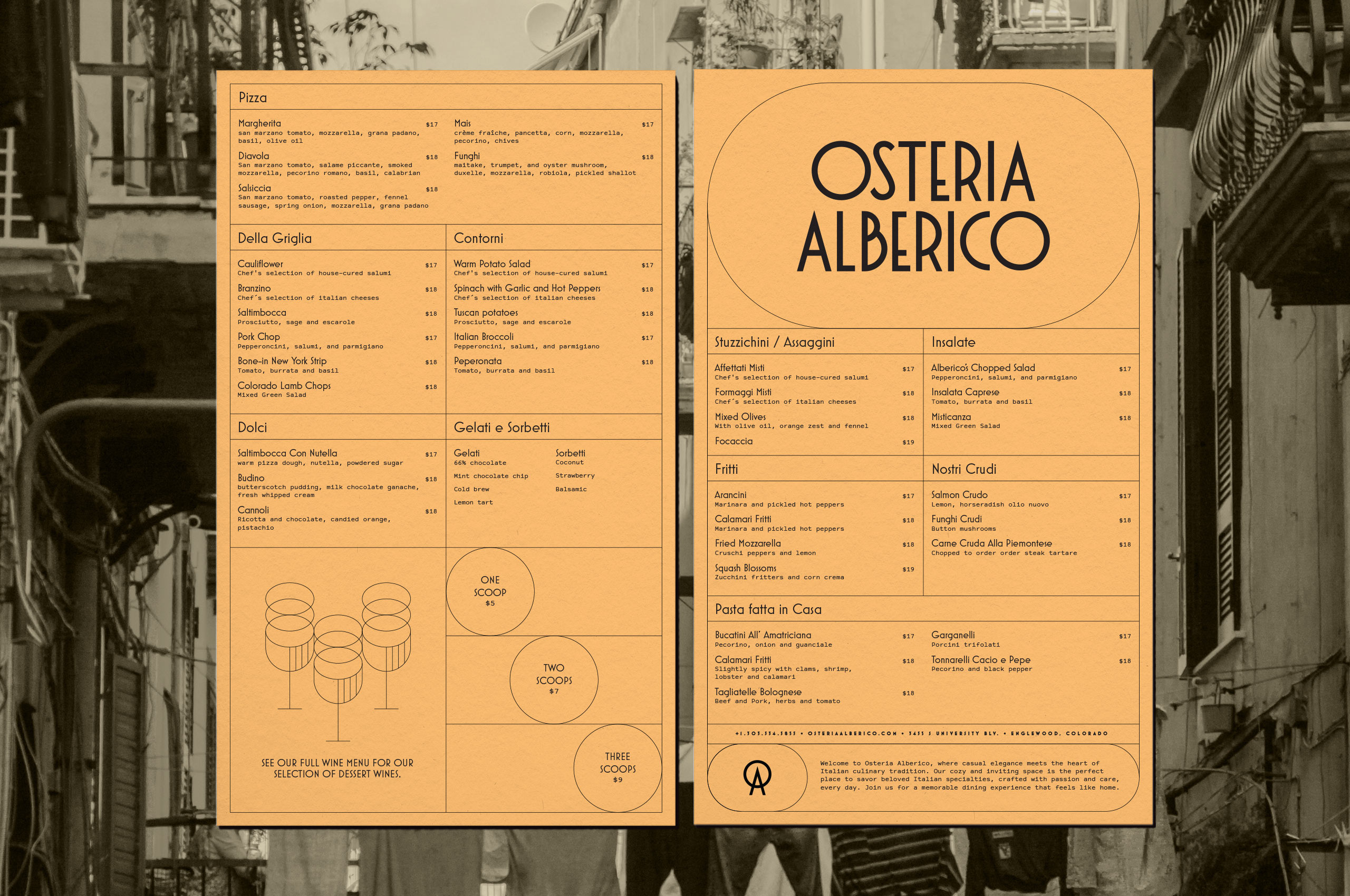
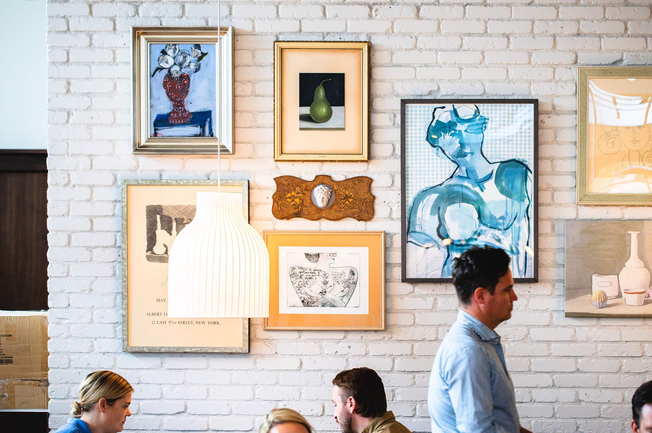
In line with our modern interpretation of historical typography, we meticulously explored Italy’s urban landscapes to develop a distinctive color palette. This journey took us deep into the heart of Italy’s architectural heritage, resulting in a curated selection of hues inspired by the ubiquitous stucco and natural stone that define Italian cityscapes. These colors create a visual narrative that authentically reflects Osteria Alberico’s commitment to Italian culinary tradition and cultural legacy.
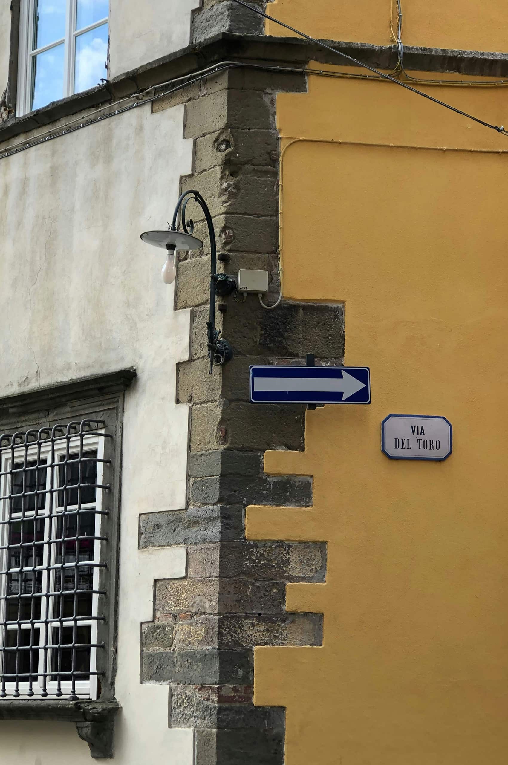
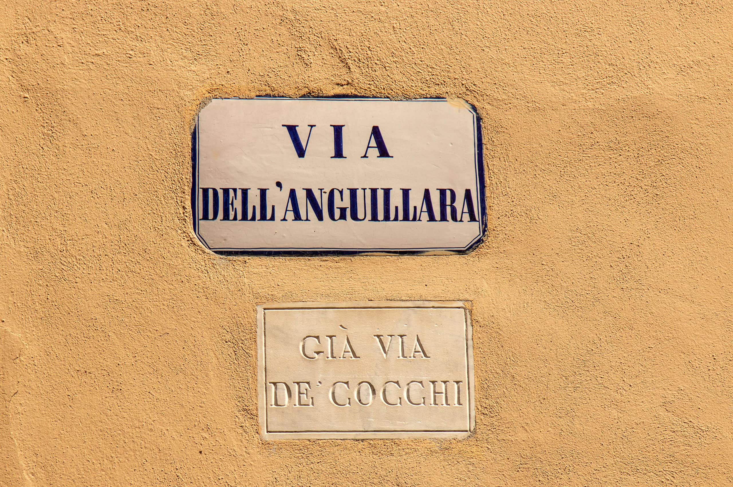
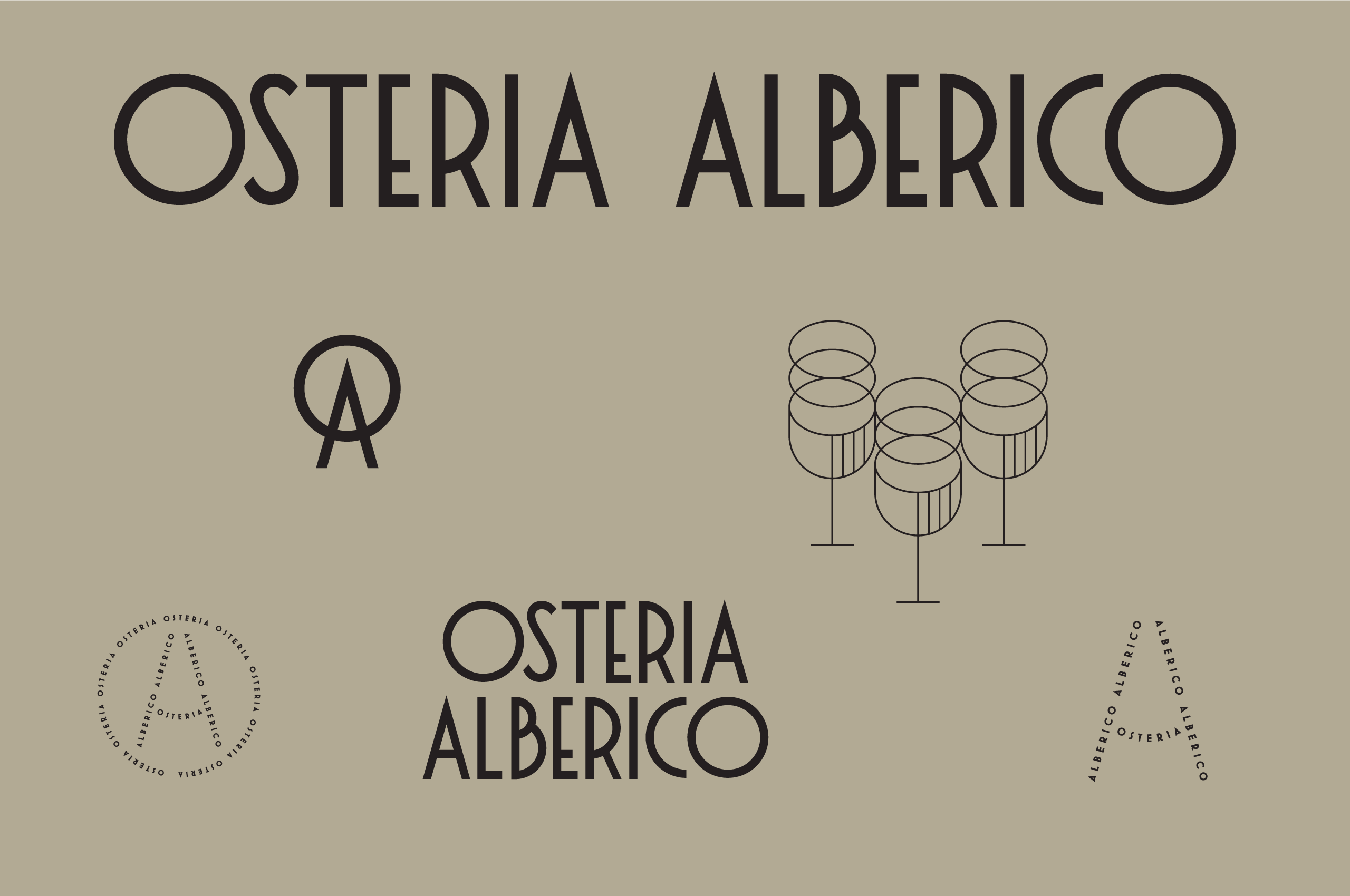
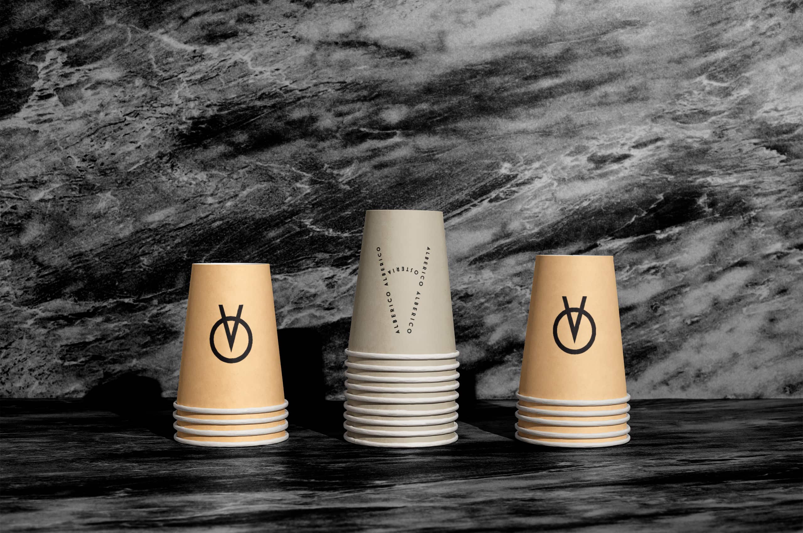
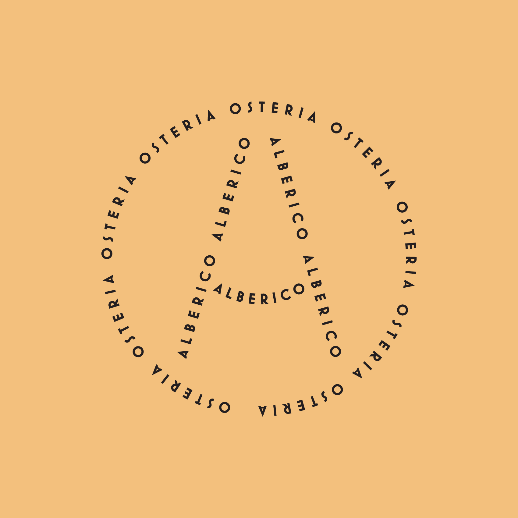
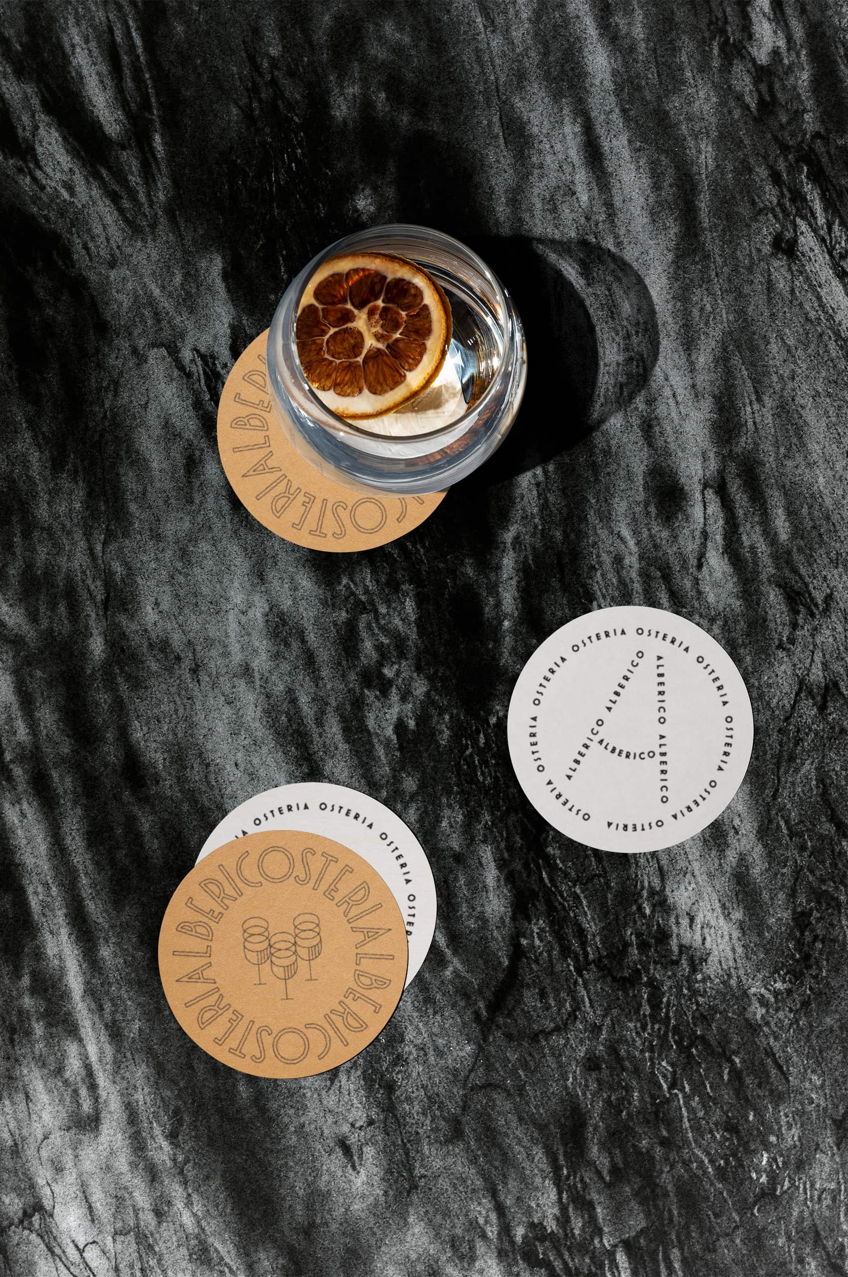
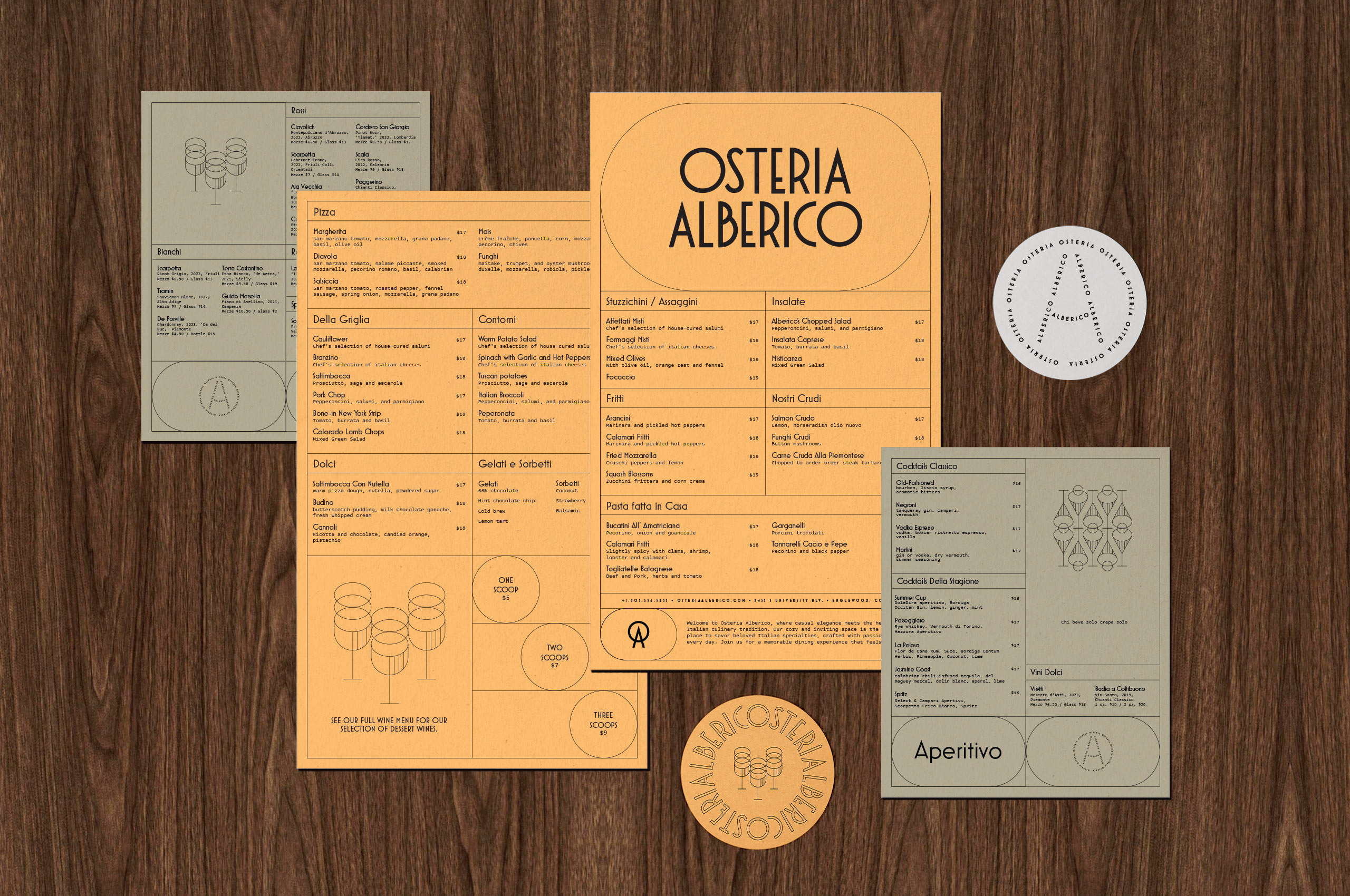
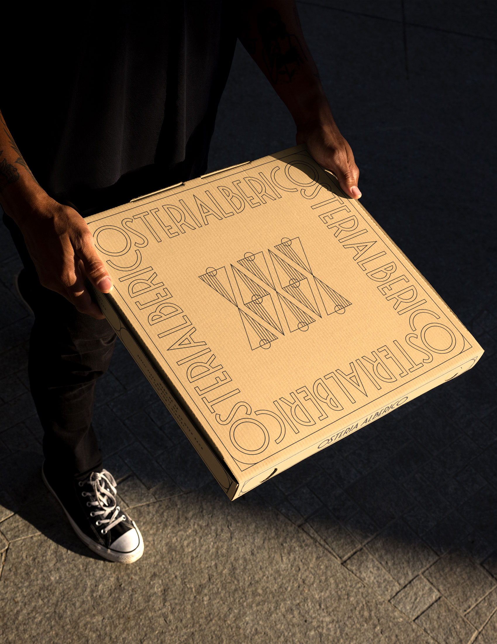
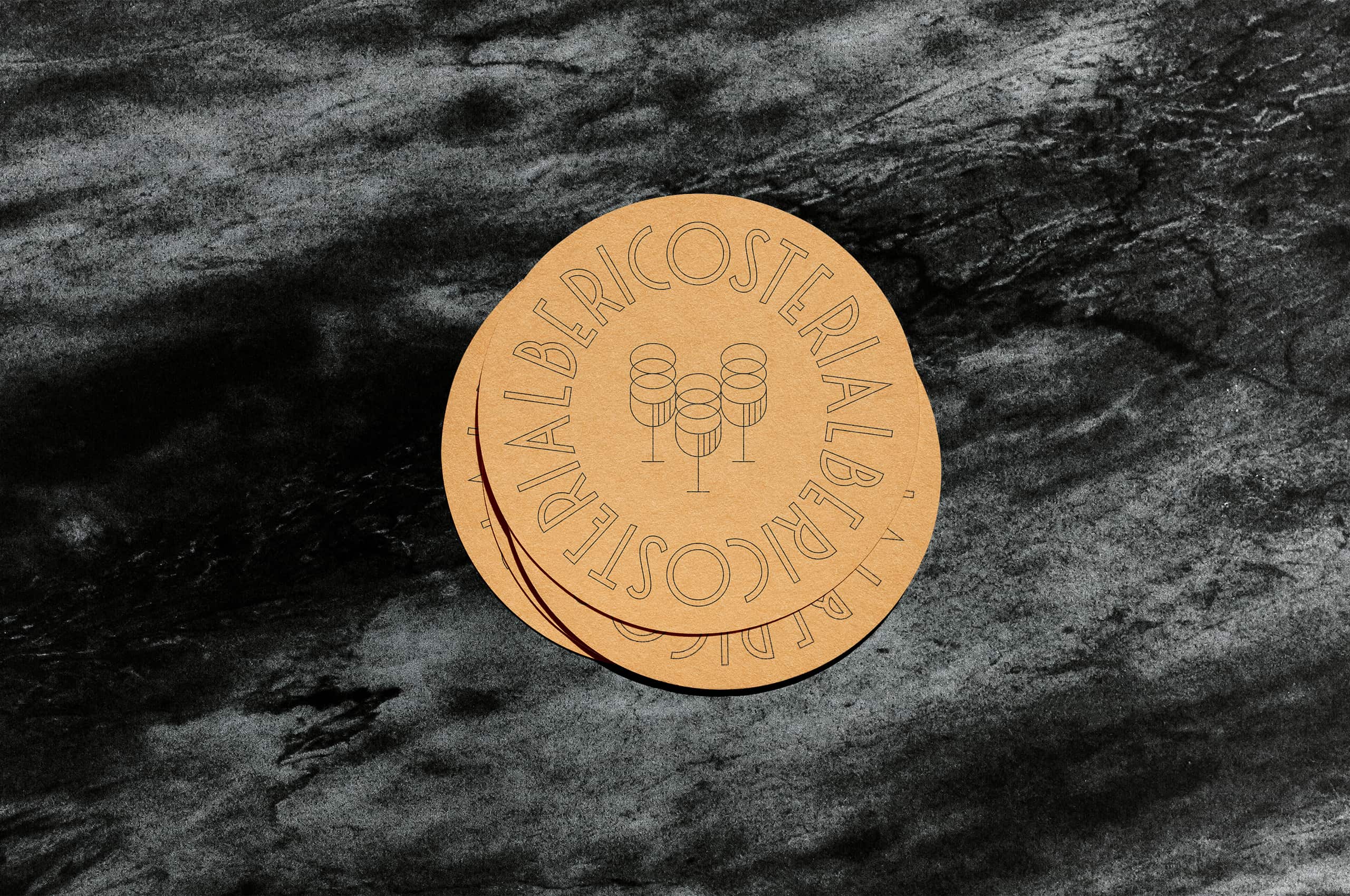
Italian signs, from shops and restaurants to street and public markers, embody a rich tradition of diverse typefaces, symbols, and marks. Drawing inspiration from this eclectic mix, we set out to design a suite of marks that could harmoniously coexist within the Alberico environment. Our goal was to capture the essence of this diversity while ensuring each mark complements the others, creating a cohesive yet dynamic visual identity.

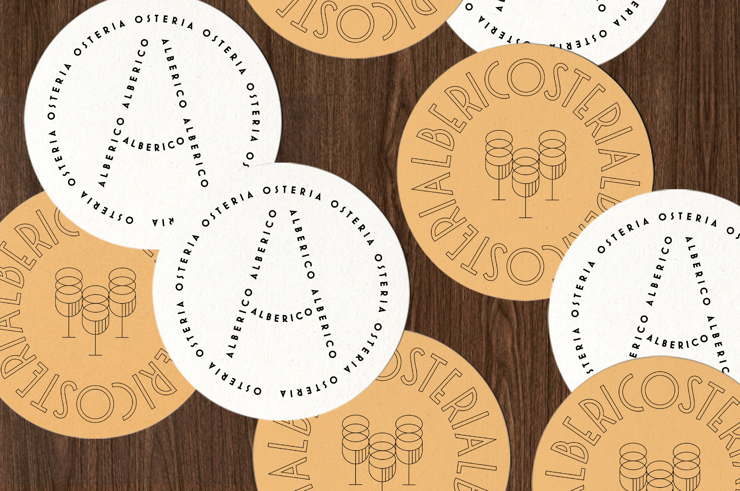
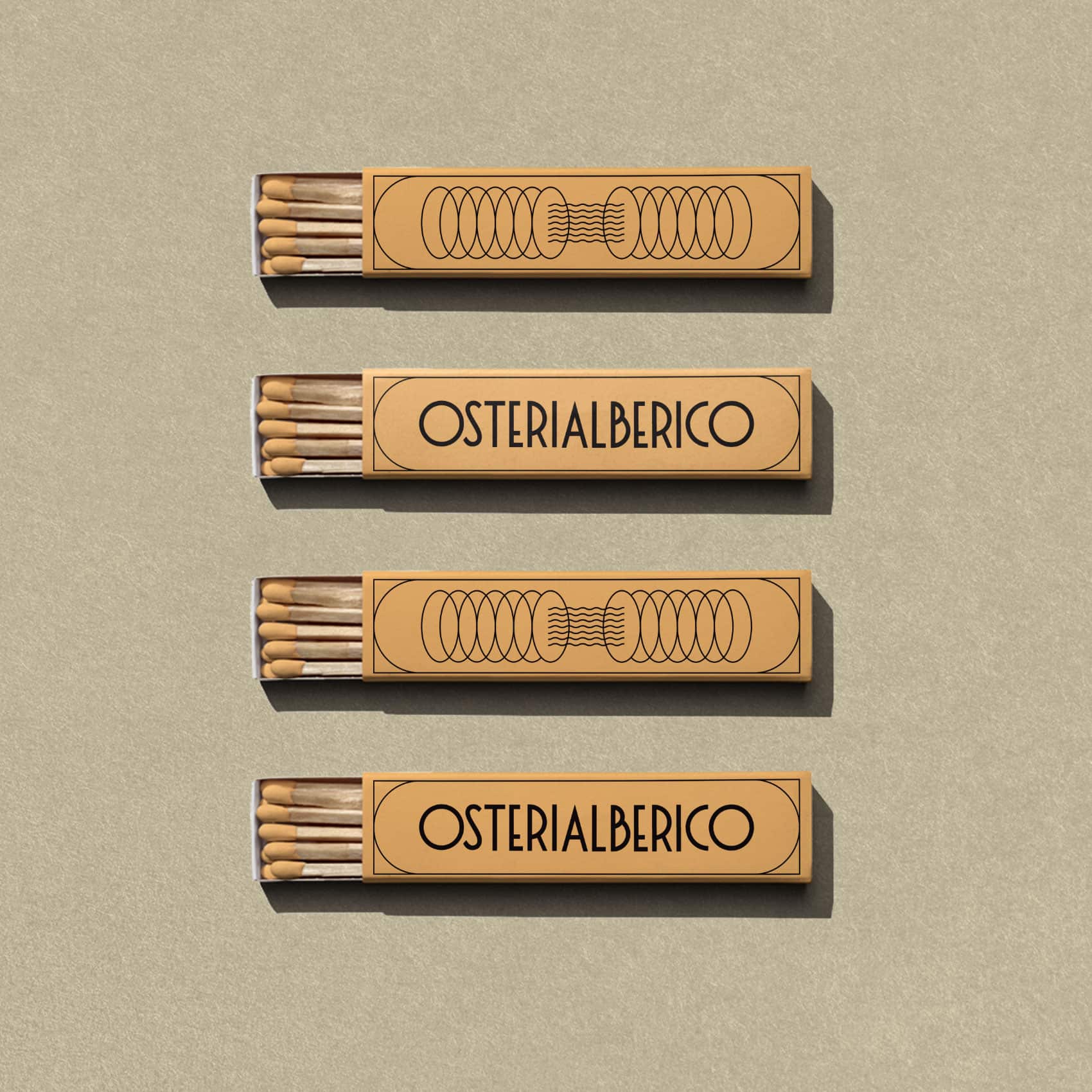
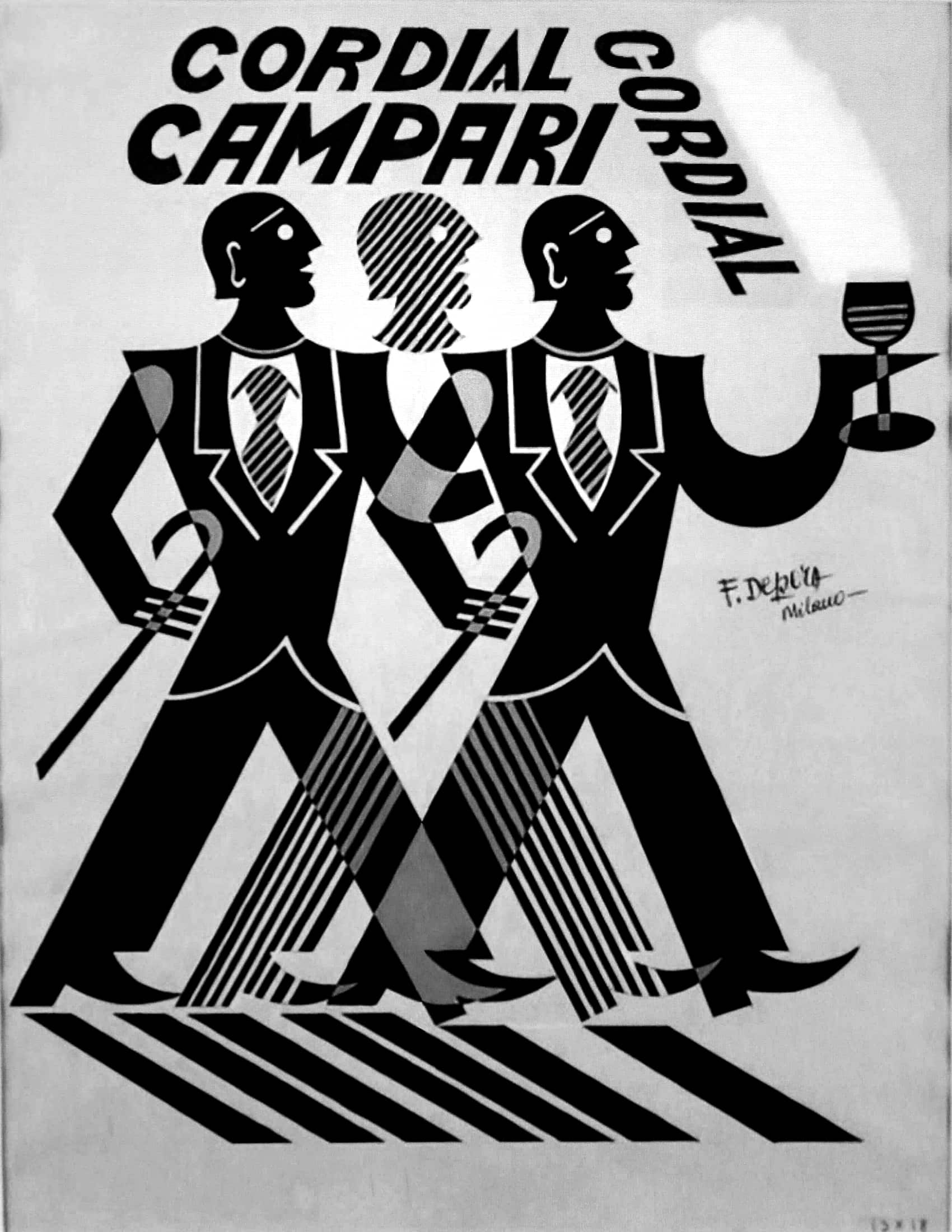
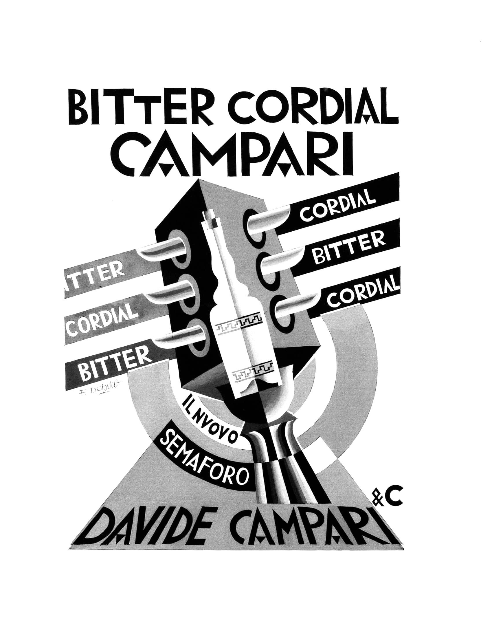
Drawing inspiration from Fortunato Depero’s iconic work for Campari, we crafted a suite of food and drink-inspired illustrative elements tailored for the Alberico brand. These elements were designed with single-weighted lines, ensuring they integrate seamlessly within the “frames” of the collateral, enhancing the brand’s visual cohesion and timeless appeal.


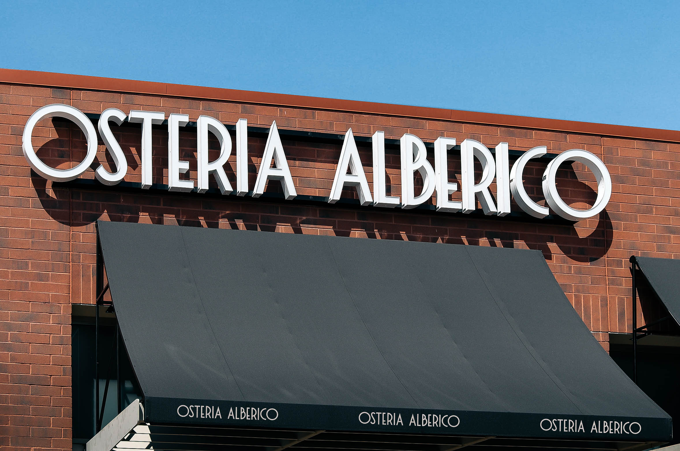
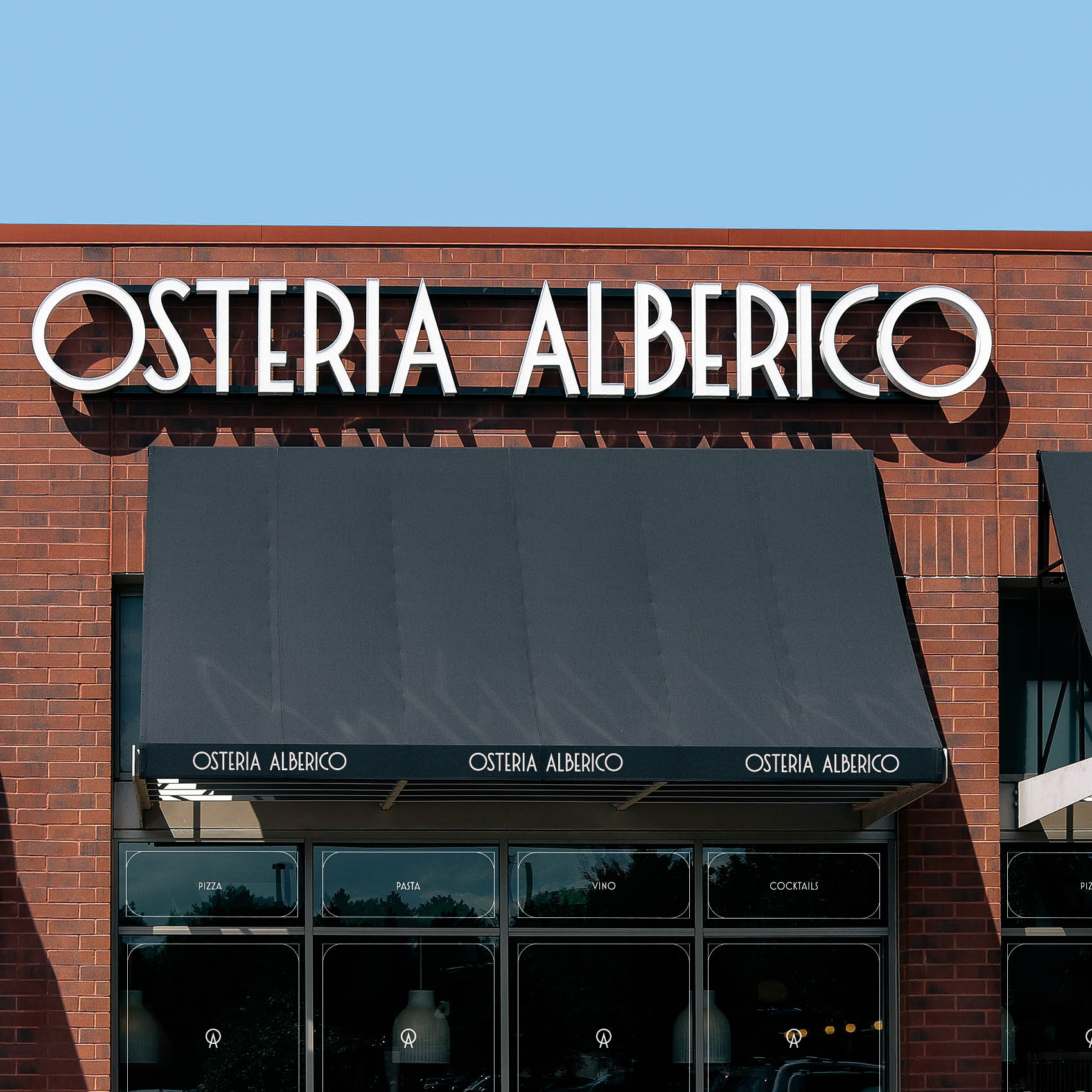
For the brand’s physical buildout, we drew inspiration from the wrought-iron signage that has long adorned Italy’s streets and buildings. These iconic elements provided strong visual cues for our design decisions, guiding us in creating an immersive experience that transports patrons from Denver to the heart of an authentic Italian osteria. This inspiration also influenced the development of ‘frames’ across various collateral items.